and harvest data for Forest Service 2010 RPA Assessment https://doi.org/10.2737/RDS-2014-0009 • From this data source, I’m exploring which species have experienced the most dramatic population increases or decreases over time. I’m also looking to see if any of the species’ trends correlate with another species’ trends. For example, does an increase in one animal’s population relate to an increase or decline for another animal?
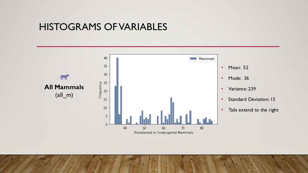
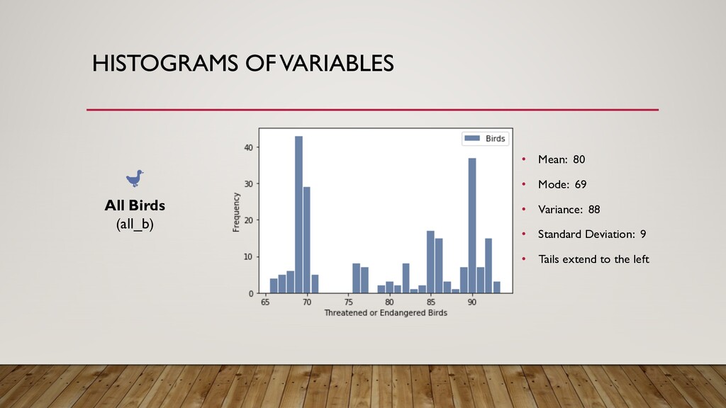
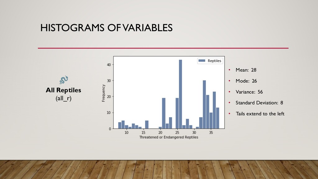
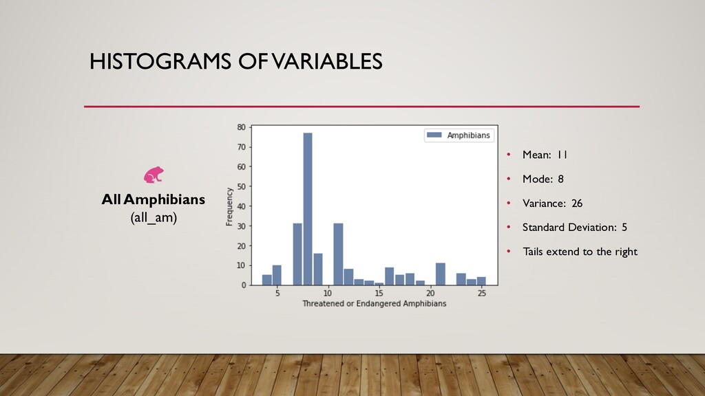
All species - Number of all species listed as threatened or endangered All mammals - Number of mammals listed as threatened or endangered All birds - Number of birds listed as threatened or endangered All reptiles - Number of reptiles listed as threatened or endangered All amphibians - Number of amphibians listed as threatened or endangered
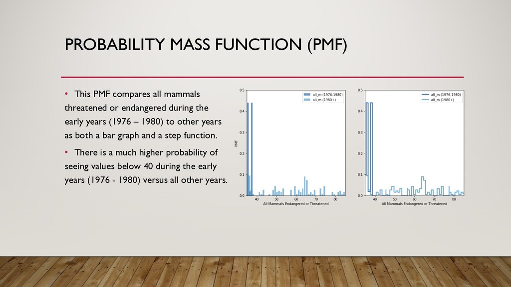
threatened or endangered during the early years (1976 – 1980) to other years as both a bar graph and a step function. • There is a much higher probability of seeing values below 40 during the early years (1976 - 1980) versus all other years.
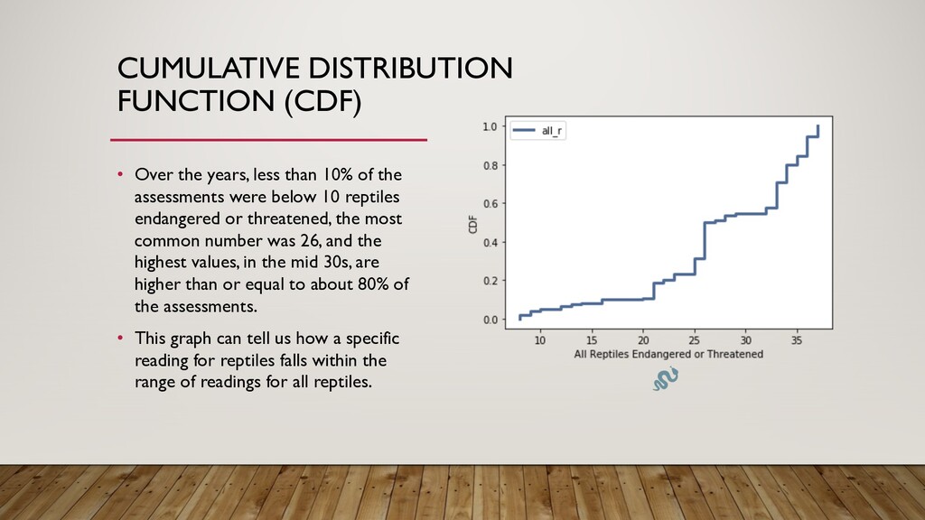
10% of the assessments were below 10 reptiles endangered or threatened, the most common number was 26, and the highest values, in the mid 30s, are higher than or equal to about 80% of the assessments. • This graph can tell us how a specific reading for reptiles falls within the range of readings for all reptiles.
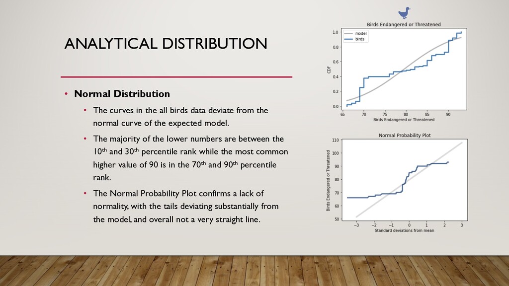
all birds data deviate from the normal curve of the expected model. • The majority of the lower numbers are between the 10th and 30th percentile rank while the most common higher value of 90 is in the 70th and 90th percentile rank. • The Normal Probability Plot confirms a lack of normality, with the tails deviating substantially from the model, and overall not a very straight line.
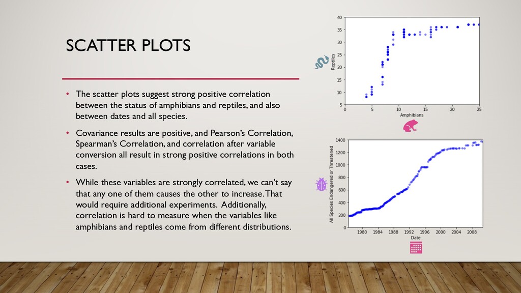
between the status of amphibians and reptiles, and also between dates and all species. • Covariance results are positive, and Pearson’s Correlation, Spearman’s Correlation, and correlation after variable conversion all result in strong positive correlations in both cases. • While these variables are strongly correlated, we can’t say that any one of them causes the other to increase. That would require additional experiments. Additionally, correlation is hard to measure when the variables like amphibians and reptiles come from different distributions.
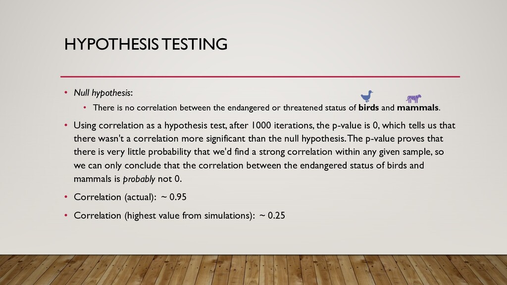
between the endangered or threatened status of birds and mammals. • Using correlation as a hypothesis test, after 1000 iterations, the p-value is 0, which tells us that there wasn't a correlation more significant than the null hypothesis. The p-value proves that there is very little probability that we'd find a strong correlation within any given sample, so we can only conclude that the correlation between the endangered status of birds and mammals is probably not 0. • Correlation (actual): ~ 0.95 • Correlation (highest value from simulations): ~ 0.25
Results: • R^2: ~ 0.9 • Intercept: ~ 29.65 • Slope: ~ 0.04 • p-value of slope estimate: 7.849550924033314e-117 • With high R^2 values, the simple regression results support strong correlation and predictive power, with the status of all species significantly accounting for variation in the status of all mammals. However, there is the problem of multicollinearity, because these variables are highly correlated, which takes away from the statistical significance of the all species variable.