Share
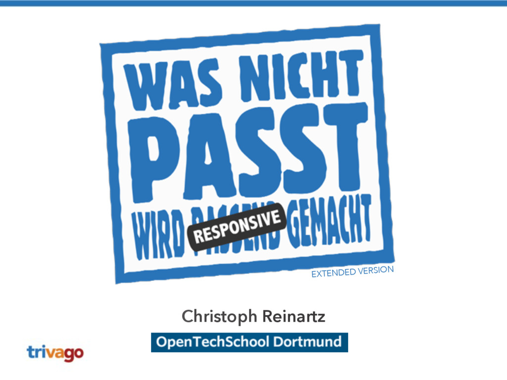
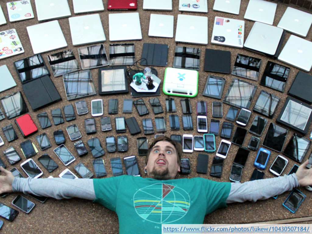
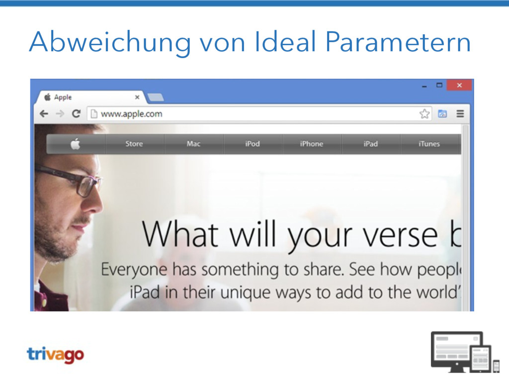
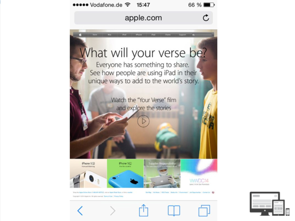
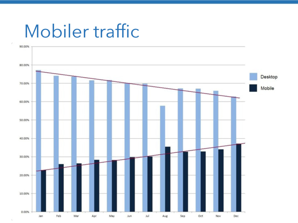
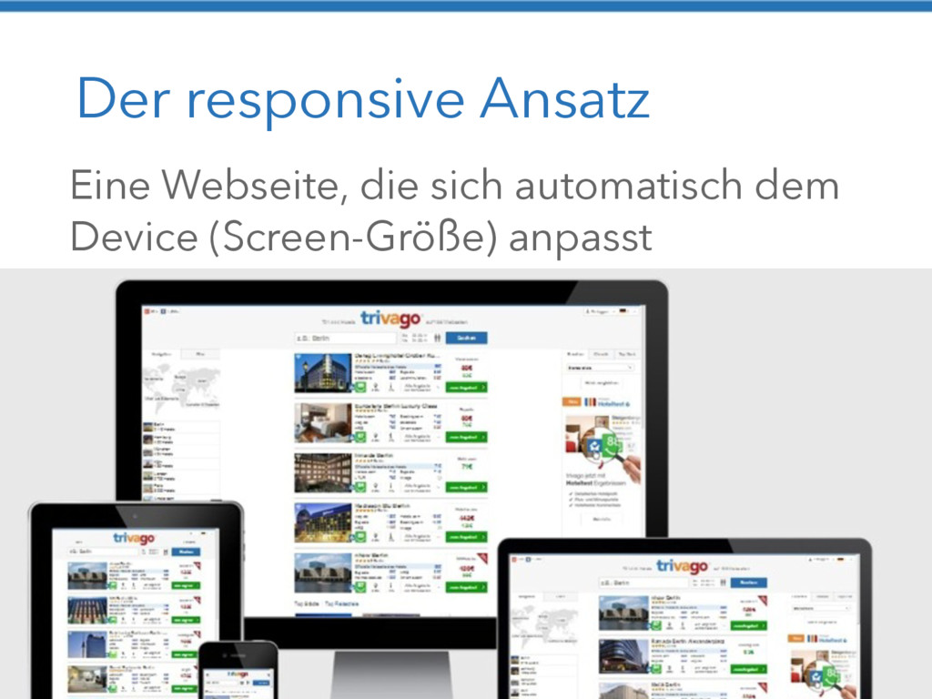
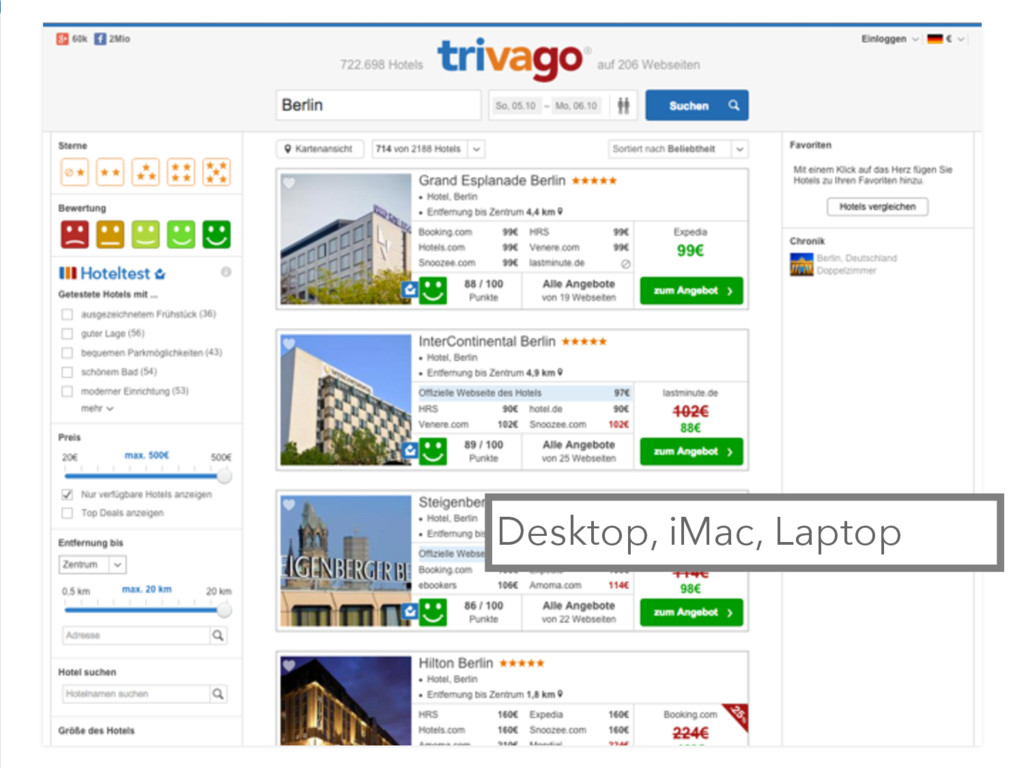
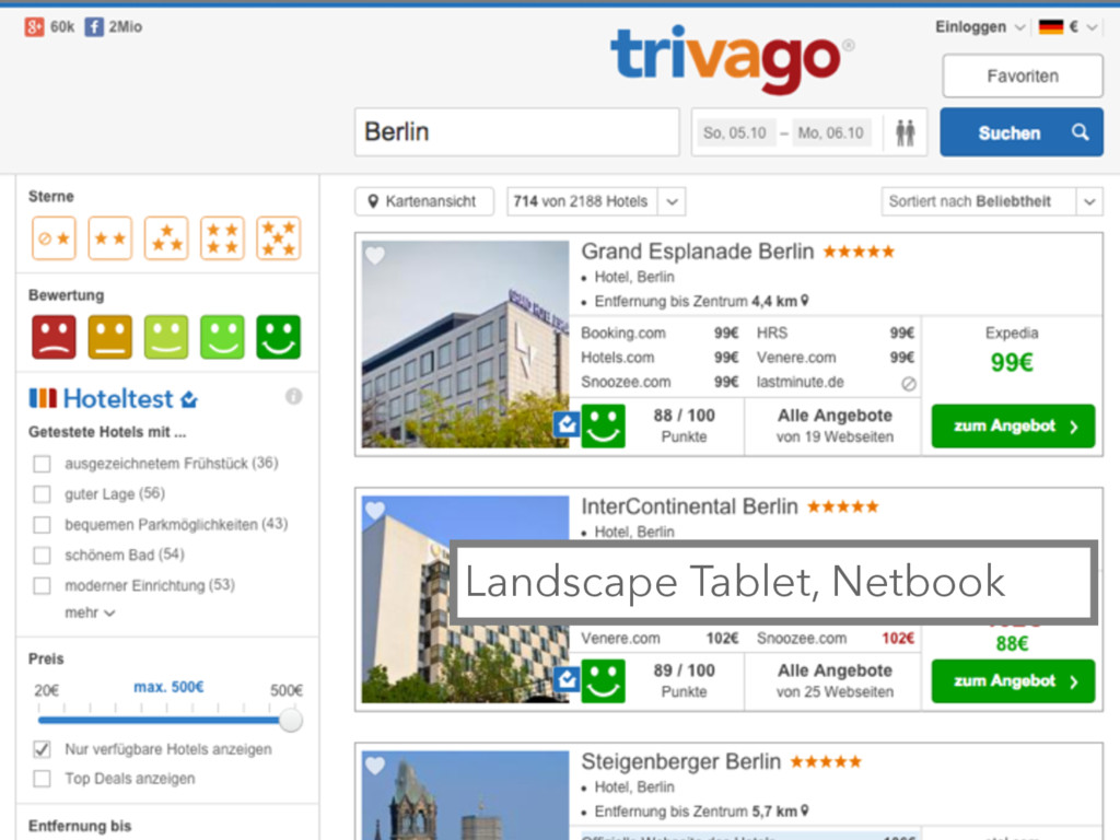
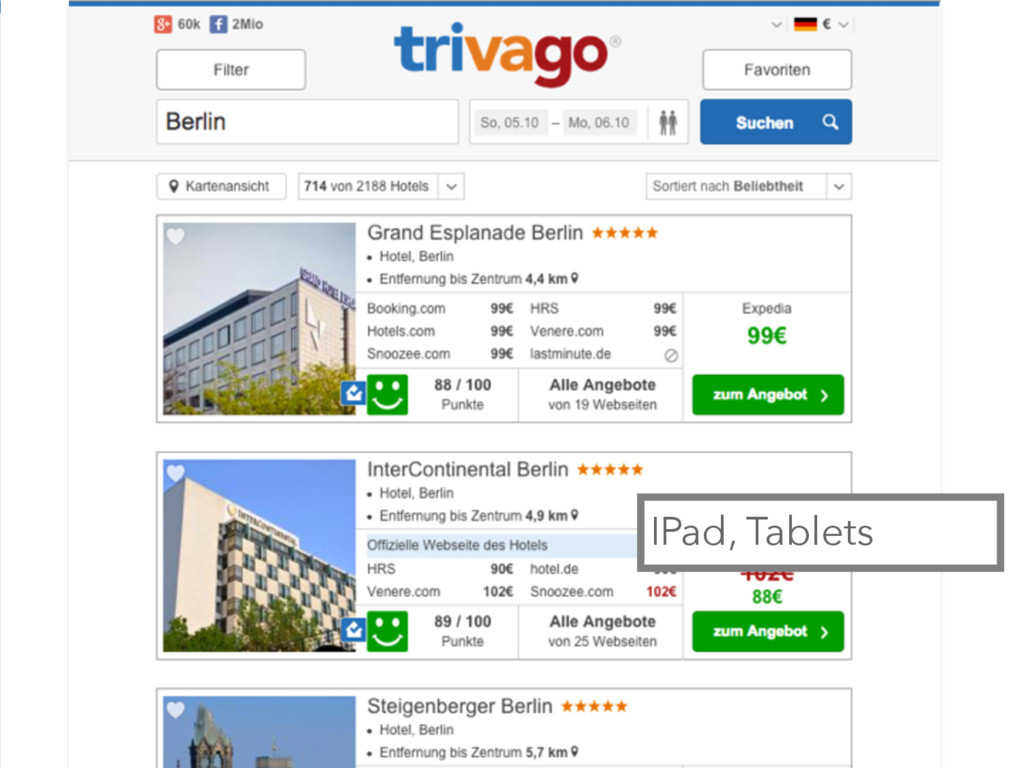
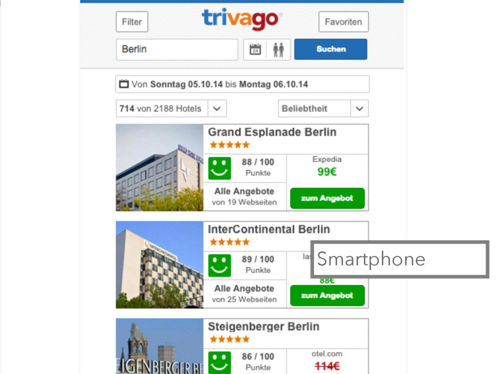
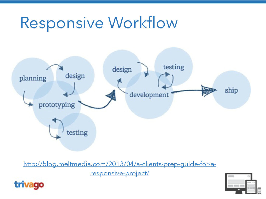
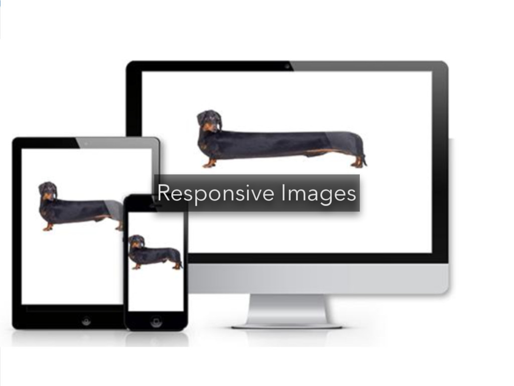
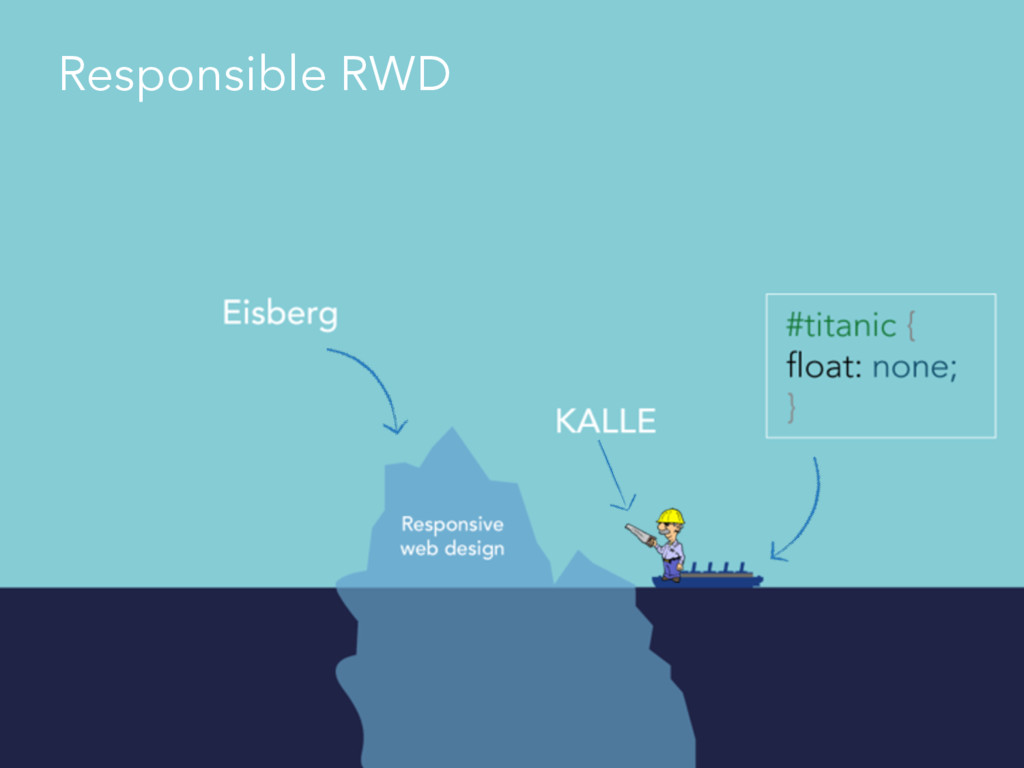
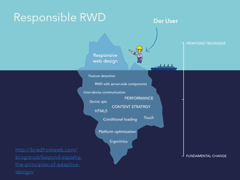
Die überarbeitete Version meiner Responsive Web Design Präsentation, vorgetragen auf dem Learners Meetup der Open Tech School Dortmund
 creinartz
 mhrtech
 maruloop
 nttcom
 shinyasaita
 tomzoh
 happysamurai294
 ry0_ka
 torumakabe
 ykagano
 iwatatomoya
 flatt_security
 sugimomoto
.png) helenjbeal
helenjbeal
 davetheseo
 chrislema
 andyhume
 moore
moore
 techseoconnect
 aleyda
 tammyeverts
 samtorres
 bethany
 jonoalderson
 gr2m
gr2m