Upgrade to Pro — share decks privately, control downloads, hide ads and more …

CSS flexbox + grid

CSS flexbox + grid

A little resume about two magic layouts from CSS

darrubla

June 20, 2020
Tweet

Other Decks in Technology

Transcript

  1. Flexbox  Es un layout de una sola dimension que

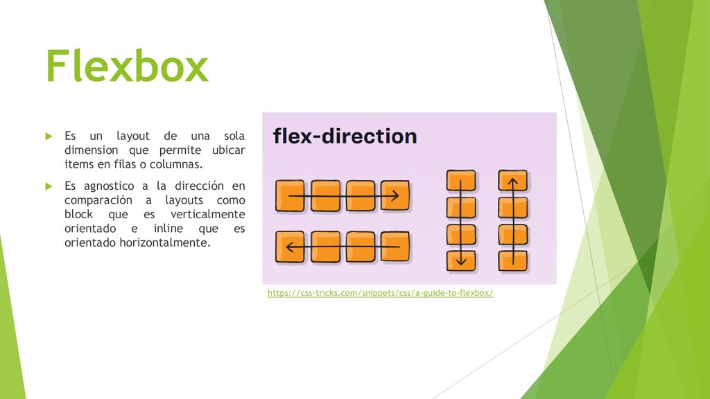
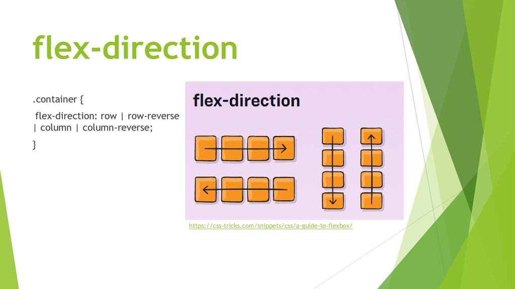
    permite ubicar items en filas o columnas.  Es agnostico a la dirección en comparación a layouts como block que es verticalmente orientado e inline que es orientado horizontalmente. https://css-tricks.com/snippets/css/a-guide-to-flexbox/
  2. Propiedades  Parent • flex-direction • justify-content • align-items •

    align-content  Child • order • flex-grow • align-self
  3. flex-direction .container { flex-direction: row | row-reverse | column |

    column-reverse; } https://css-tricks.com/snippets/css/a-guide-to-flexbox/
  4. justify-content .container { justify-content: flex-start | flex-end | center |

    space- between | space-around | space-evenly | start | end | left | right ... + safe | unsafe; } https://css-tricks.com/snippets/css/a-guide-to-flexbox/
  5. align-items .container { align-items: stretch | flex-start | flex-end |

    center | baseline | first baseline | last baseline | start | end | self-start | self-end + ... safe | unsafe; } https://css-tricks.com/snippets/css/a-guide-to-flexbox/
  6. align-content .container { align-content: flex-start | flex-end | center |

    space- between | space-around | space-evenly | stretch | start | end | baseline | first baseline | last baseline + ... safe | unsafe; } https://css-tricks.com/snippets/css/a-guide-to-flexbox/
  7. order .item { order: 5; /* default is 0 */

    } https://css-tricks.com/snippets/css/a-guide-to-flexbox/
  8. flex-grow .item { flex-grow: 4; /* default 0 */ }

    https://css-tricks.com/snippets/css/a-guide-to-flexbox/
  9. align-self .item { align-self: auto | flex-start | flex-end |

    center | baseline | stretch; } https://css-tricks.com/snippets/css/a-guide-to-flexbox/
  10. Grid Es un layout bidimensional que permite ubicar items en

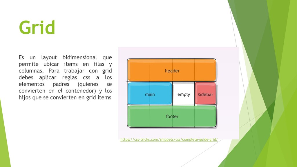
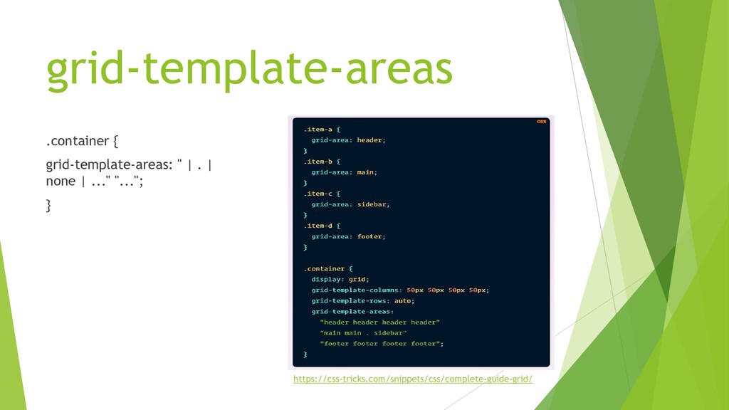
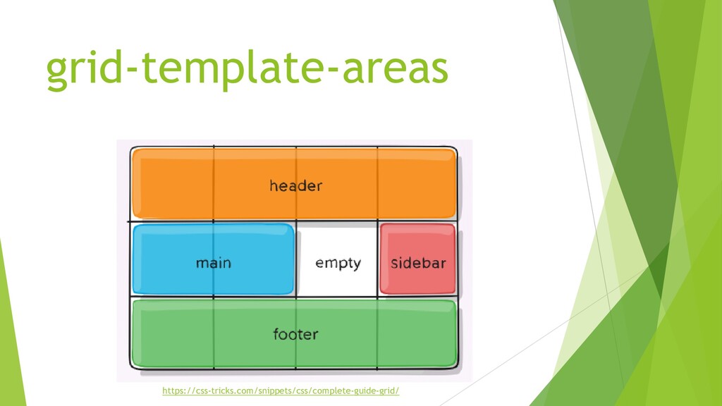
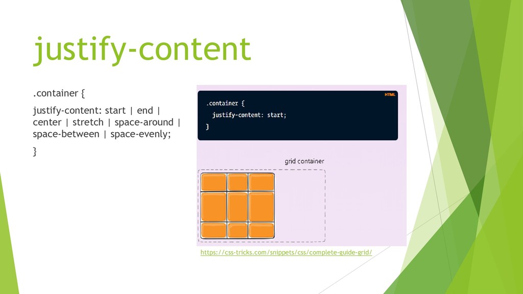
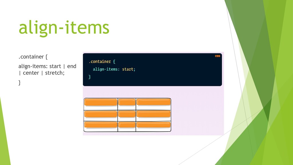
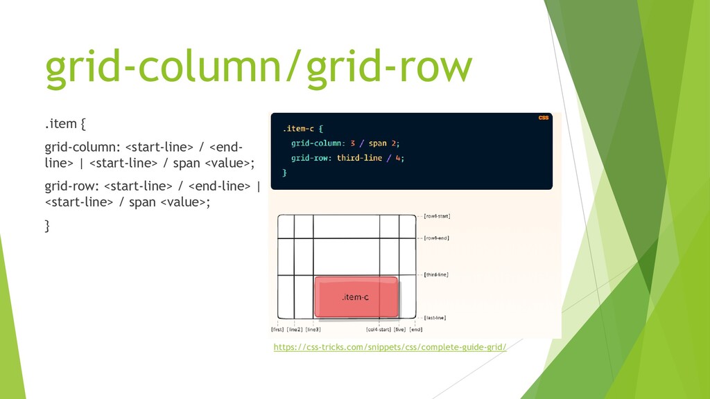
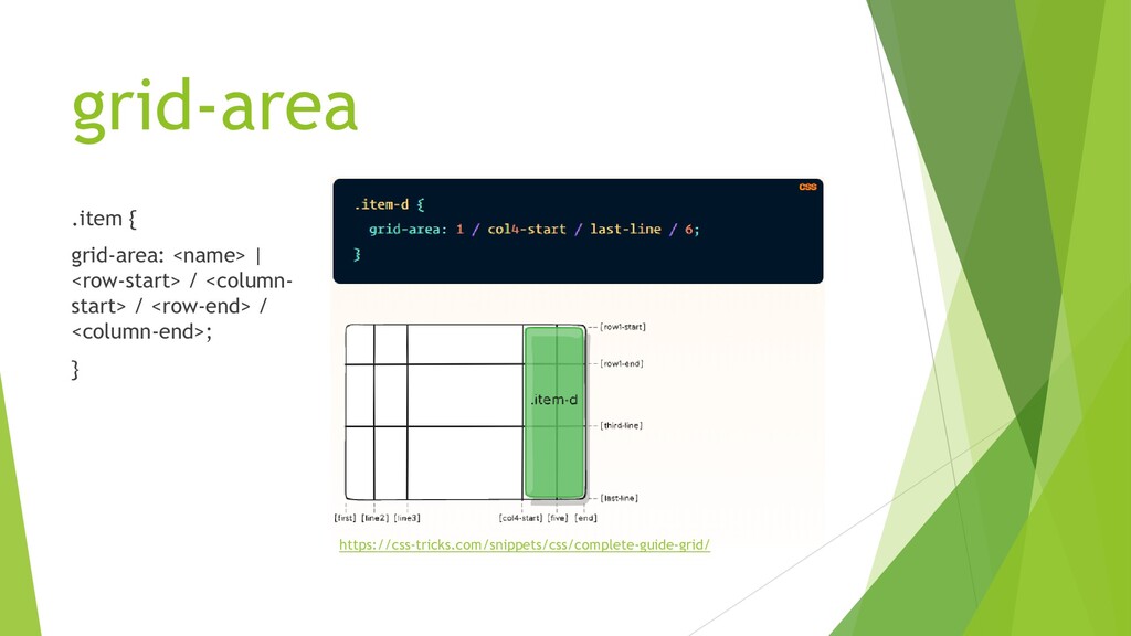
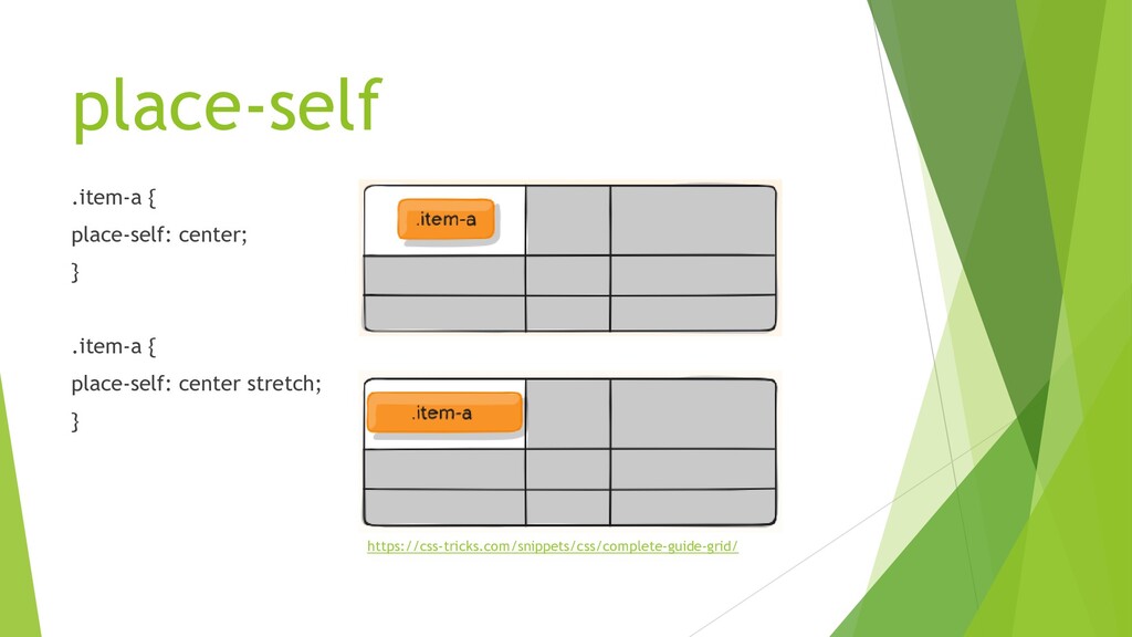
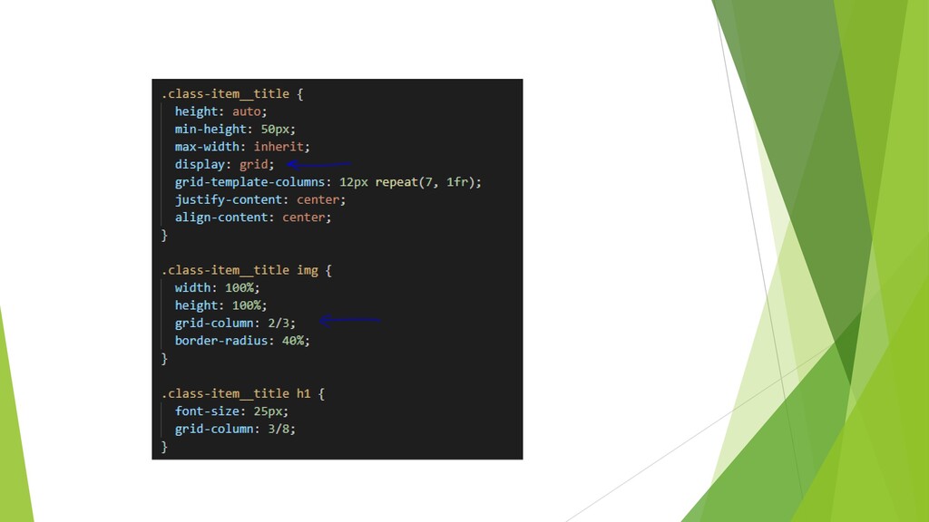
    filas y columnas. Para trabajar con grid debes aplicar reglas css a los elementos padres (quienes se convierten en el contenedor) y los hijos que se convierten en grid items https://css-tricks.com/snippets/css/complete-guide-grid/
  11. Propiedades  Parent • grid-template • grid-gap • justify-content •

    align-items  Child • grid-column • grid-row • grid-area • place-self
  12. grid-template .container { grid-template: none | <grid- template-rows> / <grid-

    template-columns>; } .container { grid-template-columns: 100px 50px 100px; grid-template-rows: 80px auto 80px; column-gap: 10px; row-gap: 15px; } https://css-tricks.com/snippets/css/complete-guide-grid/
  13. grid-template-areas .container { grid-template-areas: " | . | none |

    ..." "..."; } https://css-tricks.com/snippets/css/complete-guide-grid/
  14. justify-content .container { justify-content: start | end | center |

    stretch | space-around | space-between | space-evenly; } https://css-tricks.com/snippets/css/complete-guide-grid/
  15. grid-column/grid-row .item { grid-column: <start-line> / <end- line> | <start-line>

    / span <value>; grid-row: <start-line> / <end-line> | <start-line> / span <value>; } https://css-tricks.com/snippets/css/complete-guide-grid/
  16. grid-area .item { grid-area: <name> | <row-start> / <column- start>

    / <row-end> / <column-end>; } https://css-tricks.com/snippets/css/complete-guide-grid/
  17. place-self .item-a { place-self: center; } .item-a { place-self: center

    stretch; } https://css-tricks.com/snippets/css/complete-guide-grid/
  18. ¡¡Gracias!!  Ahora, animate a practicar y hacer tu propio

    Card, déjanos tu diseño en el grupo de slack.  Aprende jugando con:  http://flexboxfroggy.com/#es  https://cssgridgarden.com/#es