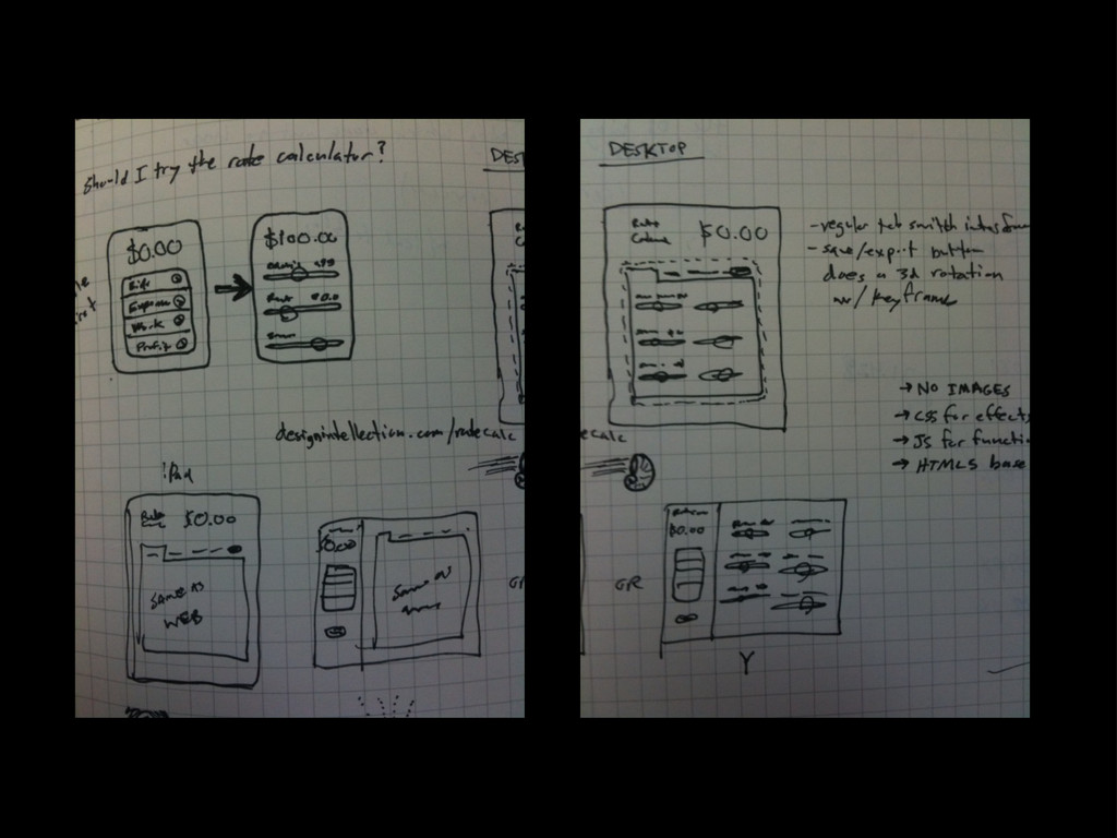
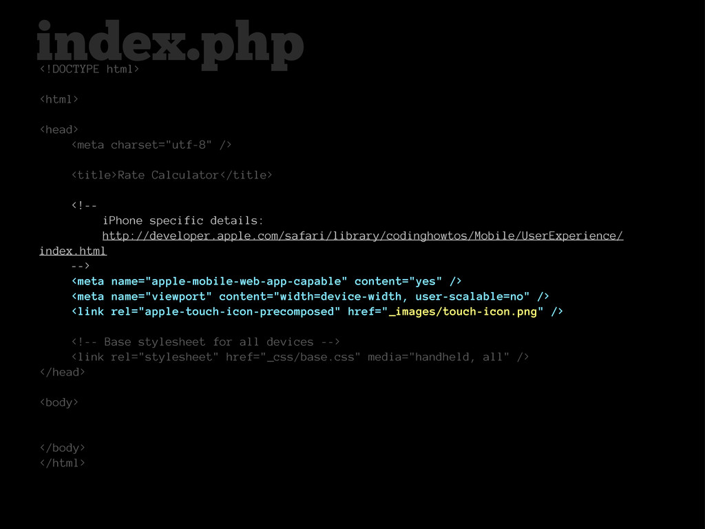
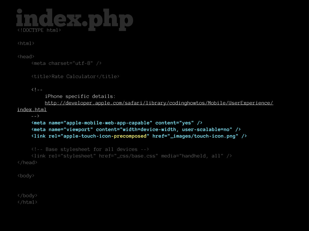
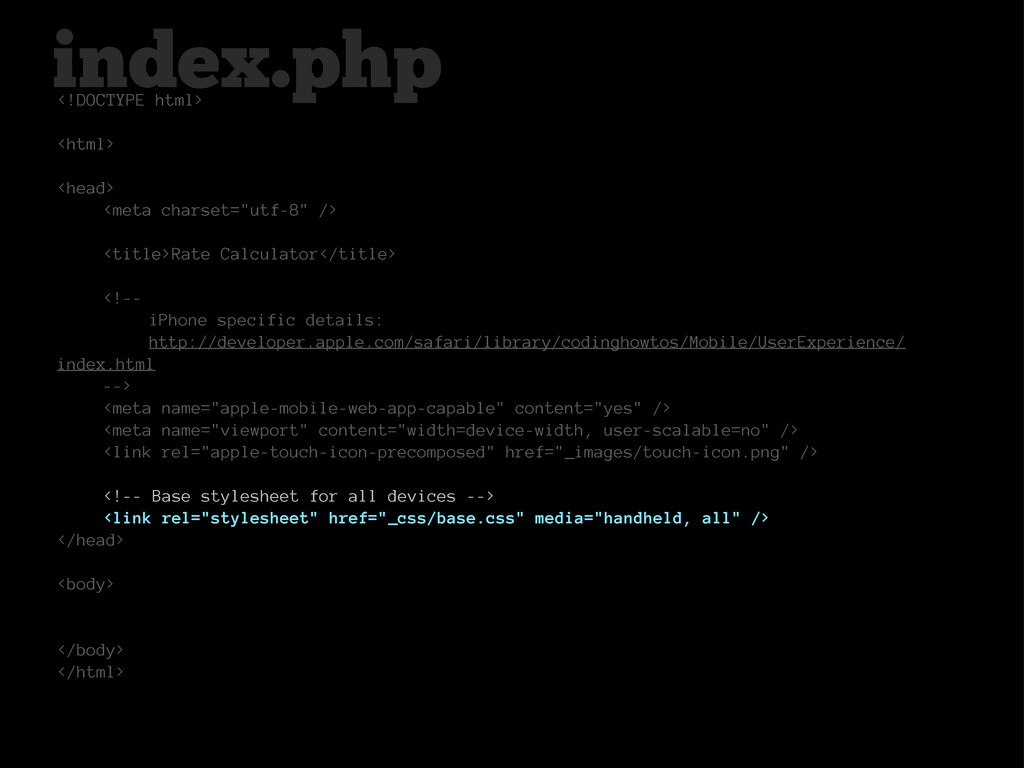
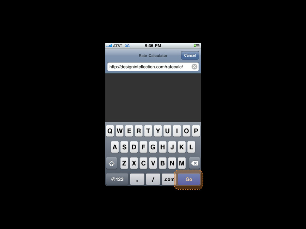
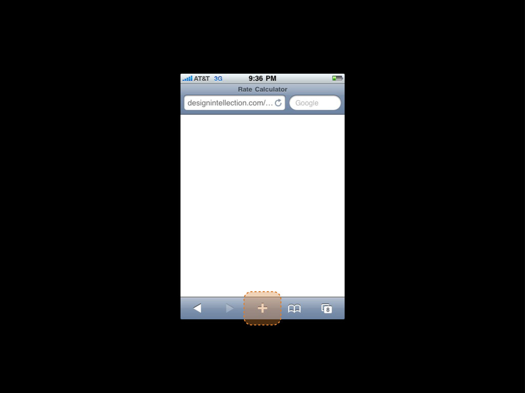
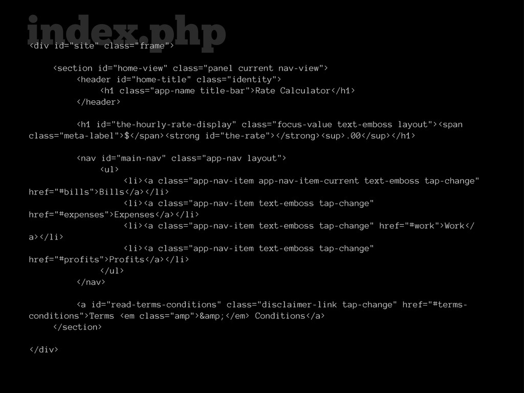
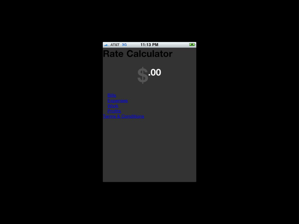
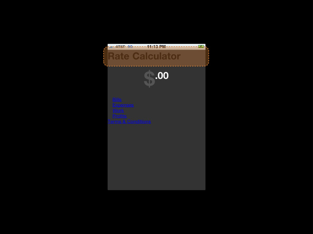
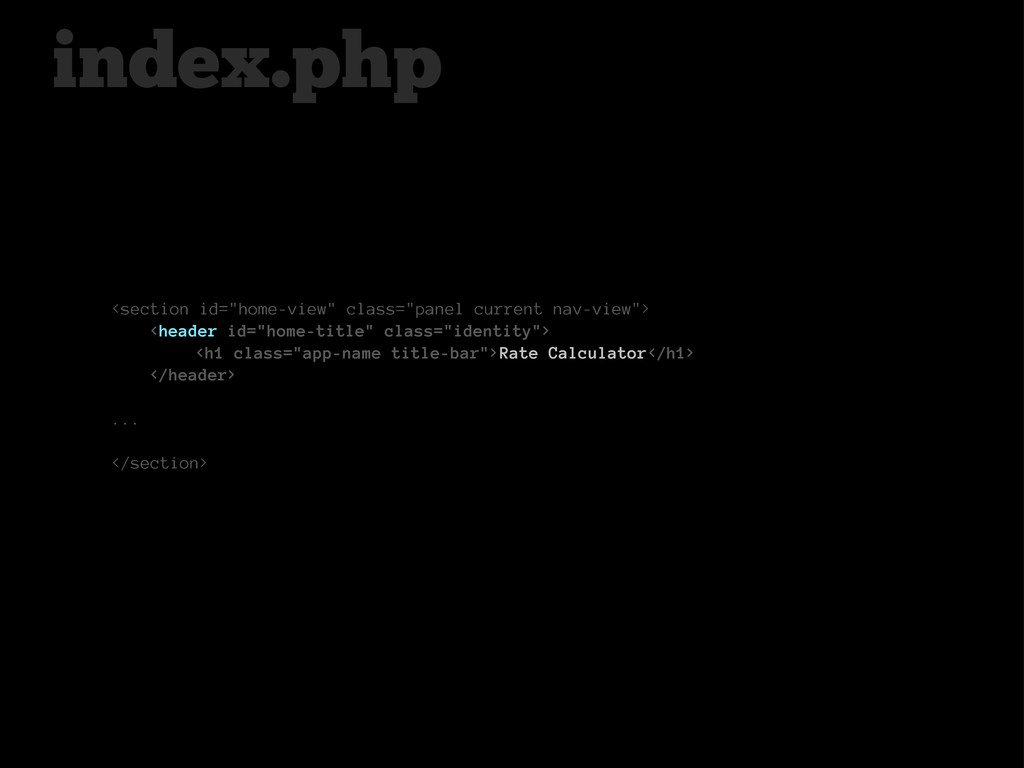
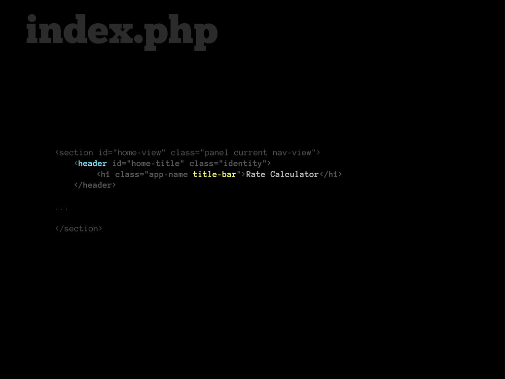
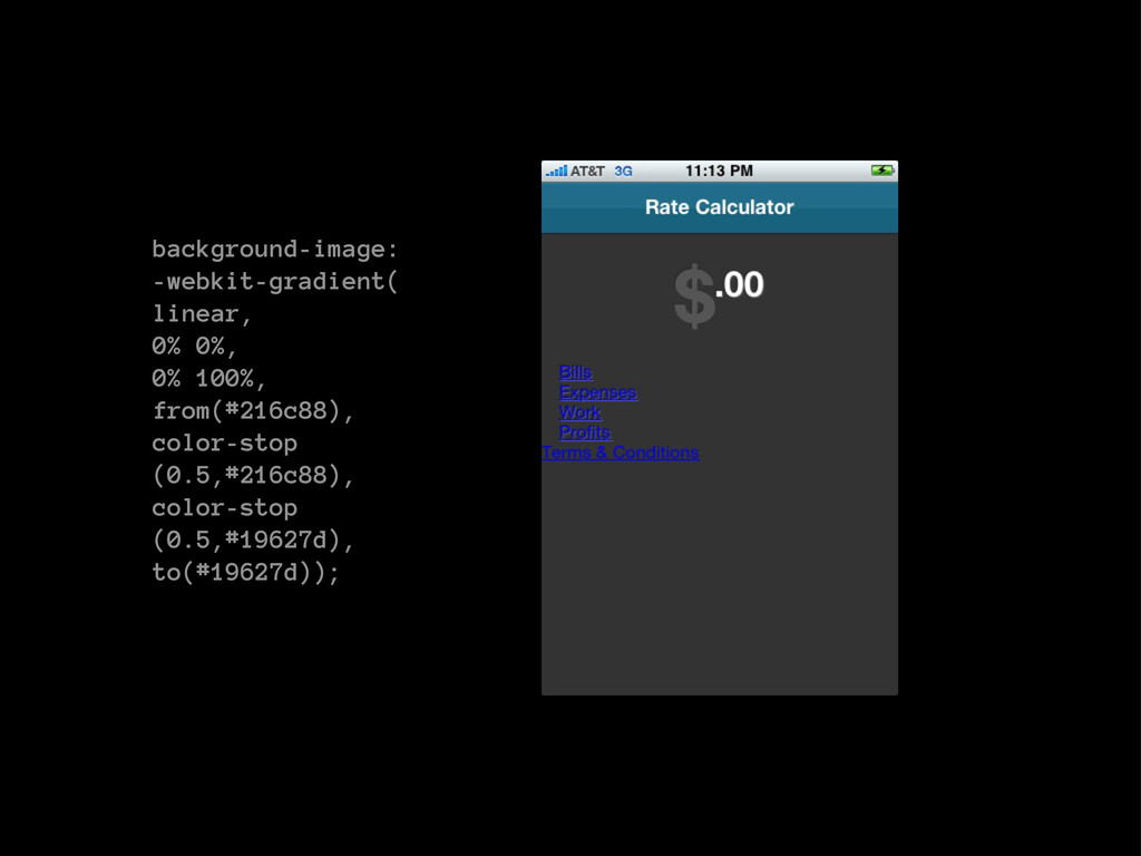
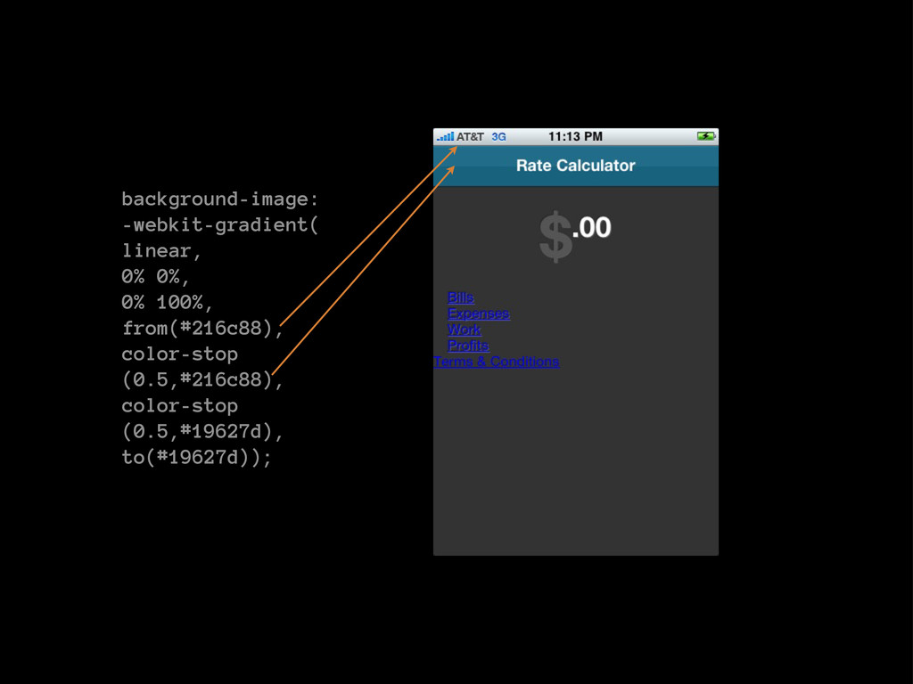
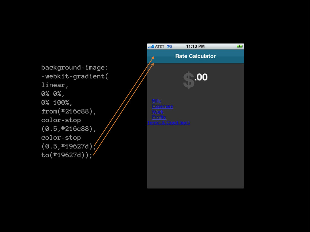
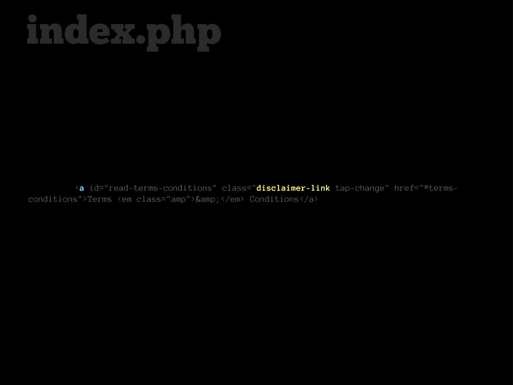
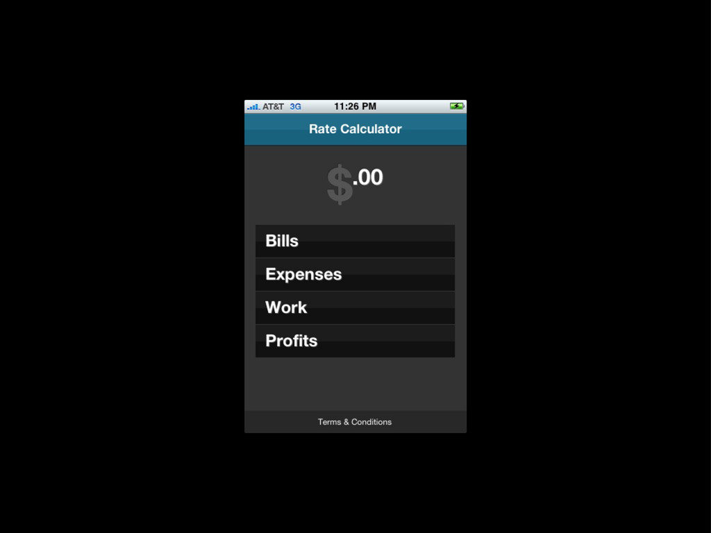
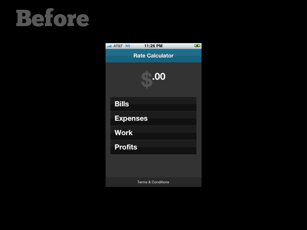
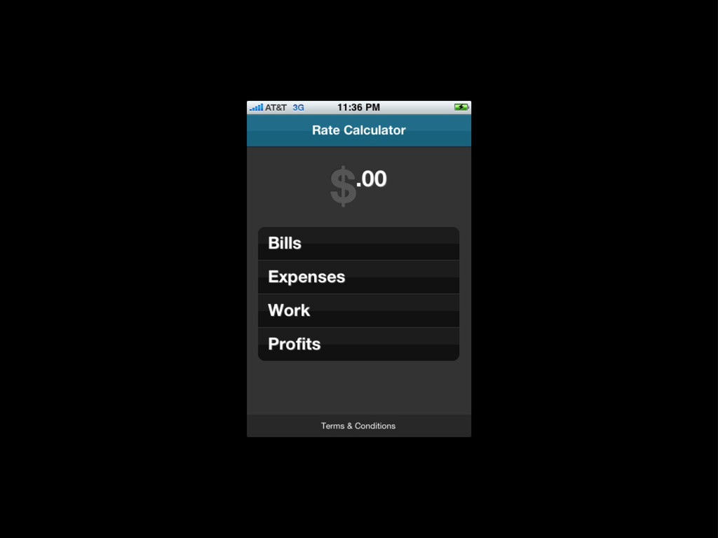
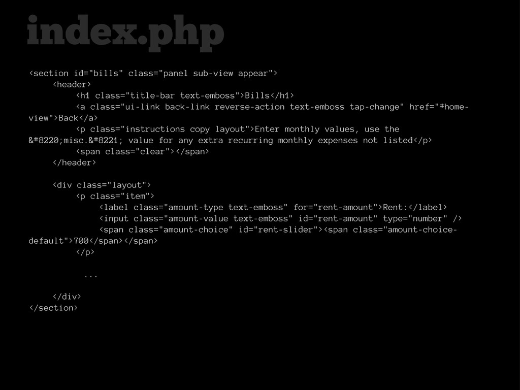
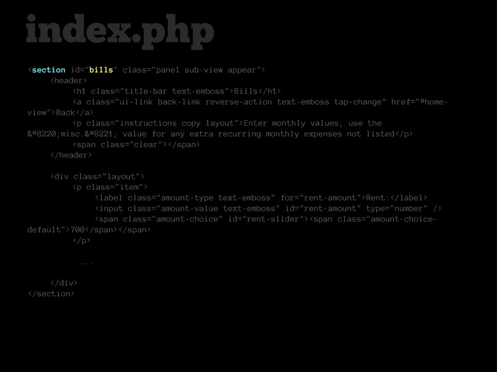
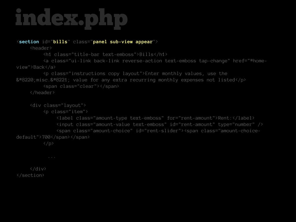
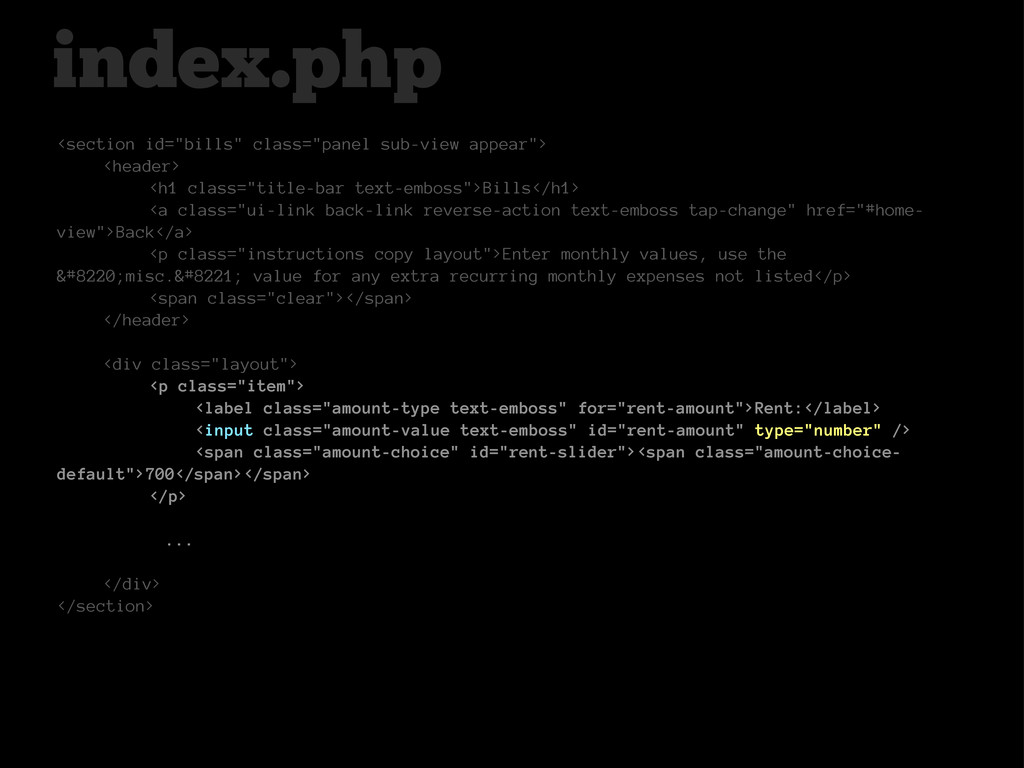
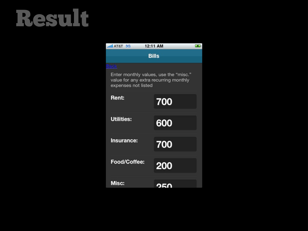
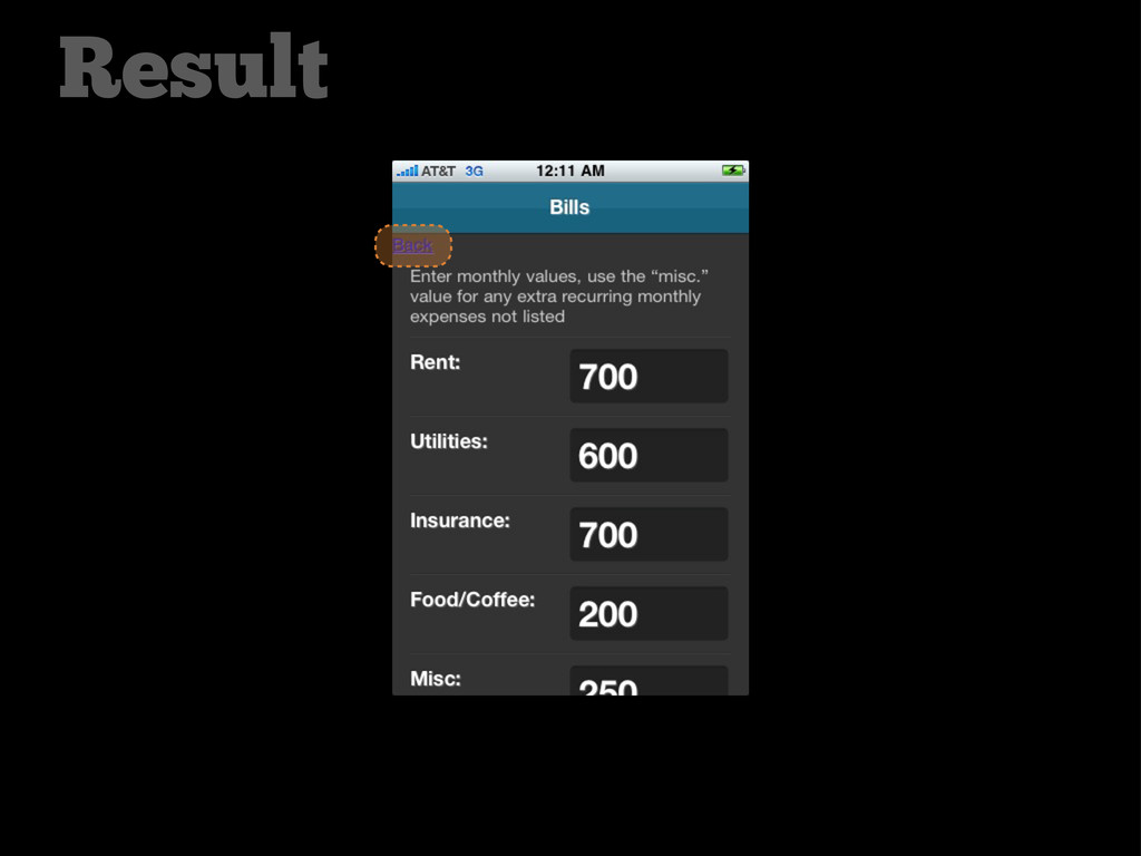
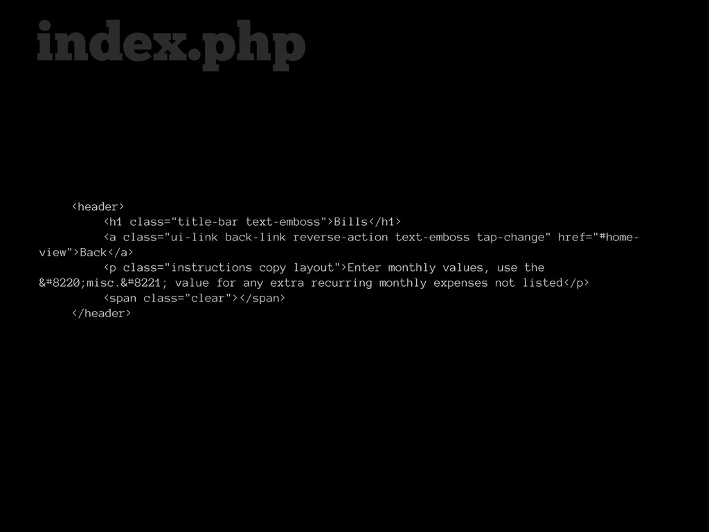
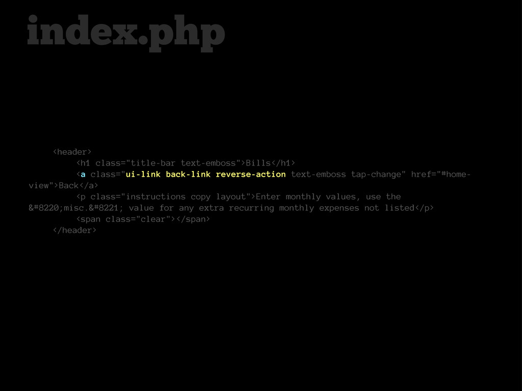
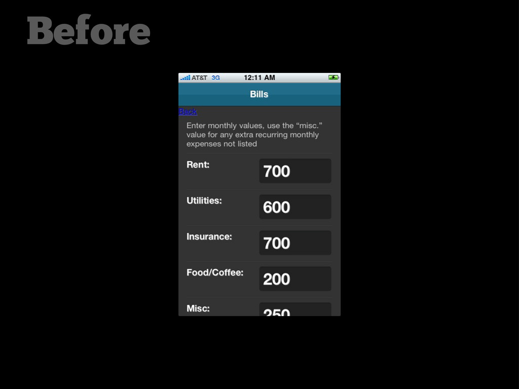
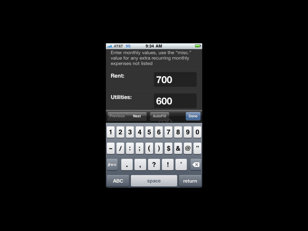
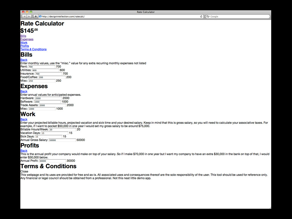
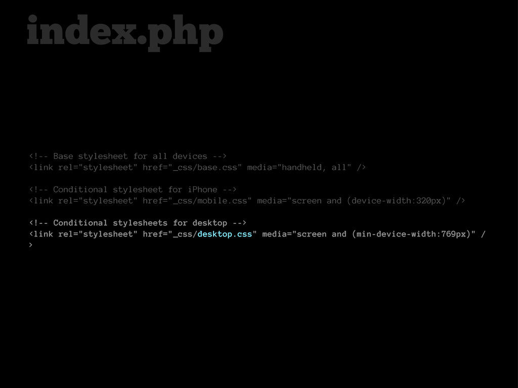
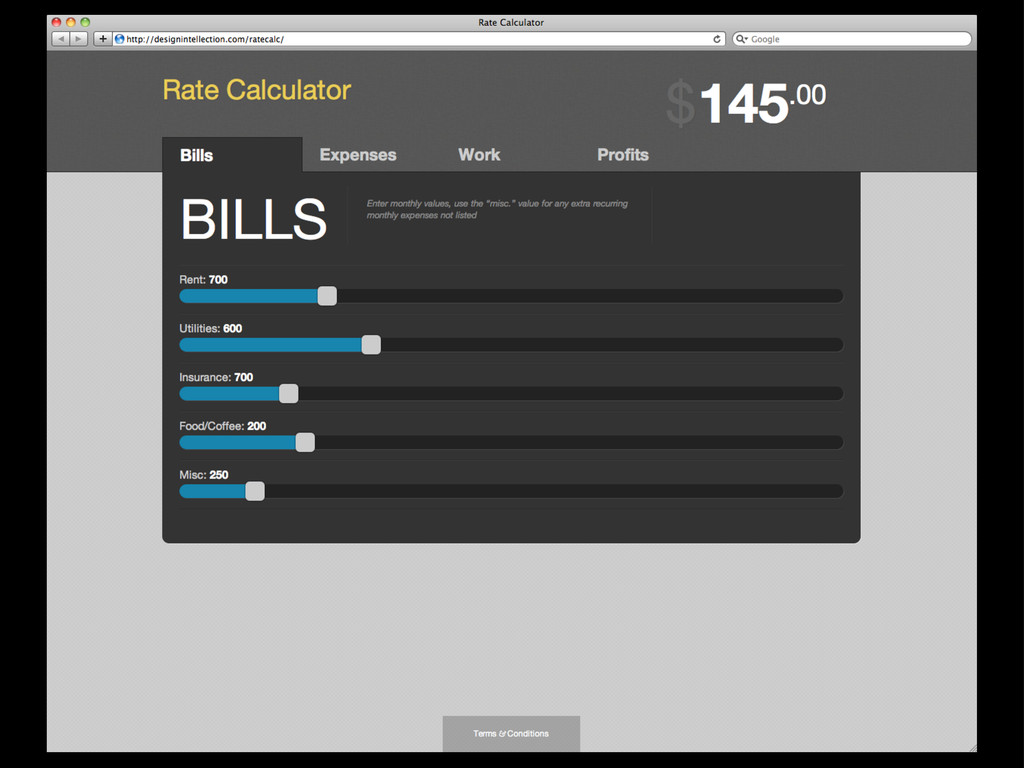
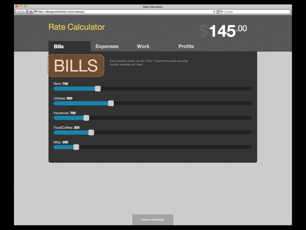
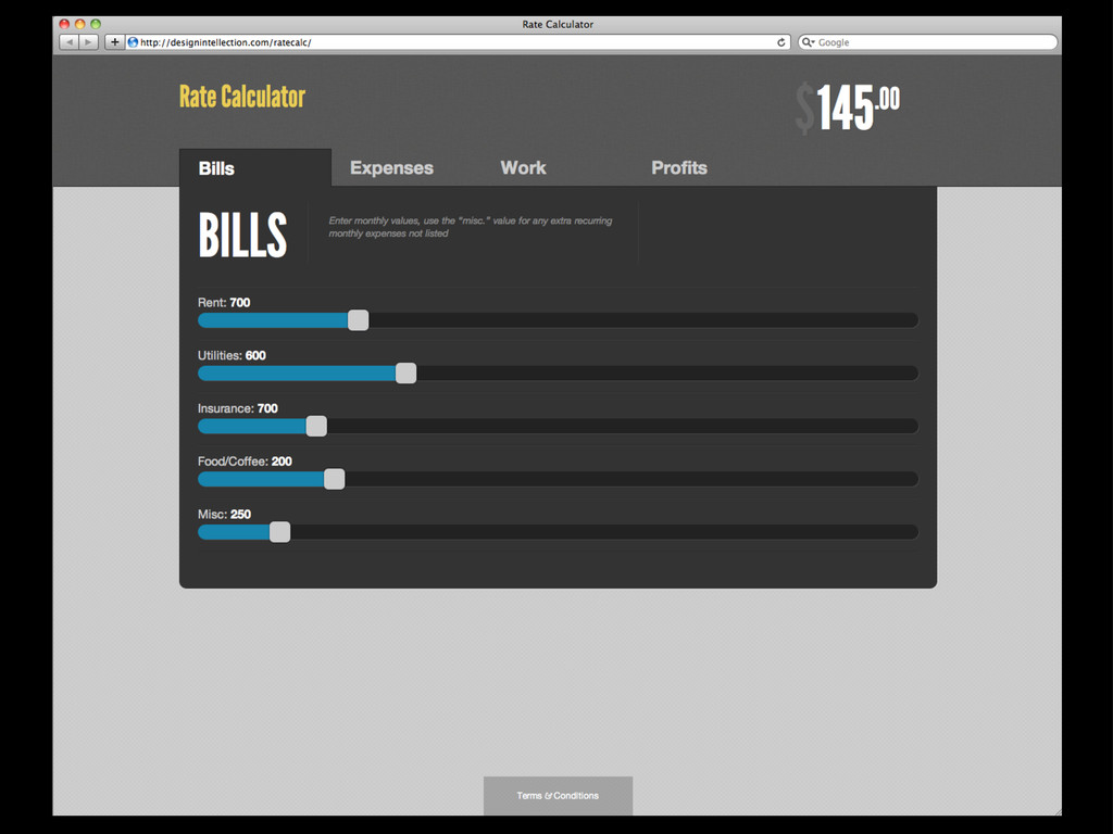
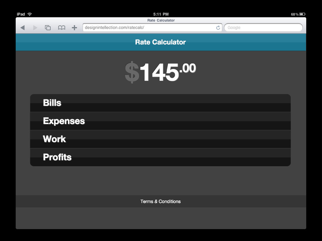
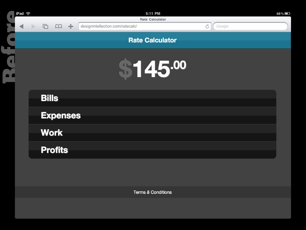
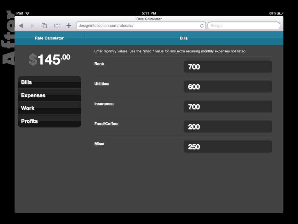
href="#home- view">Back</a> <p class="instructions copy layout">Enter monthly values, use the “misc.” value for any extra recurring monthly expenses not listed</p> <span class="clear"></span> </header> index.php
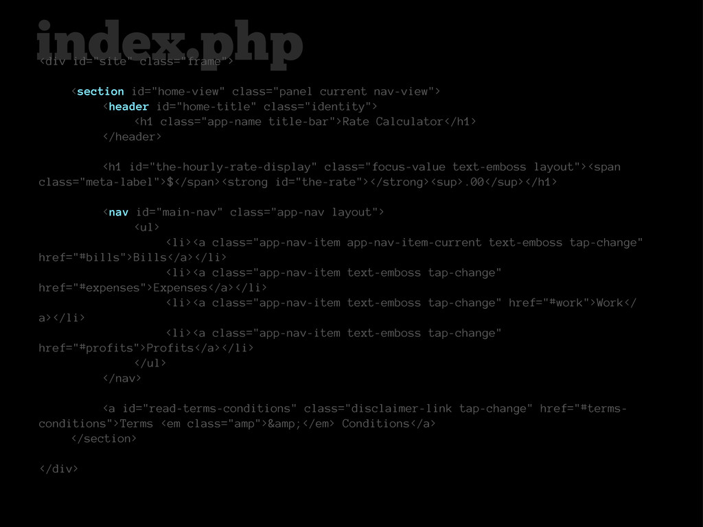
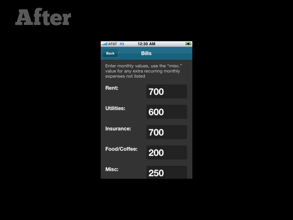
href="#home- view">Back</a> <p class="instructions copy layout">Enter monthly values, use the “misc.” value for any extra recurring monthly expenses not listed</p> <span class="clear"></span> </header> index.php
 rezaline
 a2k
a2k
 deadlinepoet
 centou
 moco1013
 nttcom
 terencebasart
 nbkouhou
 mottox2
 lynteo
 kenichiota0711
 sony
sony
 eileencodes
 rasmusluckow
 helmedeiros
 popppiees
 portentint
 jdejongh
 sstephenson
 soudai
 mkilby
 vanstee
 axbom
axbom
 ianozsvald