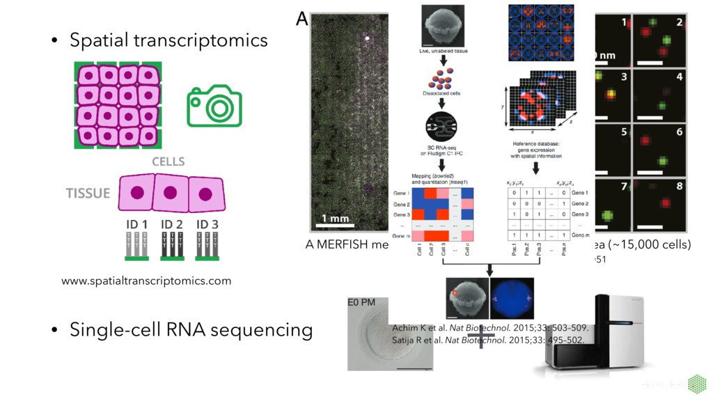
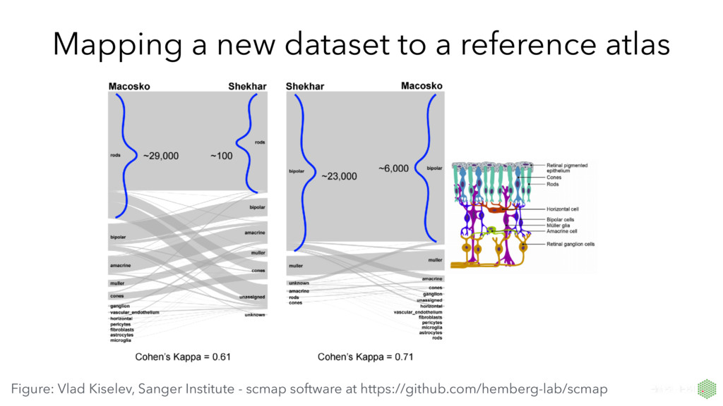
MERFISH measurement of an ~20mm2 sample area (~15,000 cells) Jeffrey R. Moffitt et al. PNAS 2016;113:11046-11051 Achim K et al. Nat Biotechnol. 2015;33: 503–509. Satija R et al. Nat Biotechnol. 2015;33: 495–502.
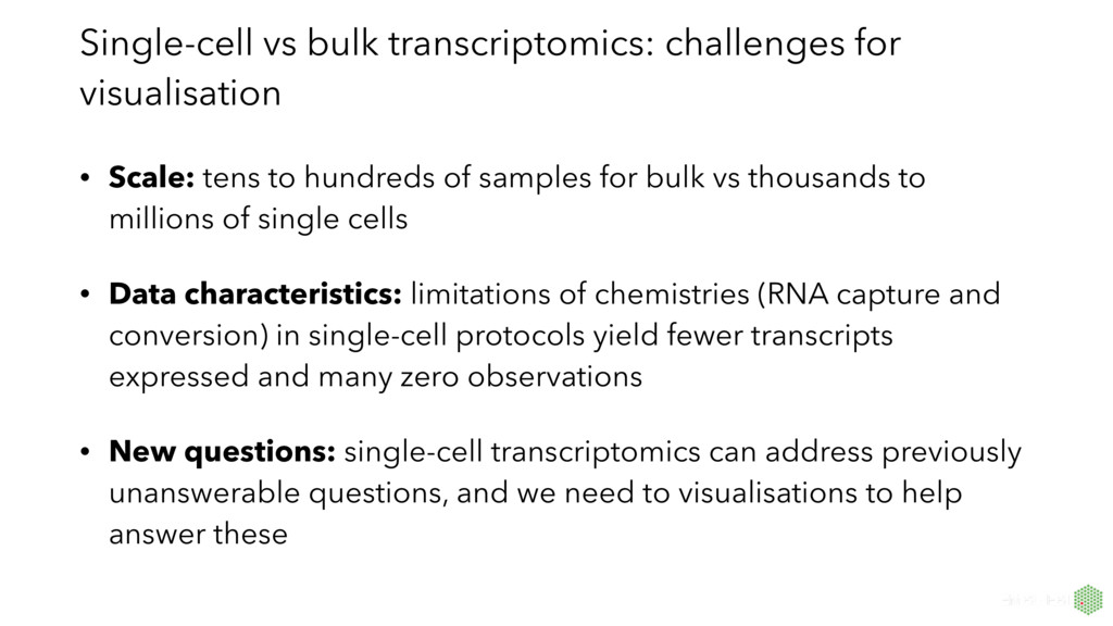
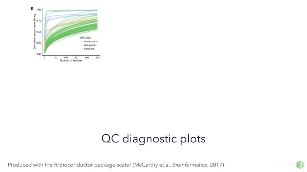
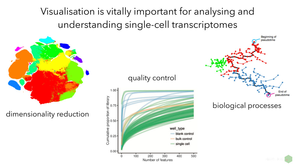
to hundreds of samples for bulk vs thousands to millions of single cells • Data characteristics: limitations of chemistries (RNA capture and conversion) in single-cell protocols yield fewer transcripts expressed and many zero observations • New questions: single-cell transcriptomics can address previously unanswerable questions, and we need to visualisations to help answer these
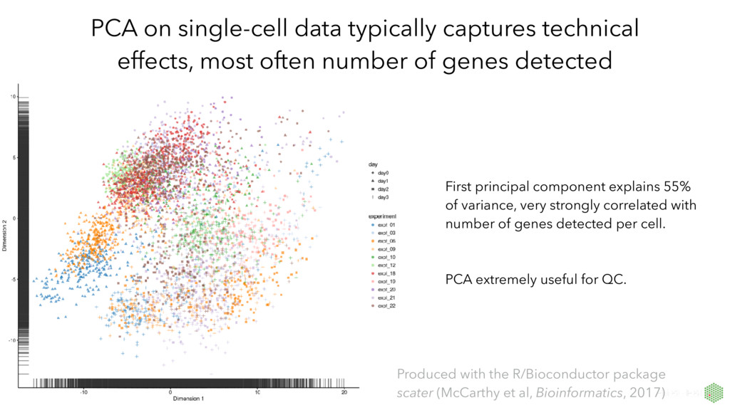
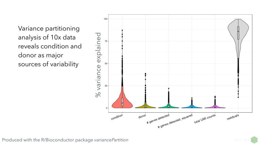
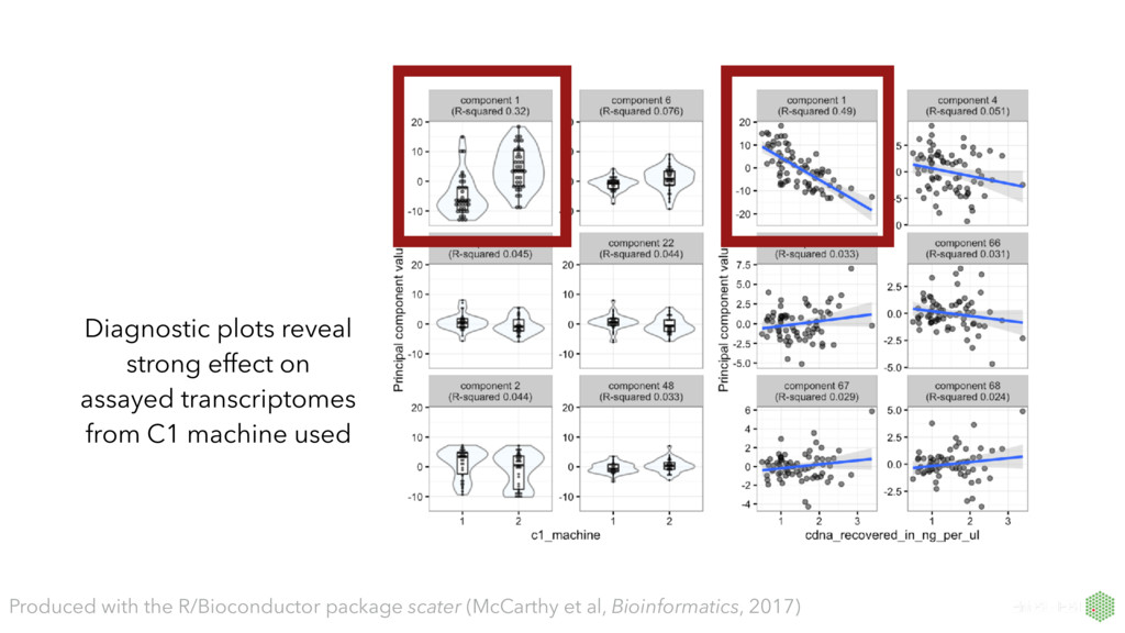
number of genes detected First principal component explains 55% of variance, very strongly correlated with number of genes detected per cell. PCA extremely useful for QC. Produced with the R/Bioconductor package scater (McCarthy et al, Bioinformatics, 2017)
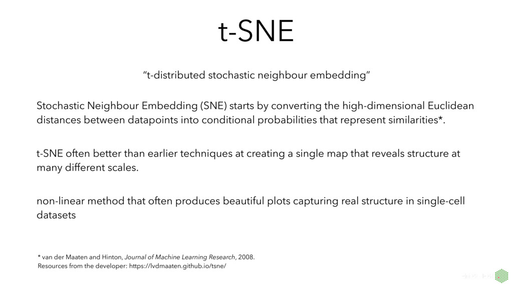
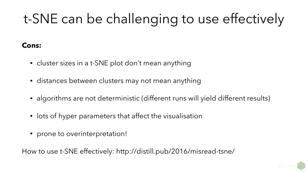
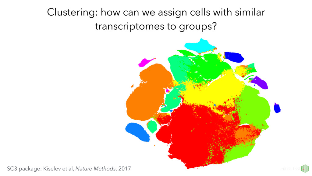
by converting the high-dimensional Euclidean distances between datapoints into conditional probabilities that represent similarities*. t-SNE often better than earlier techniques at creating a single map that reveals structure at many different scales. non-linear method that often produces beautiful plots capturing real structure in single-cell datasets * van der Maaten and Hinton, Journal of Machine Learning Research, 2008. Resources from the developer: https://lvdmaaten.github.io/tsne/
sizes in a t-SNE plot don’t mean anything • distances between clusters may not mean anything • algorithms are not deterministic (different runs will yield different results) • lots of hyper parameters that affect the visualisation • prone to overinterpretation! How to use t-SNE effectively: http://distill.pub/2016/misread-tsne/