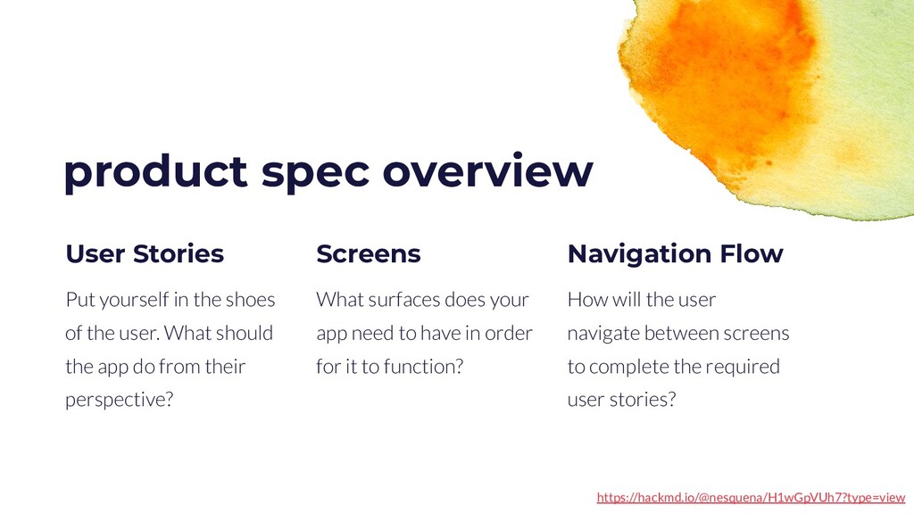
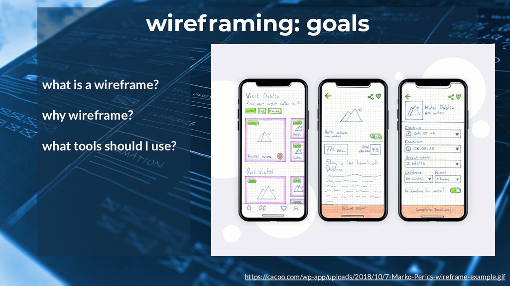
required user stories? Navigation Flow product spec overview Put yourself in the shoes of the user. What should the app do from their perspective? User Stories What surfaces does your app need to have in order for it to function? Screens https://hackmd.io/@nesquena/H1wGpVUh7?type=view
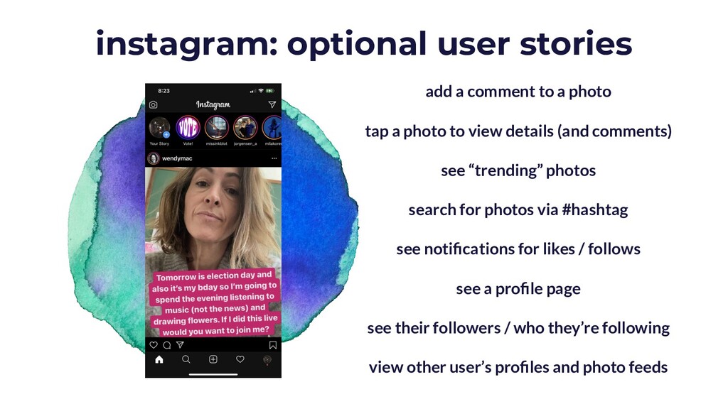
tap a photo to view details (and comments) see “trending” photos search for photos via #hashtag see notifications for likes / follows see a profile page see their followers / who they’re following view other user’s profiles and photo feeds
is highest priority? what feature is most important for the user? what is the user’s goal when they interact with this screen? how can the content be organized to help the user achieve this goal? what should a user see when they first open your app? where does it make sense for your main message / logo to go? what is the “call to action”? where does it make sense for it to be? what would the user expect to see on each screen of the app?
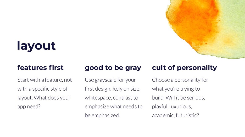
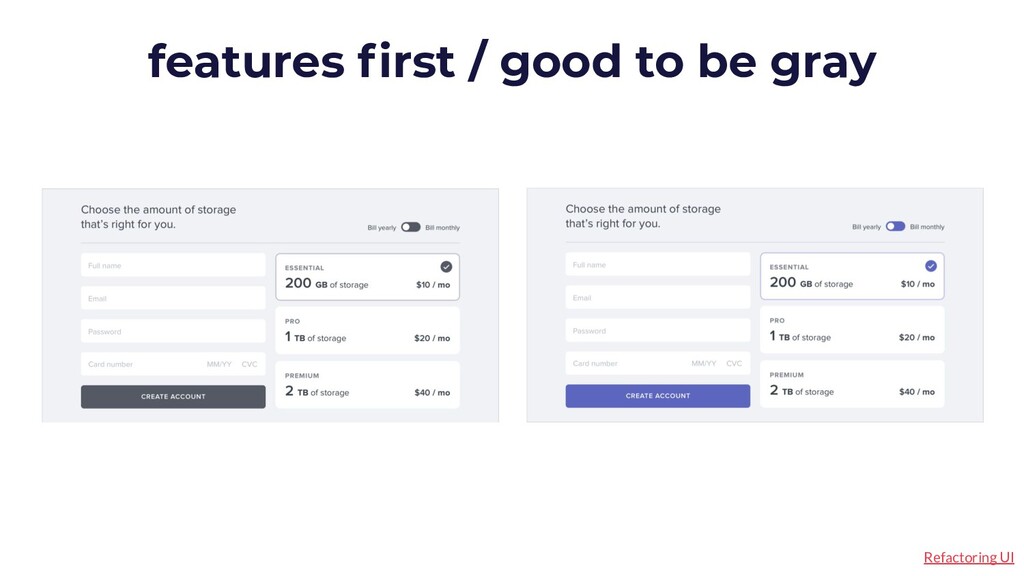
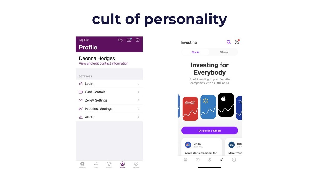
it be serious, playful, luxurious, academic, futuristic? cult of personality layout Start with a feature, not with a specific style of layout. What does your app need? features first Use grayscale for your first design. Rely on size, whitespace, contrast to emphasize what needs to be emphasized. good to be gray
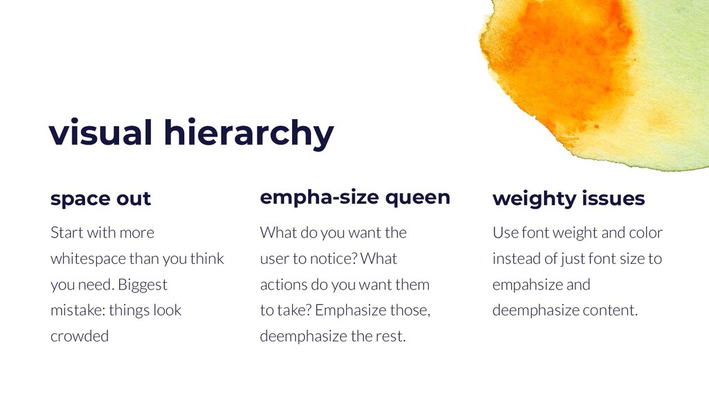
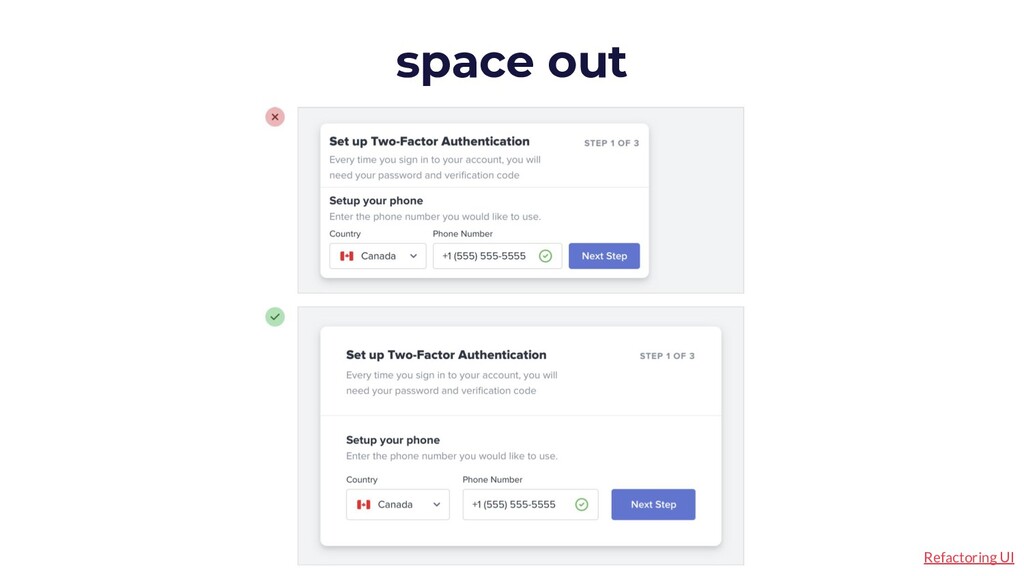
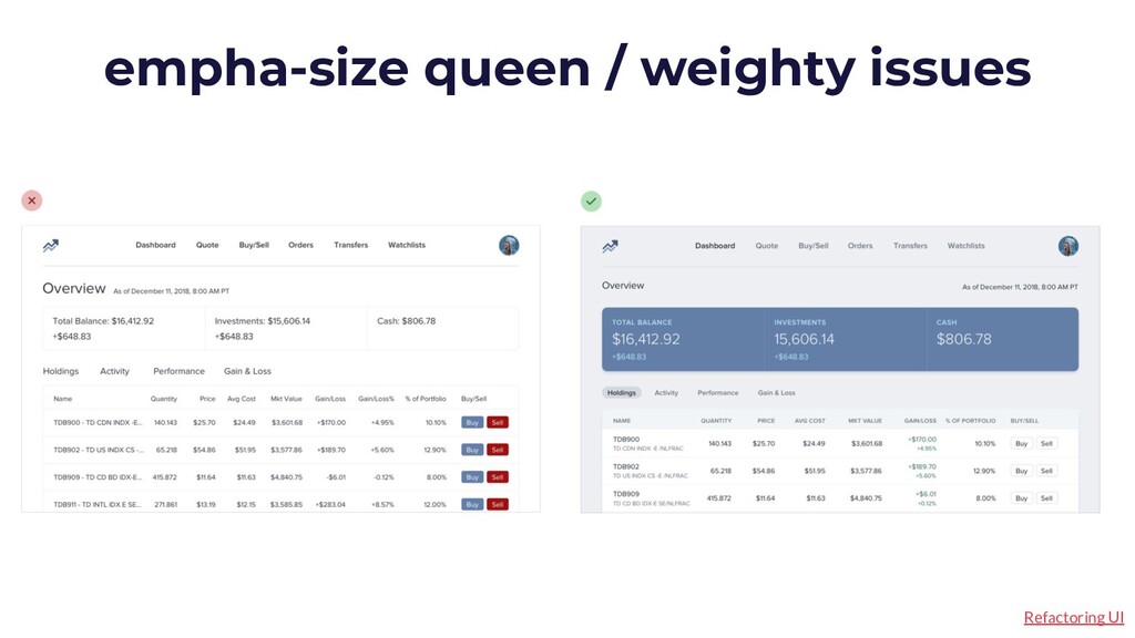
to empahsize and deemphasize content. weighty issues visual hierarchy Start with more whitespace than you think you need. Biggest mistake: things look crowded space out What do you want the user to notice? What actions do you want them to take? Emphasize those, deemphasize the rest. empha-size queen
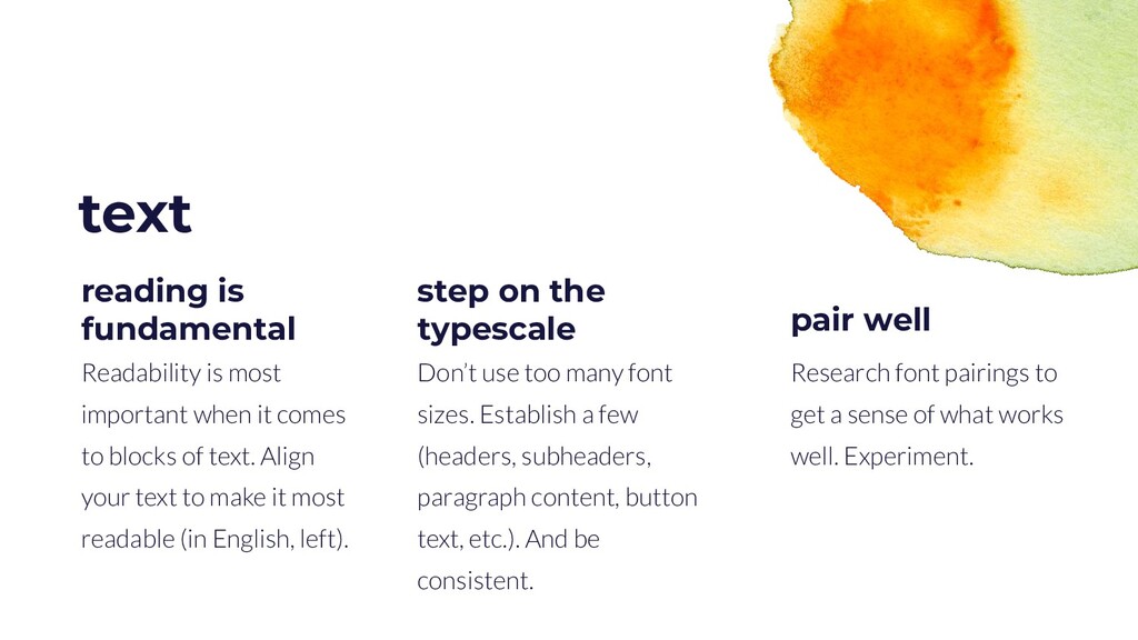
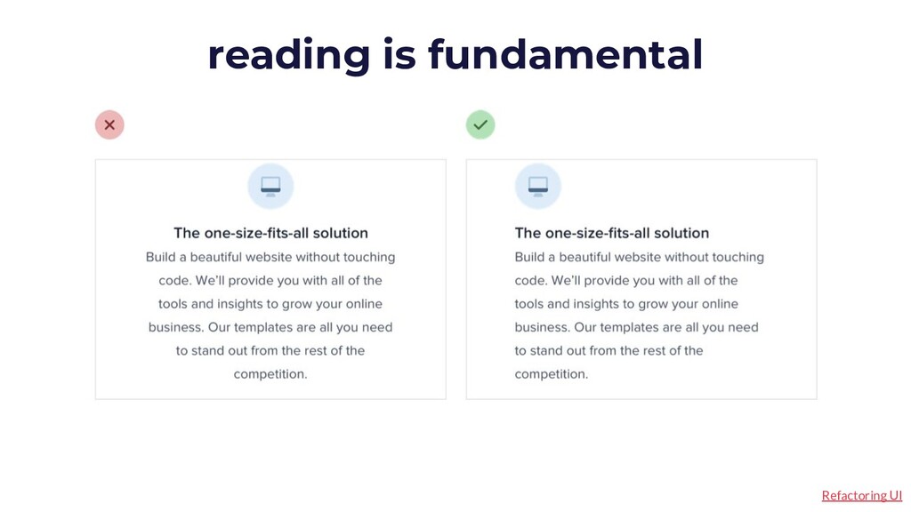
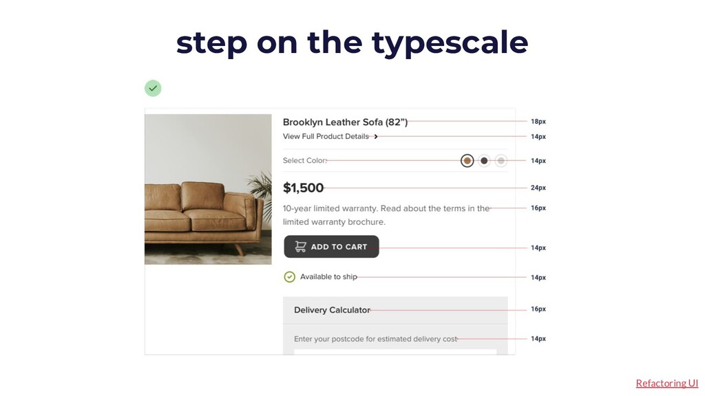
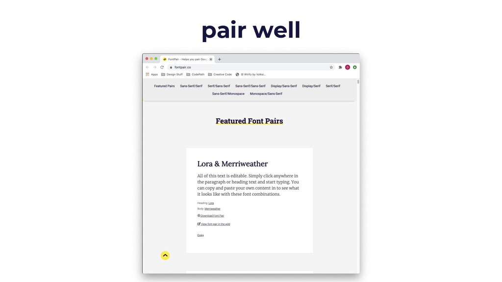
well. Experiment. reading is fundamental text Readability is most important when it comes to blocks of text. Align your text to make it most readable (in English, left). pair well Don’t use too many font sizes. Establish a few (headers, subheaders, paragraph content, button text, etc.). And be consistent. step on the typescale
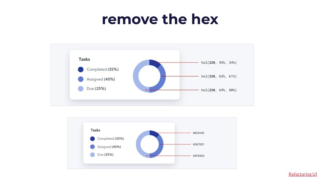
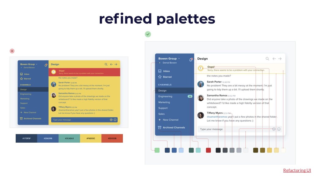
use. Define your primary, neutral, and accent colors. refined palettes color You may have to use hex while programming, but prefer HSL for designing, as colors that are similar look more similar in code. remove the hex
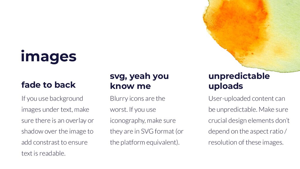
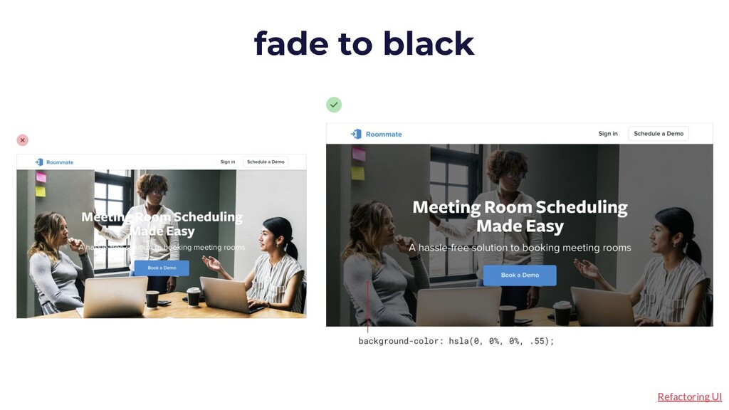
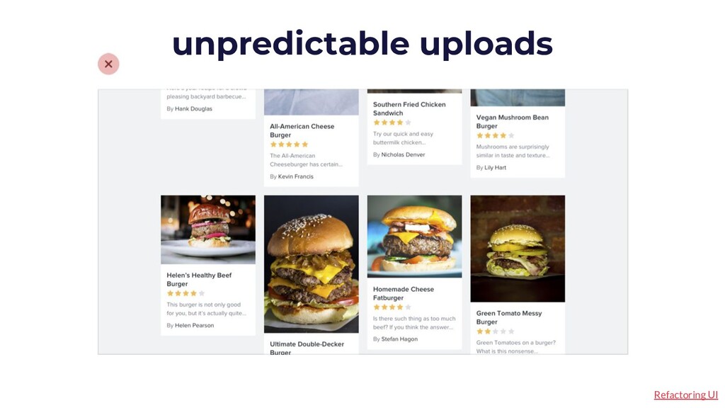
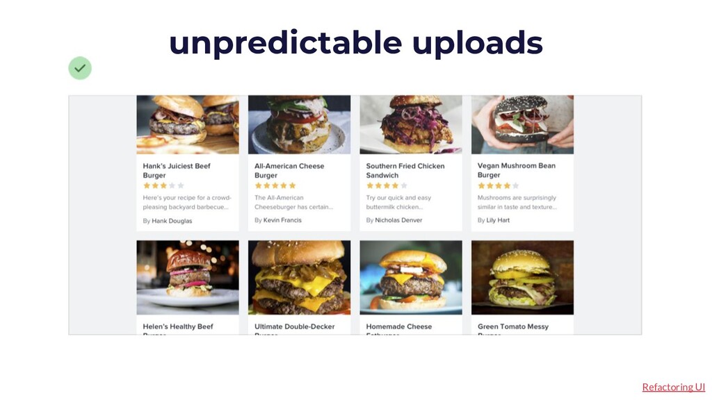
don’t depend on the aspect ratio / resolution of these images. fade to back images If you use background images under text, make sure there is an overlay or shadow over the image to add constrast to ensure text is readable. unpredictable uploads Blurry icons are the worst. If you use iconography, make sure they are in SVG format (or the platform equivalent). svg, yeah you know me
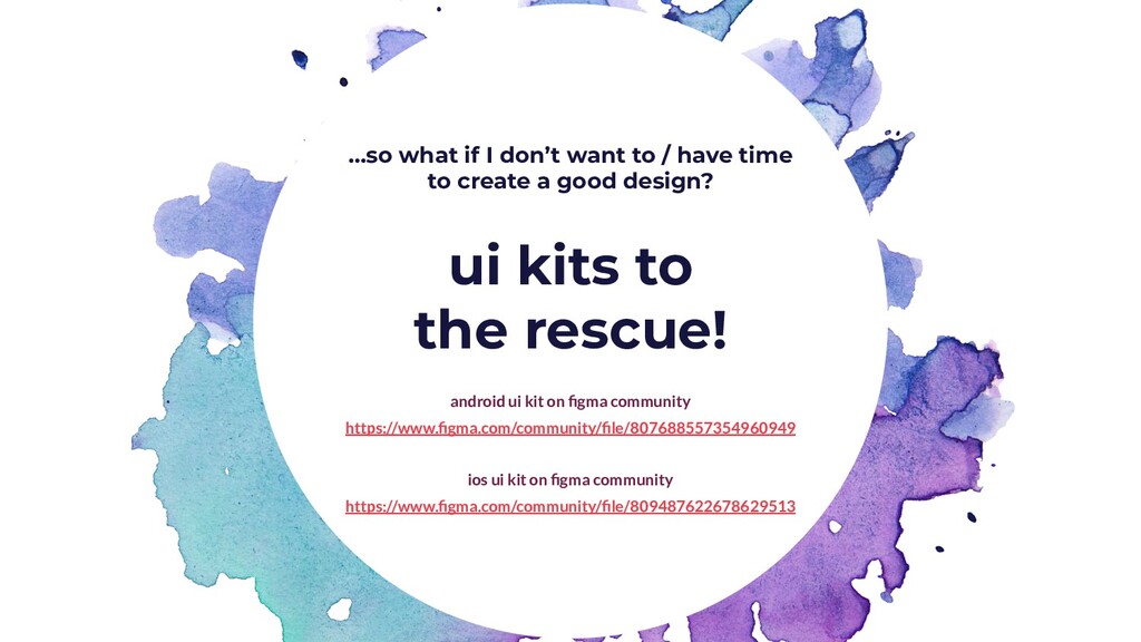
to create a good design? ui kits to the rescue! android ui kit on figma community https://www.figma.com/community/file/807688557354960949 ios ui kit on figma community https://www.figma.com/community/file/809487622678629513