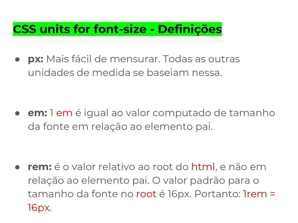
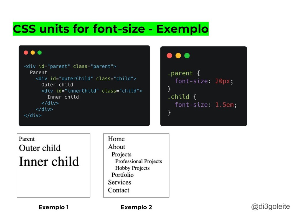
de mensurar. Todas as outras unidades de medida se baseiam nessa. • em: 1 em é igual ao valor computado de tamanho da fonte em relação ao elemento pai. • rem: é o valor relativo ao root do html, e não em relação ao elemento pai. O valor padrão para o tamanho da fonte no root é 16px. Portanto: 1rem = 16px.
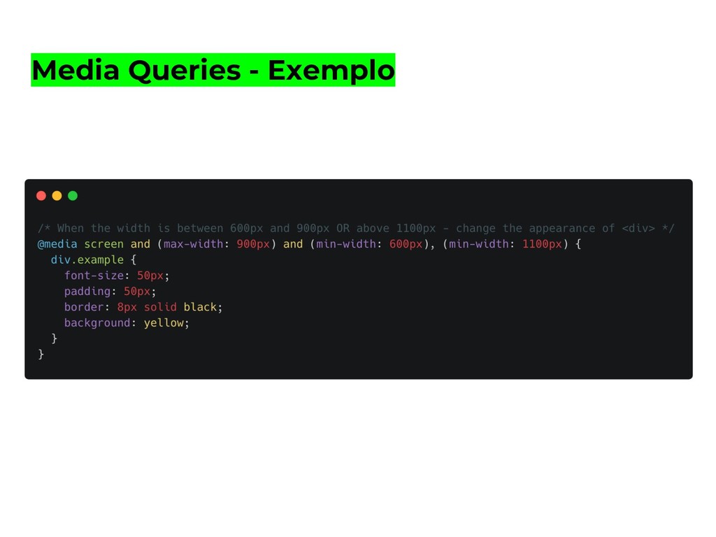
para aplicar diferentes regras de estilo de acordo com a resolução do device. • not, only, and, or(vírgula): palavras reservadas utilizadas para realizar operações lógicas em media queries. • min-width, max-width: propriedades que definem a largura mínima ou máxima de um elemento.
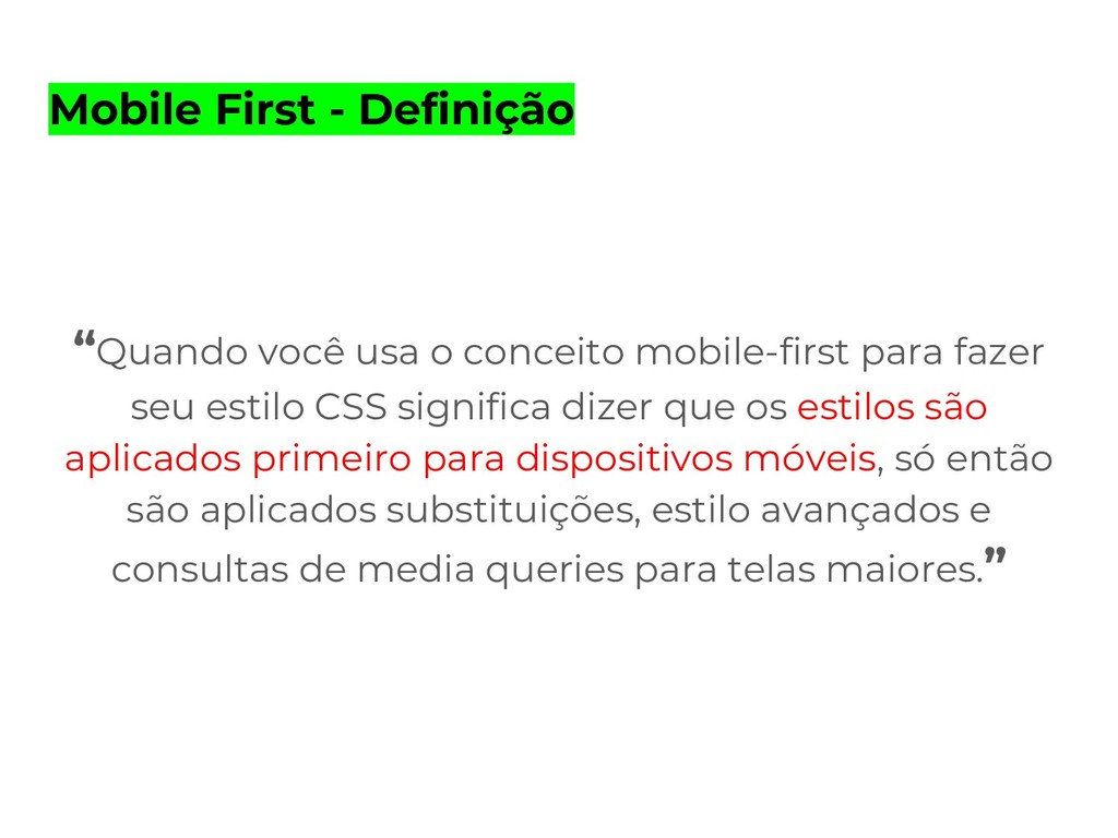
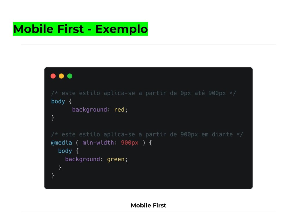
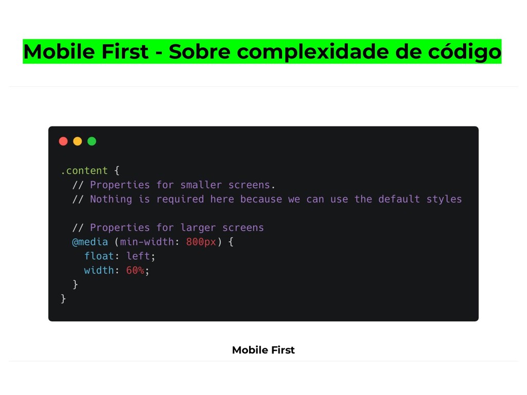
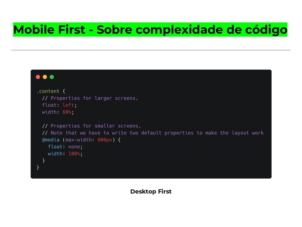
para fazer seu estilo CSS significa dizer que os estilos são aplicados primeiro para dispositivos móveis, só então são aplicados substituições, estilo avançados e consultas de media queries para telas maiores.”
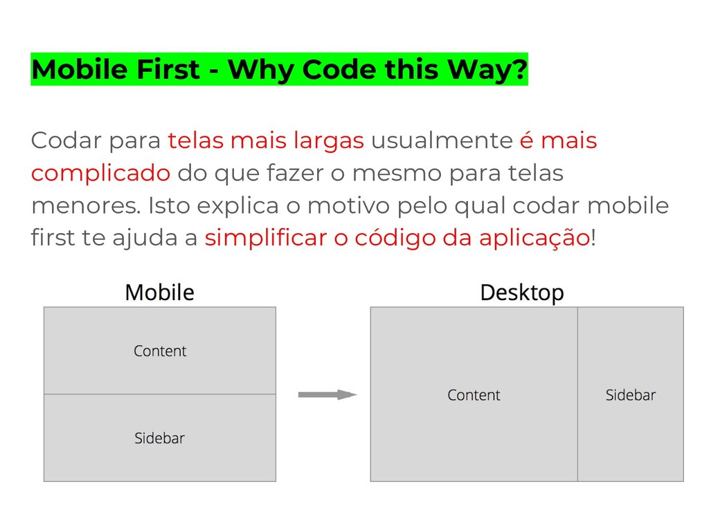
mais largas usualmente é mais complicado do que fazer o mesmo para telas menores. Isto explica o motivo pelo qual codar mobile first te ajuda a simplificar o código da aplicação!
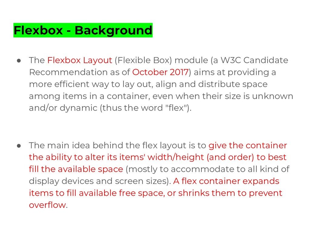
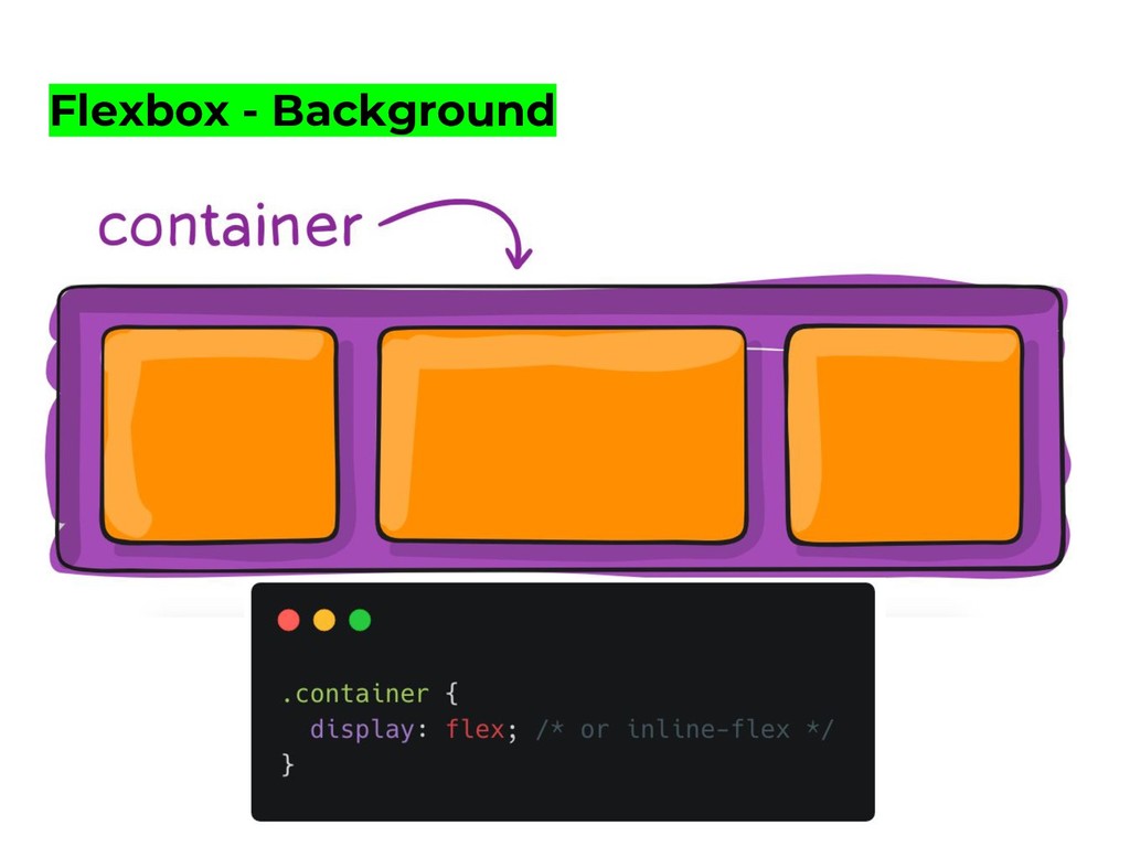
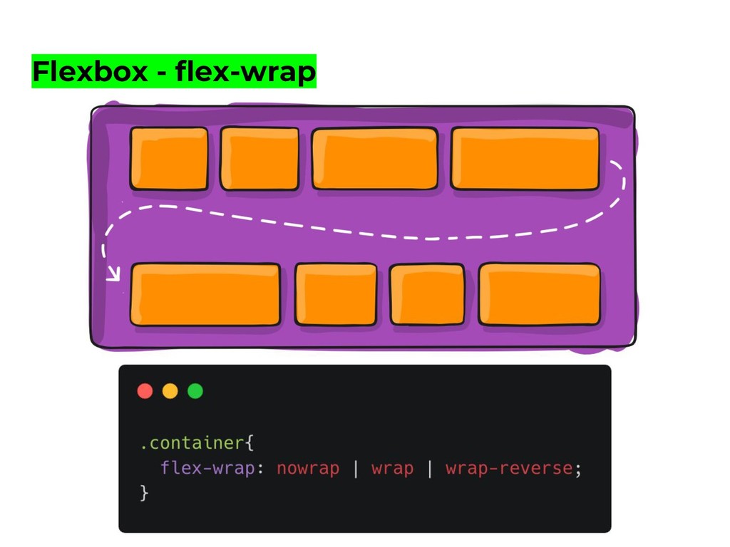
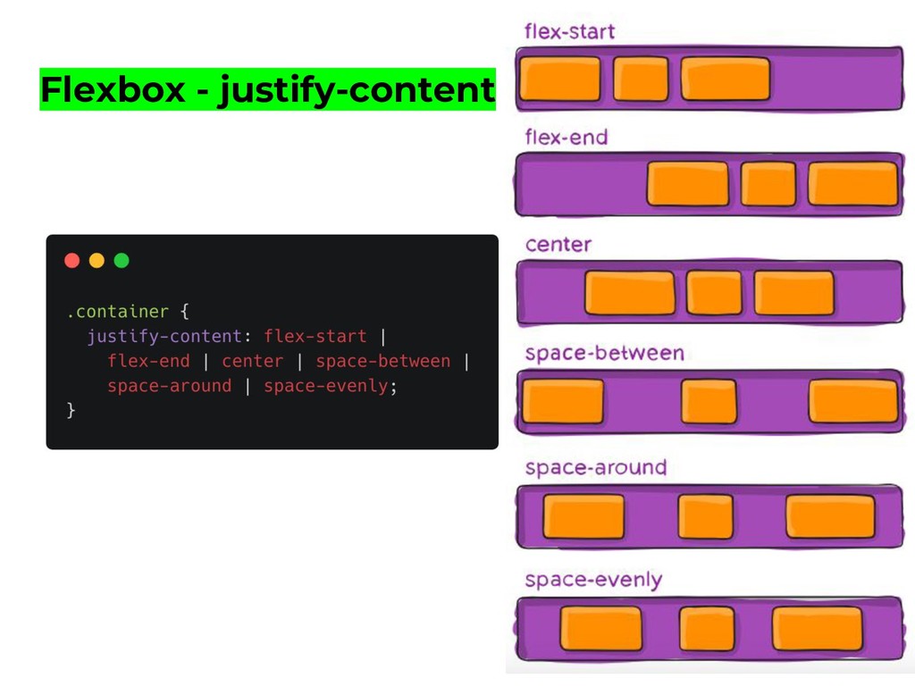
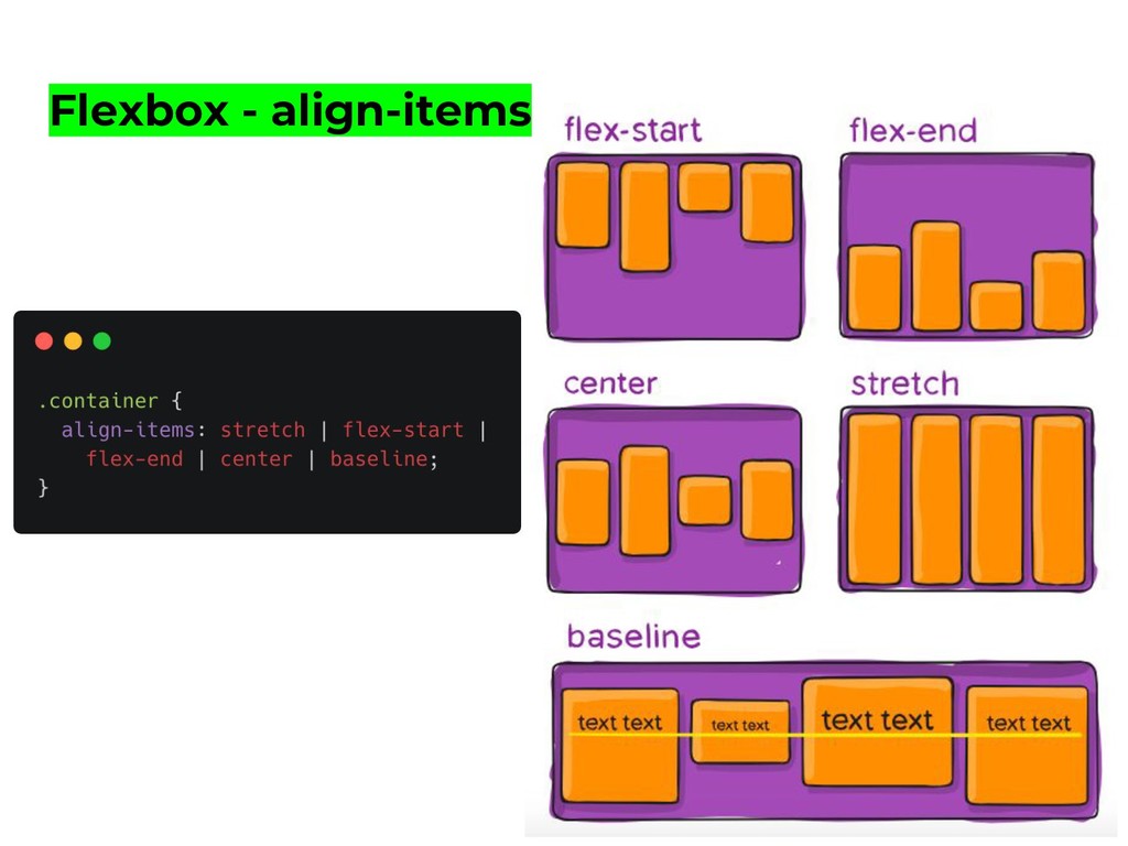
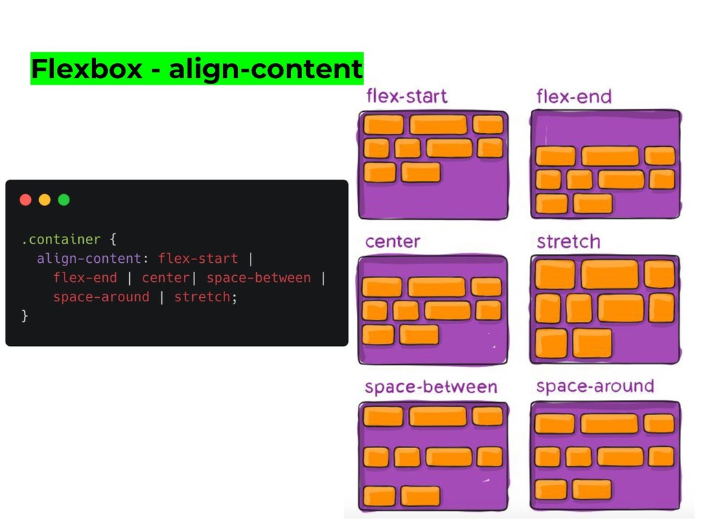
(a W3C Candidate Recommendation as of October 2017) aims at providing a more efficient way to lay out, align and distribute space among items in a container, even when their size is unknown and/or dynamic (thus the word "flex"). • The main idea behind the flex layout is to give the container the ability to alter its items' width/height (and order) to best fill the available space (mostly to accommodate to all kind of display devices and screen sizes). A flex container expands items to fill available free space, or shrinks them to prevent overflow.
 di3goleite
 matsuo_atsushi
 ochtum
 minodriven
 wemra
wemra
 tnagao7
 yaotti
 kajitack
 nakahara
 syumai
 manfredsteyer
 utgwkk
 jnchito
 maggiecrowley
 leimatthew05
 smashingmag
 zakiyama
 productmarketing
 cassininazir
 caitiem20
 akashhashmi
 bryan
bryan
 matthewcrist
 cromwellryan