Share
Embed
Using styles and themes without going crazy
Presented at Droidcon NYC 2015.
Daniel Lew
August 27, 2015
Transcript
60 slides
-
• No style <View android:background=“#FF0000” /> • Style <!--- some_layout.xml
--> <View style="@style/MyStyle" /> <!--- styles.xml --> <style name="MyStyle"> <item name="android:background">#FF0000</item> </style> -
When to style • Semantically identical Views • All styled
Views should change at once -
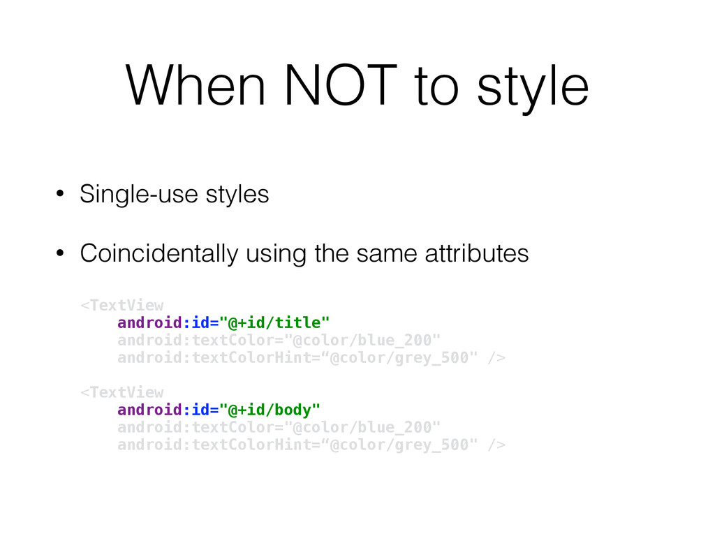
When NOT to style • Single-use styles • Coincidentally using
the same attributes <TextView android:id="@+id/title" android:textColor="@color/blue_200" android:textColorHint=“@color/grey_500" /> <TextView android:id="@+id/body" android:textColor="@color/blue_200" android:textColorHint=“@color/grey_500" /> -
static final int NUM_COLUMNS = 3; static final int
NUM_RETRIES = 3; static final int NUM_THREE = 3; -
// static final int NUM_COLUMNS = 3; // static
final int NUM_RETRIES = 3; static final int NUM_THREE = 3; -
• Parent <style name="Parent" /> • Explicit child <style name="Child"
parent="Parent" /> • Implicit child <style name="Parent.Child" /> -
Custody Battle <style name="Implicit" /> <style name="Explicit" /> <style
name="Implicit.Child" parent="Explicit" /> • Who gets the child? • Choices: • Both • Implicit • Explicit -
• Explicit parent -> dotless child <style name="BorderlessButton" parent="Widget.AppCompat.Button.Borderless" />
• Fake it! <style name="Widget.Button" parent="Widget.AppCompat.Button" /> <style name="Widget.Button.Borderless" parent="Widget.AppCompat.Button.Borderless" /> -
TextAppearance Attributes • textColor • textColorHighlight • textColorHint • textColorLink
• textSize • textStyle • fontFamily • typeface • textAllCaps • shadowColor • shadowDx • shadowDy • shadowRadius • elegantTextHeight • letterSpacing • fontFeatureSettings -
TextAppearance • In action <TextView style="@style/MyStyle" android:textAppearance="@style/MyText" /> • Always
inherit TextAppearance! <style name="MyText" parent="TextAppearance.AppCompat"> <item name="android:textColor">#F00</item> </style> -
Themes! • Write a whole lot of UX code at
once! • Setup defaults for everything! • Activity-level theming! • Configure system-created Views! • Theme swapping! -
Themes vs. Styles • Same thing! <style name="Style"> <item name="android:background">#FF0000</item>
</style> <style name="Theme"> <item name="android:statusBarColor">@color/blue_200</item> </style> • Different scope • Different attributes -
Themes in Manifest • Application <application android:theme="@style/Theme.AppCompat"> • Activity <activity
android:theme="@style/Theme.AppCompat.Light"> -
Use AppCompat • Material on all devices • Baseline themes/styles
• Enables View theming pre-Lollipop • …And more! -
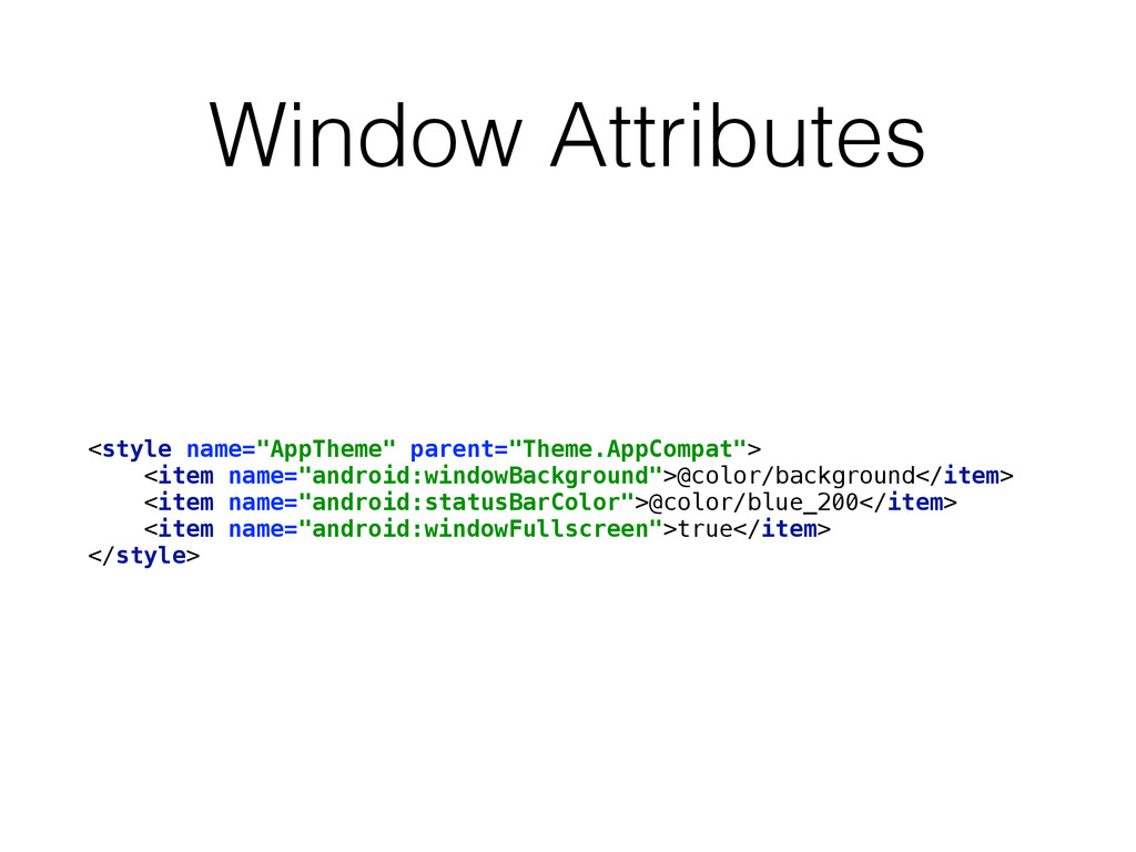
Window Attributes <style name="AppTheme" parent="Theme.AppCompat"> <item name="android:windowBackground">@color/background</item> <item name="android:statusBarColor">@color/blue_200</item> <item
name="android:windowFullscreen">true</item> </style> -
Color Attributes <style name="ColorTheme" parent="Theme.AppCompat"> <item name="colorPrimary">#F00</item> <item name="colorPrimaryDark">#0F0</item> <item
name="colorControlNormal">#00F</item> </style> -
Default Styles <style name="AppTheme" parent="Theme.AppCompat"> <item name="buttonStyle">@style/MyButton</item> <item name="android:spinnerItemStyle">@style/MySpinnerItem</item>
<item name="android:textAppearance">@style/MyText</item> <item name="android:textAppearanceInverse">@style/MyTextInverse</item> </style> -
Resource Attributes <style name="AttrTheme" parent="Theme.AppCompat"> <item name="selectableItemBackground">@drawable/bg</item> </style> <!-- some_layout.xml
--> <Button android:background="?attr/selectableItemBackground" /> -
Resource Attributes <style name="AttrTheme" parent="Theme.AppCompat"> <item name="selectableItemBackground">@drawable/bg</item> </style> <!-- some_layout.xml
--> <Button android:background="?attr/selectableItemBackground" /> -
Namespacing • Official attributes <style name="MyTheme"> <item name="android:colorPrimary">#000</item> </style> •
Custom attributes <style name="MyTheme" parent="Theme.AppCompat"> <item name="colorPrimary">#000</item> </style> v21 only appcompat magic -
Finding Attributes • Most difficult part of themes • Anyone
can create attributes • Anything can use attributes -
Attributes in XML • Look for ?attr or ?android:attr <Button
android:background="?attr/selectableItemBackground" /> -
View Style Attributes • Look for obtainStyledAttributes() TypedArray a =
context.obtainStyledAttributes(attrs, com.android.internal.R.styleable.ImageView, defStyleAttr, defStyleRes); • Investigate TypedArray usage int alpha = a.getInt(com.android.internal.R.styleable.ImageView_drawableAlpha, 255); attribute default -
Recipe for Sanity • Use AppCompat • Modify theme first
• Reference theme attributes • Apply themes to Views when necessary • Use styles wisely -
<style name="MyTheme" parent="Theme.AppCompat"> <item name="android:windowBackground">@color/bg_window</item> </style> <!-- values/colors.xml --> <color
name="bg_window">#FF0000</color> <!-- values-v21/colors.xml --> <color name="bg_window">#0000FF</color> -
<!-- values/styles.xml --> <style name="BaseToolbar" /> <!-- values-v21/styles.xml -->
<style name="BaseToolbar"> <item name="android:elevation">4dp</item> </style> <!-- values/styles.xml --> <style name="Toolbar" parent="BaseToolbar" /> <!-- values/styles.xml --> <style name="BaseToolbar" /> <!-- values-v21/styles.xml --> <style name="BaseToolbar"> <item name="android:elevation">4dp</item> </style> -
Qualifier Diamond values/Theme.Platform values-v21/Theme.Platform Theme.Platform.Used values/Theme attributes for everyone what
is actually used qualifier modifications -
Custom Attributes <!-- values/attrs.xml --> <attr name="myAttribute" format="dimension" />
<!-- values/themes.xml --> <style name="MyTheme" parent="Theme.AppCompat"> <item name="myAttribute">4dp</item> </style> <!-- values/styles.xml --> <style name="MyStyle"> <item name="android:padding">?attr/myAttribute</item> </style> -
Dynamic Styles public View(Context context, AttributeSet attrs, int defStyleAttr, int
defStyleRes) themed context layout attributes default style (v21+) default style attribute (from theme, e.g. buttonStyle) -
Dynamic Styles • Context carries theme • ContextThemeWrapper replaces parts
of theme Context themedContext = new ContextThemeWrapper(baseContext, R.style.MyTheme); // Use in LayoutInflater View view = LayoutInflater.from(themedContext) .inflate(R.layout.my_layout, null); // Use in View constructor View view = new View(themedContext); -
Thank You! • @danlew42 • +DanielLew • http://danlew.net • Color
debug theme: https://goo.gl/BPNhp1