Upgrade to Pro — share decks privately, control downloads, hide ads and more …

10 Advanced CSS Techniques (You Always Wanted to Know More About)

Emily Lewis
November 06, 2011

10 Advanced CSS Techniques (You Always Wanted to Know More About)

Presentation for Webuquerque’s November 2, 2011 event.

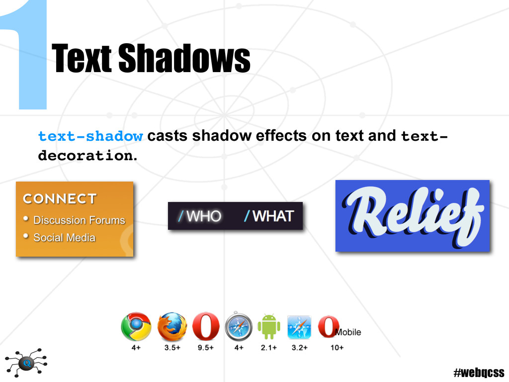
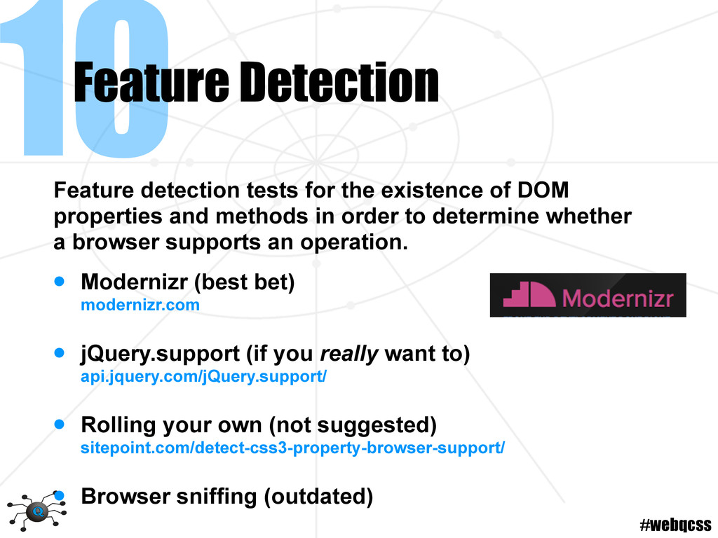
Practical examples of some of the latest CSS 3 techniques (and a few often-forgotten CSS 2.1 ones) including: image-free gradients and text shadows, attribute selectors, transitions and transforms, and media queries
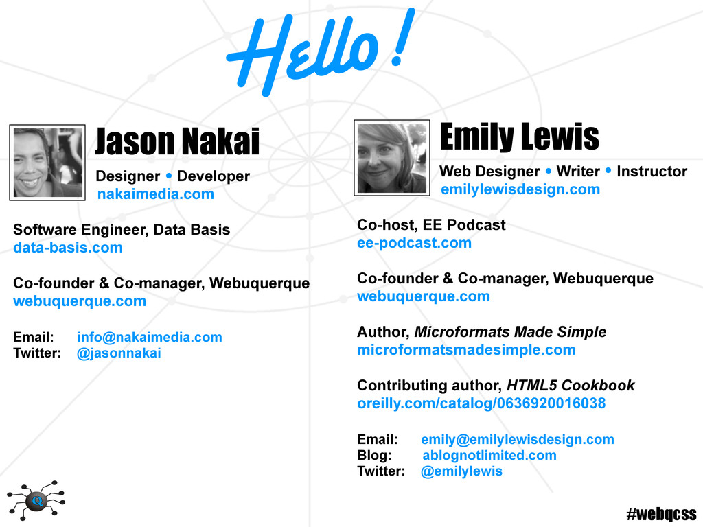
Emily Lewis

November 06, 2011
Tweet

More Decks by Emily Lewis

Other Decks in Technology

Transcript

  1. Advanced CSS Techniques Webuquerque November 2, 2011 you always wanted

    to know more about Some rights reserved 10 #webqcss
  2. #webqcss Web Designer Writer Instructor emilylewisdesign.com Co-host, EE Podcast ee-podcast.com

    Co-founder & Co-manager, Webuquerque webuquerque.com Author, Microformats Made Simple microformatsmadesimple.com Contributing author, HTML5 Cookbook oreilly.com/catalog/0636920016038 Email: [email protected] Blog: ablognotlimited.com Twitter: @emilylewis Emily Lewis Jason Nakai Designer Developer nakaimedia.com Software Engineer, Data Basis data-basis.com Co-founder & Co-manager, Webuquerque webuquerque.com Email: [email protected] Twitter: @jasonnakai Hello!
  3. #webqcss Advanced Techniques 1. Text shadows 2. Box shadows 3.

    Generated content 4. Attribute selectors 5. Gradients 6. Multiple background images 7. Transitions 8. Transforms 9. Media queries 10.Feature detection 10 and Awesome ^
  4. #webqcss 1Text Shadows h3 {text-shadow: 1px 1px 2px #000;} Syntax

    • x (horizontal) offset casts shadow to the right of the text. Negative value casts to the left. • y (vertical) offset casts shadow below the text. Negative value casts above. • blur radius blurs the shadow, with higher values making the shadows wider and lighter. • color
  5. #webqcss 1Text Shadows Syntax Multiple effects are comma-separated and are

    applied front to back, with the first shadow on the top of the stack. text-shadow: #fff -1px -1px, #fff -2px -2px, #fff -3px -3px, #fff -4px -4px, #fff -5px -5px, #fff -6px -6px, #fff -7px -7px, #fff -8px -8px;
  6. #webqcss 1Text Shadows • Typekit text shadow tutorial blog.typekit.com/2011/07/19/shading-with-css-text-shadows/ •

    Dynamic text shadow generator mothereffingtextshadow.com • Dynamic text shadow generator westciv.com/tools/shadows/ • IE Shadow filter msdn.microsoft.com/en-us/library/ms533086(v=VS.85).aspx • IE DropShadow filter msdn.microsoft.com/en-us/library/ms532985(v=VS.85).aspx Tools & Resources
  7. #webqcss 2Box Shadows div {box-shadow: inset 2px 2px 3px 1px

    #666;} Syntax • inset moves shadow inside frame of element. • x (horizontal) offset casts shadow to the right of the text. Negative value casts to the left. • y (vertical) offset casts shadow below the text. Negative value casts above.
  8. #webqcss 2Box Shadows div {box-shadow: inset 2px 2px 3px 1px

    #666;} Syntax • blur radius blurs the shadow, with higher values making the shadows wider and lighter. • spread radius conrtrols the expansion of the shadow, with higher values making it bigger. • color
  9. #webqcss 2Box Shadows Syntax Vendor prefixes are available for older

    versions, which should be listed before the standard property. -moz-box-shadow: 2px 2px 3px #666; -webkit-box-shadow: 2px 2px 3px #666; box-shadow: 2px 2px 3px #666; Automatic prefixing with JavaScript leaverou.github.com/prefixfree/
  10. #webqcss 2Box Shadows Syntax Multiple effects are applied front to

    back, with the first shadow on top of the stack. box-shadow: 1px 1px #007d9a, 2px 2px #007d9a, 3px 3px #007d9a, 4px 4px #007d9a, 5px 5px #007d9a, 6px 6px #007d9a, 7px 7px #007d9a, 8px 8px #007d9a;
  11. #webqcss 2Box Shadows • CSS Tricks box shadow tutorial css-tricks.com/snippets/css/css-box-shadow/

    • Drop shadows tutorial & example gallery nicolasgallagher.com/css-drop-shadows-without-images/ • Dynamic box shadow generator westciv.com/tools/box-properties/index.html • CSS3 decorations for IE css3pie.com • IE DropShadow filter msdn.microsoft.com/en-us/library/ms532985(v=VS.85).aspx Tools & Resources
  12. #webqcss 3Generated Content Using the :before and :after pseudo elements,

    can insert content before and after the specified element: • Strings of text • Images • Counters • Attribute values (i.e. title)
  13. #webqcss 3Generated Content a:after {content:" \00a0\00bb";} Syntax • content property

    contains the content to appear before or after the element. • For text strings, contain the value in quotes. • If you want to use a special character, make sure it is properly encoded (digitalmediaminute.com/ reference/entity/).
  14. #webqcss 3Generated Content li:hover:before { content:url(arrow.png); position:absolute; top:-17px; left:0;} Syntax

    • :before and :after can also be combined with pseudo-classes like :hover. • content property can only be used on :before and :after.
  15. #webqcss 3Generated Content • Generated content tutorial & speech bubble

    gallery http://nicolasgallagher.com/pure-css-speech-bubbles/ • Tooltips with generated content http://jsfiddle.net/chriscoyier/EMhRJ/92/ • Automatic numbering & counters dev.opera.com/articles/view/automatic-numbering-with-css-counters/ • Pure CSS3 boxes without images webdesignshock.com/css3-box-shadow/ Tools & Resources
  16. #webqcss 4Attribute Selectors Attribute selectors allow you to target elements

    based on their attributes. • [attr] • [attr=value] • [attr~=value] • [attr|=value] • [attr^=value] • [attr$=value] • [attr*=value]
  17. #webqcss 4Attribute Selectors a[href$="zip"]{...;} Syntax • Attribute property and value

    are specified within brackets • Can use multiple selectors for greater specificity input[type="submit"][value="Search"]{...;}
  18. #webqcss 4Attribute Selectors • Emily’s attribute selectors tutorial msdn.microsoft.com/en-us/scriptjunkie/gg619394 •

    CSS3 selectors explained 456bereastreet.com/archive/200601/css_3_selectors_explained/ • CSS Tricks attribute selectors tutorial css-tricks.com/5591-attribute-selectors/ • ARIA roles & attribute selectors germanforblack.com/articles/stepping-into-attribute-selectors • IE support for CSS3 selectors selectivizr.com Tools & Resources
  19. #webqcss 5Gradients Gradients allow smooth transitions between two or more

    colors. Can reduce need for background images. • Linear • Radial • Specified via background-image
  20. #webqcss 5Linear Gradients Syntax • Angle determines the direction of

    the gradient. • Color stop defines the color and it’s position relative to the element. Can have multiple, comma-separated color stops. div { background-image: linear- gradient(-90deg, #fff 0%, #ccc 100%); }
  21. #webqcss 5Radial Gradients Syntax • Position indicates the origin (center)

    of the gradient. • Shape and size of the gradient • Color stops, comma-separated div { background-image:radial- gradient(center, ellipse cover, #ff0 0%, #0f0 100%); }
  22. #webqcss 5Gradients Syntax Vendor prefixes are required. -moz-linear-gradient -o-linear-gradient -webkit-linear-gradient

    Dynamic cross-browser CSS3 generator (even includes older syntaxes and prefixes) css3please.com -moz-radial-gradient -webkit-radial-gradient
  23. #webqcss 5Gradients • Incredible background patterns gallery leaverou.me/css3patterns/ • Dynamic

    linear gradient generator display-inline.fr/projects/css-gradient/ • Dynamic radial gradient generator westciv.com/tools/radialgradients/index.html • Dynamic gradient generator (Firefox) colorzilla.com/gradient-editor/ • CSS decorations for IE css3pie.com Tools & Resources
  24. #webqcss 6Multiple Background Images Syntax article { background: url(curtainTop.png) 0

    0 no-repeat, url(curtainBottom.png) 0 100% no-repeat #000; } • Comma-separated list of shorthand values for URL, x- axis, y-axis and repeat. Can also use full declarations. • Images are layered, with first declared image on top of the stack. If using a background color, declare with last image to be at bottom of stack.
  25. #webqcss 6Multiple Background Images Syntax article { background: url(curtainBottom.png) 0

    100% no-repeat #000; background: url(curtainTop.png) 0 0 no-repeat, url(curtainBottom.png) 0 100% no-repeat #000; } For IE and other browser that don’t support, declare background twice.
  26. #webqcss 6Multiple Background Images • Multiple backgrounds & gradients tutorial

    snook.ca/archives/html_and_css/multiple-bg-css-gradients • CSS3 demo site from SXSW panel sxswcss3.com • Background patterns gallery leaverou.me/css3patterns/ • CSS decorations for IE css3pie.com Tools & Resources
  27. #webqcss 7Transitions div {transition: all .5s linear .2s;} Syntax •

    Property name specifies the CSS property to be changed. • Duration specifies the number of (milli)seconds a transition animation should take to complete. • Timing function specifies the easing • Delay indicates the amount of time to wait to start the transition effect
  28. #webqcss Transitions Vendor prefixes are required. Should be specified before

    standard property. 7 -moz-transition: all .5s linear .2s; -o-transition: all .5s linear .2s; -webkit-transition: all .5s linear .2s; transition: all .5s linear .2s; Syntax
  29. #webqcss 7Transitions • Think Vitamin transitions tutorial thinkvitamin.com/code/sexy-interactions-with-css-transitions/ • cubic-bezier()

    easing with transitions cubic-bezier.com • CSS transitions gallery leaverou.github.com/animatable/ • Dynamic transitions generator css3generator.com Tools & Resources
  30. #webqcss • Translate • Rotate • Skew • Scale 8Transforms

    transform enables modifications to coordinate-based CSS properties:
  31. #webqcss 8Transforms h3 {transform: rotate(45deg);} Syntax • Transform functions specify

    the modification action and corresponding values. h3 {transform: translate(25px, 10px);}
  32. #webqcss 8Transforms Syntax Vendor prefixes are required. Should be specified

    before standard property. -moz-transform: rotate(45deg); -o-transform: rotate(45deg); -webkit-transform: rotate(45deg); transform: rotate(45deg);
  33. #webqcss 8Transforms • Transforms tutorial css3files.com/transform/ • Text rotation tutorial

    snook.ca/archives/html_and_css/css-text-rotation • Transforms for IE useragentman.com/IETransformsTranslator/ • Dynamic transforms generator westciv.com/tools/transforms/ • Dynamic transforms generator css3generator.com Tools & Resources
  34. #webqcss 9Media Queries Media queries deliver styles based on the

    user’s display: • Media type • Browser window • Device screen, orientation & resolution • Colors
  35. #webqcss 9Media Queries Syntax @media screen and (max-width: 650px){ body

    {background: #f90;} } • Nest resolution-specific styles within the @media query • Media options include all, handheld, projection, screen, tv • Properties and values establish the conditions for rendering styles
  36. #webqcss 9Media Queries • A List Apart’s responsive web design

    alistapart.com/articles/responsive-web-design/ • Emily’s media queries tutorial msdn.microsoft.com/en-us/scriptjunkie/gg619395 • Comprehensive media queries zomigi.com/blog/essential-considerations-for-crafting-quality-media-queries/ • Media queries polyfill github.com/scottjehl/Respond • Dynamic resolution testing quirktools.com/screenfly/ Tools & Resources
  37. #webqcss 10 Feature Detection Feature detection tests for the existence

    of DOM properties and methods in order to determine whether a browser supports an operation. • Modernizr (best bet) modernizr.com • jQuery.support (if you really want to) api.jquery.com/jQuery.support/ • Rolling your own (not suggested) sitepoint.com/detect-css3-property-browser-support/ • Browser sniffing (outdated)
  38. #webqcss 10 Feature Detection • Do you even need a

    polyfill? A fallback? caniuse.com • Conditional polyfill loading yepnopejs.com • Practical feature detection css-tricks.com/13641-sideways-headers/ Tools & Resources