10 Original Company Logos You Wouldn't Recognize Today (Then and Now)
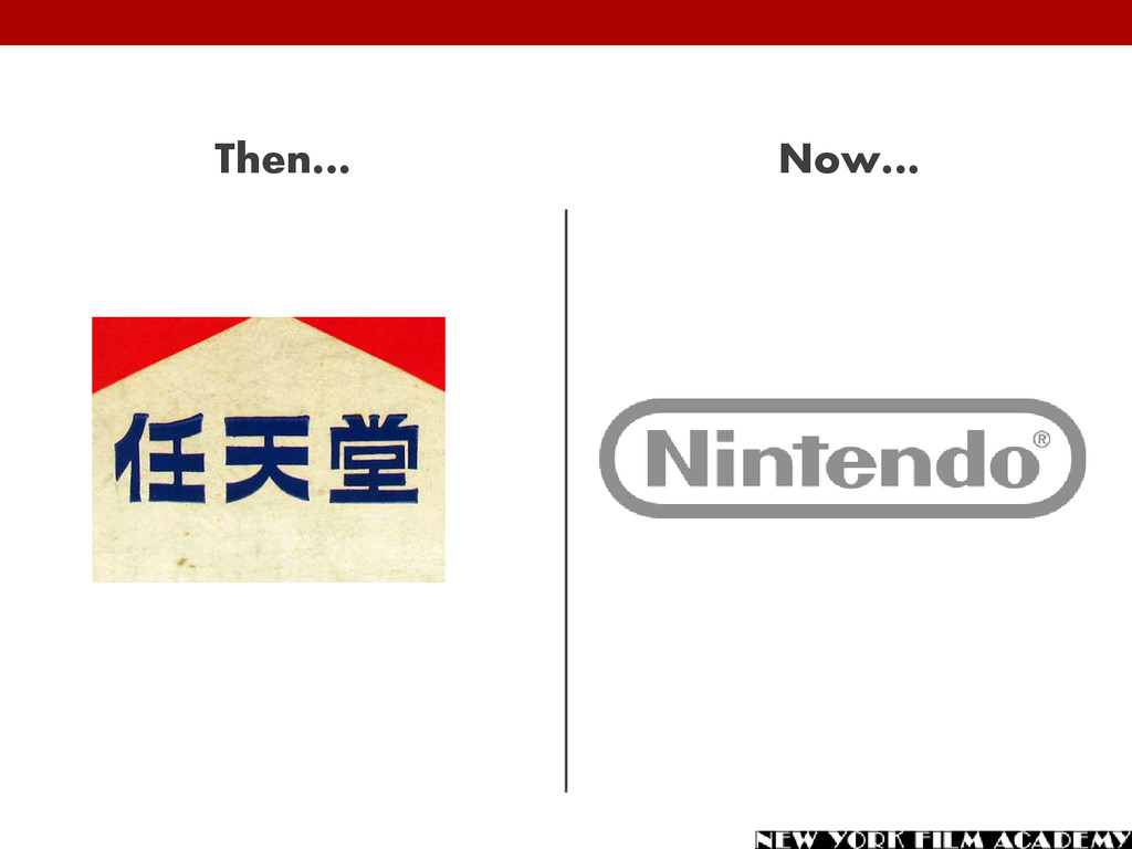
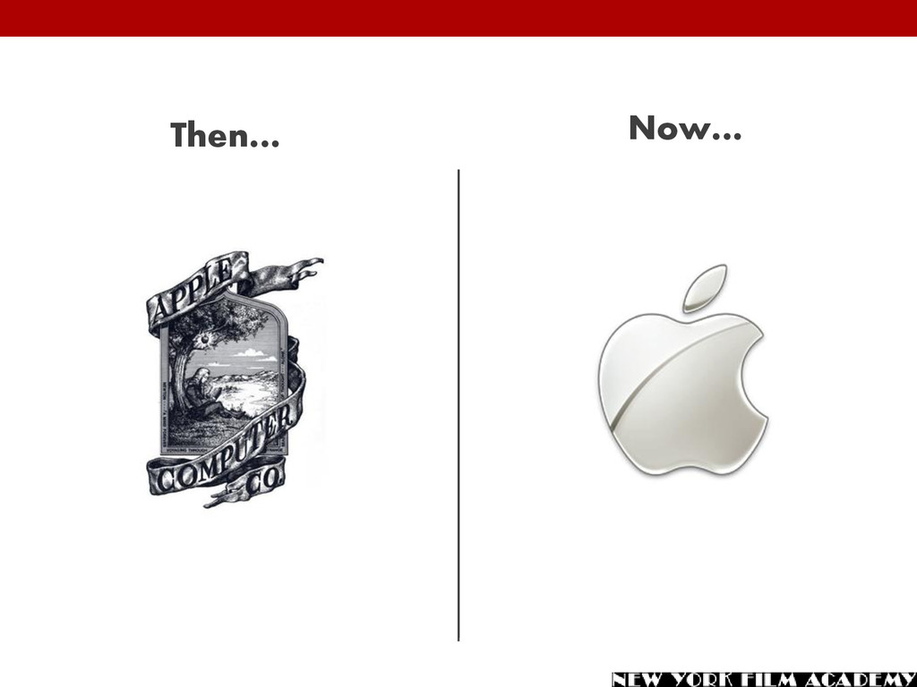
A presentation that features 10 logos for some of the biggest companies in the world. This highlights the evolution of their brands and show how important graphic design is for a corporate identity.
school for graphic design, one of the potential job prospects is to work in a marketing department on corporate branding. It is easy to underestimate the power of a logo on how we perceive companies. But if you compare the original logos for some of the world’s most well-known companies to the logos they have now, you can see how powerful graphic design can really be. Let’s take a look at the evolution of 10 corporate logos, then and now…
design, they were actually a playing card company. The original logo from 1889 consisted of three words (nin, ten, and do). But it wasn’t until 1967, when the company ventured into creating electronic toys, that the company we now know as Nintendo was born. Over 100 years later, the current logo was introduced in 2006.
of the most cash- rich) companies in the world today. And they got there largely in part due to their branding and sleek design, which is often minimalist. But their current identity is a far departure from their original 1976 logo, which came complete with an inscription which read: "Newton … A Mind Forever Voyaging Through Strange Seas of Thought … Alone."
fact, McDonald’s wasn’t always the fast-food restaurant we know today. The first restaurant operated by McDonald’s served burgers, but it was also a place for barbecue. The iconic McDonald’s fries weren’t even an option. By the late 1940s McDonald’s decided to focus on burgers and speedy service, creating “Chef Speedee” as a mascot.
recognizable and most valuable brands in the world, Coca Cola’s original logo wasn’t nearly as recognizable as the one now. Created in 1886, the original logo was simple and without color. In the 1900s Coca Cola introduced the script which they have stuck with ever since (except for a short departure in 1985, which didn’t last very long).
methods, MasterCard also has one of the most universally known logos. But it wasn’t always that way. In 1966 the company was actually known as Interbank. By 1969, it transitioned into the newer logo with the overlapping circles, and went by the name of Master Charge. 1979 saw the birth of MasterCard as we know it today (with a few slight tweaks along the way).
first introduced to the market in 1893 under the name “Brad’s Drink.” A re-branding in 1898 saw the birth of Pepsi-Cola, complete with a brand new logo. Unlike Coca Cola, Pepsi went with a fancier script and color right away. The two companies actually had logos that resembled each other for a while. After several iterations, and decades with new a new logo, Pepsi re-introduced script in a logo/script combo in 2014.
But it wasn’t always the case. They have a history of selling quite a variety of products, including televisions, car tires, shoes, and more. They’ve also had a variety of logos throughout their history, beginning in 1865. The word “Nokia” actually refers to an animal – one that is not a fish. But a fish took center stage in its original logo. But then again, the company is Scandinavian…
1906 as the Harloid Company. And it had a logo to match. In 1948, the Xerox name was born out of the invention of xerography, a photocopy technique (although the Harloid name was still incorporated in the logo). The idea became a huge success, and the company became known as just Xerox in 1961.
1896 as the Tabulating Machine Company. It wasn’t until 1924 that the company adopted the name it holds to this day: International Business Machines. The logo has changed along with the name changes, and through different eras. While the newest logo holds a similar design to the IBM we’ve seen for decades, it has gone back to the classic black-and-white.
star of Mercedes- Benz is as iconic as it gets. But it wasn’t always the symbol for the German automaker. Prior to a merger of separate companies before World War I, Mercedes had a very straightforward logo without any symbols; just the name. In 1909 the company introduced the three-pointed star which has lasted (with a few evolutions) ever since.
career in graphic design? Learn more about the graphic design school at the New York Film Academy… New York: https://www.nyfa.edu/graphic-design/ Los Angeles: https://www.nyfa.edu/los-angeles/graphic-design/