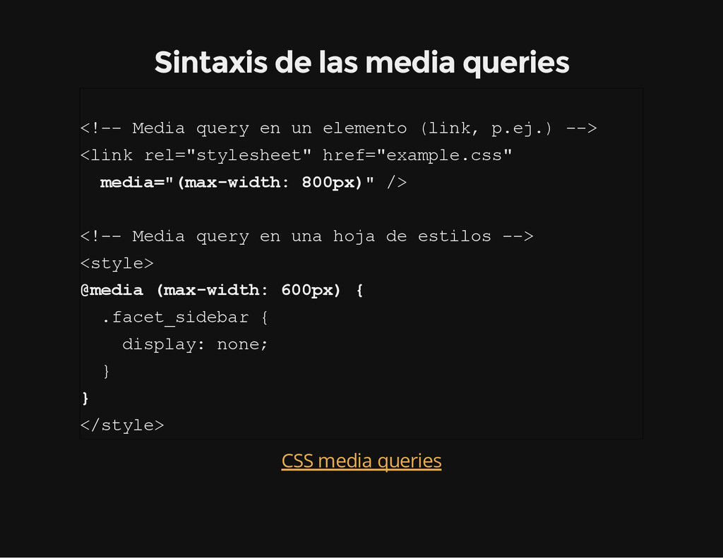
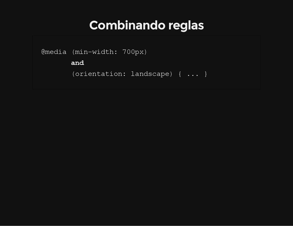
e d i a q u e r y e n u n e l e m e n t o ( l i n k , p . e j . ) - - > < l i n k r e l = " s t y l e s h e e t " h r e f = " e x a m p l e . c s s " m e d i a = " ( m a x - w i d t h : 8 0 0 p x ) " / > < ! - - M e d i a q u e r y e n u n a h o j a d e e s t i l o s - - > < s t y l e > @ m e d i a ( m a x - w i d t h : 6 0 0 p x ) { . f a c e t _ s i d e b a r { d i s p l a y : n o n e ; } } < / s t y l e > CSS media queries
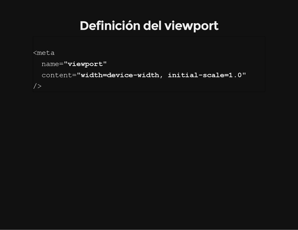
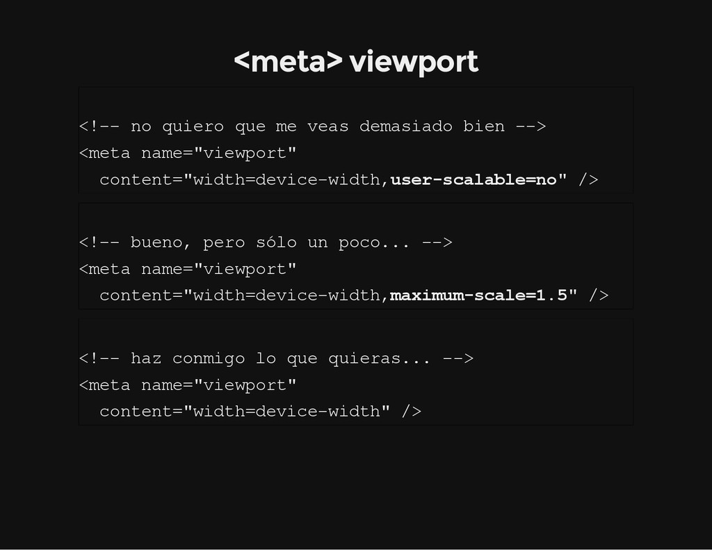
i e r o q u e m e v e a s d e m a s i a d o b i e n - - > < m e t a n a m e = " v i e w p o r t " c o n t e n t = " w i d t h = d e v i c e - w i d t h , u s e r - s c a l a b l e = n o " / > < ! - - b u e n o , p e r o s ó l o u n p o c o . . . - - > < m e t a n a m e = " v i e w p o r t " c o n t e n t = " w i d t h = d e v i c e - w i d t h , m a x i m u m - s c a l e = 1 . 5 " / > < ! - - h a z c o n m i g o l o q u e q u i e r a s . . . - - > < m e t a n a m e = " v i e w p o r t " c o n t e n t = " w i d t h = d e v i c e - w i d t h " / >
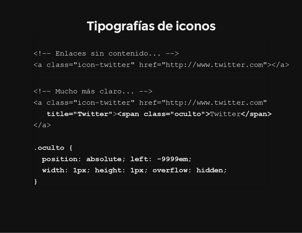
a c e s s i n c o n t e n i d o . . . - - > < a c l a s s = " i c o n - t w i t t e r " h r e f = " h t t p : / / w w w . t w i t t e r . c o m " > < / a > < ! - - M u c h o m á s c l a r o . . . - - > < a c l a s s = " i c o n - t w i t t e r " h r e f = " h t t p : / / w w w . t w i t t e r . c o m " t i t l e = " T w i t t e r " > < s p a n c l a s s = " o c u l t o " > T w i t t e r < / s p a n > < / a > . o c u l t o { p o s i t i o n : a b s o l u t e ; l e f t : - 9 9 9 9 e m ; w i d t h : 1 p x ; h e i g h t : 1 p x ; o v e r f l o w : h i d d e n ; }
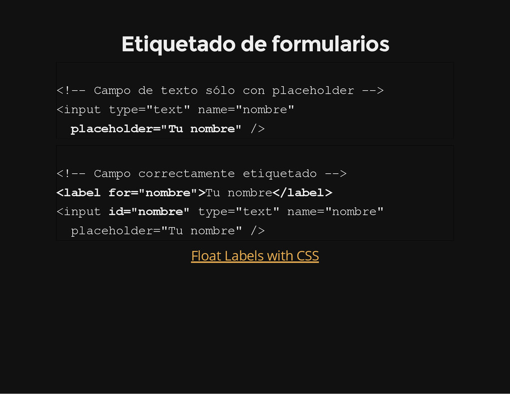
p o d e t e x t o s ó l o c o n p l a c e h o l d e r - - > < i n p u t t y p e = " t e x t " n a m e = " n o m b r e " p l a c e h o l d e r = " T u n o m b r e " / > < ! - - C a m p o c o r r e c t a m e n t e e t i q u e t a d o - - > < l a b e l f o r = " n o m b r e " > T u n o m b r e < / l a b e l > < i n p u t i d = " n o m b r e " t y p e = " t e x t " n a m e = " n o m b r e " p l a c e h o l d e r = " T u n o m b r e " / > Float Labels with CSS
workshop from New Adventures, January 2013) CSS3 for Responsive Web Design (full day workshop) [VIDEO] HTML5 Spain: Hangout #2 – Responsive Web Design Un gato "responsive"
accesibilidad. Buenas y malas prácticas. Errores comunes. What Does Responsive Web Design Have to do with Accessibility "Accessible Responsive Web Design", by Kathy Wahlbin) Accessibility Problems in Responsive Websites
 fzberlinches
 hwangbyeonghun
 nomizone
 y150saya
 lycorptech_jp
 gotok365
 tamaiyutaro
 sansantech
 jnchito
 estie
estie
 z63d
z63d
 masaokb
 maf_0521
 inesmontani
 ivargrimstad
 lara
lara
 mfonobong
 jacobtomlinson
 destraynor
 greggifford
 akashhashmi
 maltzj
 sferik
 kimpetersen
 gurzu
gurzu