Upgrade to Pro — share decks privately, control downloads, hide ads and more …

[Mustafa Kurtuldu] Designing for speed and hacking users perception

[Mustafa Kurtuldu] Designing for speed and hacking users perception

Content level: Beginner

In this talk I will go through research completed at Google regarding speed and users perception and how we can hack that to make sites and apps feel faster.

Mustafa Kurtuldu
Google / United Kingdom

Google Developers Group Lviv

October 13, 2018
Tweet

More Decks by Google Developers Group Lviv

Other Decks in Programming

Transcript

  1. Photo by Saffu on Unsplash Parked the plane further away

    from the terminal, complaints dropped to about zero
  2. #dfua Occupied time vs unoccupied Waiting Walking Occupied Unoccupied 7

    MINUTES LEAVE PLANE GET LUGGAGE Source: New York Times
  3. “ By making the site 1 second faster we could

    increase engagement by 5% “ - Cait O’Riordan, The Financial Times
  4. #dfua 53% of mobile site visits are abandoned if pages

    take longer than 3 seconds to load.
  5. #dfua User behaviour is affected by; State of mind Occupied

    time Intention Importance State of body
  6. #dfua 30% Web visits are triggered by many things... 30%

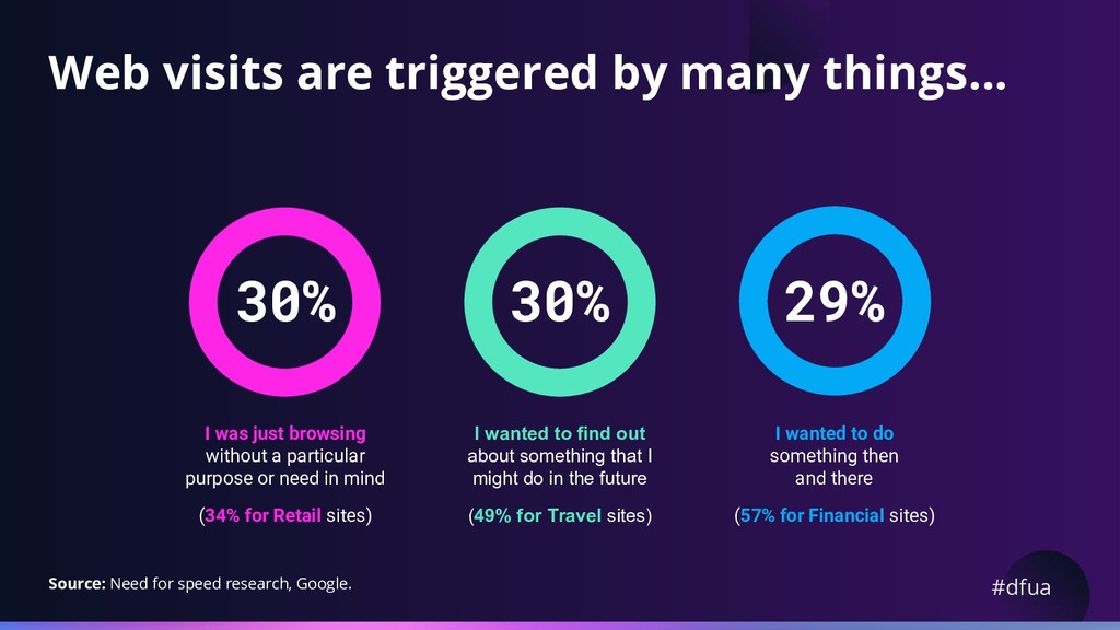
    29% I was just browsing without a particular purpose or need in mind (34% for Retail sites) I wanted to find out about something that I might do in the future (49% for Travel sites) I wanted to do something then and there (57% for Financial sites) Source: Need for speed research, Google.
  7. #dfua Where do users browse the mobile web? Relaxed Calm

    State of mind Location Home Work 8% Traveling / on the move 82% 7% Elsewhere 3% 74% 76% Source: Need for speed research, Google.
  8. #dfua Sites load faster at home Location Slow page loads

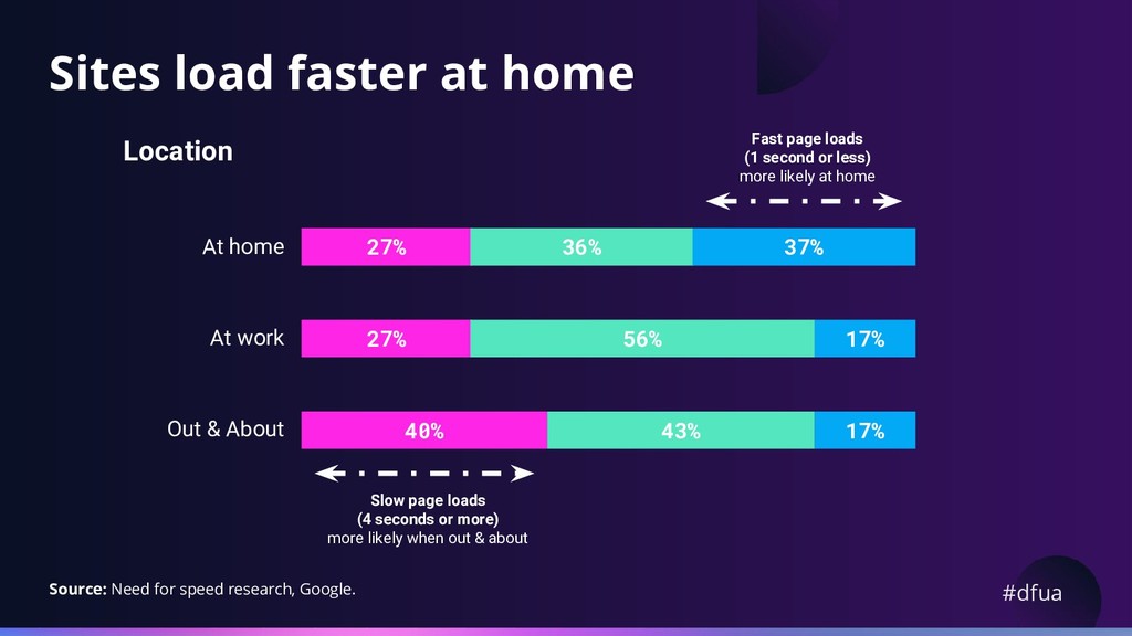
    (4 seconds or more) more likely when out & about Fast page loads (1 second or less) more likely at home At home At work Out & About 27% 36% 37% 27% 56% 17% 40% 43% 17% Source: Need for speed research, Google.
  9. #dfua Users alternate devices throughout the day Desktop Mobile 31%

    69% Time spent 80% 20% Money spent 49% Gap Source: comScore MMX Multi-Platform and e-Commerce & m-Commerce Measurement , Q3 2016
  10. #dfua Load speed is important to people Perceived importance of

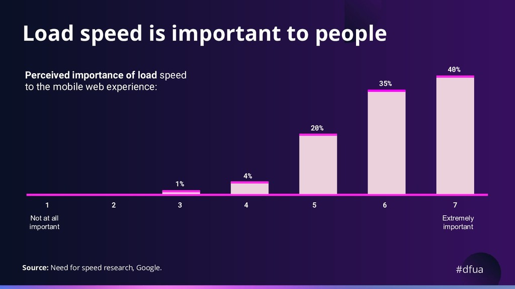
    load speed to the mobile web experience: Extremely important 1% Not at all important 4% 20% 35% 40% 3 4 5 6 7 2 1 Source: Need for speed research, Google.
  11. #dfua UX importance hierarchy 75% 66% 61% 58% 24% The

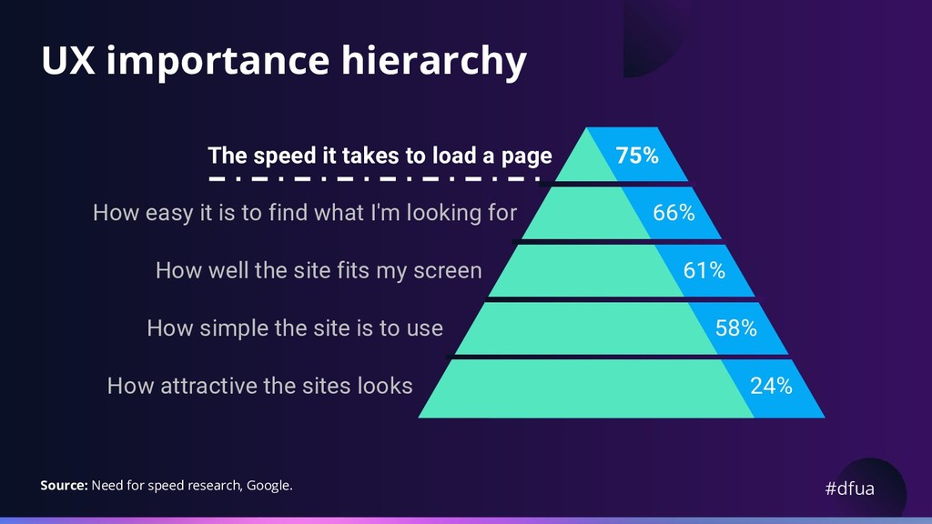
    speed it takes to load a page How easy it is to find what I'm looking for How well the site fits my screen How simple the site is to use How attractive the sites looks Source: Need for speed research, Google.
  12. “ We perceive a delay on loading which is 80

    milliseconds more than the reality. “ - @pbakaus
  13. #dfua A third of visits were perceived to be slow

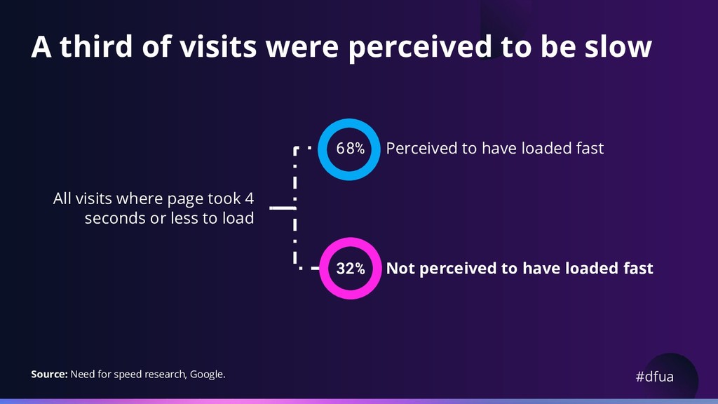
    All visits where page took 4 seconds or less to load 32% Perceived to have loaded fast Not perceived to have loaded fast 68% Source: Need for speed research, Google.
  14. #dfua 70% People under 25 generally perceive load times as

    slower 18-24s 25-34s 35-44s % perceived website / web page to have loaded relatively fast: 50% 71% Source: Need for speed research, Google.
  15. #dfua 75% When on the move, things also feel slower

    52% On the move Sat down Source: Need for speed research, Google.
  16. #dfua General guide Response times 200 ms 1 s 5

    s 8 s Feels instant Feels it is performing smoothly Part of user flow Lose attention
  17. #dfua Remove the 300-350ms tap delay Add the following in

    the of your page: <meta name='viewport' content='width=device-width'>
  18. #dfua Use animations to start slow and end fast Disguise

    slow loading times in the beginning with delightful animations.
  19. #dfua Mask loading time with transitions Instead of showing a

    spinner, brief animations can mask the loading transition to imply that the system is “progressing” rather than “processing”. Progressing Processing
  20. #dfua Top tabs Frequent switching between views Apps with few

    top-level views Using a label AND icon we find works best Source: uxmyths.com/post/715009009/myth-icons-enhance-usability
  21. #dfua Bottom navigation bar Promoting awareness of alternate views Appears

    at the bottom of every screen. Destinations should be of equal importance
  22. #dfua Floating Action Button (FAB) Represents the primary action in

    an application Should perform a constructive action like create, share, or explore Should be relevant to the screen
  23. #dfua App bars: Top Displays information and actions relating to

    the current screen Appears at the top of each screen and can disappear upon scroll Provides a reliable way to guide users through an app
  24. #dfua App bars: Bottom Provide access to a bottom navigation

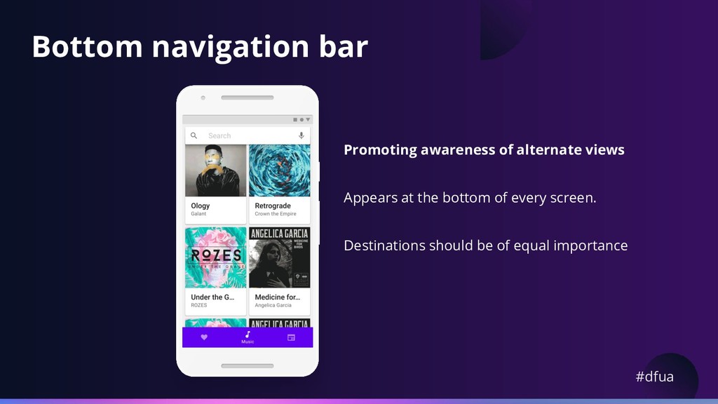
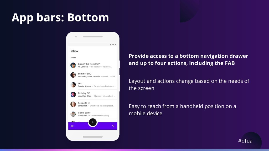
    drawer and up to four actions, including the FAB Layout and actions change based on the needs of the screen Easy to reach from a handheld position on a mobile device
  25. #dfua Navigation drawer Apps with many top-level views Quick navigation

    between unrelated views Deep navigation structures Reducing visibility of infrequent destinations
  26. #dfua Backdrop drawer Appears behind all other surfaces in an

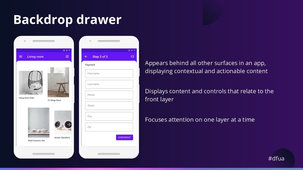
    app, displaying contextual and actionable content Displays content and controls that relate to the front layer Focuses attention on one layer at a time
  27. #dfua Google+ When someone joins a Community, they are more

    likely to... 3.8x post 6.7x comment 7.3x plus one
  28. #dfua Google+ What happened when we put them in the

    bottom menu? So Collections & Communities are critical for growing engagement.
  29. Collection follows per day grew 3x Remember our strongest indicator

    of who comes back to our app (after their first day) is following a Collection Source: Luke Wroblewski
  30. Community joins per day more than doubled Strongest indicator of

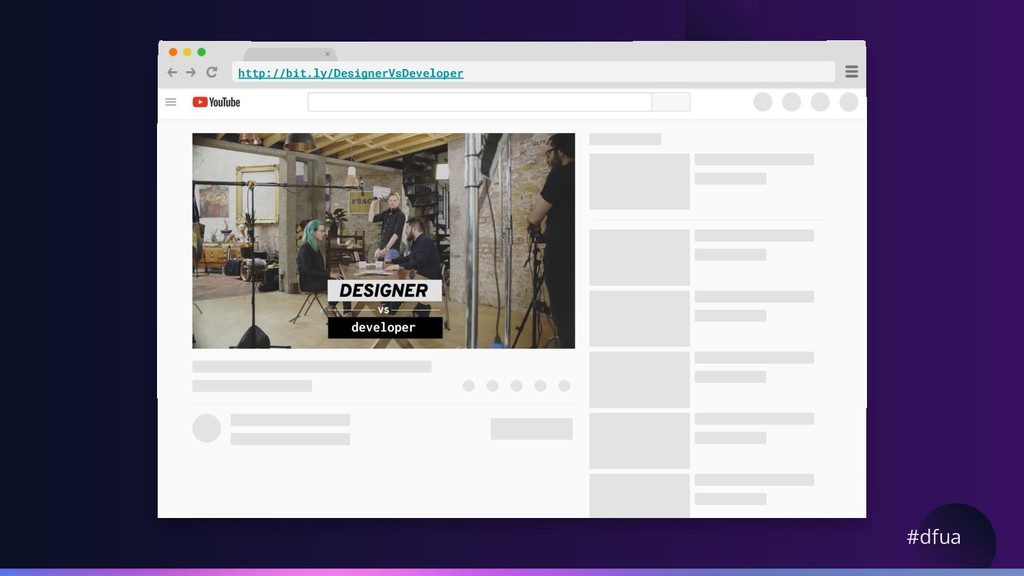
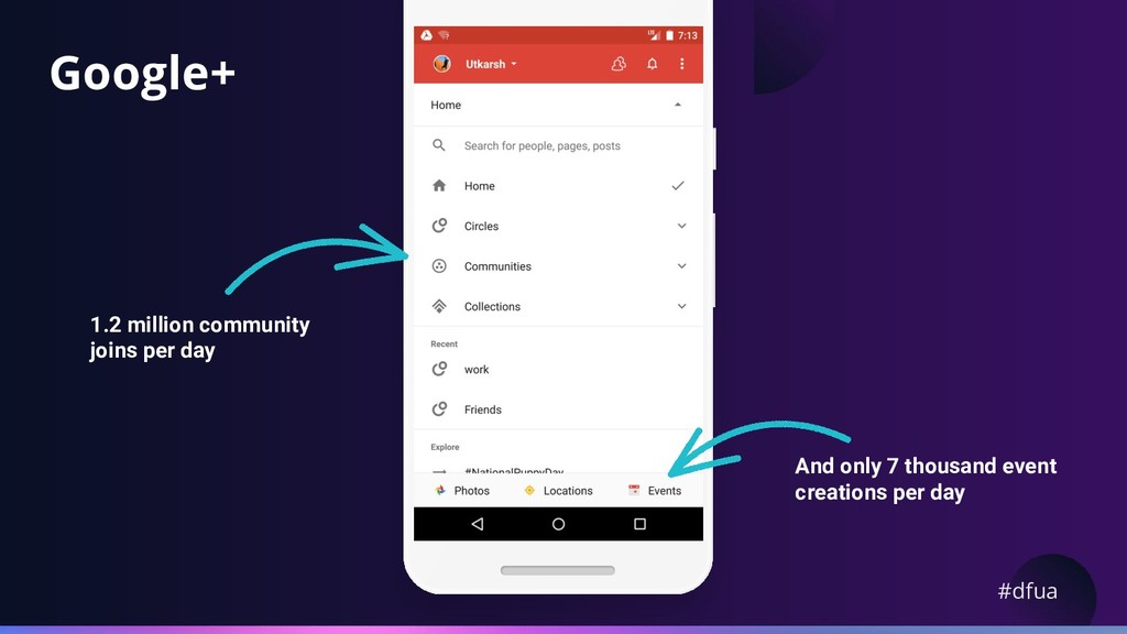
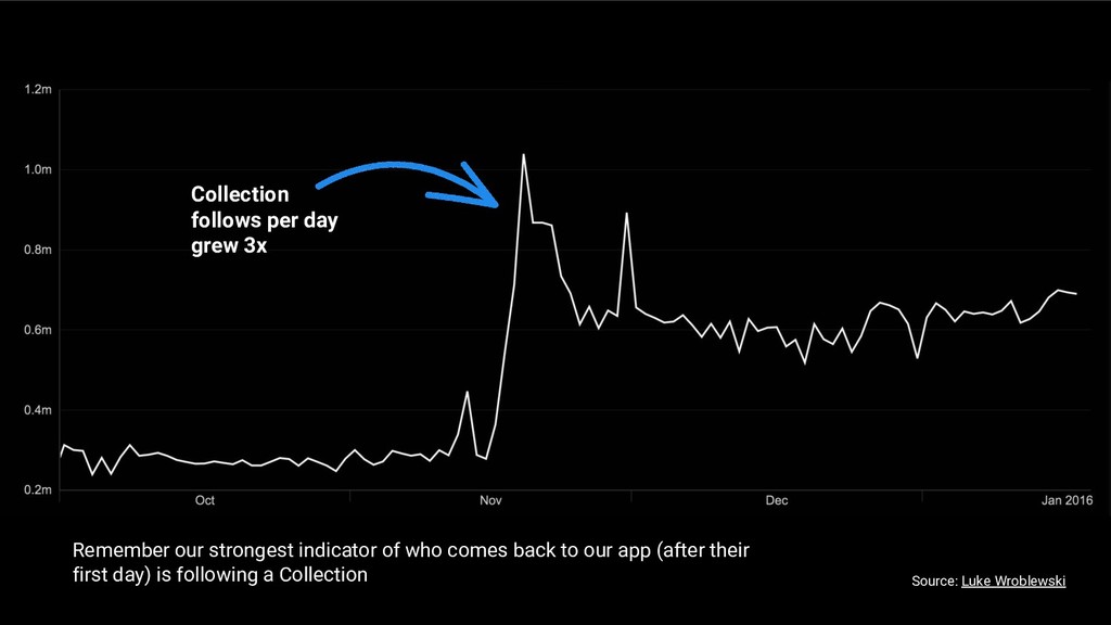
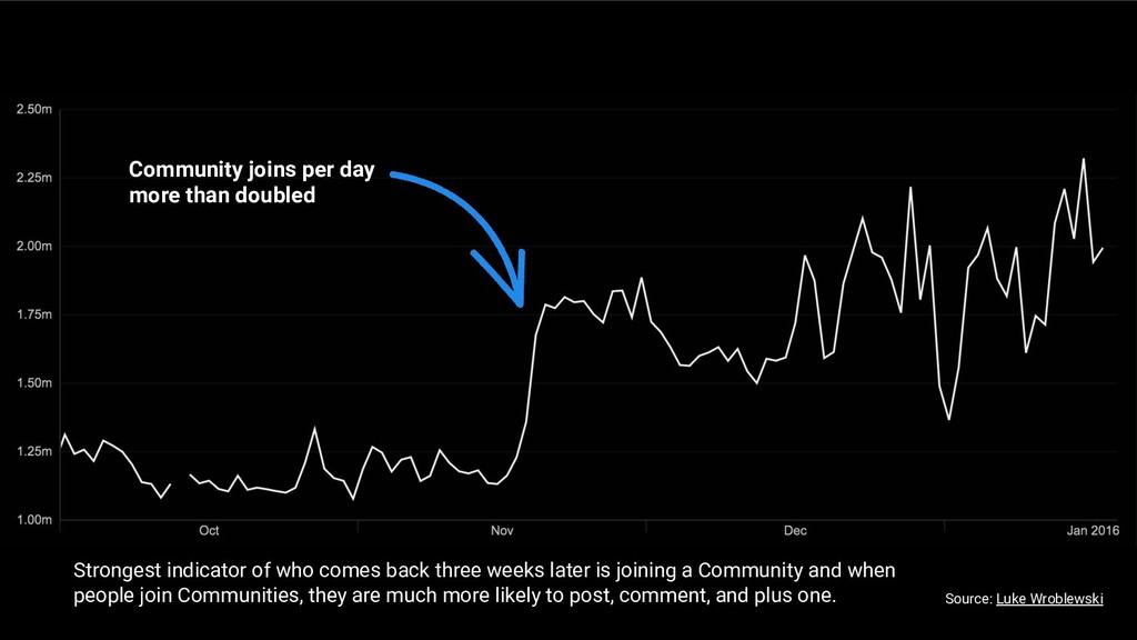
    who comes back three weeks later is joining a Community and when people join Communities, they are much more likely to post, comment, and plus one. Source: Luke Wroblewski
  31. #dfua As we saw a huge impact on critical metrics

    when we added the bottom menu Out of sight really was out of mind
  32. #dfua Bottom navigation has been hugely successful at driving engagement

    with G+ core features * * Step one is knowing what your core features are.
  33. #dfua Redbooth Number of user sessions more than doubled! Session

    time increased 70% More customers returned, with a 65% increase in daily active users nearly overnight.
  34. #dfua Spotify Tab bar ended up clicking 9% more in

    general. 30% more on menu items. Reduced number of options to five increased the reach of Spotify’s programmed content.
  35. #dfua The Hunt Improving first-time user engagement with the FAB;

    30% increase in users starting “hunts” relative to non-Material platforms.
  36. #dfua Trello Increasing engagement since the FAB; 10% increase in

    sessions 42% more boards created per session
  37. #dfua Summary Avoid blank screen. Show content as soon as

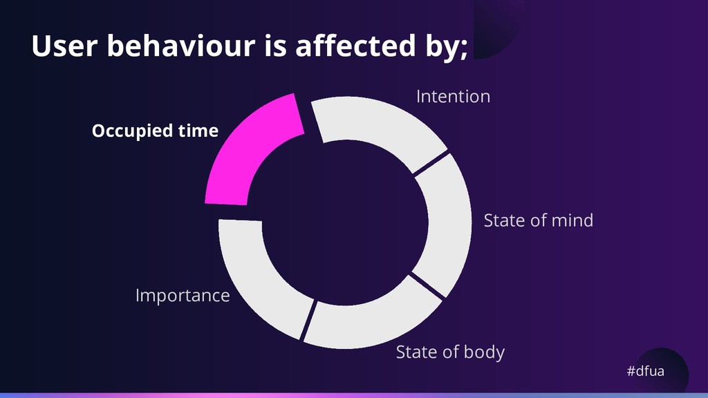
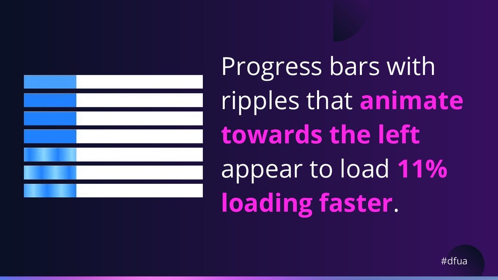
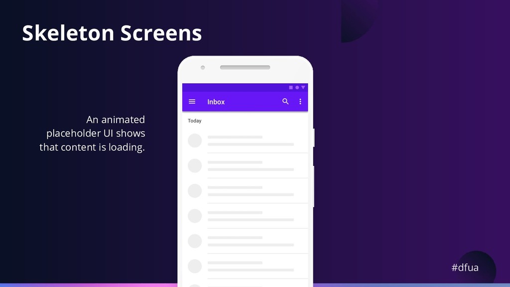
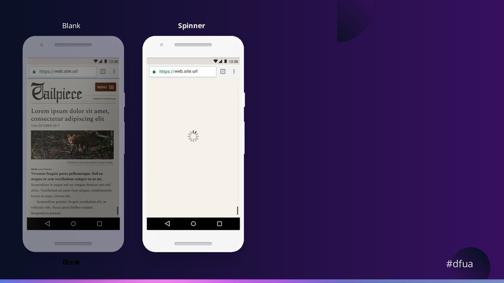
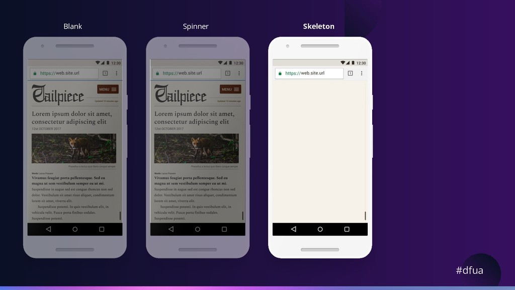
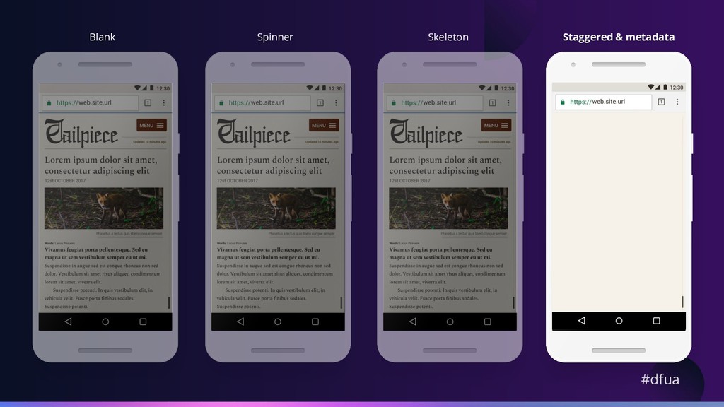
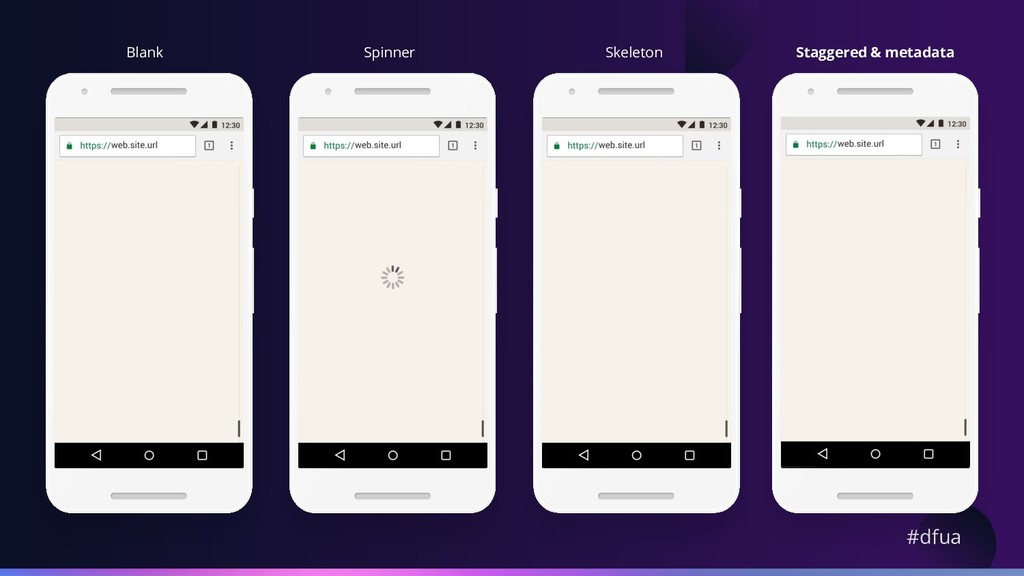
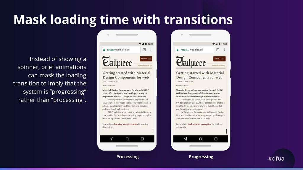
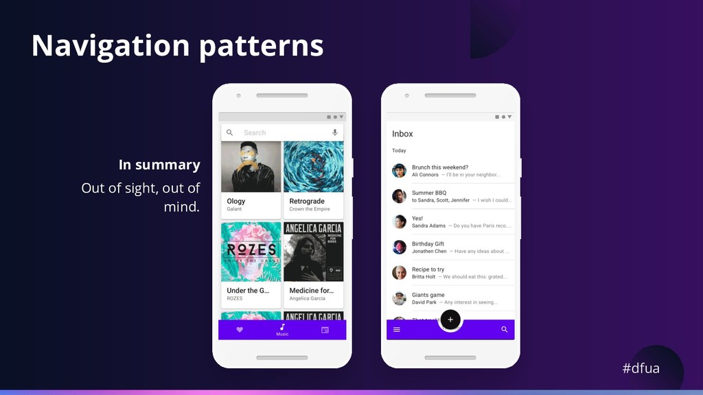
    possible. Bold animations and partial content placeholders makes the app look like it is “progressing”, avoid “processing”. Distract users and fill up their time with fun animations. Put navigation front and center.