Upgrade to Pro — share decks privately, control downloads, hide ads and more …

Sass, Compass and the new tools - Open Web Camp IV

Sass, Compass and the new tools - Open Web Camp IV

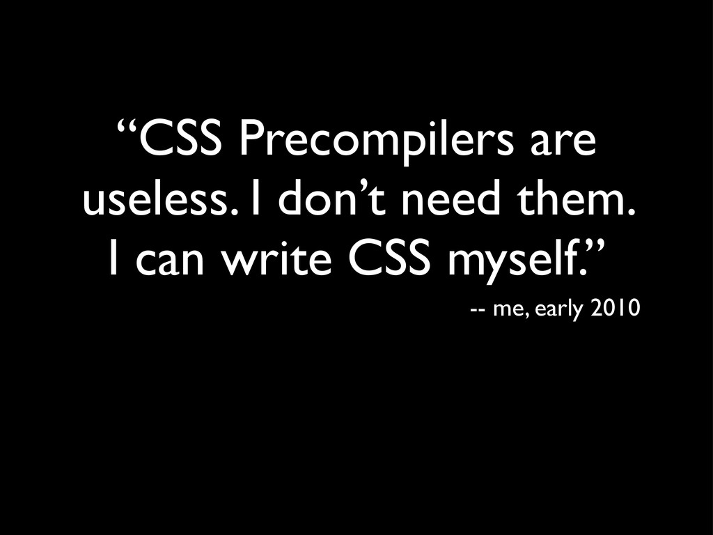
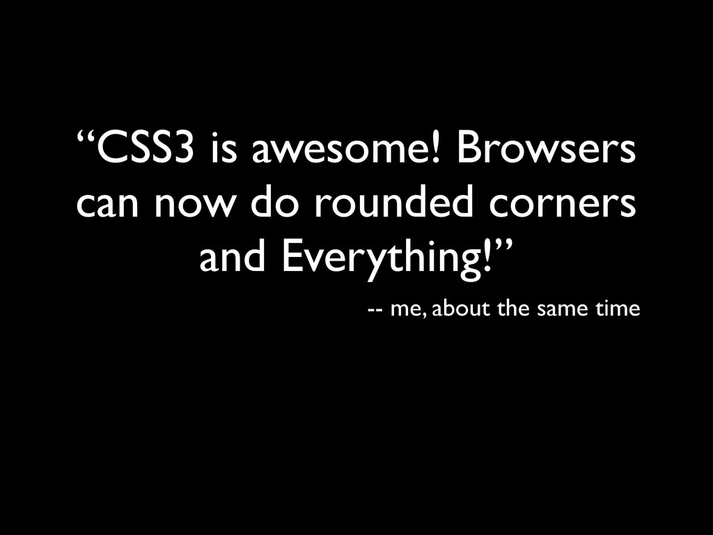
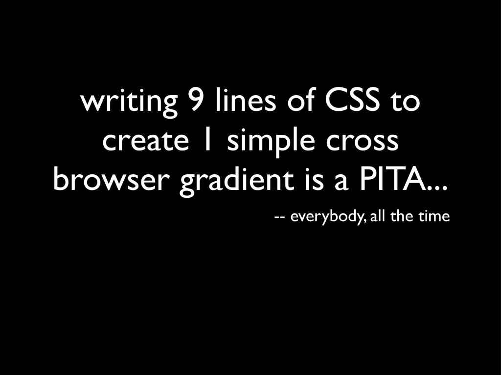
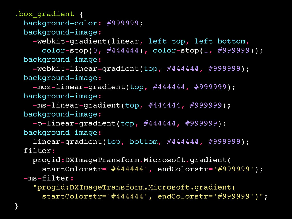
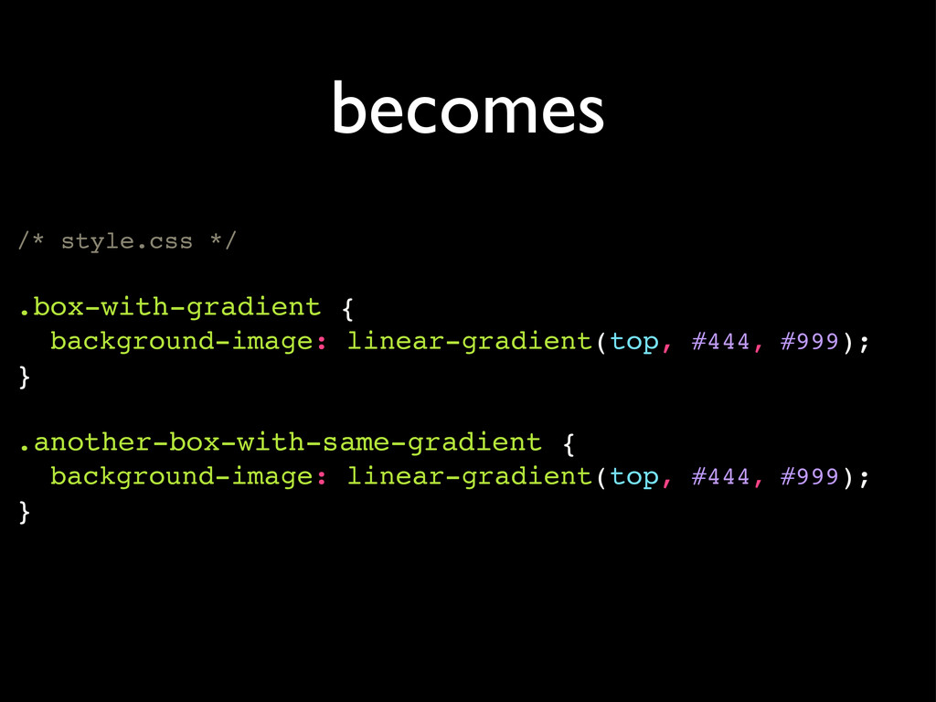
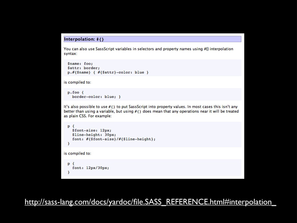
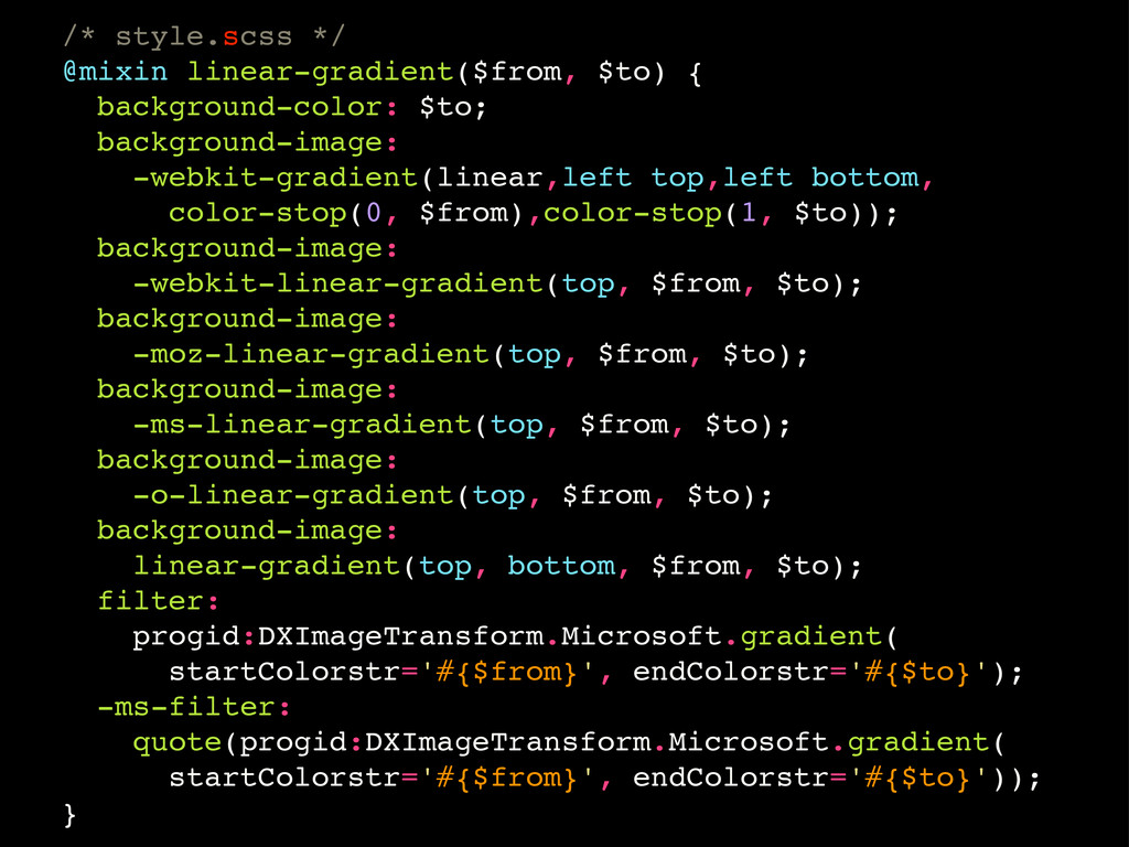
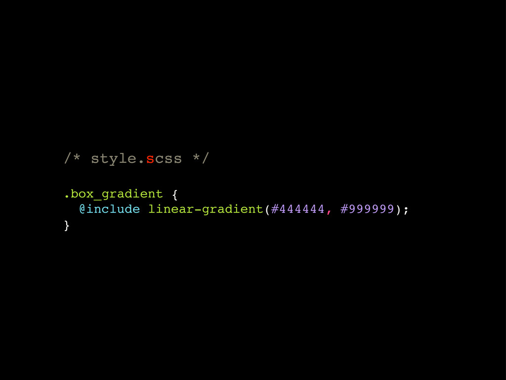
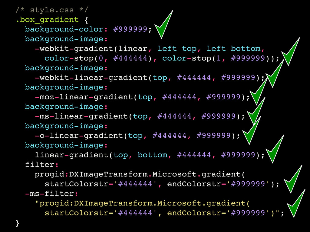
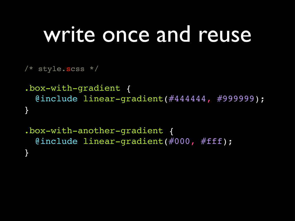
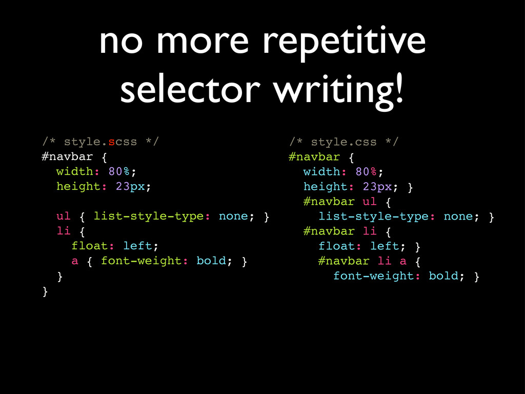
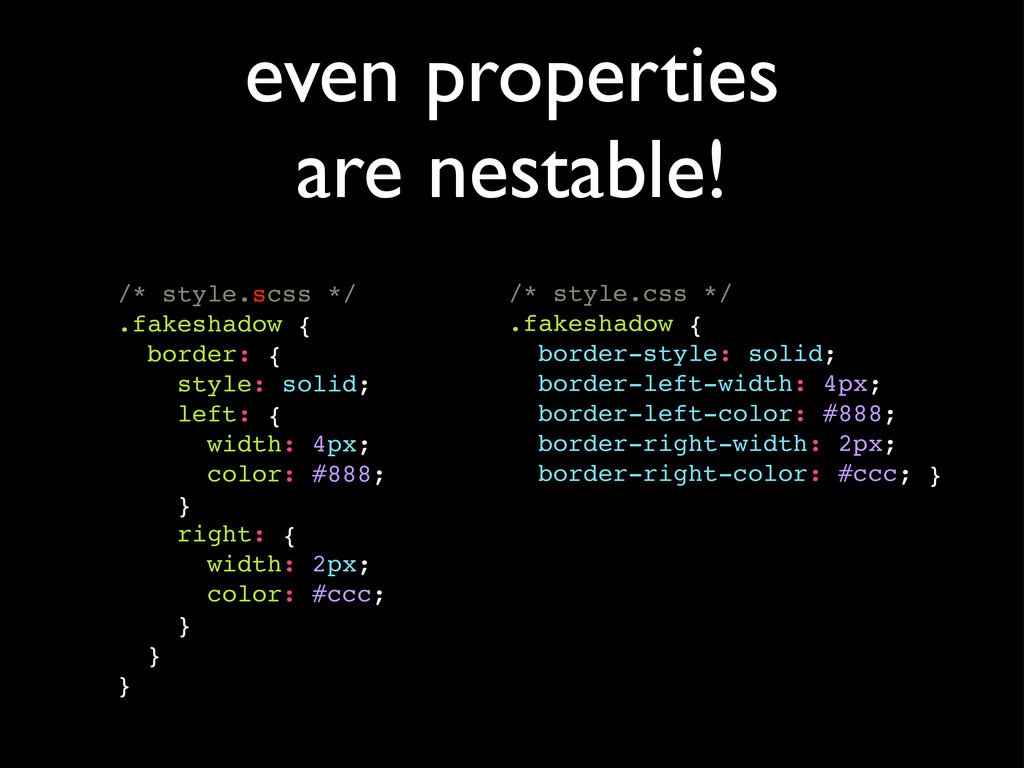
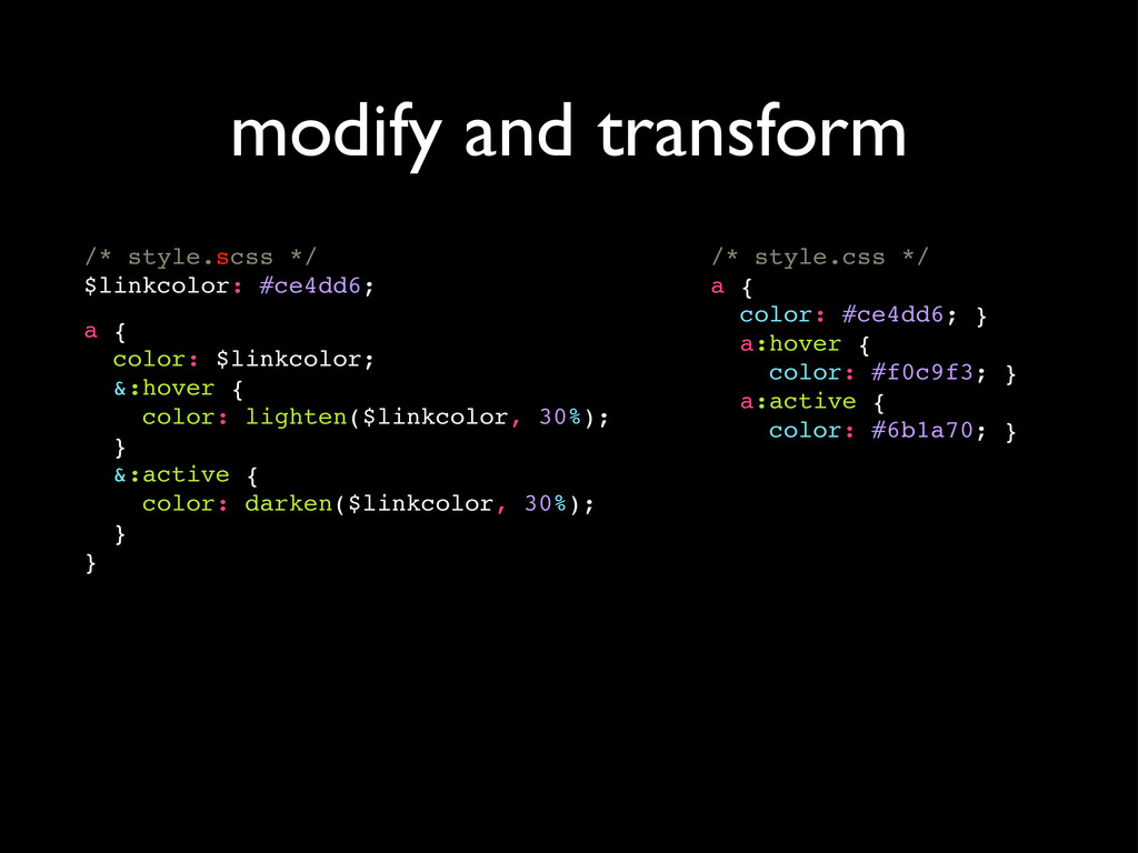
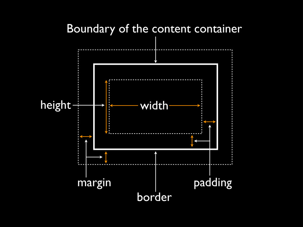
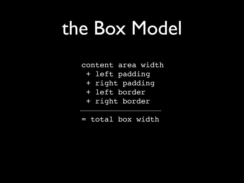
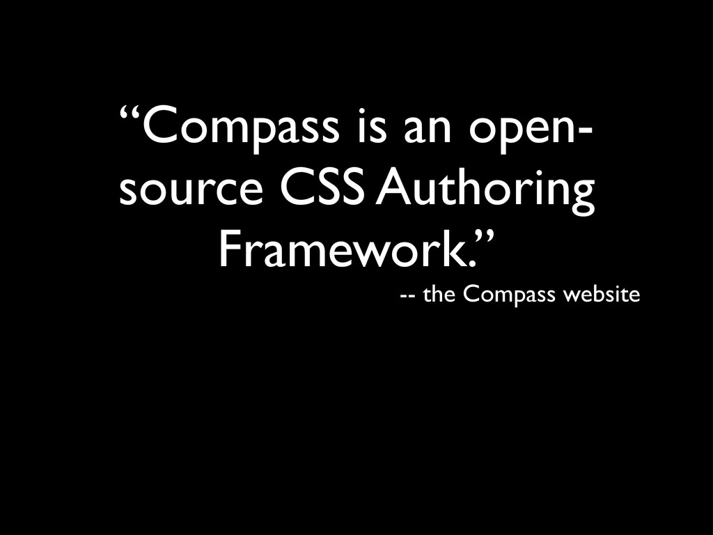
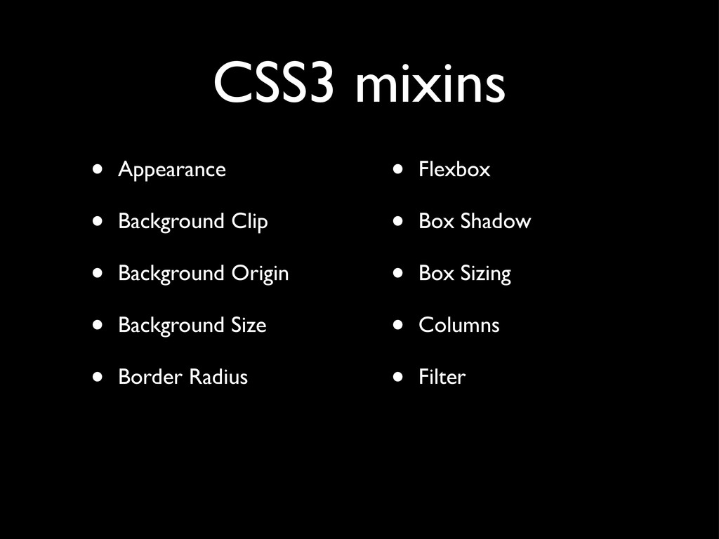
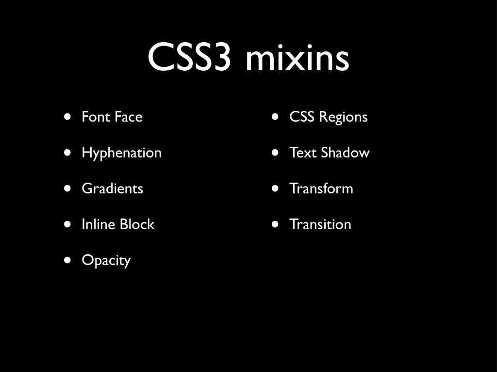
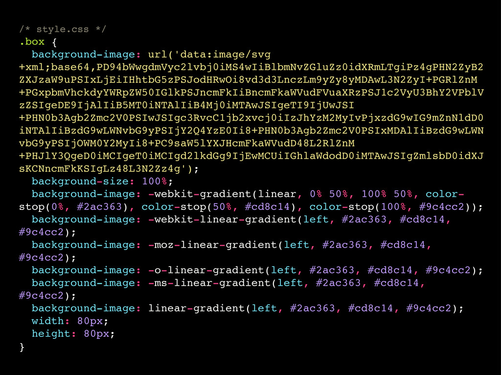
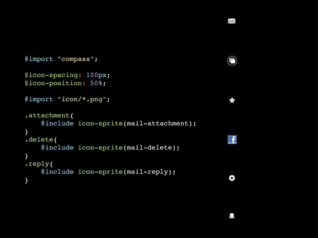
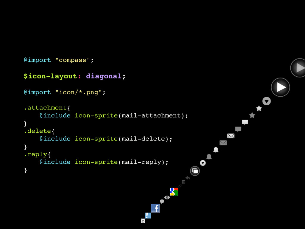
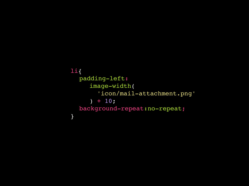
Developing and maintaining CSS projects can become a tedious task full of repetition. Especially taking care of all the vendor prefixes necessary to make your shiny gradients, drop shadows and rounded corners work in all the many Browsers out there seems so hard that many developers simply give up and go all -webkit-.
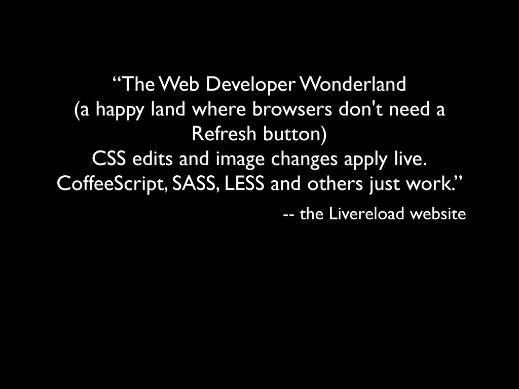
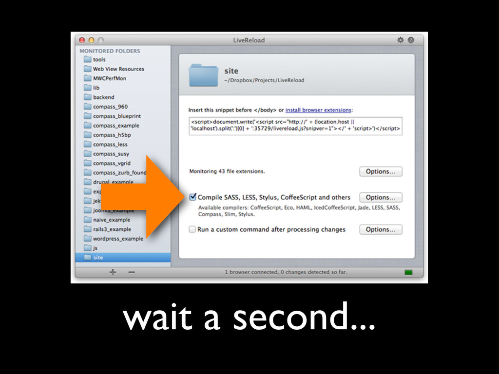
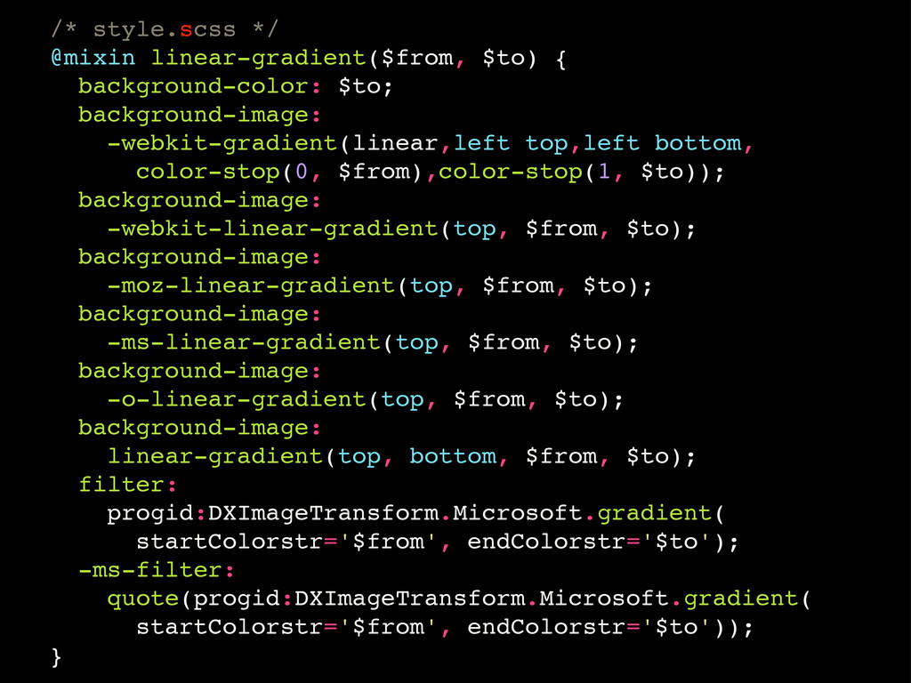
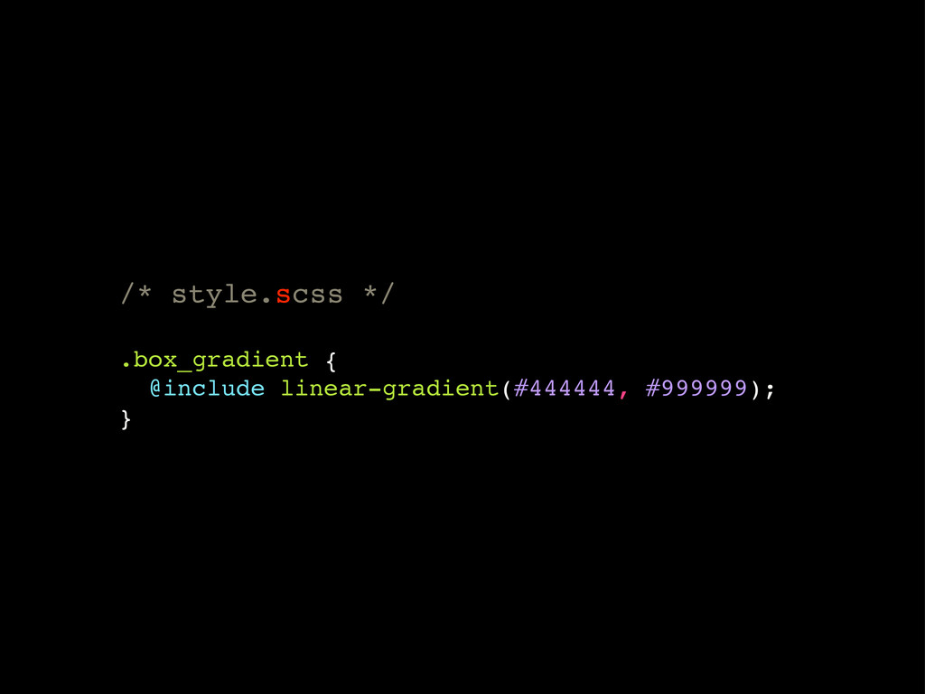
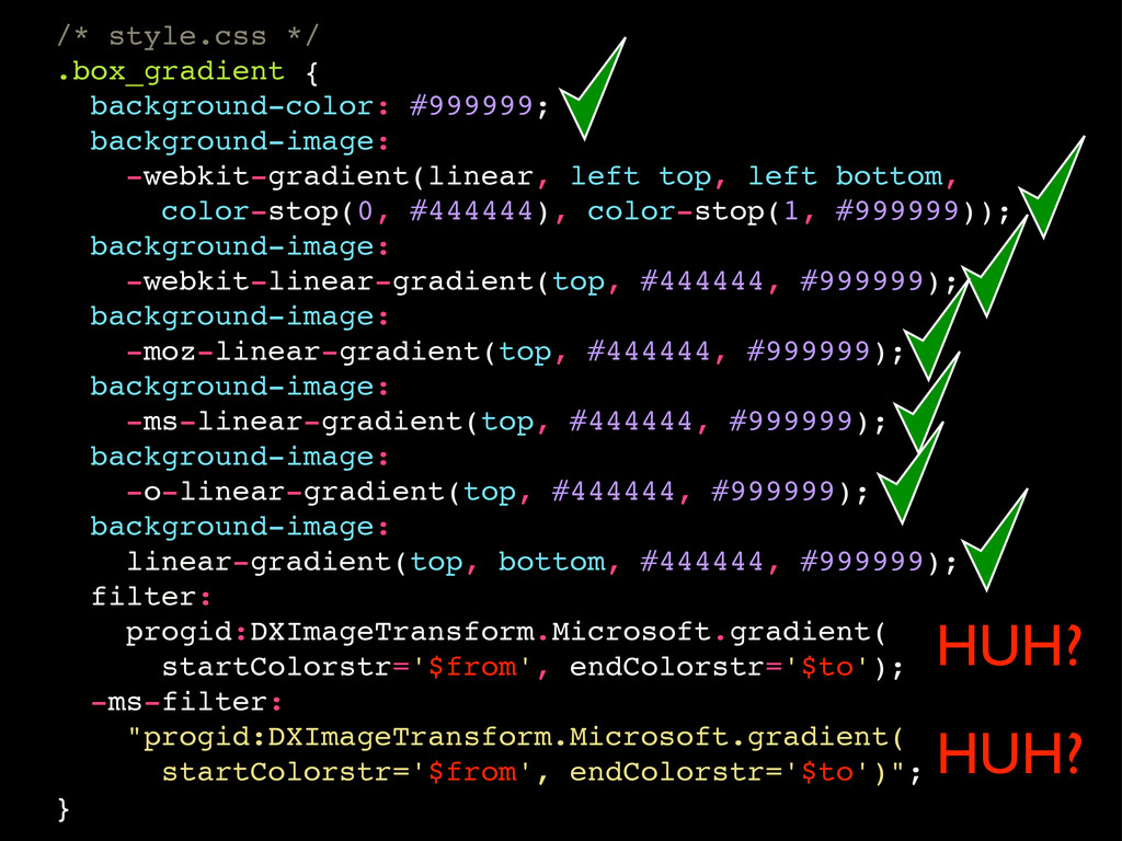
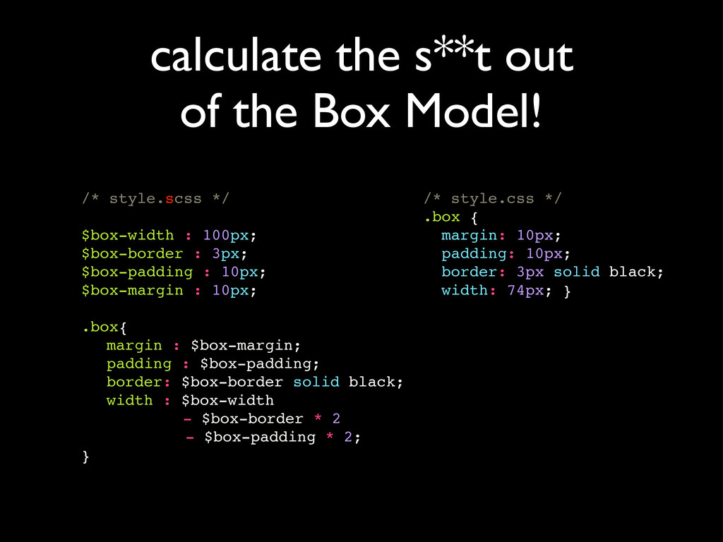
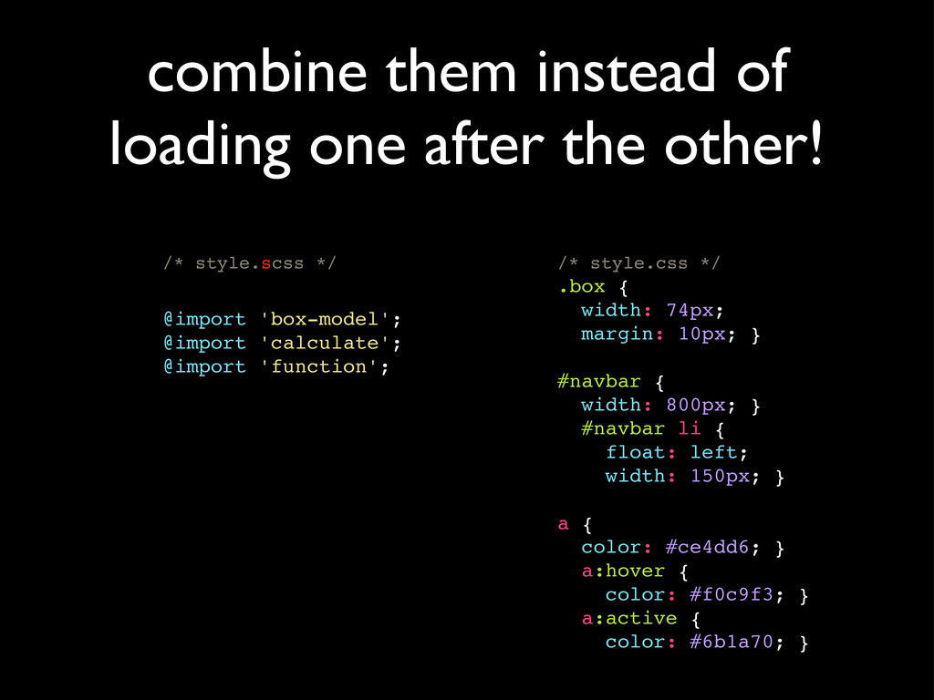
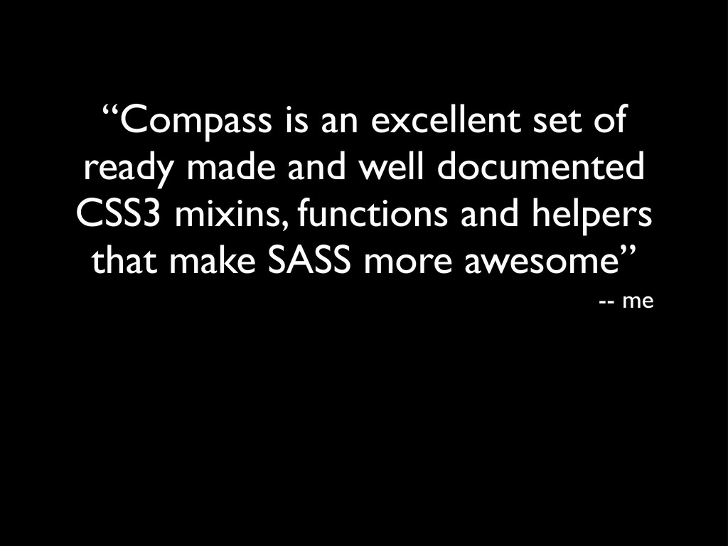
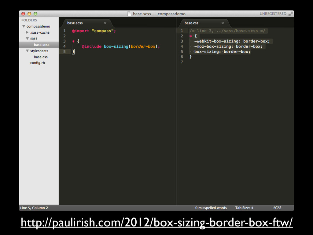
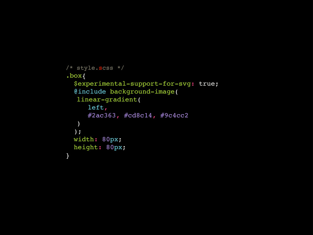
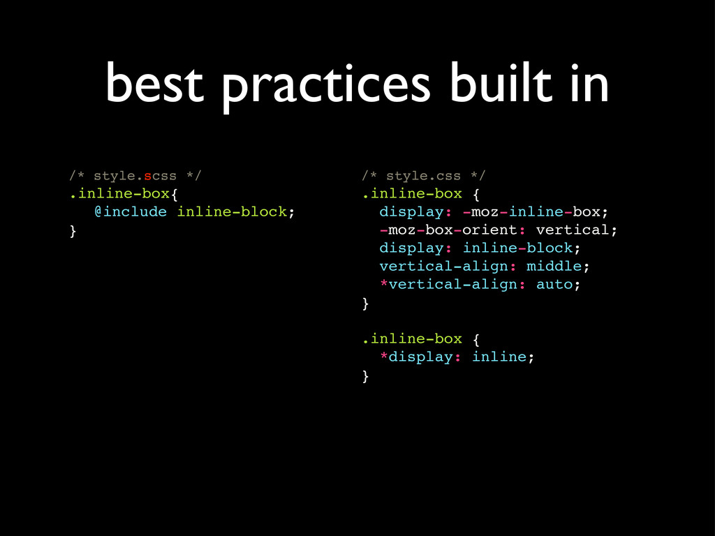
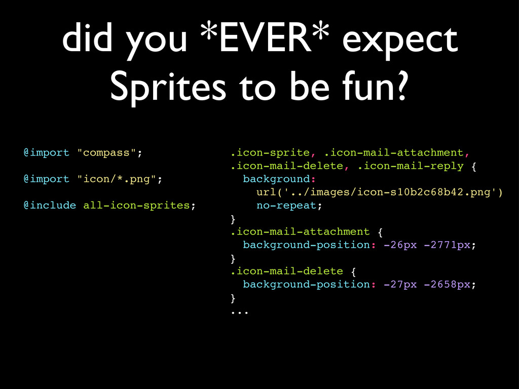
As it turns out there's absolutely no reason for that. CSS preprocessors like SASS with Compass take the pain out of CSS development and bring the fun back in! Additionally tools like Livereload or CodeKit speed up development even further!
I can happily say that my web development work-flow has never been more fun than in the last year. Let me show you why :-)

Dirk Ginader

July 14, 2012
Tweet

More Decks by Dirk Ginader

Other Decks in Technology

Transcript

  1. “CSS Precompilers are useless. I don’t need them. I can

    write CSS myself.” -- me, early 2010
  2. “CSS3 is awesome! Browsers can now do rounded corners and

    Everything!” -- me, about the same time
  3. “The Web Developer Wonderland (a happy land where browsers don't

    need a Refresh button) CSS edits and image changes apply live. CoffeeScript, SASS, LESS and others just work.” -- the Livereload website
  4. “What does LiveReload do? LiveReload monitors changes in the file

    system. As soon as you save a file, it is preprocessed as needed, and the browser is refreshed. Even cooler, when you change a CSS file or an image, the browser is updated instantly without reloading the page.” -- the Livereload website
  5. writing 9 lines of CSS to create 1 simple cross

    browser gradient is a PITA... -- everybody, all the time
  6. .box_gradient { background-color: #999999; background-image: -webkit-gradient(linear, left top, left bottom,

    color-stop(0, #444444), color-stop(1, #999999)); background-image: -webkit-linear-gradient(top, #444444, #999999); background-image: -moz-linear-gradient(top, #444444, #999999); background-image: -ms-linear-gradient(top, #444444, #999999); background-image: -o-linear-gradient(top, #444444, #999999); background-image: linear-gradient(top, bottom, #444444, #999999); filter: progid:DXImageTransform.Microsoft.gradient( startColorstr='#444444', endColorstr='#999999'); -ms-filter: "progid:DXImageTransform.Microsoft.gradient( startColorstr='#444444', endColorstr='#999999')"; }
  7. well if it’s *THAT* easy I could as well give

    it a try, right? me, after having seen this toggle countless times...
  8. “Sass makes CSS fun again. Sass is an extension of

    CSS3, adding nested rules, variables, mixins, selector inheritance, and more. It’s translated to well-formatted, standard CSS using the command line tool or a web-framework plugin.” -- the Sass Website
  9. /* style.scss */ @mixin linear-gradient { background-image: linear-gradient(top, #444, #999);

    } .box-with-gradient { @include linear-gradient; } .another-box-with-same-gradient { @include linear-gradient; } reusable chunks of code
  10. /* style.css */ .box-with-gradient { background-image: linear-gradient(top, #444, #999); }

    .another-box-with-same-gradient { background-image: linear-gradient(top, #444, #999); } becomes
  11. /* style.scss */ @mixin linear-gradient($from, $to) { background-color: $to; background-image:

    -webkit-gradient(linear,left top,left bottom, color-stop(0, $from),color-stop(1, $to)); background-image: -webkit-linear-gradient(top, $from, $to); background-image: -moz-linear-gradient(top, $from, $to); background-image: -ms-linear-gradient(top, $from, $to); background-image: -o-linear-gradient(top, $from, $to); background-image: linear-gradient(top, bottom, $from, $to); filter: progid:DXImageTransform.Microsoft.gradient( startColorstr='$from', endColorstr='$to'); -ms-filter: quote(progid:DXImageTransform.Microsoft.gradient( startColorstr='$from', endColorstr='$to')); }
  12. /* style.css */ .box_gradient { background-color: #999999; background-image: -webkit-gradient(linear, left

    top, left bottom, color-stop(0, #444444), color-stop(1, #999999)); background-image: -webkit-linear-gradient(top, #444444, #999999); background-image: -moz-linear-gradient(top, #444444, #999999); background-image: -ms-linear-gradient(top, #444444, #999999); background-image: -o-linear-gradient(top, #444444, #999999); background-image: linear-gradient(top, bottom, #444444, #999999); filter: progid:DXImageTransform.Microsoft.gradient( startColorstr='$from', endColorstr='$to'); -ms-filter: "progid:DXImageTransform.Microsoft.gradient( startColorstr='$from', endColorstr='$to')"; } HUH? HUH?
  13. /* style.scss */ @mixin linear-gradient($from, $to) { background-color: $to; background-image:

    -webkit-gradient(linear,left top,left bottom, color-stop(0, $from),color-stop(1, $to)); background-image: -webkit-linear-gradient(top, $from, $to); background-image: -moz-linear-gradient(top, $from, $to); background-image: -ms-linear-gradient(top, $from, $to); background-image: -o-linear-gradient(top, $from, $to); background-image: linear-gradient(top, bottom, $from, $to); filter: progid:DXImageTransform.Microsoft.gradient( startColorstr='#{$from}', endColorstr='#{$to}'); -ms-filter: quote(progid:DXImageTransform.Microsoft.gradient( startColorstr='#{$from}', endColorstr='#{$to}')); }
  14. /* style.css */ .box_gradient { background-color: #999999; background-image: -webkit-gradient(linear, left

    top, left bottom, color-stop(0, #444444), color-stop(1, #999999)); background-image: -webkit-linear-gradient(top, #444444, #999999); background-image: -moz-linear-gradient(top, #444444, #999999); background-image: -ms-linear-gradient(top, #444444, #999999); background-image: -o-linear-gradient(top, #444444, #999999); background-image: linear-gradient(top, bottom, #444444, #999999); filter: progid:DXImageTransform.Microsoft.gradient( startColorstr='#444444', endColorstr='#999999'); -ms-filter: "progid:DXImageTransform.Microsoft.gradient( startColorstr='#444444', endColorstr='#999999')"; }
  15. /* style.css */ #navbar { width: 80%; height: 23px; }

    #navbar ul { list-style-type: none; } #navbar li { float: left; } #navbar li a { font-weight: bold; } /* style.scss */ #navbar { width: 80%; height: 23px; ul { list-style-type: none; } li { float: left; a { font-weight: bold; } } } no more repetitive selector writing!
  16. even properties are nestable! /* style.scss */ .fakeshadow { border:

    { style: solid; left: { width: 4px; color: #888; } right: { width: 2px; color: #ccc; } } } /* style.css */ .fakeshadow { border-style: solid; border-left-width: 4px; border-left-color: #888; border-right-width: 2px; border-right-color: #ccc; }
  17. use the & (parent reference) i.e. for pseudoclasses /* style.scss

    */ a { color: #ce4dd6; &:hover { color: #ffb3ff; } &:visited { color: #c458cb; } .module &{ ! color: red; } } /* style.css */ a { color: #ce4dd6; } a:hover { color: #ffb3ff; } a:visited { color: #c458cb; } .module a { color: red; }
  18. define standard settings and reuse across your project /* style.scss

    */ $main-color: #ce4dd6; $style: solid; #navbar { border-bottom: { color: $main-color; style: $style; } } a { color: $main-color; &:hover { border-bottom: $style 1px; } } /* style.css */ #navbar { border-bottom-color: #ce4dd6; border-bottom-style: solid; } a { color: #ce4dd6; } a:hover { border-bottom: solid 1px; }
  19. modify and transform /* style.scss */ $linkcolor: #ce4dd6; a {

    color: $linkcolor; &:hover { color: lighten($linkcolor, 30%); } &:active { color: darken($linkcolor, 30%); } } /* style.css */ a { color: #ce4dd6; } a:hover { color: #f0c9f3; } a:active { color: #6b1a70; }
  20. content area width + left padding + right padding +

    left border + right border = total box width the Box Model
  21. calculate the s**t out of the Box Model! /* style.scss

    */ $box-width : 100px; $box-border : 3px; $box-padding : 10px; $box-margin : 10px; .box{ ! margin : $box-margin; ! padding : $box-padding; ! border: $box-border solid black; ! width : $box-width ! ! ! - $box-border * 2 ! ! ! - $box-padding * 2; } /* style.css */ .box { margin: 10px; padding: 10px; border: 3px solid black; width: 74px; }
  22. combine them instead of loading one after the other! /*

    style.scss */ @import 'box-model'; @import 'calculate'; @import 'function'; /* style.css */ .box { width: 74px; margin: 10px; } #navbar { width: 800px; } #navbar li { float: left; width: 150px; } a { color: #ce4dd6; } a:hover { color: #f0c9f3; } a:active { color: #6b1a70; }
  23. “Compass is an excellent set of ready made and well

    documented CSS3 mixins, functions and helpers that make SASS more awesome” -- me
  24. CSS3 mixins • Appearance • Background Clip • Background Origin

    • Background Size • Border Radius • Flexbox • Box Shadow • Box Sizing • Columns • Filter
  25. CSS3 mixins • Font Face • Hyphenation • Gradients •

    Inline Block • Opacity • CSS Regions • Text Shadow • Transform • Transition
  26. /* style.scss */ .box{ $experimental-support-for-svg: true; @include background-image( !linear-gradient( !!

    left, !! #2ac363, #cd8c14, #9c4cc2 !) ); width: 80px; height: 80px; }
  27. /* style.css */ .box { background-image: url('data:image/svg +xml;base64,PD94bWwgdmVyc2lvbj0iMS4wIiBlbmNvZGluZz0idXRmLTgiPz4gPHN2ZyB2 ZXJzaW9uPSIxLjEiIHhtbG5zPSJodHRwOi8vd3d3LnczLm9yZy8yMDAwL3N2ZyI+PGRlZnM +PGxpbmVhckdyYWRpZW50IGlkPSJncmFkIiBncmFkaWVudFVuaXRzPSJ1c2VyU3BhY2VPblV

    zZSIgeDE9IjAlIiB5MT0iNTAlIiB4Mj0iMTAwJSIgeTI9IjUwJSI +PHN0b3Agb2Zmc2V0PSIwJSIgc3RvcC1jb2xvcj0iIzJhYzM2MyIvPjxzdG9wIG9mZnNldD0 iNTAlIiBzdG9wLWNvbG9yPSIjY2Q4YzE0Ii8+PHN0b3Agb2Zmc2V0PSIxMDAlIiBzdG9wLWN vbG9yPSIjOWM0Y2MyIi8+PC9saW5lYXJHcmFkaWVudD48L2RlZnM +PHJlY3QgeD0iMCIgeT0iMCIgd2lkdGg9IjEwMCUiIGhlaWdodD0iMTAwJSIgZmlsbD0idXJ sKCNncmFkKSIgLz48L3N2Zz4g'); background-size: 100%; background-image: -webkit-gradient(linear, 0% 50%, 100% 50%, color- stop(0%, #2ac363), color-stop(50%, #cd8c14), color-stop(100%, #9c4cc2)); background-image: -webkit-linear-gradient(left, #2ac363, #cd8c14, #9c4cc2); background-image: -moz-linear-gradient(left, #2ac363, #cd8c14, #9c4cc2); background-image: -o-linear-gradient(left, #2ac363, #cd8c14, #9c4cc2); background-image: -ms-linear-gradient(left, #2ac363, #cd8c14, #9c4cc2); background-image: linear-gradient(left, #2ac363, #cd8c14, #9c4cc2); width: 80px; height: 80px; }
  28. /* style.scss */ .inline-box{ ! @include inline-block; } /* style.css

    */ .inline-box { display: -moz-inline-box; -moz-box-orient: vertical; display: inline-block; vertical-align: middle; *vertical-align: auto; } .inline-box { *display: inline; } best practices built in
  29. /* style.scss */ .box{ ! @include clearfix; } /* style.css

    */ .box { overflow: hidden; *zoom: 1; } best practices built in
  30. best practices built in /* style.scss */ .other-box{ ! @include

    pie-clearfix; } /* style.css */ .other-box { *zoom: 1; } .other-box:after { content: ""; display: table; clear: both; }
  31. did you *EVER* expect Sprites to be fun? @import "compass";

    @import "icon/*.png"; @include all-icon-sprites; .icon-sprite, .icon-mail-attachment, .icon-mail-delete, .icon-mail-reply { background: url('../images/icon-s10b2c68b42.png') no-repeat; } .icon-mail-attachment { background-position: -26px -2771px; } .icon-mail-delete { background-position: -27px -2658px; } ...
  32. @import "compass"; $icon-spacing: 100px; $icon-position: 50%; @import "icon/*.png"; .attachment{ @include

    icon-sprite(mail-attachment); } .delete{ @include icon-sprite(mail-delete); } .reply{ @include icon-sprite(mail-reply); }
  33. @import "compass"; $icon-layout: diagonal; @import "icon/*.png"; .attachment{ @include icon-sprite(mail-attachment); }

    .delete{ @include icon-sprite(mail-delete); } .reply{ @include icon-sprite(mail-reply); }
  34. .attachment{ background: inline-image( 'icon/mail-attachment.png' ) no-repeat; } .attachment { background:

    url('data:image/ png;base64,iVBORw0KGgoAAAANSUh EUgAAAA0AAAAOBAMAAAAGUYvhAAAAA 3NCSVQICAjb4U/gAAAAHlBMVEX/// 8AAAAAAAAAAAAAAAAAAAAAAAAAAAAA AAAAAACGjDitAAAACnRSTlMAESIzRF Vmd4iZu4Nz1gAAAAlwSFlzAAALEgAA CxIB0t1+/ AAAABR0RVh0Q3JlYXRpb24gVGltZQA 0LzQvMTI1uCR/ AAAAHHRFWHRTb2Z0d2FyZQBBZG9iZS BGaXJld29ya3MgQ1M0BrLToAAAAFNJ REFUCJljYAACjWkCIIqpRSwBzDVgLg BxGwTEA0Bc9sAyMLdMPAHMTSxjhHKb GBg4DAvLOBQYGNQZ1EFcBg2gEJDLwG HAAuIyMJangg1nYARTACNTDXDO7nbI AAAAAElFTkSuQmCC') no-repeat; } ...
  35. SASS ultimately won out because it's the most mature, easiest

    to find information and help about, seems to have the most active and robust development, and has the least bugs. http://css-tricks.com/musings-on-preprocessing/ -- Chris Coyier, just recently