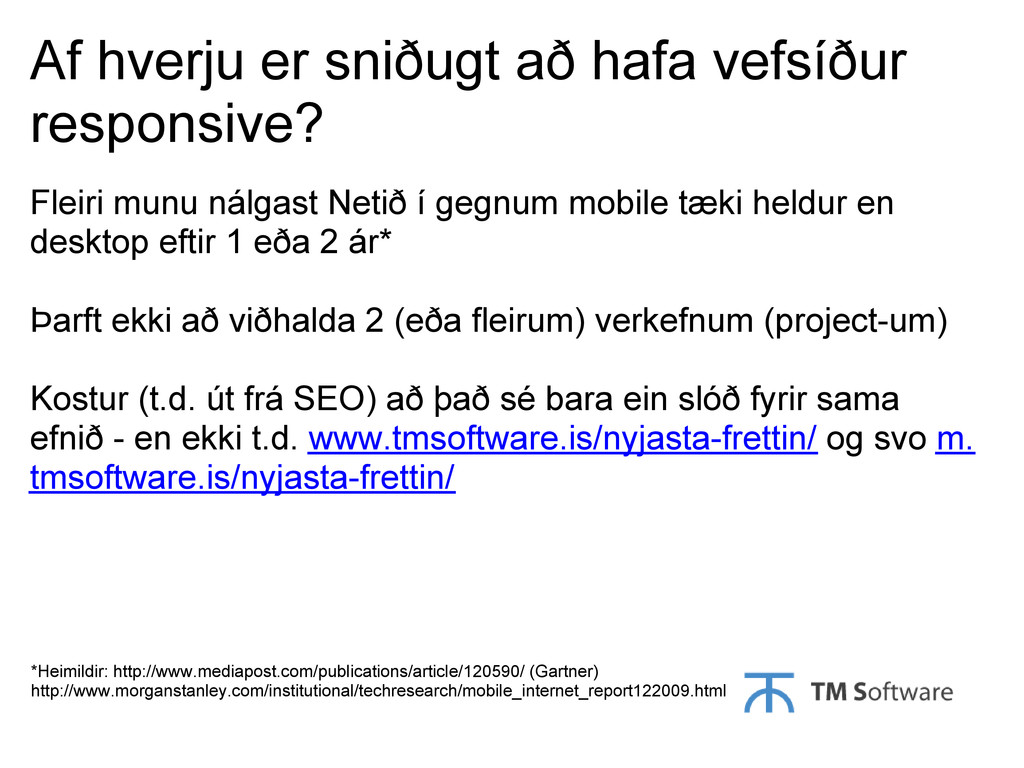
vefsíður responsive? Fleiri munu nálgast Netið í gegnum mobile tæki heldur en desktop eftir 1 eða 2 ár* Þarft ekki að viðhalda 2 (eða fleirum) verkefnum (project-um) Kostur (t.d. út frá SEO) að það sé bara ein slóð fyrir sama efnið - en ekki t.d. www.tmsoftware.is/nyjasta-frettin/ og svo m. tmsoftware.is/nyjasta-frettin/
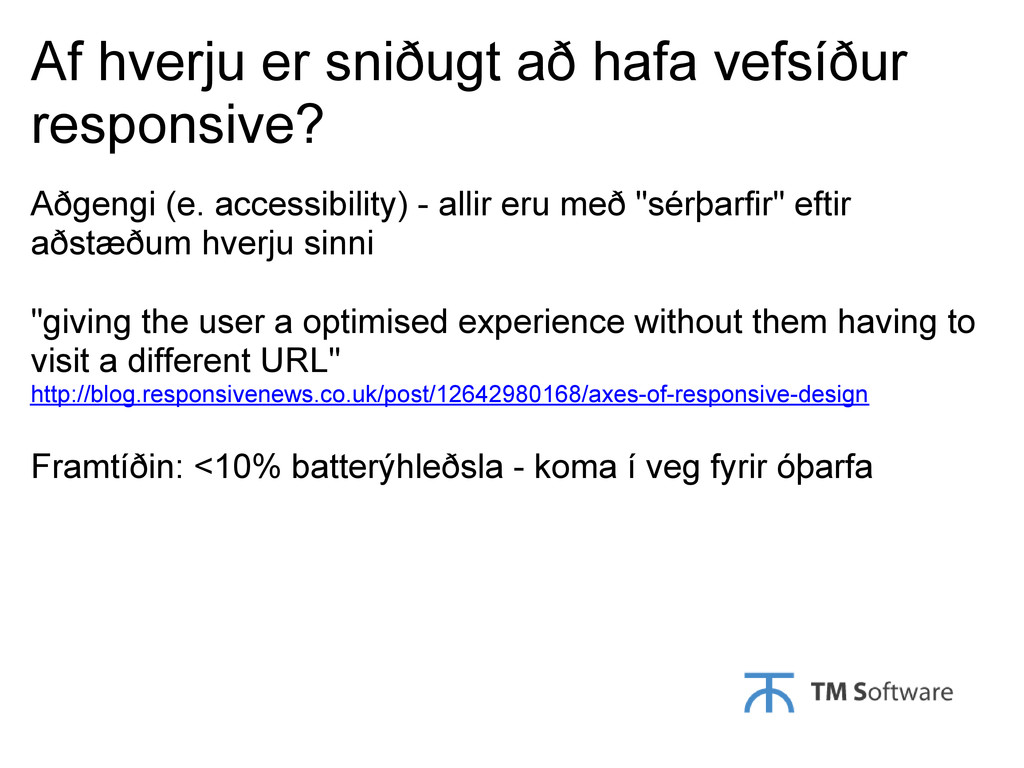
accessibility) - allir eru með "sérþarfir" eftir aðstæðum hverju sinni "giving the user a optimised experience without them having to visit a different URL" http://blog.responsivenews.co.uk/post/12642980168/axes-of-responsive-design Framtíðin: <10% batterýhleðsla - koma í veg fyrir óþarfa
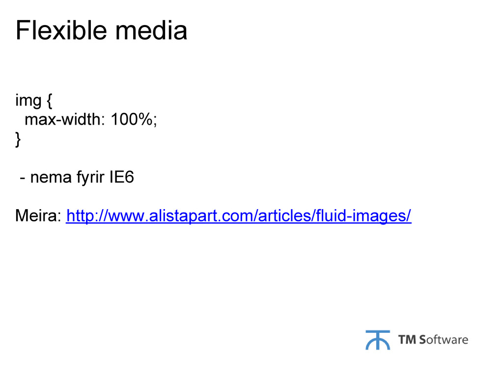
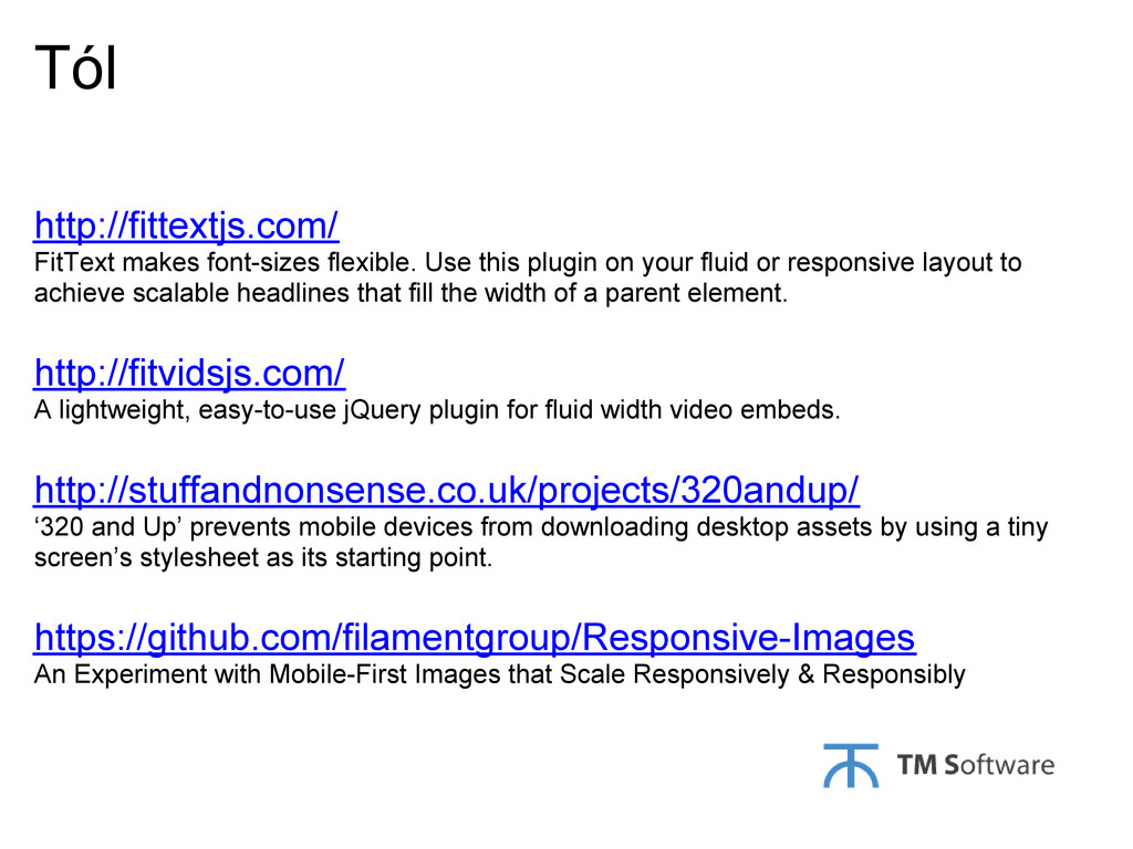
your fluid or responsive layout to achieve scalable headlines that fill the width of a parent element. http://fitvidsjs.com/ A lightweight, easy-to-use jQuery plugin for fluid width video embeds. http://stuffandnonsense.co.uk/projects/320andup/ ‘320 and Up’ prevents mobile devices from downloading desktop assets by using a tiny screen’s stylesheet as its starting point. https://github.com/filamentgroup/Responsive-Images An Experiment with Mobile-First Images that Scale Responsively & Responsibly
 ks91
ks91
 findy_eventslides
 k_adachi_01
 shihochan
 line_developers_tw
 ming_ayami
 sonic
sonic
 nobutomurata
 brainpadpr
 hiranabe
 ysd113
 moulongzhang
 codingconduct
 rkendrick25
 soysaucechin
 stuffmc
 lynnandtonic
 aki_iinuma
 tammyeverts
 bcantrill
 aleyda
 tapps
tapps
 chriscoyier
 brettharned