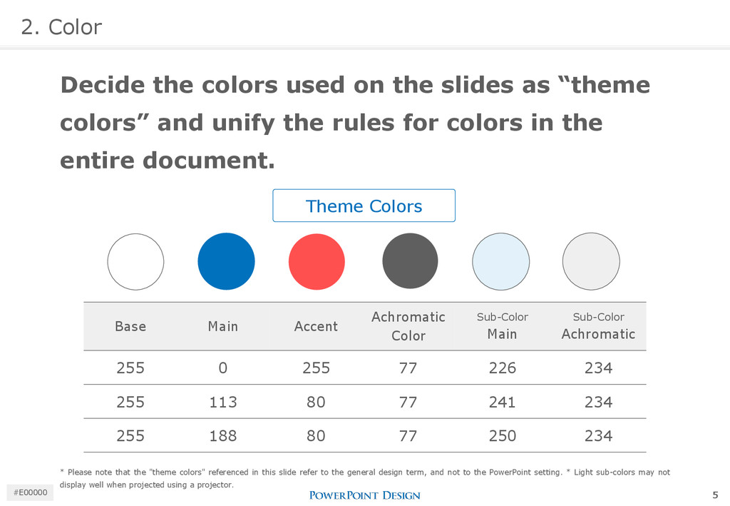
“theme colors” and unify the rules for colors in the entire document. Theme Colors Base Main Accent Achromatic Color Sub-Color Main Sub-Color Achromatic 255 0 255 77 226 234 255 113 80 77 241 234 255 188 80 77 250 234 * Please note that the "theme colors" referenced in this slide refer to the general design term, and not to the PowerPoint setting. * Light sub-colors may not display well when projected using a projector. 5 #E00000
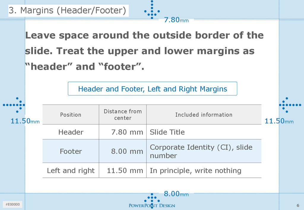
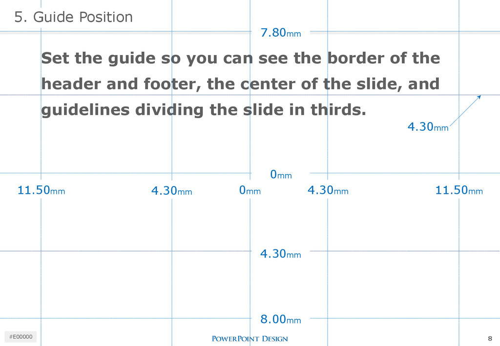
the outside border of the slide. Treat the upper and lower margins as “header” and “footer”. Header and Footer, Left and Right Margins Position Distance from center Included information Header 7.80 mm Slide Title Footer 8.00 mm Corporate Identity (CI), slide number Left and right 11.50 mm In principle, write nothing 6 #E00000
the header and footer, the center of the slide, and guidelines dividing the slide in thirds. 0mm 4.30mm 11.50mm 8.00mm 5. Guide Position 7.80mm 4.30mm 11.50mm 0mm 4.30mm 4.30mm 8 #E00000
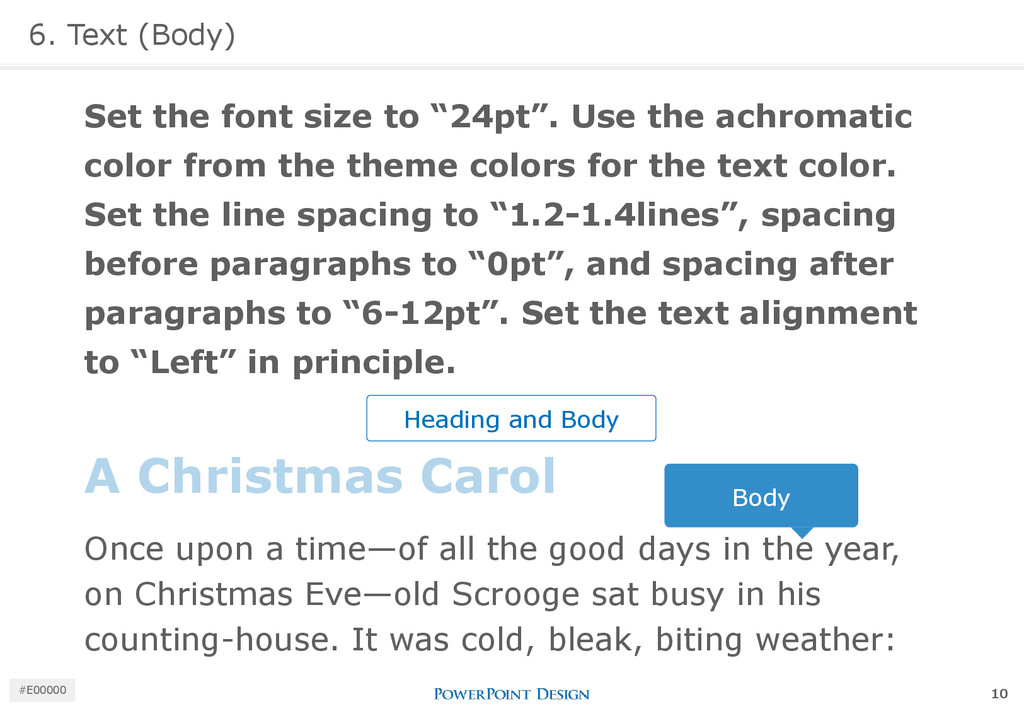
the achromatic color from the theme colors for the text color. Set the line spacing to “1.2-1.4lines”, spacing before paragraphs to “0pt”, and spacing after paragraphs to “6-12pt”. Set the text alignment to “Left” in principle. A Christmas Carol Once upon a time—of all the good days in the year, on Christmas Eve—old Scrooge sat busy in his counting-house. It was cold, bleak, biting weather: Body Heading and Body 10 #E00000
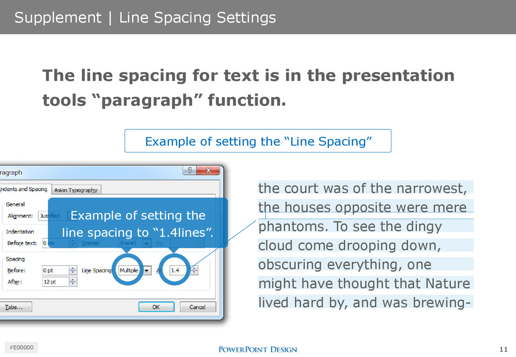
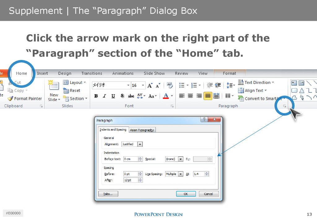
narrowest, the houses opposite were mere phantoms. To see the dingy cloud come drooping down, obscuring everything, one might have thought that Nature lived hard by, and was brewing- The line spacing for text is in the presentation tools “paragraph” function. Example of setting the line spacing to “1.4lines”. Example of setting the “Line Spacing” 11 #E00000
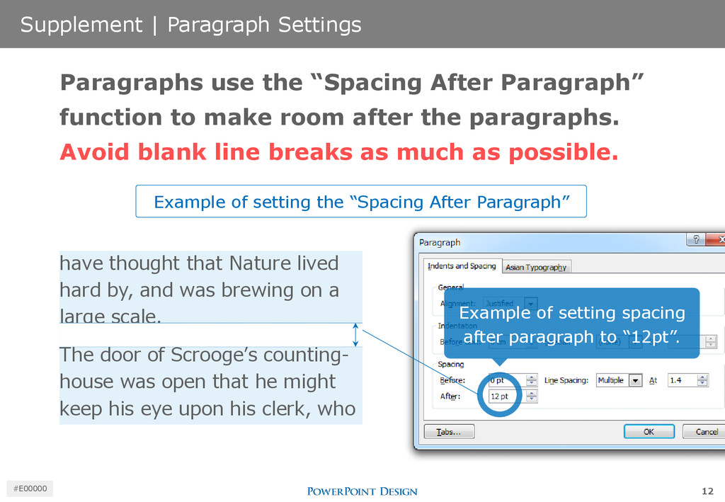
by, and was brewing on a large scale. The door of Scrooge’s counting- house was open that he might keep his eye upon his clerk, who Paragraphs use the “Spacing After Paragraph” function to make room after the paragraphs. Avoid blank line breaks as much as possible. Example of setting spacing after paragraph to “12pt”. Example of setting the “Spacing After Paragraph” 12 #E00000
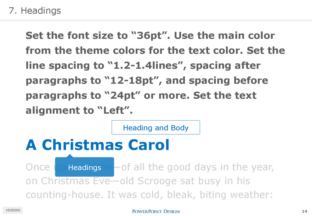
main color from the theme colors for the text color. Set the line spacing to “1.2-1.4lines”, spacing after paragraphs to “12-18pt”, and spacing before paragraphs to “24pt” or more. Set the text alignment to “Left”. Heading and Body A Christmas Carol Once upon a time—of all the good days in the year, on Christmas Eve—old Scrooge sat busy in his counting-house. It was cold, bleak, biting weather: Headings 14 #E00000
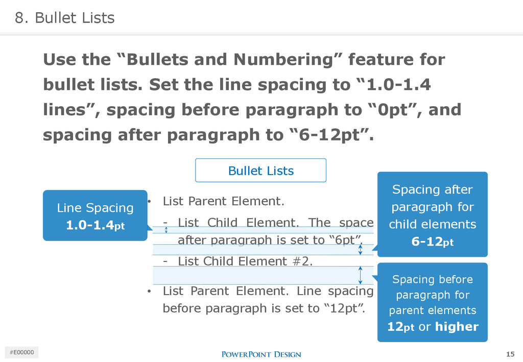
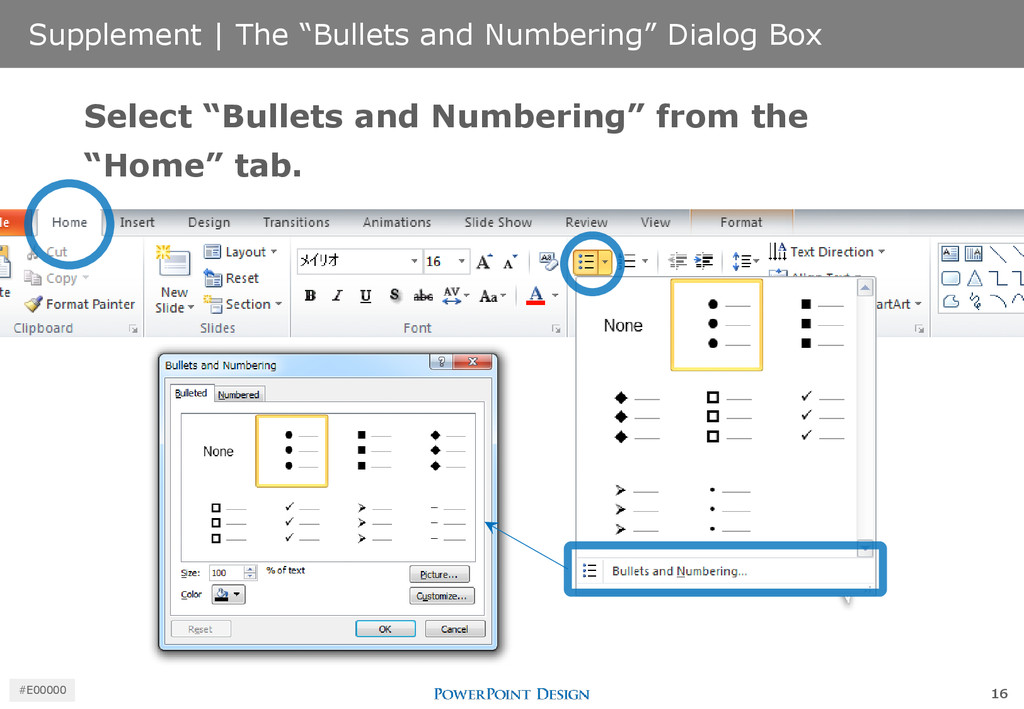
after paragraph is set to “6pt”. ⁃ List Child Element #2. • List Parent Element. Line spacing before paragraph is set to “12pt”. 8. Bullet Lists Use the “Bullets and Numbering” feature for bullet lists. Set the line spacing to “1.0-1.4 lines”, spacing before paragraph to “0pt”, and spacing after paragraph to “6-12pt”. Bullet Lists Line Spacing 1.0-1.4pt Spacing after paragraph for child elements 6-12pt Spacing before paragraph for parent elements 12pt or higher 15 #E00000
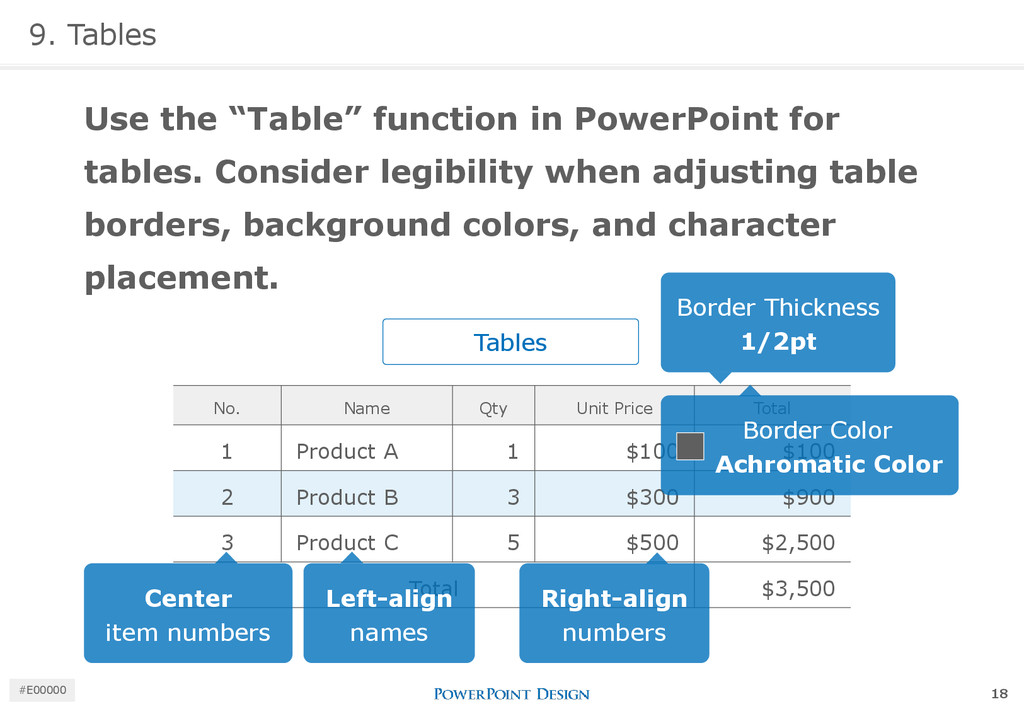
Consider legibility when adjusting table borders, background colors, and character placement. Tables No. Name Qty Unit Price Total 1 Product A 1 $100 $100 2 Product B 3 $300 $900 3 Product C 5 $500 $2,500 Total $3,500 Border Thickness 1/2pt Border Color Achromatic Color Center item numbers Left-align names Right-align numbers 18 #E00000
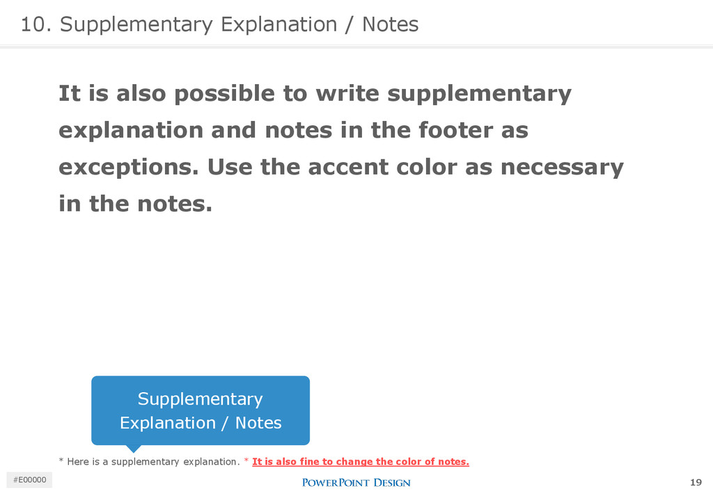
write supplementary explanation and notes in the footer as exceptions. Use the accent color as necessary in the notes. * Here is a supplementary explanation. * It is also fine to change the color of notes. Supplementary Explanation / Notes 19 #E00000
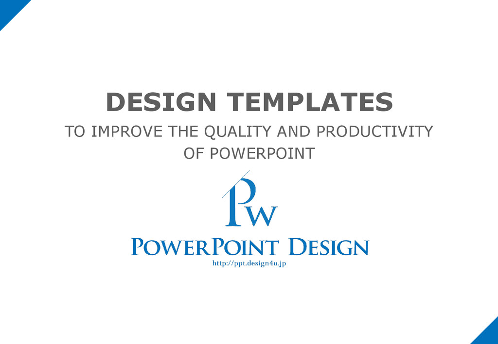
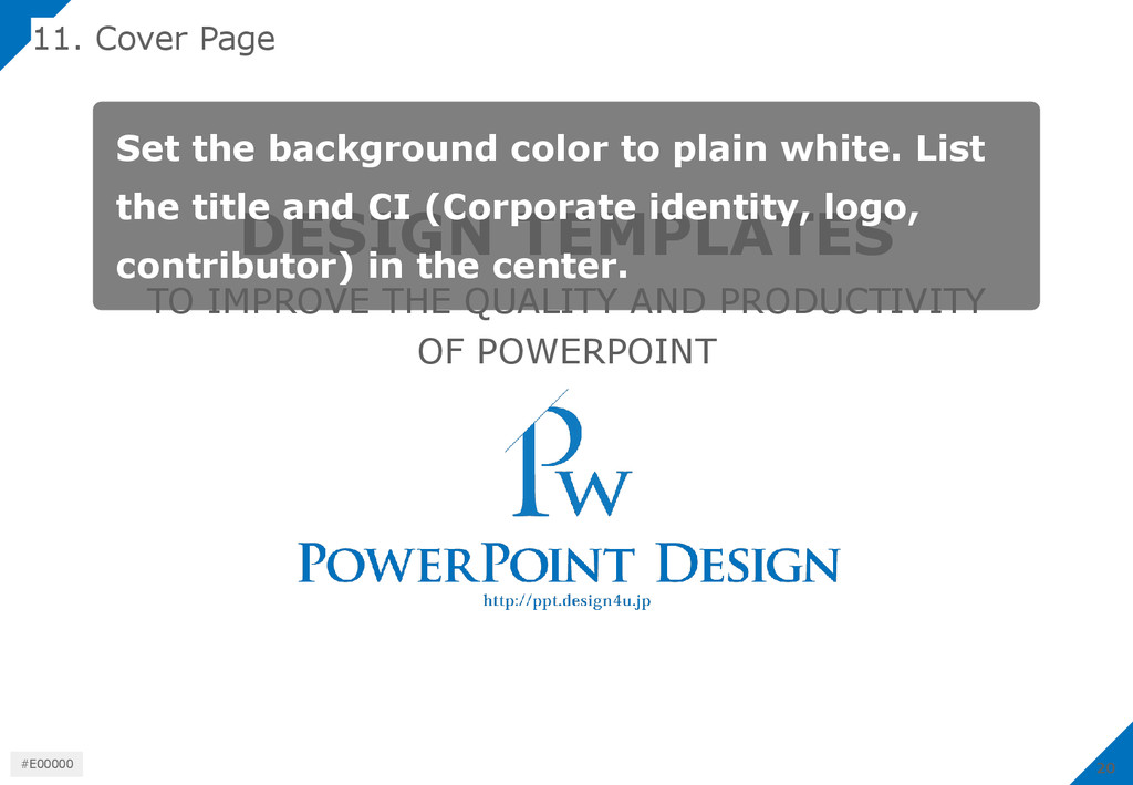
PRODUCTIVITY OF POWERPOINT Set the background color to plain white. List the title and CI (Corporate identity, logo, contributor) in the center. 20 #E00000
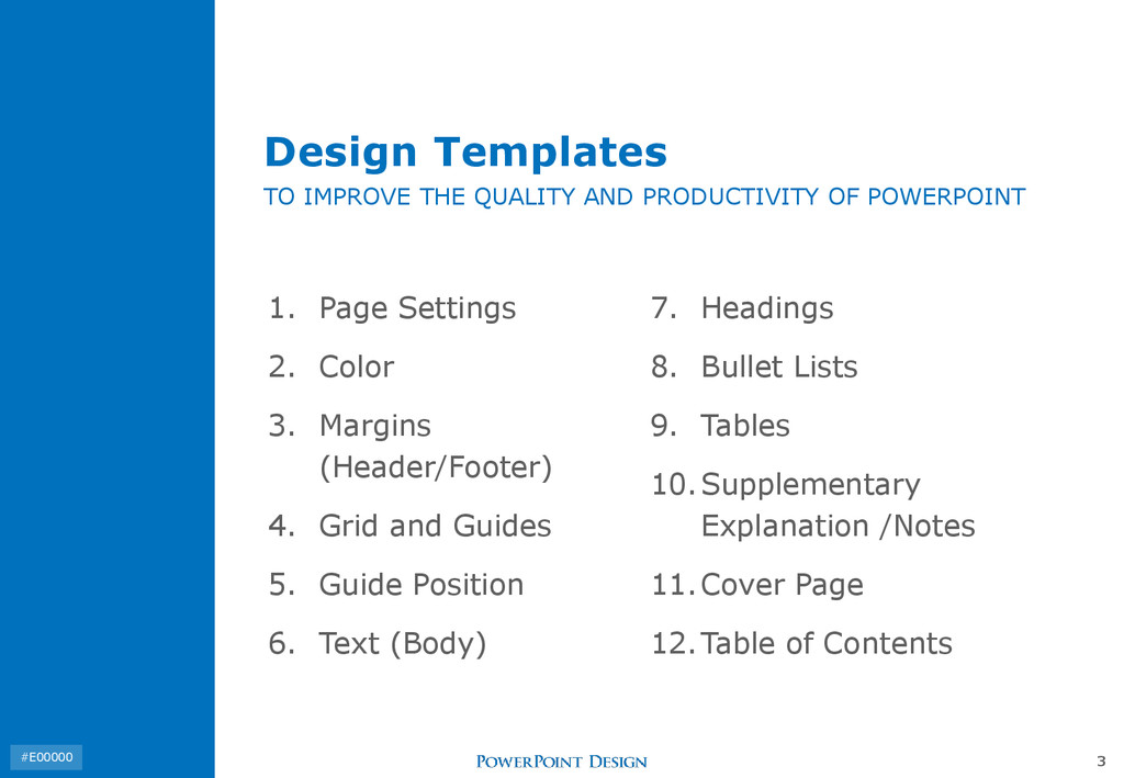
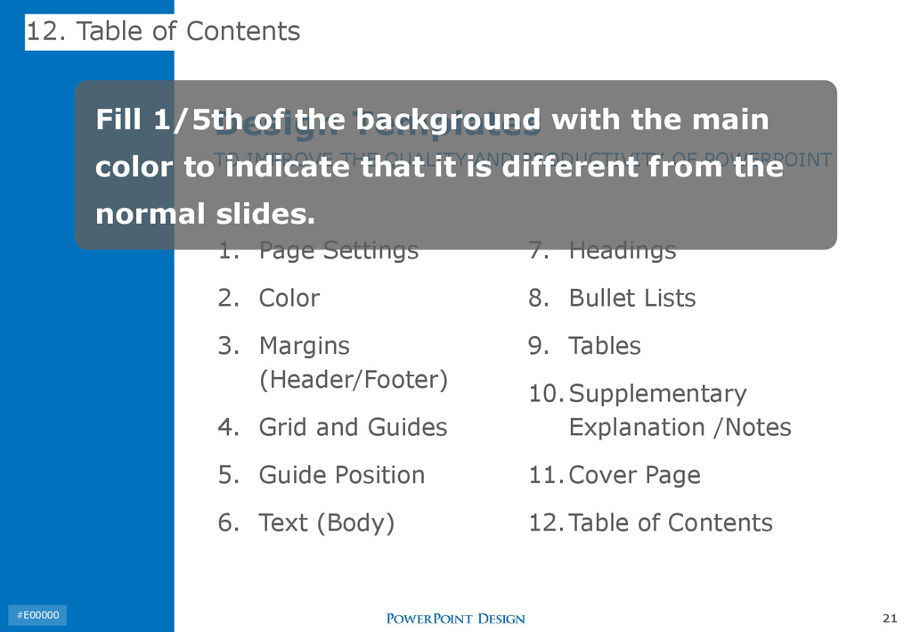
Margins (Header/Footer) 4. Grid and Guides 5. Guide Position 6. Text (Body) 7. Headings 8. Bullet Lists 9. Tables 10.Supplementary Explanation /Notes 11.Cover Page 12.Table of Contents Design Templates TO IMPROVE THE QUALITY AND PRODUCTIVITY OF POWERPOINT Fill 1/5th of the background with the main color to indicate that it is different from the normal slides. 21 #E00000
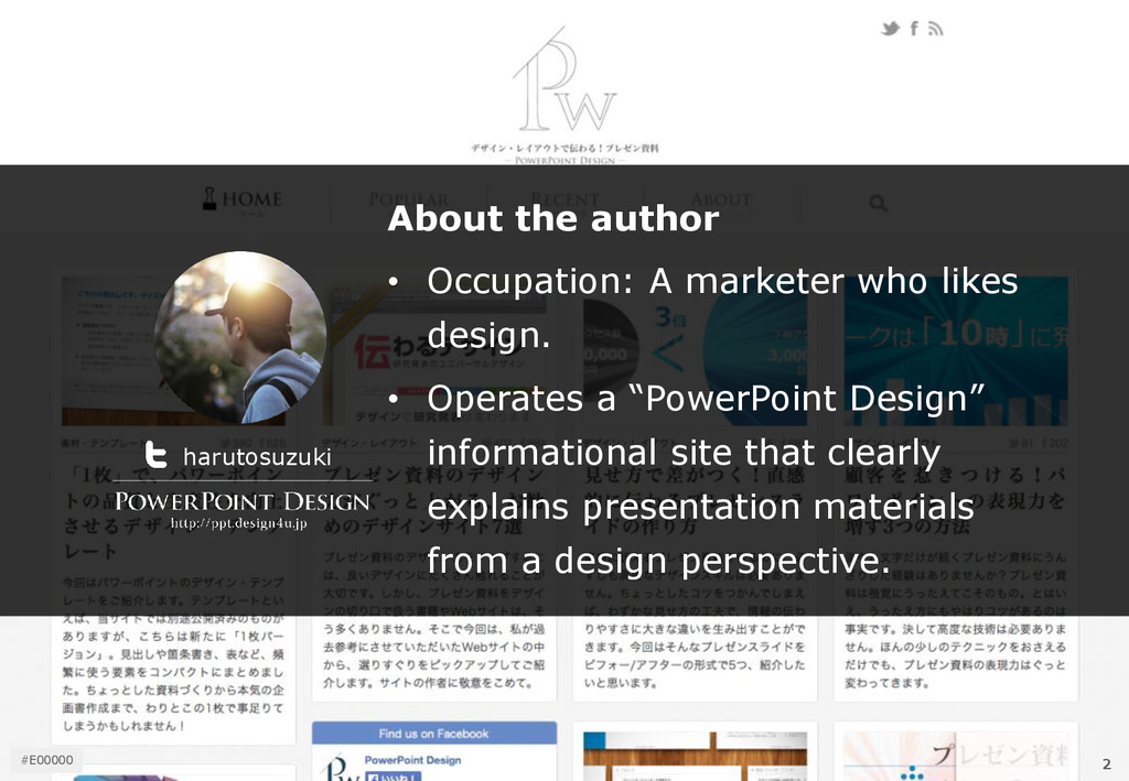
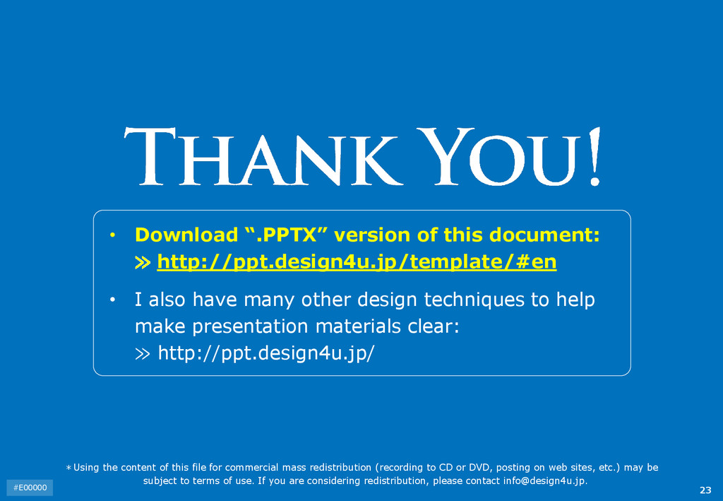
I also have many other design techniques to help make presentation materials clear: ≫ http://ppt.design4u.jp/ *Using the content of this file for commercial mass redistribution (recording to CD or DVD, posting on web sites, etc.) may be subject to terms of use. If you are considering redistribution, please contact [email protected]. 23 #E00000