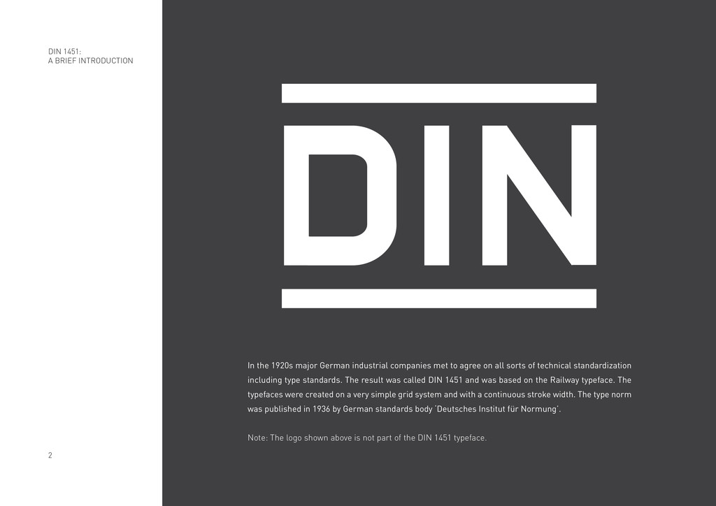
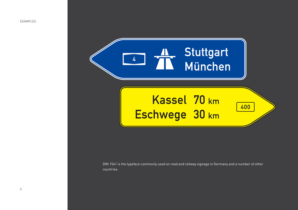
agree on all sorts of technical standardization including type standards. The result was called DIN 1451 and was based on the Railway typeface. The typefaces were created on a very simple grid system and with a continuous stroke width. The type norm was published in 1936 by German standards body ‘Deutsches Institut für Normung’. Note: The logo shown above is not part of the DIN 1451 typeface. DIN 1451: A BRIEF INTRODUCTION
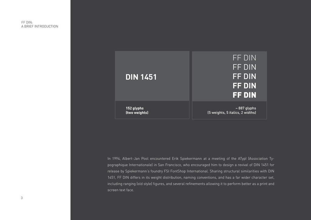
meeting of the ATypI (Association Ty- pographique Internationale) in San Francisco, who encouraged him to design a revival of DIN 1451 for release by Spiekermann’s foundry FSI FontShop International. Sharing structural similarities with DIN 1451, FF DIN differs in its weight distribution, naming conventions, and has a far wider character set, including ranging (old style) figures, and several refinements allowing it to perform better as a print and screen text face. FF DIN: A BRIEF INTRODUCTION FF DIN FF DIN FF DIN FF DIN FF DIN ~ 887 glyphs (5 weights, 5 italics, 2 widths) DIN 1451 152 glyphs (two weights)
J K L M N O P Q R S T U V W X Y Z a b c d e f g h i j k l m n o p q r s t u v w x y z 1 2 3 4 5 6 7 8 9 A B C D E F G H I J K L M N O P Q R S T U V W X Y Z a b c d e f g h i j k l m n o p q r s t u v w x y z 1 2 3 4 5 6 7 8 9 A B C D E F G H I J K L M N O P Q R S T U V W X Y Z a b c d e f g h i j k l m n o p q r s t u v w x y z 1 2 3 4 5 6 7 8 9 A B C D E F G H I J K L M N O P Q R S T U V W X Y Z a b c d e f g h i j k l m n o p q r s t u v w x y z 1 2 3 4 5 6 7 8 9 A B C D E F G H I J K L M N O P Q R S T U V W X Y Z a b c d e f g h i j k l m n o p q r s t u v w x y z 1 2 3 4 5 6 7 8 9 light regular medium bold black TYPEFACE: WEIGHTS
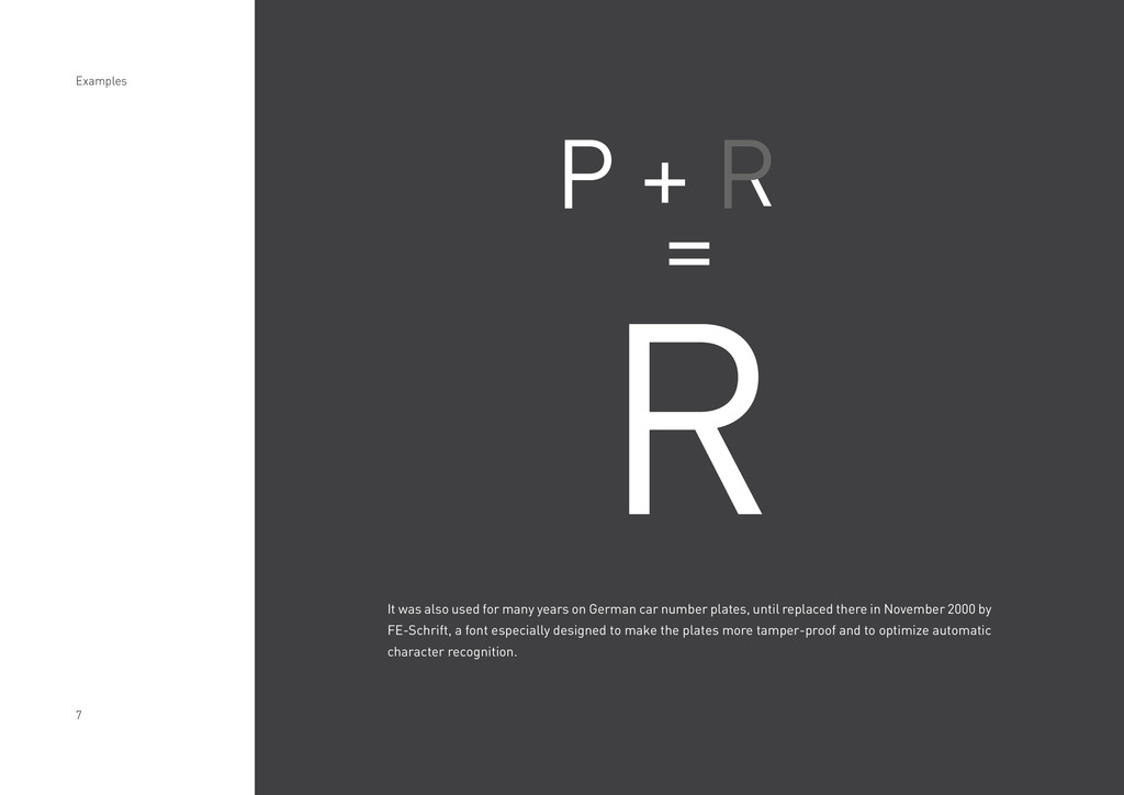
car number plates, until replaced there in November 2000 by FE-Schrift, a font especially designed to make the plates more tamper-proof and to optimize automatic character recognition. P + P = R Examples