notifications, right? Emphasizing! preferred action. The button style also mimics! what I’ve encountered in the ! first two screens to ‘continue’. ! To avoid dissonance, I’m ! inclined to select this button! and allow notifications.
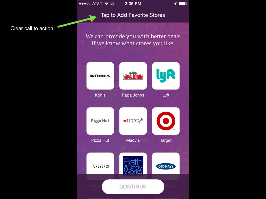
also provides a ! great introduction to ! the diversity of ! companies! that RetailMeNot! partners with! I do wonder how! RetailMeNot decided ! to order these companies! on the grid.
is this not! the real Pizza Hut logo? This also provides a ! great introduction to ! the diversity of ! companies! that RetailMeNot! partners with! I do wonder how! RetailMeNot decided ! to order these companies! on the grid.
preferred sign up.! I chose to put in a false email! to see what would happen! ([email protected]). There! was no error message and I! was passed on to the next! screen. Seems like they’re ! trying to sneak this ! part in.! I’m not sure I like ! newsletters!
no call to! action once I had signed up.! Tips like “check your! email” or confirm address” ! could have been helpful. Clearly promoting ! preferred sign up.! I chose to put in a false email! to see what would happen! ([email protected]). There! was no error message and I! was passed on to the next! screen. Seems like they’re ! trying to sneak this ! part in.! I’m not sure I like ! newsletters!
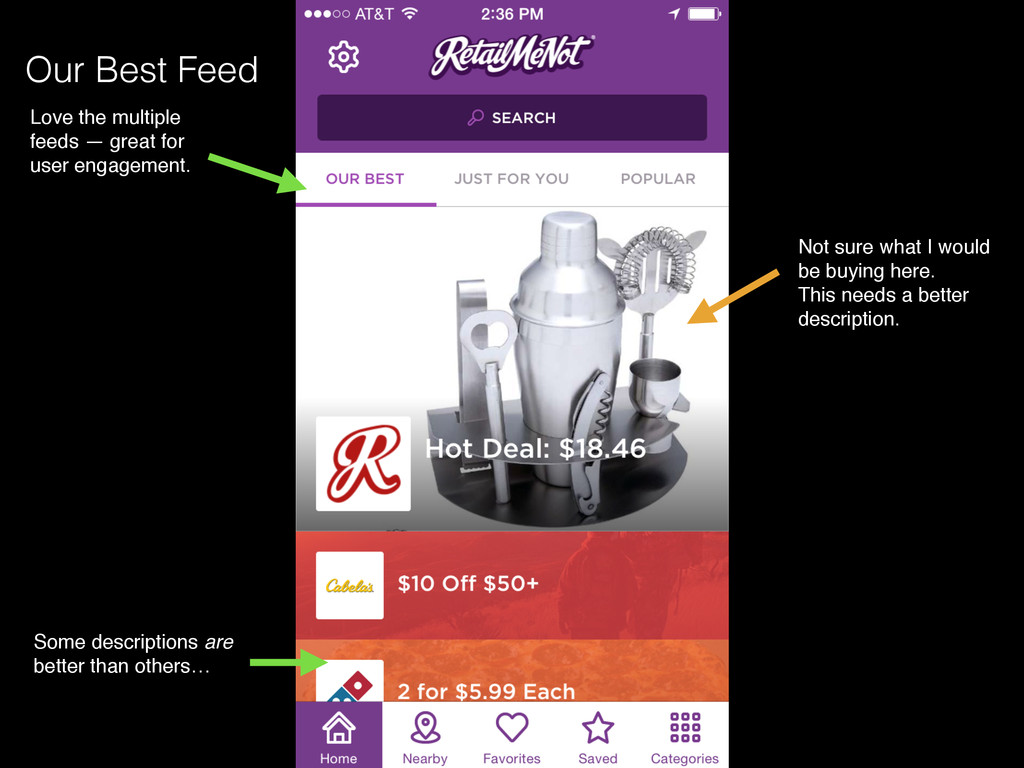
engagement. Some descriptions are ! better than others… Cool scrolling interaction. ! Nice that I’m ! able to preview other ! deals as I scroll.! Our Best Feed Not sure what I would! be buying here.! This needs a better! description.
! deeper for details Important to have ! a way for users ! to bail out if they! don’t want to activate! Nearby. Good way of not forcing! me to make a decision! immediately. Good copy. Reminder! of how feature! can help me.
me. Preferred action! nicely highlighted Allows user to dive ! deeper for details Important to have ! a way for users ! to bail out if they! don’t want to activate! Nearby. Interesting use of teal ! as a secondary color! here. ! Aren’t RetailMeNot’s ! colors purple and red? Good way of not forcing! me to make a decision! immediately.
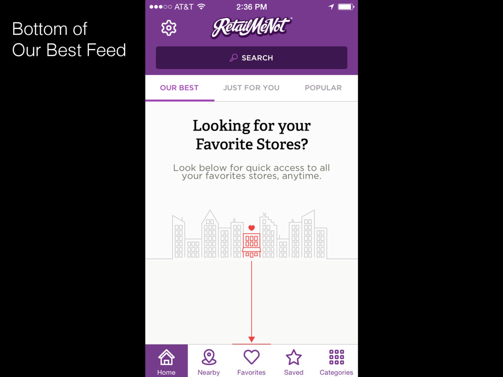
like the grid graphic but am ! a little confused.! This section is not organized! in the grid system depicted in! the graphic. Overall, nice layout! with easy scrolling


 jtakeda
 mhrtech
 yazm
 kakehashi
 tokuty
 techtekt
 maimyyym
 onk
 endonanana
 bitkey
 greenmidori
 iktakahiro
 aleyda
 reverentgeek
 axbom
 inesmontani
 sabderemane
 sachag
 apolaine
 zakiyama
 eileencodes
 uxyall