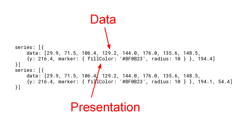
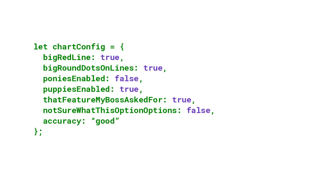
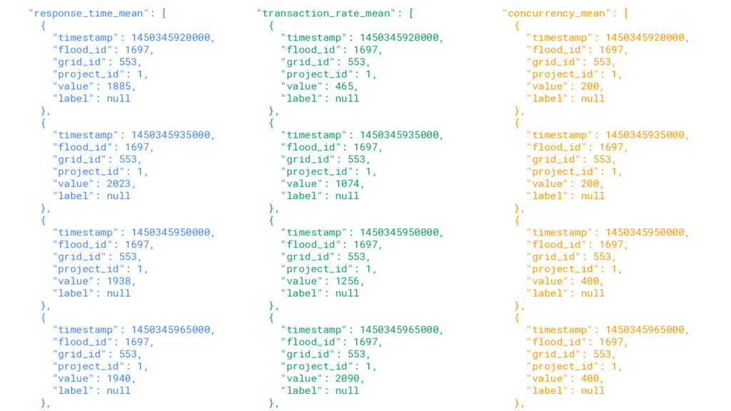
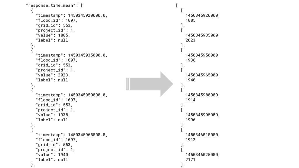
1, "value": 200, "label": null }, { "timestamp": 1450345935000, "flood_id": 1697, "grid_id": 553, "project_id": 1, "value": 200, "label": null }, { "timestamp": 1450345950000, "flood_id": 1697, "grid_id": 553, "project_id": 1, "value": 400, "label": null }, { "timestamp": 1450345965000, "flood_id": 1697, "grid_id": 553, "project_id": 1, "value": 400, "label": null }, "response_time_mean": [ { "timestamp": 1450345920000, "flood_id": 1697, "grid_id": 553, "project_id": 1, "value": 1885, "label": null }, { "timestamp": 1450345935000, "flood_id": 1697, "grid_id": 553, "project_id": 1, "value": 2023, "label": null }, { "timestamp": 1450345950000, "flood_id": 1697, "grid_id": 553, "project_id": 1, "value": 1938, "label": null }, { "timestamp": 1450345965000, "flood_id": 1697, "grid_id": 553, "project_id": 1, "value": 1940, "label": null }, "transaction_rate_mean": [ { "timestamp": 1450345920000, "flood_id": 1697, "grid_id": 553, "project_id": 1, "value": 465, "label": null }, { "timestamp": 1450345935000, "flood_id": 1697, "grid_id": 553, "project_id": 1, "value": 1074, "label": null }, { "timestamp": 1450345950000, "flood_id": 1697, "grid_id": 553, "project_id": 1, "value": 1256, "label": null }, { "timestamp": 1450345965000, "flood_id": 1697, "grid_id": 553, "project_id": 1, "value": 2090, "label": null },
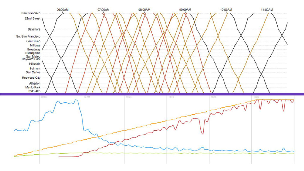
![var stations = []; // lazily loaded var formatTime =](https://files.speakerdeck.com/presentations/1721fa13ca594936a2301390b1c1ded4/slide_28.jpg)
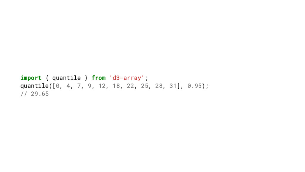
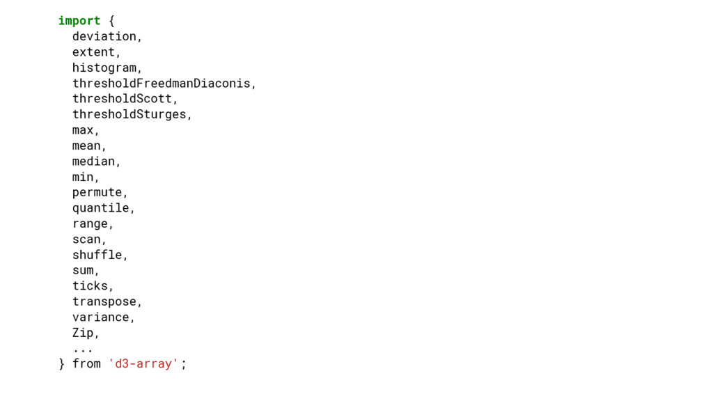
![1500 54 SCALE Input domain=[1200,4000] Output domain=[0,500]](https://files.speakerdeck.com/presentations/1721fa13ca594936a2301390b1c1ded4/slide_63.jpg)
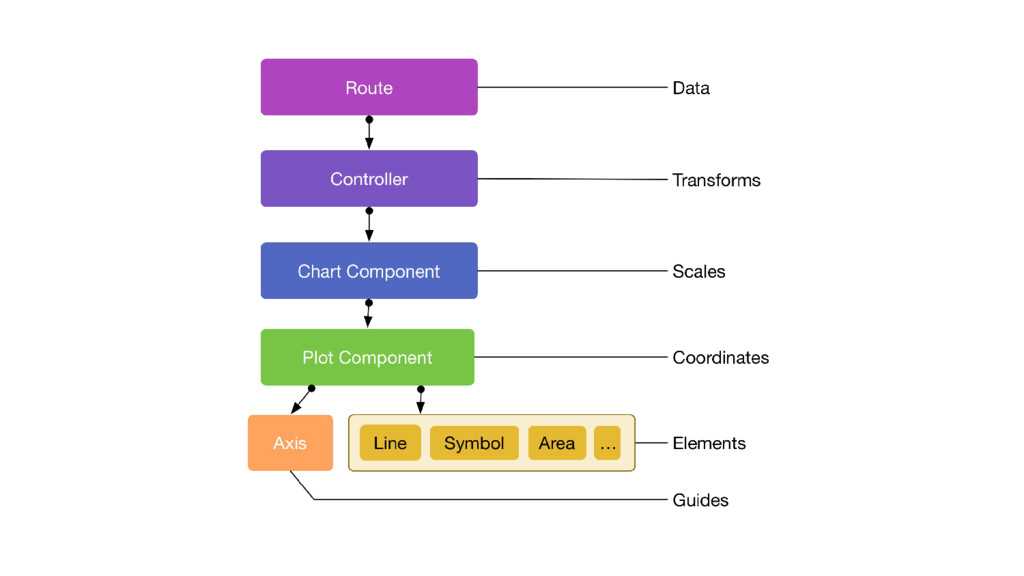
![export default Component.extend(Coordinates, { values: [], xValues: computed.map('values.[]', (d) =>](https://files.speakerdeck.com/presentations/1721fa13ca594936a2301390b1c1ded4/slide_66.jpg)
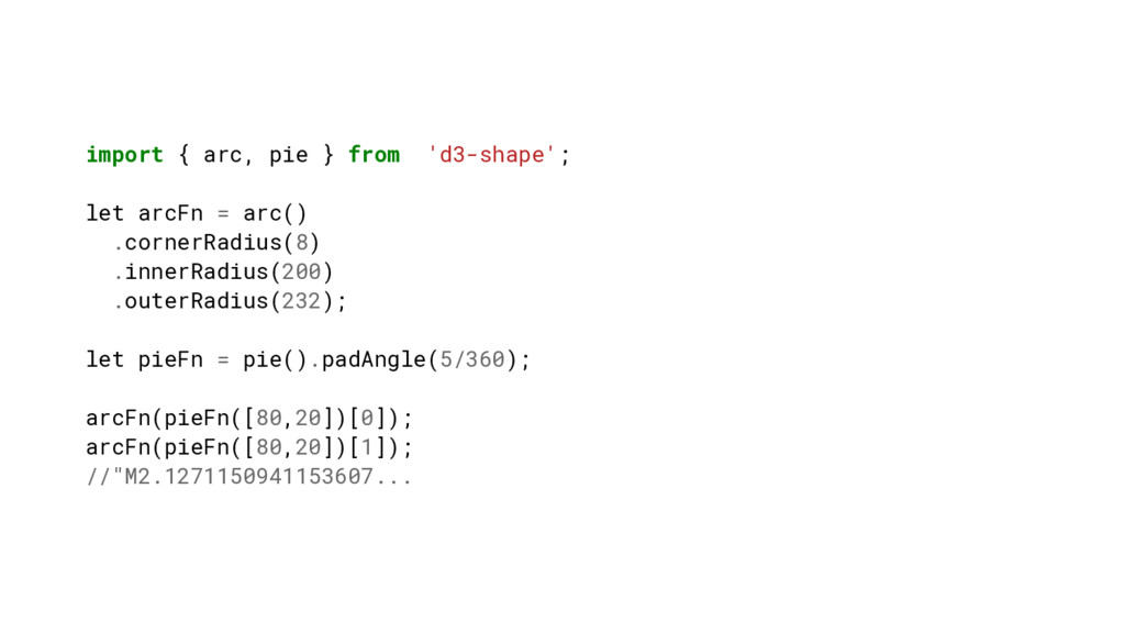
![d3-shape features implemented: - [x] Lines (plaid-line) - [x] Symbols](https://files.speakerdeck.com/presentations/1721fa13ca594936a2301390b1c1ded4/slide_78.jpg)