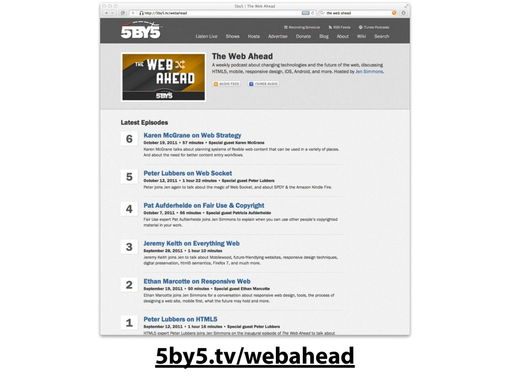
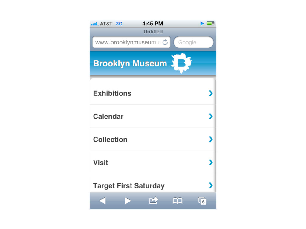
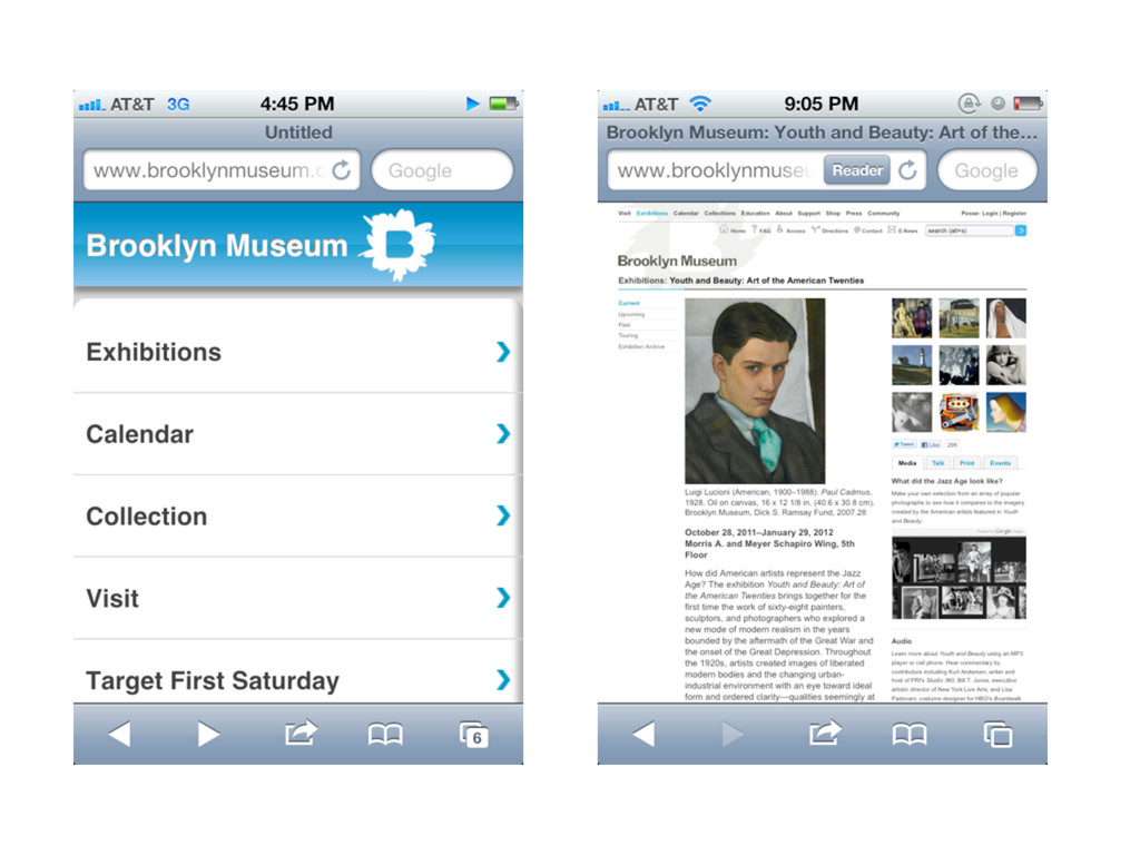
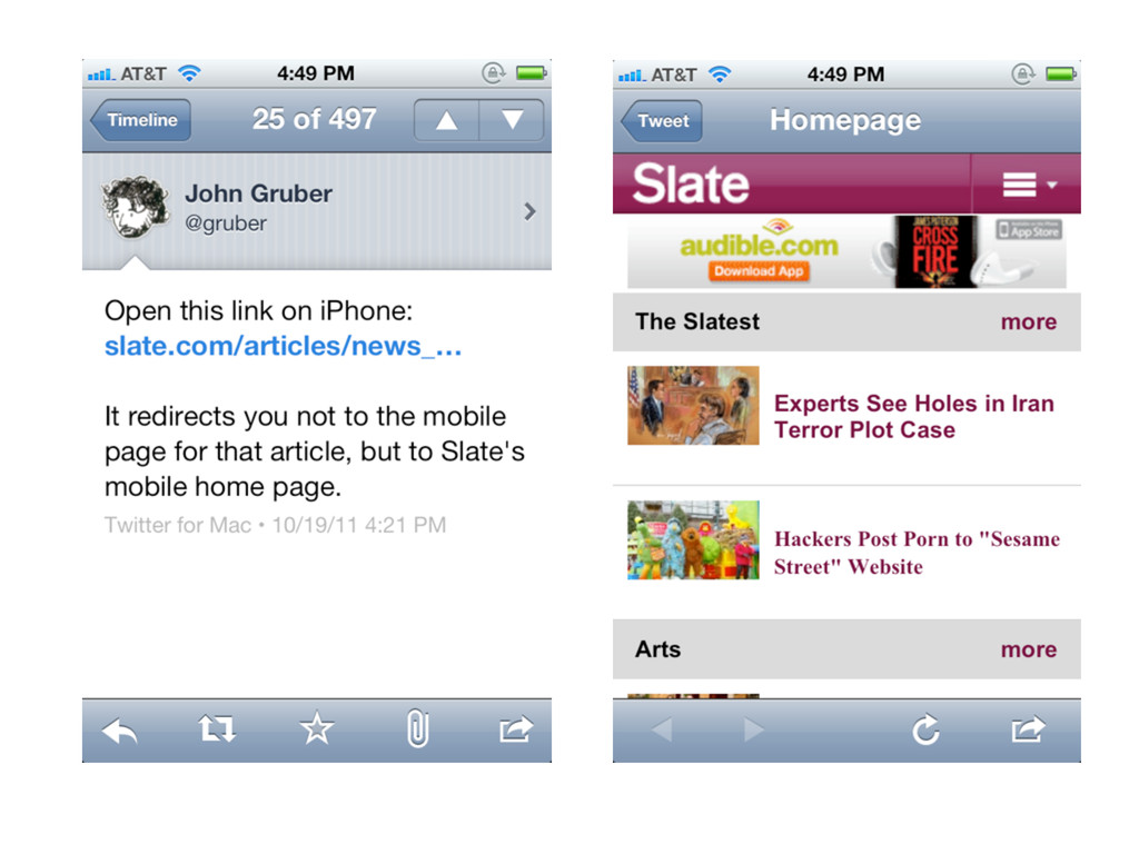
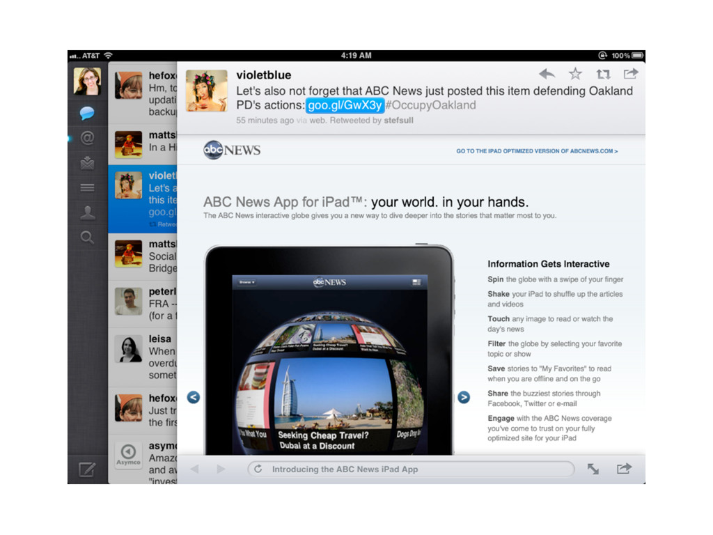
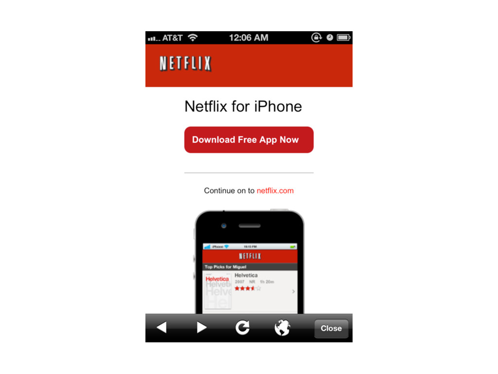
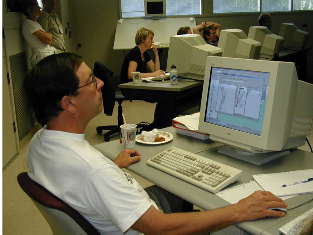
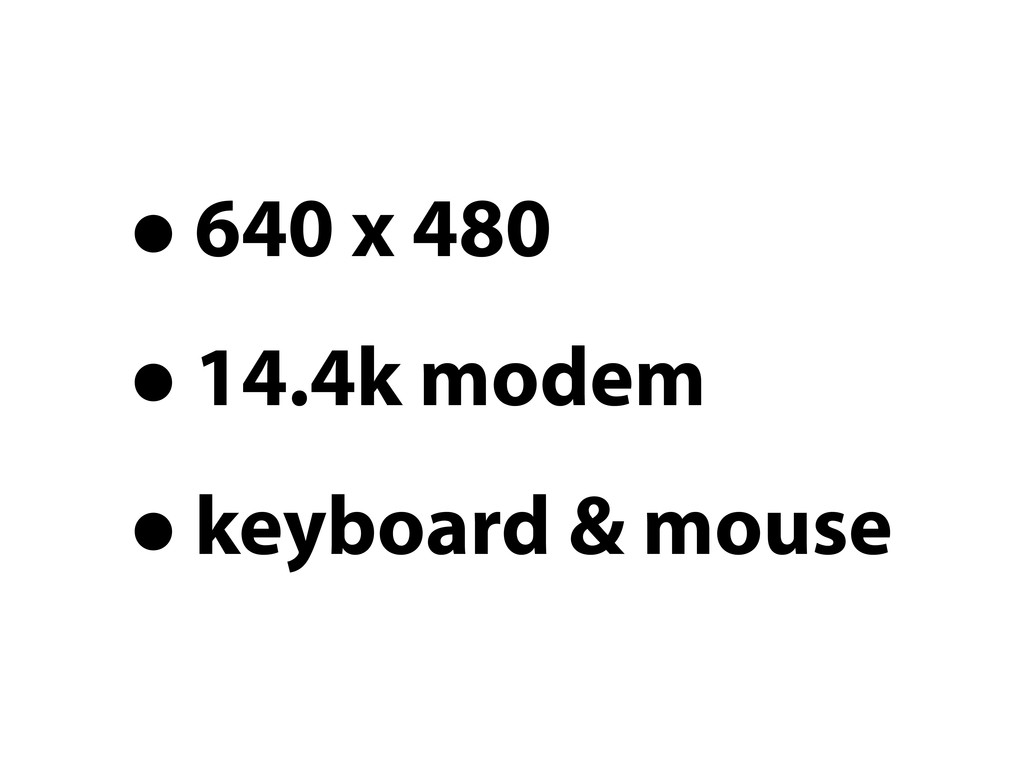
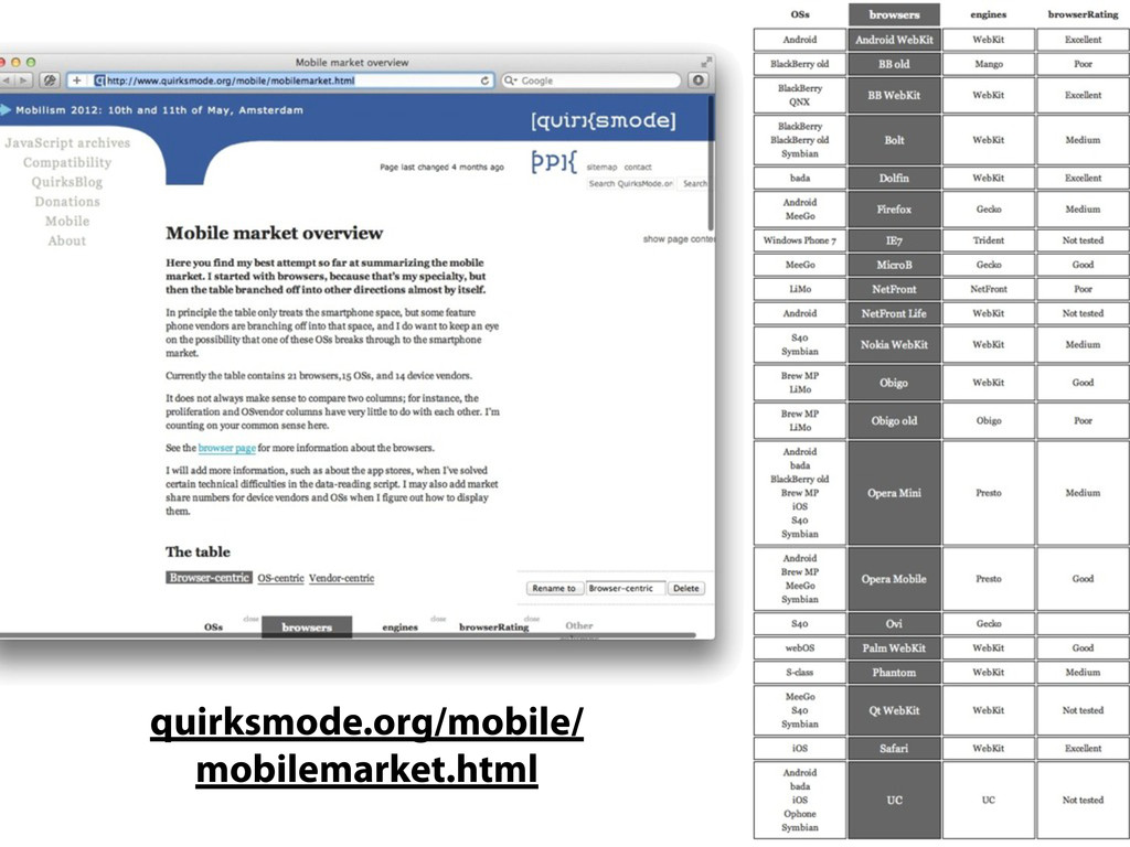
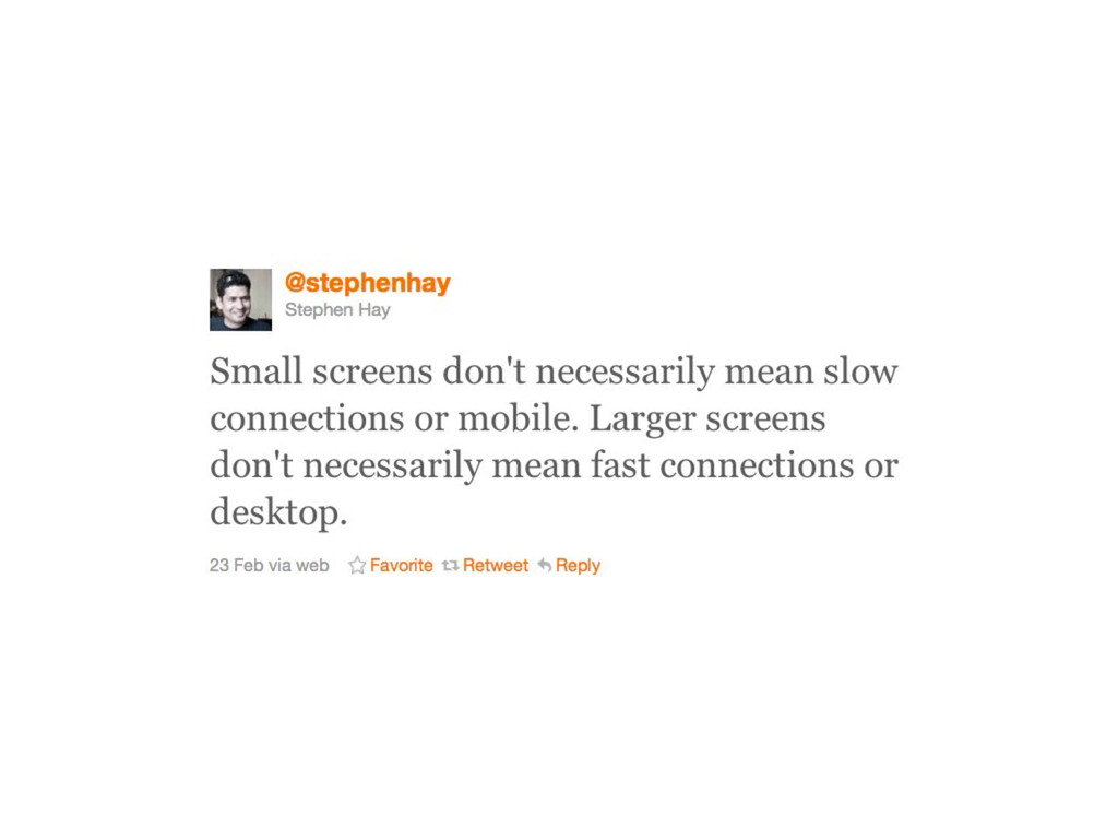
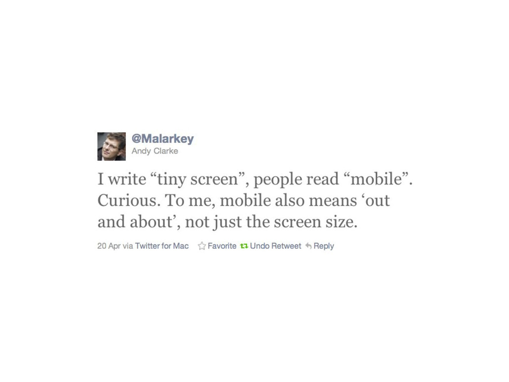
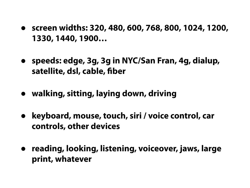
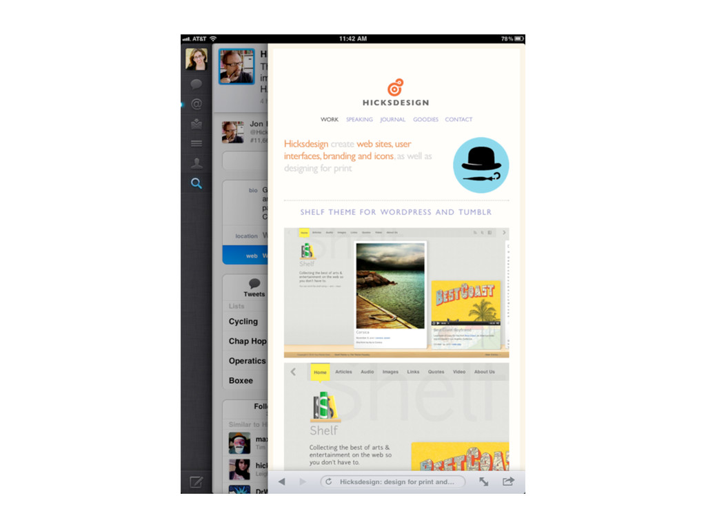
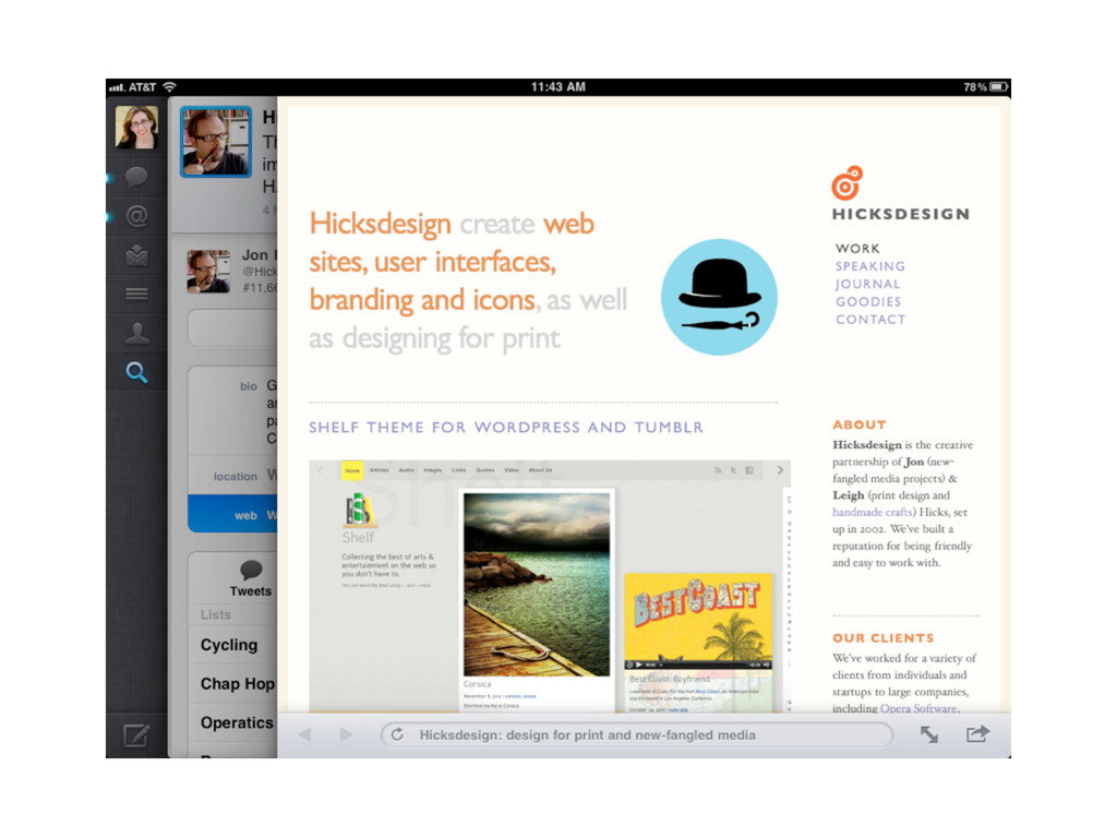
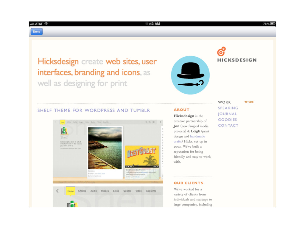
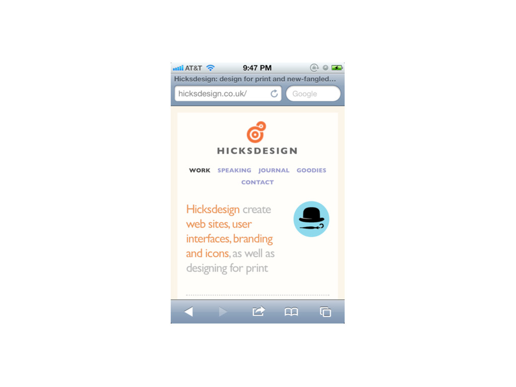
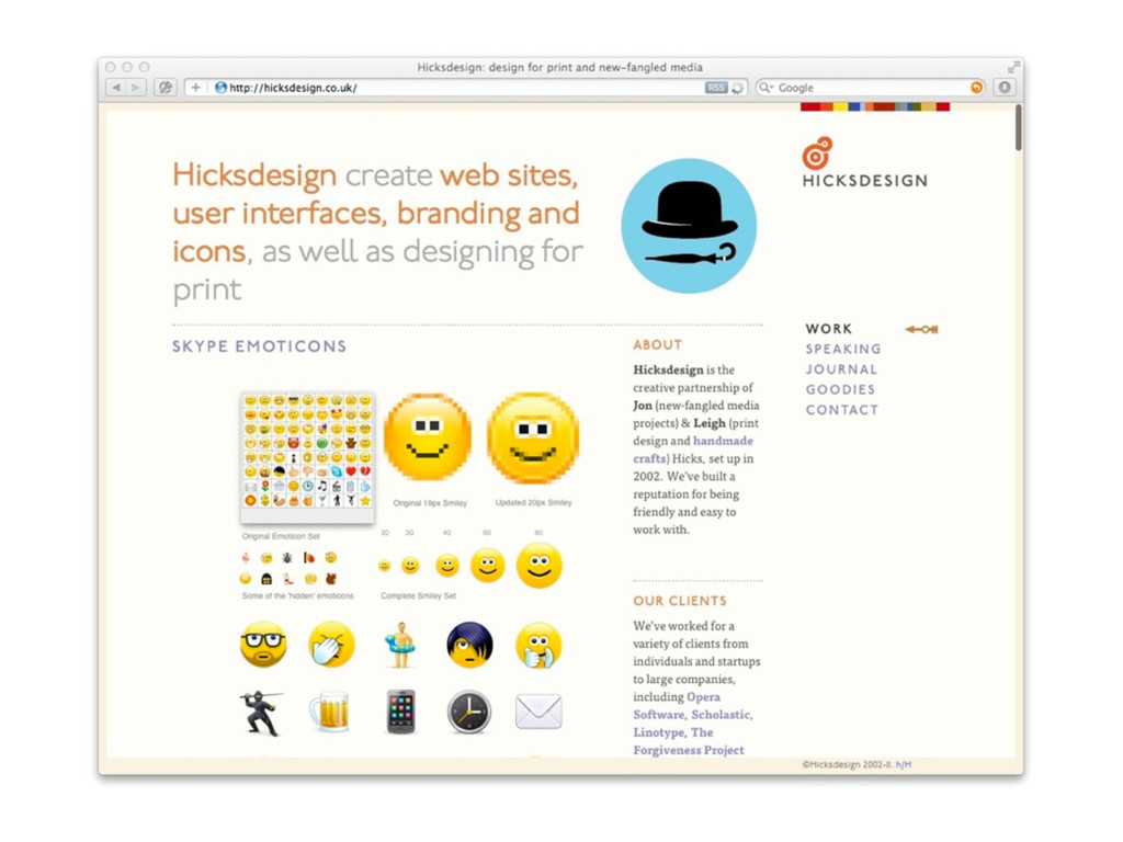
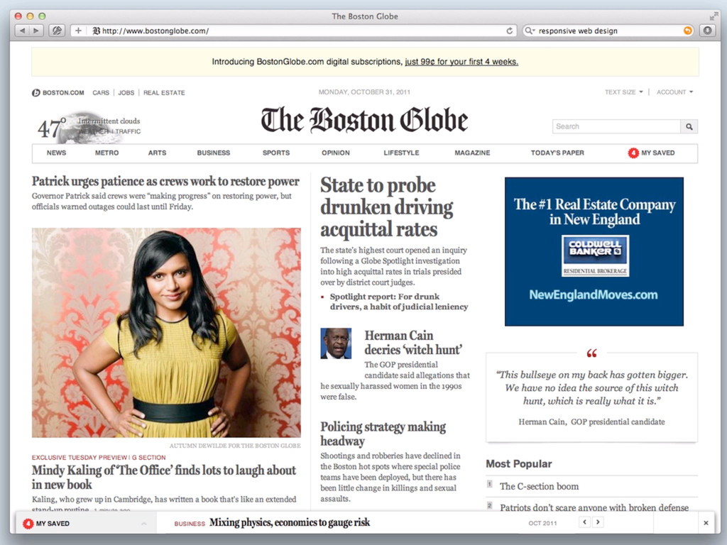
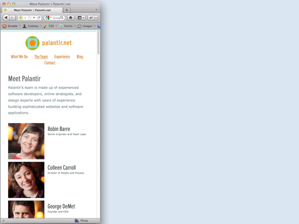
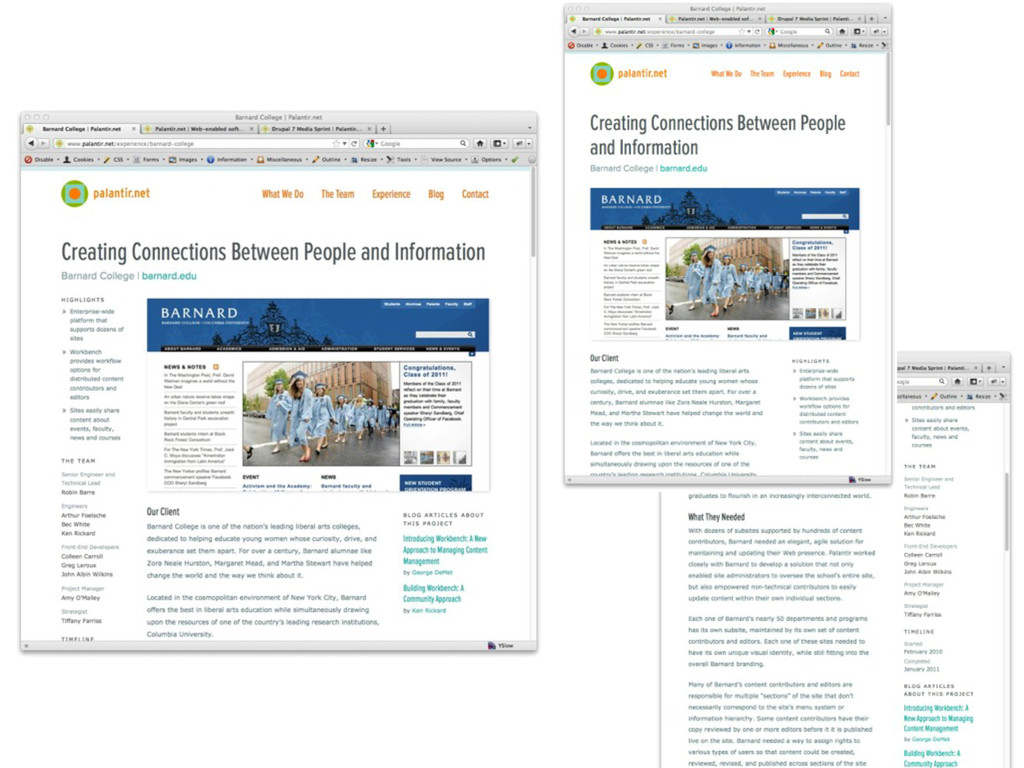
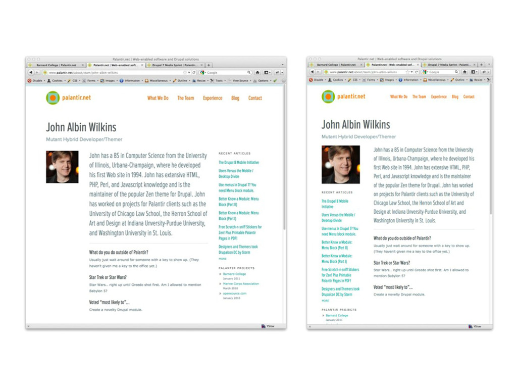
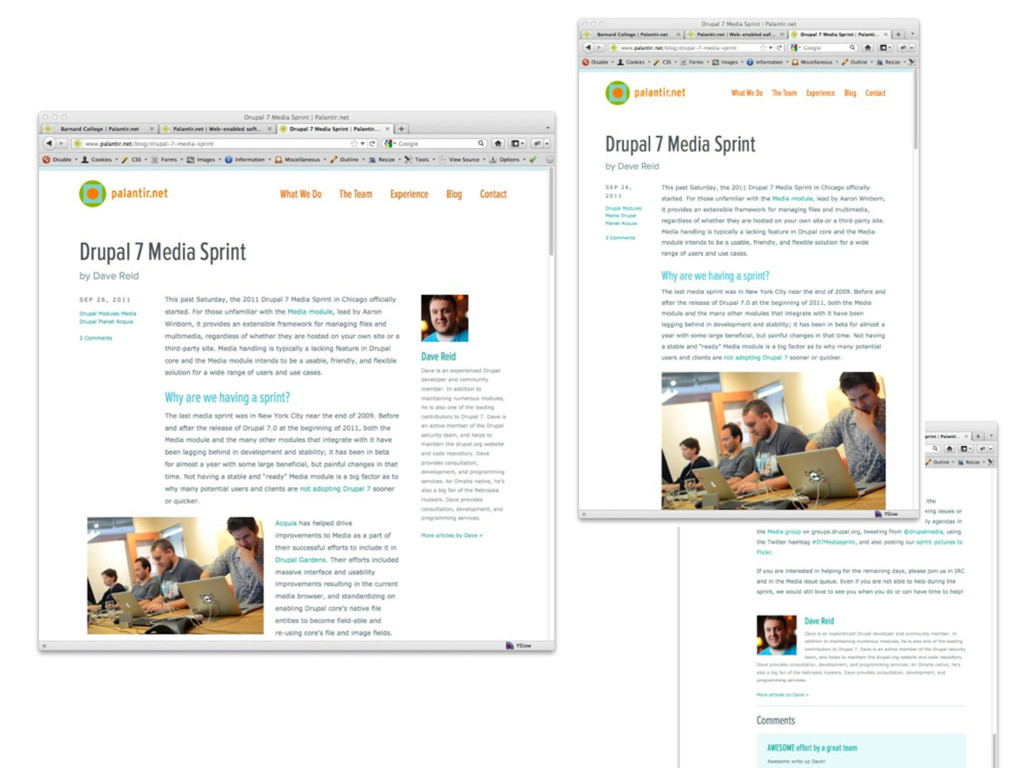
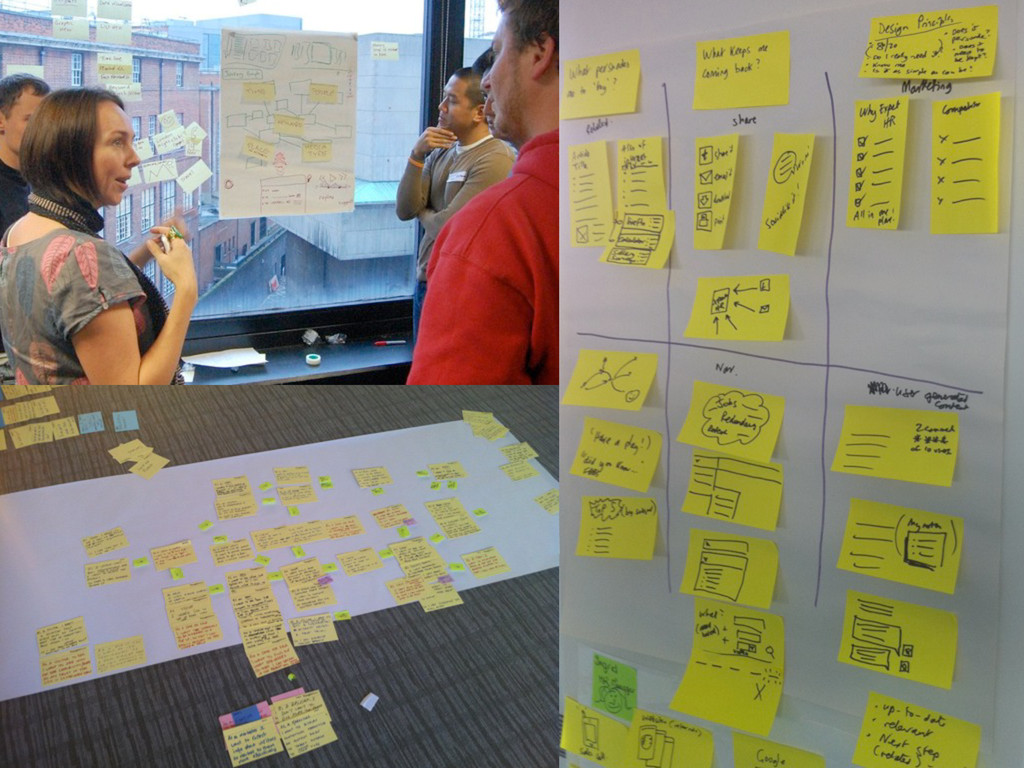
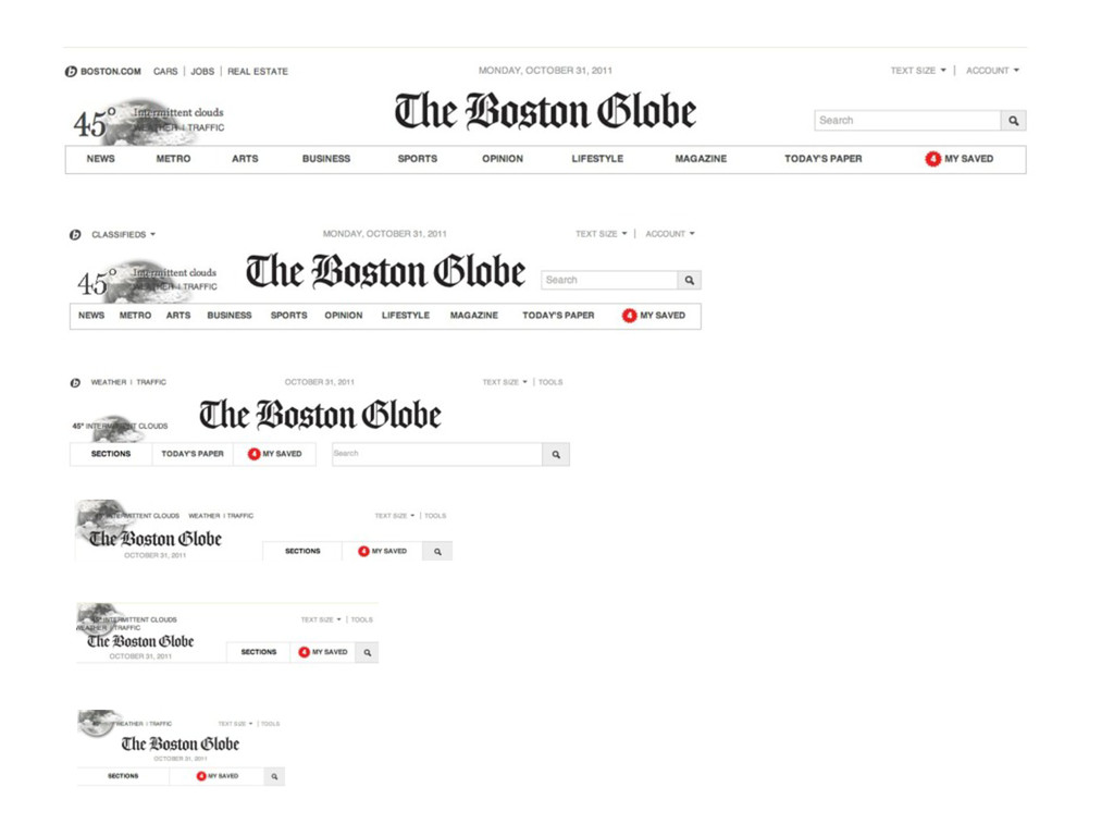
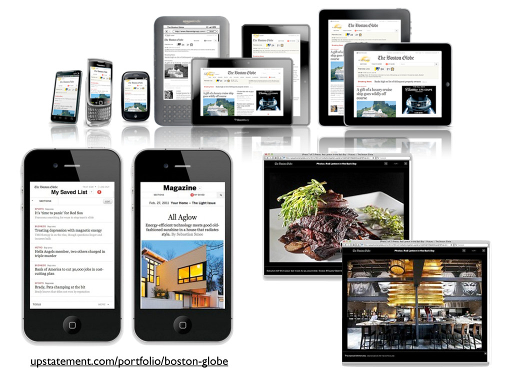
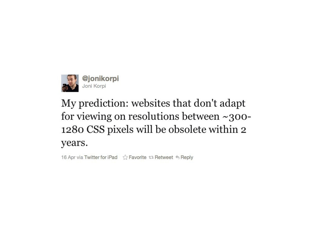
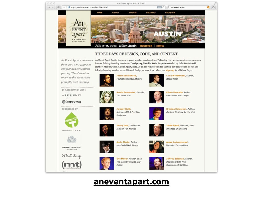
Mobile is all the rage these days — and it should be. Many website owners believe creating a separate mobile website is the solution, with browser sniffing to redirect all "mobile" traffic to a separate m.example.com domain. But it turns out that most of the time this is a terrible solution. Come hear Jen Simmons talk about how there's only one web — not a mobile web separate from the desktop web. And learn how you can use HTML5 and responsive web design to create one unified website or web app for your project and Just Have It Work™ on a wide range of devices.
Presented at the HTML5 Live Conference in New York CIty in November 2011.
 jensimmons
 kakehashi
 srenext
 oikon48
 genda
genda
 ming_ayami
 ardbeg1958
 pict3
pict3
 yurufuwahealer
 kekke_n
 nari_ex
 sansantech
 yanzm
yanzm
 addyosmani
 palkan
 chikuwait
 ryanjones
 aleyda
 michaelherold
 uxyall
 baasie
 codingconduct
 mongodb
 chriscoyier
 katarinadahlin