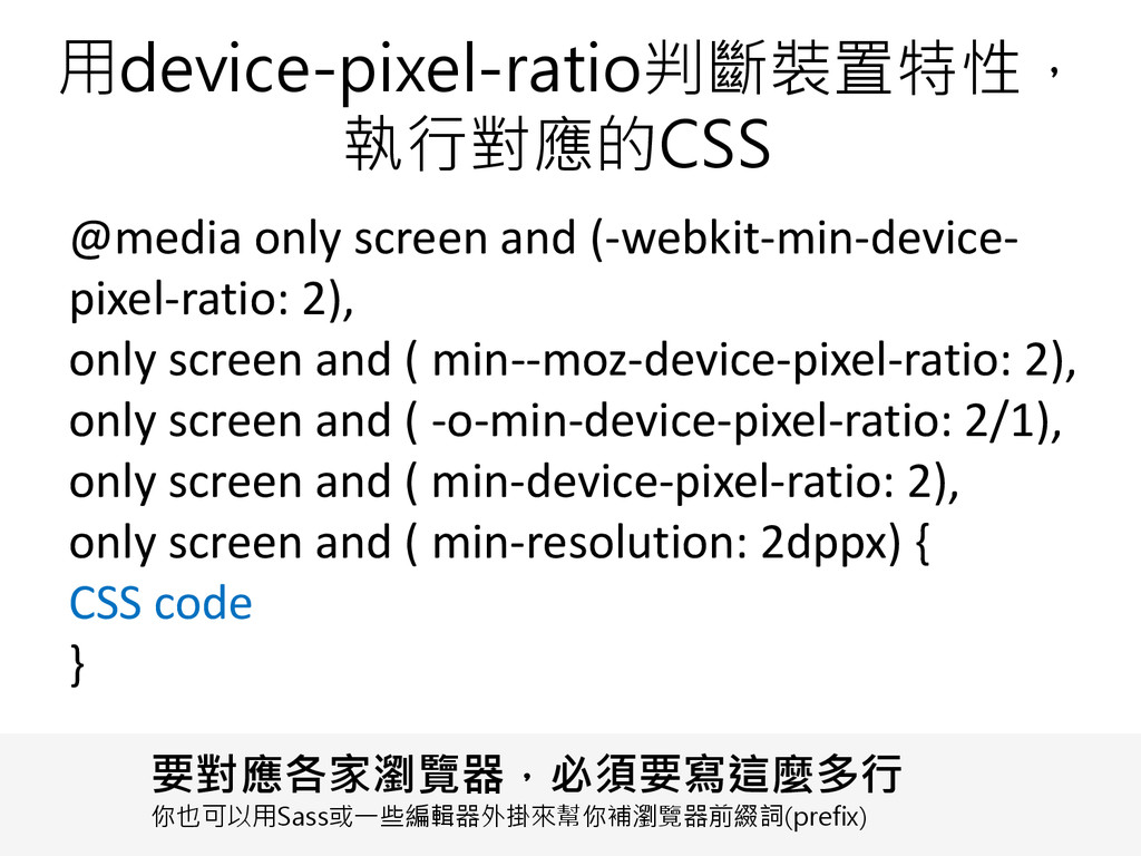
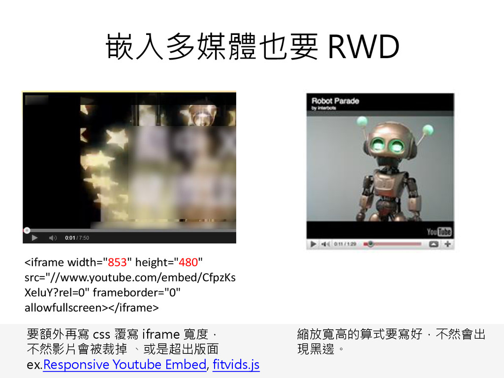
screen and ( min--moz-device-pixel-ratio: 2), only screen and ( -o-min-device-pixel-ratio: 2/1), only screen and ( min-device-pixel-ratio: 2), only screen and ( min-resolution: 2dppx) { CSS code } 要對應各家瀏覽器,必須要寫這麼多行 你也可以用Sass或一些編輯器外掛來幫你補瀏覽器前綴詞(prefix)
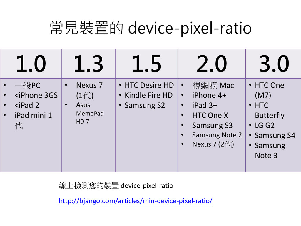
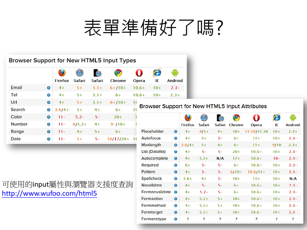
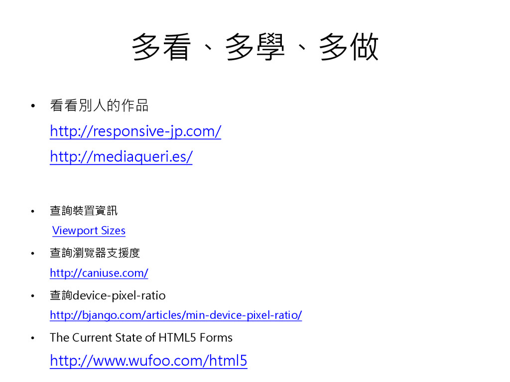
查詢瀏覽器支援度 http://caniuse.com/ • 查詢device-pixel-ratio http://bjango.com/articles/min-device-pixel-ratio/ • The Current State of HTML5 Forms http://www.wufoo.com/html5
 jiimmysu
 securecat
 satosio
 vivion
 hilokifigma
 a2k
a2k
 terencebasart
 kitanosirokuma
 nishame
 r5ni4
r5ni4
 takaikanako
 ajstarks
 koyaman
 reverentgeek
 lynnandtonic
 smashingmag
 jcasabona
 ammeep
 marcelosomers
 soudai
 dougneiner
 schroneko
 sonatard
 danielanewman
 keathley
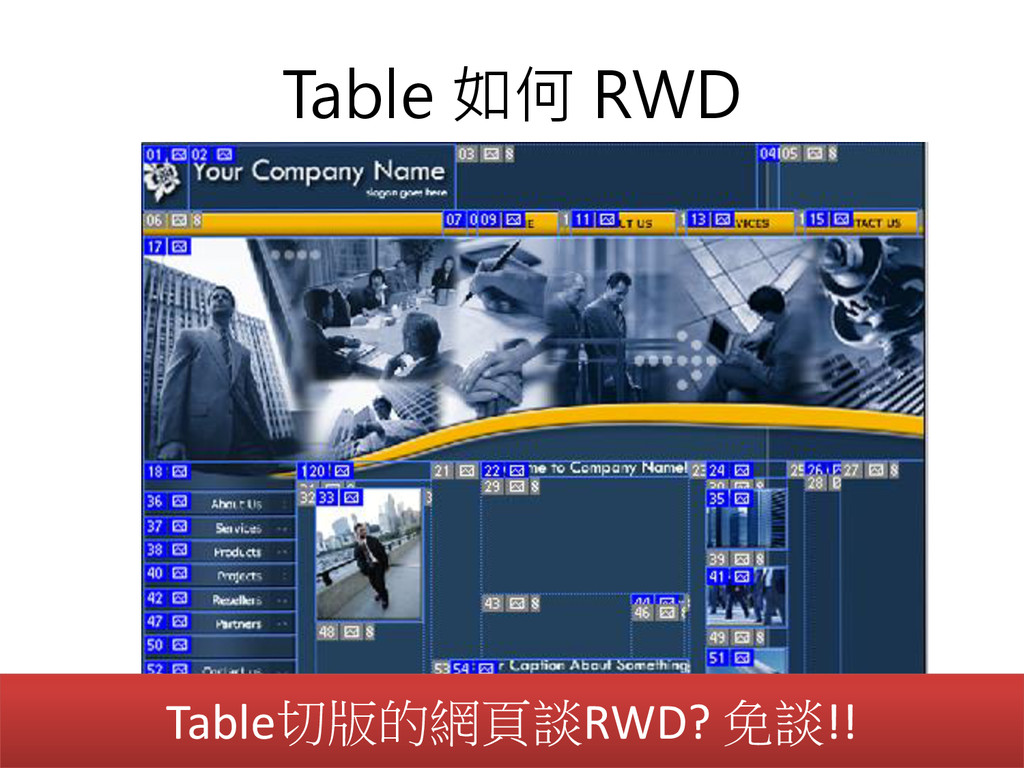
![行動版網頁不就是把網頁縮小而已嗎? [email protected] http://jimmysu.logdown.com/](https://files.speakerdeck.com/presentations/11264c50ec6701318ac32a5458301a54/slide_0.jpg)