Upgrade to Pro — share decks privately, control downloads, hide ads and more …

Practical Bootstrap

jklepatch
October 27, 2014

Practical Bootstrap

In this presentation, I give a quick recap about bootstrap, then I show you how to build a website with bootstrap, step by step.

For more articles and tutorials about front-end and WordPress, check out my blog at: http://julienklepatch.com/blog

jklepatch

October 27, 2014
Tweet

More Decks by jklepatch

Other Decks in Programming

Transcript

  1. Plan • Recap on Bootstrap • Build a website with

    Bootstrap • Customize Bootstrap • Conclusion • Additional Resources
  2. Plan • Recap on Bootstrap • Build a website with

    Bootstrap • Customize Bootstrap • Conclusion • Additional Resources
  3. Recap on Bootstrap (I) • What is bootstrap ? •

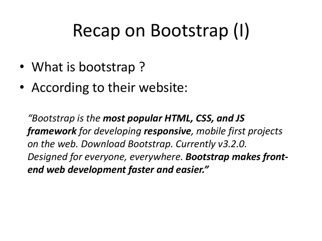
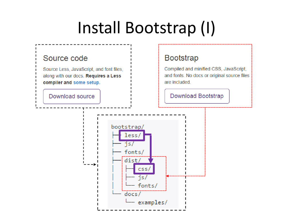
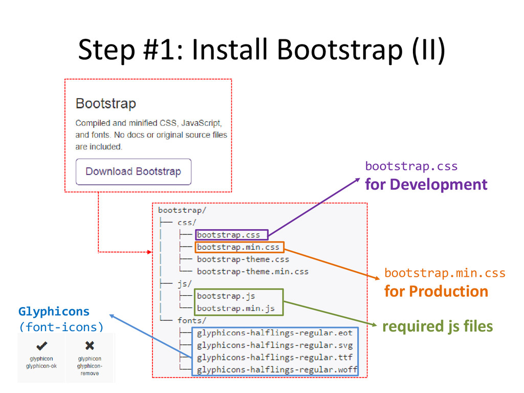
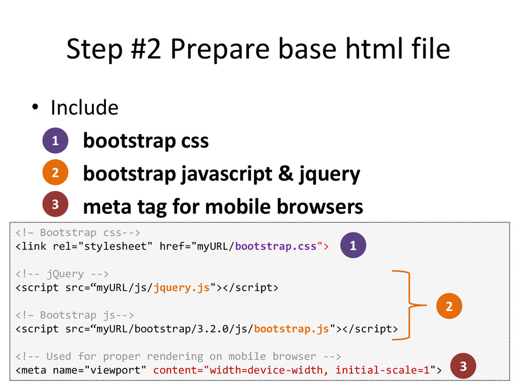
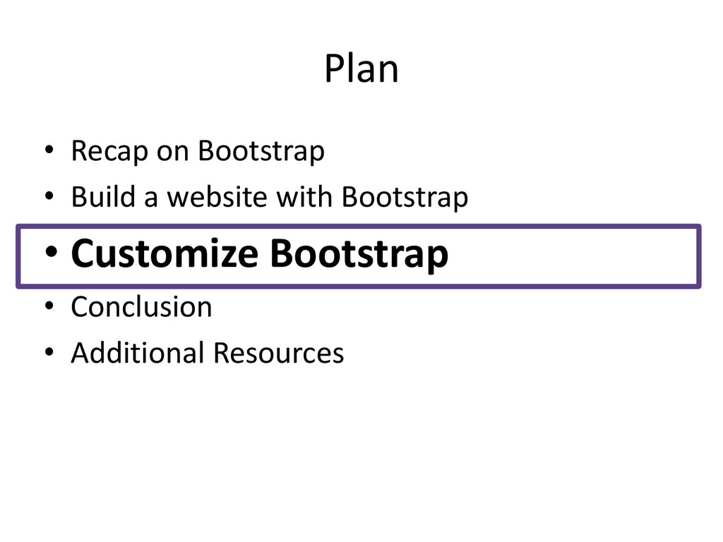
    According to their website: “Bootstrap is the most popular HTML, CSS, and JS framework for developing responsive, mobile first projects on the web. Download Bootstrap. Currently v3.2.0. Designed for everyone, everywhere. Bootstrap makes front- end web development faster and easier.”
  4. Recap on Bootstrap (II) • One of the most popular

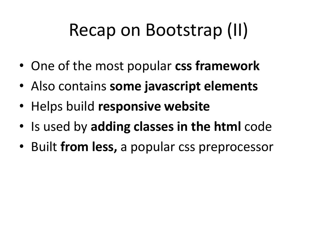
    css framework • Also contains some javascript elements • Helps build responsive website • Is used by adding classes in the html code • Built from less, a popular css preprocessor
  5. Recap on Bootstrap (III) • Most important element: the Grid

    System • It contains 3 elements: – Container – Row – Columns Container row Column Column Column
  6. Recap on Bootstrap (IV) Content Margin Margin P a d

    d i n g P a d d i n g Container Row Negative margin Negative margin Column Content Padding Padding
  7. Plan • Recap on Bootstrap • Build a website with

    Bootstrap • Customize Bootstrap • Conclusion • Additional Resources
  8. Requirements • Requirements: – Responsive – Use as less custom

    css as possible – Easy to customize appearance – And good looking of course !
  9. Step #2 Prepare base html file • Include bootstrap css

    bootstrap javascript & jquery meta tag for mobile browsers <!– Bootstrap css--> <link rel="stylesheet" href="myURL/bootstrap.css"> <!-- jQuery --> <script src=“myURL/js/jquery.js"></script> <!– Bootstrap js--> <script src=“myURL/bootstrap/3.2.0/js/bootstrap.js"></script> <!-- Used for proper rendering on mobile browser --> <meta name="viewport" content="width=device-width, initial-scale=1"> 1 2 3 1 2 3
  10. Step #3: top menu (I) • We will use a

    component called navbar Desktop View Mobile View
  11. Step #3: top menu (II) Desktop View Mobile View <nav

    class="navbar" role="navigation"> <div class="container"> <div class="navbar-header"> </div> <div class="collapse navbar-collapse"> </div> </div> </nav>
  12. Step #3: top menu - mobile (I) <nav class="navbar" role="navigation">

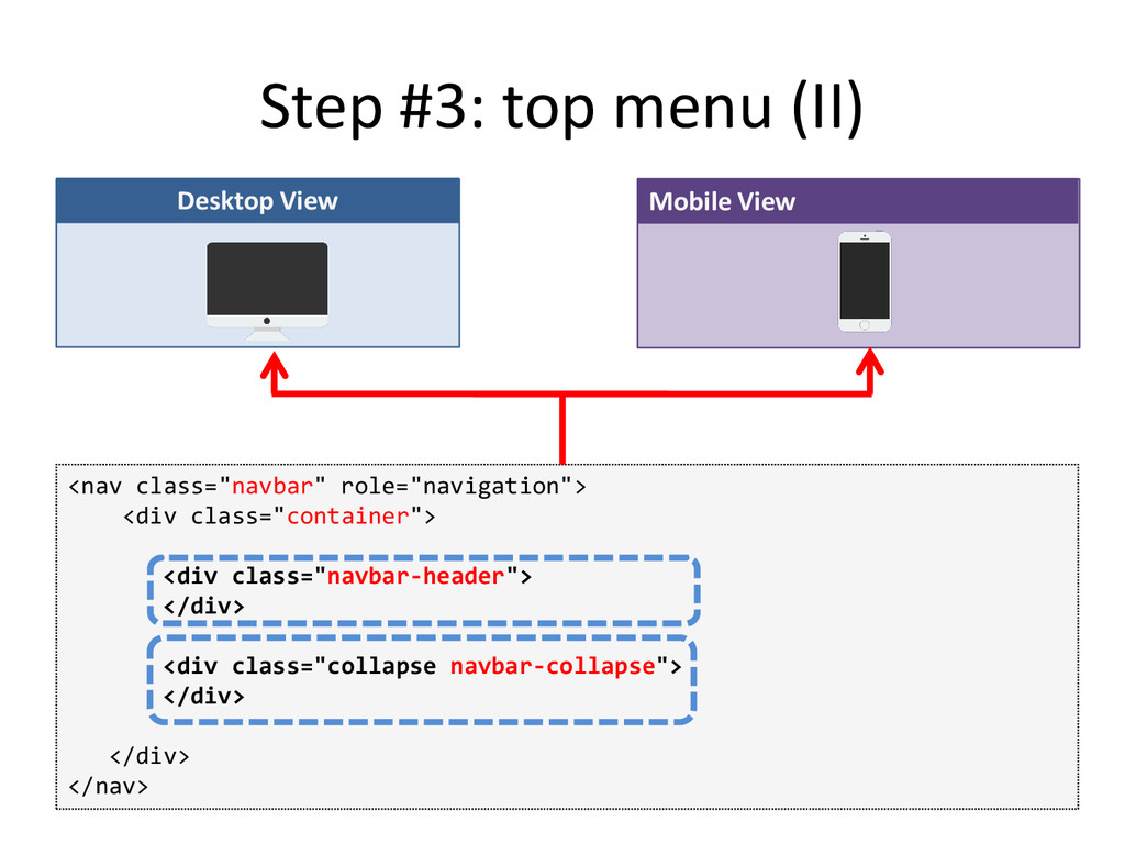
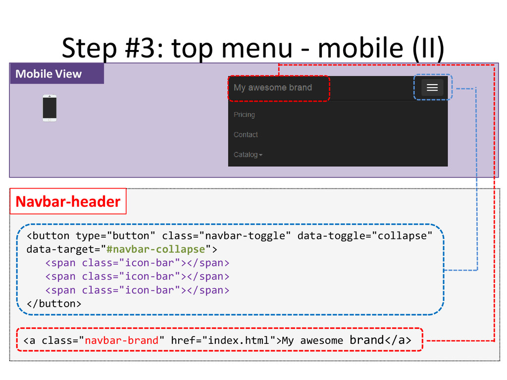
    <div class="container"> </nav> Mobile View <!– Menu icon for small devices and brand --> <div class="navbar-header"> </div> <!– Items of Menu --> <div class="collapse navbar-collapse" id="navbar-collapse"> </div>
  13. Step #3: top menu - mobile (II) Navbar-header <button type="button"

    class="navbar-toggle" data-toggle="collapse" data-target="#navbar-collapse"> <span class="icon-bar"></span> <span class="icon-bar"></span> <span class="icon-bar"></span> </button> <a class="navbar-brand" href="index.html">My awesome brand</a> Mobile View
  14. Step #3: top menu - Desktop (I) <nav class="navbar" role="navigation">

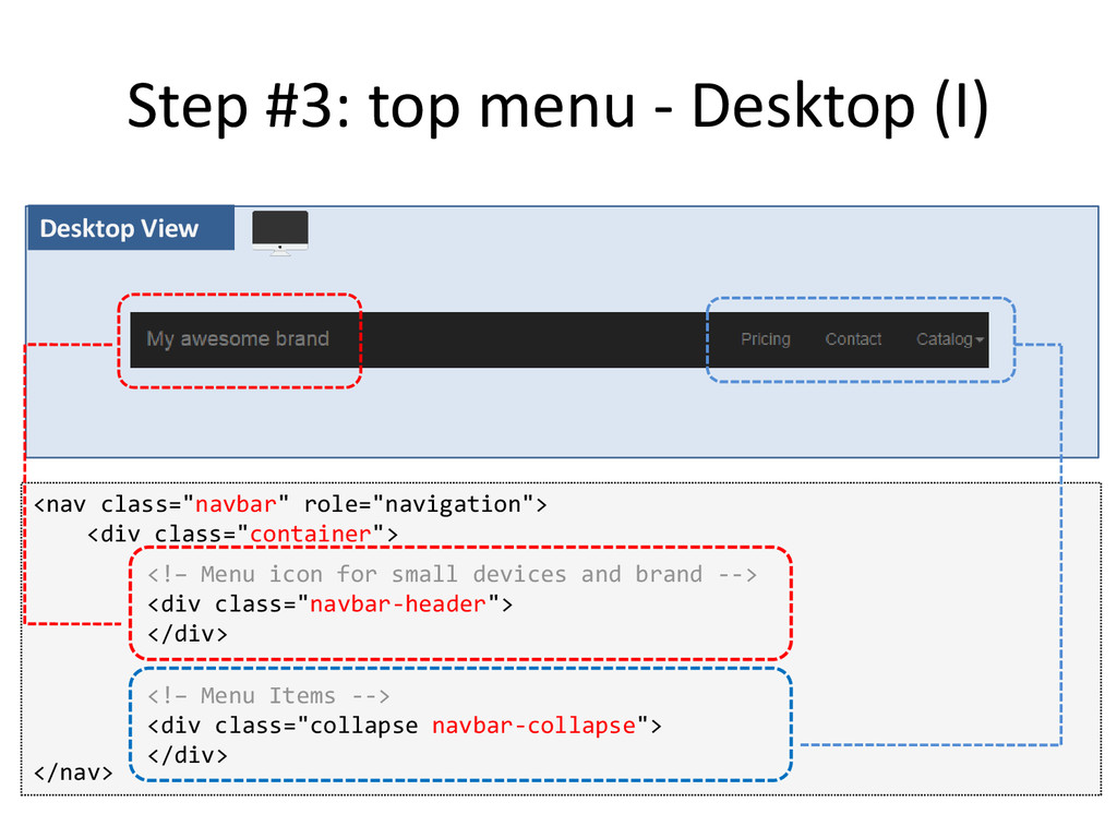
    <div class="container"> </nav> Desktop View <!– Menu icon for small devices and brand --> <div class="navbar-header"> </div> <!– Menu Items --> <div class="collapse navbar-collapse"> </div>
  15. Step #3: top menu - Desktop (II) <ul class="nav navbar-nav">

    </ul> Navbar-collapse <li> Item1 </li> … <li class="dropdown"> <a href="#" class="dropdown-toggle" data-toggle="dropdown"> Catalog <span class="caret"></span></a> <ul class="dropdown-menu"> <li> Sub-Item1 </li> … </ul> </li> Desktop View
  16. Step #4: Page header • We will use a component

    called jumbotron <--! Remark  no container, no row, no column <div class=“jumbotron"> <h1> <--! Main message --> </h1> <p> <--! secondary message --> </p> </div>
  17. Step #5: Marketing boxes (II) • We will use a

    component called panel <div class="panel panel-default"> </div> <div class="panel-heading "> <--! Title of Panel --> </div> <div class="panel-body"> <--! Content of Panel--> </div>
  18. Step #6: Full-width section (1) Content Margin Margin P a

    d d i n g P a d d i n g Painting Area • We cannot use the container class
  19. Painting Area Step #6: Full-width section (2) • We will

    use the container-fluid class Content P a d d i n g P a d d i n g
  20. Step #6: Full-width section (3) <--! Container-fluid  no margin,

    just padding--> <div class="container-fluid"> <div class="row"> <--! Content inside --> </div> </div>
  21. Step #7: Image Gallery (1) Image Image Image Image Layout

    #1 - big screen: 4 images / row >1199px Image Image Image Layout #2 - medium screen: 3 images / row <1199px Image Image Layout #3 - small screen: 2 images / row <992px
  22. Step #7: Image Gallery (2) • We will use columns

    and img-responsive <--! Col-lg-3  For Large screen 4 pictures / row --> <--! Col-md-4  For Medium screen 3 pictures / row --> <--! Col-xs-6  For Small screen 2 pictures / row --> <div class="col-lg-3 col-md-4 col-xs-6"> <img class="img-responsive thumbnail" src="img/400x300.gif"> </div> … … … <div class="col-lg-3 col-md-4 col-xs-6"> <img class="img-responsive thumbnail" src="img/400x300.gif"> </div>
  23. Step #8: Pricing Section • We will use Panels and

    list-group elements <div class="panel panel-default"> <div class="panel-heading"> <h3>MyTitle</h3> </div> <ul class="list-group"> <li class="list-group-item">Item1</li> <li class="list-group-item">Item1</li> … … </ul> </div>
  24. Step #9: Contact Us • We will use form and

    feedback elements <div class="form-group"> <label class="control-label" for="inputSuccess"> Input with success </label> <input type="text" class="form-control" id="inputSuccess"> <span class="glyphicon glyphicon-ok form-control-feedback"></span> </div> has-success has-feedback">
  25. Plan • Recap on Bootstrap • Build a website with

    Bootstrap • Customize Bootstrap • Conclusion • Additional Resources
  26. Customize Bootstrap (I) with a theme • In /css folder,

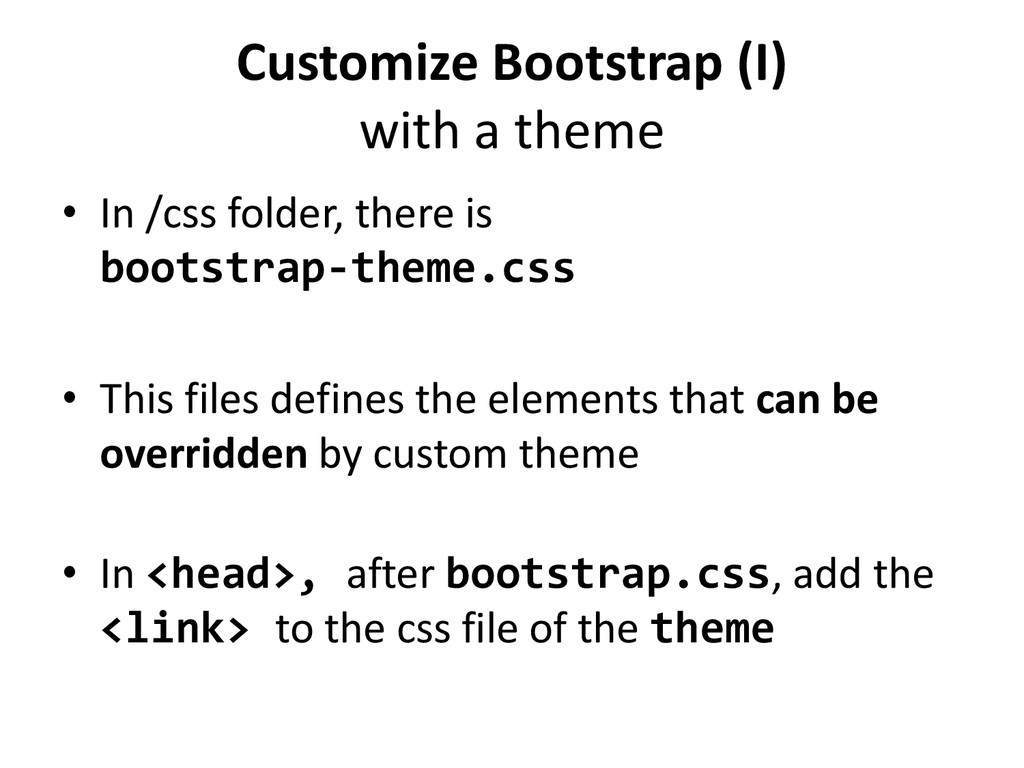
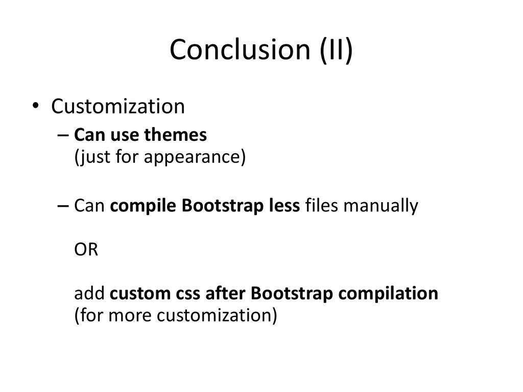
    there is bootstrap-theme.css • This files defines the elements that can be overridden by custom theme • In <head>, after bootstrap.css, add the <link> to the css file of the theme
  27. Customize Bootstrap (II) by compiling manually • Using the web

    interface (getbootstrap.com/customize) • Using a less compiler (bootstrap suggests to use grunt)
  28. Customize Bootstrap (III) with custom css/less files • Add your

    own css/less files AFTER the bootstrap css • Pro: Provides more options for customization • Con: Can break some basic feature of bootstrap (ex: grid)
  29. Plan • Recap on Bootstrap • Build a website with

    Bootstrap • Customize Bootstrap • Conclusion • Additional Resources
  30. Conclusion (I) • Recap on Bootstrap – Pattern: Container >

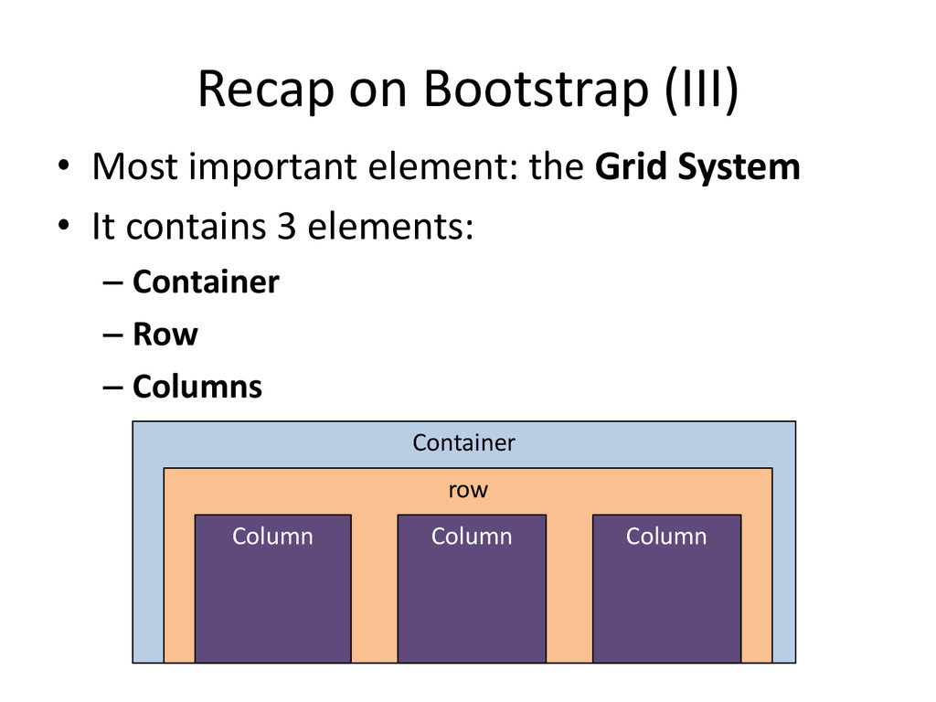
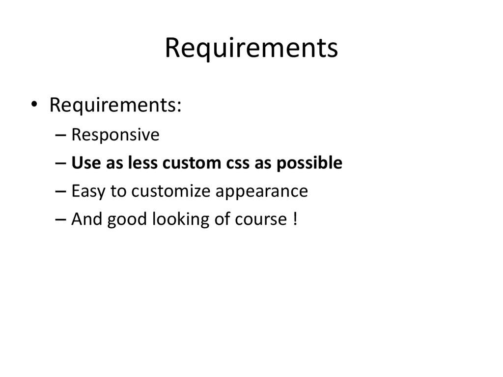
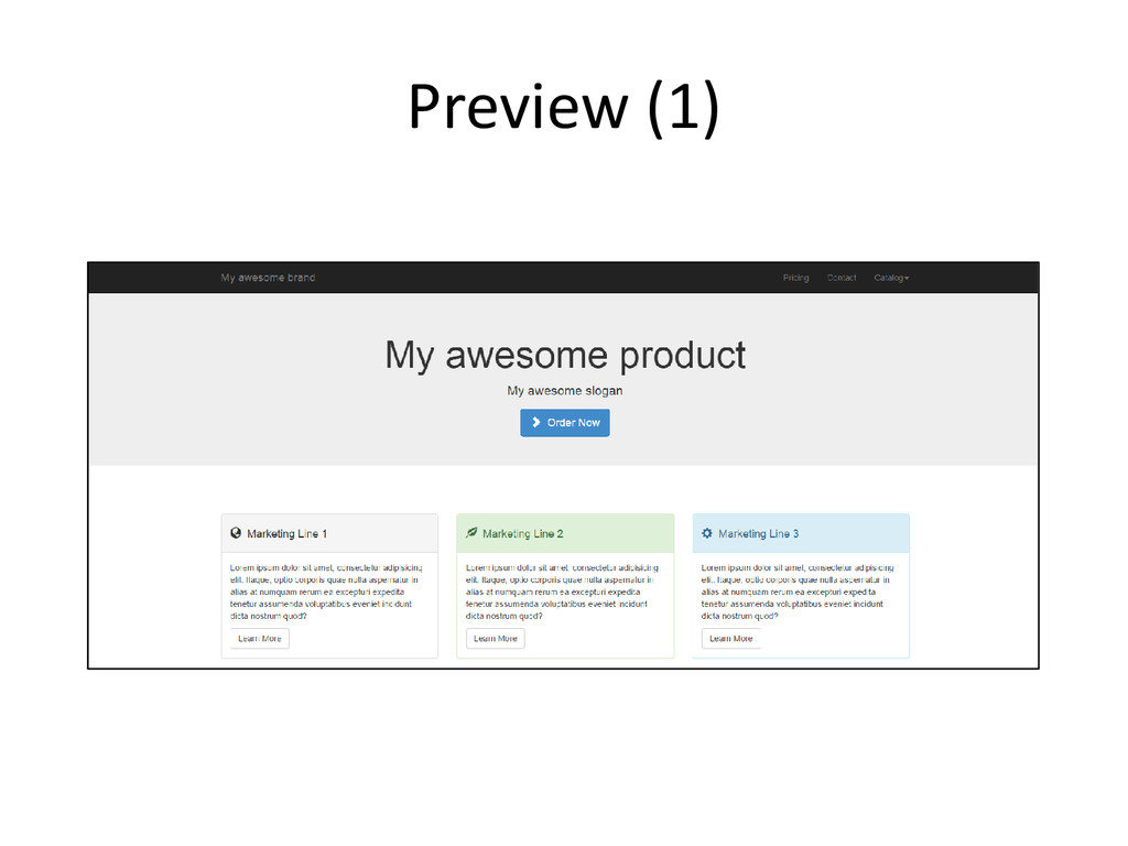
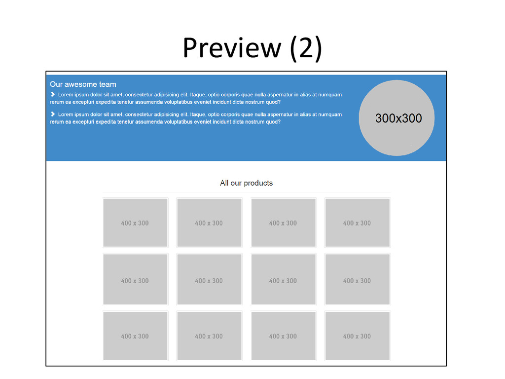
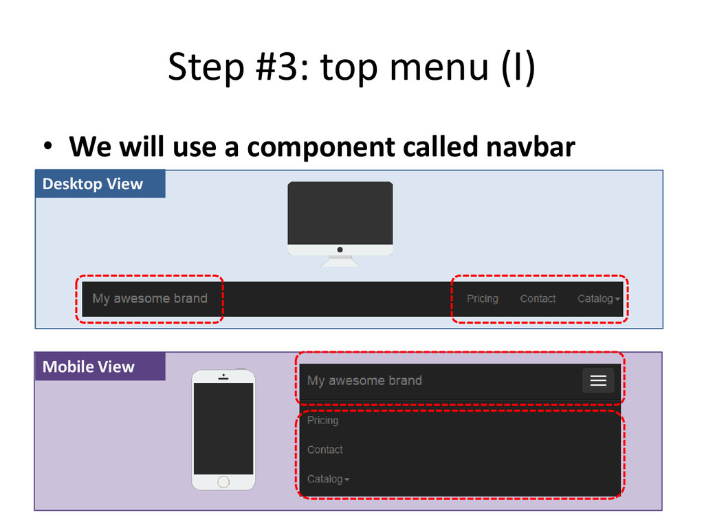
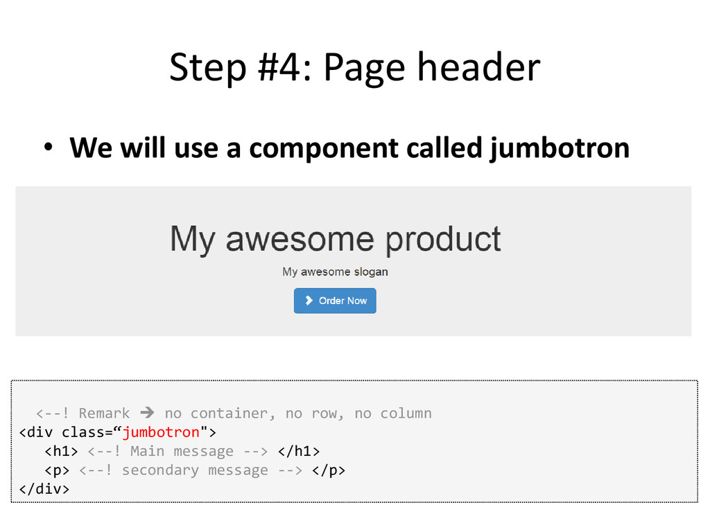
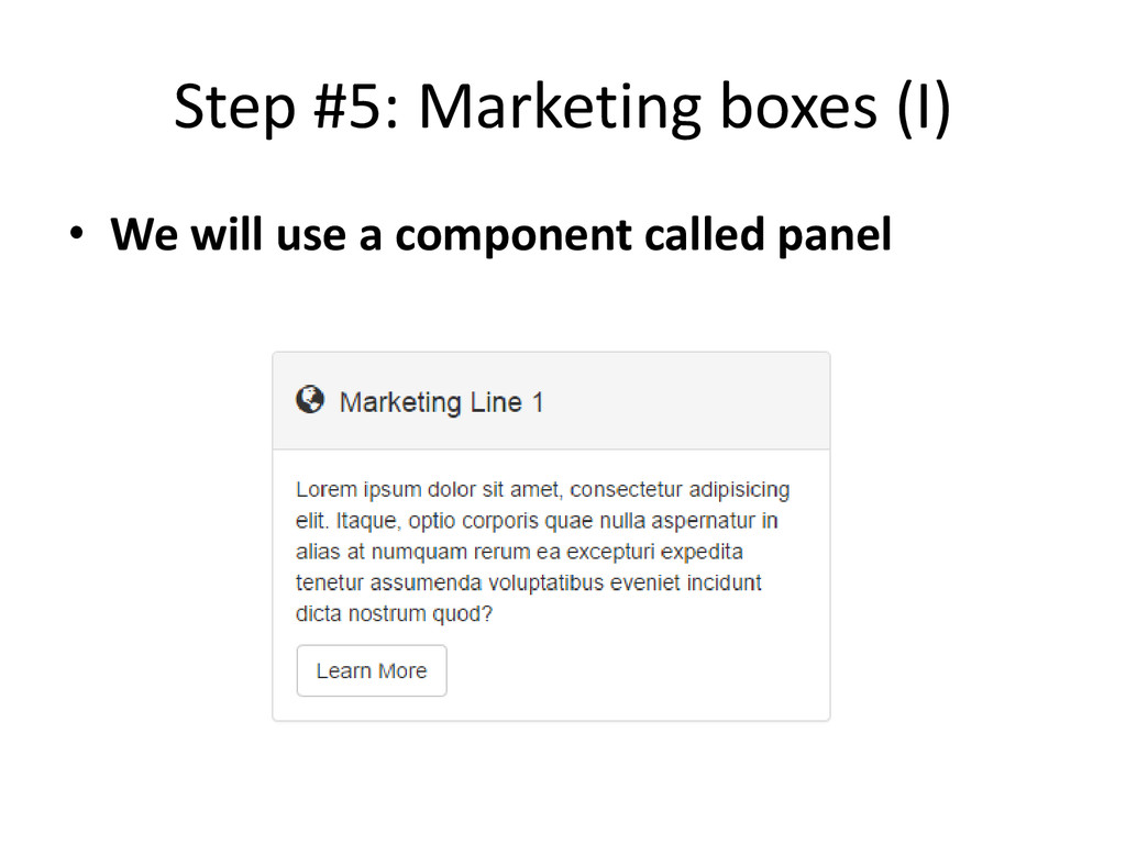
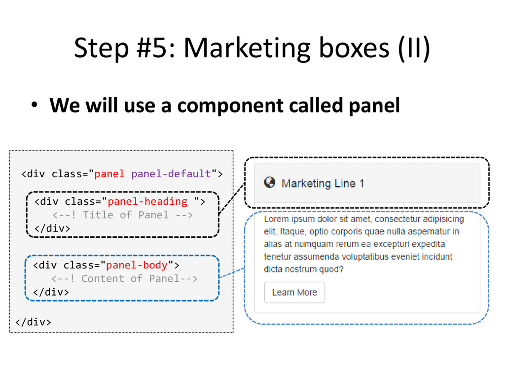
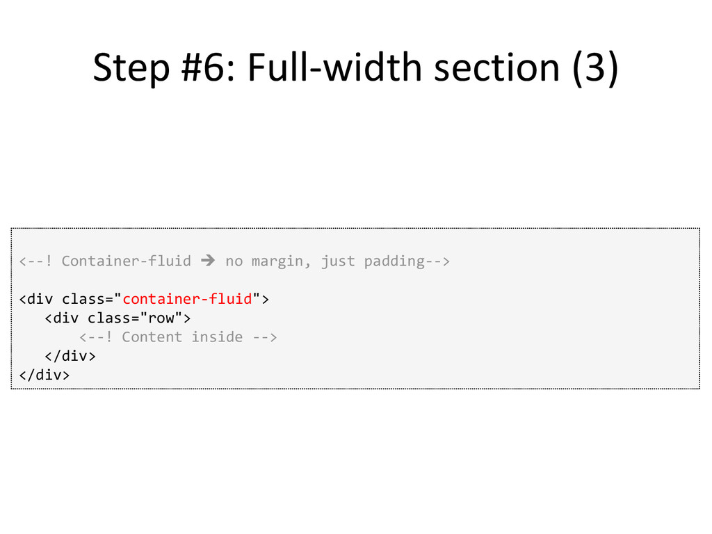
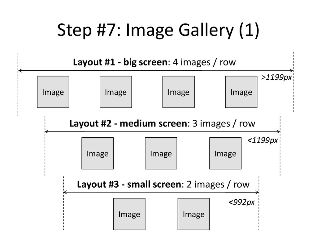
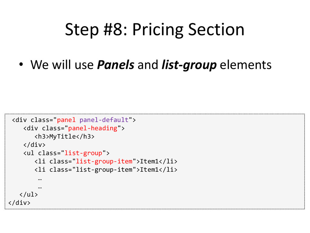
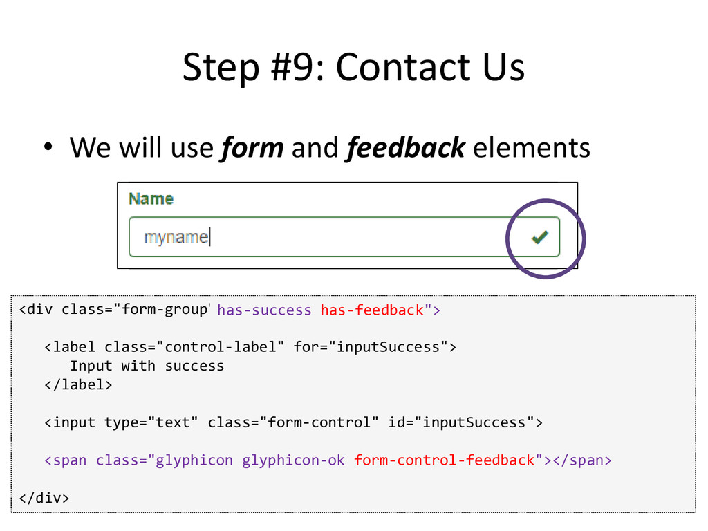
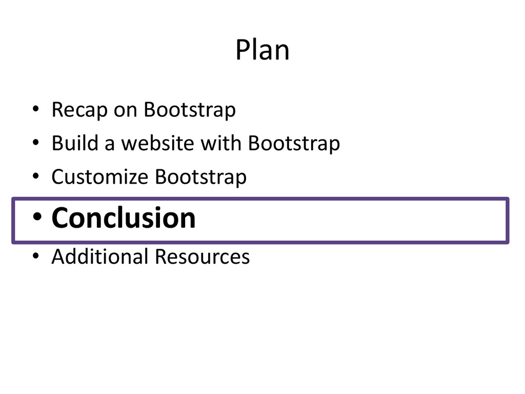
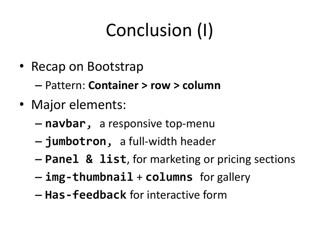
    row > column • Major elements: – navbar, a responsive top-menu – jumbotron, a full-width header – Panel & list, for marketing or pricing sections – img-thumbnail + columns for gallery – Has-feedback for interactive form
  31. Conclusion (II) • Customization – Can use themes (just for

    appearance) – Can compile Bootstrap less files manually OR add custom css after Bootstrap compilation (for more customization)
  32. Plan • Recap on grid system • Build a website

    with Bootstrap • Customize Bootstrap • Conclusion • Additional Resources
  33. Additional Resources • Bootstrapzero (bootstrapzero.com) – Bootstrap Templates + Themes

    • Startbootstrap (startbootstrap.com) – Bootstrap Templates • Bootswatch (bootswatch.com) – Bootstrap Themes • Bootbundle (bootbundle.com) – Combination of a lot of bootstrap resources