Upgrade to Pro — share decks privately, control downloads, hide ads and more …

How to make a responsive WordPress website with Bootstrap

How to make a responsive WordPress website with Bootstrap

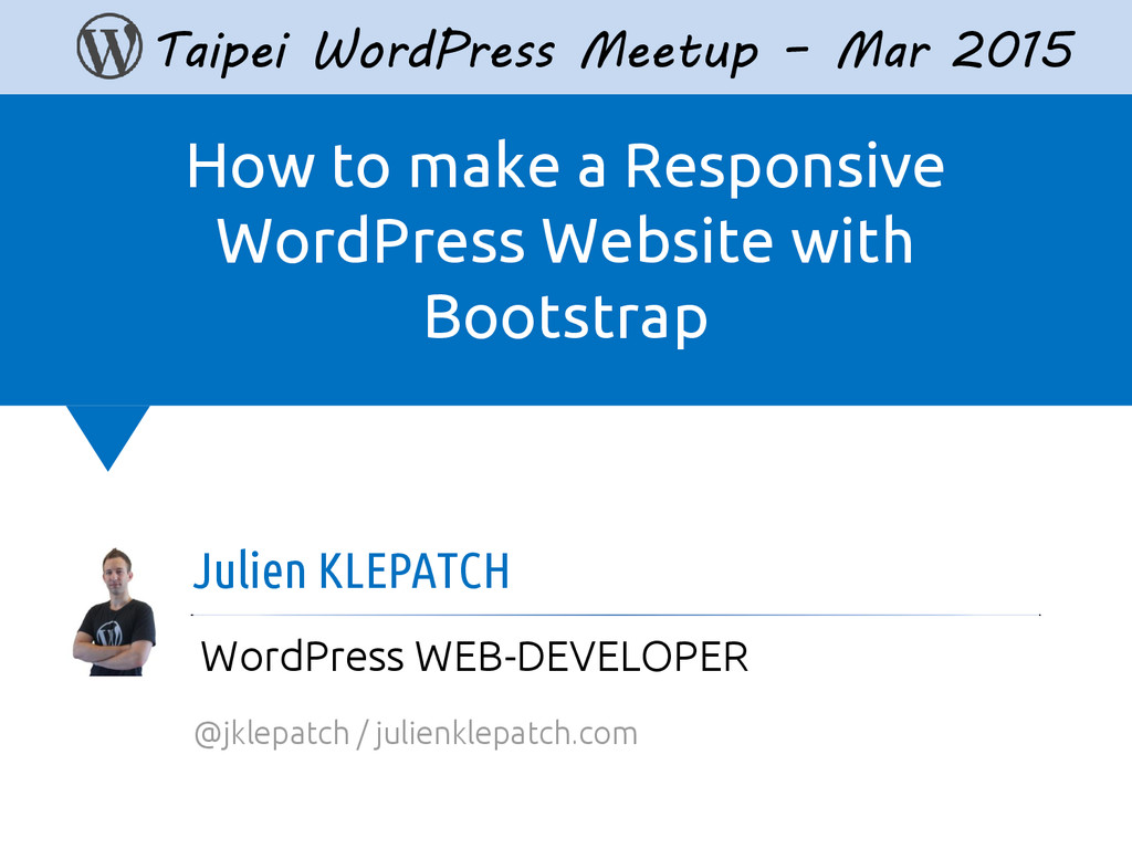
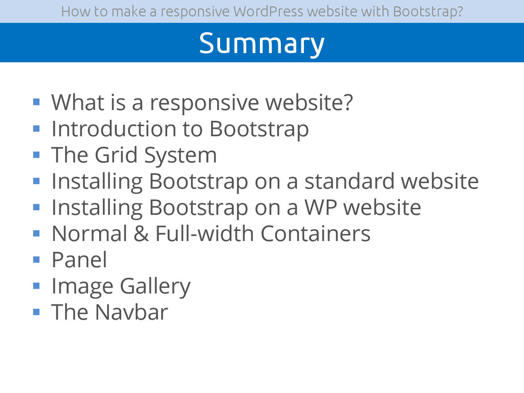
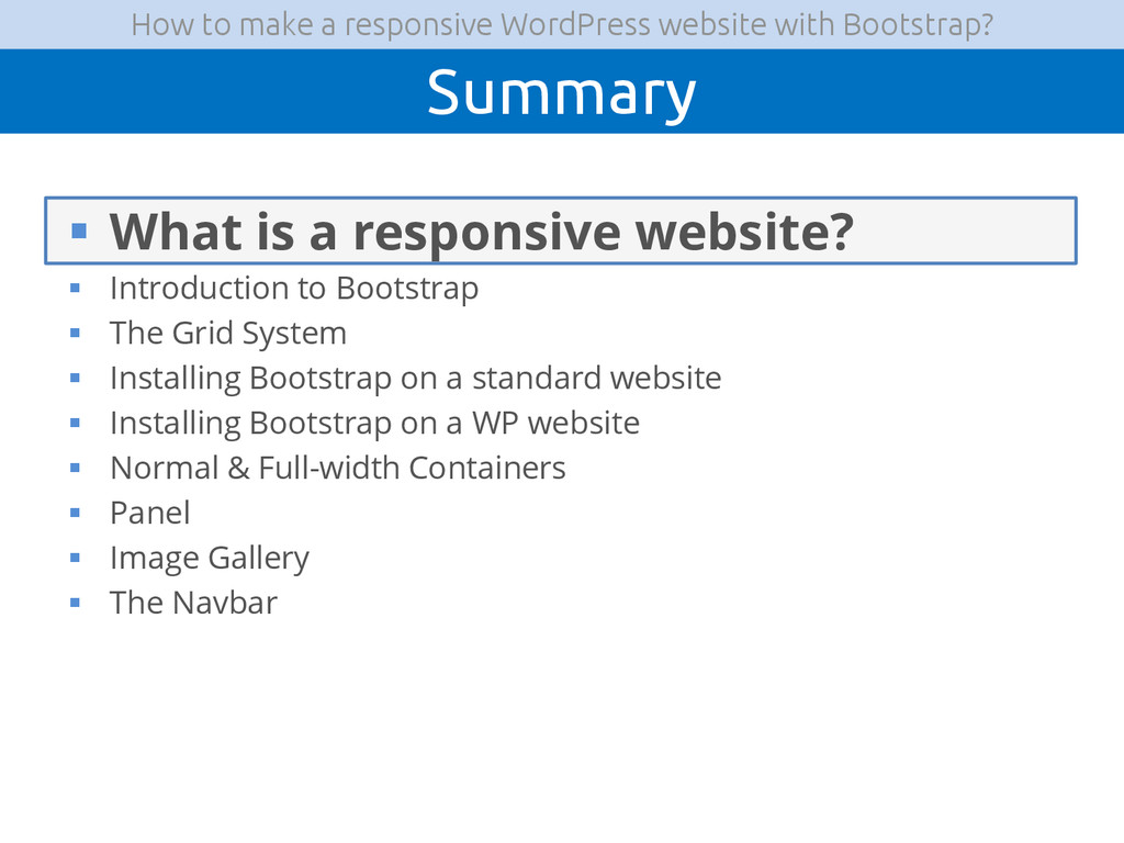
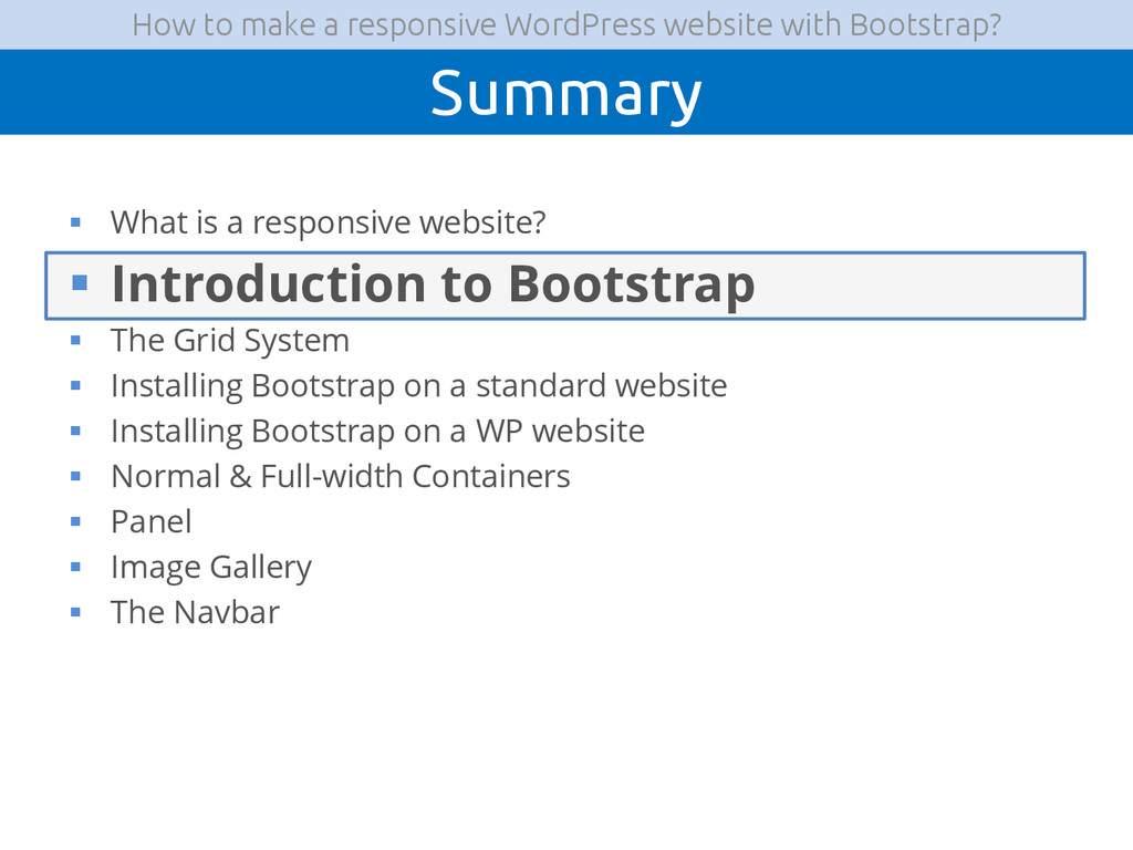
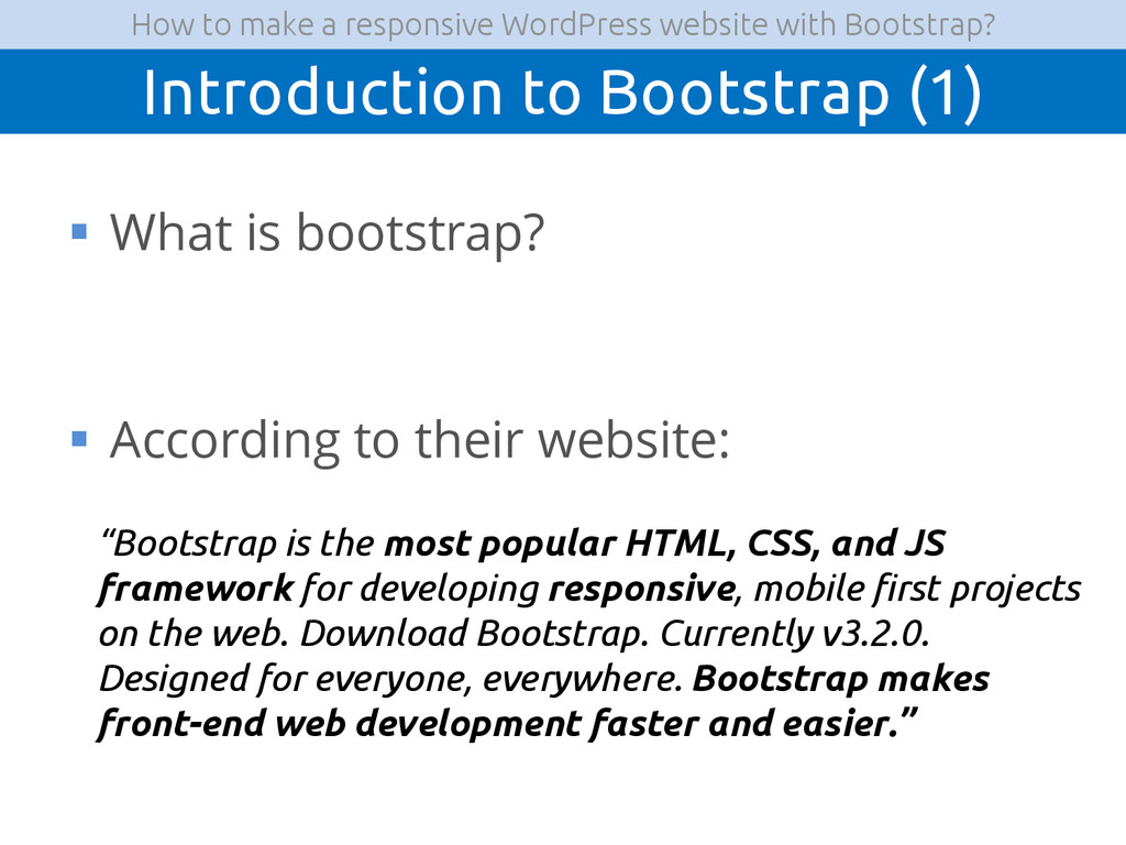
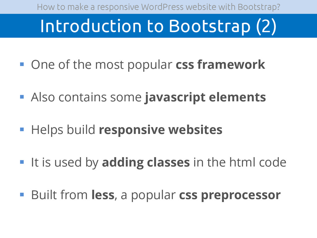
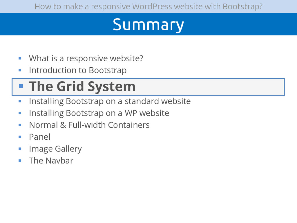
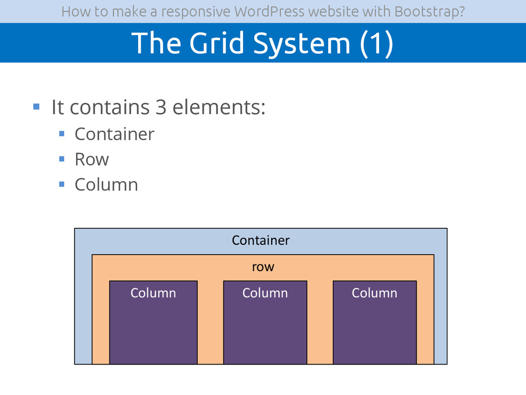
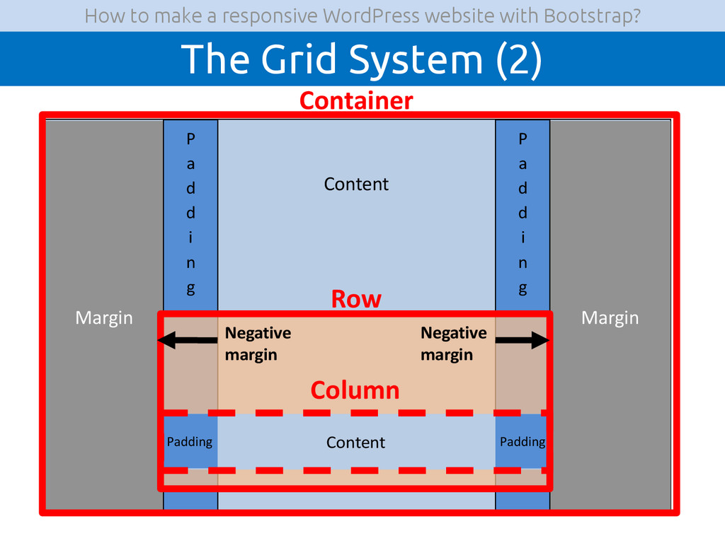
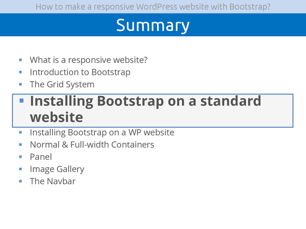
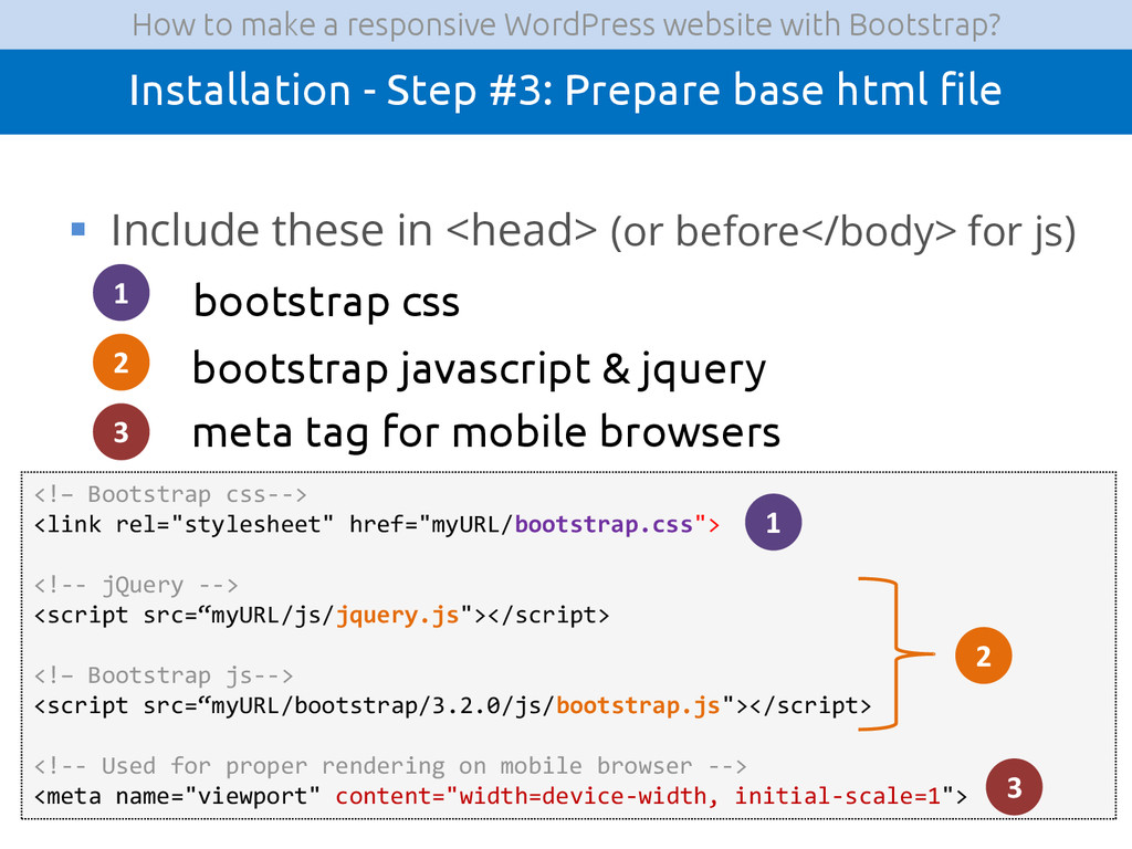
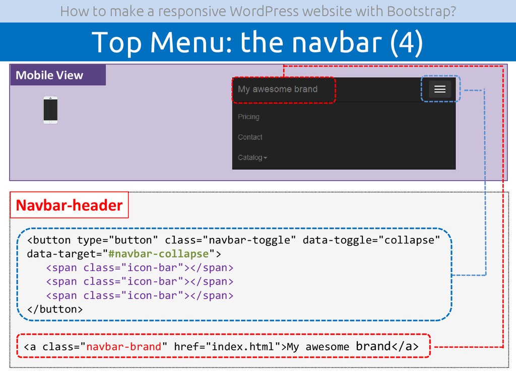
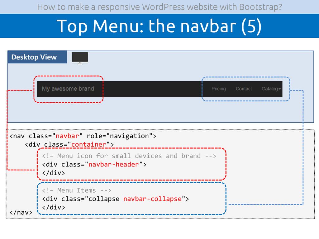
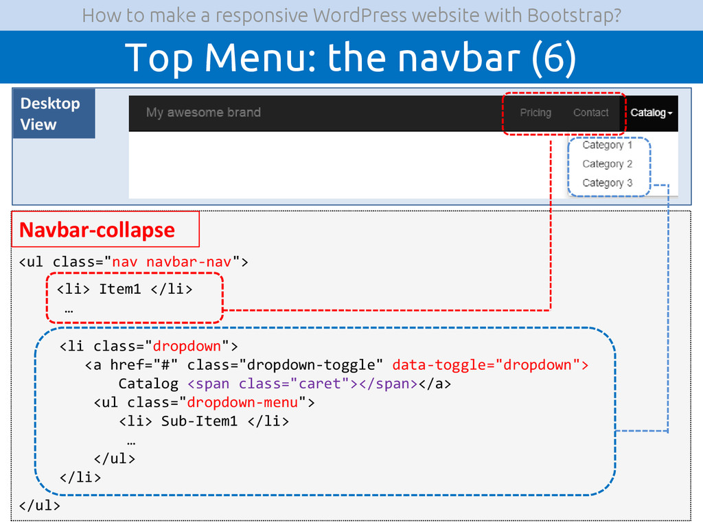
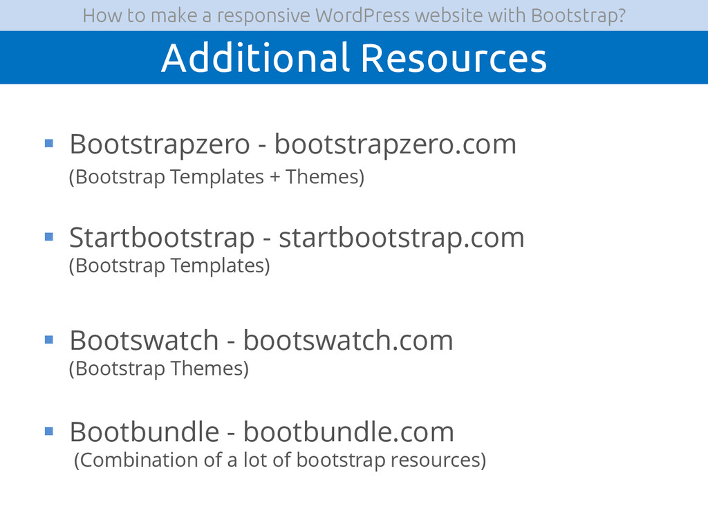
A presentation about how to integrate the css framework Bootstrap with a WordPress website, in order to make your website responsive (i.e make it look good for both mobile and laptops).

For more articles and tutorials about WordPress, check out my blog at: http://julienklepatch.com/blog

jklepatch

March 17, 2015
Tweet

More Decks by jklepatch

Other Decks in Programming

Transcript

  1. How to make a Responsive WordPress Website with Bootstrap Julien

    KLEPATCH WordPress WEB-DEVELOPER @jklepatch / julienklepatch.com Taipei WordPress Meetup – Mar 2015
  2.  What is a responsive website?  Introduction to Bootstrap

     The Grid System  Installing Bootstrap on a standard website  Installing Bootstrap on a WP website  Normal & Full-width Containers  Panel  Image Gallery  The Navbar How to make a responsive WordPress website with Bootstrap? Summary
  3.  What is a responsive website?  Introduction to Bootstrap

     The Grid System  Installing Bootstrap on a standard website  Installing Bootstrap on a WP website  Normal & Full-width Containers  Panel  Image Gallery  The Navbar How to make a responsive WordPress website with Bootstrap? Summary
  4. How to make a responsive WordPress website with Bootstrap? What

    is a responsive website? (1)  A website that adapts to different kind of devices (desktop computers, tablets, mobiles)  Behind the scenes use css media queries  Important because more than 50% of internet traffic comes from mobiles
  5. How to make a responsive WordPress website with Bootstrap? What

    is a responsive website? (2) Desktop Computer Mobile
  6.  What is a responsive website?  Introduction to Bootstrap

     The Grid System  Installing Bootstrap on a standard website  Installing Bootstrap on a WP website  Normal & Full-width Containers  Panel  Image Gallery  The Navbar How to make a responsive WordPress website with Bootstrap? Summary
  7. How to make a responsive WordPress website with Bootstrap? Introduction

    to Bootstrap (1)  What is bootstrap?  According to their website: “Bootstrap is the most popular HTML, CSS, and JS framework for developing responsive, mobile first projects on the web. Download Bootstrap. Currently v3.2.0. Designed for everyone, everywhere. Bootstrap makes front-end web development faster and easier.”
  8. How to make a responsive WordPress website with Bootstrap? Introduction

    to Bootstrap (2)  One of the most popular css framework  Also contains some javascript elements  Helps build responsive websites  It is used by adding classes in the html code  Built from less, a popular css preprocessor
  9.  What is a responsive website?  Introduction to Bootstrap

     The Grid System  Installing Bootstrap on a standard website  Installing Bootstrap on a WP website  Normal & Full-width Containers  Panel  Image Gallery  The Navbar How to make a responsive WordPress website with Bootstrap? Summary
  10. How to make a responsive WordPress website with Bootstrap? The

    Grid System (1)  It contains 3 elements:  Container  Row  Column Container row Column Column Column
  11. How to make a responsive WordPress website with Bootstrap? The

    Grid System (2) Content Margin Margin P a d d i n g P a d d i n g Container Row Negative margin Negative margin Column Content Padding Padding
  12.  What is a responsive website?  Introduction to Bootstrap

     The Grid System  Installing Bootstrap on a standard website  Installing Bootstrap on a WP website  Normal & Full-width Containers  Panel  Image Gallery  The Navbar How to make a responsive WordPress website with Bootstrap? Summary
  13. How to make a responsive WordPress website with Bootstrap? The

    Bootstrap folder (2) bootstrap.css for Development bootstrap.min.css for Production required js files Glyphicons (font-icons)
  14. How to make a responsive WordPress website with Bootstrap? Installation

    - Step #1: Download Bootstrap  Go to http://getbootstrap.com/getting-started/#download  Click on “Download Bootstrap
  15. How to make a responsive WordPress website with Bootstrap? Installation

    - Step #2: Unzip and move the folder  Unzip the bootstrap folder  Put it in your project (ex: yourproject/assets/bootstrap)
  16. How to make a responsive WordPress website with Bootstrap? Installation

    - Step #3: Prepare base html file  Include these in <head> (or before</body> for js) bootstrap css bootstrap javascript & jquery meta tag for mobile browsers <!– Bootstrap css--> <link rel="stylesheet" href="myURL/bootstrap.css"> <!-- jQuery --> <script src=‚myURL/js/jquery.js"></script> <!– Bootstrap js--> <script src=‚myURL/bootstrap/3.2.0/js/bootstrap.js"></script> <!-- Used for proper rendering on mobile browser --> <meta name="viewport" content="width=device-width, initial-scale=1"> 1 2 3 1 2 3
  17.  What is a responsive website?  Introduction to Bootstrap

     The Grid System  Installing Bootstrap on a standard website  Installing Bootstrap on a WP website  Normal & Full-width Containers  Panel  Image Gallery  The Navbar How to make a responsive WordPress website with Bootstrap? Summary
  18. How to make a responsive WordPress website with Bootstrap? Installing

    Bootstrap in WordPress  In WordPress, it is slightly different  Bootstrap have to be at a certain location  Css and Javascript files have to be loaded in a certain way
  19. How to make a responsive WordPress website with Bootstrap? Where

    to put Bootstrap?  In a WordPress installation, themes (~skin of the website) are in wp-content/themes/ directory  For example, if your theme is called ‘mytheme’, you will put bootstrap in wp-content/themes/ directory/assets/bootstrap
  20. How to make a responsive WordPress website with Bootstrap? How

    to include css and js files?  In a WordPress installation, themes (~skin of the website) are in wp-content/themes/ directory <?php //First, register a function with the ‘wp_enqueue_scripts’ action hook //(Please refer to the WordPress Codex for more info on hooks & Filter) add_action( 'wp_enqueue_scripts', ‘my_load_scripts' ); function my_load_scripts() { //Load Bootstrap css wp_enqueue_style( ‘my-bootstrap', get_template_directory_uri() .'/assets/bootstrap/css/bootstrap.min.css' ); //Load Bootstrap js (can also load in footer with extra arguments) wp_enqueue_script( ‘my-bootstrapjs', get_template_directory_uri().'/assets/bootstrap/js/bootstrap.min.js', array('jquery') ); } wp-content/mytheme/functions.php
  21.  What is a responsive website?  Introduction to Bootstrap

     The Grid System  Installing Bootstrap on a standard website  Installing Bootstrap on a WP website  Normal & Full-width Containers  Panel  Image Gallery  The Navbar How to make a responsive WordPress website with Bootstrap? Summary
  22. How to make a responsive WordPress website with Bootstrap? Container

    with horizontal margin Content Margin Margin P a d d i n g P a d d i n g Painting Area <div class="container"> <div class="row"> <div class="col-sm-12"> </div> </div> </div>
  23. How to make a responsive WordPress website with Bootstrap? Full-width

    container <div class="container-fluid"> <div class="row"> <div class="col-sm-12"> </div> </div> </div> Painting Area Content P a d d i n g P a d d i n g
  24.  What is a responsive website?  Introduction to Bootstrap

     The Grid System  Installing Bootstrap on a standard website  Installing Bootstrap on a WP website  Normal & Full-width Containers  Panel  Image Gallery  The Navbar How to make a responsive WordPress website with Bootstrap? Summary
  25. How to make a responsive WordPress website with Bootstrap? Panel

    (2) <div class="panel panel-default"> </div> <div class="panel-heading "> <--! Title of Panel --> </div> <div class="panel-body"> <--! Content of Panel--> </div>
  26.  What is a responsive website?  Introduction to Bootstrap

     The Grid System  Installing Bootstrap on a standard website  Installing Bootstrap on a WP website  Normal & Full-width Containers  Panel  Image Gallery  The Navbar How to make a responsive WordPress website with Bootstrap? Summary
  27. How to make a responsive WordPress website with Bootstrap? Image

    Gallery Image Image Image Image Layout #1 - big screen: 4 images / row >1199px Image Image Image Layout #2 - medium screen: 3 images / row <1199px Image Image Layout #3 - small screen: 2 images / row <992px
  28. How to make a responsive WordPress website with Bootstrap? Image

    Gallery <--! Col-lg-3  For Large screen 4 pictures / row --> <--! Col-md-4  For Medium screen 3 pictures / row --> <--! Col-xs-6  For Small screen 2 pictures / row --> <div class="col-lg-3 col-md-4 col-xs-6"> <img class="img-responsive thumbnail" src="img/400x300.gif"> </div> … … … <div class="col-lg-3 col-md-4 col-xs-6"> <img class="img-responsive thumbnail" src="img/400x300.gif"> </div>
  29.  What is a responsive website?  Introduction to Bootstrap

     The Grid System  Installing Bootstrap on a standard website  Installing Bootstrap on a WP website  Normal & Full-width Containers  Panel  Image Gallery  The Navbar How to make a responsive WordPress website with Bootstrap? Summary
  30. How to make a responsive WordPress website with Bootstrap? Top

    Menu: the navbar (1) Desktop View Mobile View
  31. How to make a responsive WordPress website with Bootstrap? Top

    Menu: the navbar (2) Desktop View Mobile View <nav class="navbar" role="navigation"> <div class="container"> <div class="navbar-header"> </div> <div class="collapse navbar-collapse"> </div> </div> </nav>
  32. How to make a responsive WordPress website with Bootstrap? Top

    Menu: the navbar (3) <nav class="navbar" role="navigation"> <div class="container"> </nav> Mobile View <!– Menu icon for small devices and brand --> <div class="navbar-header"> </div> <!– Items of Menu --> <div class="collapse navbar-collapse" id="navbar-collapse"> </div>
  33. How to make a responsive WordPress website with Bootstrap? Top

    Menu: the navbar (4) Navbar-header <button type="button" class="navbar-toggle" data-toggle="collapse" data-target="#navbar-collapse"> <span class="icon-bar"></span> <span class="icon-bar"></span> <span class="icon-bar"></span> </button> <a class="navbar-brand" href="index.html">My awesome brand</a> Mobile View
  34. How to make a responsive WordPress website with Bootstrap? Top

    Menu: the navbar (5) <nav class="navbar" role="navigation"> <div class="container"> </nav> Desktop View <!– Menu icon for small devices and brand --> <div class="navbar-header"> </div> <!– Menu Items --> <div class="collapse navbar-collapse"> </div>
  35. How to make a responsive WordPress website with Bootstrap? Top

    Menu: the navbar (6) <ul class="nav navbar-nav"> </ul> Navbar-collapse <li> Item1 </li> … <li class="dropdown"> <a href="#" class="dropdown-toggle" data-toggle="dropdown"> Catalog <span class="caret"></span></a> <ul class="dropdown-menu"> <li> Sub-Item1 </li> … </ul> </li> Desktop View
  36. How to make a responsive WordPress website with Bootstrap? Conclusion

     Responsive Design is important to adapt for the growing number of mobile devices  Bootstrap is a css framework than can help us to create responsive website easily  Bootstrap Basic concept is the grid system:  Container  Row  Column  Bootstrap offers some pre-made components that can be used easily
  37. How to make a responsive WordPress website with Bootstrap? Additional

    Resources  Bootstrapzero - bootstrapzero.com (Bootstrap Templates + Themes)  Startbootstrap - startbootstrap.com (Bootstrap Templates)  Bootswatch - bootswatch.com (Bootstrap Themes)  Bootbundle - bootbundle.com (Combination of a lot of bootstrap resources)