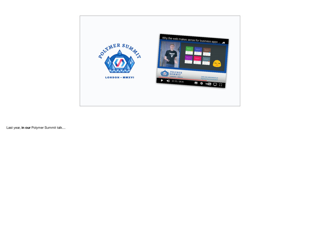
Recording of the talk: https://www.youtube.com/watch?v=xSnG-mNWhqI (the beginning of the talk was unfortunately not recorded, but it only contained a bit of background).
A presentation I gave at Vaadin pre-summit meetup 2017 in Copenhagen, Aug 21st 2017. I talk about the problems around styling web components in general, and then describe the solution that we at Vaadin implemented to offer a flexible but still robust styling API for our Polymer Elements.
 daitasu
 mhrtech
 masakichixo
.jpg) oshanqq
oshanqq
 hacomono
 datayokocho
 yamaguchitk333
 takuyay0ne
 masahirokawahara
 gpuunite_official
.png) oidfj
oidfj
 tyosi1212
 aleyda
 portentint
 mayatellez
 productmarketing
 chriscoyier
 tammyeverts
 jonoalderson
 jnunemaker
 quramy
 marktimemedia
 trallard
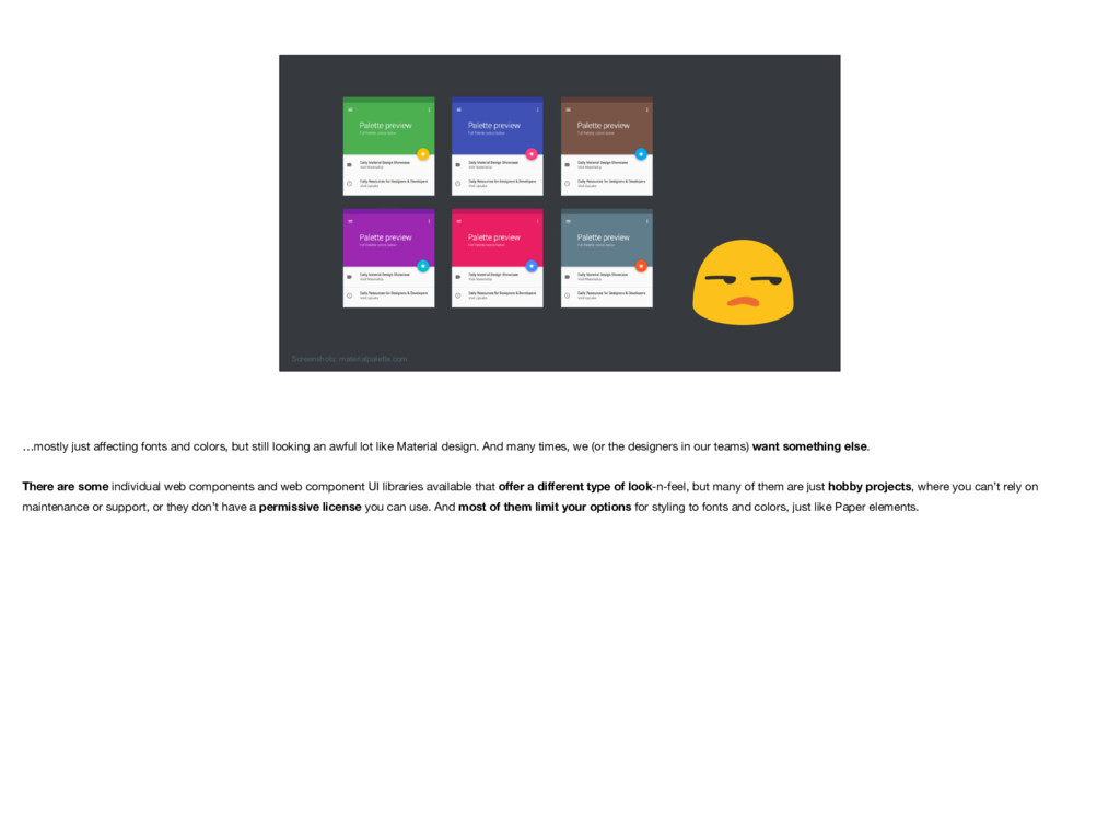
![Material design [Polymer] doesn't provide "lookless" elements – you're pretty](https://files.speakerdeck.com/presentations/0085dfce52914eab97957ed7c015b539/slide_5.jpg)
![<template> <div class="container"> <label part="label" ... >[[label]]</label> <div part="input-field"> <slot](https://files.speakerdeck.com/presentations/0085dfce52914eab97957ed7c015b539/slide_15.jpg)
![<style> [part="label"] { font-size: 0.875em; font-weight: 600; margin-bottom: 0.25em; }](https://files.speakerdeck.com/presentations/0085dfce52914eab97957ed7c015b539/slide_16.jpg)
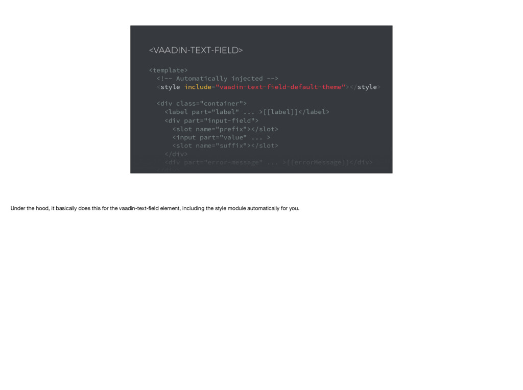
![<dom-module id="vaadin-text-field-default-theme" theme-for="vaadin-text-field"> <template> <style> [part="label"] { font-size: 0.875em; font-weight:](https://files.speakerdeck.com/presentations/0085dfce52914eab97957ed7c015b539/slide_19.jpg)
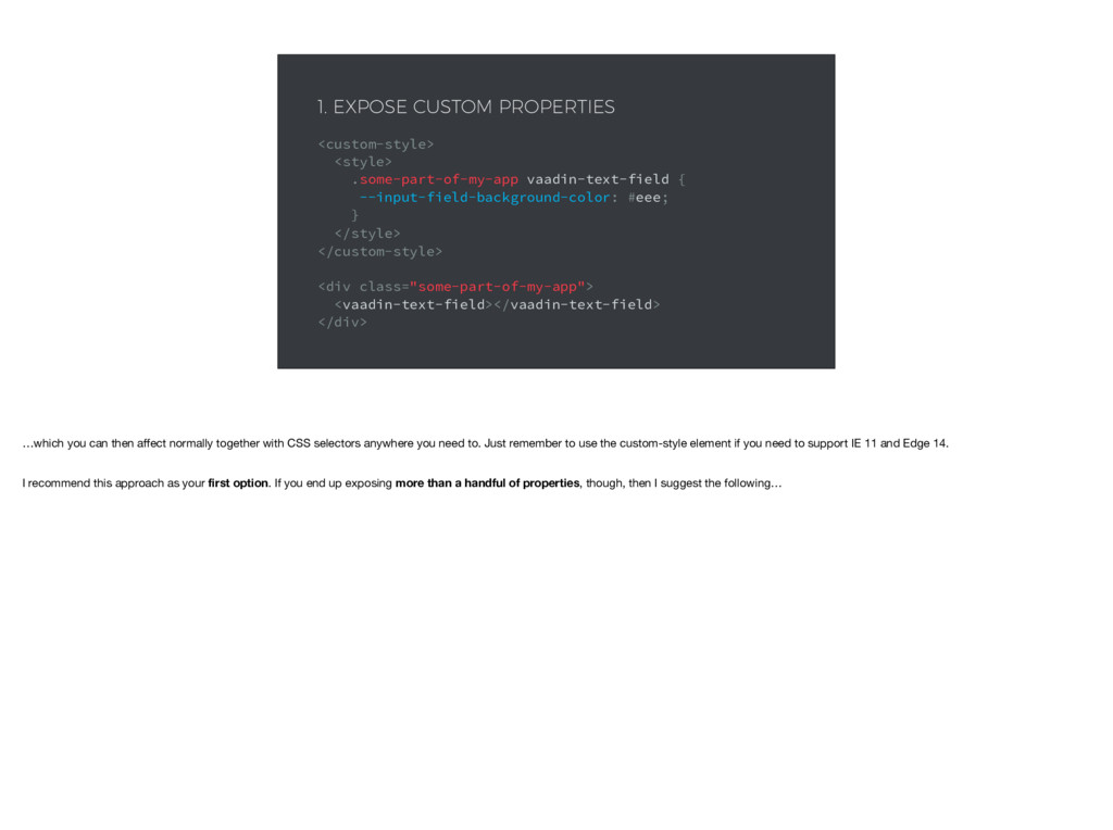
![<dom-module id="my-text-field-theme" theme-for="vaadin-text-field"> <template> <style> [part="input-field"] { background-color: var(--input-field-background-color, #fff);](https://files.speakerdeck.com/presentations/0085dfce52914eab97957ed7c015b539/slide_23.jpg)
![<dom-module id="my-text-field-theme" theme-for="vaadin-text-field"> <template> <style> :host(.special-field) [part="input-field"] { background-color: #000;](https://files.speakerdeck.com/presentations/0085dfce52914eab97957ed7c015b539/slide_25.jpg)
![<template> <div class="container"> <label part="label" ... >[[label]]</label> <div part="input-field"> <slot](https://files.speakerdeck.com/presentations/0085dfce52914eab97957ed7c015b539/slide_31.jpg)
![<template> <div class="container"> <label part="label" ... >[[label]]</label> <div part="input-field"> <slot](https://files.speakerdeck.com/presentations/0085dfce52914eab97957ed7c015b539/slide_32.jpg)
![THANK YOU! Jouni Koivuviita @jouni [email protected] Questions?](https://files.speakerdeck.com/presentations/0085dfce52914eab97957ed7c015b539/slide_54.jpg)