Behind the Scenes—and Science—of the Earth Observatory
Since 1999 NASA's Earth Observatory has produced more than 12,000 data visualizations, images, and maps. This presentation gives an overview of the Earth Observatory and our approach to science communication over the last two decades.
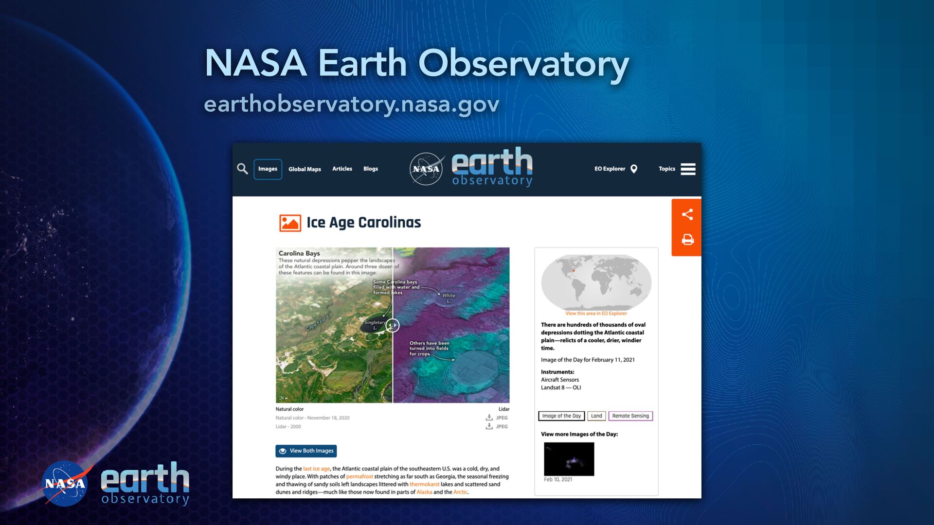
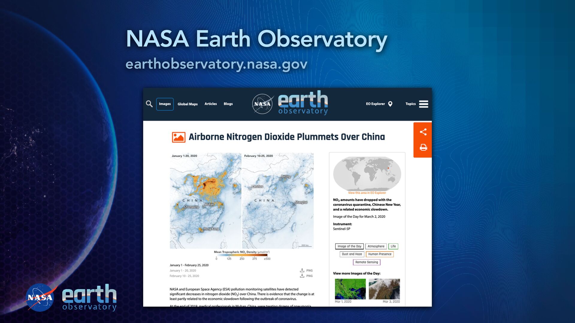
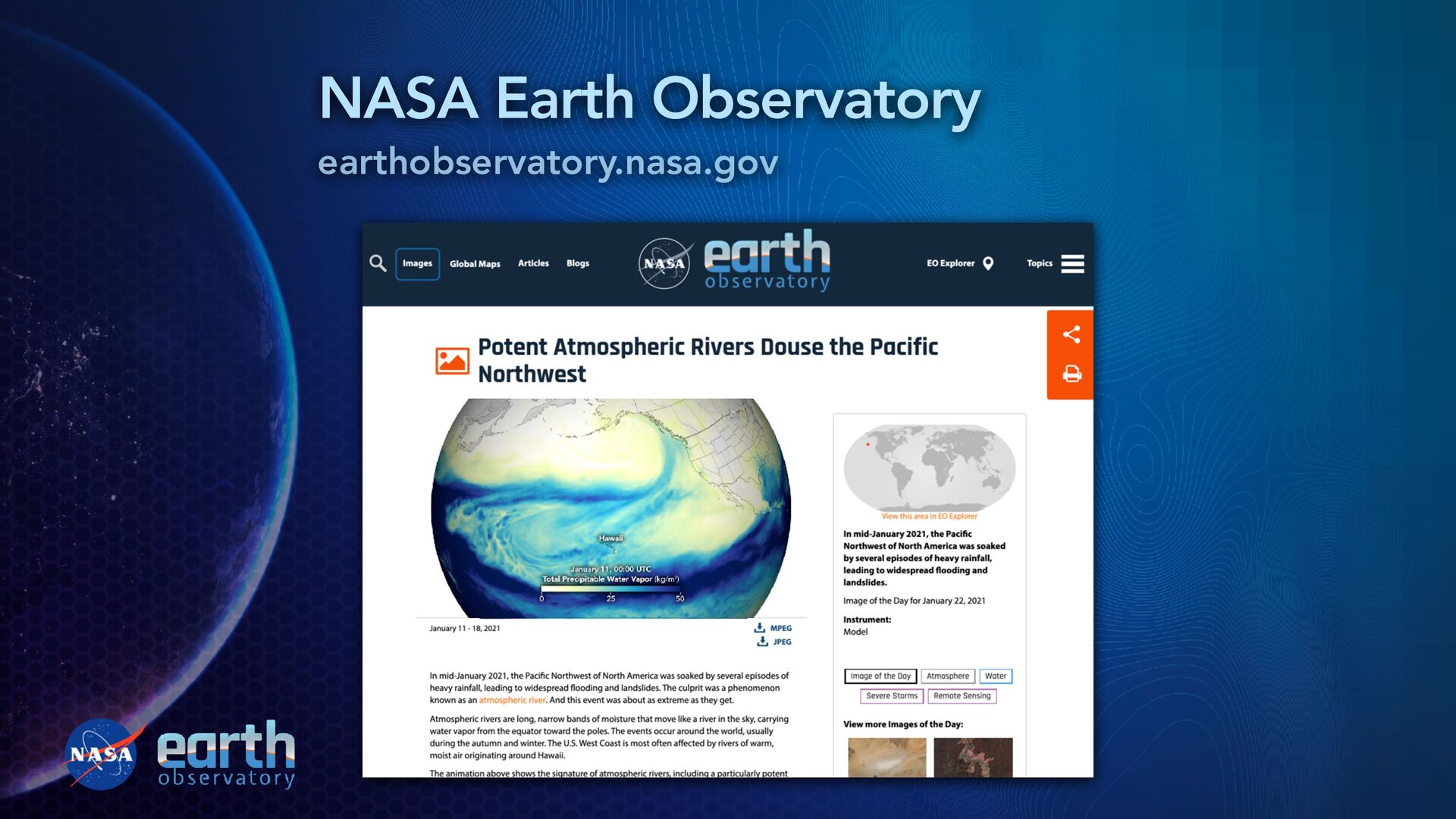
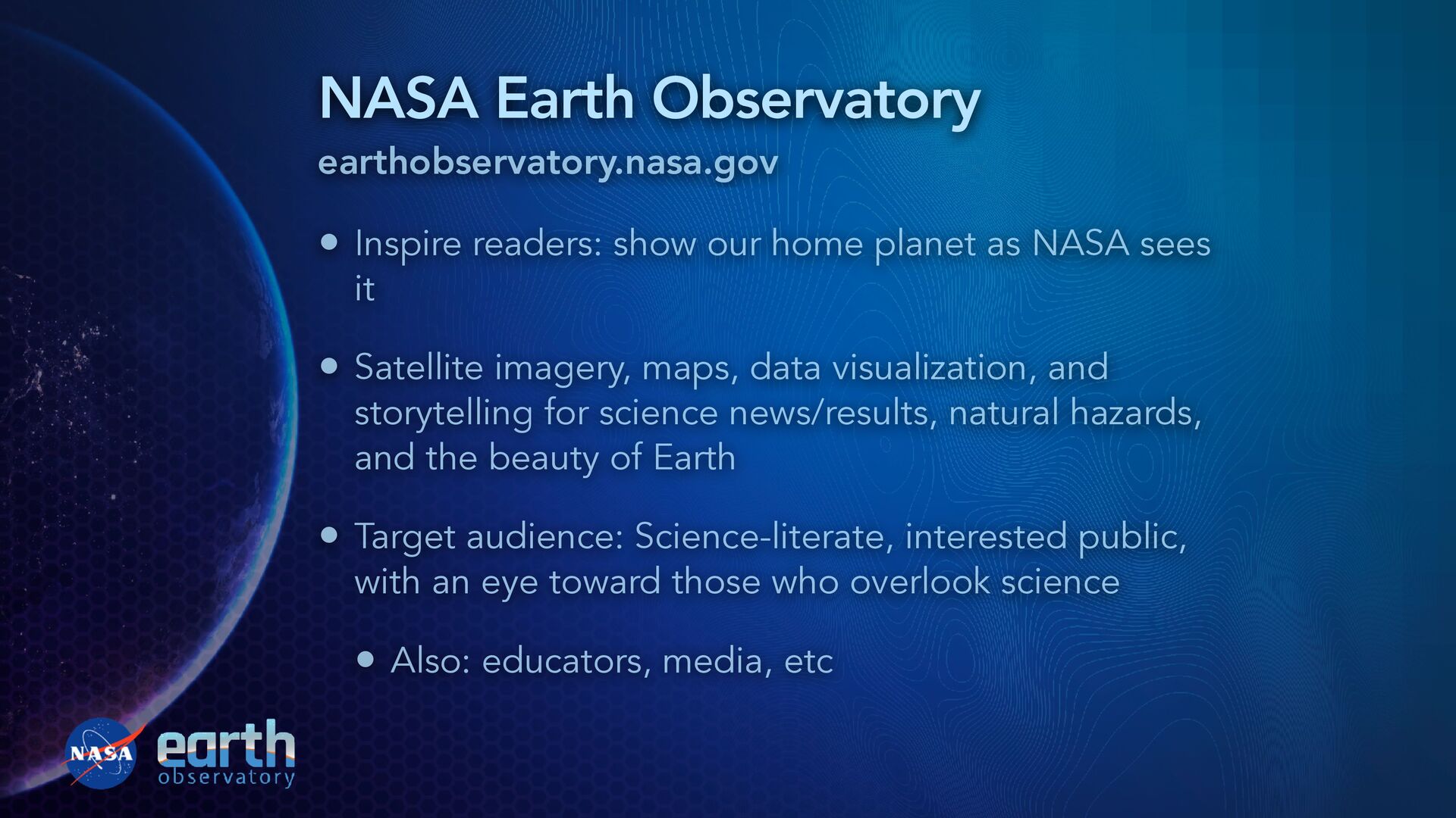
publication of data-driven, scienti fi c imagery • More than 12,000 stories published The Earth Observatory’s mission is to share with the public the images, stories, and discoveries about the environment, Earth systems, and climate that emerge from NASA research, including its satellite missions, in-the-field research, and models. “ ”
planet as NASA sees it • Satellite imagery, maps, data visualization, and storytelling for science news/results, natural hazards, and the beauty of Earth • Target audience: Science-literate, interested public, with an eye toward those who overlook science • Also: educators, media, etc
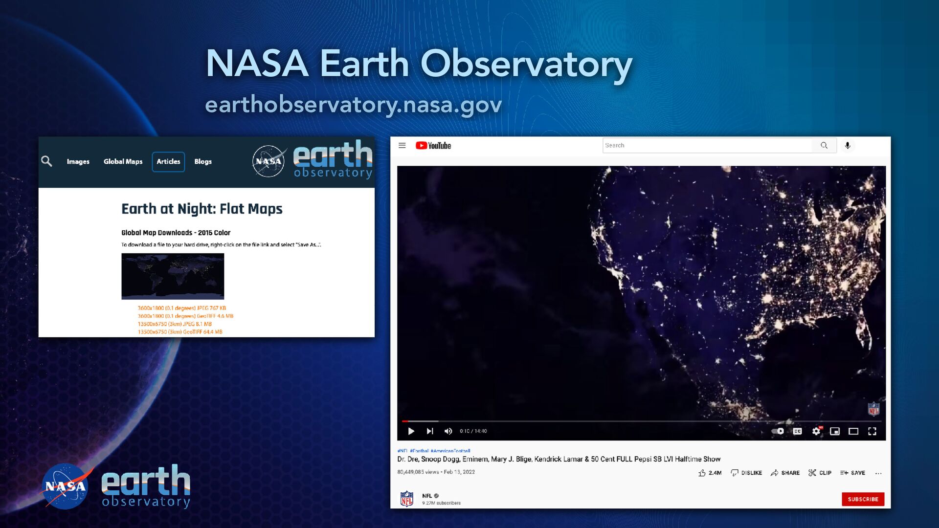
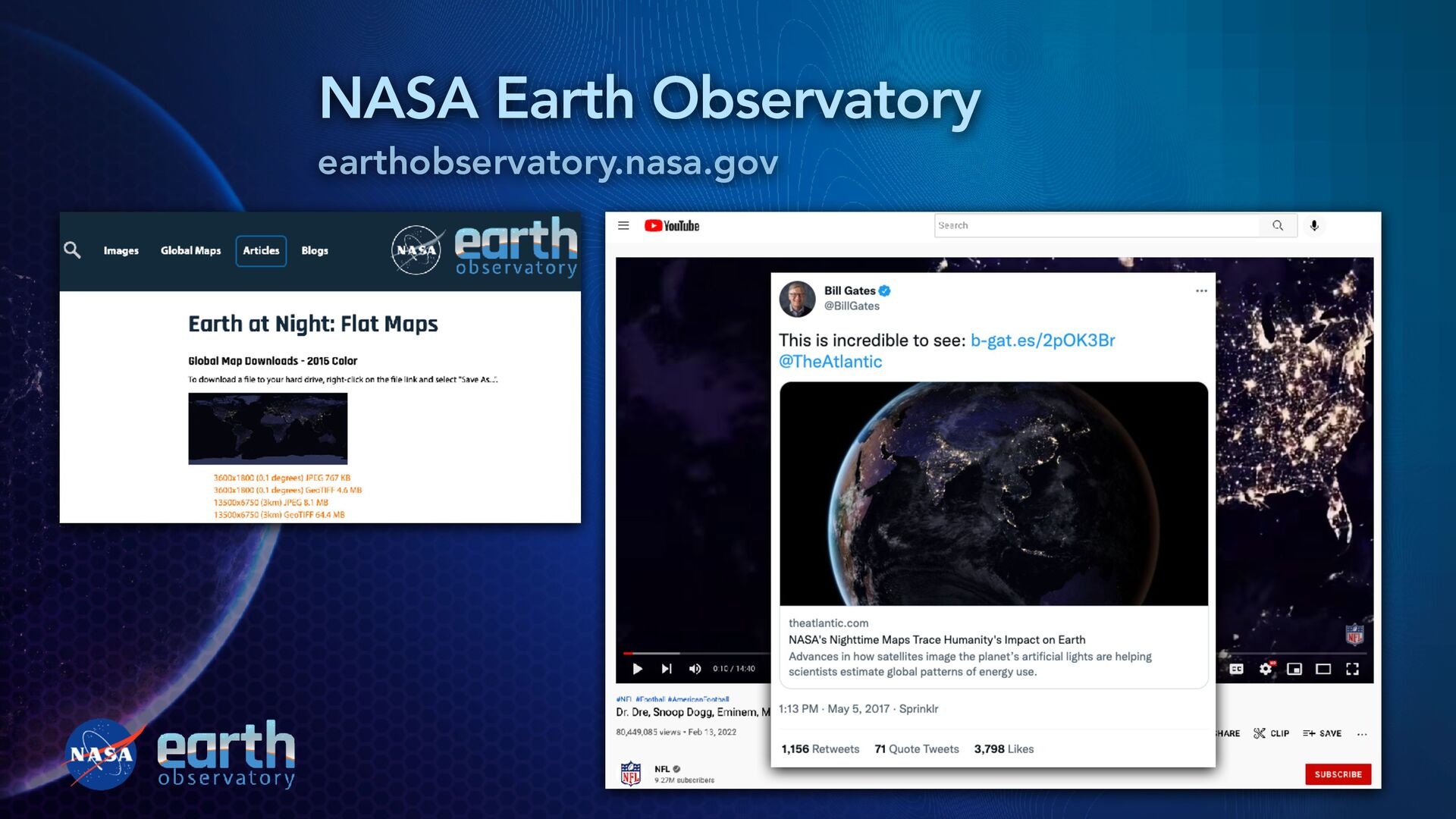
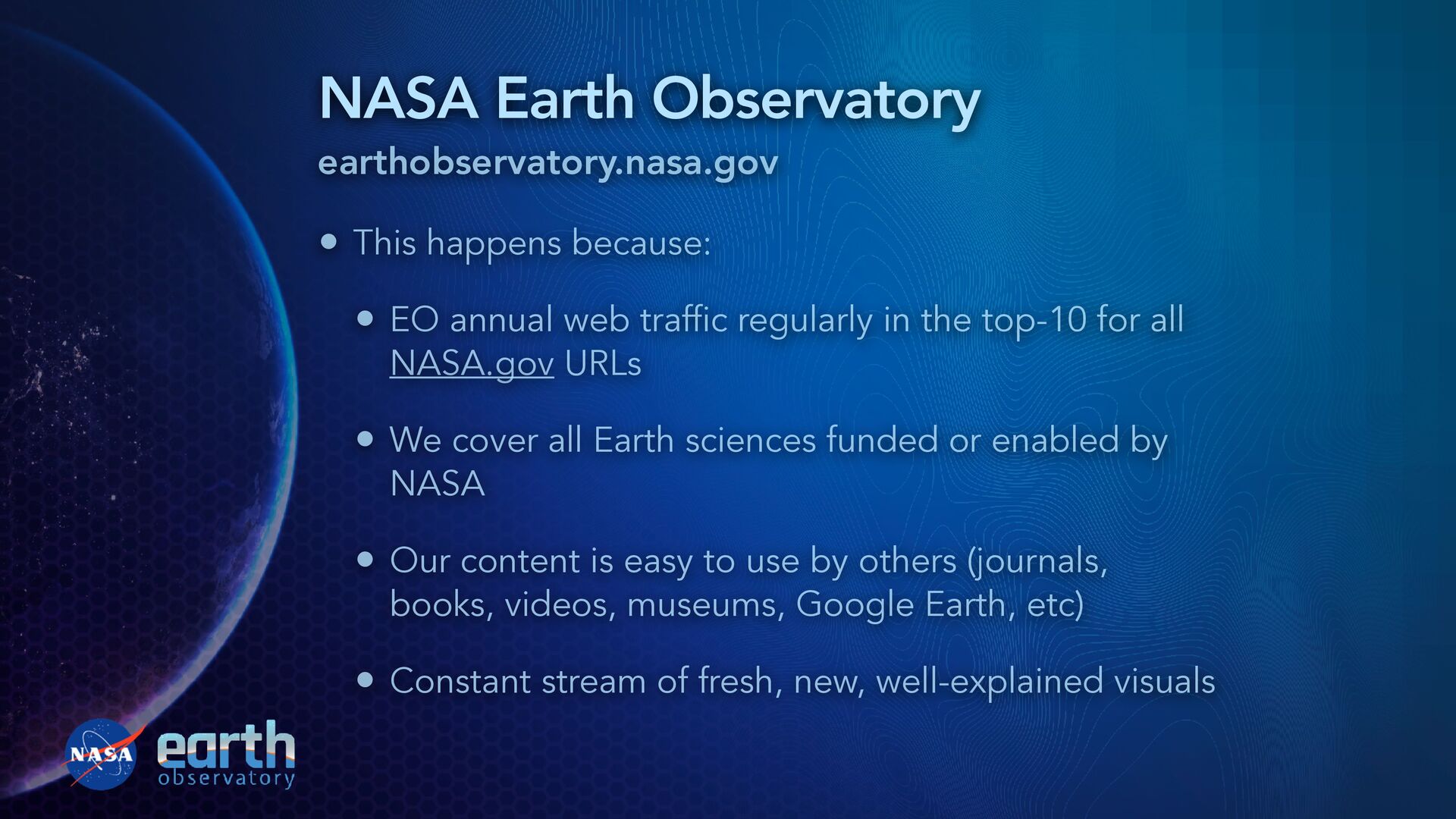
annual web traffic regularly in the top-10 for all NASA.gov URLs • We cover all Earth sciences funded or enabled by NASA • Our content is easy to use by others (journals, books, videos, museums, Google Earth, etc) • Constant stream of fresh, new, well-explained visuals
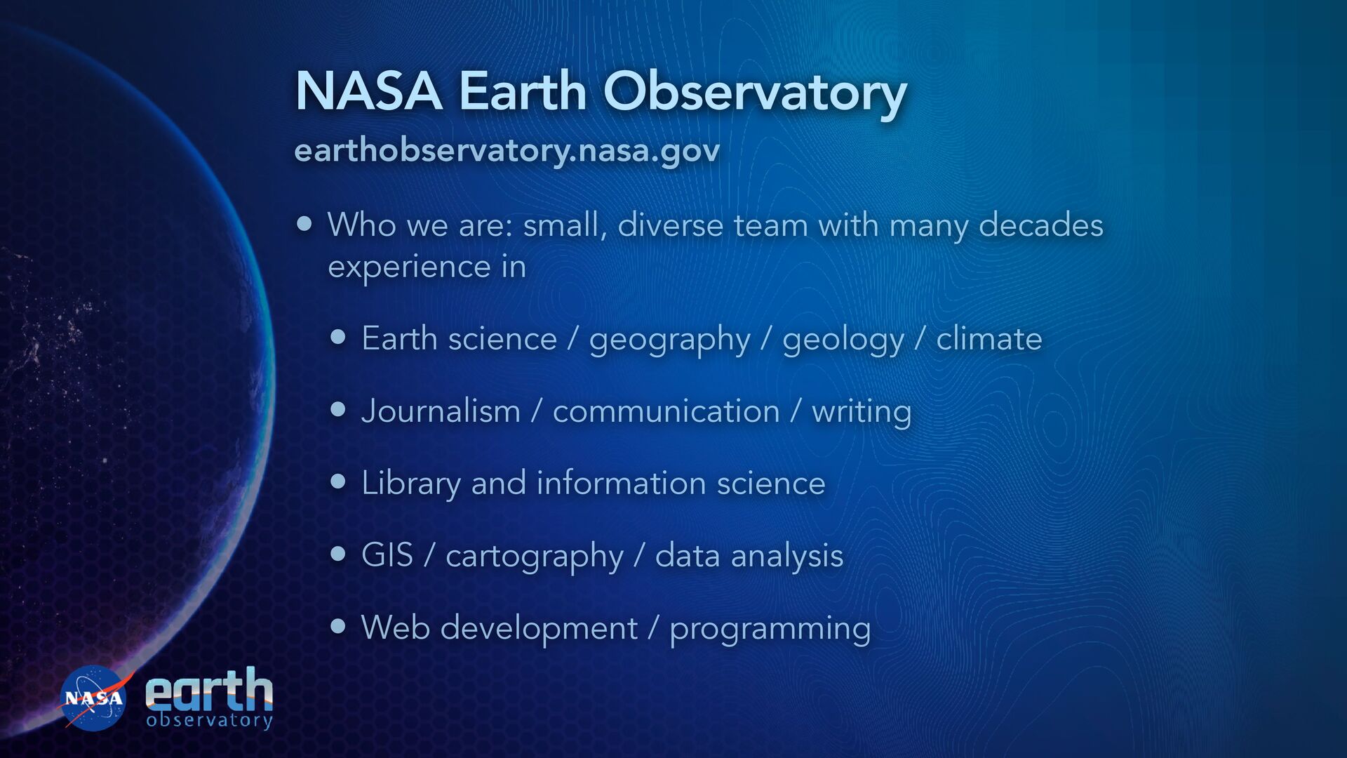
team with many decades experience in • Earth science / geography / geology / climate • Journalism / communication / writing • Library and information science • GIS / cartography / data analysis • Web development / programming
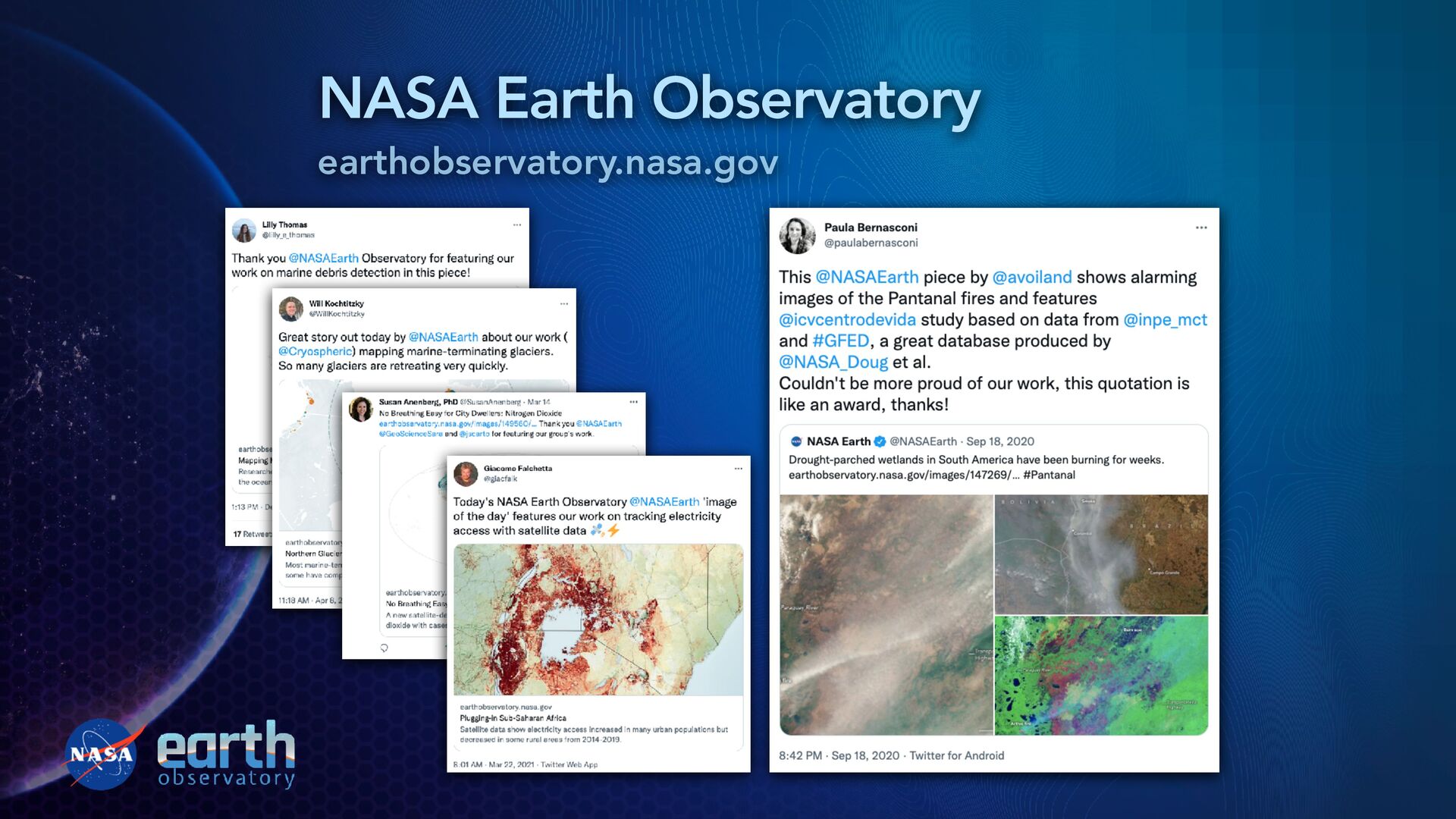
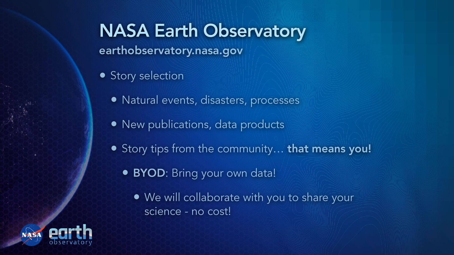
disasters, processes • New publications, data products • Story tips from the community… that means you! • BYOD: Bring your own data! • We will collaborate with you to share your science - no cost!
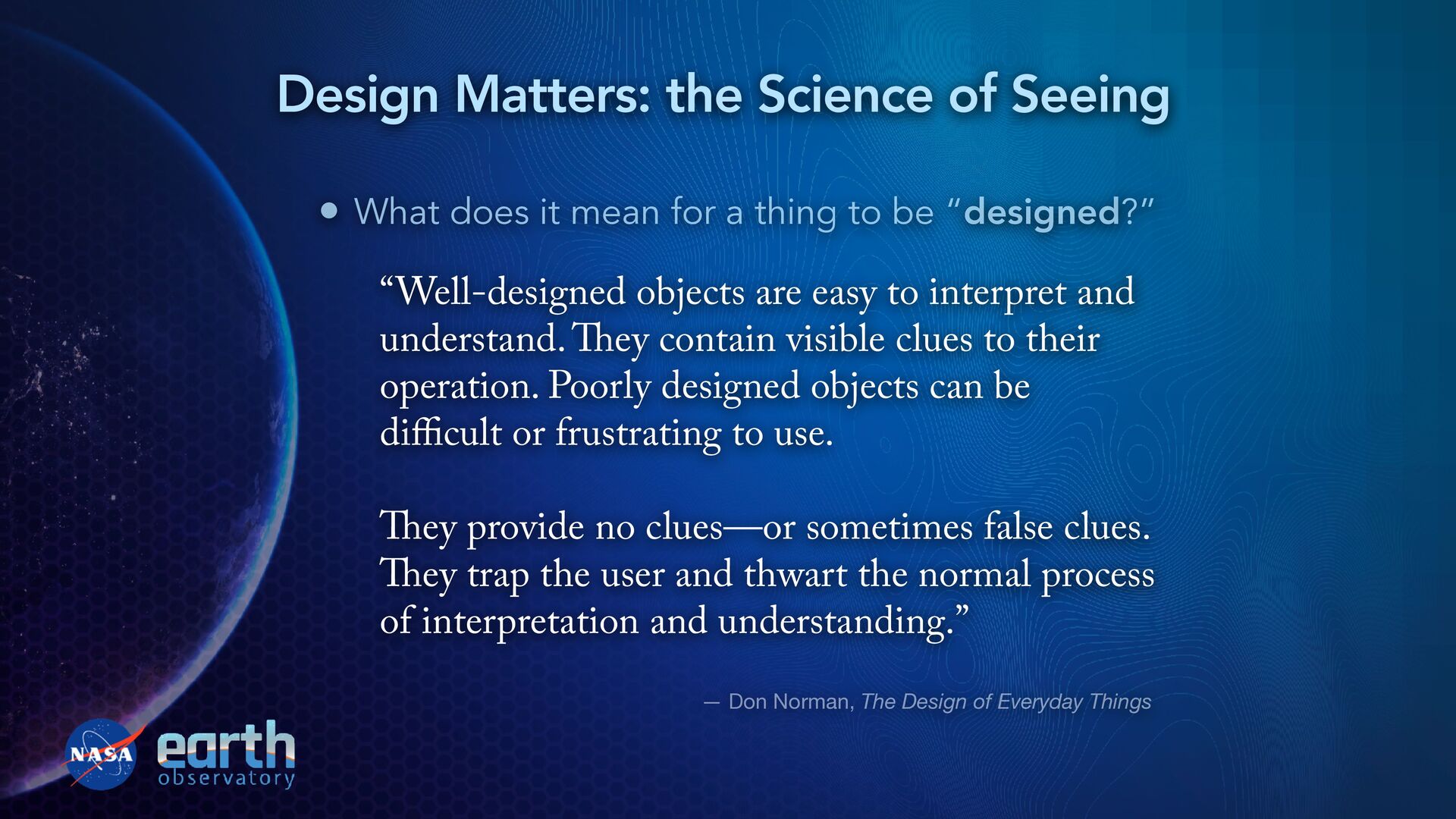
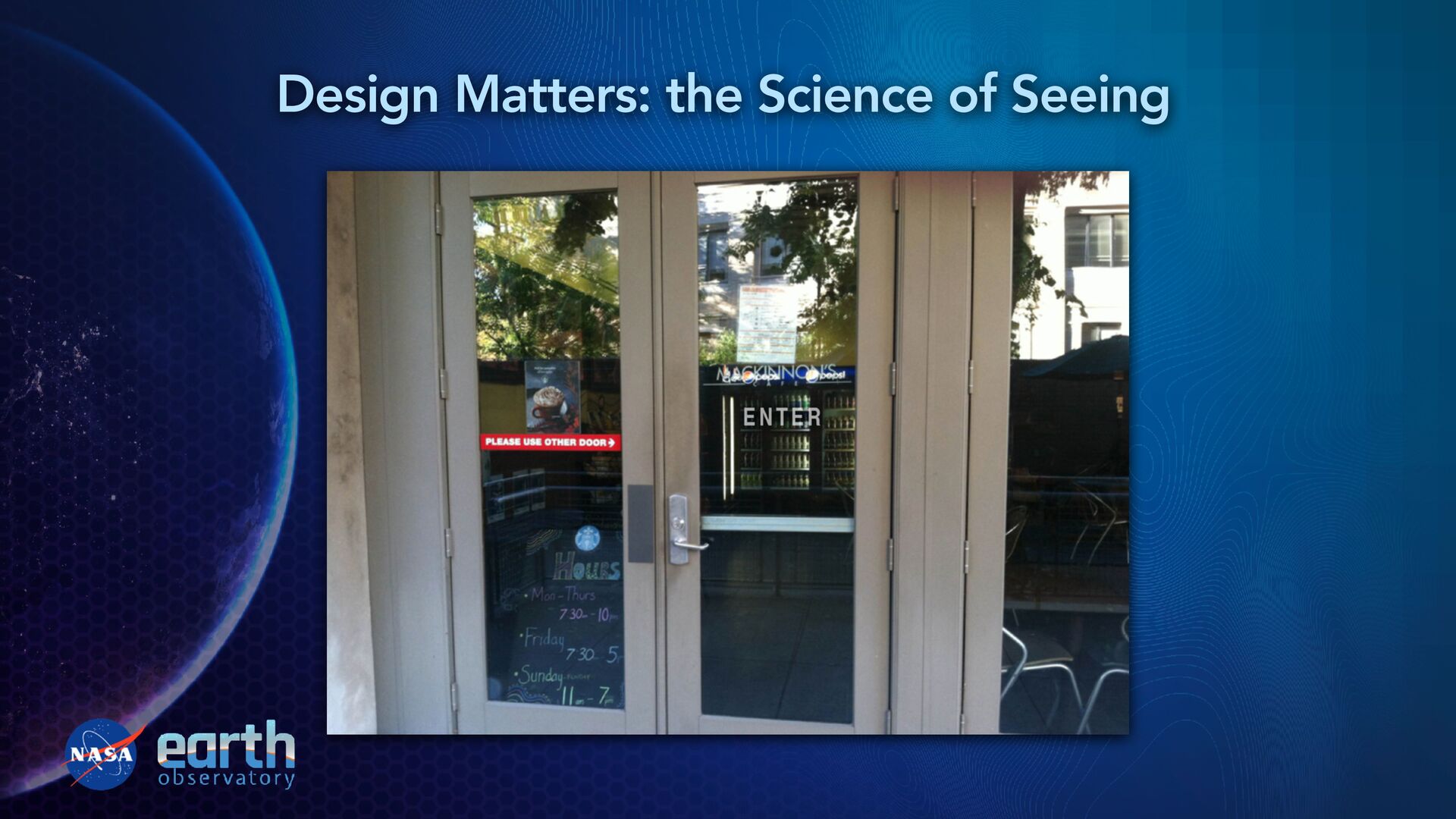
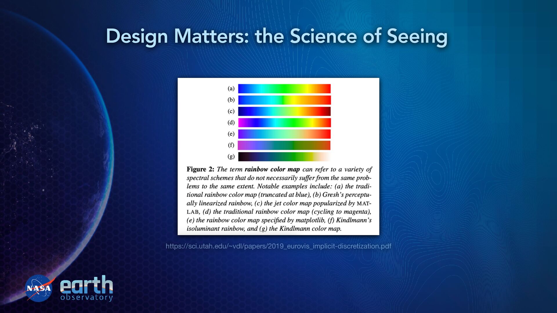
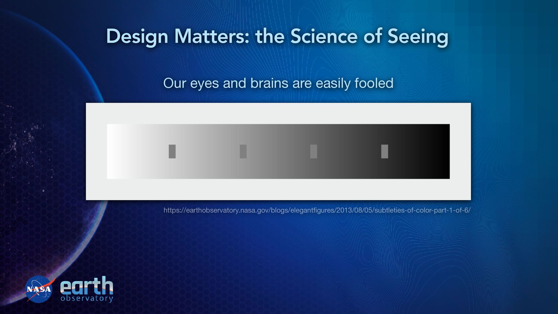
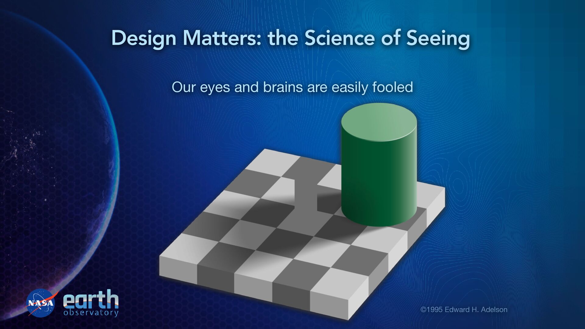
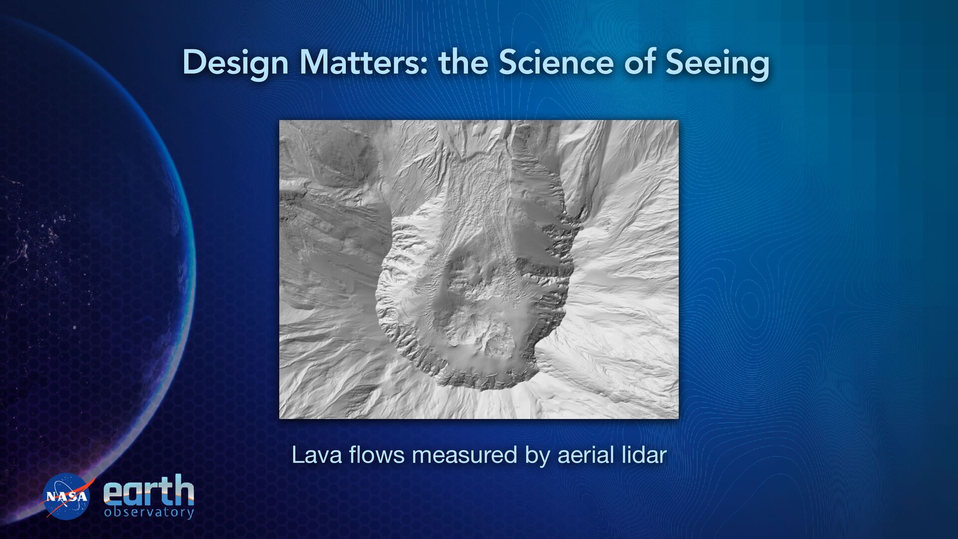
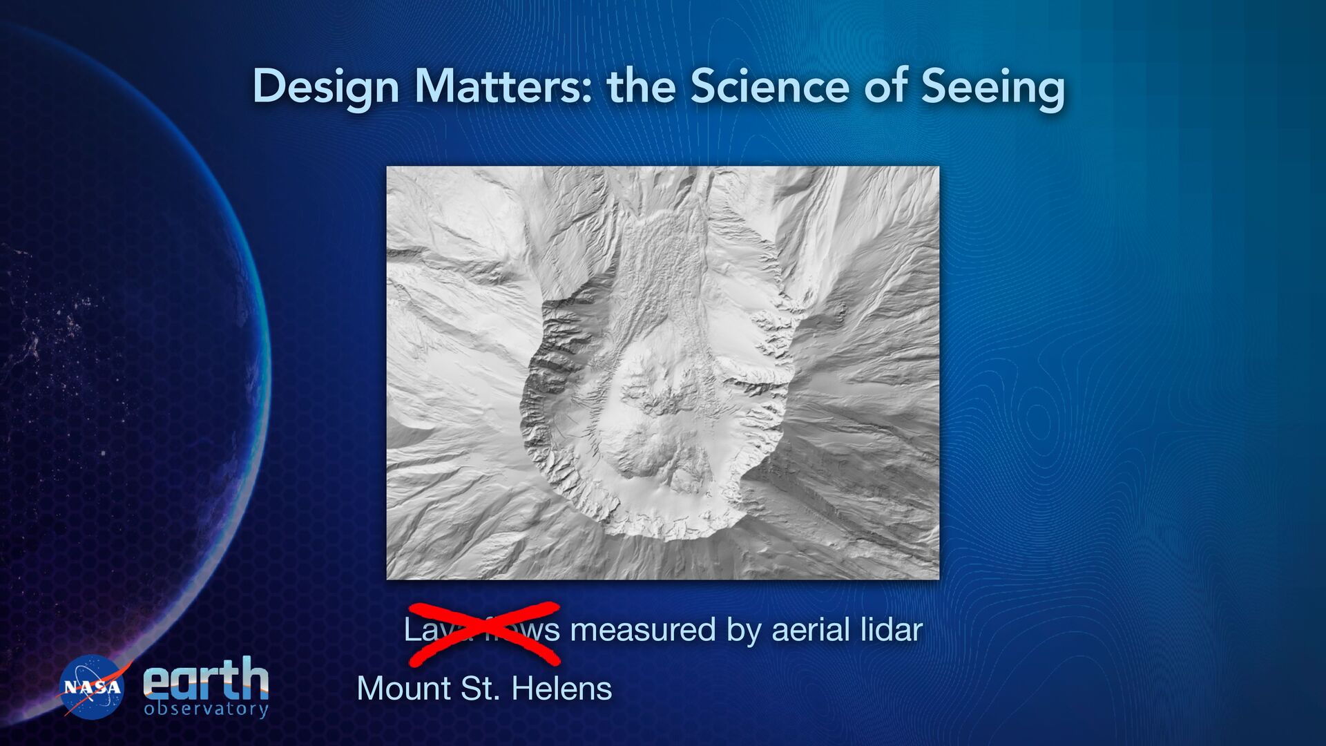
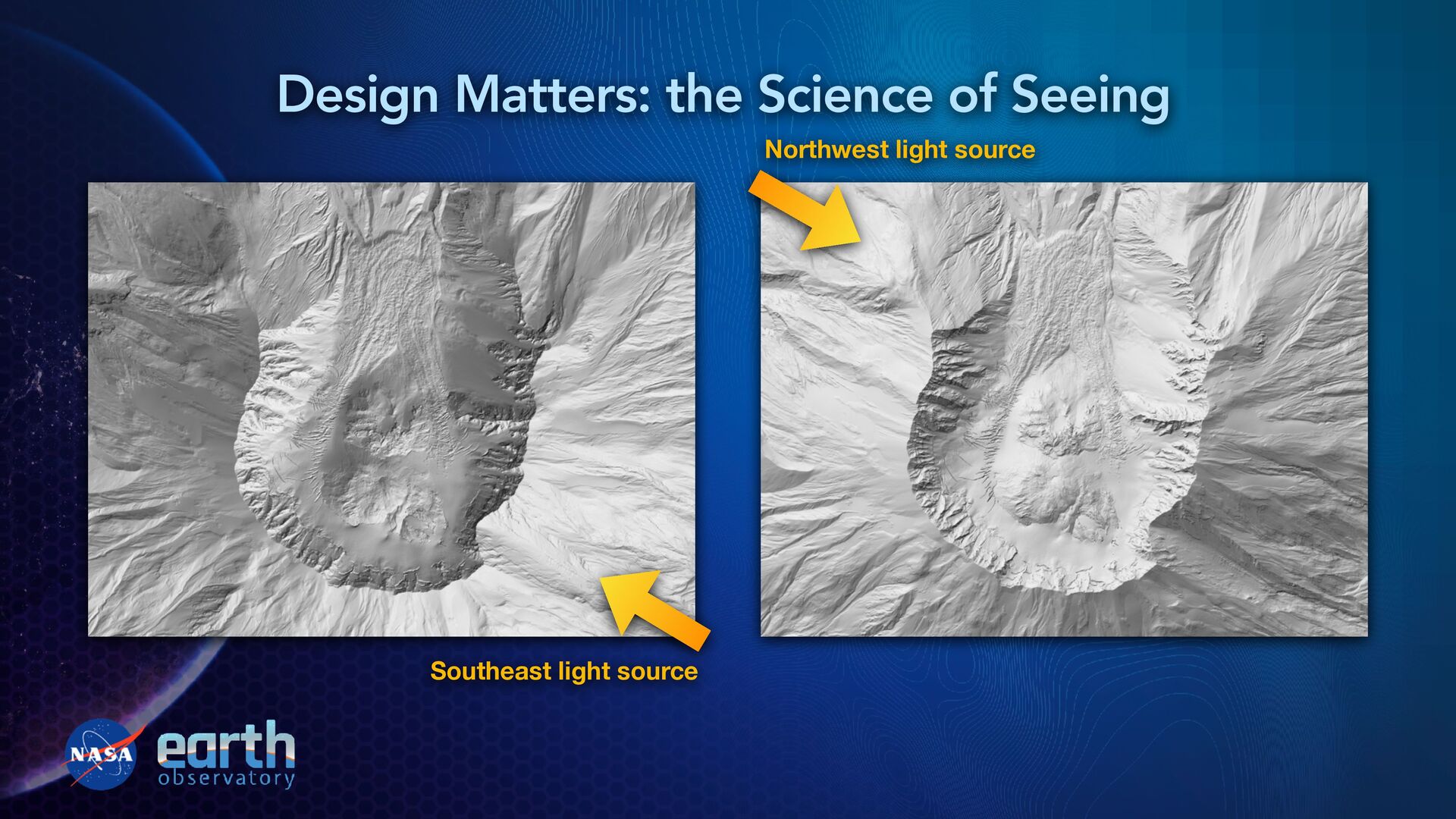
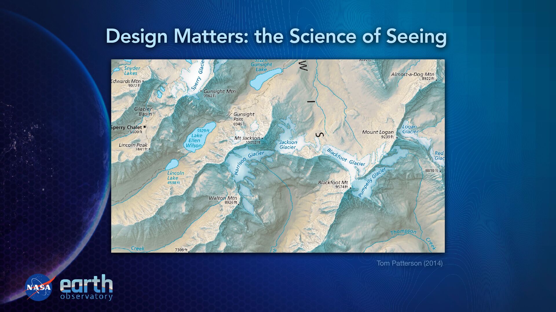
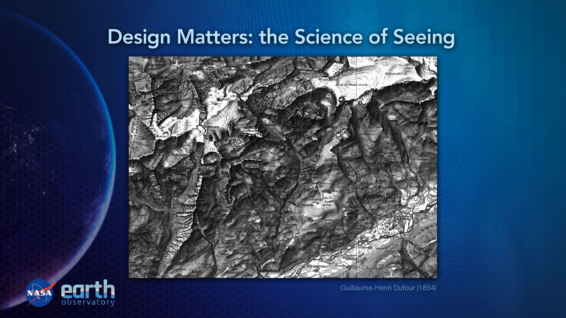
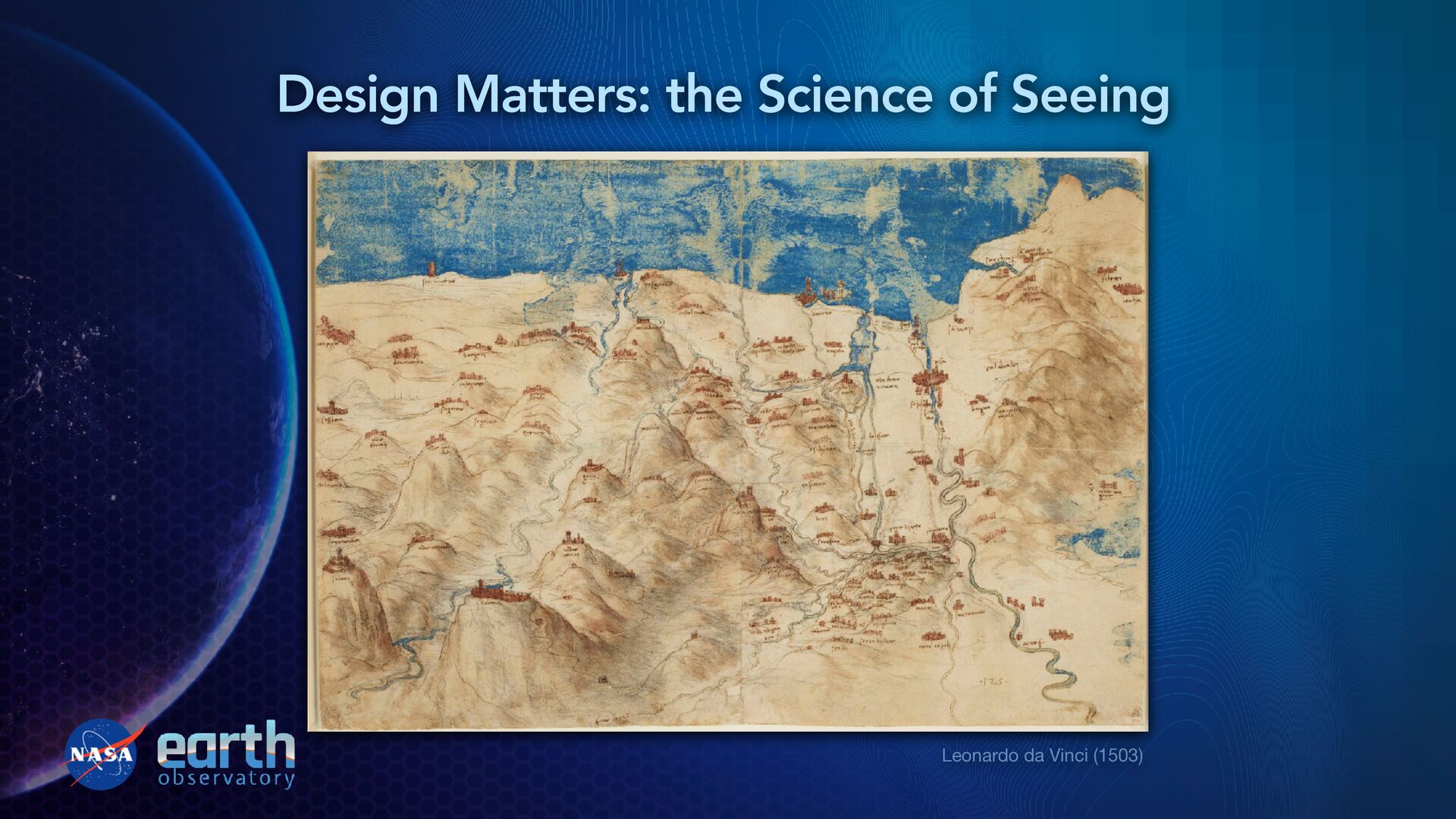
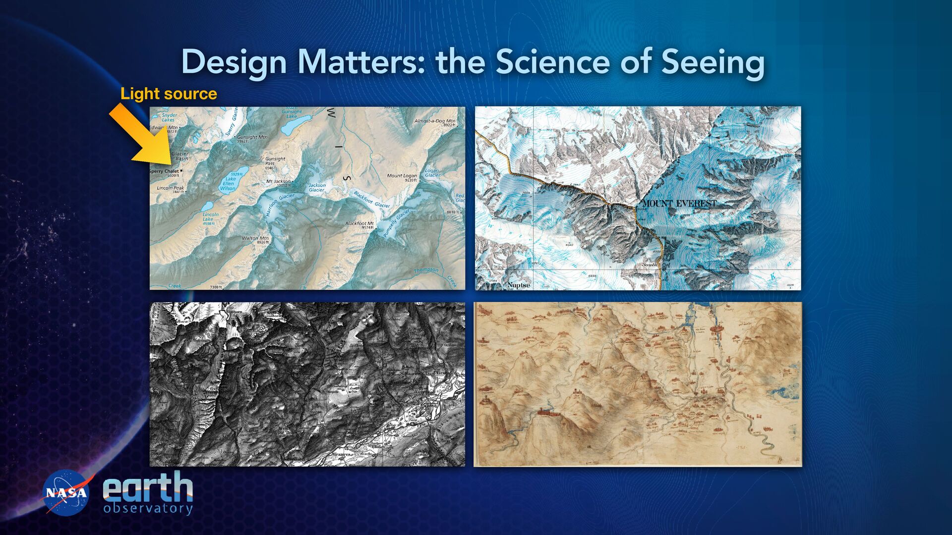
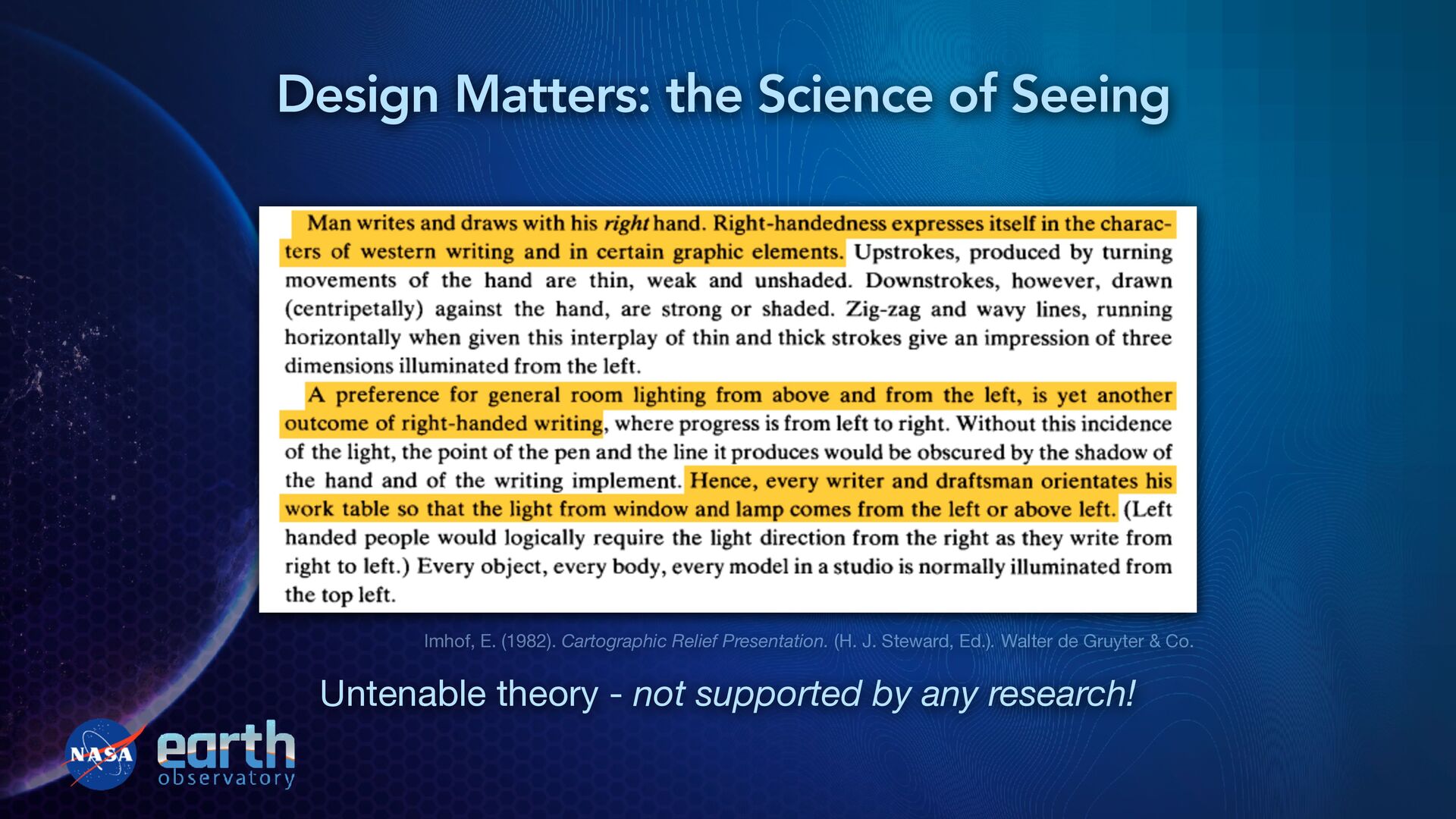
“designed?” “Well-designed objects are easy to interpret and understand. Th ey contain visible clues to their operation. Poorly designed objects can be di ffi cult or frustrating to use. Th ey provide no clues—or sometimes false clues. Th ey trap the user and thwart the normal process of interpretation and understanding.” — Don Norman, The Design of Everyday Things Design Matters: the Science of Seeing
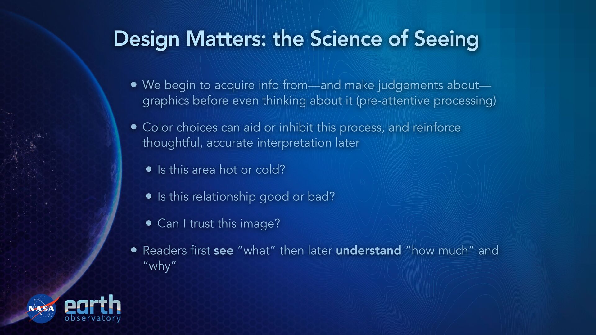
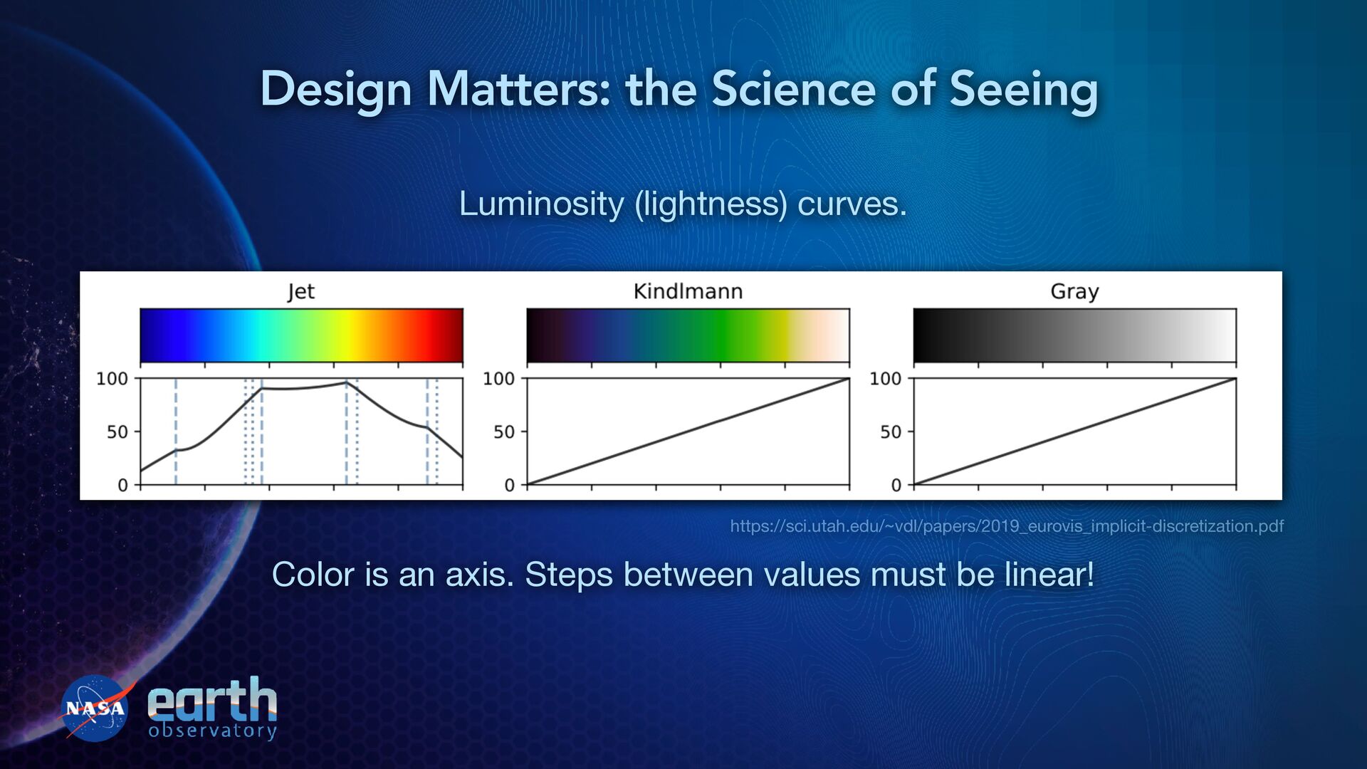
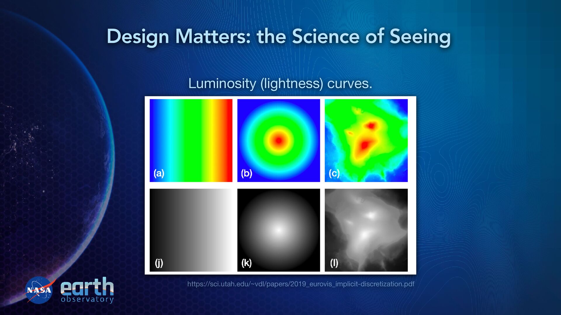
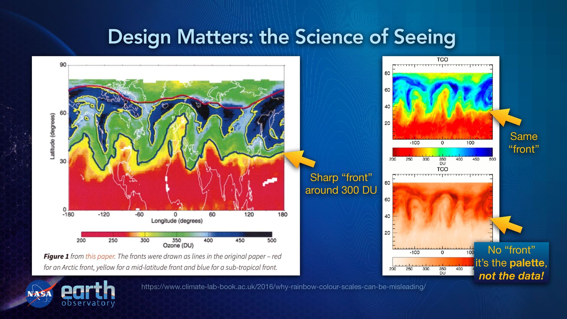
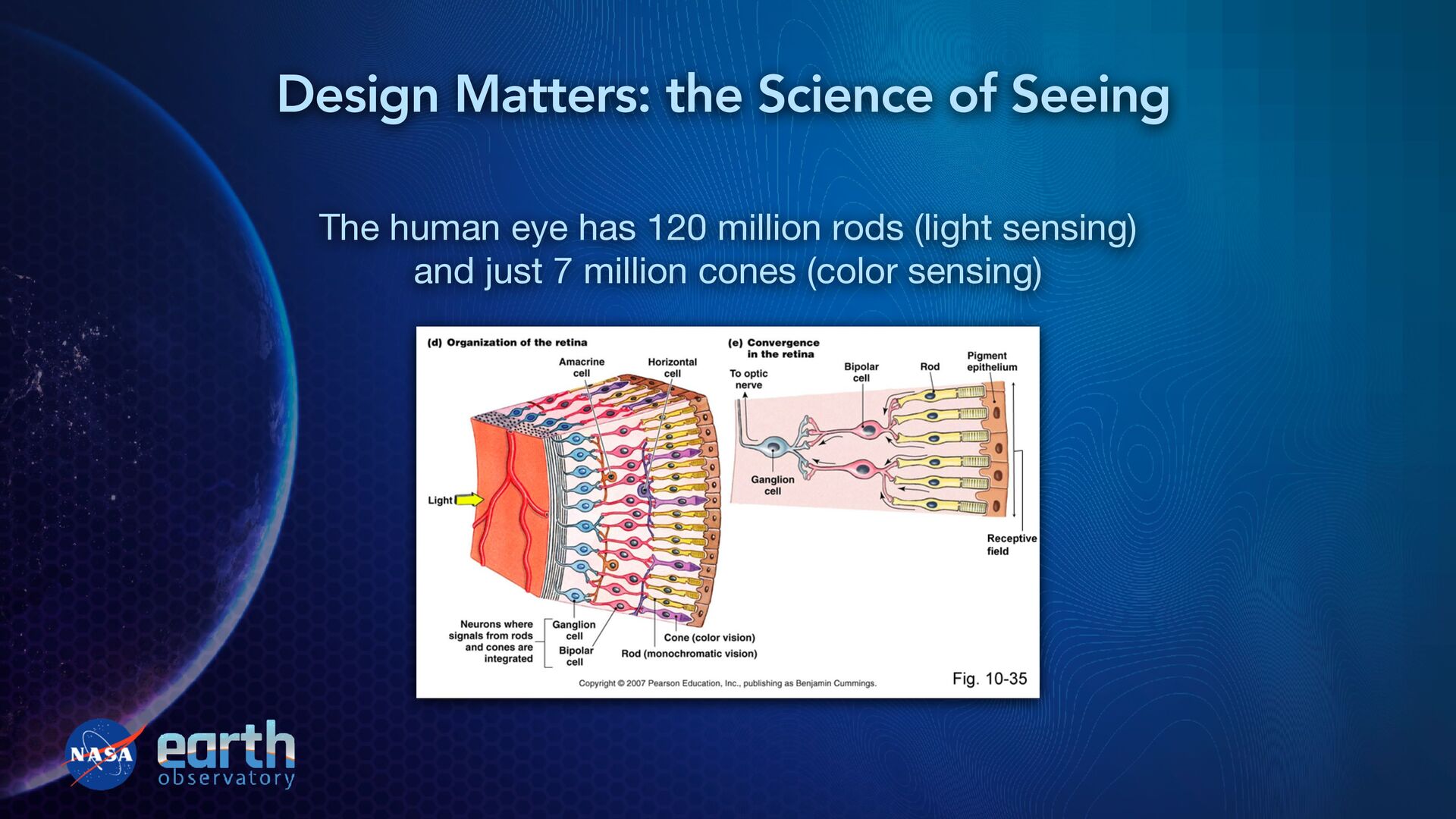
graphics before even thinking about it (pre-attentive processing) • Color choices can aid or inhibit this process, and reinforce thoughtful, accurate interpretation later • Is this area hot or cold? • Is this relationship good or bad? • Can I trust this image? • Readers first see “what” then later understand “how much” and “why” Design Matters: the Science of Seeing
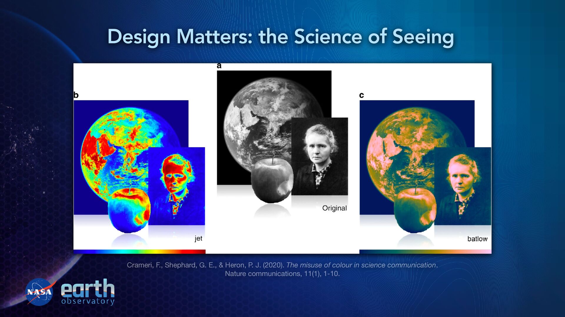
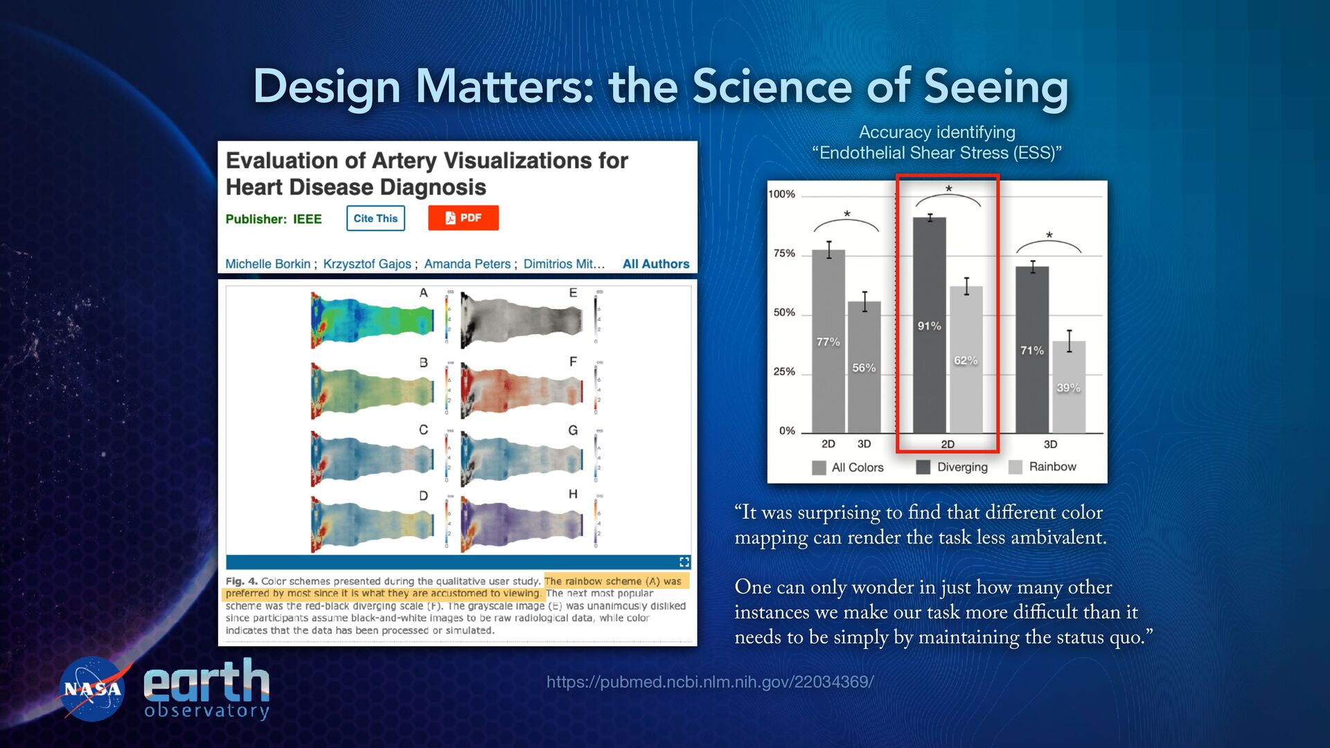
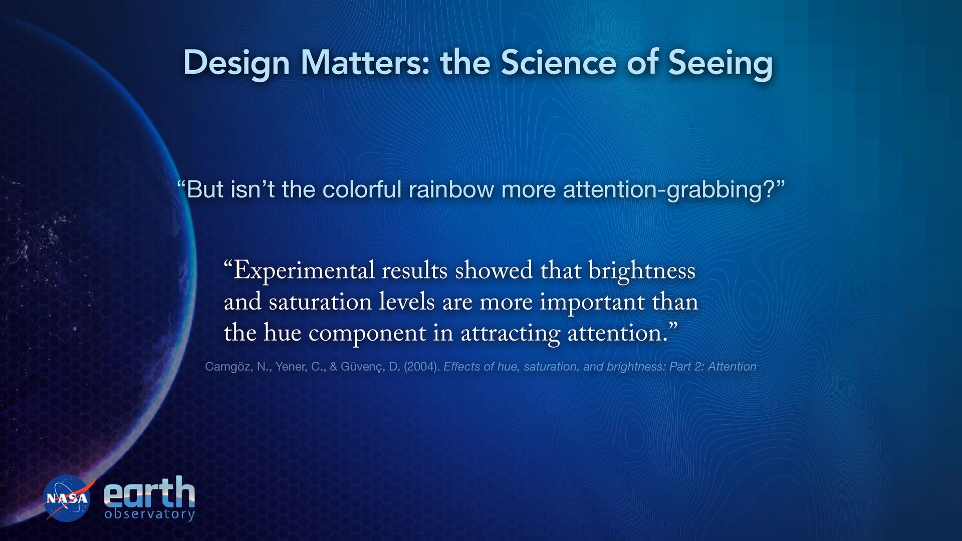
Shear Stress (ESS)” “It was surprising to fi nd that di ff erent color mapping can render the task less ambivalent. One can only wonder in just how many other instances we make our task more di ffi cult than it needs to be simply by maintaining the status quo.”
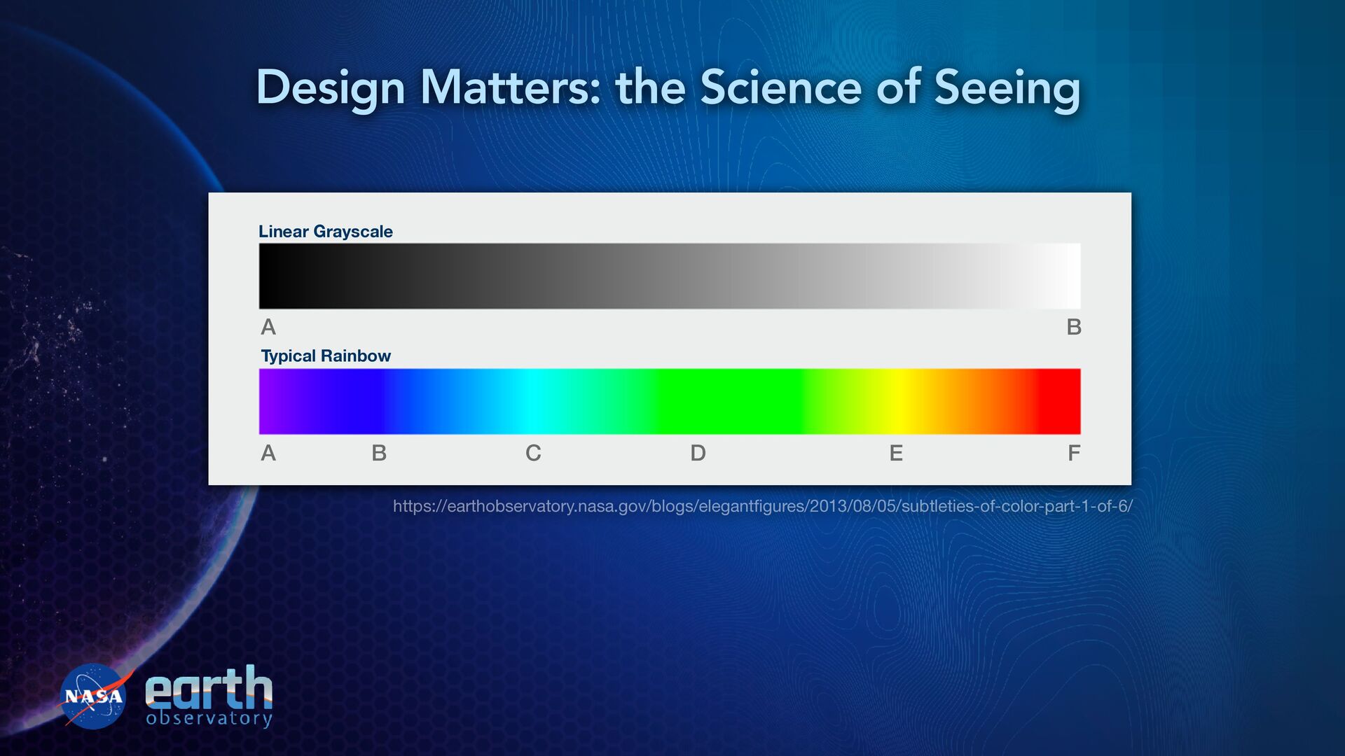
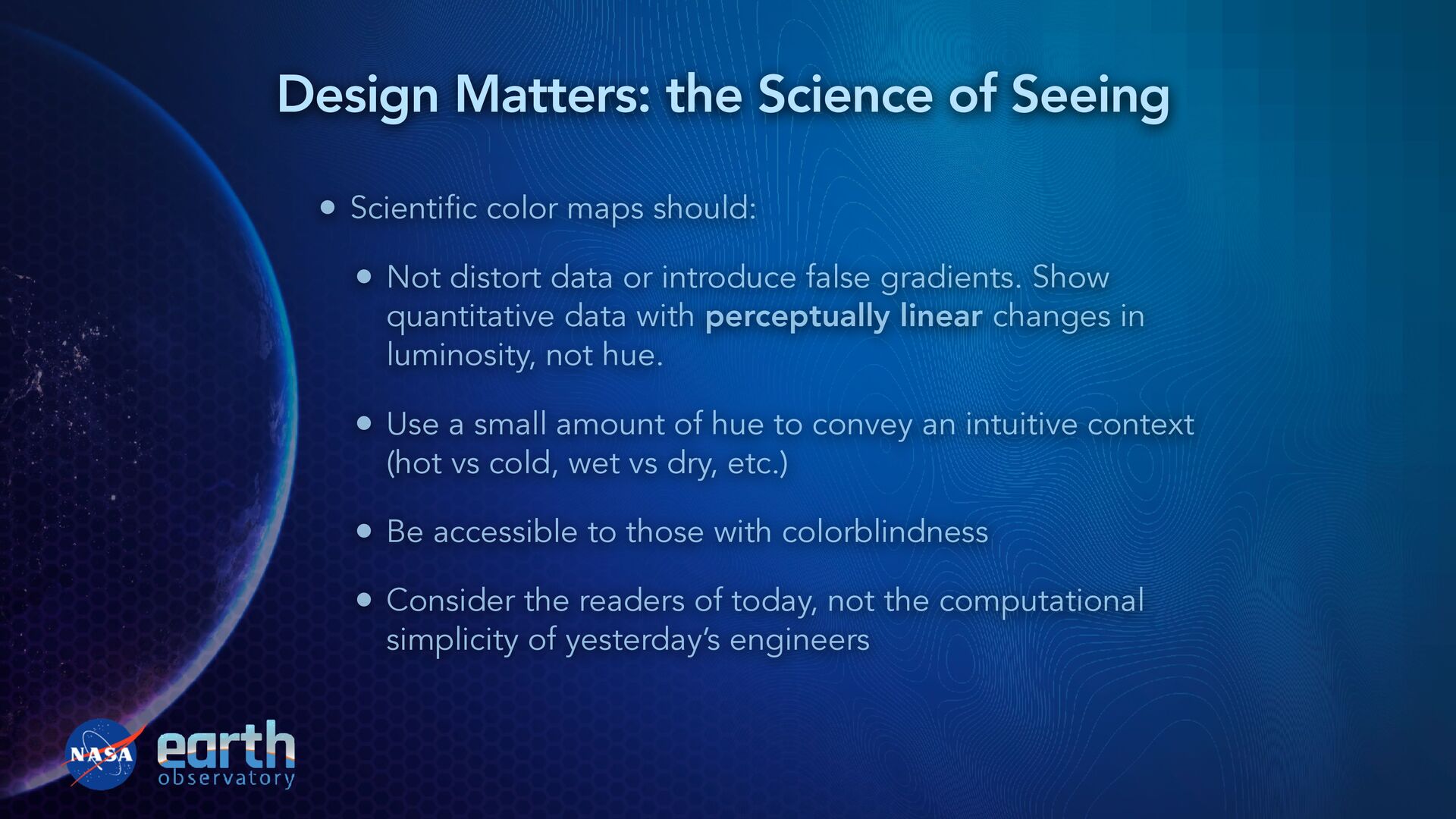
introduce false gradients. Show quantitative data with perceptually linear changes in luminosity, not hue. • Use a small amount of hue to convey an intuitive context (hot vs cold, wet vs dry, etc.) • Be accessible to those with colorblindness • Consider the readers of today, not the computational simplicity of yesterday’s engineers Design Matters: the Science of Seeing
audience—and how their brains work • General public does not know what you know, does not read same journals, is not used to the same software defaults, or the same unchallenged conventions of your field • Prioritize audience psychology over technology or irrelevant physics • If we want people to accept unfamiliar science, we need to be willing to do the same and adjust our approach accordingly Design Matters: the Science of Seeing
![Thank you! Questions or comments? [email protected] EarthObservatory.nasa.gov @jscarto](https://files.speakerdeck.com/presentations/4e66d14ad46c4c8abd28f90628d07b51/slide_51.jpg)