It used to be that you worked on look and feel before you thought about content. But it’s actually very hard to do design without content. –Jeffrey Zeldman
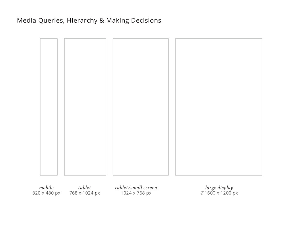
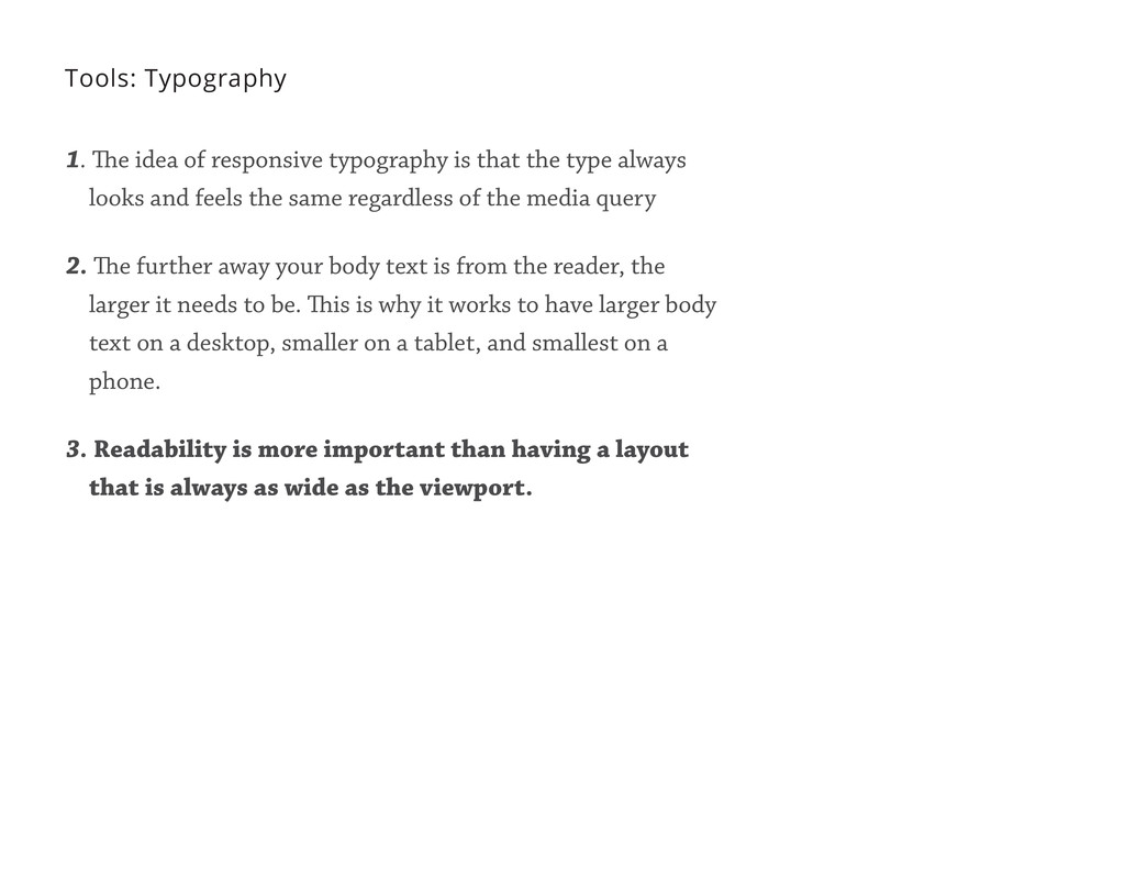
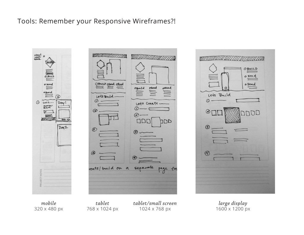
the type always looks and feels the same regardless of the media query Tools: Typography 1. The idea of responsive typography is that the type always looks and feels the same regardless of the media query 2. The further away your body text is from the reader, the larger it needs to be. This is why it works to have larger body text on a desktop, smaller on a tablet, and smallest on a phone.
the type always looks and feels the same regardless of the media query 2. The further away your body text is from the reader, the larger it needs to be. This is why it works to have larger body text on a desktop, smaller on a tablet, and smallest on a phone. 3. Readability is more important than having a layout that is always as wide as the viewport.
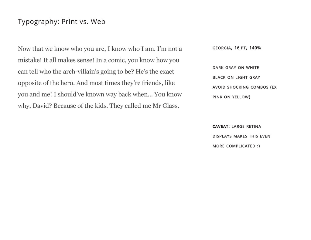
are, I know who I am. I’m not a mistake! It all makes sense! In a comic, you know how you can tell who the arch-villain’s going to be? He’s the exact opposite of the hero. And most times they’re friends, like you and me! I should’ve known way back when... You know why, David? Because of the kids. They called me Mr Glass. georgia, 16 pt, 140% dark gray on white black on light gray avoid shocking combos (ex pink on yellow) caveat: large retina displays makes this even more complicated :)
same balance of consistency and variety. Too systematic and the design becomes predictable and repetitive. Too much variation and the system is confusing and overwhelming. –Yesenia Perez-Cruz
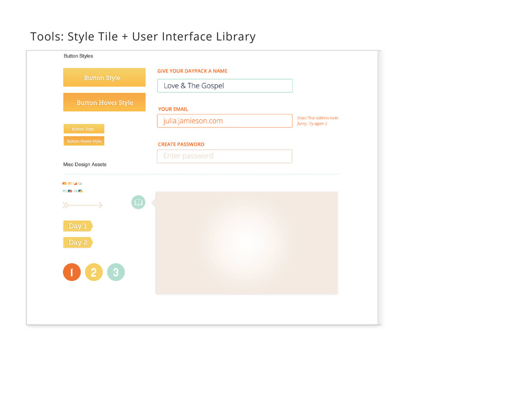
different competencies required to build a website. Instead of viewing ourselves in terms of discrete roles, we should instead look to emphasize our range of abilities, and work with others whose skills are complementary. –Paul Robert Lloyd Now, make it happen:
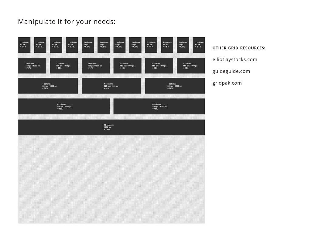
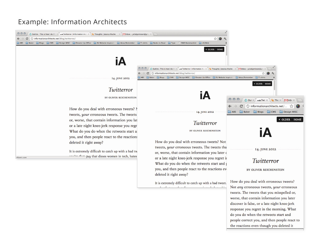
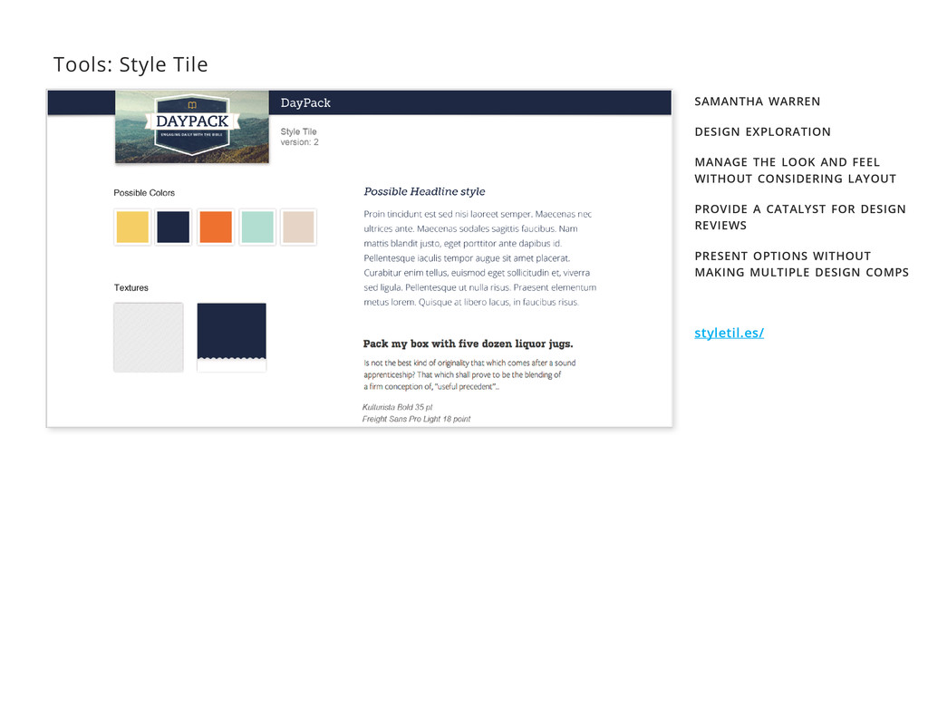
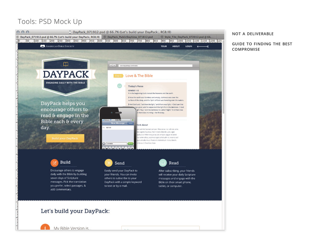
http://www.lukew.com/ff/entry.asp?1583 Mule http://weblog.muledesign.com/2010/08/why_we_dont_deliver_photoshop_files.php Samantha Warren http://styletil.es/ Paul Robert Lloyd http://24ways.org/2011/collaborative-development-for-a-responsively-designed-web ALA http://www.alistapart.com/articles/fluidgrids/ Elliot Jay Stocks http://elliotjaystocks.com/ examples jessicahische.is informationarchitects.net/blog/twitterror/ iA Writer
 juliajamieson
 usagimaru
 karad
karad
 littlebusters
 bebe
bebe
 signull
 visional_engineering_and_design
 csswizardry
 vivion
 ryu1013
 kakukoki
 hypebeans
 mhand01
 speakerdeck
 frankvandijk
 mongodb
 kneath
 schroneko
 productmarketing
 palkan
 jonoalderson
 chriscoyier
 sstephenson
 denniskardys
 bermonpainter