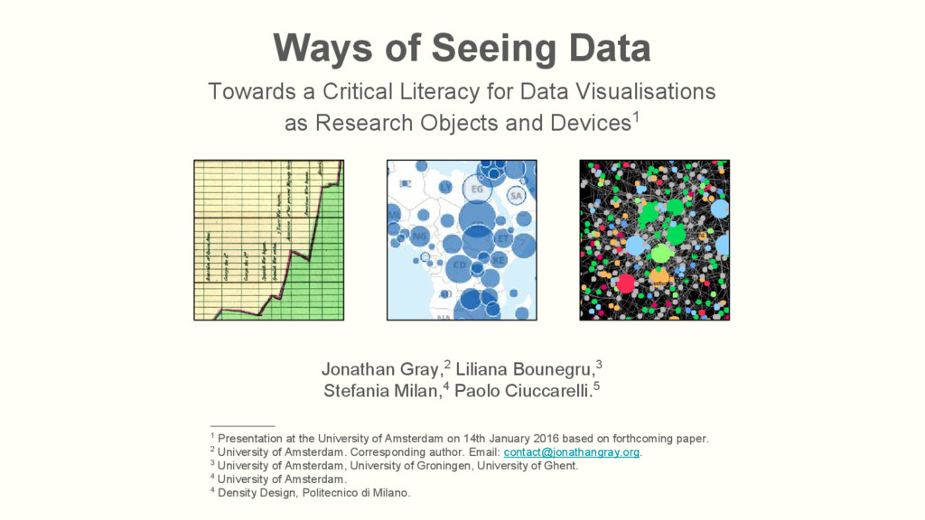
Visualisations as Research Objects and Devices1 Jonathan Gray,2 Liliana Bounegru,3 Stefania Milan,4 Paolo Ciuccarelli.5 _______________ 1 Presentation at the University of Amsterdam on 14th January 2016 based on forthcoming paper. 2 University of Amsterdam. Corresponding author. Email: [email protected]. 3 University of Amsterdam, University of Groningen, University of Ghent. 4 University of Amsterdam. 4 Density Design, Politecnico di Milano.
1972 Ways of Seeing • Agre’s notion of “critical technical practice” (1997) • Rieder and Röhle’s conception of “methodological reflexivity” (2012) We think it is vital to develop a critical literacy to read, understand, create and work with data visualisations. _______________ Berger, J. (1972). Ways of Seeing. London: Penguin Classics. Agre, P. E. (1997). “Toward a Critical Technical Practice: Lessons Learned in Trying to Reform AI”. In G. C. Bowker, et al. (eds). Social Science, Technical Systems, and Cooperative Work: Beyond the Great Divide (pp. 131-158). Mahwah, NJ: Lawrence Erlbaum Associates. Rieder, B. & Röhle, T. (2012). Digital Methods: Five Challenges. In D.M. Berry (Ed.), Understanding Digital Humanities (pp. 67-84). Houndmills: Palgrave Macmillan.
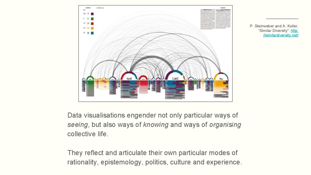
also ways of knowing and ways of organising collective life. They reflect and articulate their own particular modes of rationality, epistemology, politics, culture and experience. _______________ P. Steinweber and A. Koller, “Similar Diversity”: http: //similardiversity.net/
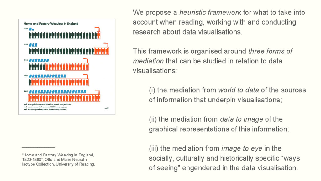
account when reading, working with and conducting research about data visualisations. This framework is organised around three forms of mediation that can be studied in relation to data visualisations: (i) the mediation from world to data of the sources of information that underpin visualisations; (ii) the mediation from data to image of the graphical representations of this information; (iii) the mediation from image to eye in the socially, culturally and historically specific “ways of seeing” engendered in the data visualisation. _______________ “Home and Factory Weaving in England, 1820-1880”, Otto and Marie Neurath Isotype Collection, University of Reading.
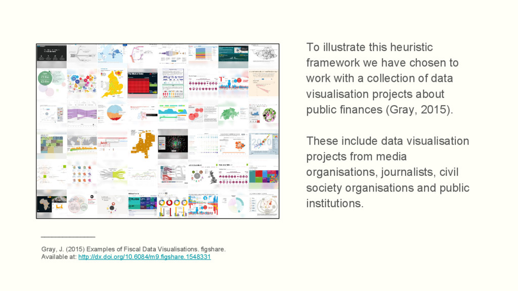
with a collection of data visualisation projects about public finances (Gray, 2015). These include data visualisation projects from media organisations, journalists, civil society organisations and public institutions. _______________ Gray, J. (2015) Examples of Fiscal Data Visualisations. figshare. Available at: http://dx.doi.org/10.6084/m9.figshare.1548331
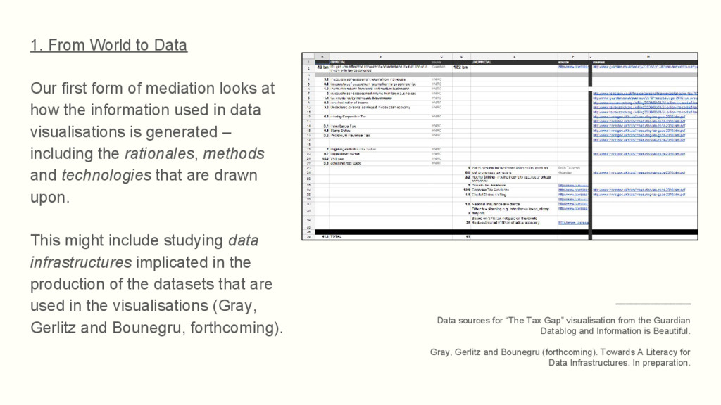
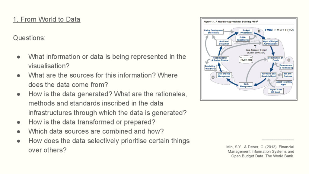
looks at how the information used in data visualisations is generated – including the rationales, methods and technologies that are drawn upon. This might include studying data infrastructures implicated in the production of the datasets that are used in the visualisations (Gray, Gerlitz and Bounegru, forthcoming). _______________ Data sources for “The Tax Gap” visualisation from the Guardian Datablog and Information is Beautiful. Gray, Gerlitz and Bounegru (forthcoming). Towards A Literacy for Data Infrastructures. In preparation.
data is being represented in the visualisation? • What are the sources for this information? Where does the data come from? • How is the data generated? What are the rationales, methods and standards inscribed in the data infrastructures through which the data is generated? • How is the data transformed or prepared? • Which data sources are combined and how? • How does the data selectively prioritise certain things over others? _______________ Min, S.Y. & Dener, C. (2013). Financial Management Information Systems and Open Budget Data. The World Bank.
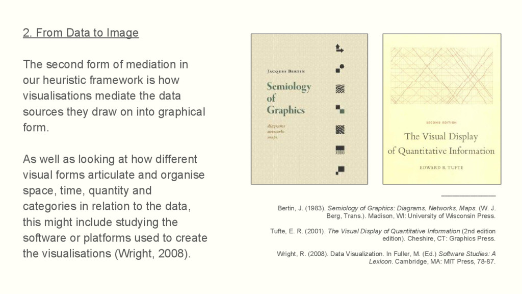
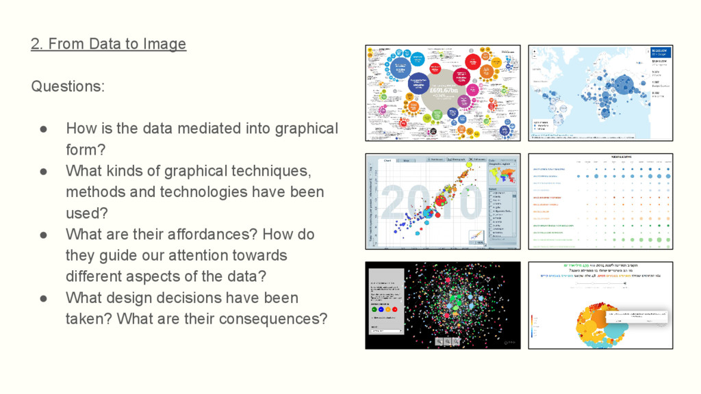
in our heuristic framework is how visualisations mediate the data sources they draw on into graphical form. As well as looking at how different visual forms articulate and organise space, time, quantity and categories in relation to the data, this might include studying the software or platforms used to create the visualisations (Wright, 2008). _______________ Bertin, J. (1983). Semiology of Graphics: Diagrams, Networks, Maps. (W. J. Berg, Trans.). Madison, WI: University of Wisconsin Press. Tufte, E. R. (2001). The Visual Display of Quantitative Information (2nd edition edition). Cheshire, CT: Graphics Press. Wright, R. (2008). Data Visualization. In Fuller, M. (Ed.) Software Studies: A Lexicon. Cambridge, MA: MIT Press, 78-87.
data mediated into graphical form? • What kinds of graphical techniques, methods and technologies have been used? • What are their affordances? How do they guide our attention towards different aspects of the data? • What design decisions have been taken? What are their consequences?
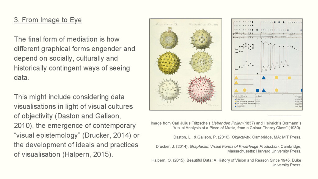
is how different graphical forms engender and depend on socially, culturally and historically contingent ways of seeing data. This might include considering data visualisations in light of visual cultures of objectivity (Daston and Galison, 2010), the emergence of contemporary “visual epistemology” (Drucker, 2014) or the development of ideals and practices of visualisation (Halpern, 2015). _______________ Image from Carl Julius Fritzsche’s Ueber den Pollen (1837) and Heinrich’s Bormann’s “Visual Analysis of a Piece of Music, from a Colour-Theory Class” (1930). Daston, L., & Galison, P. (2010). Objectivity. Cambridge, MA: MIT Press. Drucker, J. (2014). Graphesis: Visual Forms of Knowledge Production. Cambridge, Massachusetts: Harvard University Press. Halpern, O. (2015). Beautiful Data: A History of Vision and Reason Since 1945. Duke University Press.
visual cultures and practices are implicated or reflected in the data visualisation? Where do these come from? • What forms of usage are inscribed in the visualisation? • Who are the publics of the data visualisation? How is it circulated, cited and shared? _______________ Science spending in the UK (Scienceogram) and “Home and Factory Weaving in England, 1820-1880”, Otto and Marie Neurath Isotype Collection, University of Reading.
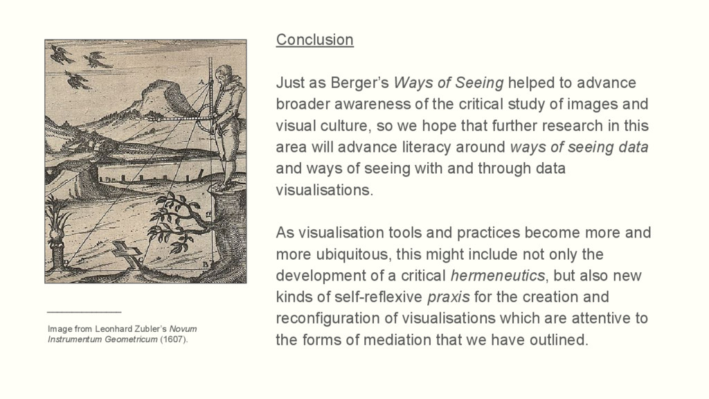
broader awareness of the critical study of images and visual culture, so we hope that further research in this area will advance literacy around ways of seeing data and ways of seeing with and through data visualisations. As visualisation tools and practices become more and more ubiquitous, this might include not only the development of a critical hermeneutics, but also new kinds of self-reflexive praxis for the creation and reconfiguration of visualisations which are attentive to the forms of mediation that we have outlined. _______________ Image from Leonhard Zubler’s Novum Instrumentum Geometricum (1607).