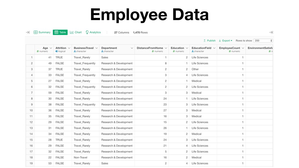
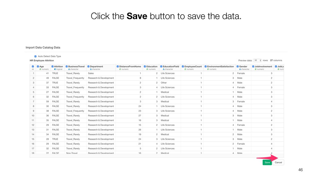
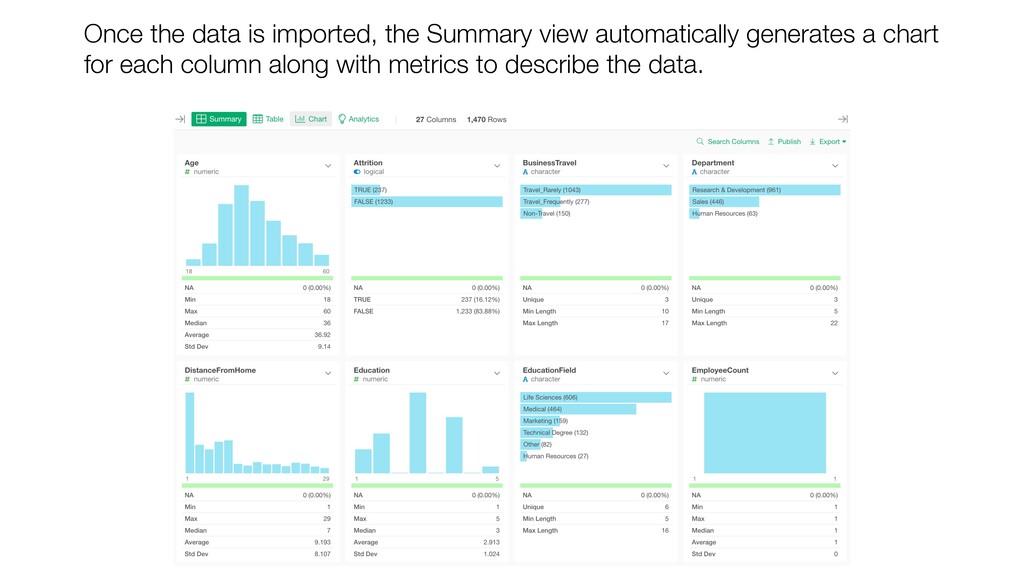
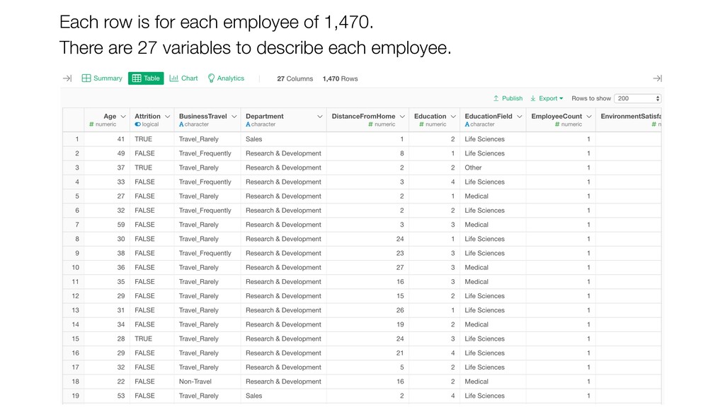
Inc. to democratize Data Science. Prior to Exploratory, Kan was a director of product development at Oracle leading teams to build various Data Science products in areas including Machine Learning, BI, Data Visualization, Mobile Analytics, Big Data, etc. While at Oracle, Kan also provided training and consulting services to help organizations transform with data. @KanAugust Speaker
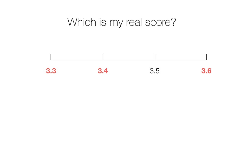
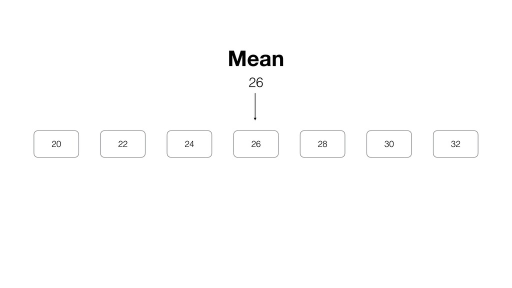
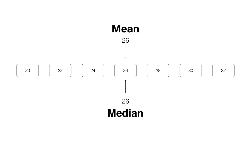
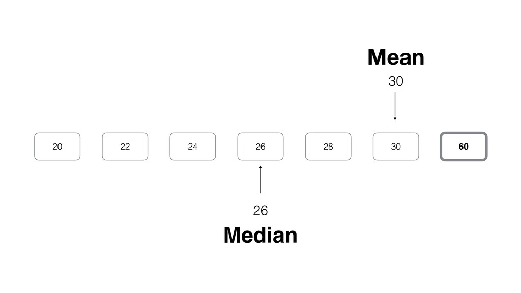
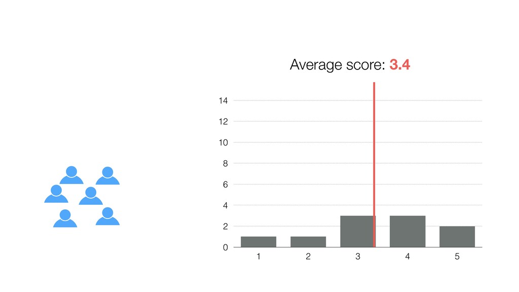
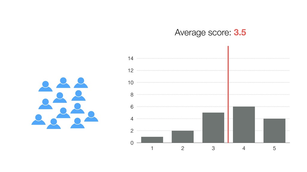
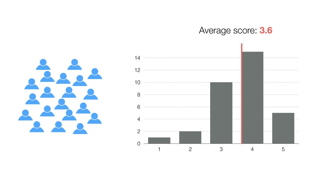
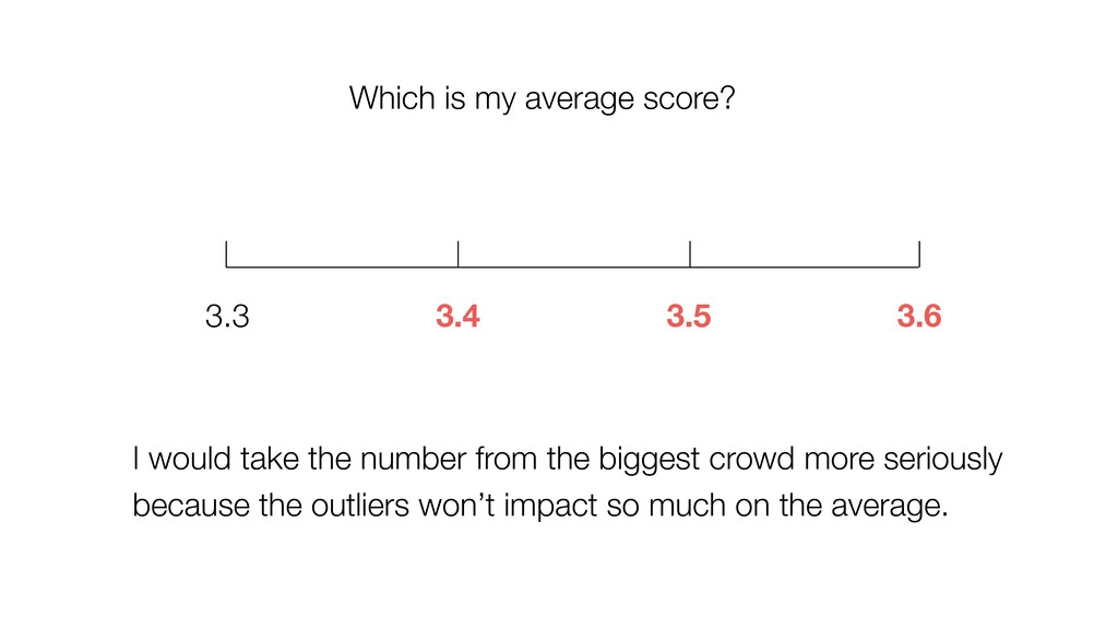
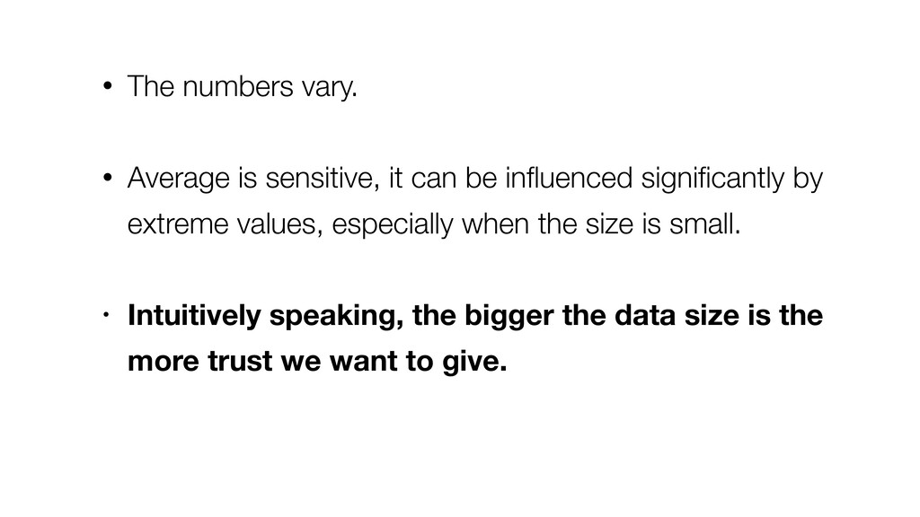
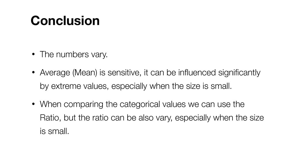
be influenced significantly by extreme values, especially when the size is small. • Intuitively speaking, the bigger the data size is the more trust we want to give.
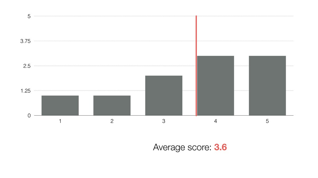
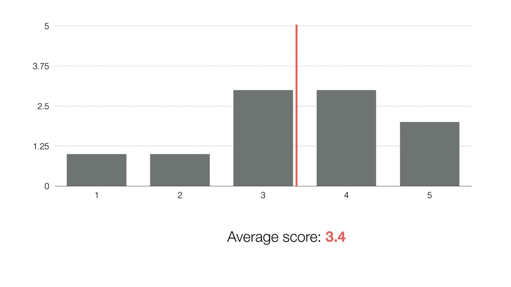
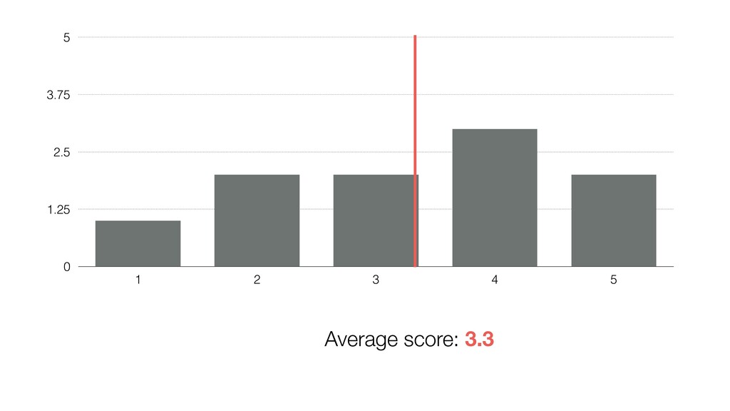
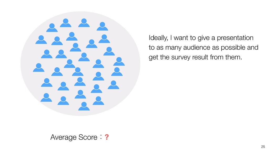
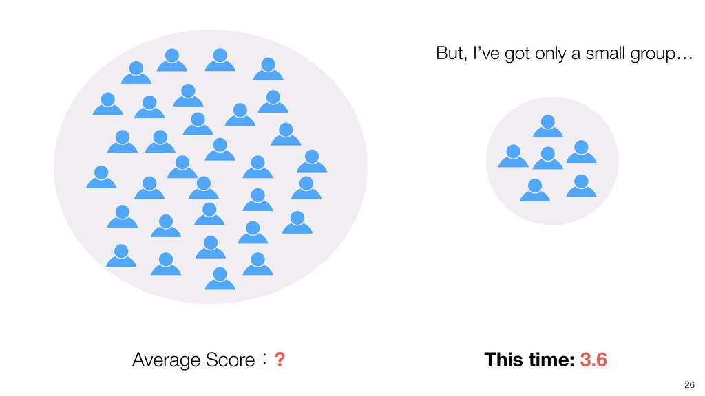
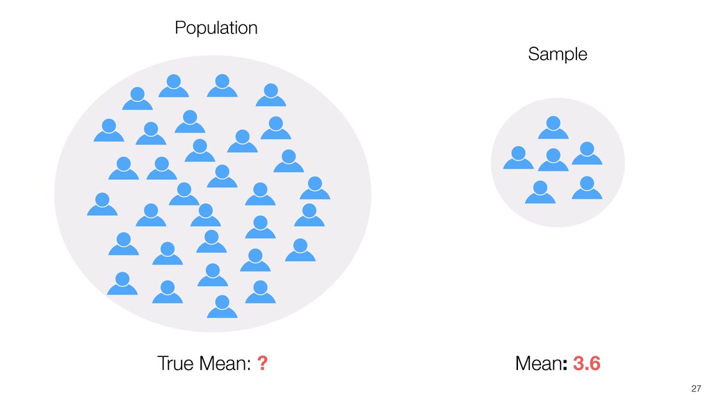
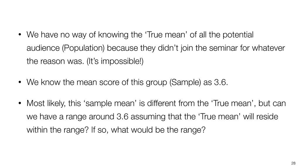
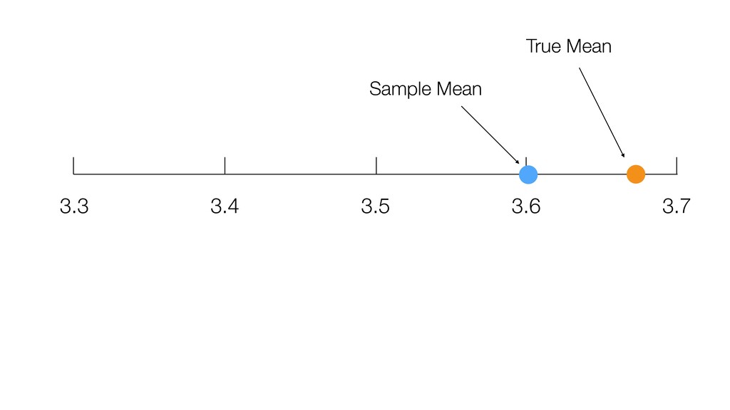
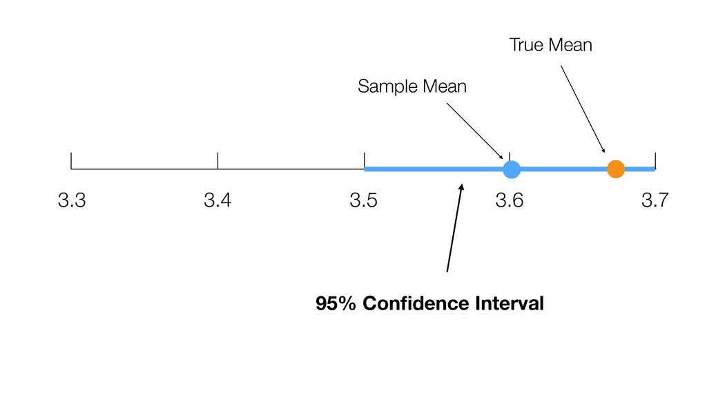
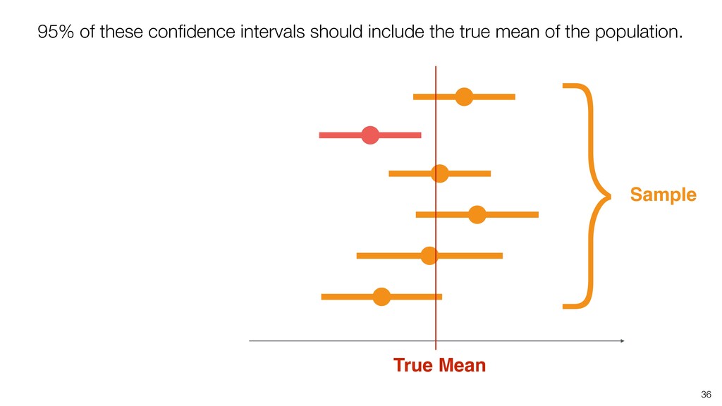
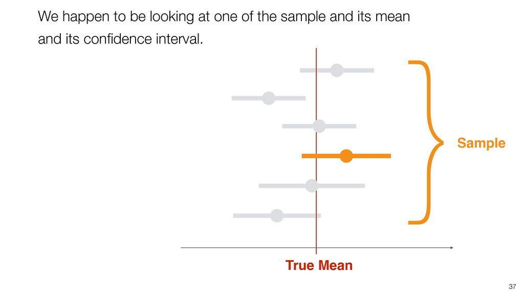
of all the potential audience (Population) because they didn’t join the seminar for whatever the reason was. (It’s impossible!) • We know the mean score of this group (Sample) as 3.6. • Most likely, this ‘sample mean’ is different from the ‘True mean’, but can we have a range around 3.6 assuming that the ‘True mean’ will reside within the range? If so, what would be the range? 28
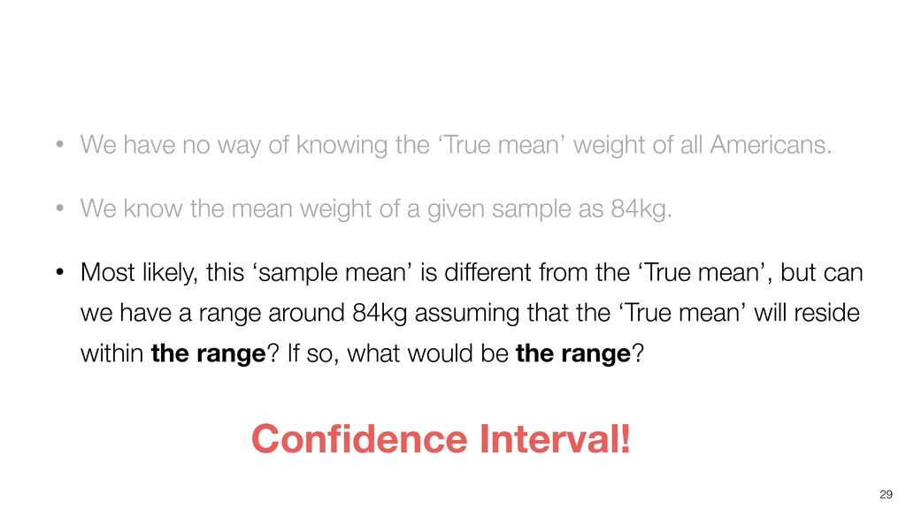
weight of all Americans. • We know the mean weight of a given sample as 84kg. • Most likely, this ‘sample mean’ is different from the ‘True mean’, but can we have a range around 84kg assuming that the ‘True mean’ will reside within the range? If so, what would be the range? 29 Confidence Interval!
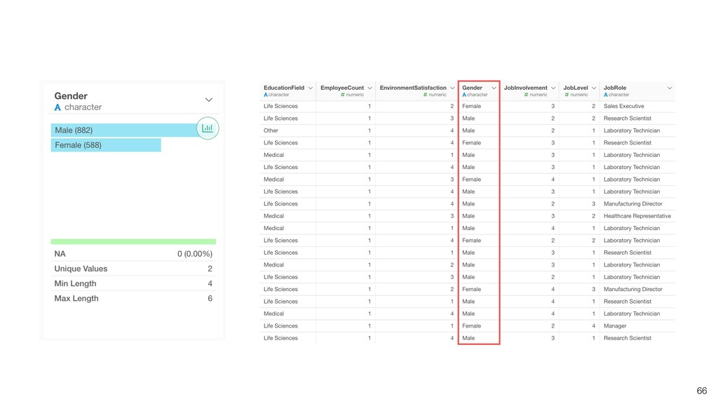
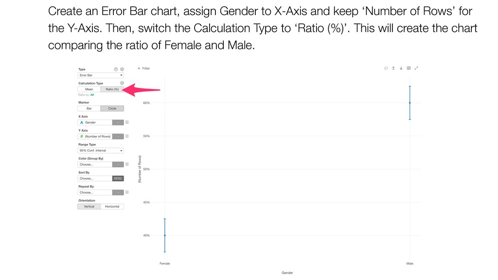
keep ‘Number of Rows’ for the Y-Axis. Then, switch the Calculation Type to ‘Ratio (%)’. This will create the chart comparing the ratio of Female and Male.
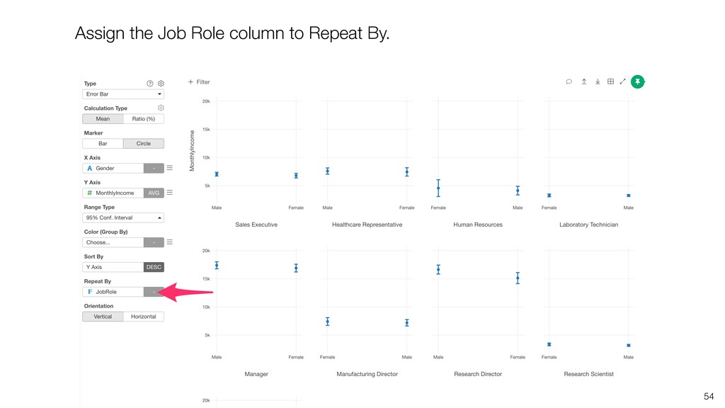
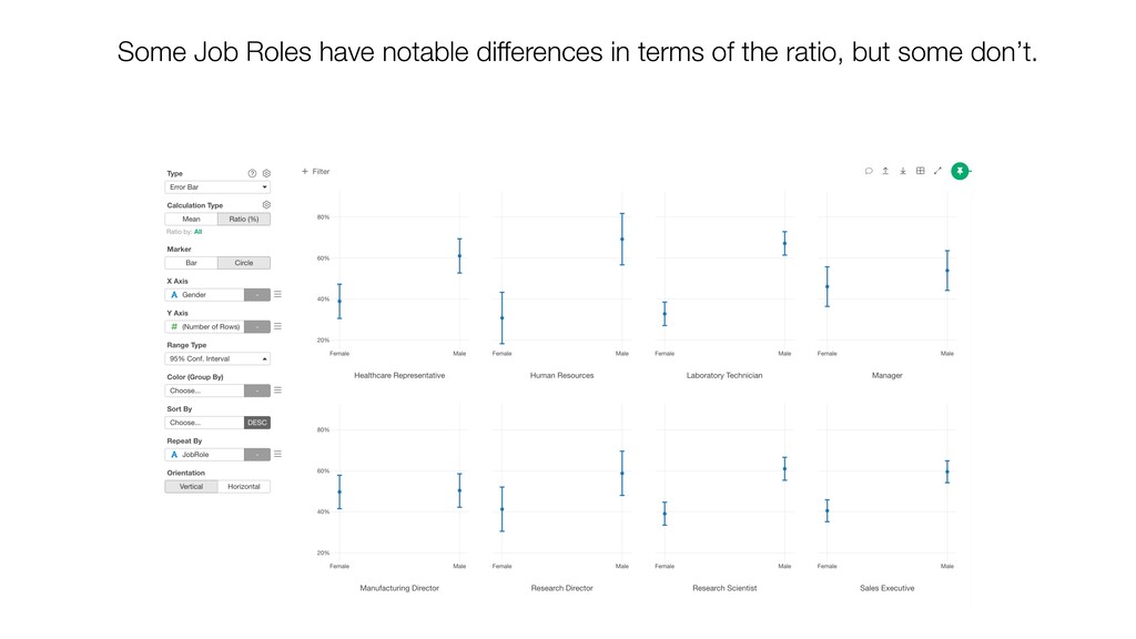
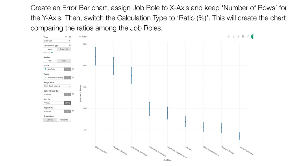
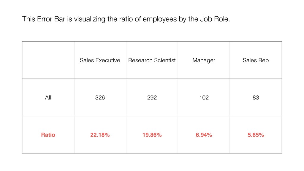
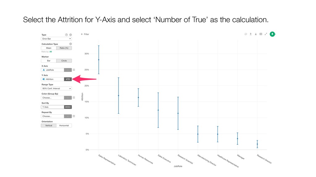
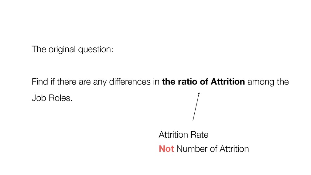
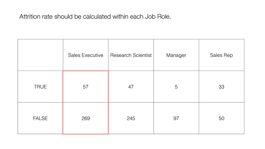
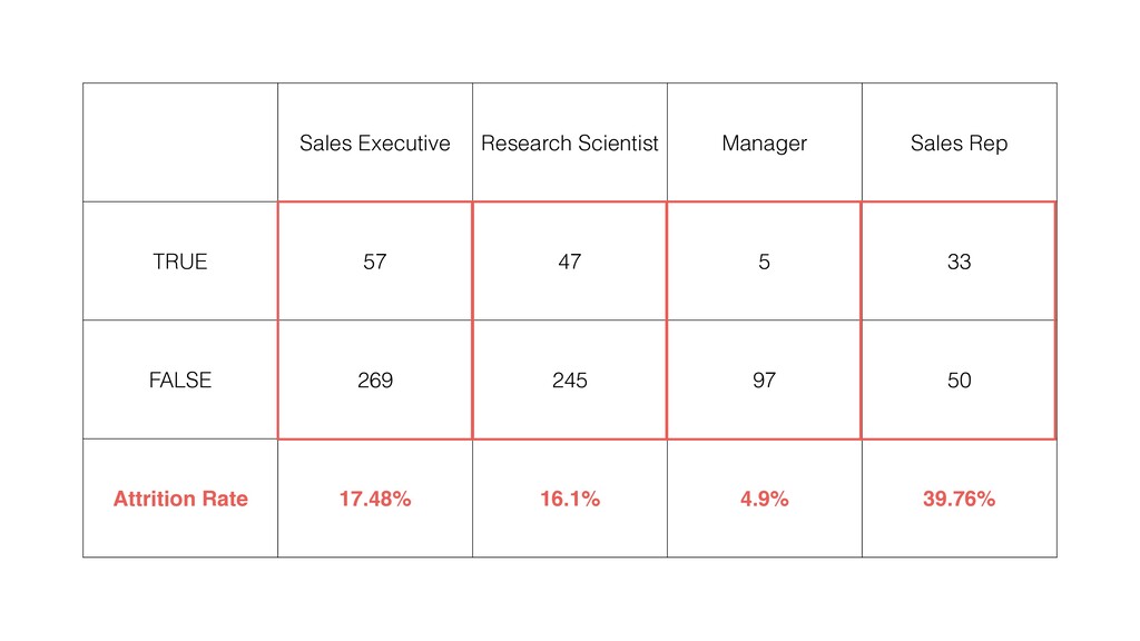
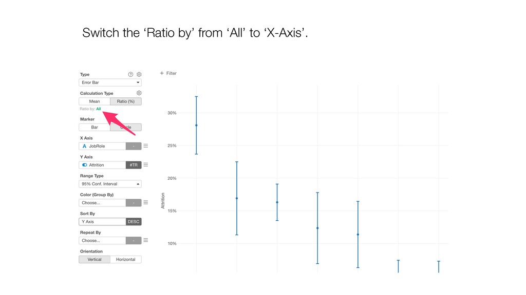
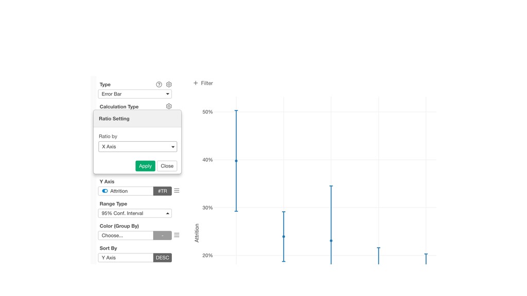
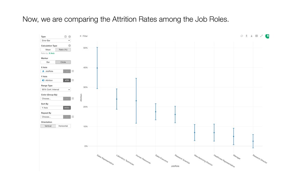
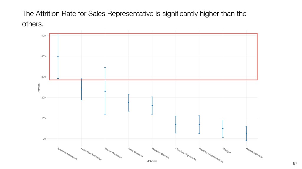
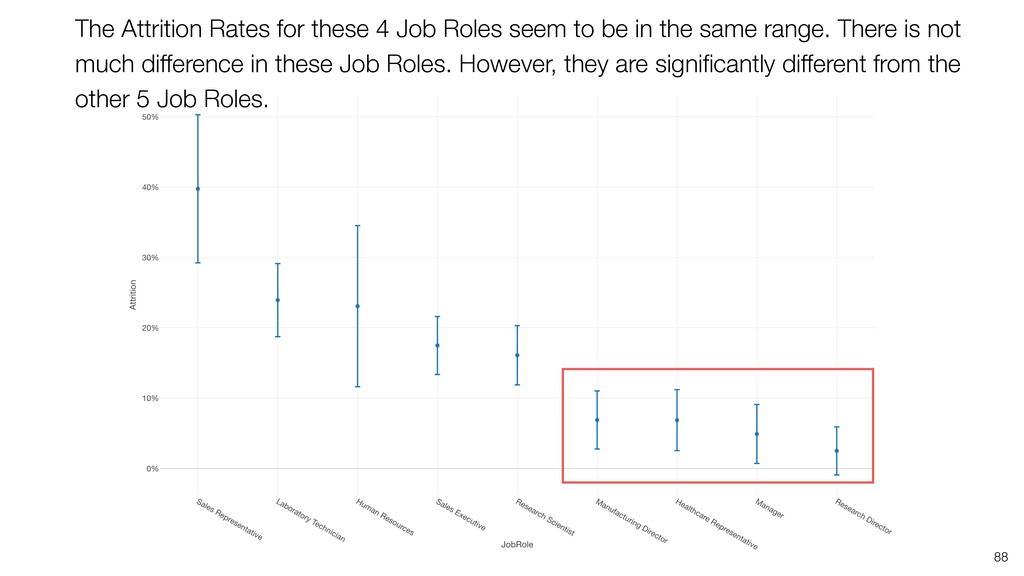
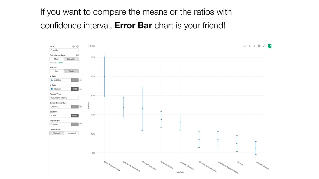
and keep ‘Number of Rows’ for the Y-Axis. Then, switch the Calculation Type to ‘Ratio (%)’. This will create the chart comparing the ratios among the Job Roles.
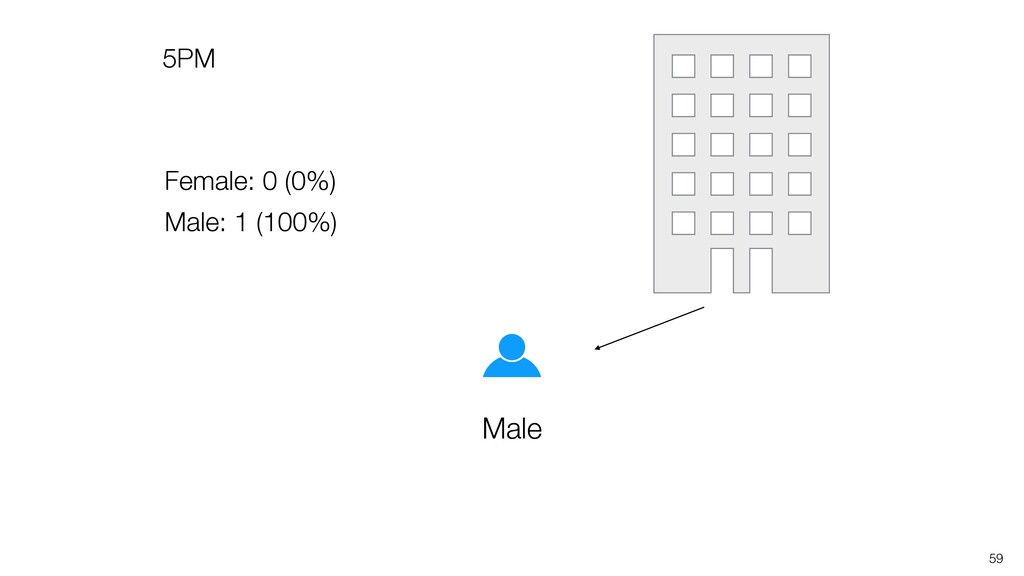
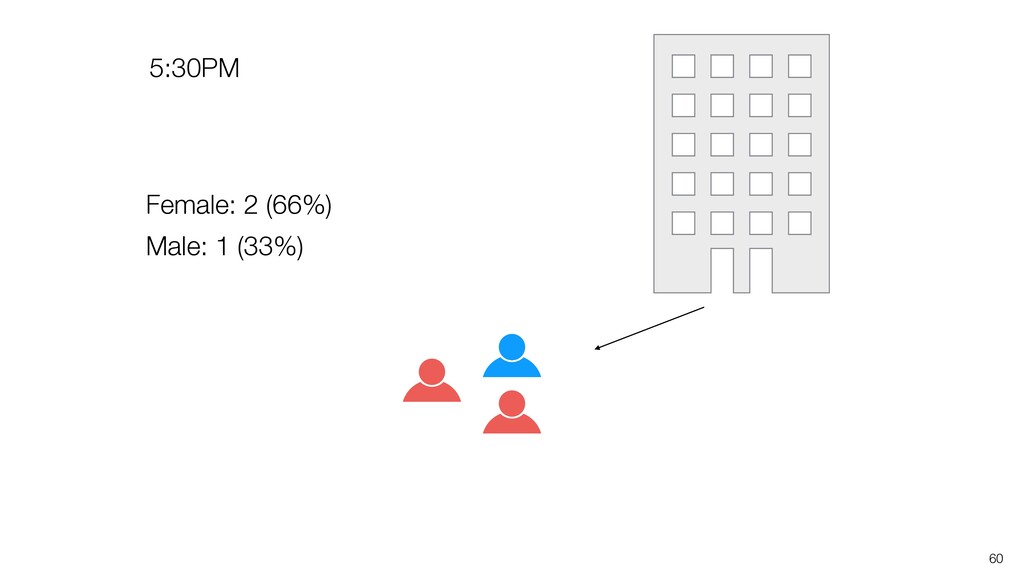
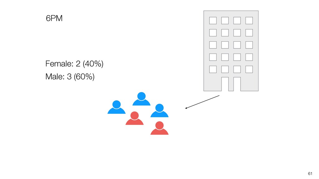
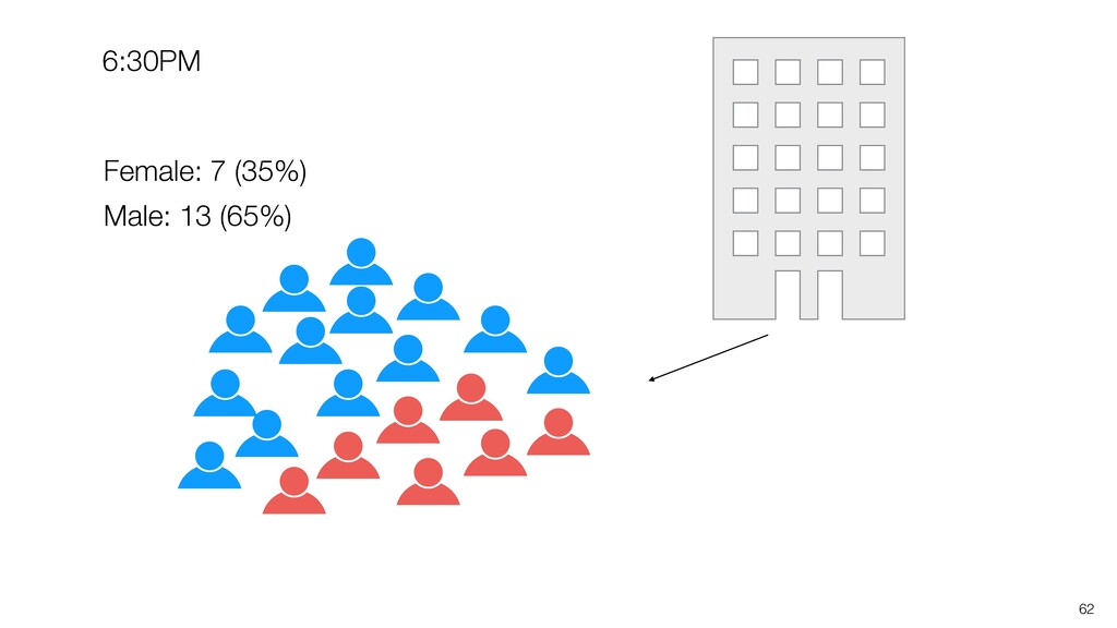
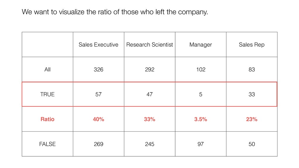
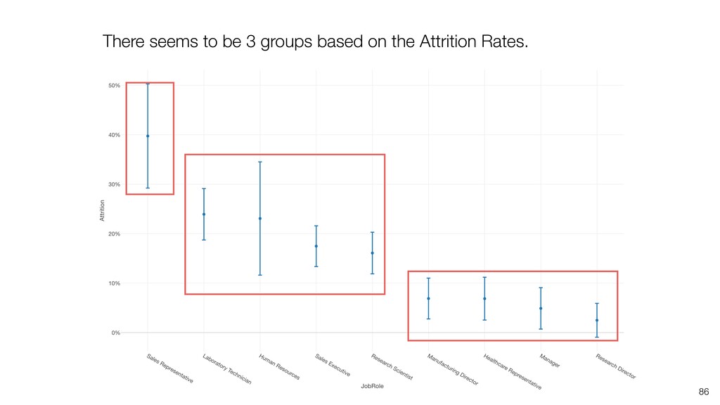
can be influenced significantly by extreme values, especially when the size is small. • When comparing the categorical values we can use the Ratio, but the ratio can be also vary, especially when the size is small. Conclusion
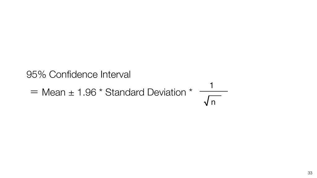
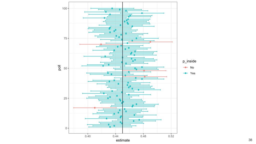
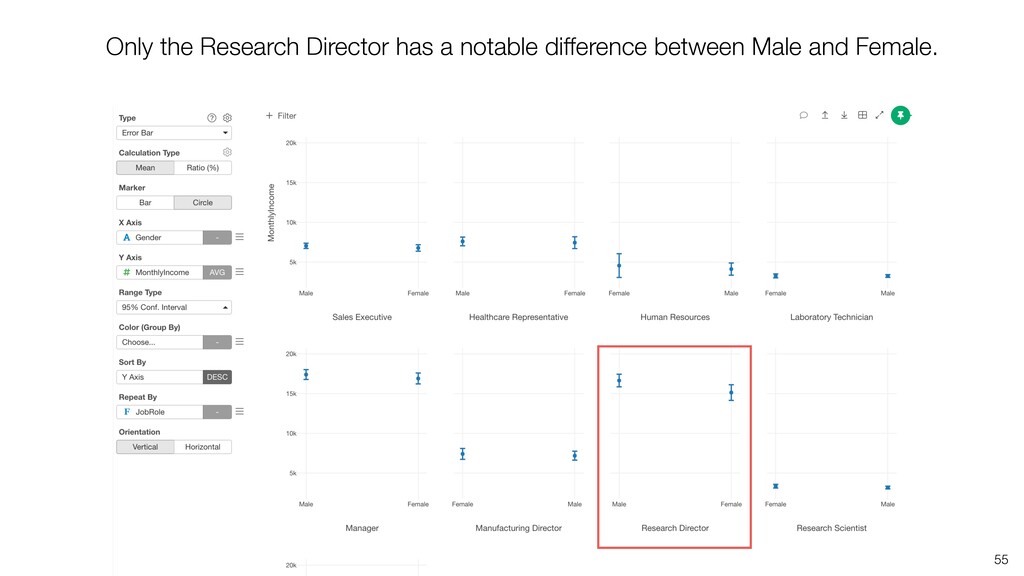
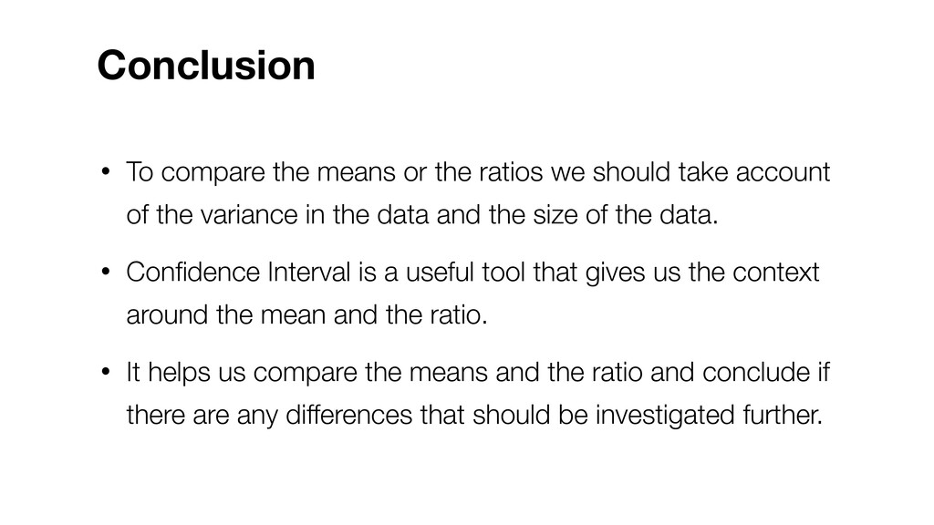
take account of the variance in the data and the size of the data. • Confidence Interval is a useful tool that gives us the context around the mean and the ratio. • It helps us compare the means and the ratio and conclude if there are any differences that should be investigated further. Conclusion
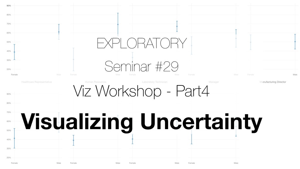
2 - Visualizing Time Series Data • Part 3 - Visualizing Variance & Correlation • Part 4 - Visualizing Uncertainty • Part 5 - Data Wrangling for Data Visualization - 7/1 (Wed) Data Visualization Workshop
![Information Email [email protected] Website https://exploratory.io Twitter @KanAugust Training https://exploratory.io/training](https://files.speakerdeck.com/presentations/388f6bb7a426499b8b396e728e57a008/slide_94.jpg)