Upgrade to Pro — share decks privately, control downloads, hide ads and more …

Exploratory: An Introduction to Cohort Analysis

Exploratory: An Introduction to Cohort Analysis

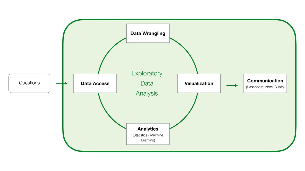
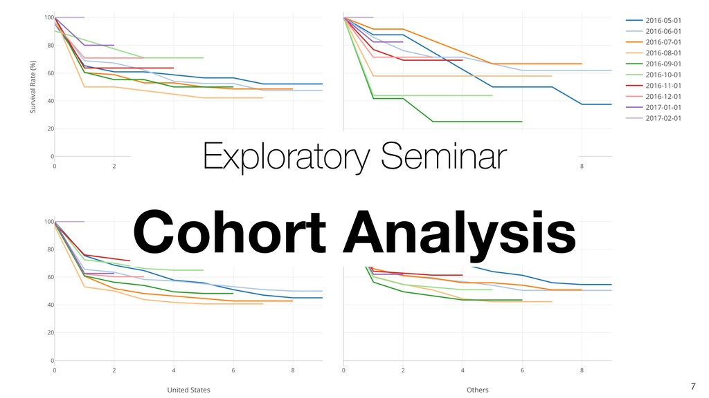
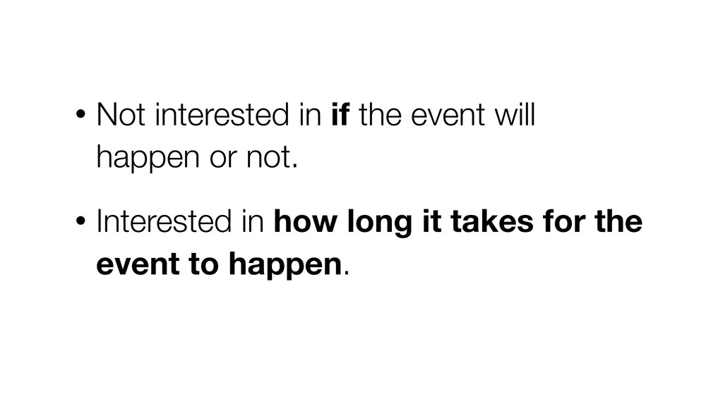
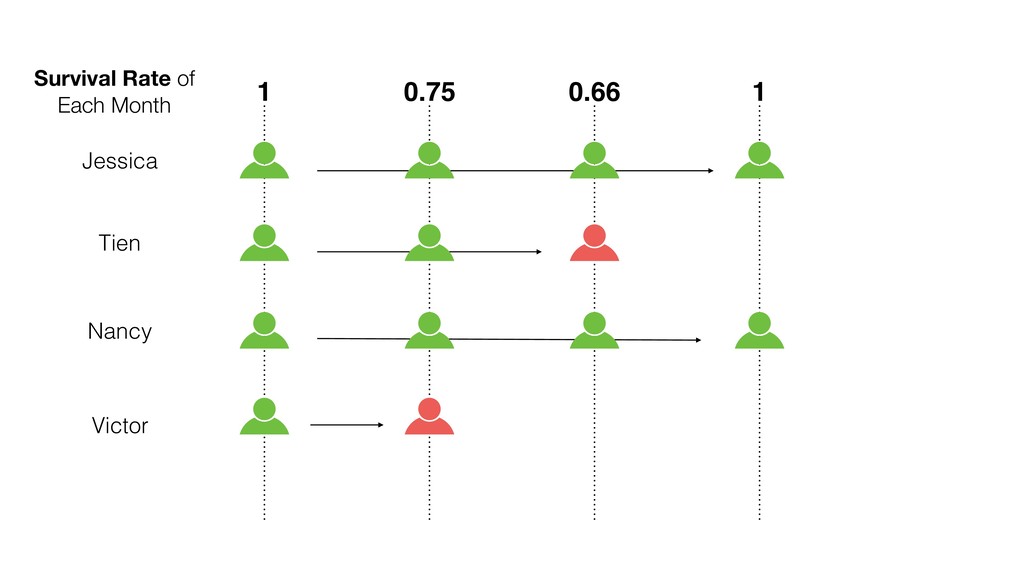
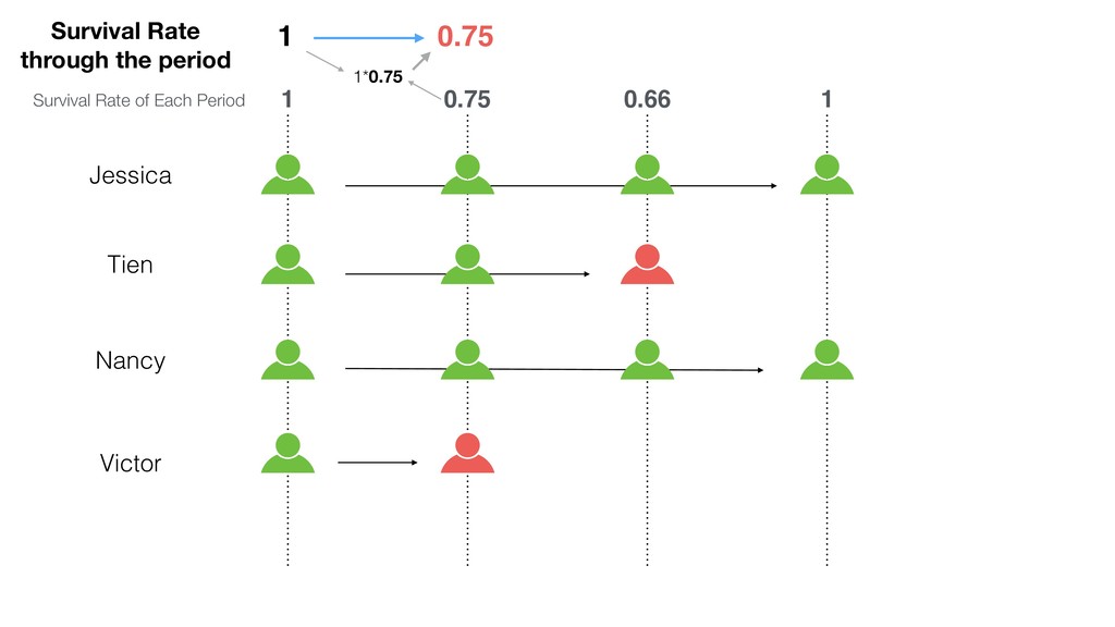
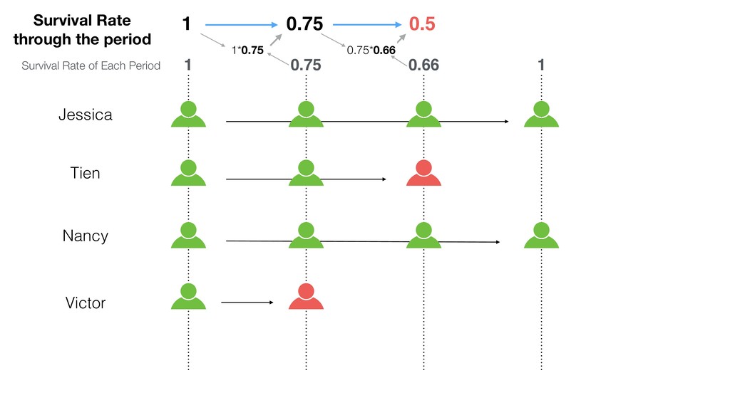
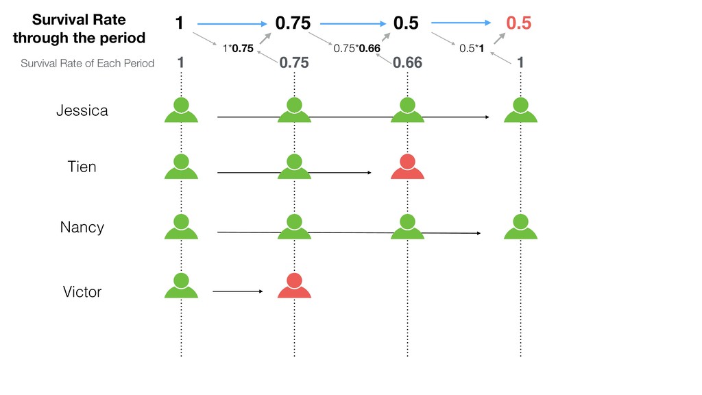
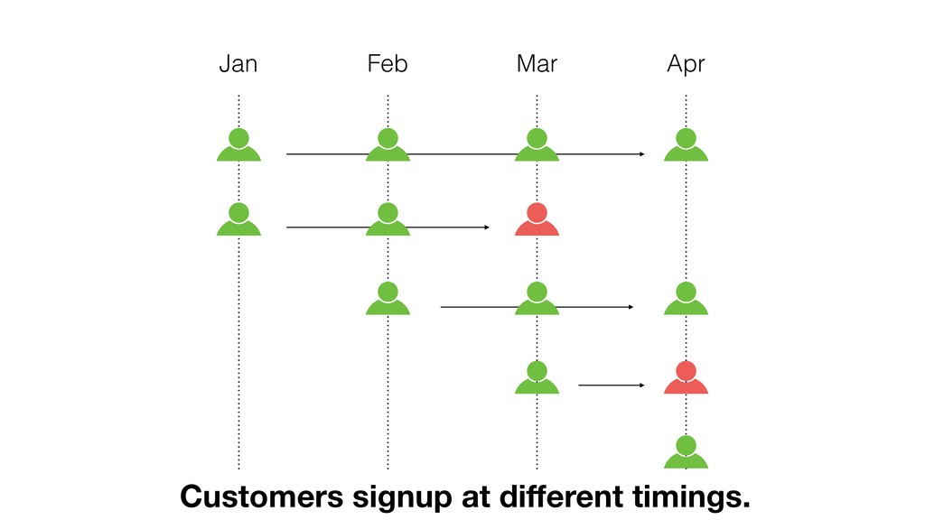
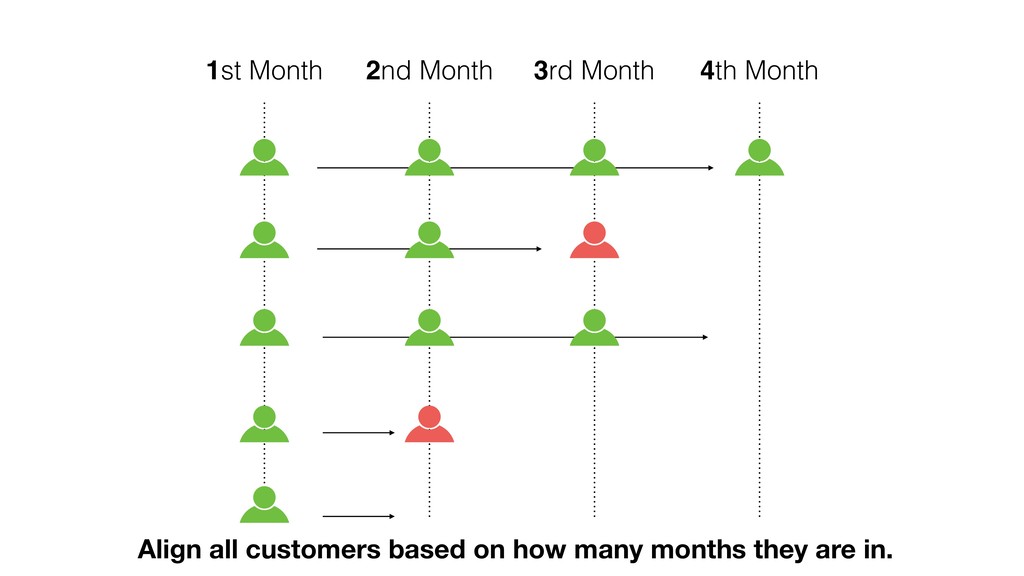
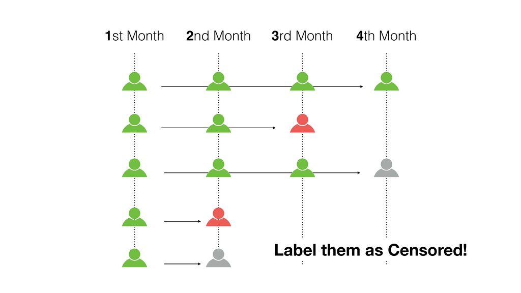
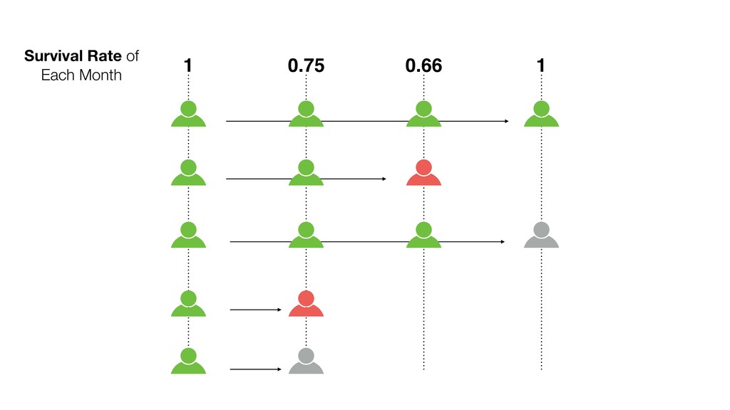
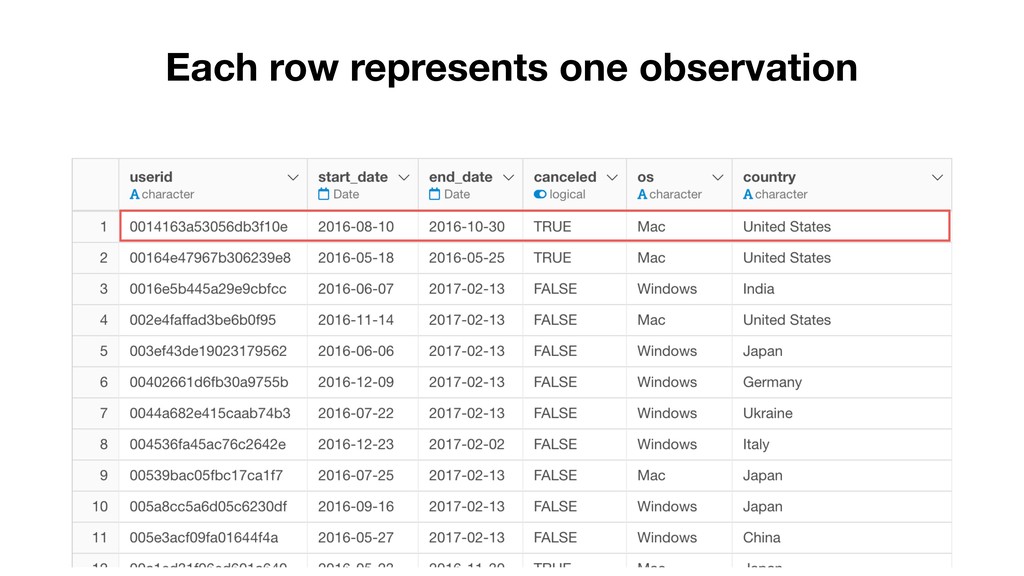
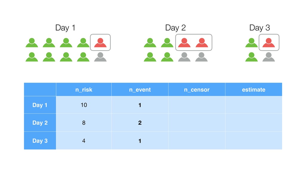
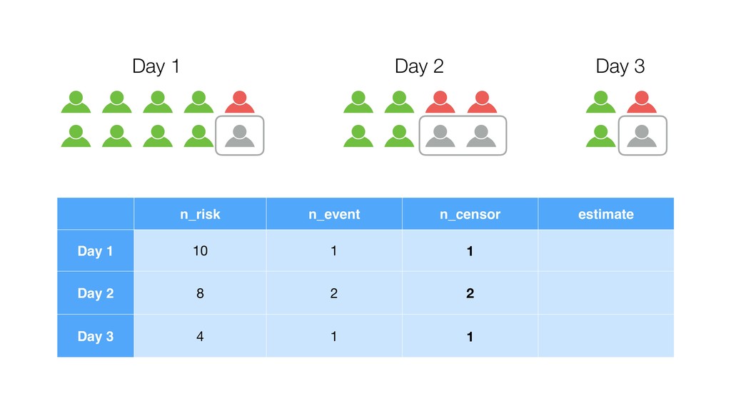
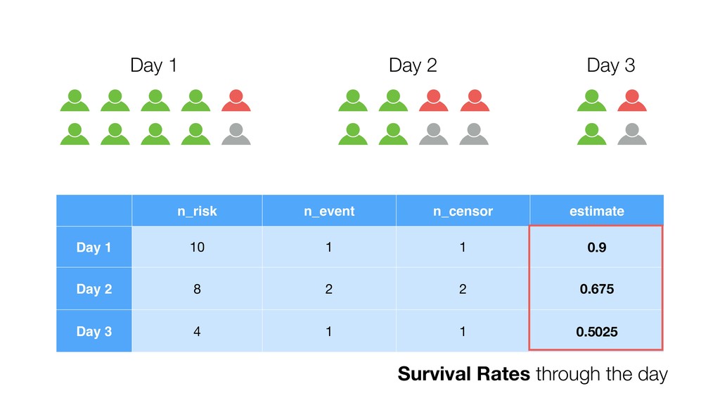
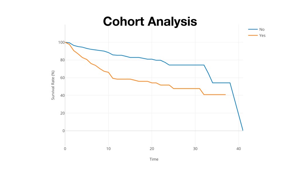
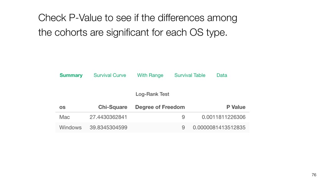
Cohort Analysis is one of the most critical analysis in SaaS / Subscription businesses. It helps you understand how your customers are churning (or retaining) your service as the time goes by.

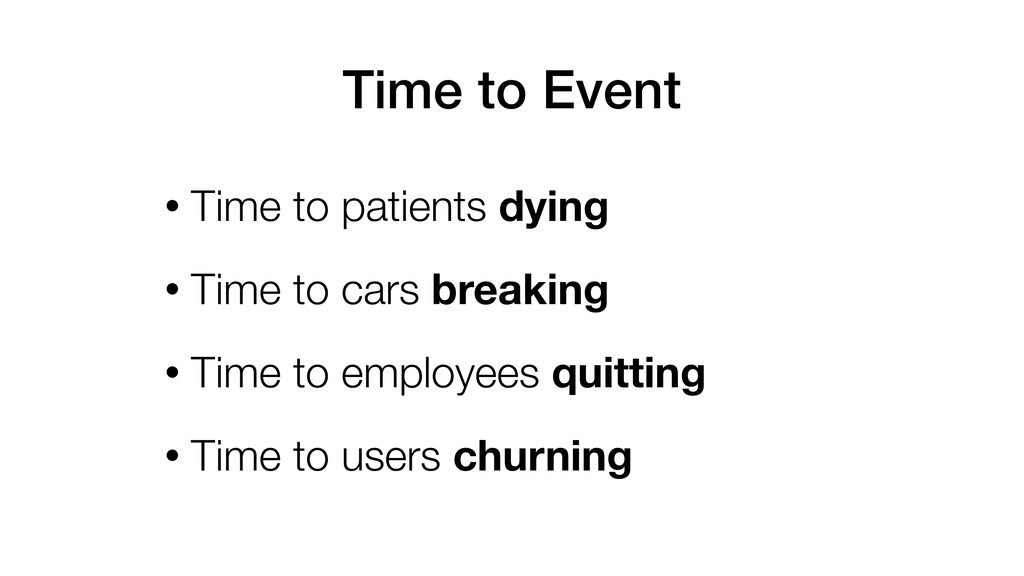
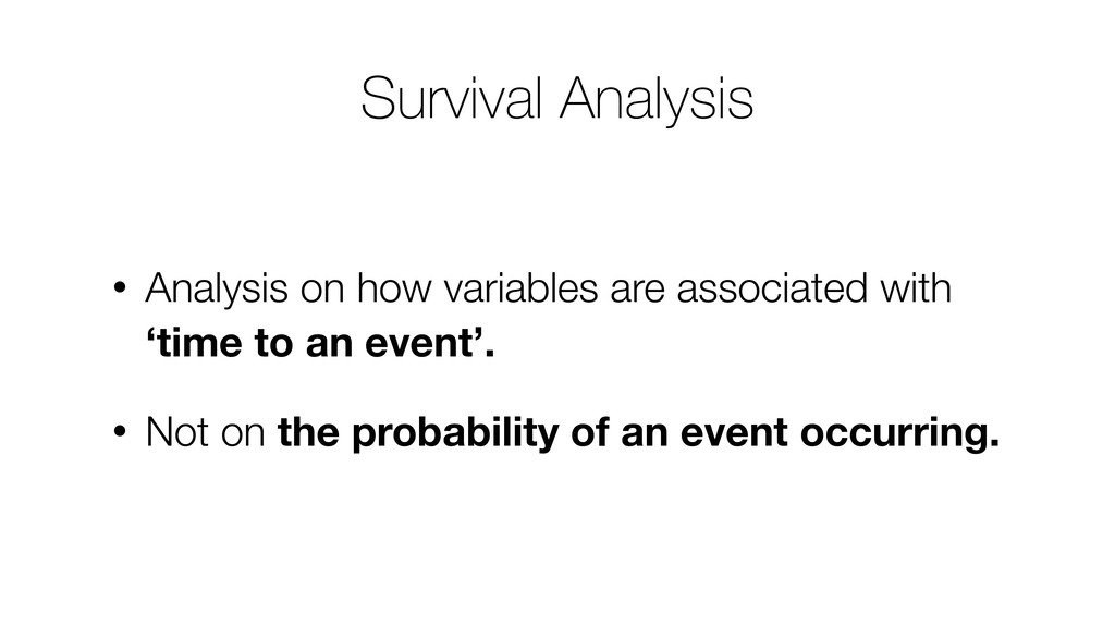
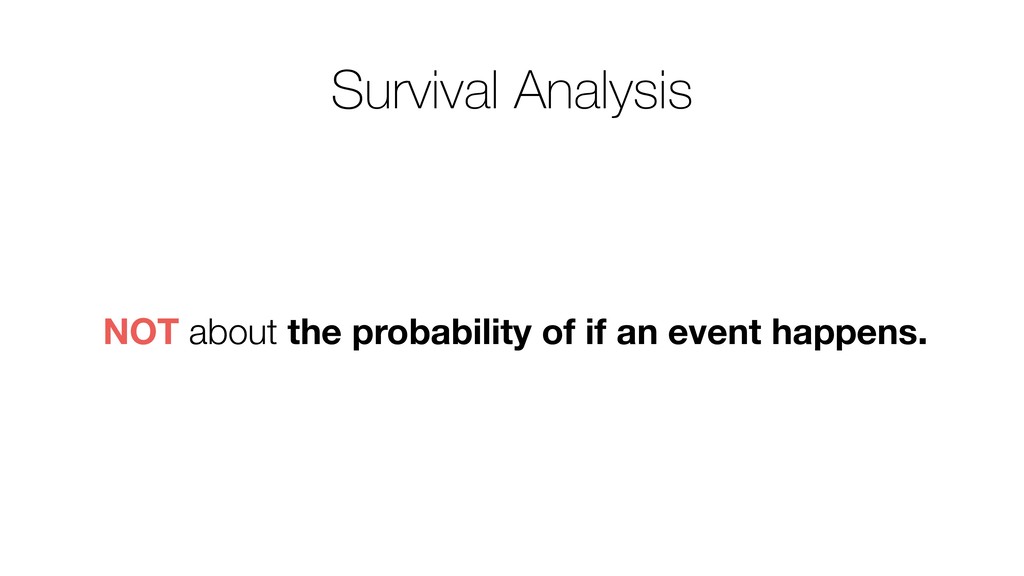
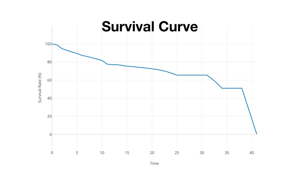
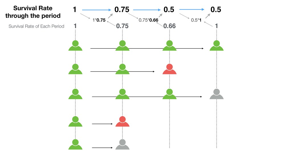
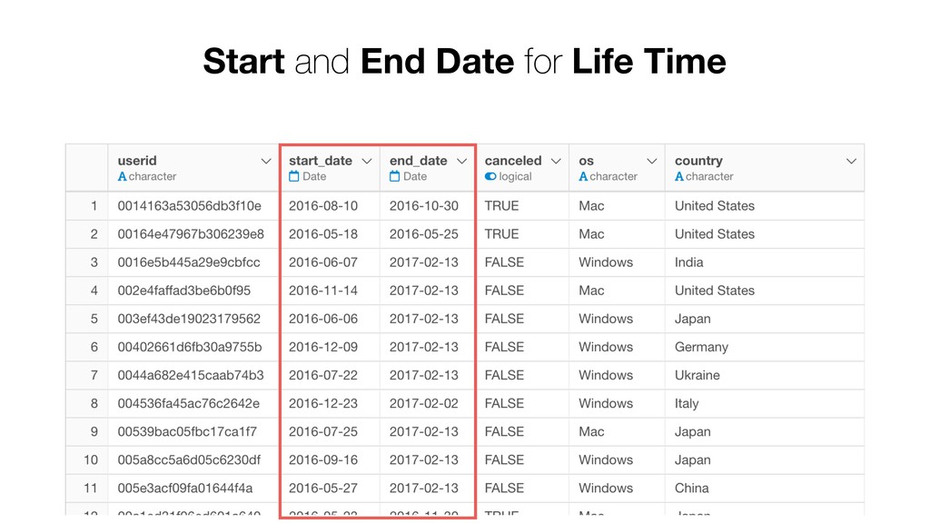
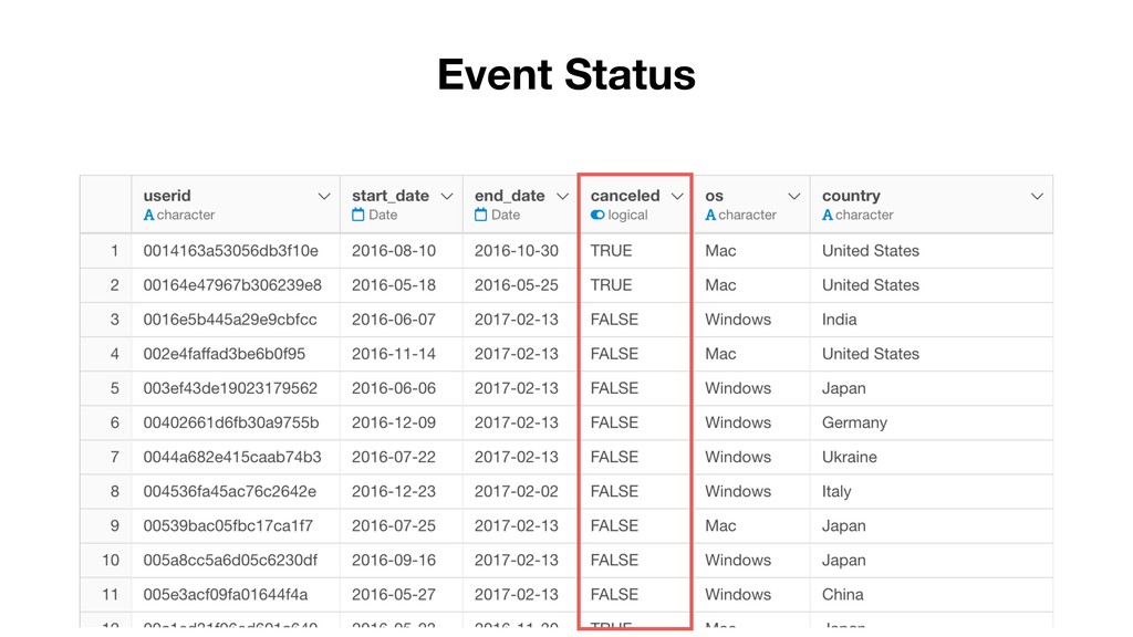
And if you want to do it right, you want to use Survival Curve algorithm a.k.a. Kaplan-Meyer. This technique has been used in other areas such as employee attrition, machine maintenance, patient treatment, etc. but it works great for today’s data savvy SaaS businesses.

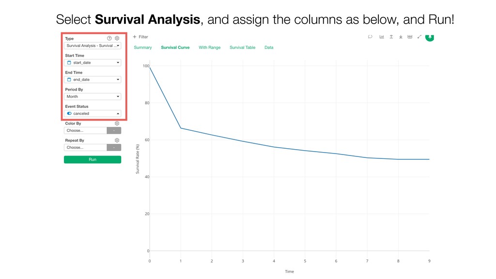
Kan will be introducing what the Survival Curve is and how you can use it in Exploratory.
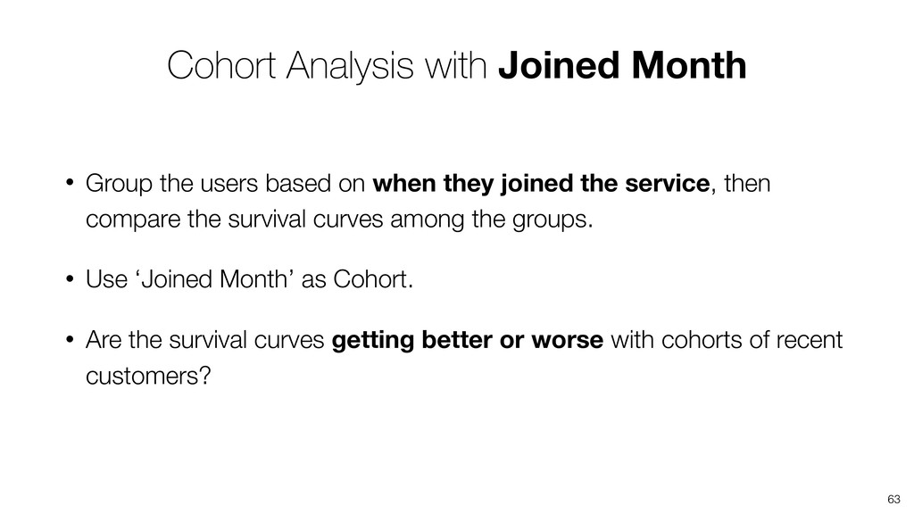
Kan Nishida

July 10, 2019
Tweet

More Decks by Kan Nishida

Other Decks in Science

Transcript

  1. Kan Nishida co-founder/CEO Exploratory Summary Beginning of 2016, launched Exploratory,

    Inc. to democratize Data Science. Prior to Exploratory, Kan was a director of development at Oracle leading development teams for building various Data Science products in areas including Machine Learning, BI, Data Visualization, Mobile Analytics, Big Data, etc. While at Oracle, Kan also provided training and consulting services to help organizations transform with data. @KanAugust Instructor
  2. Data Science is not just for Engineers and Statisticians. Exploratory

    makes it possible for Everyone to do Data Science. The Third Wave
  3. First Wave Second Wave Third Wave Proprietary Open Source UI

    & Programming Programming 2016 2000 1976 Monetization Commoditization Democratization Statisticians Data Scientists Democratization of Data Science Algorithms Experience Tools Open Source UI & Automation Business Users Theme Users
  4. Questions Communication (Dashboard, Note, Slides) Data Access Data Wrangling Visualization

    Analytics (Statistics / Machine Learning) Exploratory Data Analysis
  5. Agenda • Introduction to Survival Analysis and Survival Curve •

    Introduction to Cohort Analysis • How to Understand the Insights
  6. • Not interested in if the event will happen or

    not. • Interested in how long it takes for the event to happen.
  7. • Time to patients dying • Time to cars breaking

    • Time to employees quitting • Time to users churning Time to Event
  8. • Analysis on how variables are associated with ‘time to

    an event’. • Not on the probability of an event occurring. Survival Analysis
  9. Survival Rate of Each Period 0.75 1 1 0.66 0.75

    1 Survival Rate through the period 1*0.75 Jessica Tien Nancy Victor
  10. Survival Rate of Each Period 0.5 0.75 1 1 0.66

    0.75 1 Survival Rate through the period 1*0.75 0.75*0.66 Jessica Tien Nancy Victor
  11. Survival Rate of Each Period 0.5 0.5 0.75 1 1

    0.66 0.75 1 Survival Rate through the period 1*0.75 0.75*0.66 0.5*1 Jessica Tien Nancy Victor
  12. 4th Month 3rd Month 2nd Month 1st Month Align all

    customers based on how many months they are in.
  13. ? ? ? ? 4th Month 3rd Month 2nd Month

    1st Month We don’t know if the recently joined customers will quit or not.
  14. Survival Rate through the period Survival Rate of Each Period

    0.5 0.5 0.75 1 1 0.66 0.75 1 1*0.75 0.75*0.66 0.5*1
  15. • Estimate the probability of a given customer being canceled

    at a certain point of time by dividing the number of customers who canceled at a given time period by the number of total customers at the same time period. • By cumulatively multiplying these probabilities, we can calculate the probability of survival from the beginning through that point of time. • Instead of ratio of actual survivors, we can estimate survival curve as the probability. • For censored observation, instead of counting them as ‘canceled’, we can treat them properly by reducing the number of remaining customers. Kaplan-Meier Estimator
  16. • Each row represents one observation (e.g. Customer). • Each

    row has at least 2 information. • Start Date and End Date for Life Time • Event Status: e.g. Canceled, Quit, Died, etc. Input data for Survival Analysis
  17. • time - (e.g. Days since sign up) In survival

    data, one row represents one point of time. • n_risk - Number of observations whom the event hans’t happened to yet at a given time. • n_event - Number of observations whom the event happened at a given time. • n_censor - Number of observations censored at a given time. • estimate - Survival Rate through this point of time. These are the values visualized as Survival Curve • std_error - Standard error for the estimates • conf_low - Lower limit of the confidence interval for the estimate • conf_high - Upper limit of the confidence interval for estimate Survival Analysis Data
  18. Day 1 Day 2 Day 3 n_risk n_event n_censor estimate

    Day 1 10 1 1 Day 2 8 2 2 Day 3 4 1 1
  19. Day 1 Day 2 Day 3 n_risk n_event n_censor estimate

    Day 1 10 1 1 0.9 Day 2 8 2 2 0.675 Day 3 4 1 1 0.5025 Survival Rates through the day
  20. • The team was originated from epidemiology. • Analysis of

    the Survival Rates of multiple groups. • Each group is called Cohort. Cohort Analysis
  21. • Under Summary tab, result of statistical test on how

    sure it is that the difference in OS type has effect on survival. • In this case, P Value is 28%. This means that the probability of getting this much or more difference between OS types by chance is 28%.
  22. • A probability of getting a given value, in this

    case, that is the difference between the two curves, if we assume that there is no difference between the two. • When you keep measuring things, you will most likely get slight different numbers. • The difference we are seeing is what can happen by chance, or that is a pattern that can be observed consistently? P Value - Statistical Test
  23. All cohorts are identical. OS doesn’t make a difference. Null

    Hypothesis P-Value is 28%. If we set the threshold of P-Value to be 5%.
  24. All cohorts are identical. OS doesn’t make a difference. Null

    Hypothesis P-Value is 28%. If we set the threshold of P-Value to be 5%. We can NOT Reject the Null Hypothesis.
  25. All cohorts are identical. OS doesn’t make a difference. Null

    Hypothesis We can NOT Reject the Null Hypothesis. Conclusion OS doesn’t make a difference on the survival curves.
  26. With Confidence Interval, we can see the two survival curves

    are different up to the month 3, but they become very close after it.
  27. 63 • Group the users based on when they joined

    the service, then compare the survival curves among the groups. • Use ‘Joined Month’ as Cohort. • Are the survival curves getting better or worse with cohorts of recent customers? Cohort Analysis with Joined Month
  28. 64 • We can’t assign ‘start_date’ column to Color By

    because it’s already been assigned to Start Date. • Copy ‘start_date’ column! Data Preparation
  29. 67

  30. 1. Assign join_date to “Color By” 2. Select Floor to

    Month to create the groups at Month level.
  31. The survival curves are going down till September, 2016, but

    looks it’s getting better after that.
  32. 76 Check P-Value to see if the differences among the

    cohorts are significant for each OS type.