Upgrade to Pro — share decks privately, control downloads, hide ads and more …

Exploratory: Data Viz Workshop Part 3 - Visualizing Variance & Correlation

Exploratory: Data Viz Workshop Part 3 - Visualizing Variance & Correlation

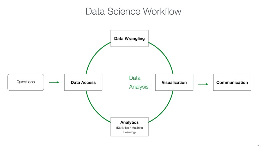
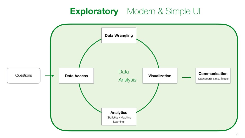
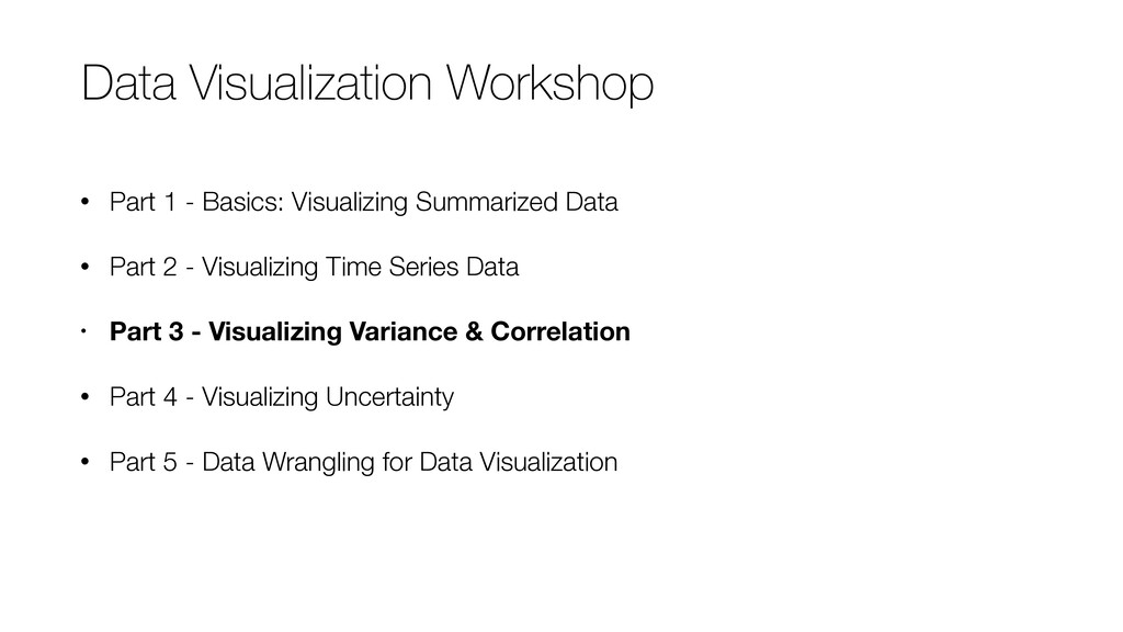
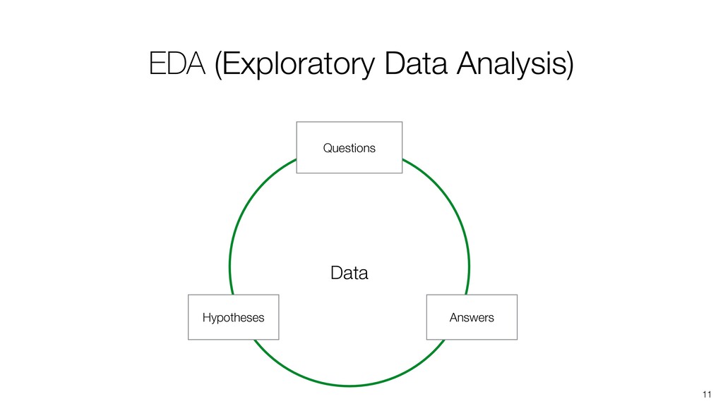
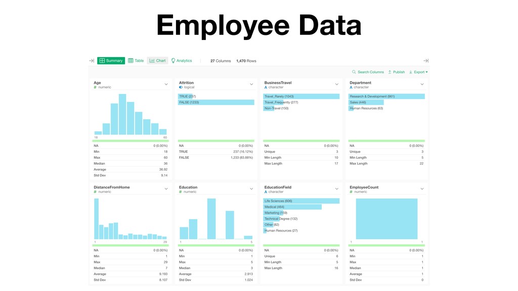
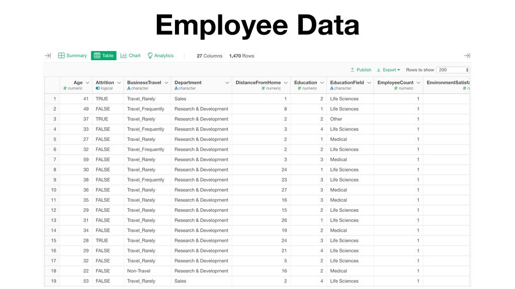
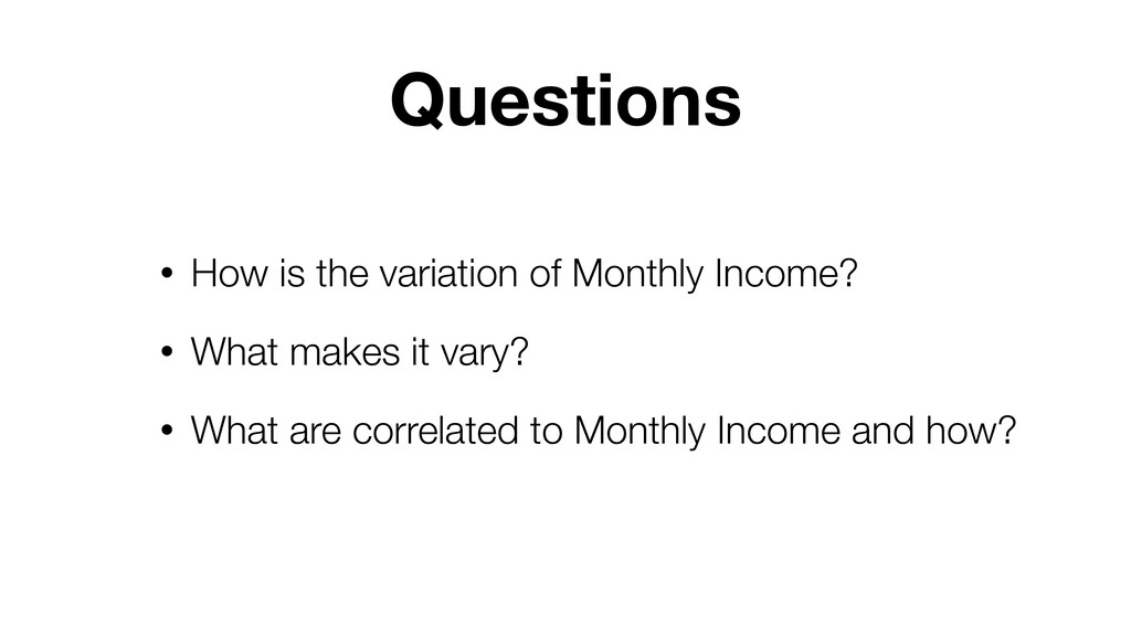
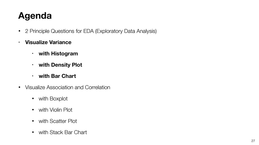
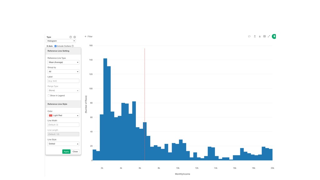
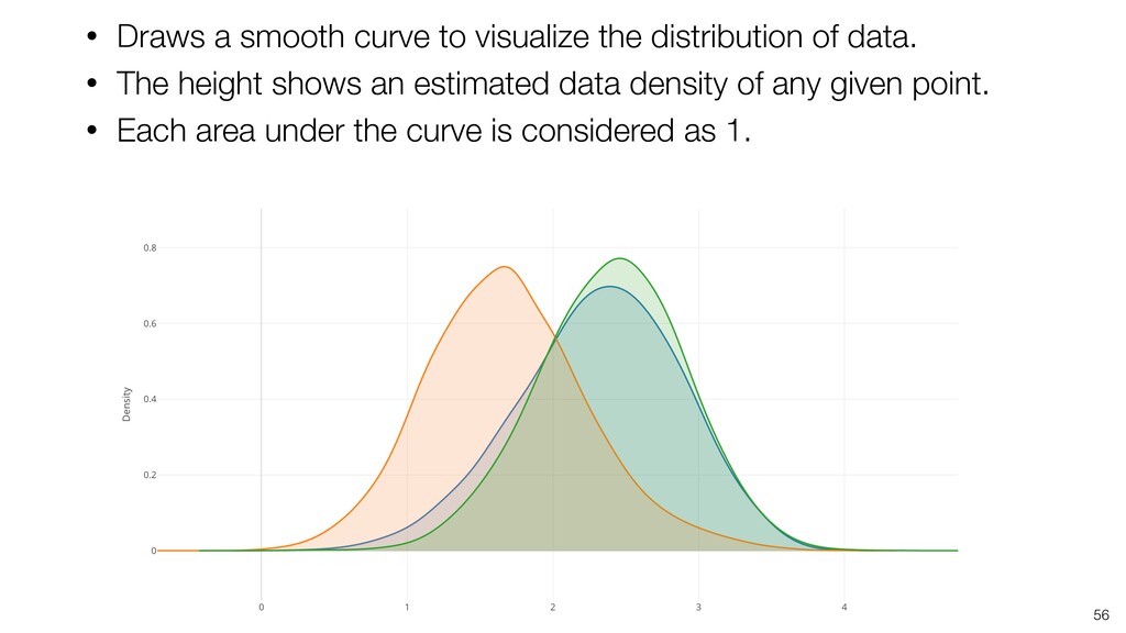
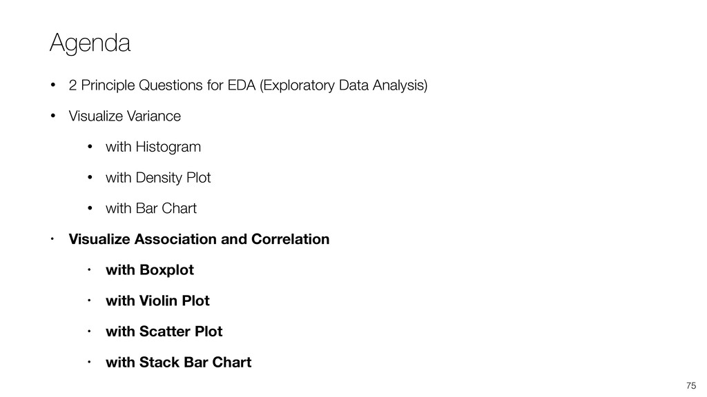
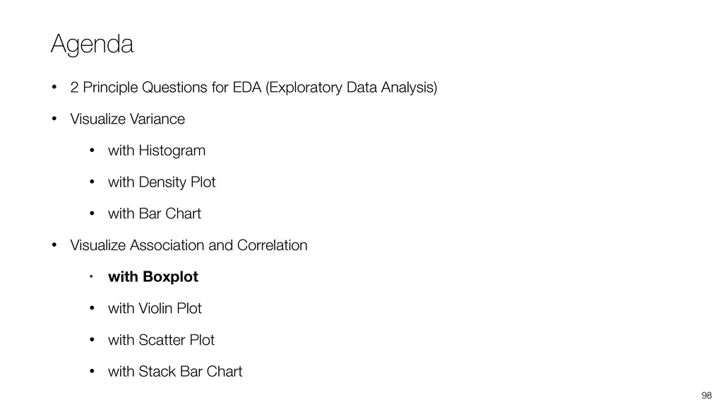
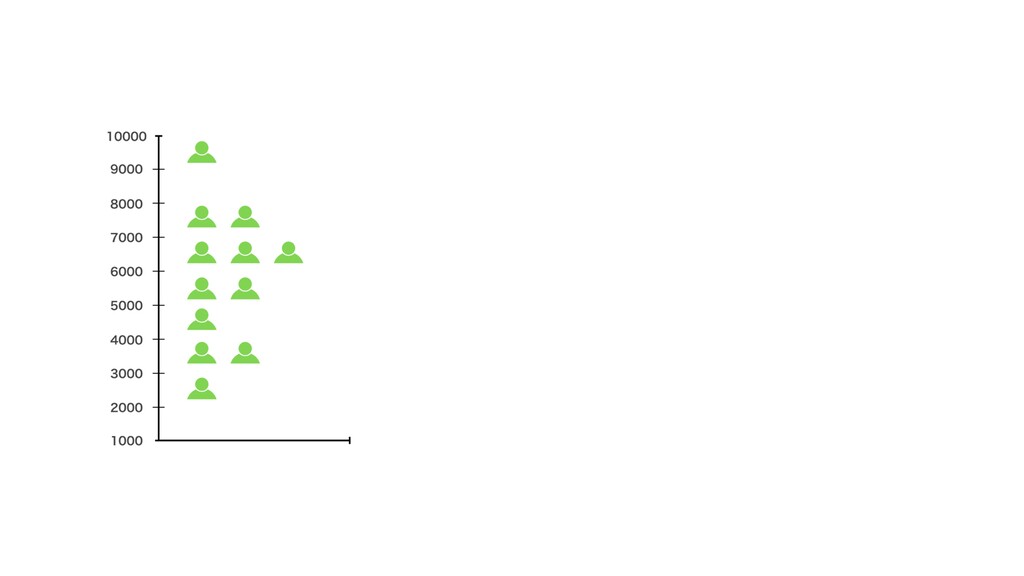
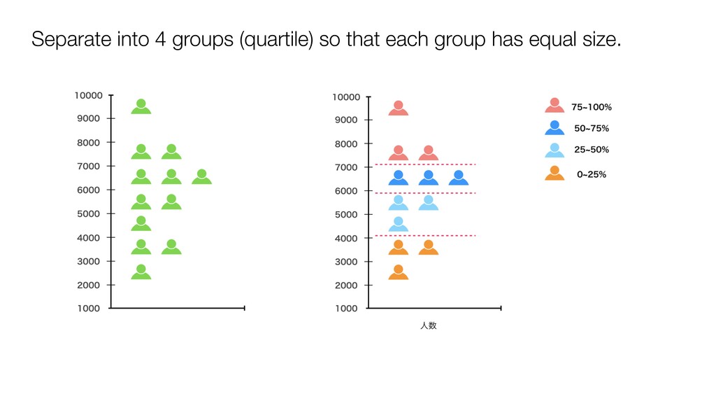
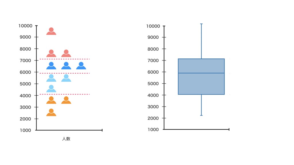
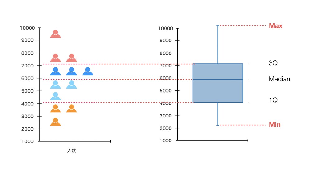
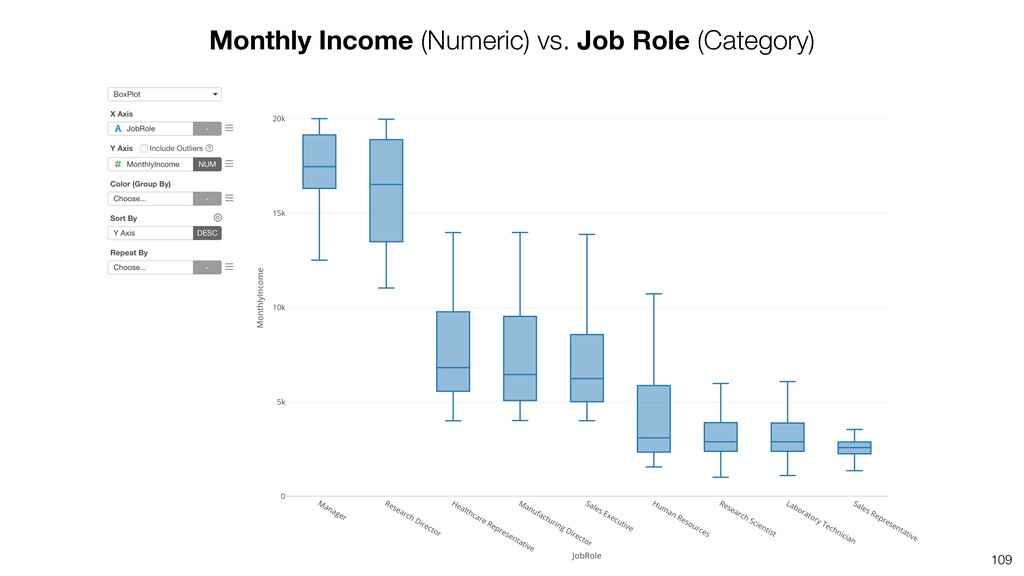
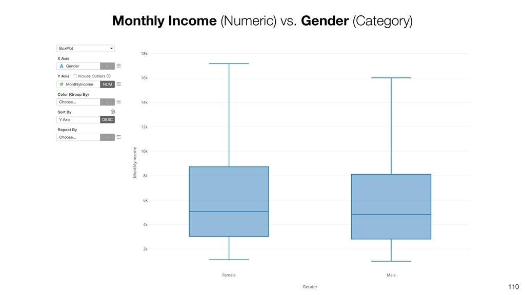
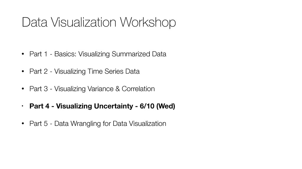
This is a part of the Data Visualization Workshop. In this seminar, we'll focus on how to visualize the variance and the correlation effectively.

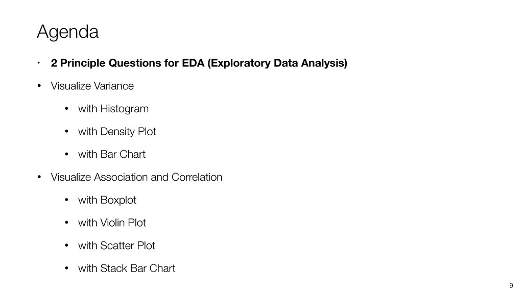
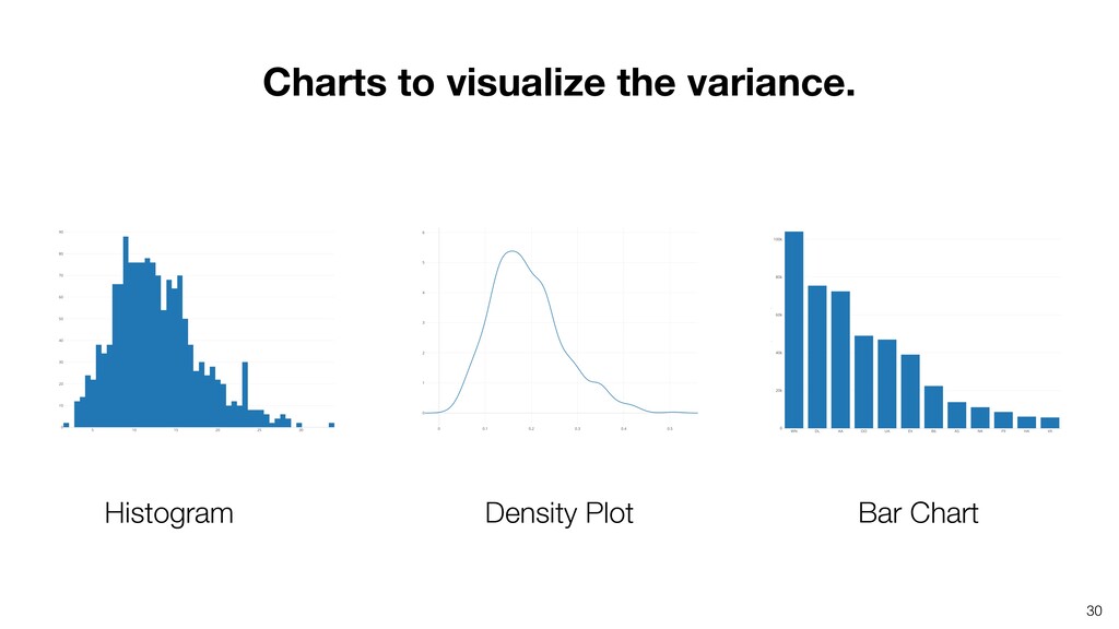
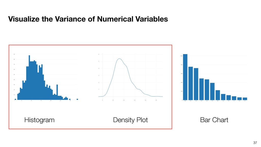
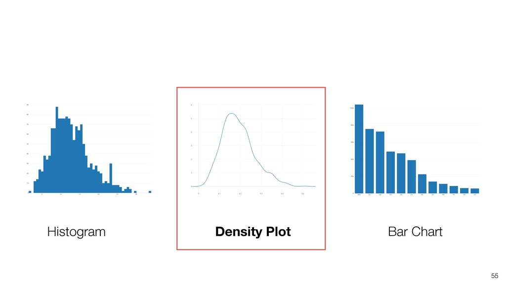
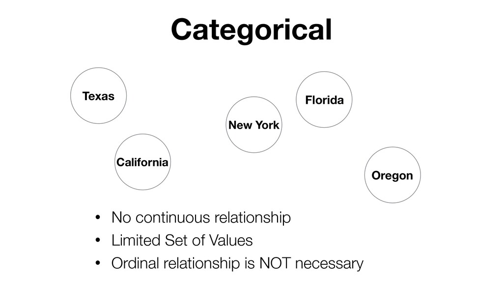
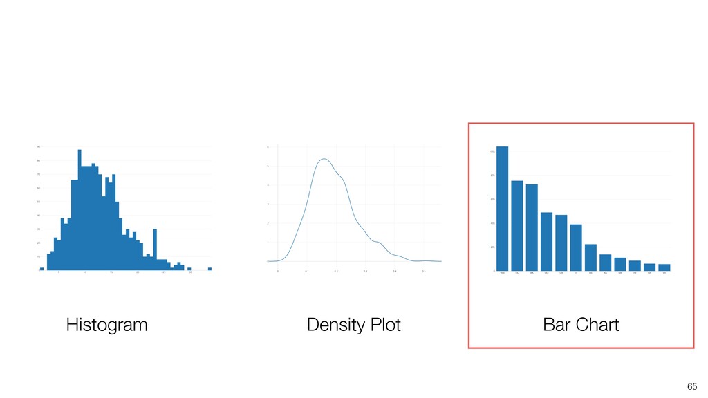
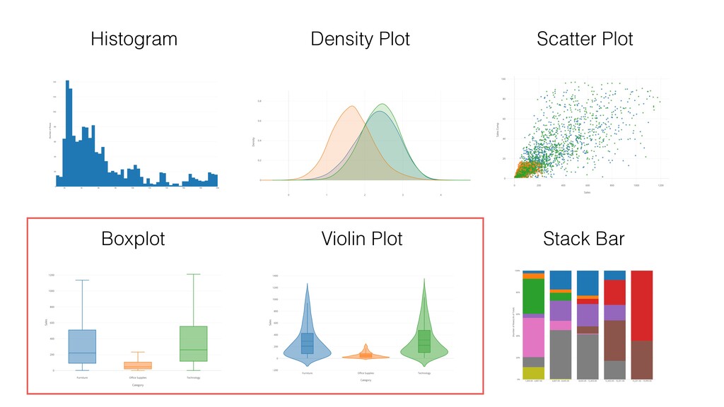
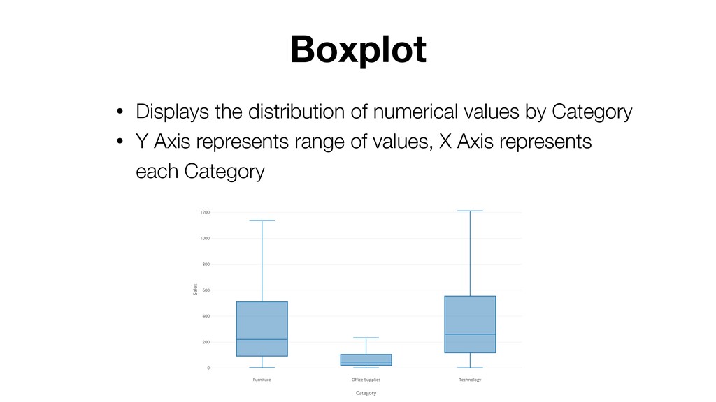
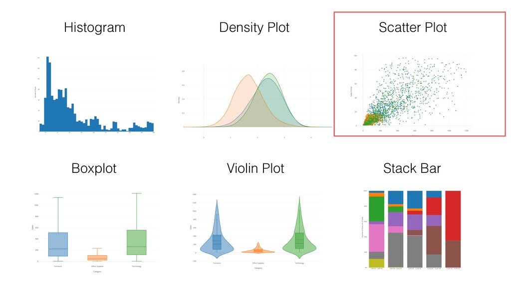
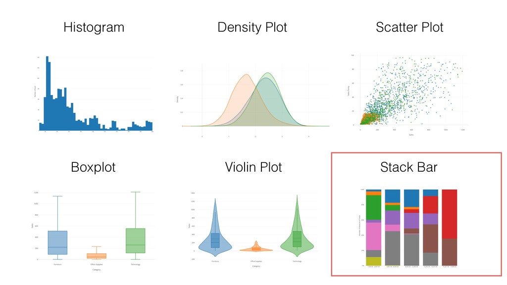
* Understanding Variance with Histogram, Density, Boxplot, Violin charts
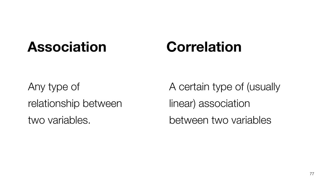
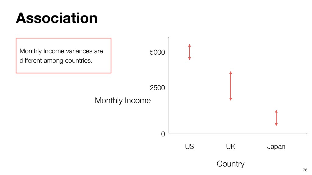
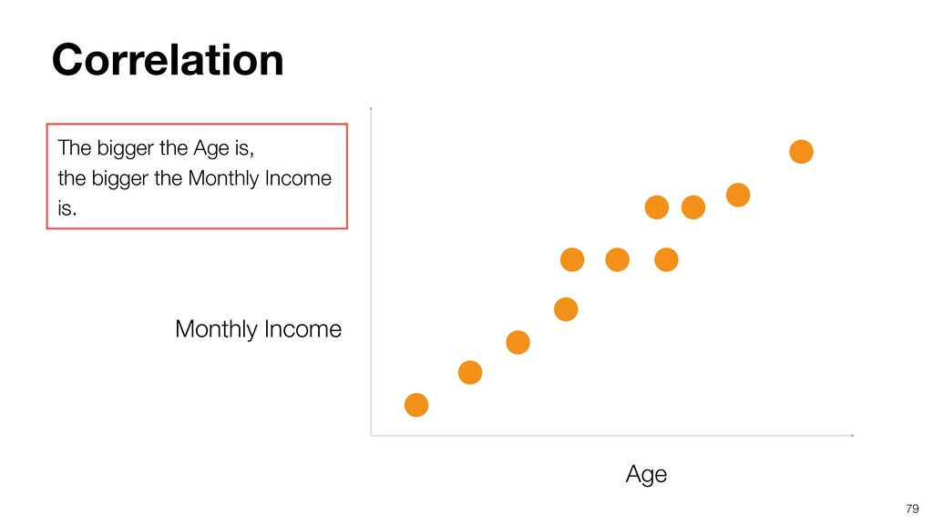
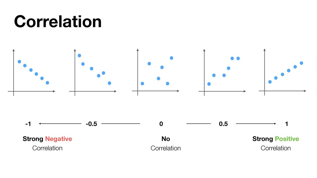
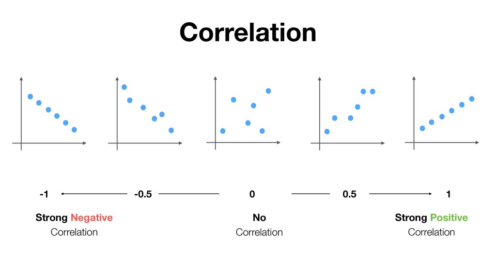
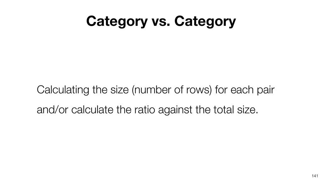
* Understanding Correlation with Scatter, Boxplot charts

Kan Nishida

May 13, 2020
Tweet

More Decks by Kan Nishida

Other Decks in Technology

Transcript

  1. Kan Nishida CEO/co-founder Exploratory Summary Beginning of 2016, launched Exploratory,

    Inc. to democratize Data Science. Prior to Exploratory, Kan was a director of product development at Oracle leading teams for building various Data Science products in areas including Machine Learning, BI, Data Visualization, Mobile Analytics, Big Data, etc. While at Oracle, Kan also provided training and consulting services to help organizations transform with data. @KanAugust Speaker
  2. 3 Data Science is not just for Engineers and Statisticians.

    Exploratory makes it possible for Everyone to do Data Science. The Third Wave
  3. 4 Questions Communication Data Access Data Wrangling Visualization Analytics (Statistics

    / Machine Learning) Data Analysis Data Science Workflow
  4. 5 Questions Communication (Dashboard, Note, Slides) Data Access Data Wrangling

    Visualization Analytics (Statistics / Machine Learning) Data Analysis ExploratoryɹModern & Simple UI
  5. • Part 1 - Basics: Visualizing Summarized Data • Part

    2 - Visualizing Time Series Data • Part 3 - Visualizing Variance & Correlation • Part 4 - Visualizing Uncertainty • Part 5 - Data Wrangling for Data Visualization Data Visualization Workshop
  6. Agenda • 2 Principle Questions for EDA (Exploratory Data Analysis)

    • Visualize Variance • with Histogram • with Density Plot • with Bar Chart • Visualize Association and Correlation • with Boxplot • with Violin Plot • with Scatter Plot • with Stack Bar Chart 8
  7. Agenda • 2 Principle Questions for EDA (Exploratory Data Analysis)

    • Visualize Variance • with Histogram • with Density Plot • with Bar Chart • Visualize Association and Correlation • with Boxplot • with Violin Plot • with Scatter Plot • with Stack Bar Chart 9
  8. An exploratory and iterative process of asking many questions and

    find answers from data in order to build better hypothesis for Explanation, Prediction, and Control. 10 EDA (Exploratory Data Analysis)
  9. 12 Far better an approximate answer to the right question,

    which is often vague, than an exact answer to the wrong question, which can always be made precise. — John Tukey
  10. 13 • How the variation in variables? • How are

    the variables associated or correlated to one another? 2 Principle Questions for EDA
  11. Once the data is imported, the Summary view automatically generates

    a chart for each column along with metrics to describe the data.
  12. Each row is for each employee of 1,470. There are

    27 variables to describe each employee.
  13. Questions • How is the variation of Monthly Income? •

    What makes it vary? • What are correlated to Monthly Income and how?
  14. 26 We can see that the average Monthly Income is

    $6,503, and it ranges from 1,009 to 19,999. That’s a huge gap!
  15. Agenda • 2 Principle Questions for EDA (Exploratory Data Analysis)

    • Visualize Variance • with Histogram • with Density Plot • with Bar Chart • Visualize Association and Correlation • with Boxplot • with Violin Plot • with Scatter Plot • with Stack Bar Chart 27
  16. Questions for Variance • What are the typical values? •

    Are there any outliers compared to the general trend in the variance? • How the data is distributed? • Are there any patterns you can spot in the variance? 29
  17. Numerical 0 10 20 30 40 50 11 22 45

    Continuous and Ordinal relationship among values.
  18. 39 It splits numerical values into a set of ‘bins’

    with equal range it shows the size (or number of rows) for each ‘bin’.
  19. 40 1. How the variance of Monthly Income? 2. Are

    there any differences in the Monthly Income variance between Male and Female. If so, how? 3. Are there any differences in the Monthly Income variance among Job Roles. If so, how? Questions
  20. 41 1. How the variance of Monthly Income? 2. Are

    there any differences in the Monthly Income variance between Male and Female. If so, how? 3. Are there any differences in the Monthly Income variance among Job Roles. If so, how? Questions
  21. 44 Increase the number of Bars by setting 100 to

    see if any new patterns can be spotted.
  22. 49 1. How the variance of Monthly Income? 2. Are

    there any differences in the Monthly Income variance between Male and Female. If so, how? 3. Are there any differences in the Monthly Income variance among Job Roles. If so, how? Questions
  23. 52 1. How the variance of Monthly Income? 2. Are

    there any differences in the Monthly Income variance between Male and Female. If so, how? 3. Are there any differences in the Monthly Income variance among Job Roles. If so, how? Questions
  24. 53 Manager’s Monthly Income range seems to be higher while

    Sales Rep & Research Scientist are lower. Manager Sales Rep Research Scientist
  25. 54 But, it’s hard to see the differences among the

    Job Roles because they are on top of each other.
  26. 56 • Draws a smooth curve to visualize the distribution

    of data. • The height shows an estimated data density of any given point. • Each area under the curve is considered as 1.
  27. 57 1. How the variance of Monthly Income? 2. Are

    there any differences in the Monthly Income variance between Male and Female. If so, how? 3. Are there any differences in the Monthly Income variance among Job Roles. If so, how? Questions
  28. 58 Create a Density Plot by selecting ‘Density Plot’ chart

    and assigning the ‘Monthly Income’ column to X-Axis.
  29. Categorical California Texas New York Florida Oregon • No continuous

    relationship • Limited Set of Values • Ordinal relationship is NOT necessary
  30. 66 1. How the variance of Job Role? 2. Are

    there any differences in the Job Role variance between Male and Female. If so, how? Questions
  31. 67 1. How the variance of Job Role? 2. Are

    there any differences in the Job Role variance between Male and Female. If so, how? Questions
  32. 68 Create a bar chart by selecting ‘Bar’ chart type

    and assigning the ‘Job Role’ column to X Axis.
  33. 70 1. How the variance of Job Role? 2. Are

    there any differences in the Job Role variance between Male and Female. If so, how? Questions
  34. Some Job Roles like Sales Executive, Research Scientists, etc. have

    a lot more males than female while there aren’t much differences between for Manufacturing Director.
  35. Agenda • 2 Principle Questions for EDA (Exploratory Data Analysis)

    • Visualize Variance • with Histogram • with Density Plot • with Bar Chart • Visualize Association and Correlation • with Boxplot • with Violin Plot • with Scatter Plot • with Stack Bar Chart 75
  36. 76 A relationship where changes in one variable happen together

    with changes in another variable with a certain rule. Association and Correlation
  37. 77 Association Correlation Any type of relationship between two variables.

    A certain type of (usually linear) association between two variables
  38. 78 US UK Japan 5000 2500 Monthly Income variances are

    different among countries. Country Monthly Income 0 Association
  39. 79 Age Monthly Income The bigger the Age is, the

    bigger the Monthly Income is. Correlation
  40. 85 0 30 20 If we can find a correlation

    between Monthly Income and Working Years… 10 $20,000 $1,000 Working Years Monthly Income
  41. 86 0 30 20 10 $20,000 $1,000 Working Years If

    Working Years is 20 years, Monthly Income would be around $15,000. $15,000 Monthly Income
  42. 87 5000 0 30 20 Working Years Correlation Variance 100

    $20,000 $1,000 $15,000 Correlation reduces the uncertainty caused by Variance. Monthly Income
  43. 88 US UK Japan Association Variance Reduce Uncertainty 5000 100

    Monthly Income Association reduces the uncertainty caused by Variance.
  44. If we can find strong correlations, it makes it easier

    to explain how Monthly Income changes and to predict what Monthly Income will be.
  45. Correlation (or Association) is not equal to Causation. Causation is

    a special type of Correlation. If we can confirm a given Correlation is Causation, then we can control the outcome.
  46. 95 • Category vs. Numerical • Numerical vs. Numerical •

    Category vs. Category Combination of Data Types
  47. 96 • Category vs. Numerical • Numerical vs. Numerical •

    Category vs. Category Combination of Data Types
  48. Agenda • 2 Principle Questions for EDA (Exploratory Data Analysis)

    • Visualize Variance • with Histogram • with Density Plot • with Bar Chart • Visualize Association and Correlation • with Boxplot • with Violin Plot • with Scatter Plot • with Stack Bar Chart 98
  49. Boxplot • Displays the distribution of numerical values by Category

    • Y Axis represents range of values, X Axis represents each Category
  50. 3Q (3rd Quartile / 75 Percentile) 2Q (2nd Quartile /

    50 Percentile / Median) 1Q (1st Quartile / 25 Percentile)
  51. 107 1. How is the variance of Monthly Income associated

    with Job Role? 2. How is the variance of Monthly Income associated with Gender? 3. Are there any difference in the Monthly Income variation between Male and Female in each Job Role? Questions
  52. 108 1. How is the variance of Monthly Income associated

    with Job Role? 2. How is the variance of Monthly Income associated with Gender? 3. Are there any difference in the Monthly Income variation between Male and Female in each Job Role? Questions
  53. 112 • Category vs. Numerical • Numerical vs. Numerical •

    Category vs. Category Combination of Data Types
  54. 115 Numeric Numeric Each data point (row) is positioned at

    an intersection of two numeric variables.
  55. 117 1. How is the variance of Monthly Income correlated

    with the variance of Age? 2. How is the variance of Monthly Income correlated with the variance of Total Working Years? 3. Are there any differences in the correlation between Monthly Income and Total Working Years among Job Roles? Questions
  56. 118 1. How is the variance of Monthly Income correlated

    with the variance of Age? 2. How is the variance of Monthly Income correlated with the variance of Total Working Years? 3. Are there any differences in the correlation between Monthly Income and Total Working Years among Job Roles? Questions
  57. 123 1. How is the variance of Monthly Income correlated

    with the variance of Age? 2. How is the variance of Monthly Income correlated with the variance of Total Working Years? 3. Are there any differences in the correlation between Monthly Income and Total Working Years among Job Roles? Questions
  58. 126 1. How is the variance of Monthly Income correlated

    with the variance of Age? 2. How is the variance of Monthly Income correlated with the variance of Total Working Years? 3. Are there any differences in the correlation between Monthly Income and Total Working Years among Job Roles? Questions
  59. 127 For example, Sales Executive and Human Resource have the

    same kind of correlation between Monthly Income and Total Working Years?
  60. Assign the ‘Job Role’ column to Repeat By to create

    the scatter chart for each of the job roles.
  61. We can see that there is a huge jump in

    Monthly Income after 20th years of working in this company.
  62. Also, up till 16th years, the income increases as the

    working years increase. But after 20th years, there is no obvious correlation between the working years and the income.
  63. We can assign the ‘Gender’ column to Color to see

    if there is any gender gap in terms of the relationship between the income and the working years.
  64. We can see that Female seems to have higher income

    range than Male up to 16th years, but after that Male seems to have higher income than Female.
  65. 139 • Numerical vs. Categorical • Numerical vs. Numerical •

    Categorical vs. Categorical Combination of Data Types
  66. 141 Category vs. Category Calculating the size (number of rows)

    for each pair and/or calculate the ratio against the total size.
  67. 142 1. How is the Job Role associated with the

    Education? 2. How is the Job Role associated with the Attrition? 3. How is the Job Role associated with the Monthly Income? Questions
  68. 143 1. How is the Job Role associated with the

    Education? 2. How is the Job Role associated with the Attrition? 3. How is the Job Role associated with the Monthly Income? Questions
  69. 145 1. How is the Job Role associated with the

    Education? 2. How is the Job Role associated with the Attrition? 3. How is the Job Role associated with the Monthly Income? Questions
  70. • Logical is a special case of Categorical. • It

    can have only two unique values, TRUE or FALSE.
  71. 151 1. between Job Role and Education. 2. between Job

    Role and Attrition. 3. between Job Role and Monthly Income. Visualize the relationship
  72. Assign the ‘Monthly Income’ column to Color, which will automatically

    categorize the values of the Monthly Income into 5 groups.
  73. Make the Y-Axis to be Ratio (%) by using ‘%

    of’ Window Calculation. Select ‘Window Calculation’ from Y Axis menu.
  74. • Part 1 - Basics: Visualizing Summarized Data • Part

    2 - Visualizing Time Series Data • Part 3 - Visualizing Variance & Correlation • Part 4 - Visualizing Uncertainty - 6/10 (Wed) • Part 5 - Data Wrangling for Data Visualization Data Visualization Workshop