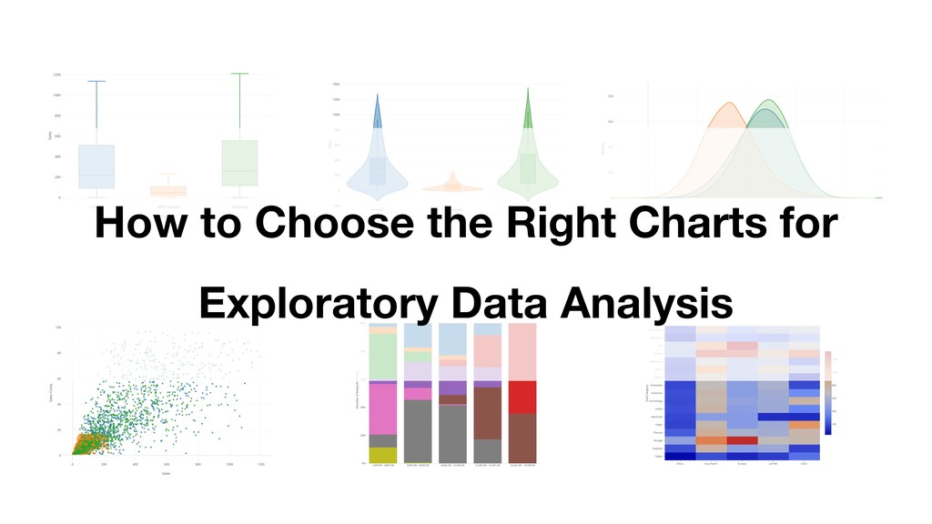
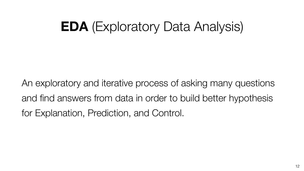
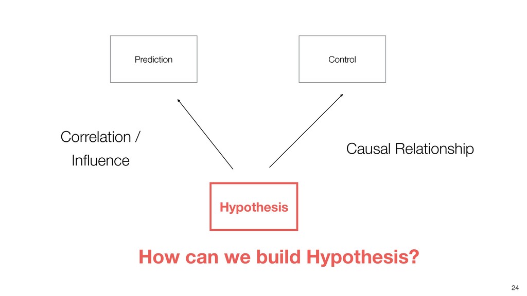
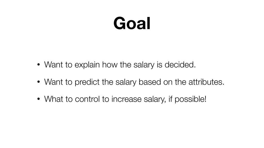
How to choose the right charts for Exploratory Data Analysis
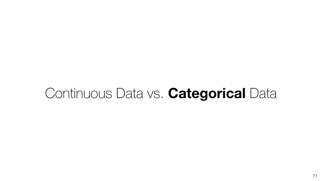
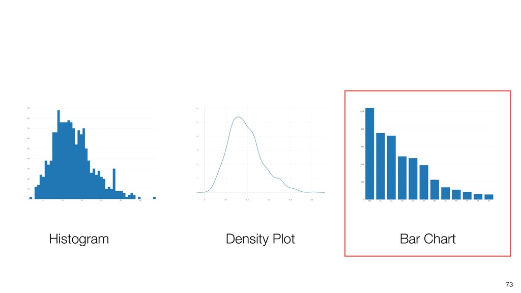
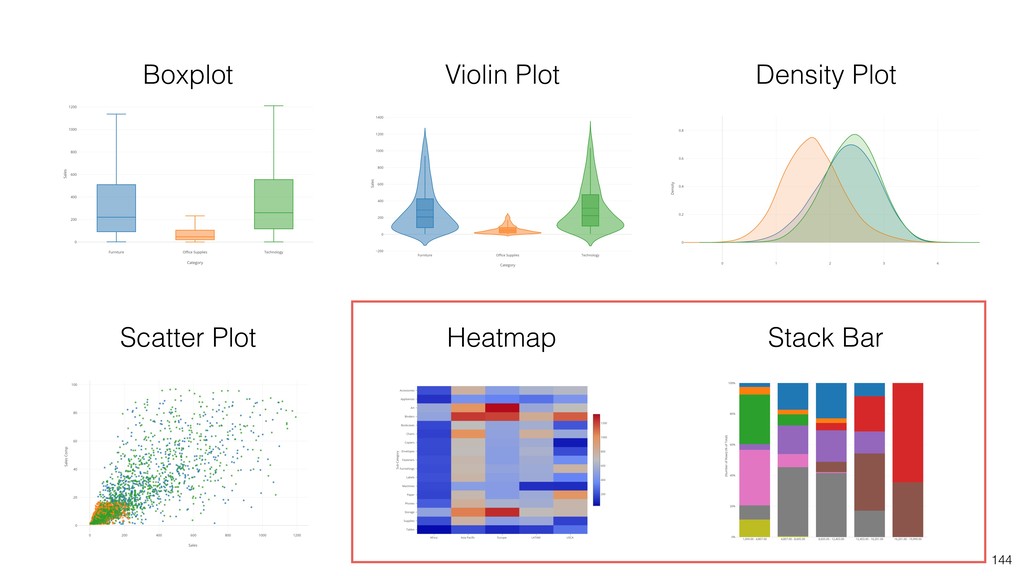
This is to show you how to choose the right charts for Exploratory Data Analysis and how to use charts like Histogram, Density Plot, Boxplot, Scatter, Stack Bar charts in Exploratory.
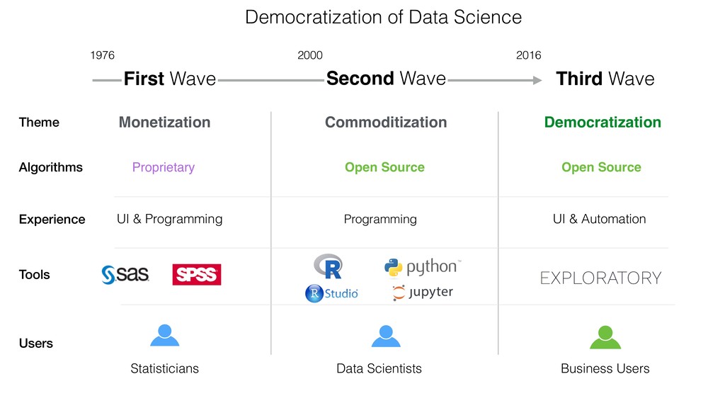
Inc. to democratize Data Science. Prior to Exploratory, Kan was a director of product development at Oracle leading teams for building various Data Science products in areas including Machine Learning, BI, Data Visualization, Mobile Analytics, Big Data, etc. While at Oracle, Kan also provided training and consulting services to help organizations transform with data. @KanAugust Speaker
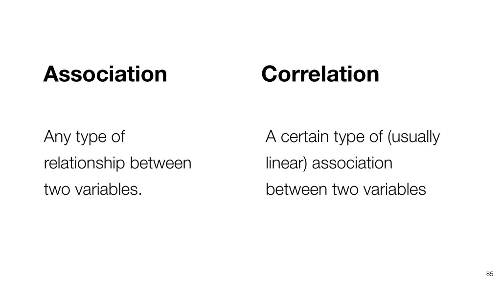
what seems to be, it should be no surprise that pictures play a vital role in doing it well. There is nothing better for making you think of questions you had forgotten to ask (even mentally),” John Tukey
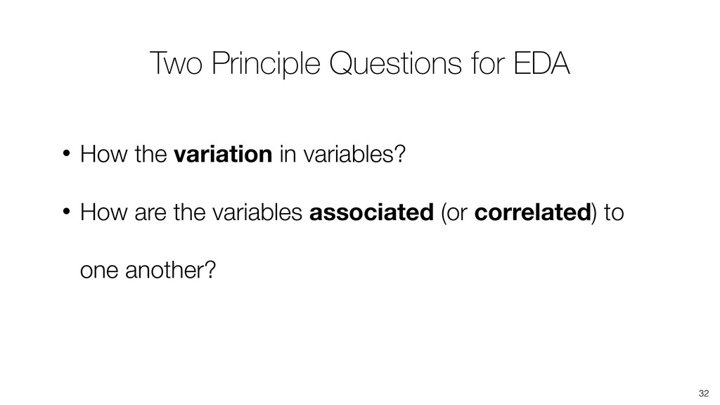
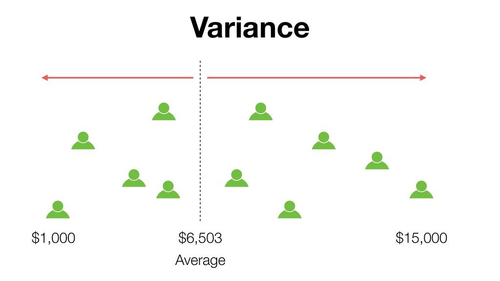
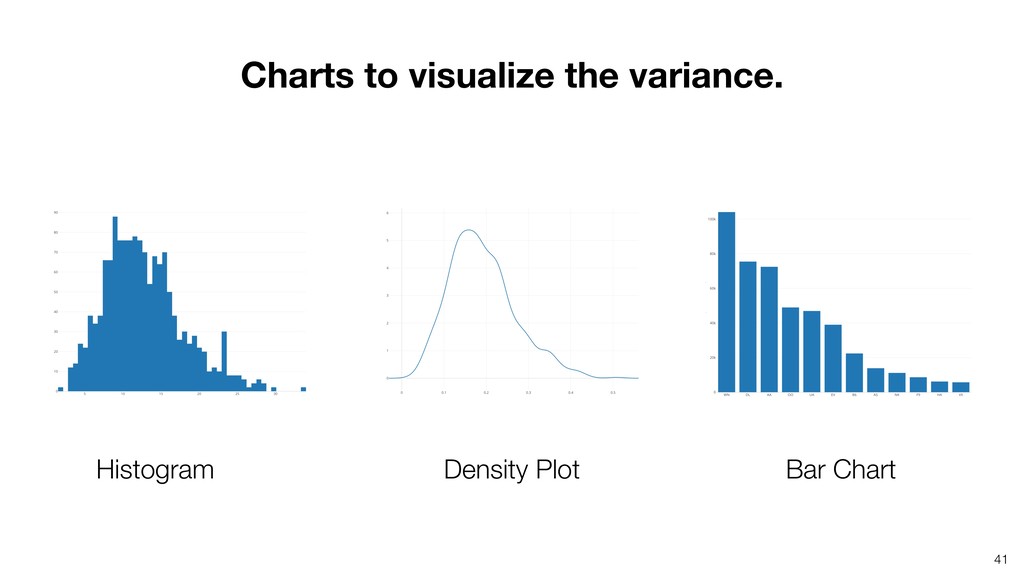
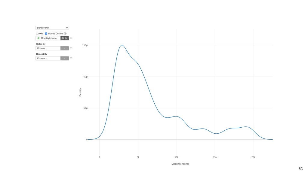
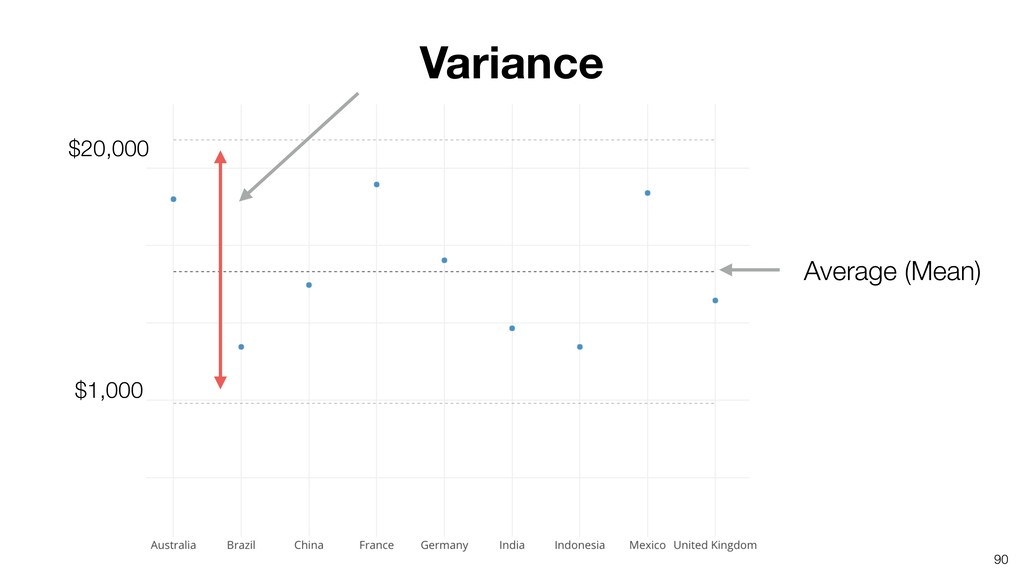
Are there any outliers compared to the general trend in the variance? • How the data is distributed? • Are there any patterns you can spot in the variance? 38
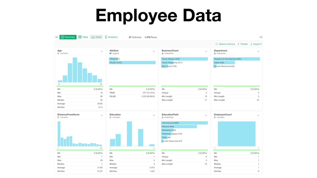
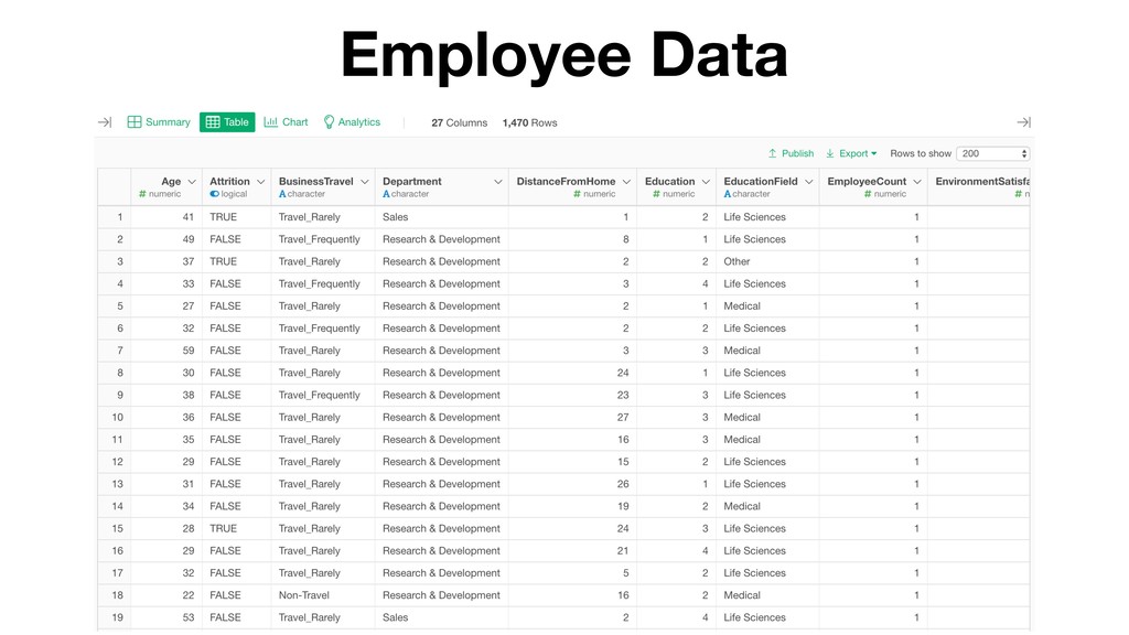
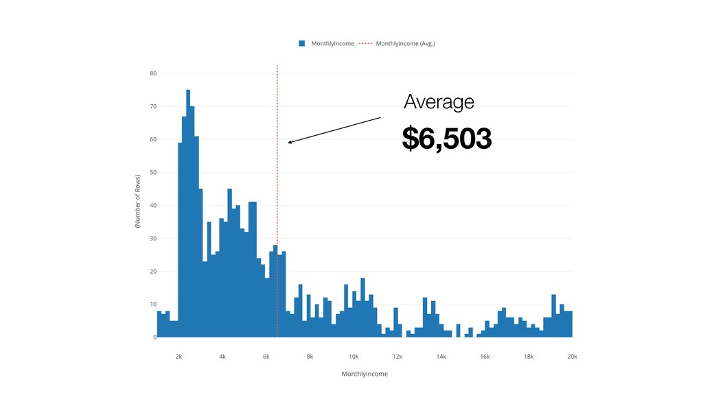
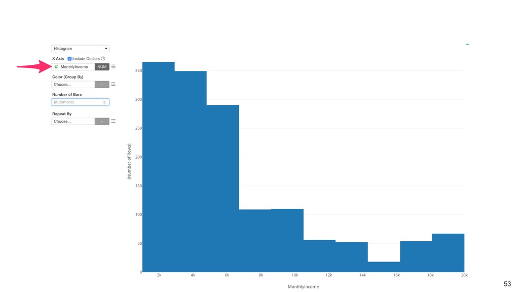
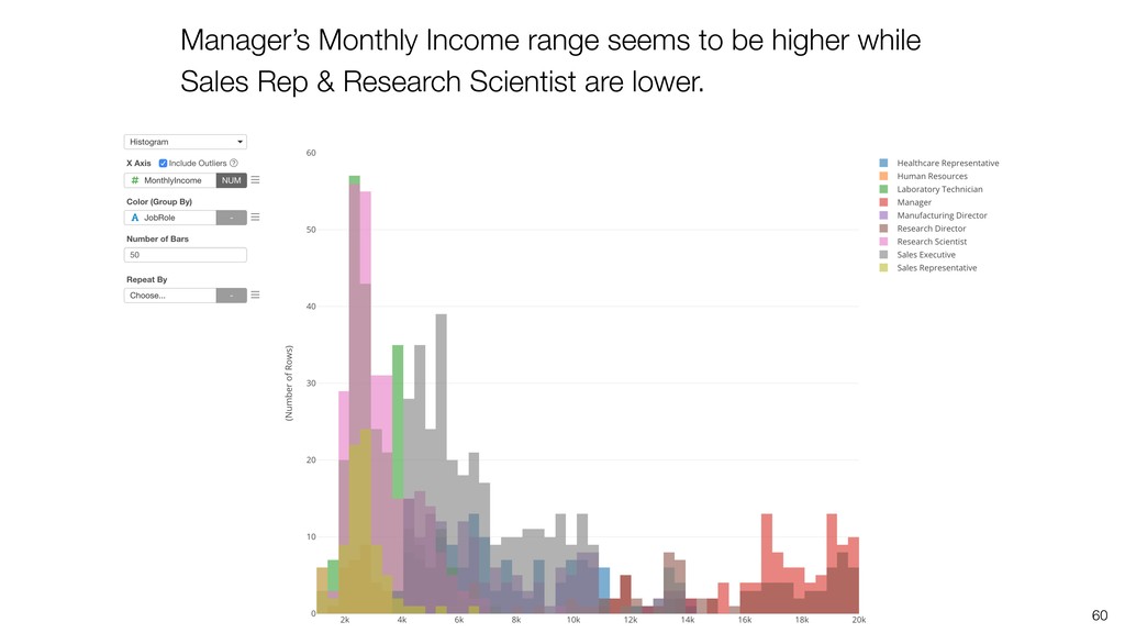
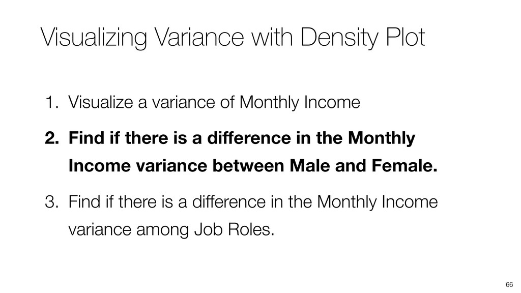
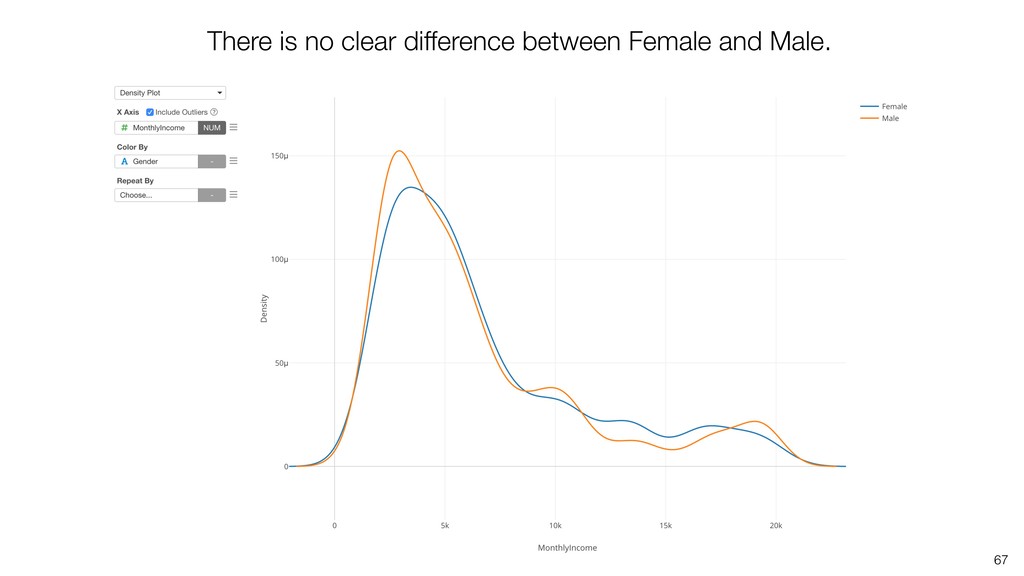
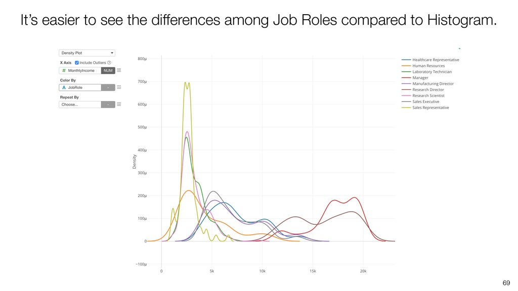
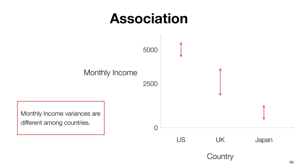
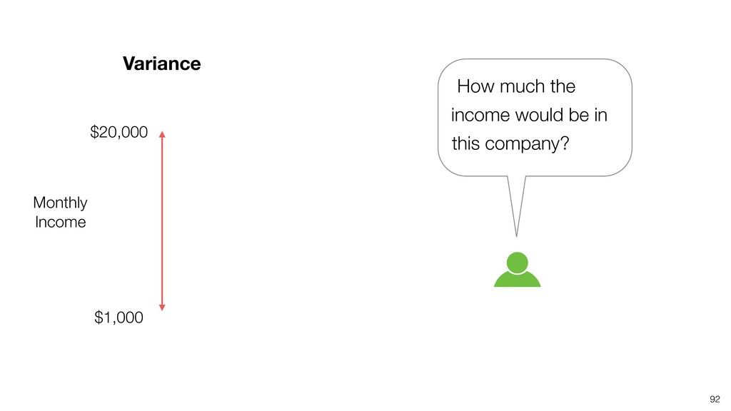
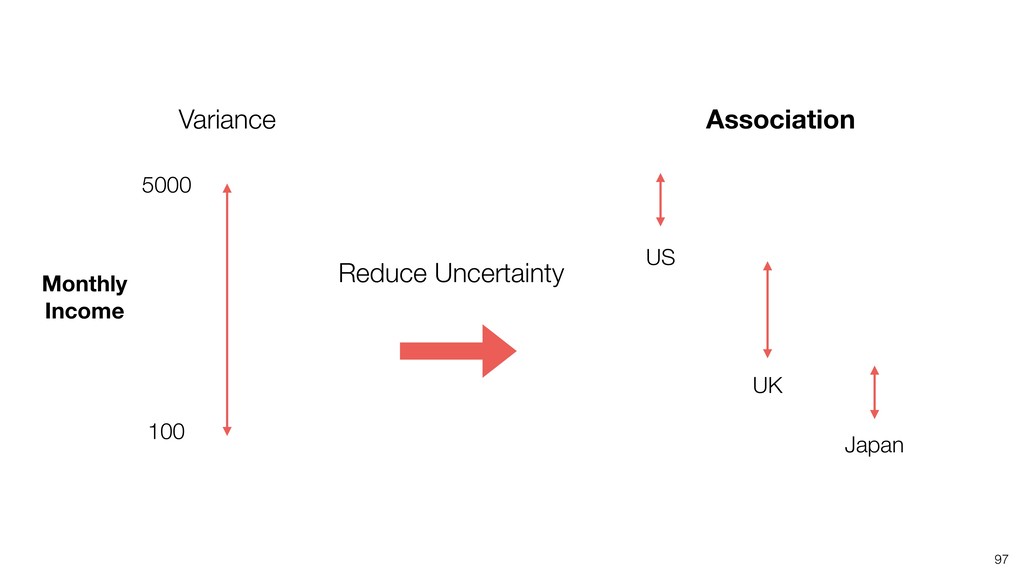
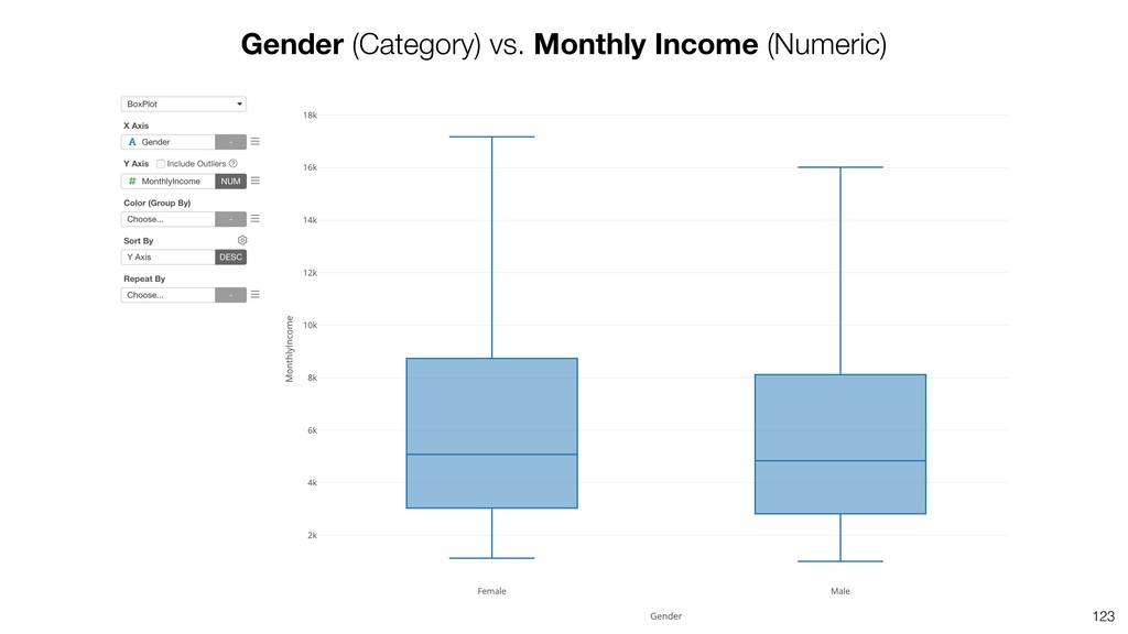
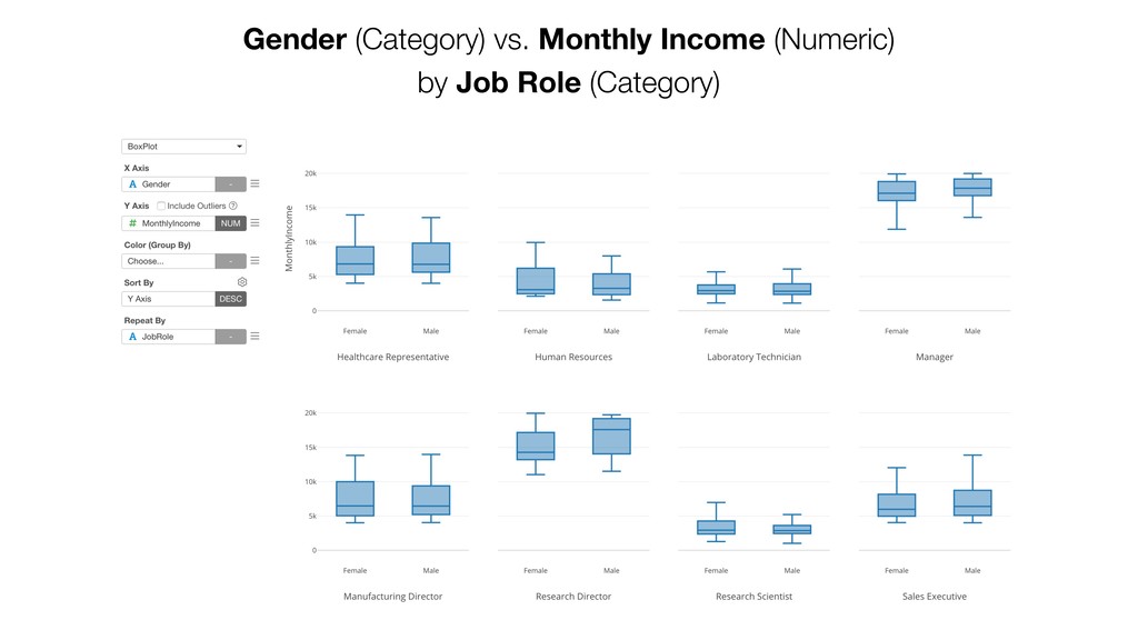
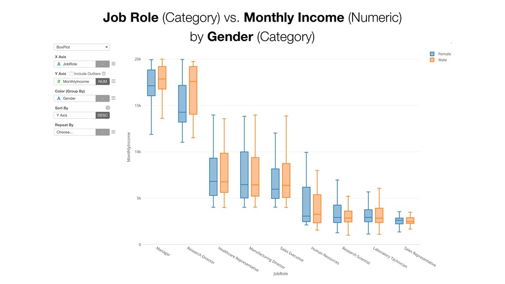
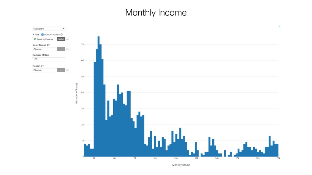
Monthly Income 2. Find if there is a difference in the Monthly Income variance between Male and Female. 3. Find if there is a difference in the Monthly Income variance among Job Roles.
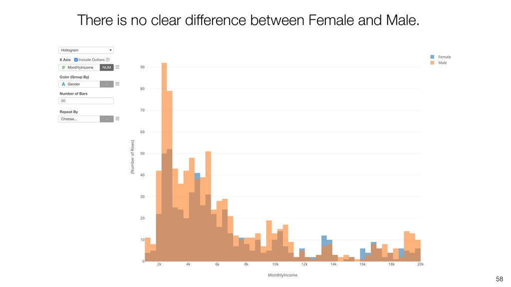
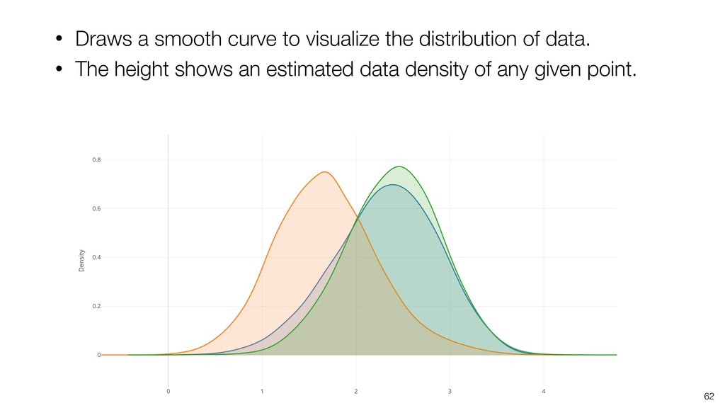
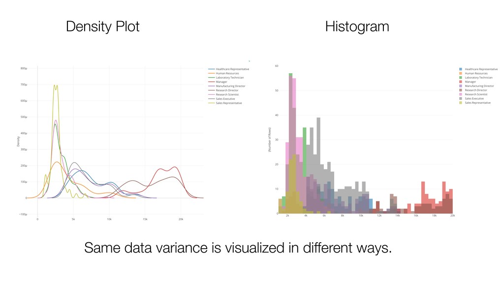
if there is a difference in the Monthly Income variance between Male and Female. 3. Find if there is a difference in the Monthly Income variance among Job Roles. Visualize the Variance with Histogram
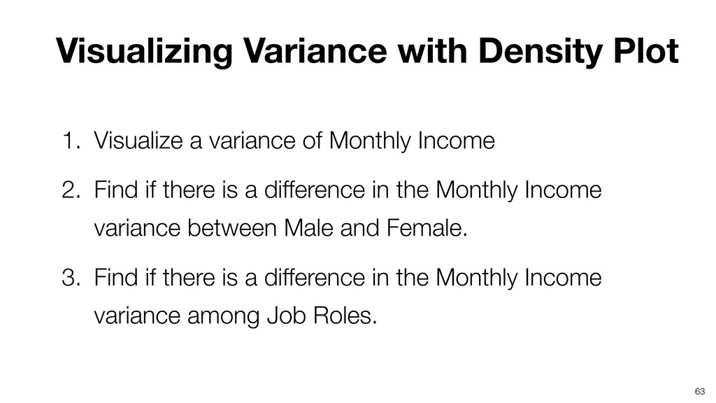
variance of Monthly Income 2. Find if there is a difference in the Monthly Income variance between Male and Female. 3. Find if there is a difference in the Monthly Income variance among Job Roles.
variance of Monthly Income 2. Find if there is a difference in the Monthly Income variance between Male and Female. 3. Find if there is a difference in the Monthly Income variance among Job Roles.
of Monthly Income 2. Find if there is a difference in the Monthly Income variance between Male and Female. 3. Find if there is a difference in the Monthly Income variance among Job Roles.
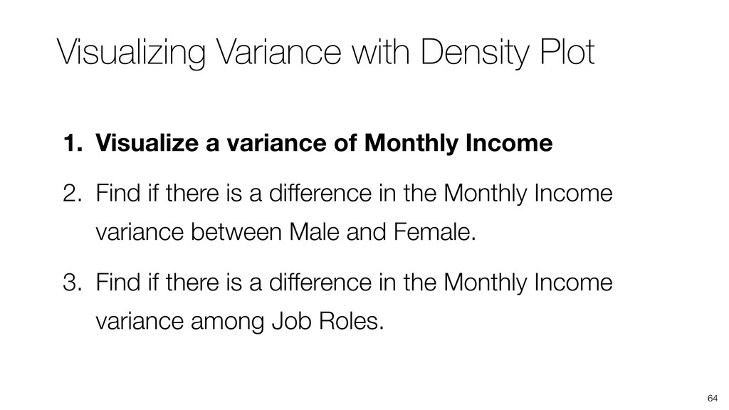
of Monthly Income 2. Find if there is a difference in the Monthly Income variance between Male and Female. 3. Find if there is a difference in the Monthly Income variance among Job Roles.
of Monthly Income 2. Find if there is a difference in the Monthly Income variance between Male and Female. 3. Find if there is a difference in the Monthly Income variance among Job Roles.
of Monthly Income 2. Find if there is a difference in the Monthly Income variance between Male and Female. 3. Find if there is a difference in the Monthly Income variance among Job Roles.
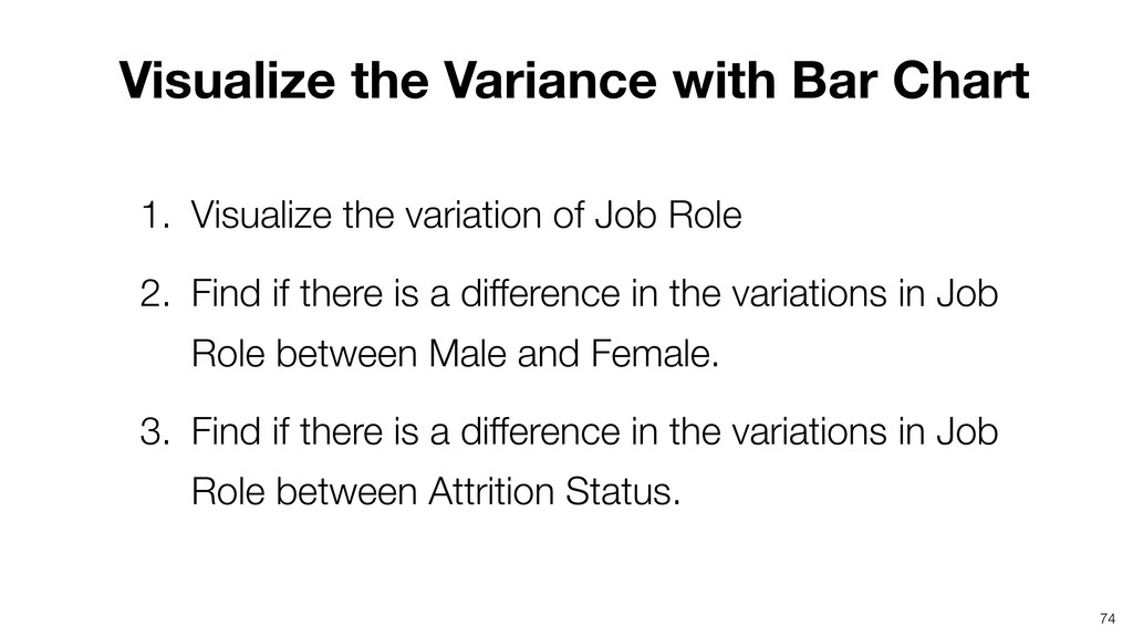
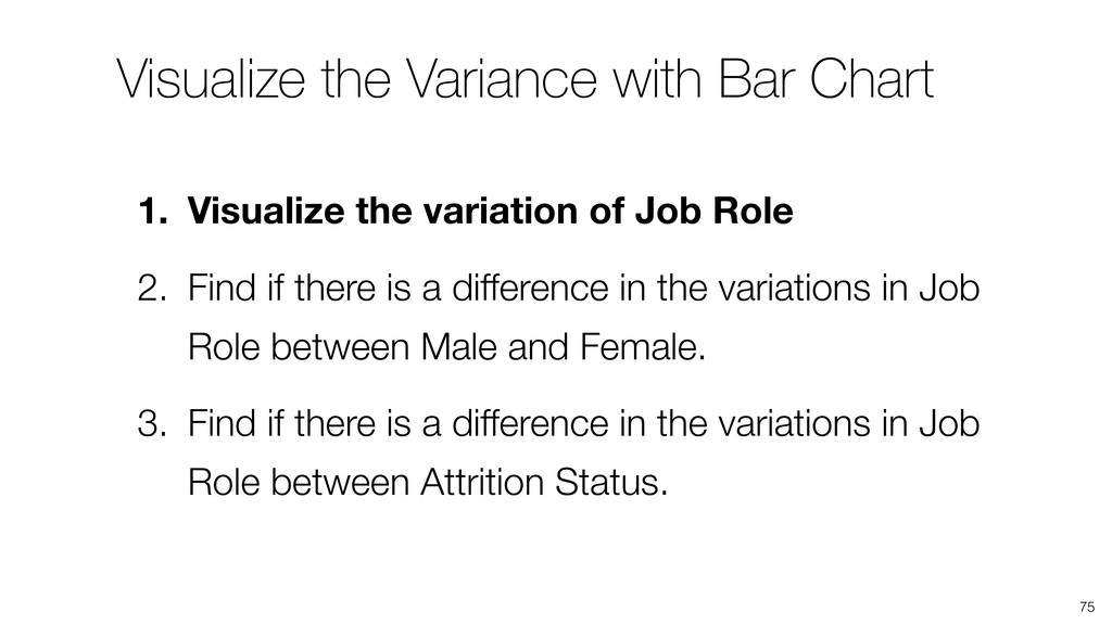
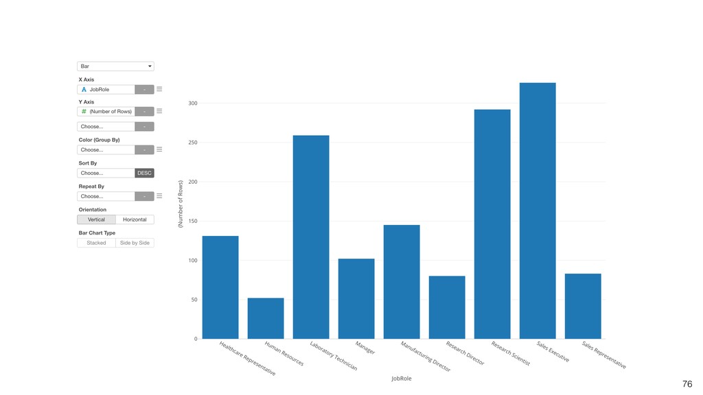
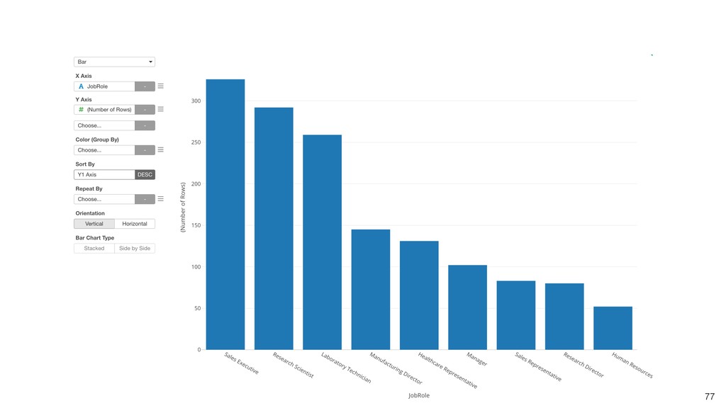
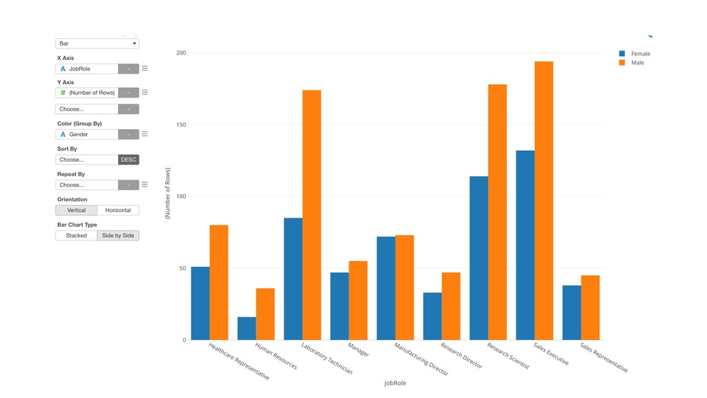
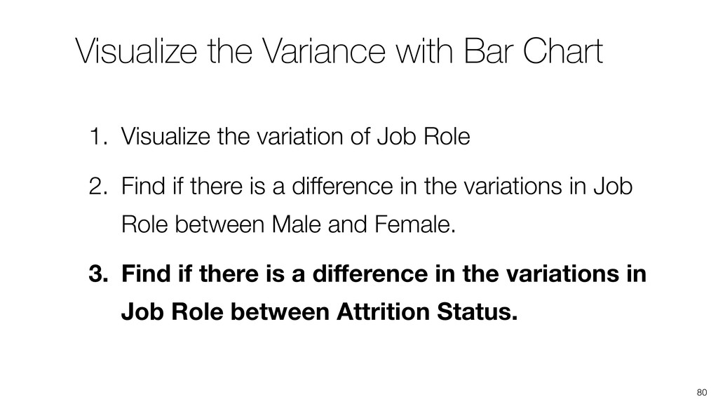
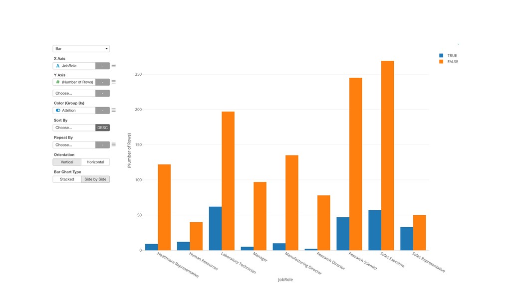
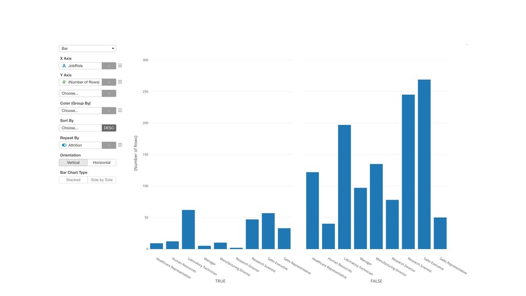
variation of Job Role 2. Find if there is a difference in the variations in Job Role between Male and Female. 3. Find if there is a difference in the variations in Job Role between Attrition Status.
variation of Job Role 2. Find if there is a difference in the variations in Job Role between Male and Female. 3. Find if there is a difference in the variations in Job Role between Attrition Status.
variation of Job Role 2. Find if there is a difference in the variations in Job Role between Male and Female. 3. Find if there is a difference in the variations in Job Role between Attrition Status.
variation of Job Role 2. Find if there is a difference in the variations in Job Role between Male and Female. 3. Find if there is a difference in the variations in Job Role between Attrition Status.
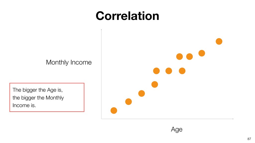
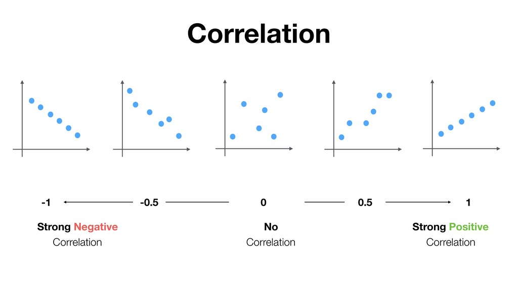
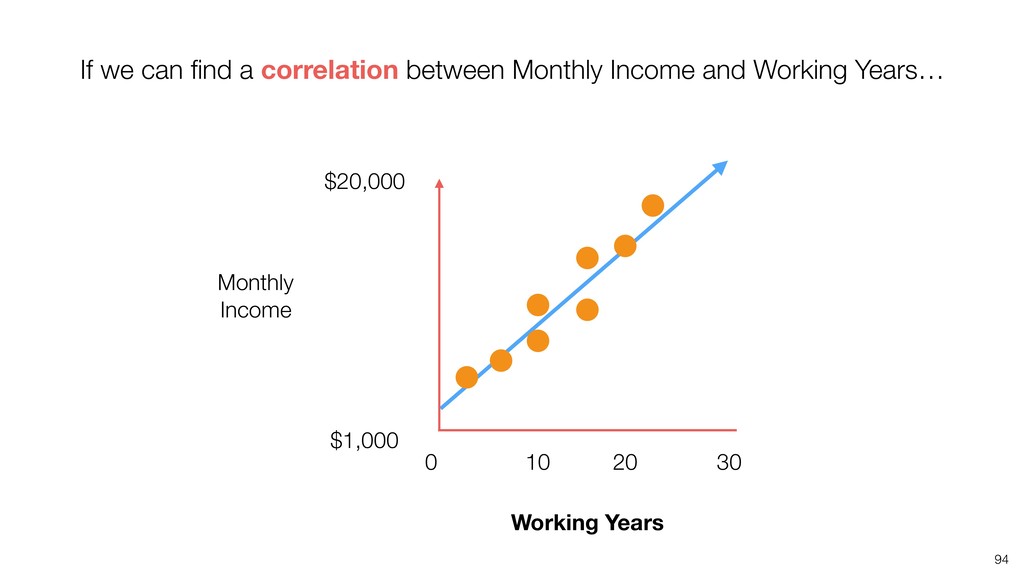
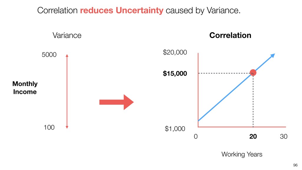
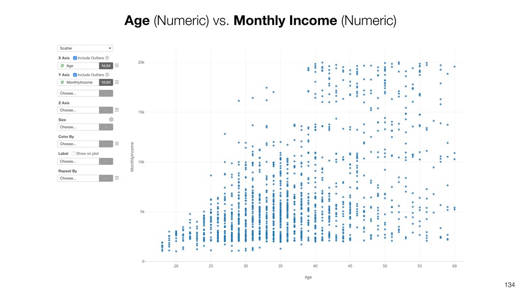
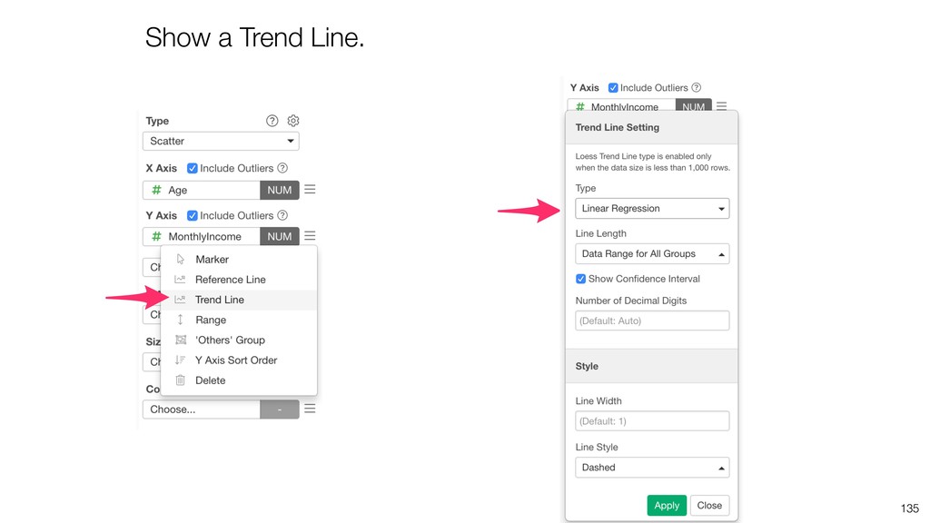
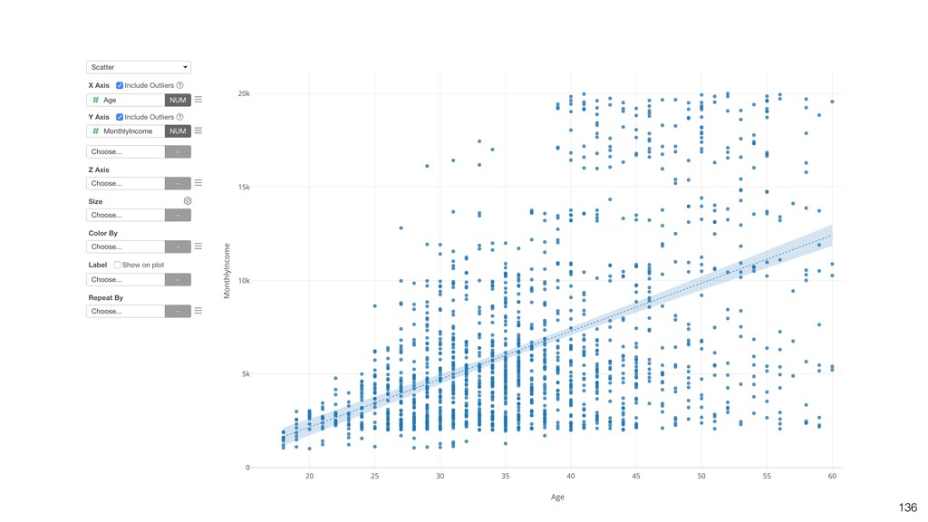
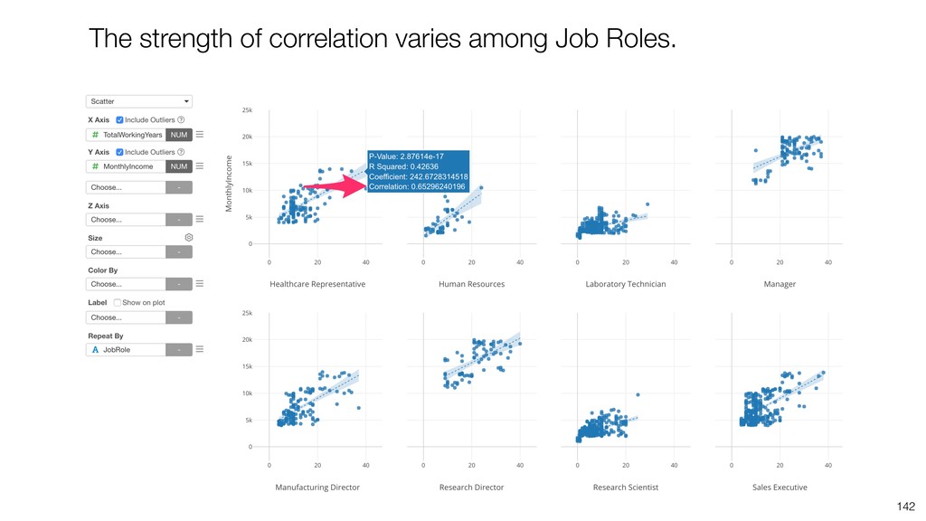
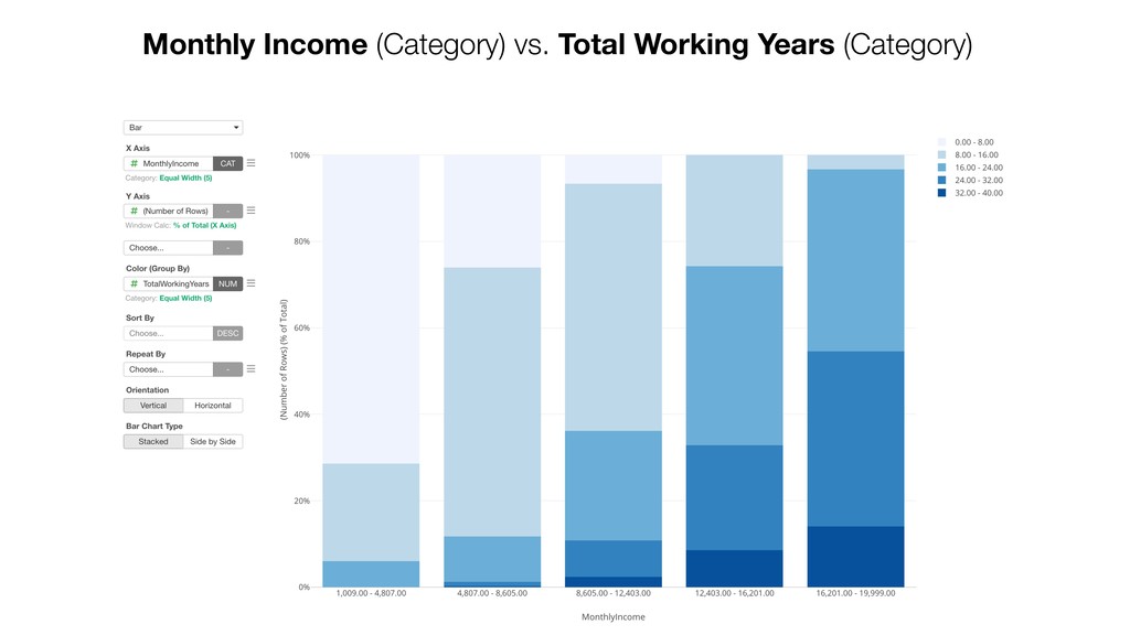
the relationship between Monthly Salary and Age. 2. Visualize the relationship between Monthly Salary and Total Working Years. 3. Find if the correlations are different among Job Roles.
the relationship between Monthly Salary and Age. 2. Visualize the relationship between Monthly Salary and Total Working Years. 3. Find if the correlations are different among Job Roles.
the relationship between Monthly Salary and Age. 2. Visualize the relationship between Monthly Salary and Total Working Years. 3. Find if the correlations are different among Job Roles.
the relationship between Monthly Salary and Age. 2. Visualize the relationship between Monthly Salary and Total Working Years. 3. Find if the correlations are different among Job Roles.
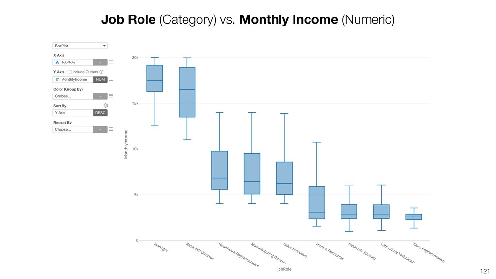
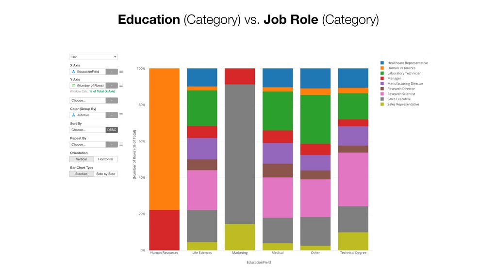
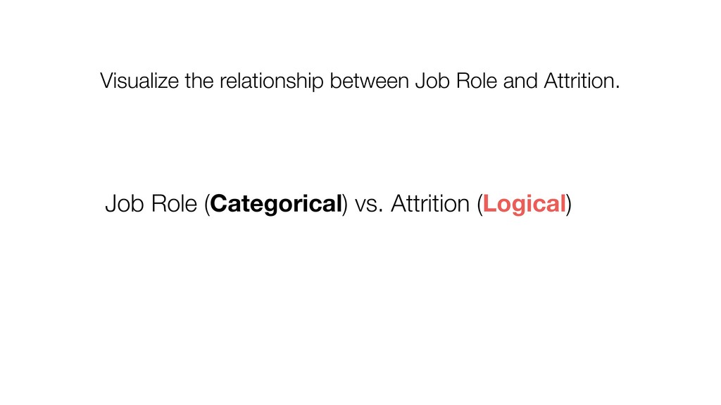
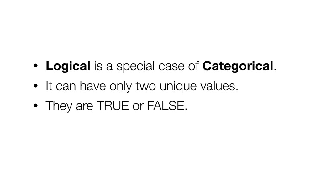
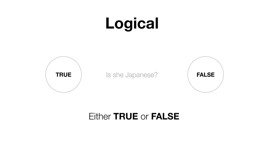
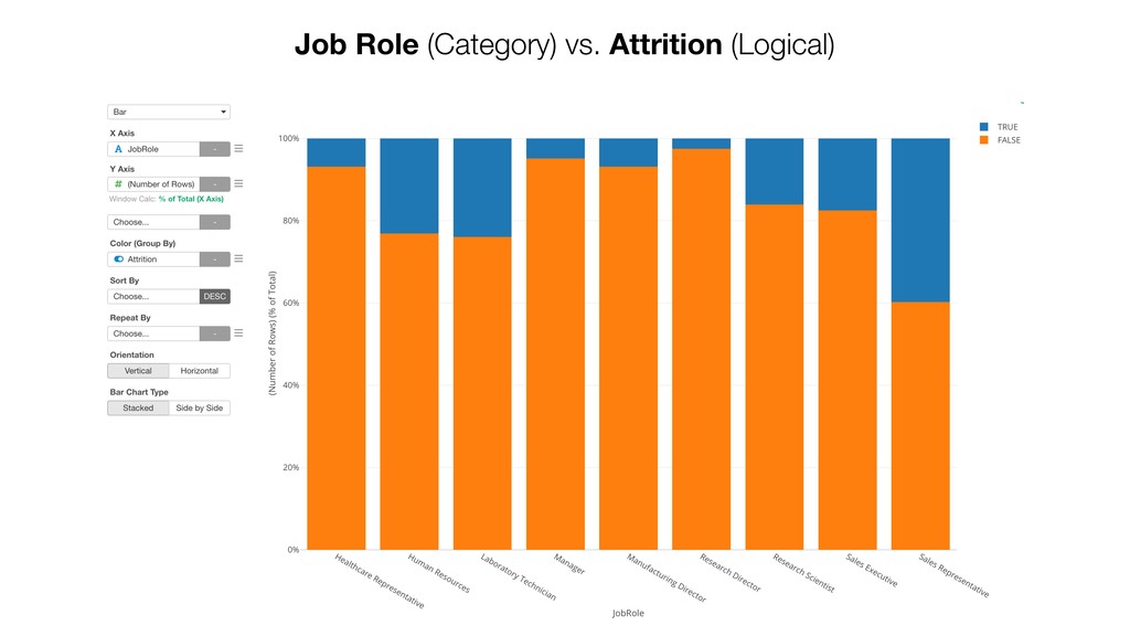
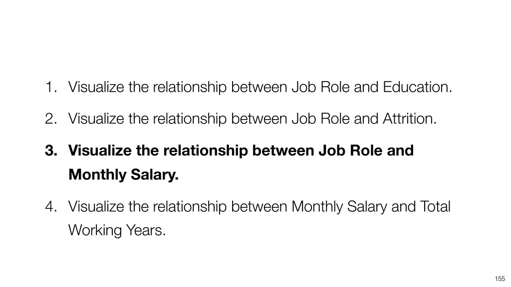
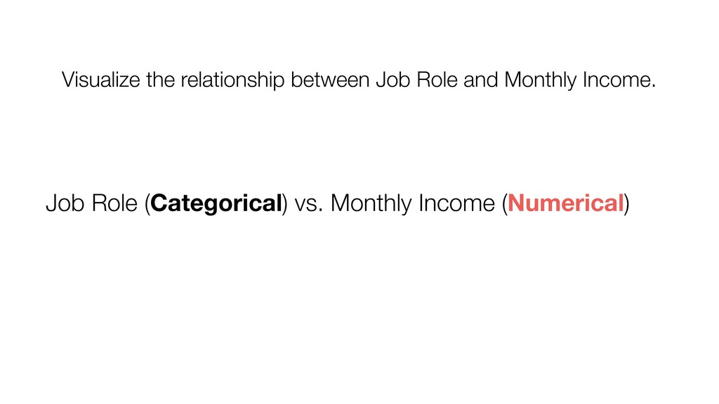
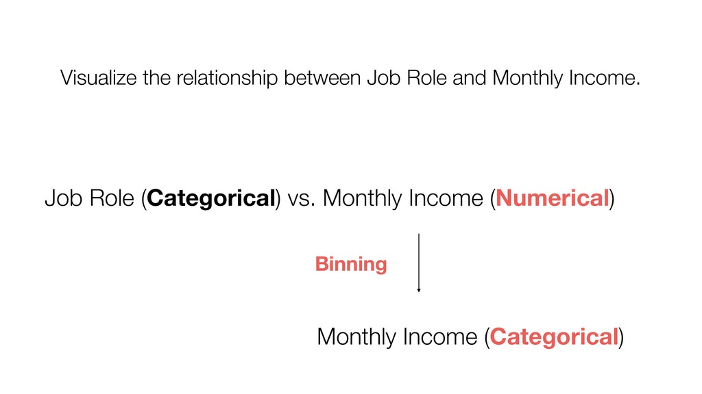
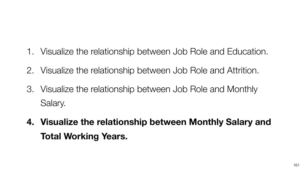
2. Visualize the relationship between Job Role and Attrition. 3. Visualize the relationship between Job Role and Monthly Salary. 4. Visualize the relationship between Monthly Salary and Total Working Years. Visualize the relationship between Categorical and Categorical
2. Visualize the relationship between Job Role and Attrition. 3. Visualize the relationship between Job Role and Monthly Salary. 4. Visualize the relationship between Monthly Salary and Total Working Years.
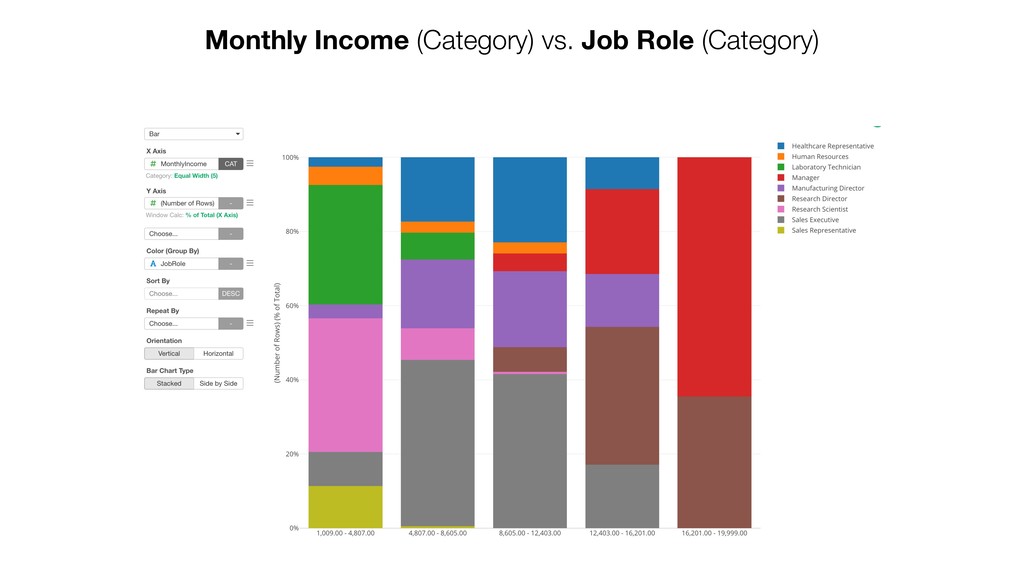
2. Visualize the relationship between Job Role and Attrition. 3. Visualize the relationship between Job Role and Monthly Salary. 4. Visualize the relationship between Monthly Salary and Total Working Years.
2. Visualize the relationship between Job Role and Attrition. 3. Visualize the relationship between Job Role and Monthly Salary. 4. Visualize the relationship between Monthly Salary and Total Working Years.
2. Visualize the relationship between Job Role and Attrition. 3. Visualize the relationship between Job Role and Monthly Salary. 4. Visualize the relationship between Monthly Salary and Total Working Years.