Upgrade to Pro — share decks privately, control downloads, hide ads and more …

How to Use Exploratory

How to Use Exploratory

Kan Nishida

January 08, 2020
Tweet

More Decks by Kan Nishida

Other Decks in Technology

Transcript

  1. 1. Create a Project 2. Import Data 3. Quick Insights

    with Summary View 4. Convert Data Type (Character, Numeric, Date, etc.) 5. Create Charts - Limit Values, Grouping, Trend line, etc.) 6. Create Calculations 7. Filter Data 8. Edit, Move, Disable, & Delete Steps 9. Introduction to Chart Pinning 10. Introduction to Branch 11. Summarize (Aggregate) Data 12. Data Reproducibility 13. Create Dashboard and Publish 2
  2. 1. Open Airbnb New York Data Page 2. Download the

    Data 3. Import the Data Import Data
  3. A different type of charts and Summary Statistics are shown

    for each column depending on the data type. 22
  4. • numeric • character • Date • POSIXct • logical

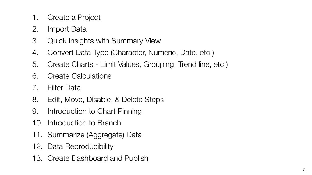
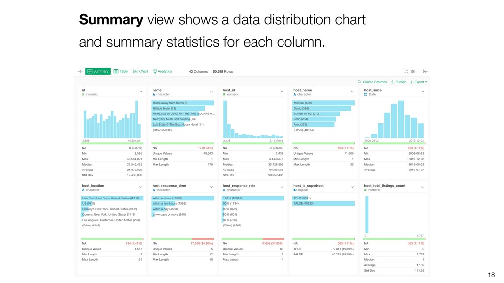
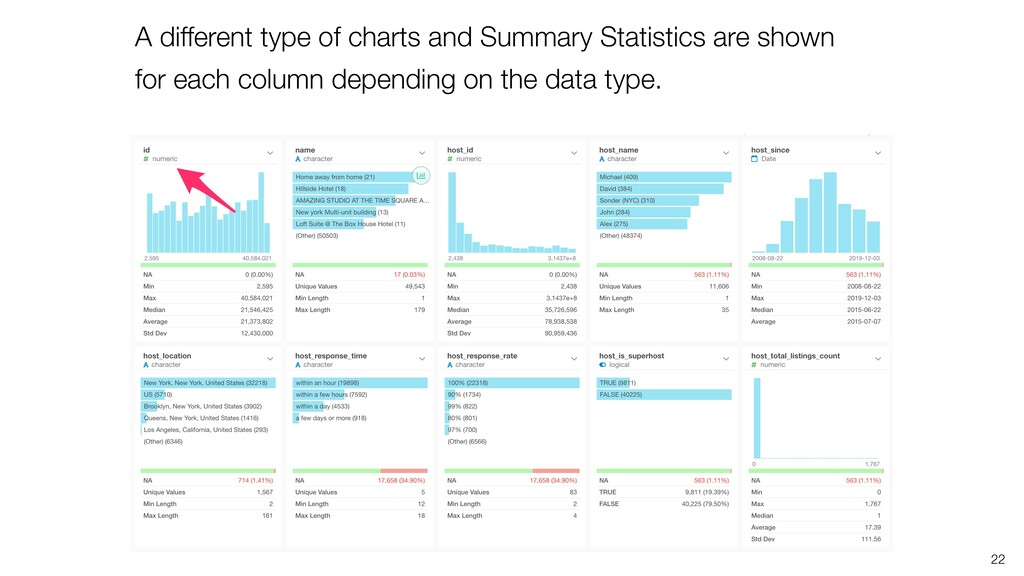
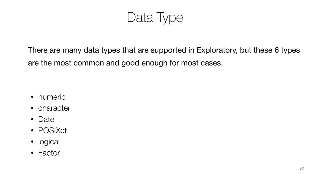
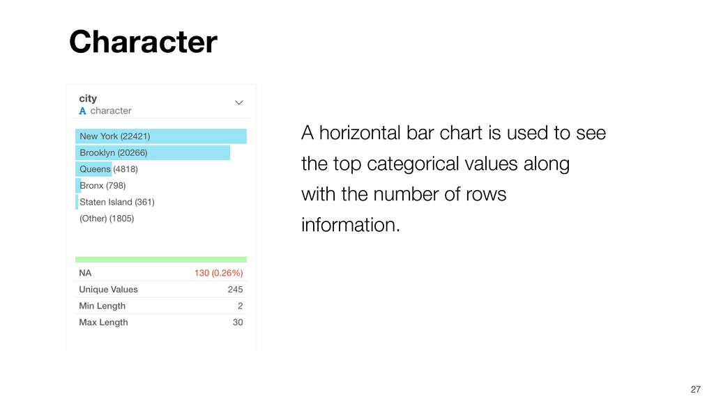
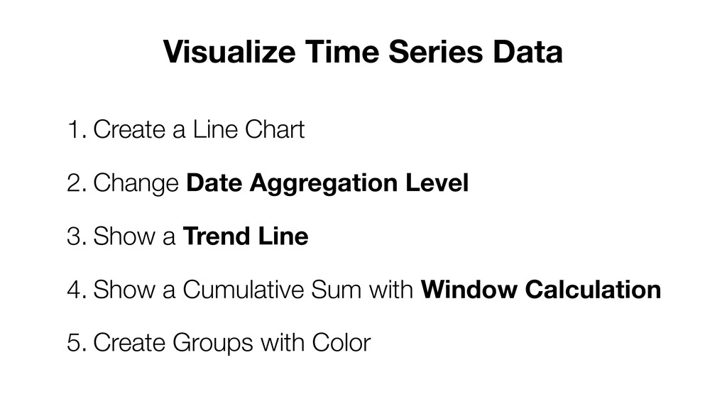
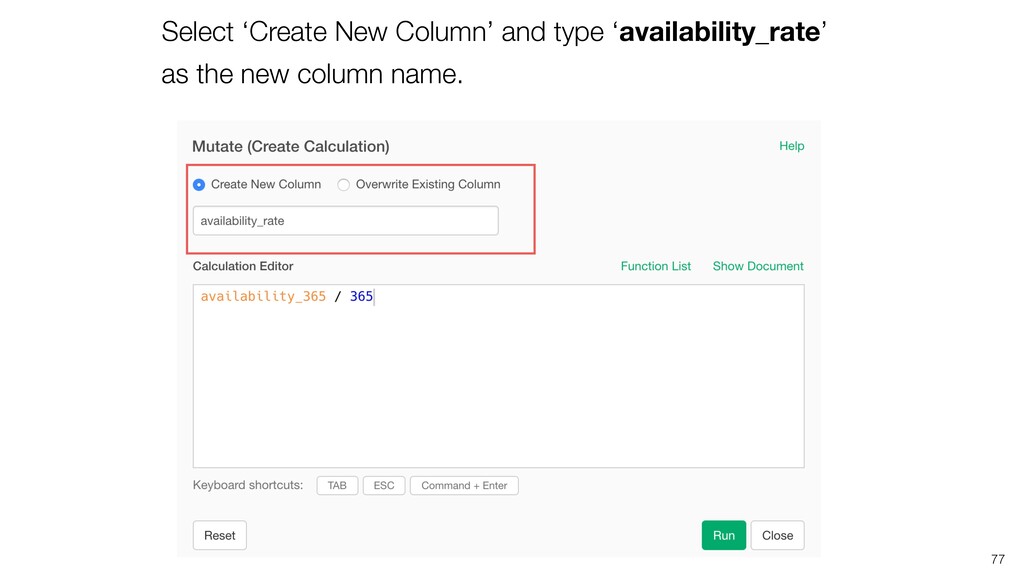
    • Factor Data Type There are many data types that are supported in Exploratory, but these 6 types are the most common and good enough for most cases. 23
  5. A histogram chart is used to show the distribution of

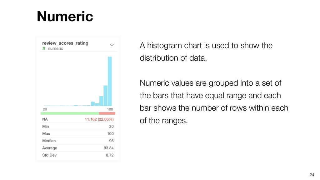
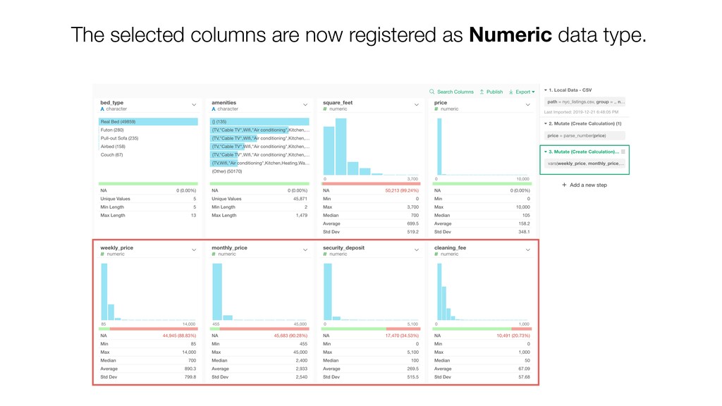
    data. Numeric values are grouped into a set of the bars that have equal range and each bar shows the number of rows within each of the ranges. Numeric 24
  6. Underneath the histogram chart, you can see a series of

    summary statistics such as Average, Median, etc. 25 Numeric - Summary Statistics
  7. You can also see how many NA rows there are

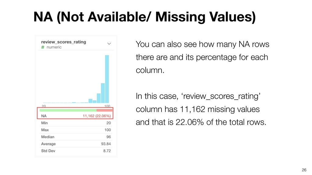
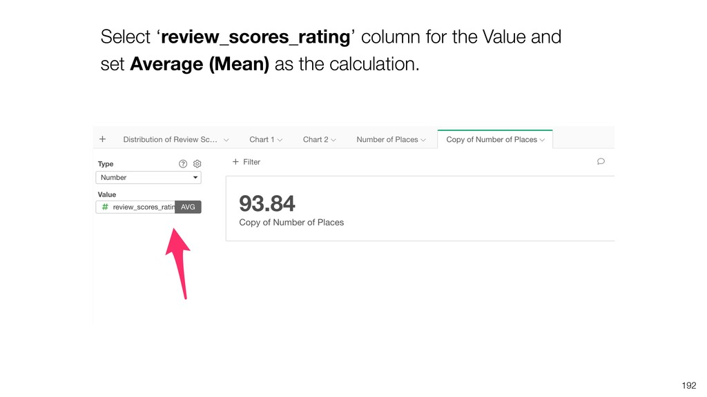
    and its percentage for each column. In this case, ‘review_scores_rating’ column has 11,162 missing values and that is 22.06% of the total rows. 26 NA (Not Available/ Missing Values)
  8. A horizontal bar chart is used to see the top

    categorical values along with the number of rows information. 27 Character
  9. A horizontal bar chart is used to indicate how many

    rows there are for TRUE and FALSE values. 28 Logical (TRUE / FALSE)
  10. A histogram chart is used to show the distribution of

    data for the Date and the POSIXct columns. You can also find the date range by looking at the Min and Max of the data. 29 Date / POSIXct (Date & Time)
  11. Factor data type is similar to Character data type except

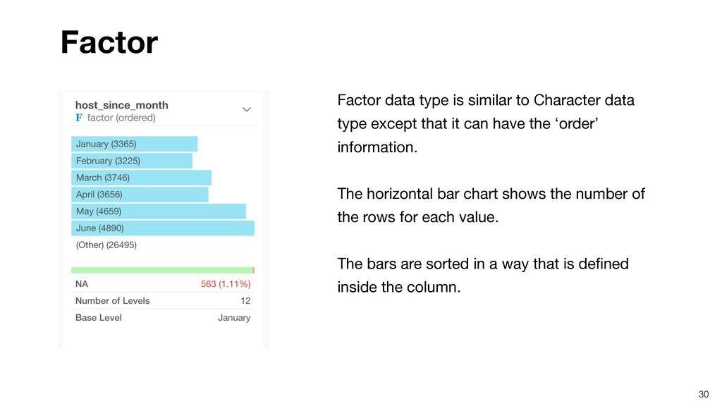
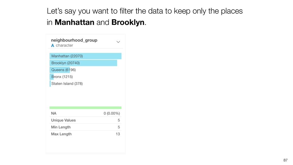
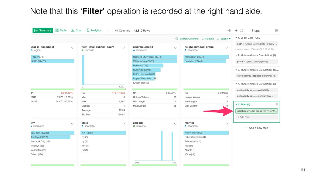
    that it can have the ‘order’ information. The horizontal bar chart shows the number of the rows for each value. The bars are sorted in a way that is defined inside the column. 30 Factor
  12. It will open ‘Mutate (Create Calculation) dialog with the ‘parse_number’

    function pre-populated inside the Calculation Editor. Simply, click ‘Run’ button.
  13. The ‘price’ column is converted to ‘numeric’ data type and

    it now shows a histogram chart with the summary statistics.
  14. You can change the data type for multiple columns at

    once. Select multiple columns by using Command key (Mac) or Control key (Windows).
  15. The selected columns are listed and ‘Convert Data Type’ is

    selected in the Calculation Type in the dialog. Simply, click ‘Run’ button.
  16. Notice that these operations are recorded at the right hand

    side as the Data Wrangling Steps. We’ll cover this in more details later.
  17. 1.Create a Bar Chart 2.Sort the Bars 3.Limit X-Axis Values

    4.Group with Color Create the 1st Chart
  18. 46 Let’s create a chart to answer this question. “Which

    neighborhoods have more places on Airbnb?”
  19. Select ‘Top’ for the limit type and set 50 so

    that only the top 50 neighborhoods with the most ‘Number of Rows’ will be shown.
  20. 1. Create a Line Chart 2. Change Date Aggregation Level

    3. Show a Trend Line 4. Show a Cumulative Sum with Window Calculation 5. Create Groups with Color Visualize Time Series Data
  21. “How many places have been added to Airbnb over the

    years?” 57 Let’s create a chart to answer this question.
  22. 1. Create a Line Chart 2. Change Date Aggregation Level

    3. Show a Trend Line 4. Show a Cumulative Sum with Window Calculation 5. Create Groups with Color
  23. 1. Create a Line Chart 2. Change Date Aggregation Level

    3. Show a Trend Line 4. Show a Cumulative Sum with Window Calculation 5. Create Groups with Color
  24. 1. Create a Line Chart 2. Change Date Aggregation Level

    3. Show a Trend Line 4. Show a Cumulative Sum with Window Calculation 5. Create Groups with Color
  25. The numbers are going ups and downs. In order to

    make it easier to see the overall trend, let’s show the ‘trend line’.
  26. 1. Create a Line Chart 2. Change Date Aggregation Level

    3. Show a Trend Line 4. Show a Cumulative Sum with Window Calculation 5. Create Groups with Color
  27. What if we want to know how many places have

    been added to Airbnb accumulatively, instead of how many places were added at each given month?
  28. 1. Create a Line Chart 2. Change Date Aggregation Level

    3. Show a Trend Line 4. Show a Cumulative Sum with Window Calculation 5. Create Groups with Color
  29. You can assign ‘neighborhood_group’ column to Color to see how

    the places have been added to Airbnb in each of the 5 boroughs accumulatively.
  30. 79 There are too many decimal digits. Let’s round the

    values and keep only two decimal digits.
  31. You can go to Summary view to check the distribution

    of ‘availability_rate’ values. 85
  32. Let’s say you want to filter the data to keep

    only the places in Manhattan and Brooklyn. 87
  33. Let’s say you want to move the step 5 (Filter)

    to right before the step 4 (Mutate). 98
  34. Same type of the operations are added into the same

    step. Here, the 2 calculations have been added to the same ‘Mutate’ step. 103
  35. 104 You can click the token to open the dialog

    to update the configuration.
  36. 112 We want to assign the ‘availability_rate’ column, which we

    have created at the previous step to Y-Axis. But, the column is not there in the dropdown!
  37. In order to use the step 5 data, you need

    to move the ‘Pin’ to the step 5.
  38. Now that this chart is ‘Pinned’ to the step 5,

    it will always references the data at the step 5 regardless of which step you select at the right hand side. 119
  39. The data at the step 5 has only Manhattan and

    Brooklyn, hence the chart shows only the two boroughs with two colors (Blue & Orange). 120
  40. 124 What if we want to see all the neighborhoods,

    not just for Manhattan and Brooklyn?
  41. Now you can compare the average availability rates of the

    top 50 neighborhoods from all 5 boroughs. 127
  42. You can click ‘Enable Step’ icon to enable the step.

    But for this tutorial, we’ll continue with this step being disabled. 128
  43. Looks there are a lot of places in Staten Island

    (Purple) with high availability rates. For example, ‘Fort Wadsworth’ is 100% available, that’s crazy!
  44. There is only one place in this neighborhood! And this

    place happens to have 1 (100%) for the availability rate.
  45. Instead of ‘Top 50’ neighborhoods, we want to show only

    the neighborhood with at least 100 places listed. 132
  46. Select ‘Condition’ for Type, select ‘Number of Rows’ for Based

    on, ‘greater than’ for Operator, and type 100 for Value.
  47. The neighborhoods in Queens (Red) tend to be more available

    while the neighborhoods with lower availability rates are in Brooklyn or Manhattan.
  48. Sometimes, you might want to create different versions of data

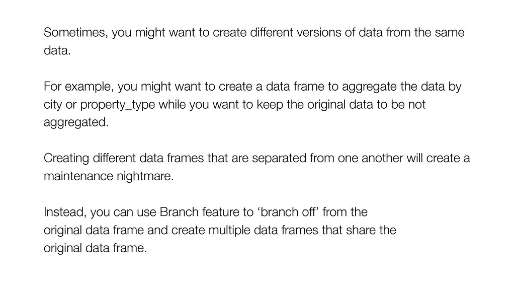
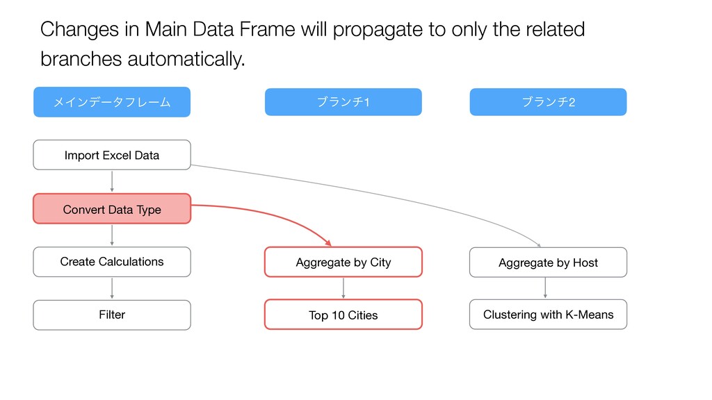
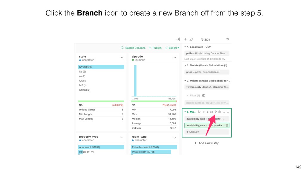
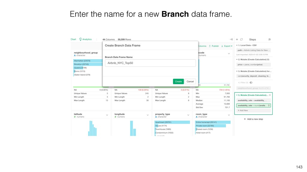
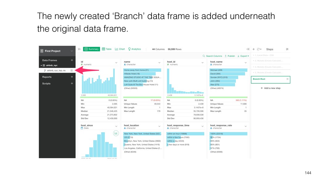
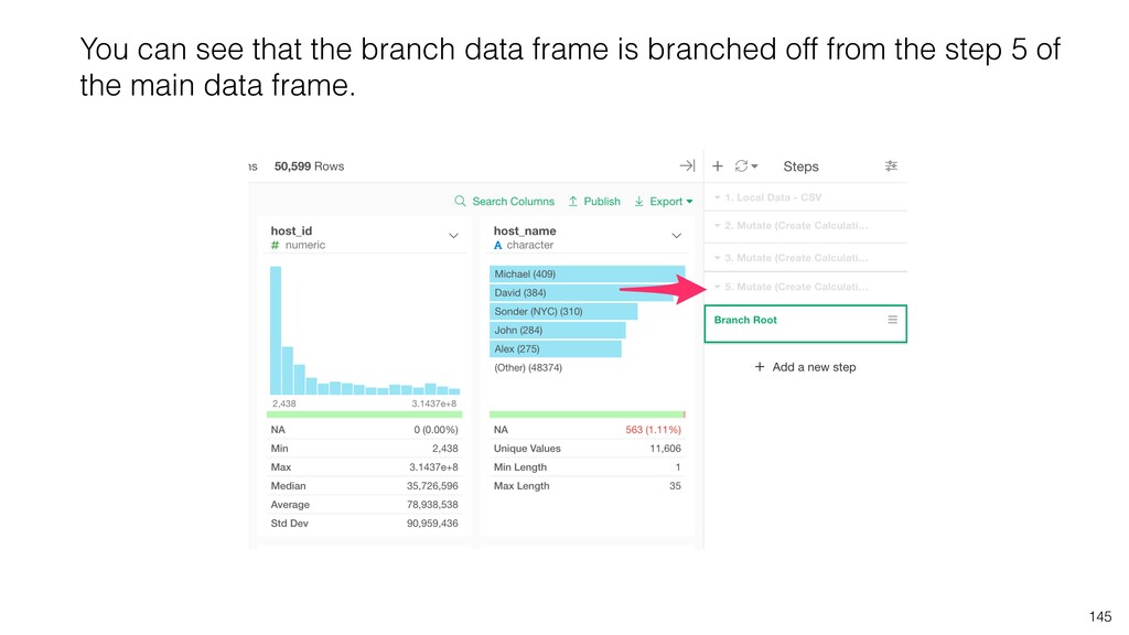
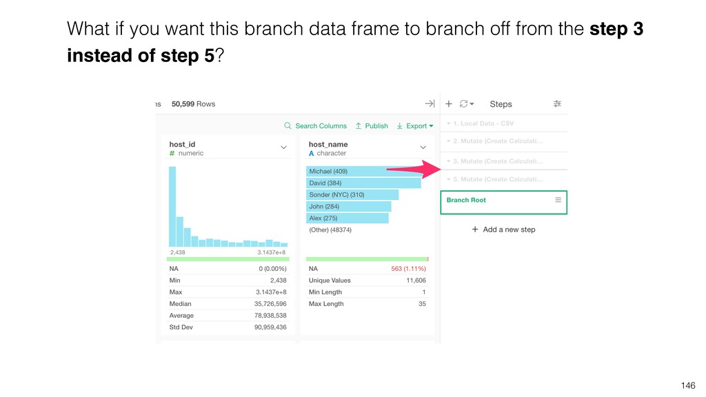
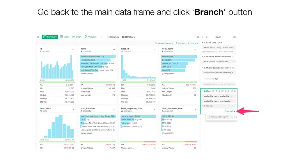
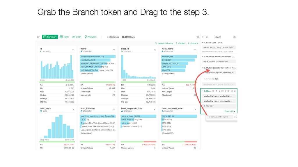
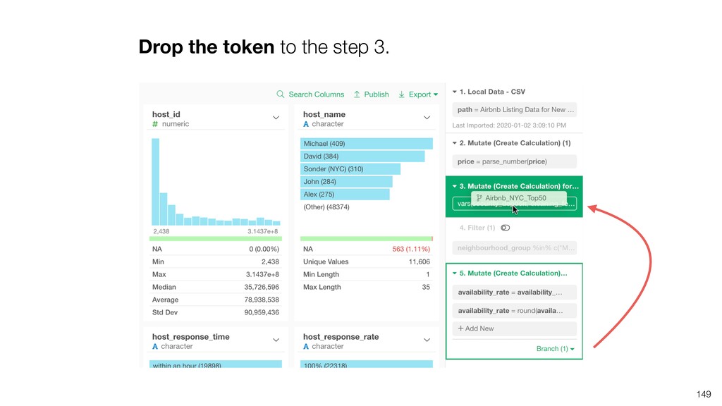
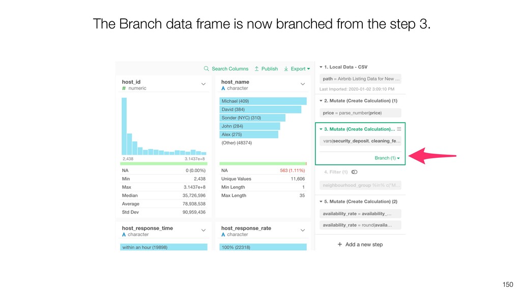
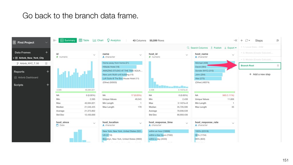
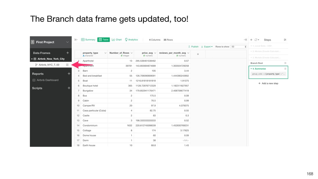
    from the same data. For example, you might want to create a data frame to aggregate the data by city or property_type while you want to keep the original data to be not aggregated. Creating different data frames that are separated from one another will create a maintenance nightmare. Instead, you can use Branch feature to ‘branch off’ from the original data frame and create multiple data frames that share the original data frame.
  49. Create Branch Main Data Frame Branch Data Frame Data Import

    Convert Data Type Create Calculations Filter Aggregate by City
  50. Import Excel Data Convert Data Type Create Calculations Filter Branch

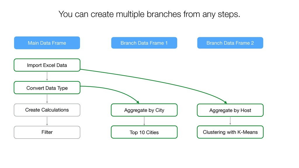
    Data Frame 1 Branch Data Frame 2 Aggregate by City Top 10 Cities Aggregate by Host Clustering with K-Means You can create multiple branches from any steps. Main Data Frame
  51. ϝΠϯσʔλϑϨʔϜ ϒϥϯν1 ϒϥϯν2 Changes in Main Data Frame will propagate

    to only the related branches automatically. Import Excel Data Convert Data Type Create Calculations Filter Aggregate by City Top 10 Cities Aggregate by Host Clustering with K-Means
  52. 145 You can see that the branch data frame is

    branched off from the step 5 of the main data frame.
  53. 146 What if you want this branch data frame to

    branch off from the step 3 instead of step 5?
  54. Let’s say we want to summarize the data by property_type

    so that each row represents each property_type. Summarize
  55. There are 2 scenarios. • The data is updated and

    saved as the same file. • The data is updated but saved as a separate file. 160
  56. There are 2 scenarios. • The data is updated and

    saved as the same file. • The data is updated but saved as a separate file. 161
  57. This will re-read the data from the same file and

    run all the data wrangling steps automatically. 163
  58. There are 2 scenarios. • The data is updated and

    saved as the same file. • The data is updated but saved as a separate file. 164
  59. 166 Click ‘Change File’ button and select the newly updated

    data file and click ‘Apply’ button.
  60. Data will be imported and all the data wrangling steps

    will be applied automatically. 167
  61. Dashboard • Create a new Dashboard • Add Charts and

    Analytics • Add Numbers • Publish & Share 170
  62. Dashboard • Create a new Dashboard • Add Charts and

    Analytics • Add Numbers • Publish & Share 171
  63. Dashboard • Create a new Dashboard • Add Charts and

    Analytics • Add Numbers • Publish & Share 175
  64. 184

  65. Dashboard • Create a new Dashboard • Add Charts and

    Analytics • Add Numbers • Publish & Share 185
  66. Go back to the data frame and add a new

    chart to create the Numbers. 187
  67. Dashboard • Create a new Dashboard • Add Charts and

    Analytics • Add Numbers • Publish & Share 200
  68. 203 Private Mode Only the ones you explicitly share with

    can open your dashboard. Public Mode Anybody can open your dashboard.
  69. 205 Once it’s published, an unique URL is assigned to

    the Dashboard. Click ‘Open in Browser’ link to open the Dashboard in the web browser.
  70. Share with Invite 208 Type the email and click ‘Share’

    button. This will send an invite email.
  71. 209 Share with Invite The person who is invited can

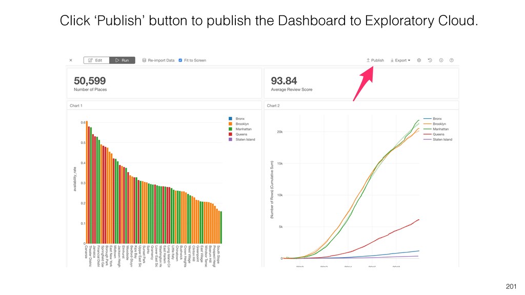
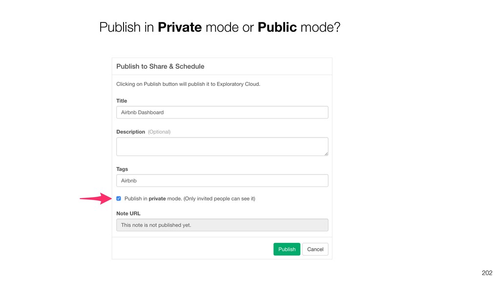
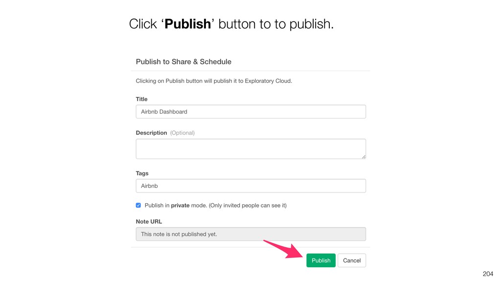
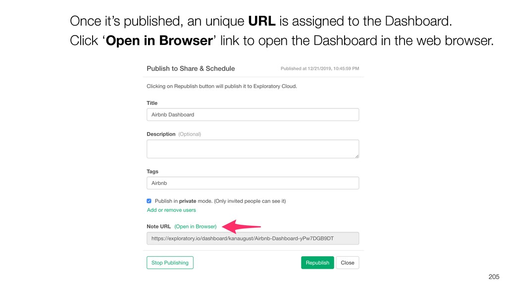
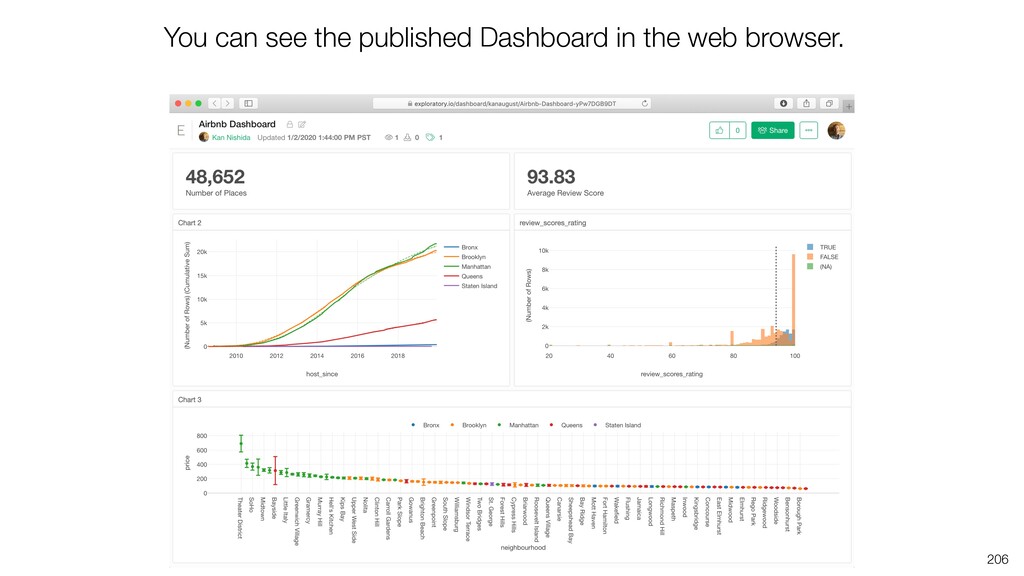
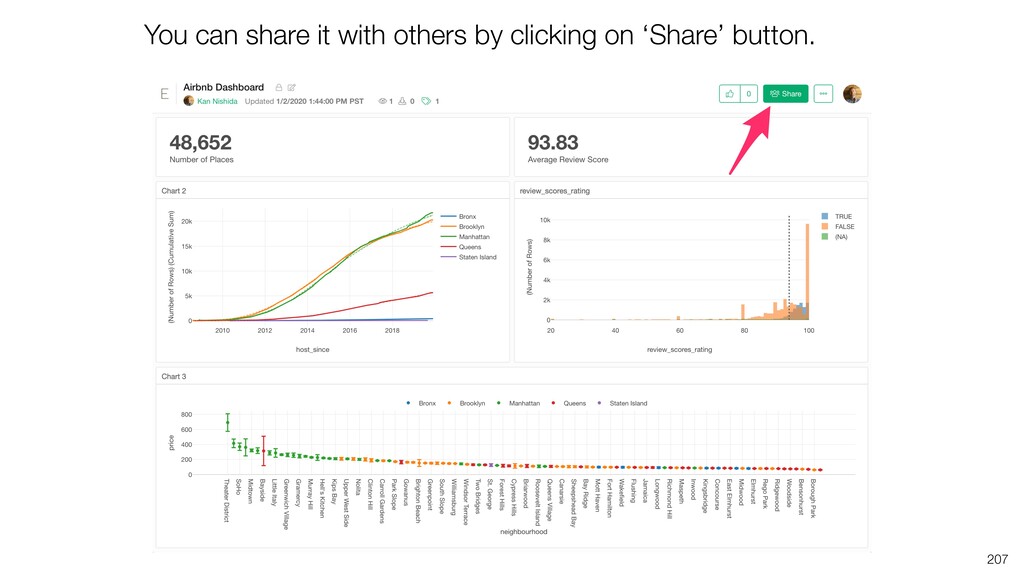
    log in with her/his Exploratory account and open the Dashboard. If the person doesn’t have an Exploratory account then she/he can create it for FREE. The viewers can continue to view any contents at Exploratory Cloud as long as they are invited to view.
  72. 210 Share with URL You can also share your Dashboard

    with URL. This allows anyone with the URL to open the Dashboard without logging into Exploratory Cloud.
  73. Schedule Dashboard 211 You can schedule the dashboard to keep

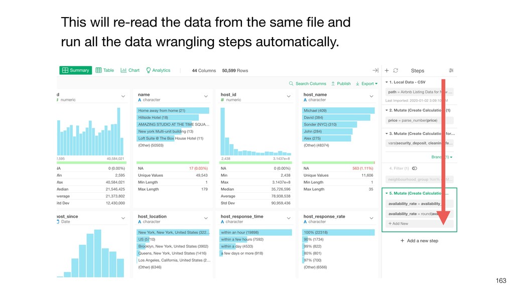
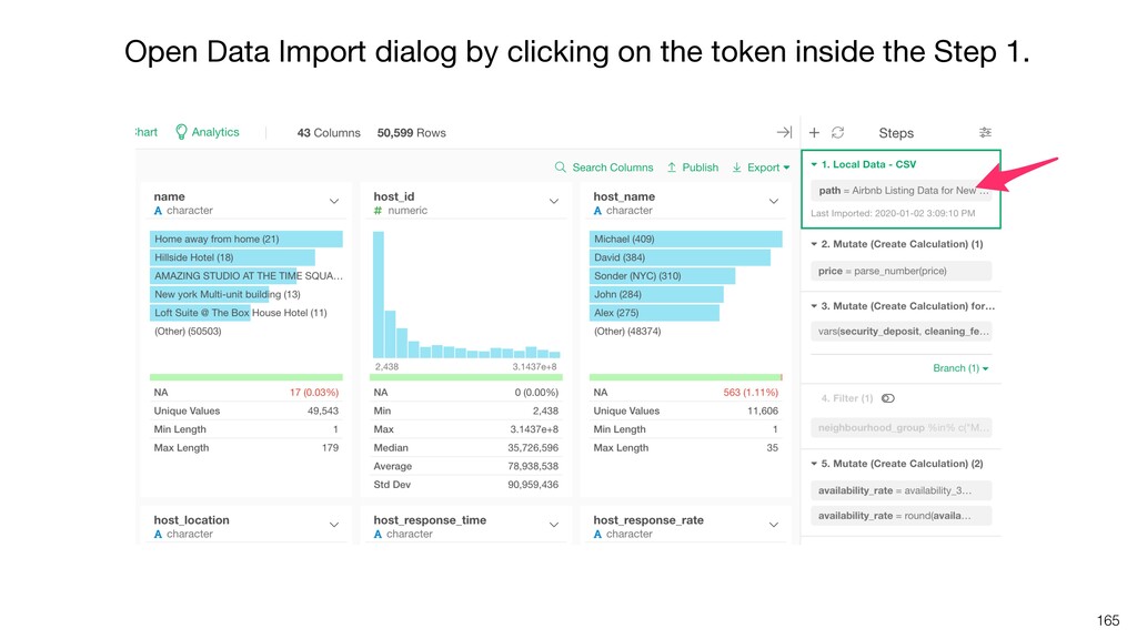
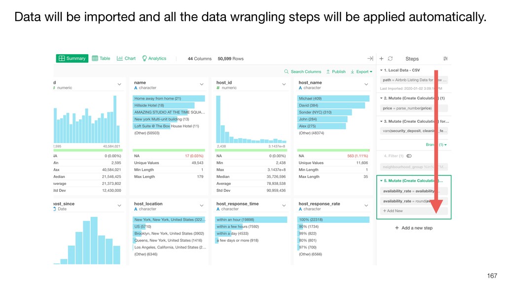
    the data always up-to-date by querying against the data sources and applying all the data wrangling steps automatically. Note that you can schedule only the ones with remote data sources that can be accessed by Exploratory Cloud.