Upgrade to Pro — share decks privately, control downloads, hide ads and more …

Always look on the bright side of plots

Kara Woo
February 25, 2021

Always look on the bright side of plots

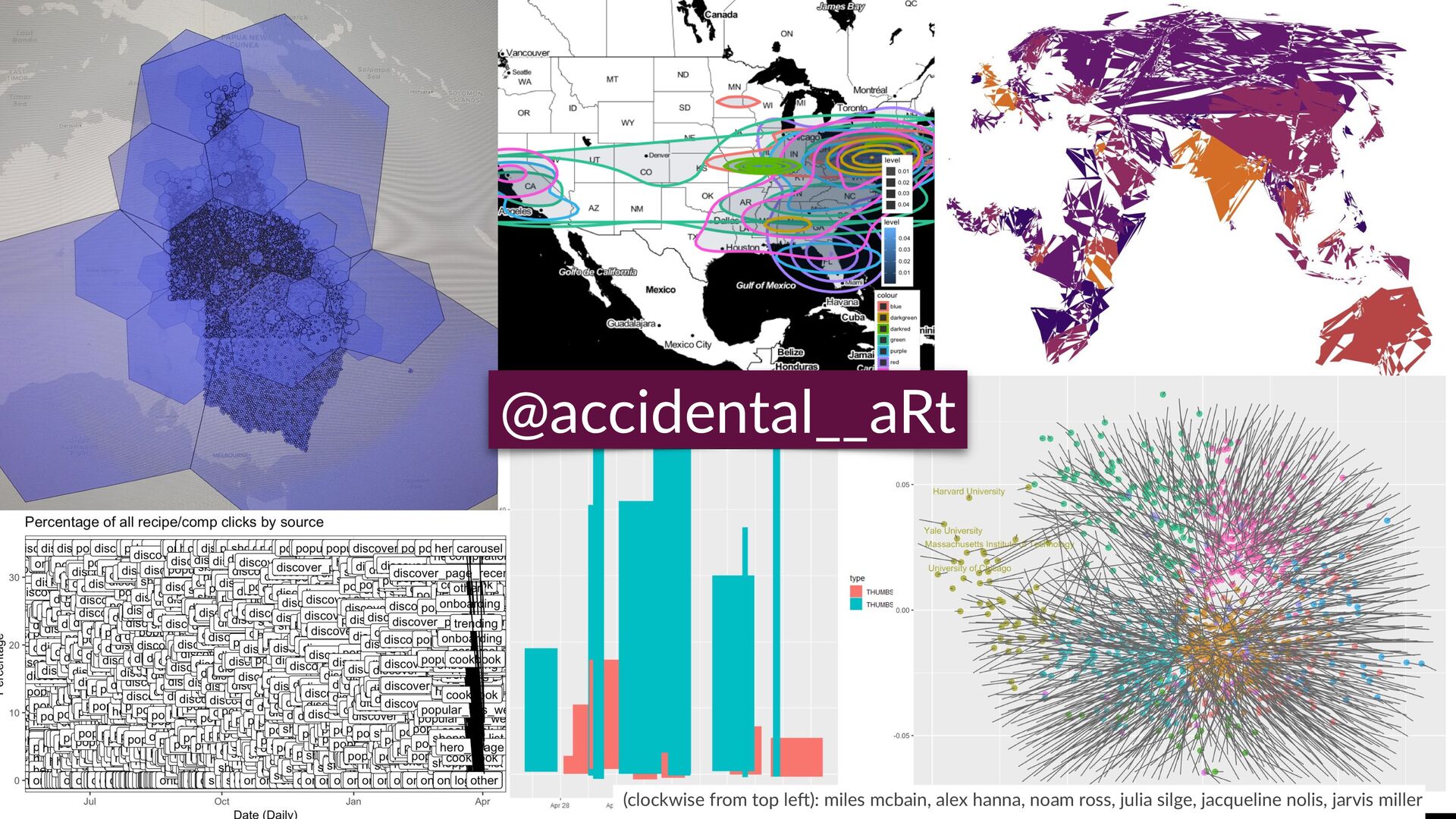
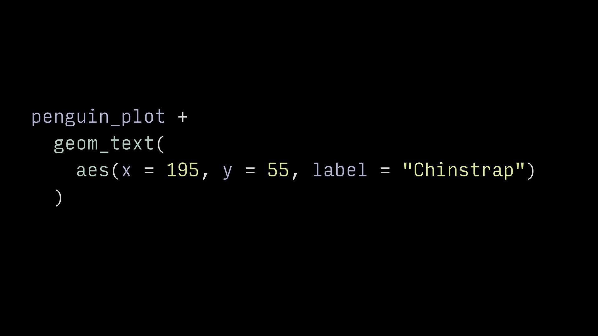
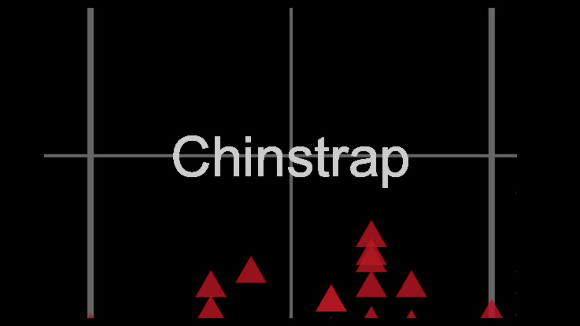
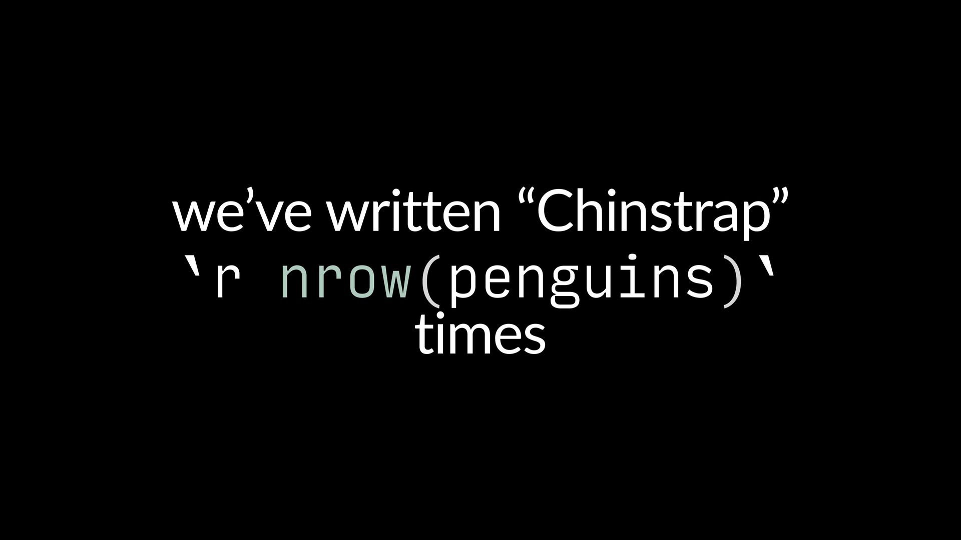
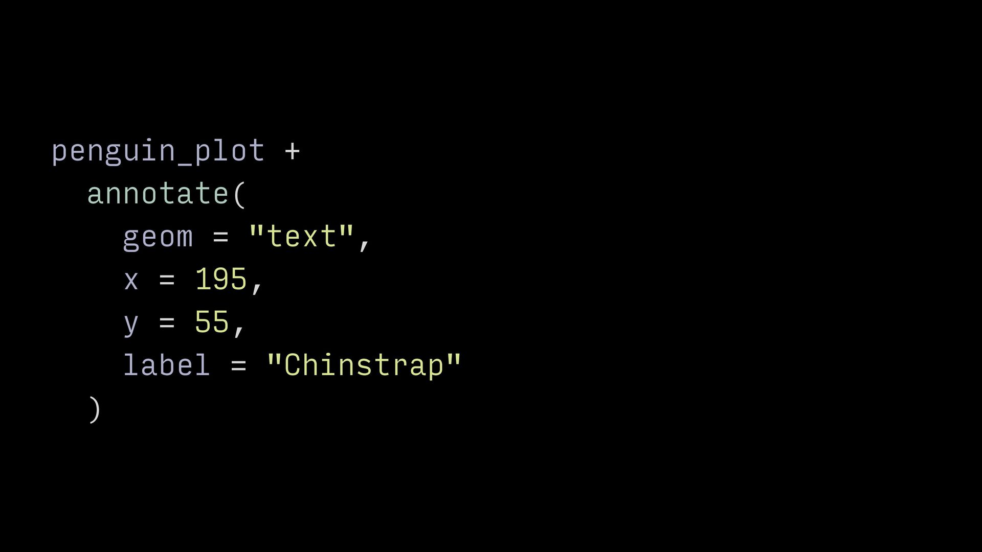
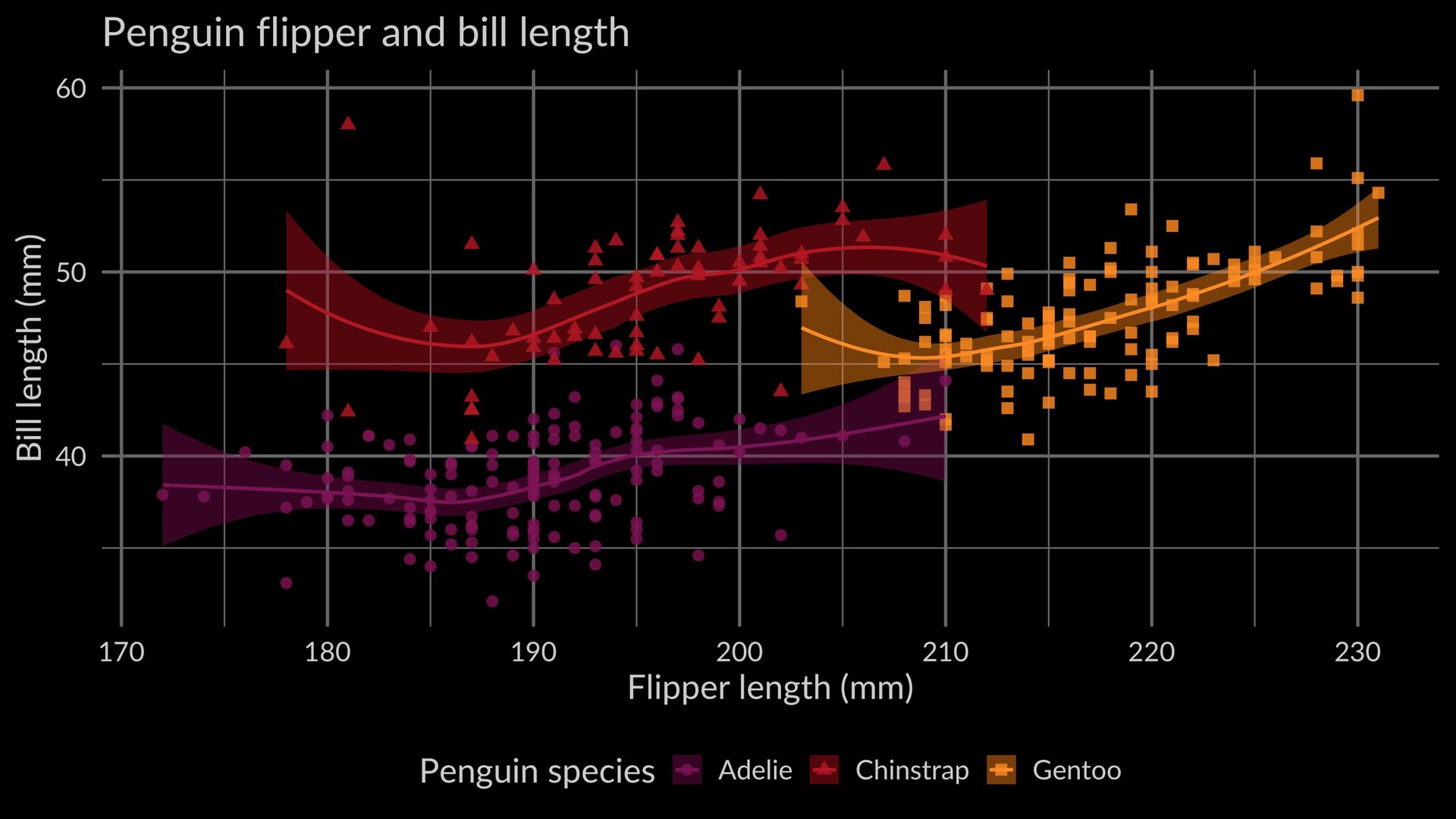
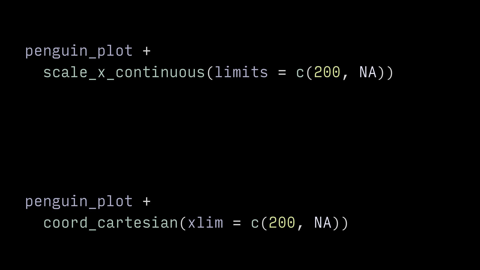
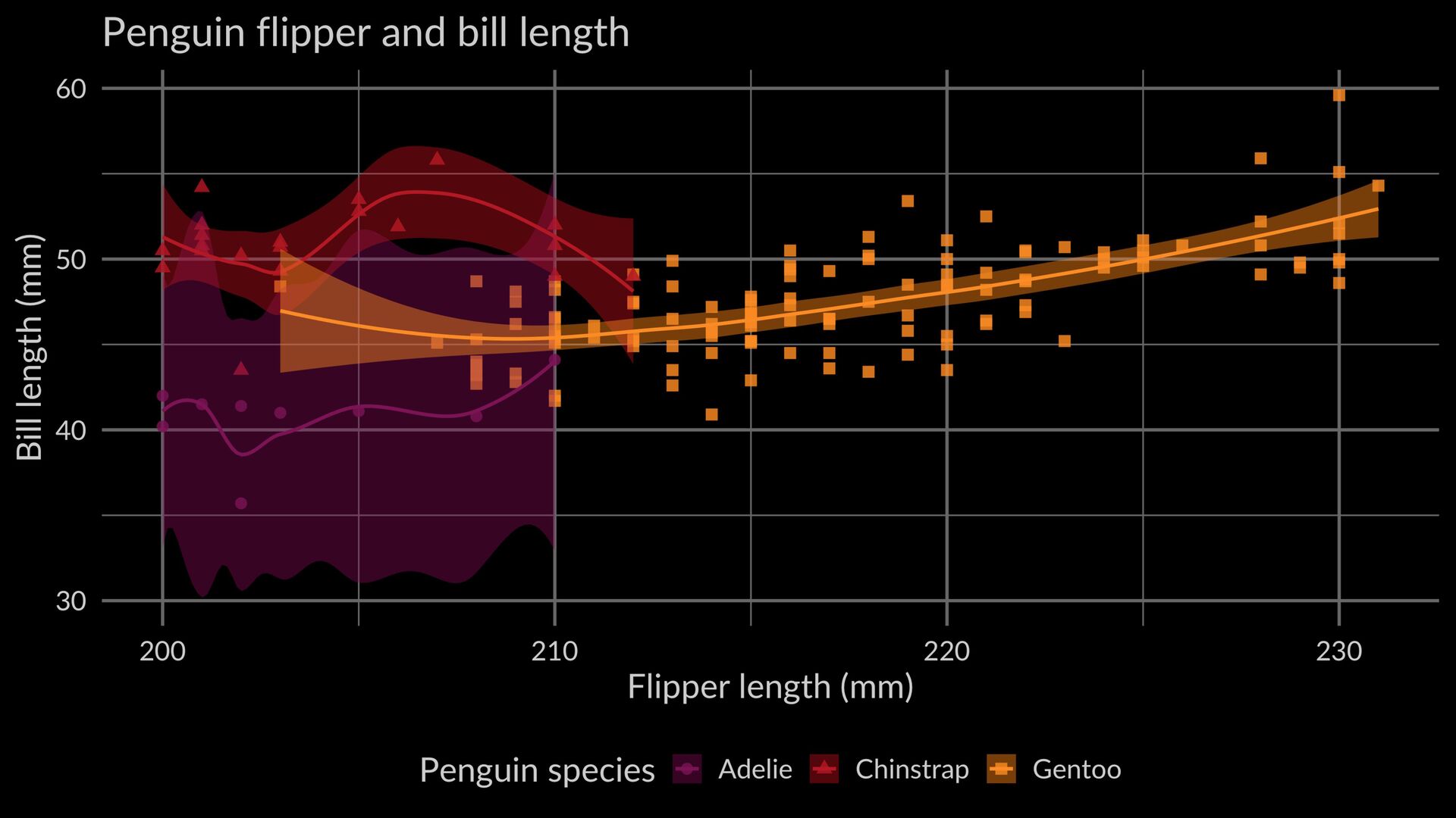
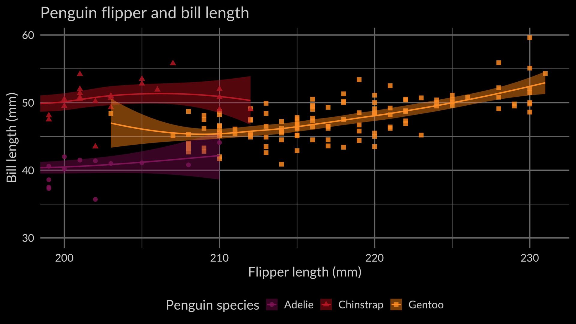
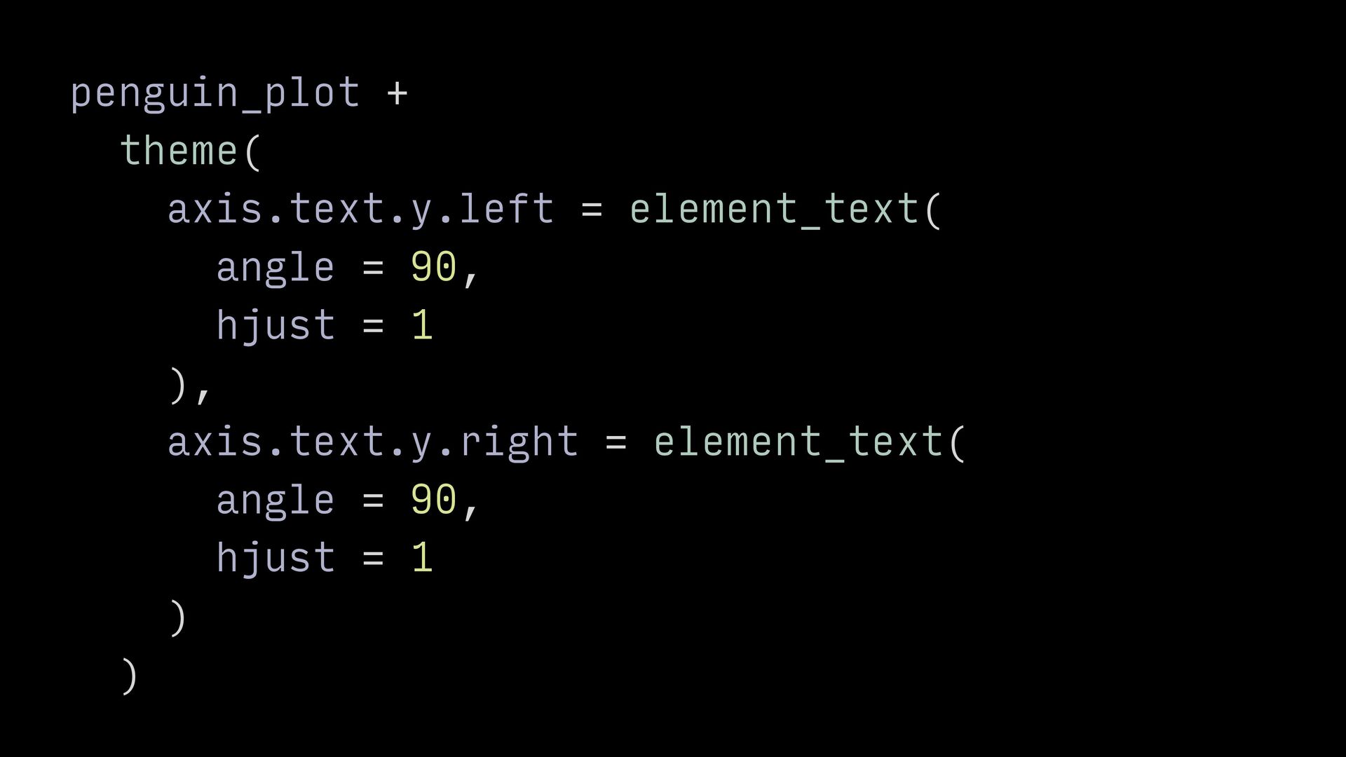
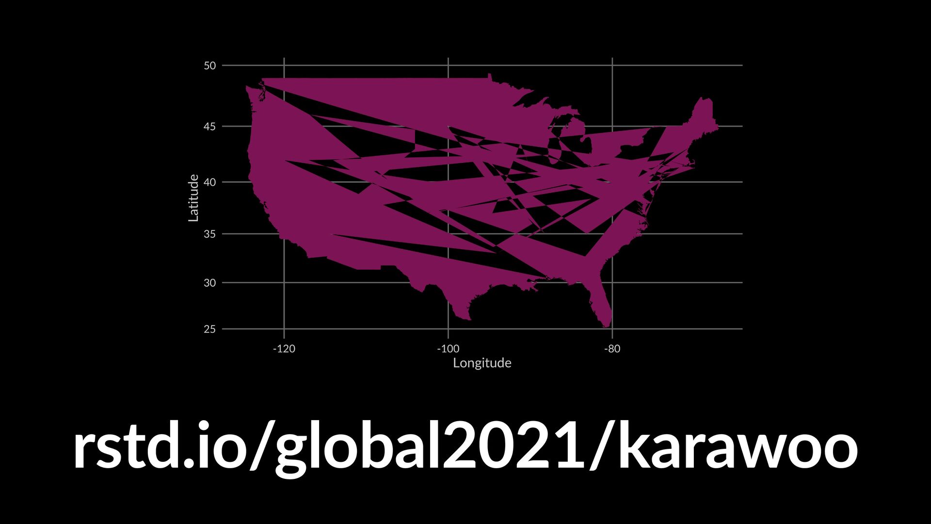
Everyone who creates visualizations in R is bound to make mistakes that prevent their plots from looking as they should. Sometimes, these mistakes create beautiful "accidental aRt", though other times they're just plain frustrating. Either way, however, there's something to be learned. This talk will draw on years of watching both the ggplot2 issue tracker and the @accidental__aRt twitter account to highlight some common plot foibles and explain what they can teach us about how ggplot2 works.

Kara Woo

February 25, 2021
Tweet

More Decks by Kara Woo

Other Decks in Technology

Transcript

  1. @kara_woo


    rstudio::global(2021)
    always look on the bright
    side of plots

    View Slide

  2. (clockwise from top le
    ft
    ): miles mcbain, alex hanna, noam ross, julia silge, jacqueline nolis, jarvis miller


    @accidental__aRt

    View Slide

  3. sarah kilian

    View Slide

  4. the prac
    ti
    cal dev, cc-by-nc 2.0

    View Slide

  5. View Slide

  6. View Slide

  7. created with danielle navarro’s
    fl
    ametree package

    View Slide

  8. mapping mishaps

    View Slide

  9. aesthetics map visual properties to
    variables in your data

    View Slide

  10. data from the palmerpenguins package by


    allison horst, alison hill, & kristen gorman

    View Slide

  11. penguin_plot +


    geom_text(


    aes(x = 195, y = 55, label = "Chinstrap")


    )


    View Slide

  12. View Slide

  13. View Slide

  14. library("ggrepel")


    penguin_plot +


    geom_text_repel(


    aes(x = 195, y = 55, label = "Chinstrap")


    )


    View Slide

  15. View Slide

  16. we’ve written “Chinstrap”

    `r nrow(penguins)`


    times

    View Slide

  17. we’ve written “Chinstrap”


    344


    times

    View Slide

  18. penguin_plot +


    geom_text(


    aes(x = 195, y = 55, label = "Chinstrap")


    )


    View Slide

  19. penguin_plot +


    annotate(


    geom = "text",


    x = 195,


    y = 55,


    label = "Chinstrap"


    )

    View Slide

  20. View Slide

  21. View Slide

  22. View Slide

  23. scale snafus

    View Slide

  24. scales convert values from the data
    space to the aesthetic space

    View Slide

  25. coordinate systems draw axes and
    panels

    View Slide

  26. View Slide

  27. penguin_plot +


    scale_x_continuous(limits = c(200, NA))


    penguin_plot +


    coord_cartesian(xlim = c(200, NA))

    View Slide

  28. View Slide

  29. View Slide

  30. scale transformation occurs before
    statistical summaries

    View Slide

  31. setting coordinate limits zooms in
    the plot

    View Slide

  32. View Slide

  33. penguin_plot +


    scale_x_continuous(limits = c(200, NA))


    penguin_plot +


    coord_cartesian(xlim = c(200, NA))

    View Slide

  34. penguin_plot +


    scale_x_continuous(limits = c(200, NA))


    #> Warning: Removed 192 rows containing non-
    finite values (stat_smooth).


    #> Warning: Removed 192 rows containing missing
    values (geom_point).


    penguin_plot +


    coord_cartesian(xlim = c(200, NA))

    View Slide

  35. theme threats

    View Slide

  36. themes customize the look and feel
    of your plots

    View Slide

  37. text


    View Slide

  38. View Slide

  39. text


    └── axis.text


    View Slide

  40. View Slide

  41. text


    └── axis.text


    └── axis.text.x


    └── axis.text.y


    View Slide

  42. text


    └── axis.text


    └── axis.text.x


    │ └── axis.text.x.bottom


    │ └── axis.text.x.top


    └── axis.text.y


    └── axis.text.y.left


    └── axis.text.y.right

    View Slide

  43. View Slide

  44. penguin_plot +


    theme(


    axis.text.y = element_text(


    angle = 90,


    hjust = 1


    )


    )

    View Slide

  45. View Slide

  46. 🤔

    View Slide

  47. theme_grey


    #> function (…)


    #> {


    #> …


    #> axis.text.y = element_text(margin =
    margin(r = 0.8 * half_line/2), hjust = 1),


    #> axis.text.y.right = element_text(margin =
    margin(l = 0.8 * half_line/2), hjust = 0),


    #> …


    #> }

    View Slide

  48. the most specific theme element
    wins

    View Slide

  49. penguin_plot +


    theme(


    axis.text.y.left = element_text(


    angle = 90,


    hjust = 1


    ),


    axis.text.y.right = element_text(


    angle = 90,


    hjust = 1


    )


    )

    View Slide

  50. View Slide

  51. View Slide

  52. mapping mishaps

    View Slide

  53. mapping mishaps
    scale snafus

    View Slide

  54. mapping mishaps
    scale snafus
    theme threats

    View Slide

  55. chapter 13: mastering the grammar
    ggplot2-book.org

    View Slide

  56. ggplot(states, aes(x = long, y = lat)) +


    geom_polygon() +


    coord_map()

    View Slide

  57. rstd.io/global2021/karawoo

    View Slide