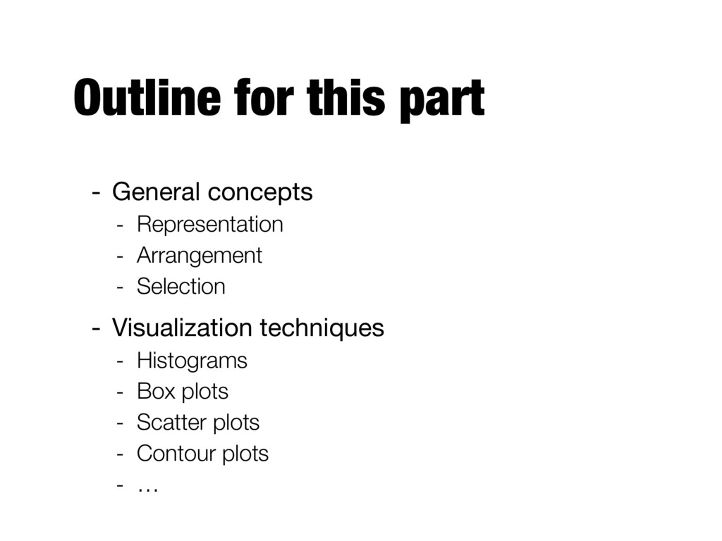
to better understand its specific characteristics - Can aid in selecting the appropriate preprocessing and data analysis techniques - Can even address some of the questions typically answered by data mining - Finding patterns by visually inspecting the data
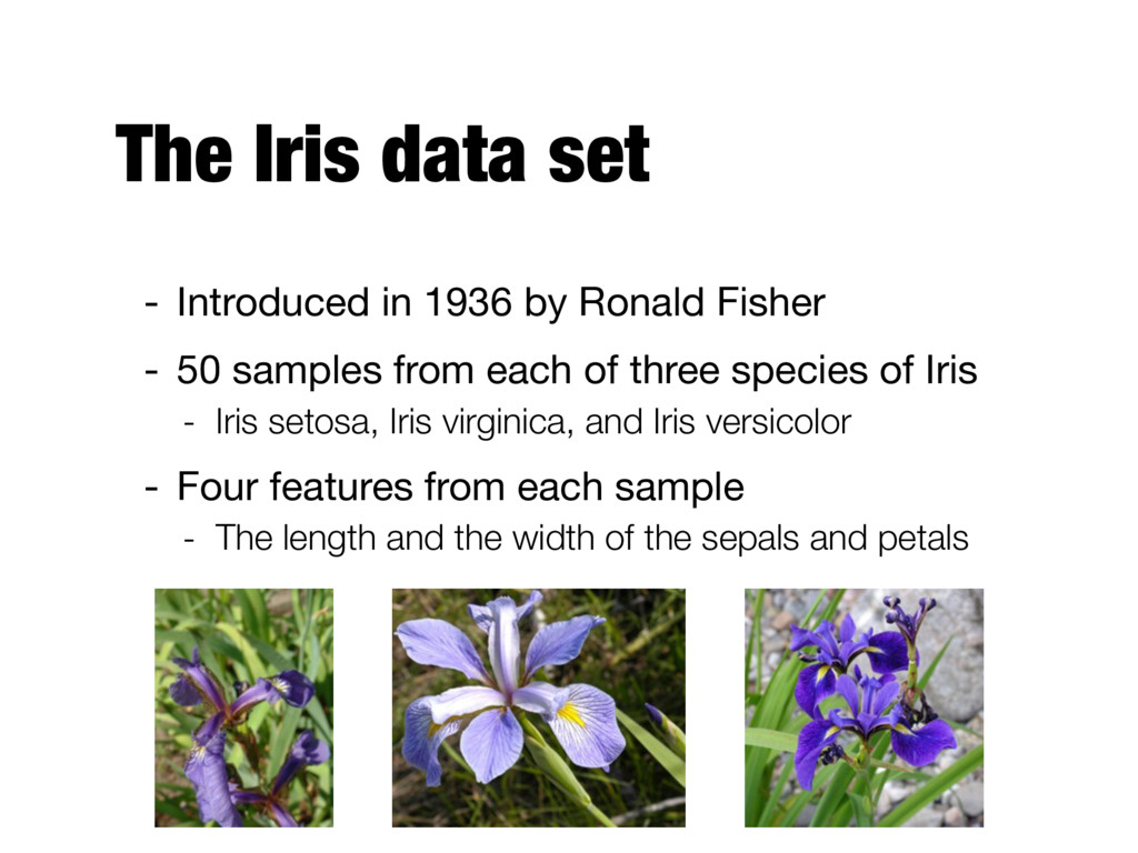
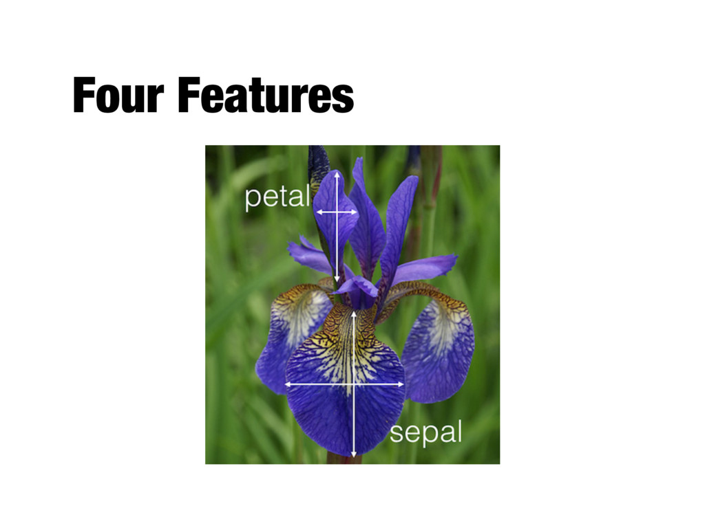
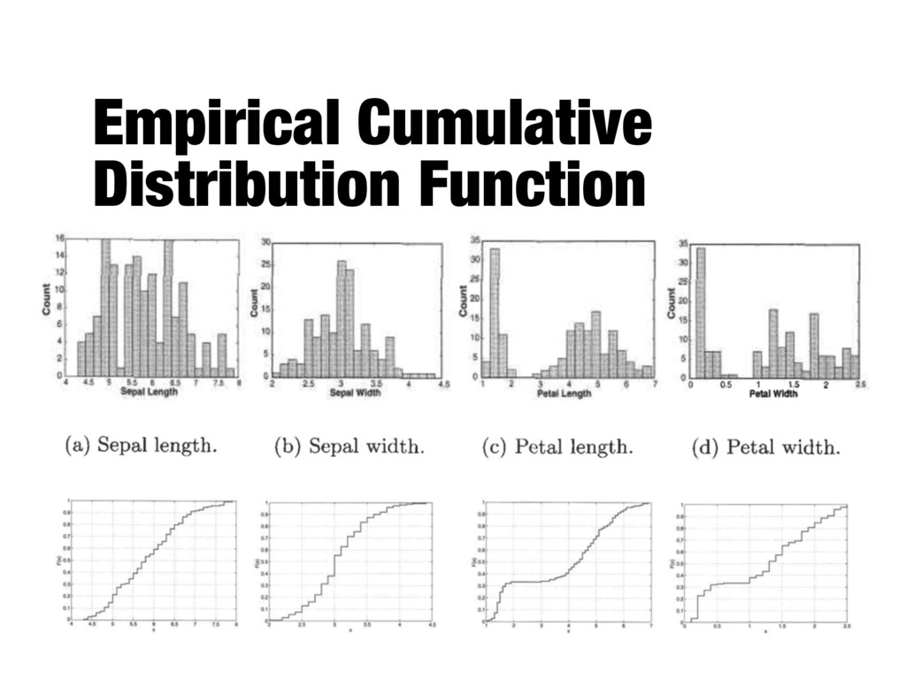
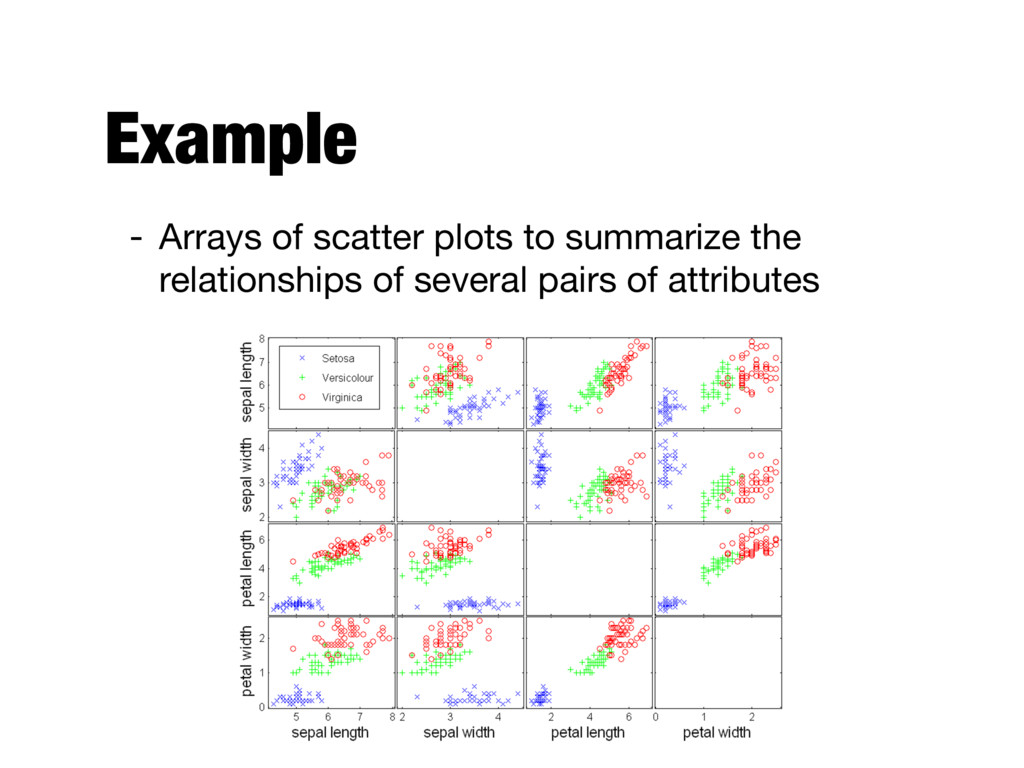
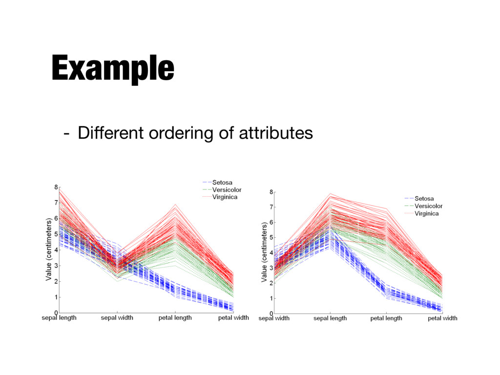
Fisher - 50 samples from each of three species of Iris - Iris setosa, Iris virginica, and Iris versicolor - Four features from each sample - The length and the width of the sepals and petals
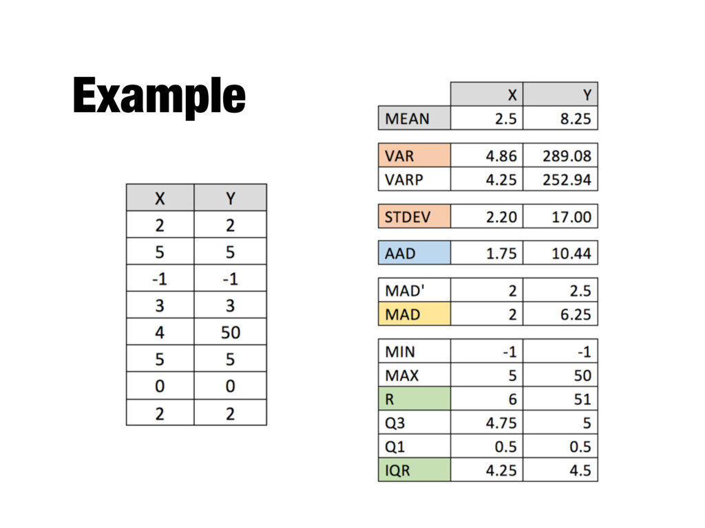
potentially large set of values with a single number (or a small set of numbers) - Examples - Average household income - Fraction of students who complete a BSc in 3 years
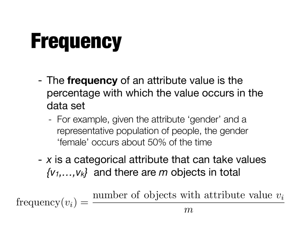
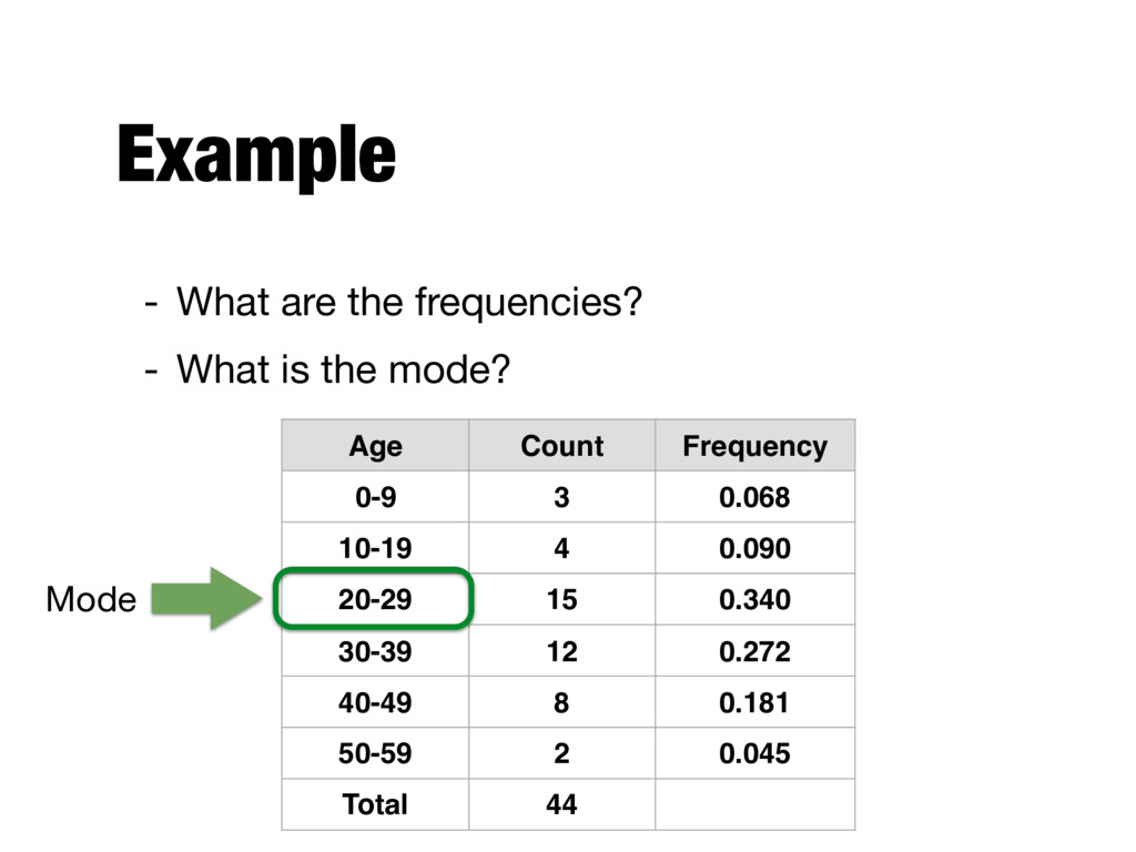
percentage with which the value occurs in the data set - For example, given the attribute ‘gender’ and a representative population of people, the gender ‘female’ occurs about 50% of the time - x is a categorical attribute that can take values {v1,…,vk} and there are m objects in total frequency( vi) = number of objects with attribute value vi m
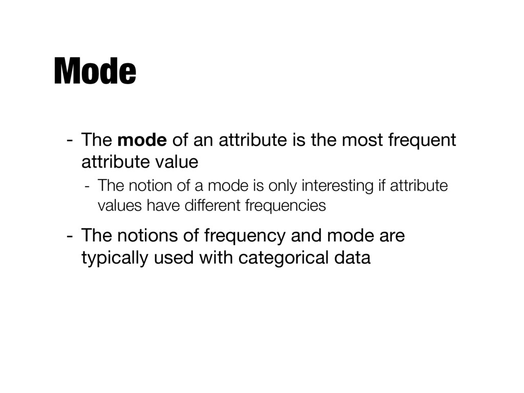
frequent attribute value - The notion of a mode is only interesting if attribute values have different frequencies - The notions of frequency and mode are typically used with categorical data
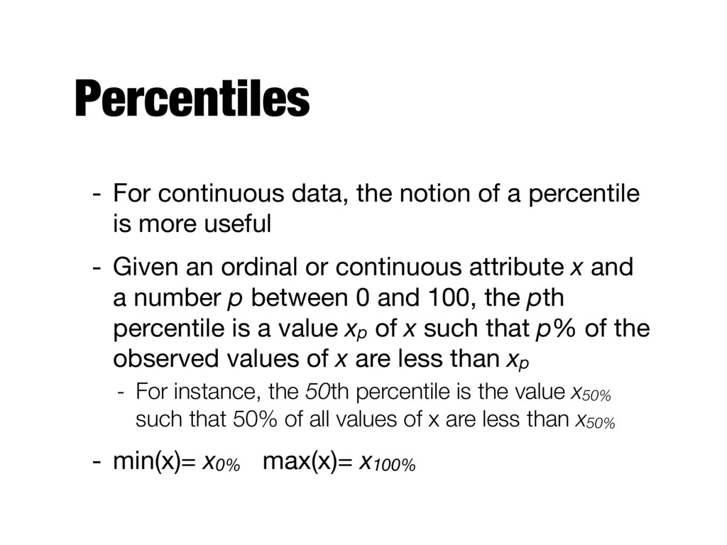
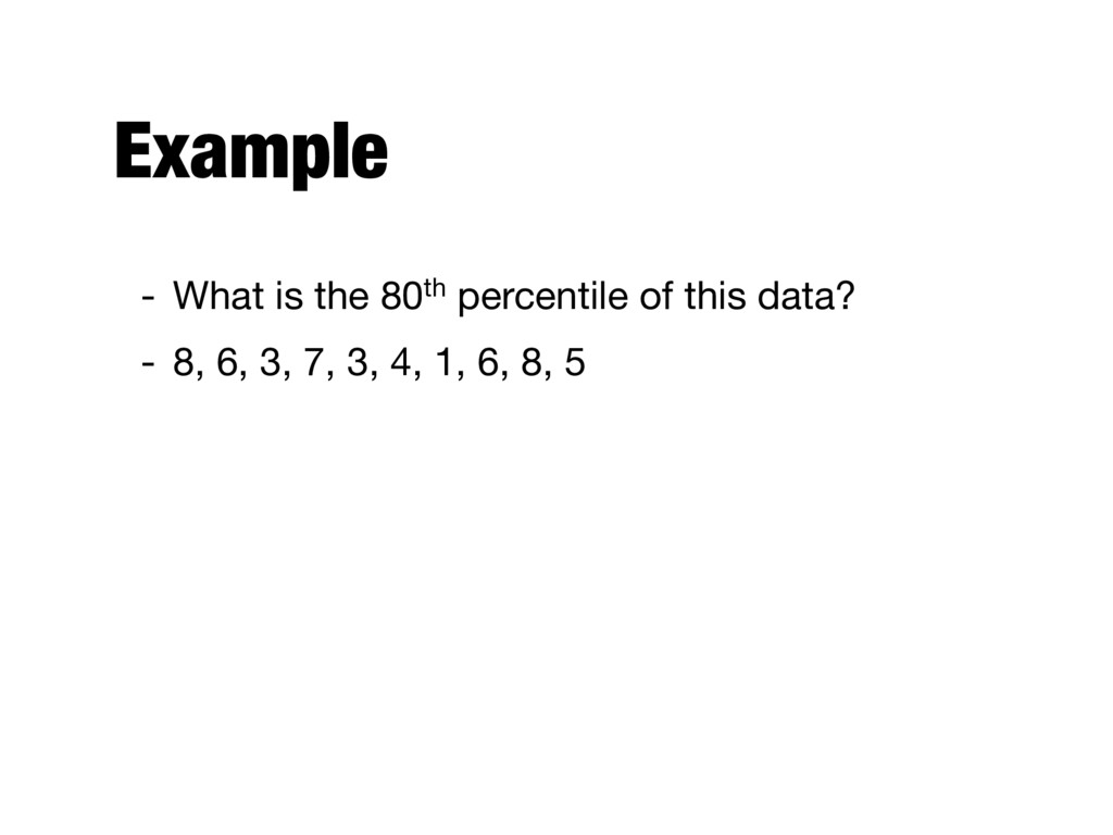
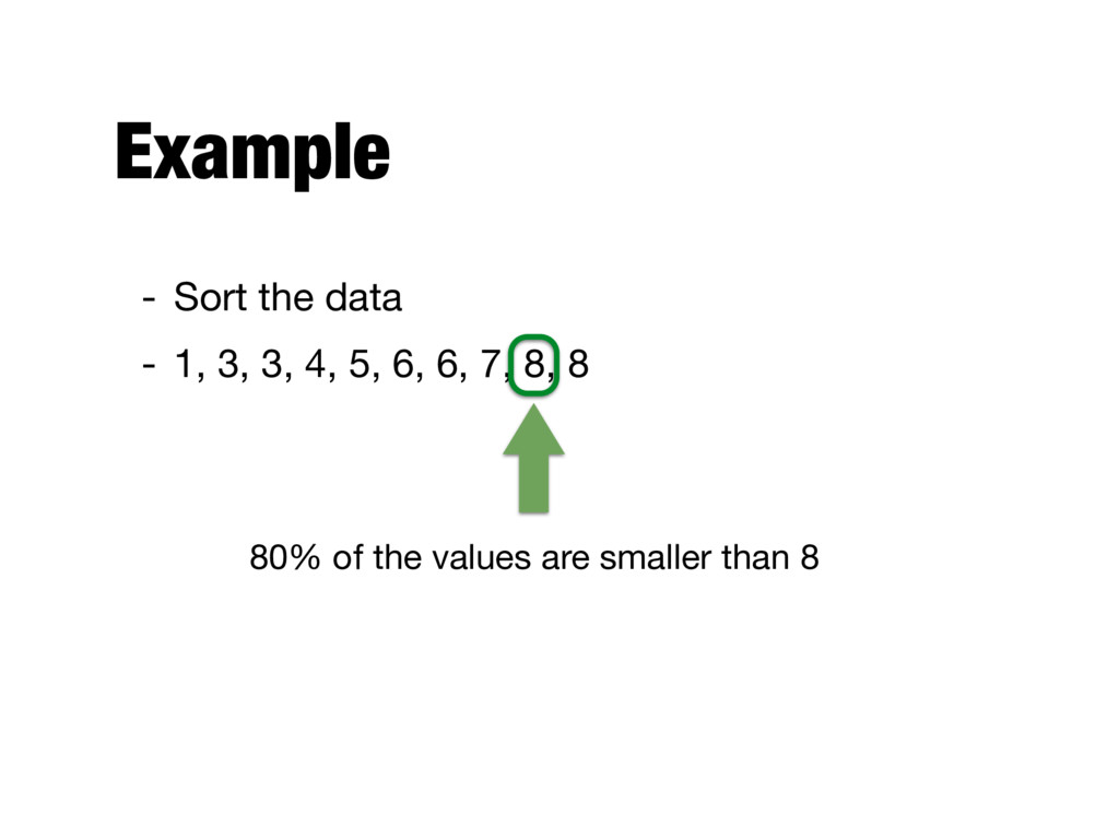
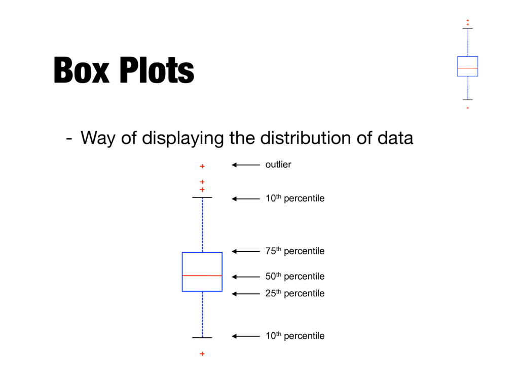
is more useful - Given an ordinal or continuous attribute x and a number p between 0 and 100, the pth percentile is a value xp of x such that p% of the observed values of x are less than xp - For instance, the 50th percentile is the value x50% such that 50% of all values of x are less than x50% - min(x)= x0% max(x)= x100%
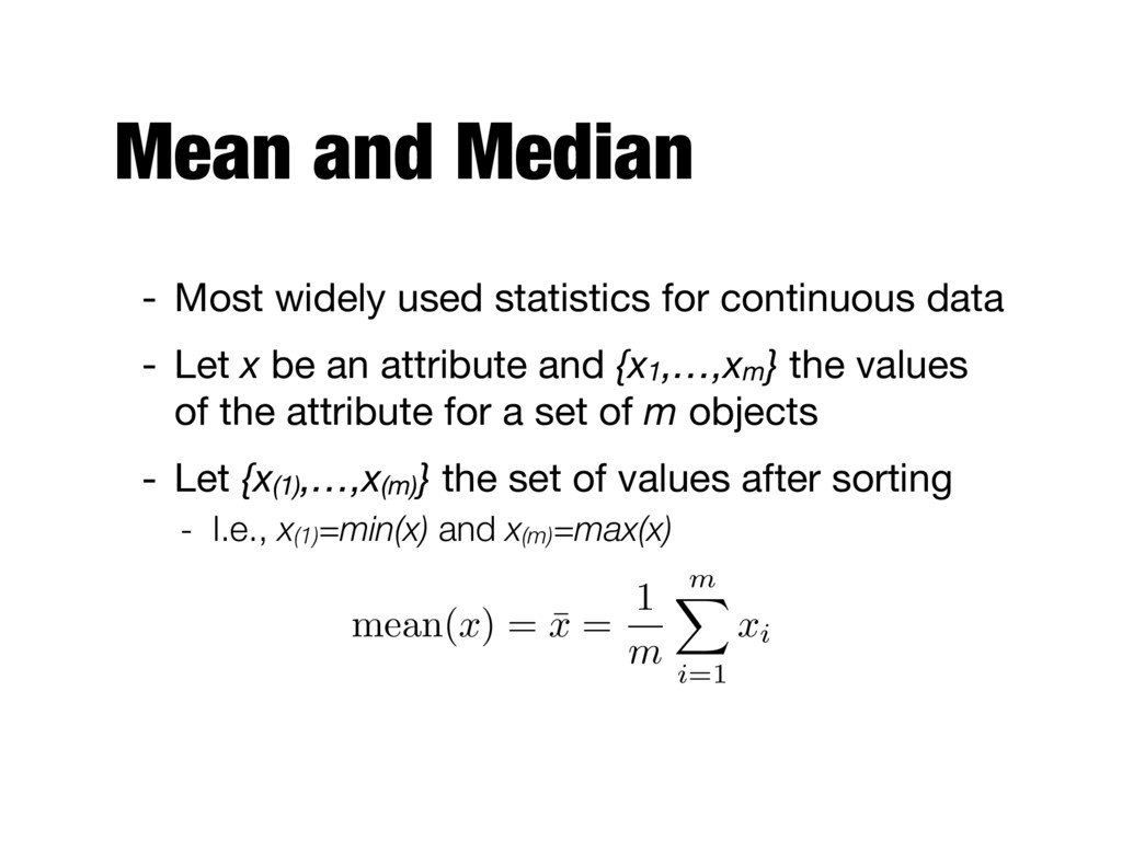
data - Let x be an attribute and {x1,…,xm} the values of the attribute for a set of m objects - Let {x(1),…,x(m)} the set of values after sorting - I.e., x(1)=min(x) and x(m)=max(x) mean( x ) = ¯ x = 1 m m X i=1 xi
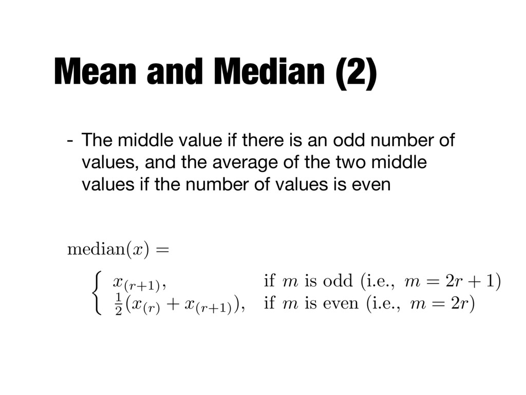
is an odd number of values, and the average of the two middle values if the number of values is even ⇢ x(r+1), if m is odd (i.e., m = 2r + 1) 1 2 (x(r) + x(r+1)), if m is even (i.e., m = 2r) median( x ) =
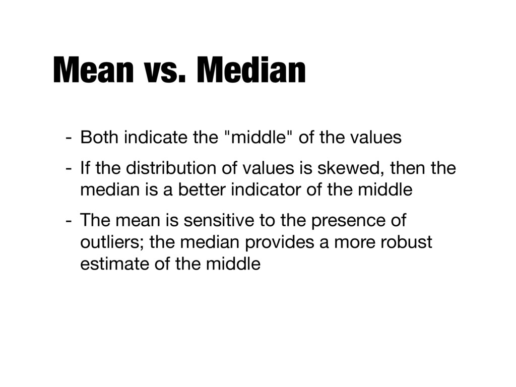
values - If the distribution of values is skewed, then the median is a better indicator of the middle - The mean is sensitive to the presence of outliers; the median provides a more robust estimate of the middle
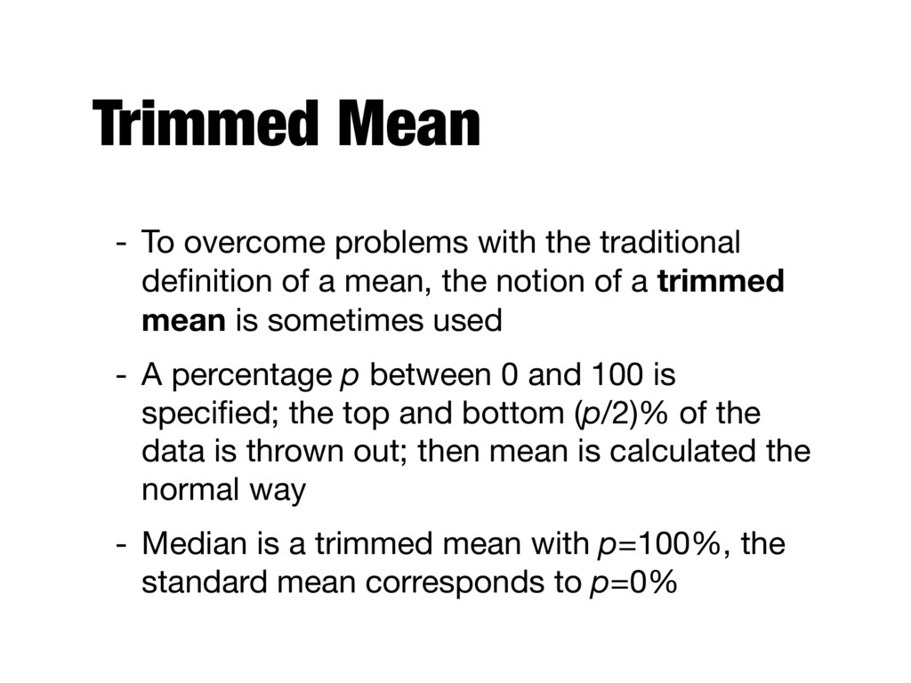
of a mean, the notion of a trimmed mean is sometimes used - A percentage p between 0 and 100 is specified; the top and bottom (p/2)% of the data is thrown out; then mean is calculated the normal way - Median is a trimmed mean with p=100%, the standard mean corresponds to p=0%
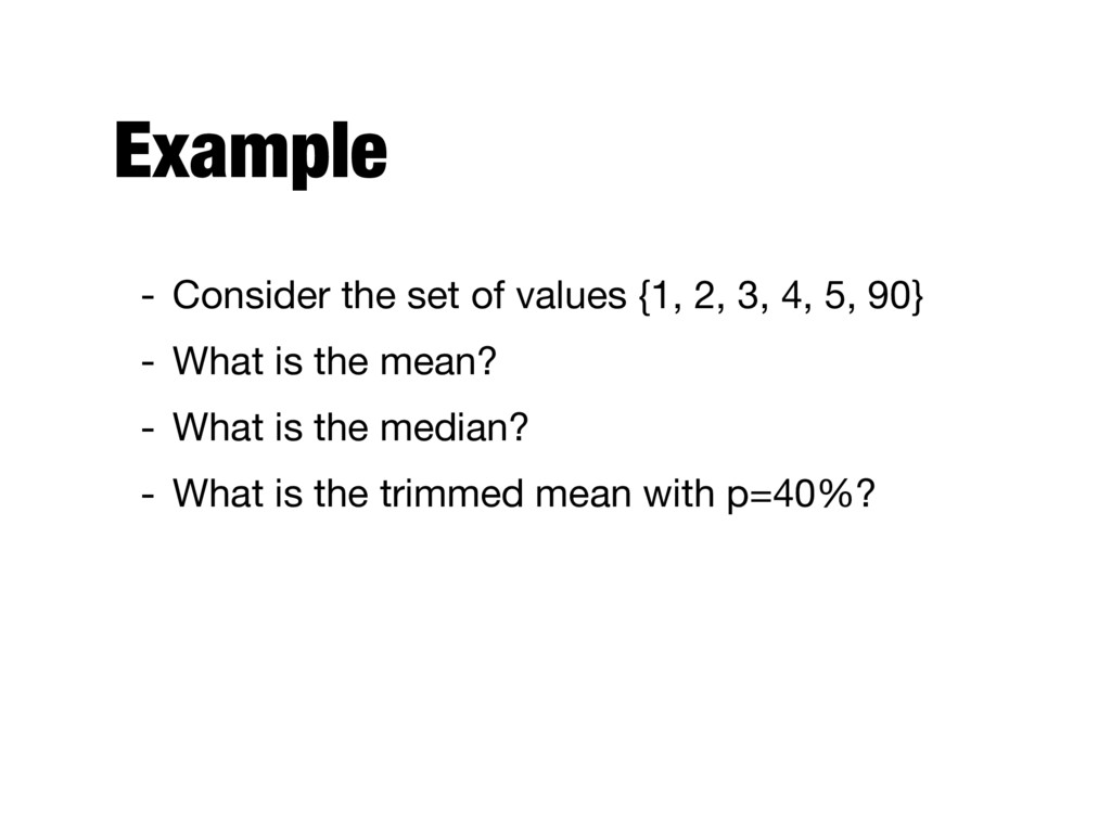
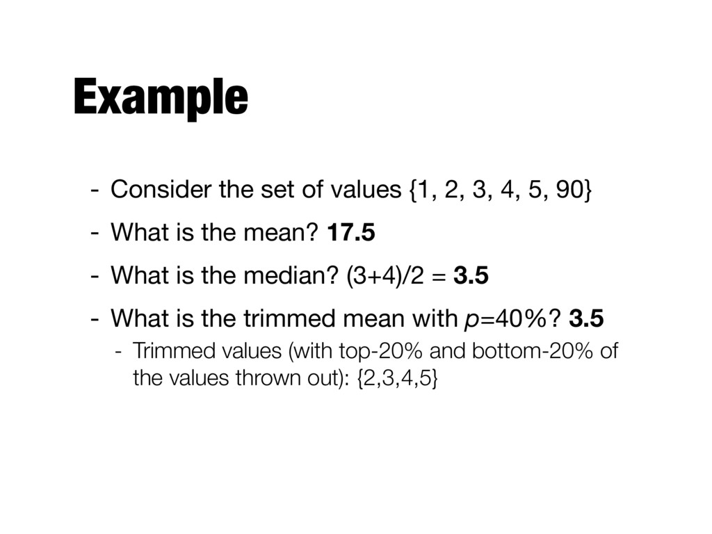
4, 5, 90} - What is the mean? 17.5 - What is the median? (3+4)/2 = 3.5 - What is the trimmed mean with p=40%? 3.5 - Trimmed values (with top-20% and bottom-20% of the values thrown out): {2,3,4,5}
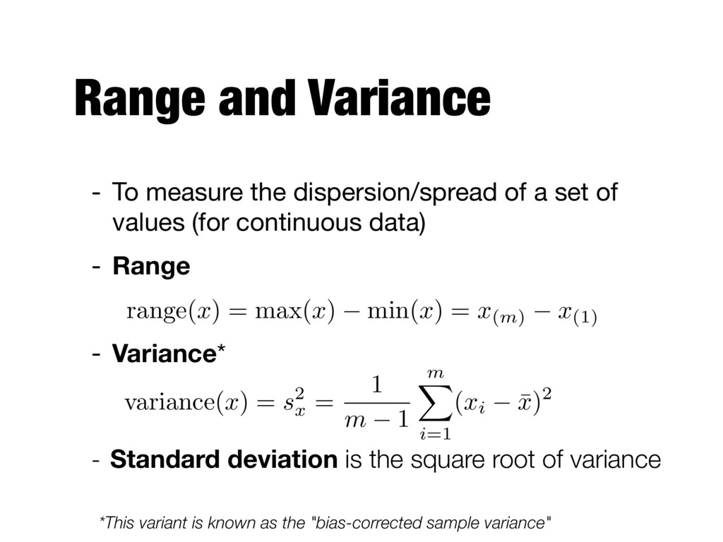
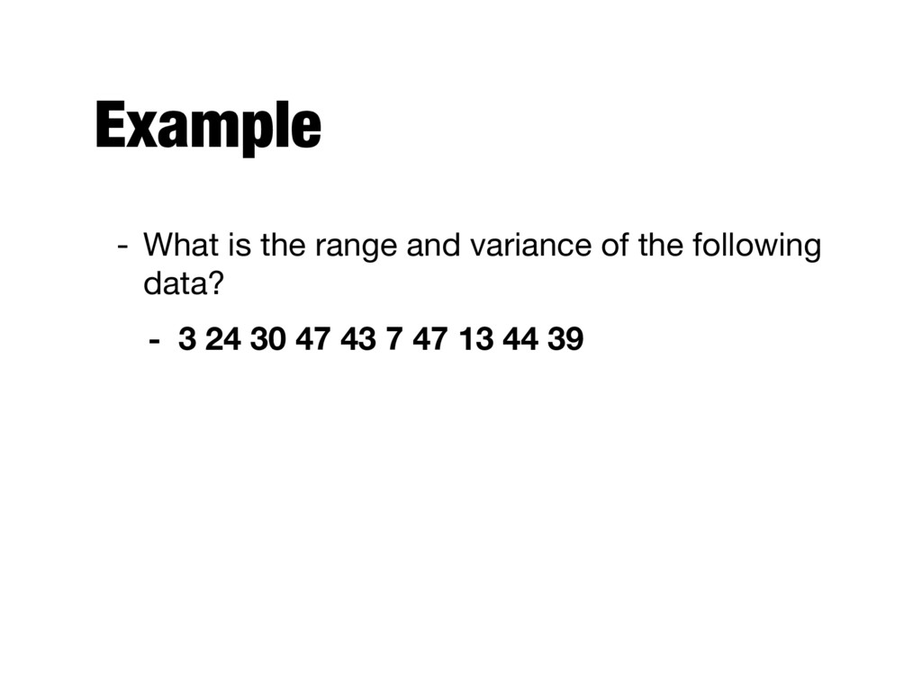
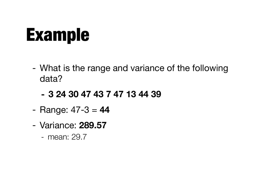
set of values (for continuous data) - Range - Variance* - Standard deviation is the square root of variance range(x) = max(x) min(x) = x(m) x(1) *This variant is known as the "bias-corrected sample variance" variance( x ) = s 2 x = 1 m 1 m X i =1 ( xi ¯ x )2
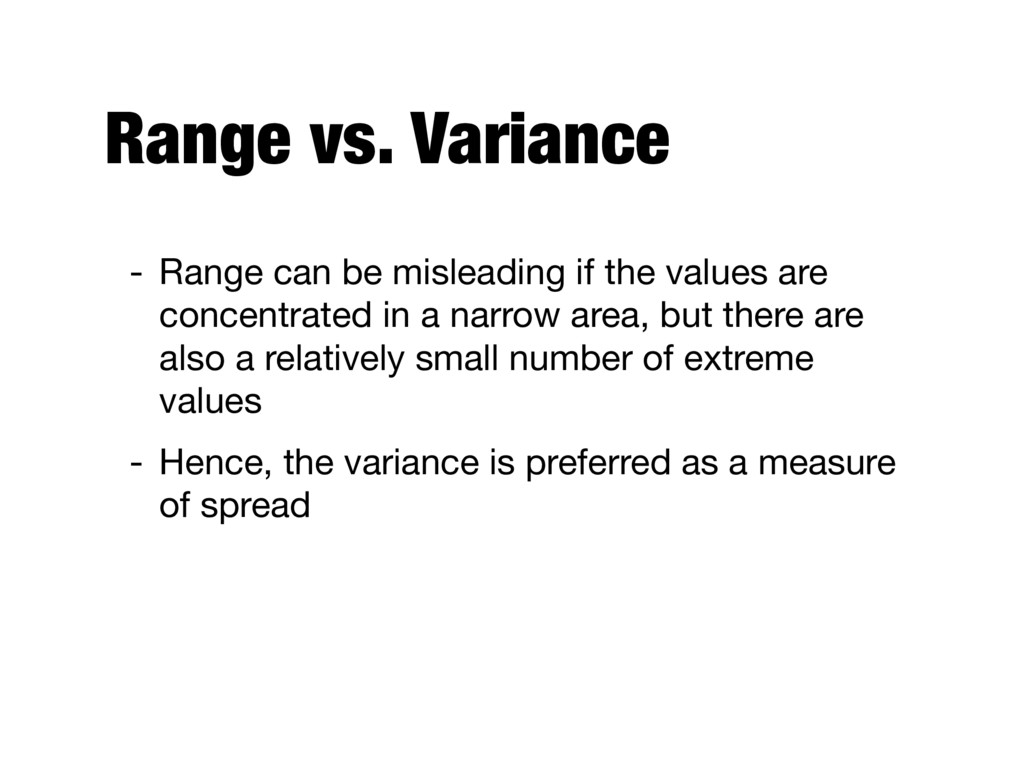
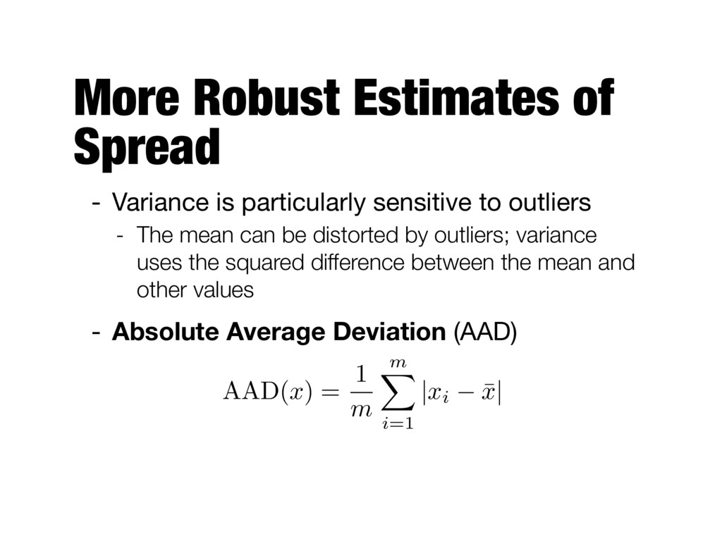
values are concentrated in a narrow area, but there are also a relatively small number of extreme values - Hence, the variance is preferred as a measure of spread
to outliers - The mean can be distorted by outliers; variance uses the squared difference between the mean and other values - Absolute Average Deviation (AAD) AAD( x ) = 1 m m X i=1 | xi ¯ x |
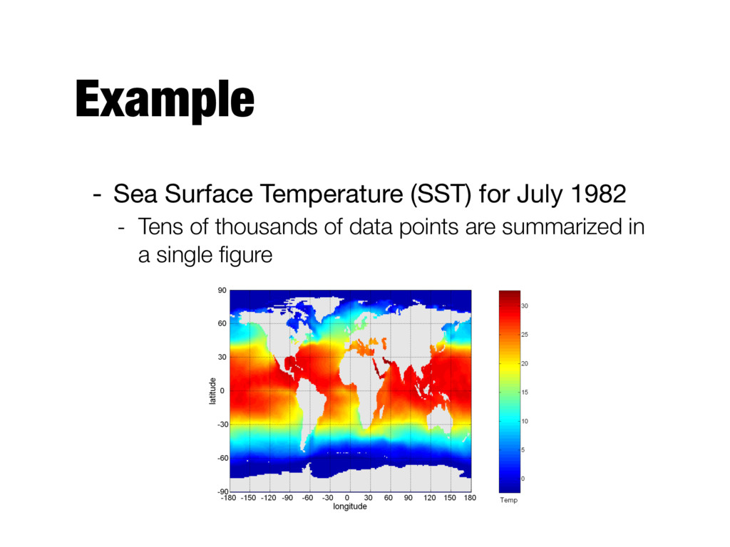
information in a graphic or tabular format - The motivation for using visualization is that people can quickly absorb large amounts of visual information and find patterns in it - Visualization is a powerful and appealing technique for data exploration - Humans can easily detect general patterns and trends as well as outliers and unusual patterns
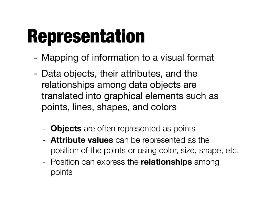
Data objects, their attributes, and the relationships among data objects are translated into graphical elements such as points, lines, shapes, and colors - Objects are often represented as points - Attribute values can be represented as the position of the points or using color, size, shape, etc. - Position can express the relationships among points
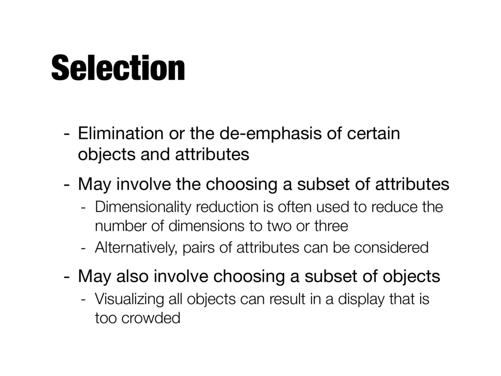
attributes - May involve the choosing a subset of attributes - Dimensionality reduction is often used to reduce the number of dimensions to two or three - Alternatively, pairs of attributes can be considered - May also involve choosing a subset of objects - Visualizing all objects can result in a display that is too crowded
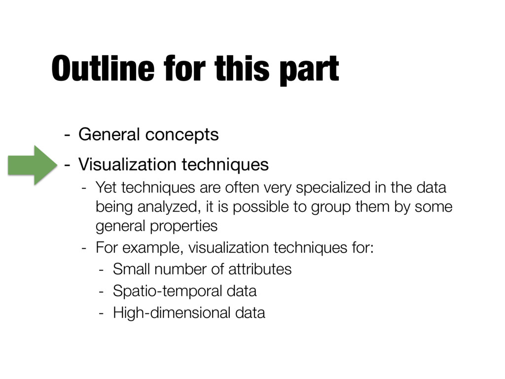
- Yet techniques are often very specialized in the data being analyzed, it is possible to group them by some general properties - For example, visualization techniques for: - Small number of attributes - Spatio-temporal data - High-dimensional data
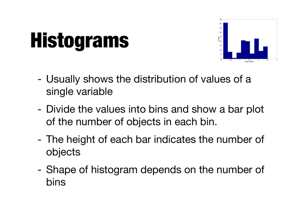
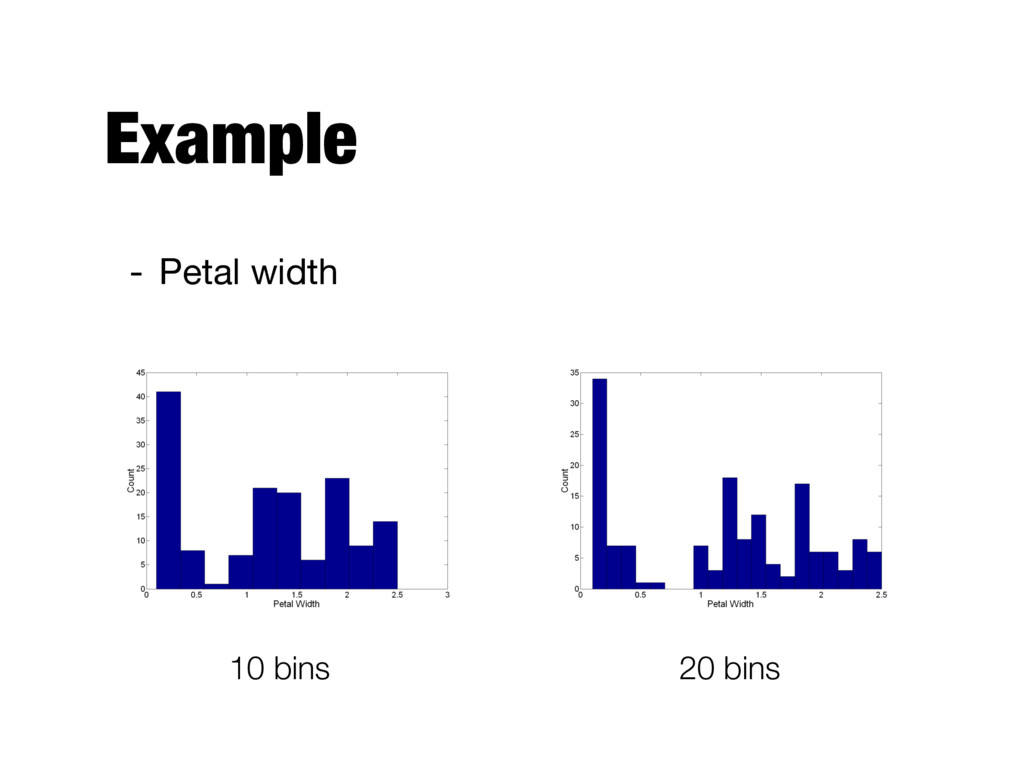
single variable - Divide the values into bins and show a bar plot of the number of objects in each bin. - The height of each bar indicates the number of objects - Shape of histogram depends on the number of bins
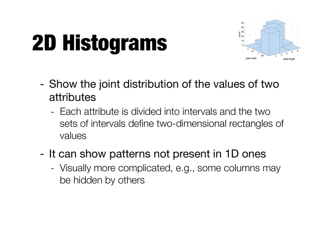
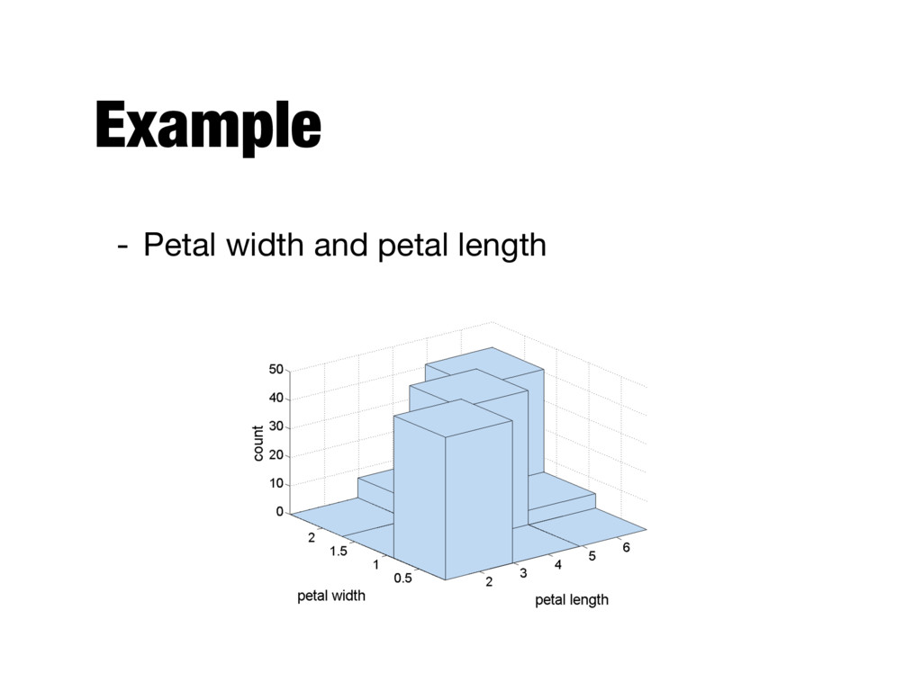
of two attributes - Each attribute is divided into intervals and the two sets of intervals define two-dimensional rectangles of values - It can show patterns not present in 1D ones - Visually more complicated, e.g., some columns may be hidden by others
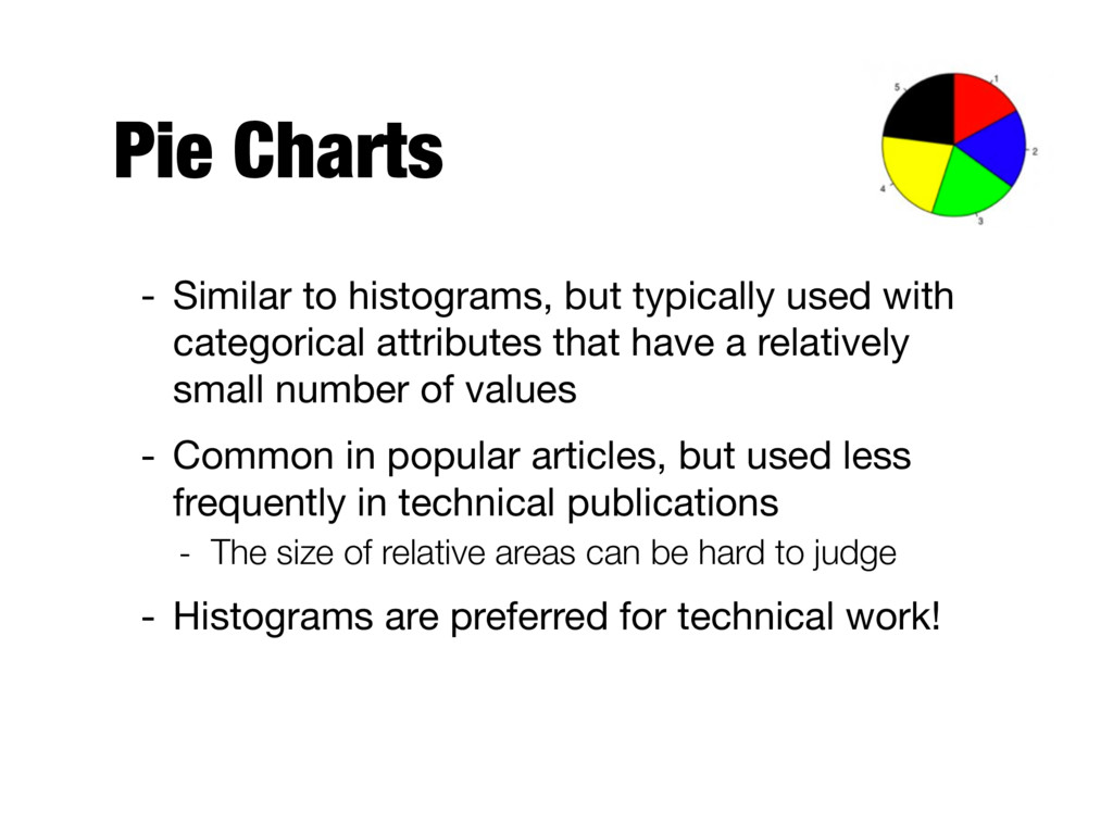
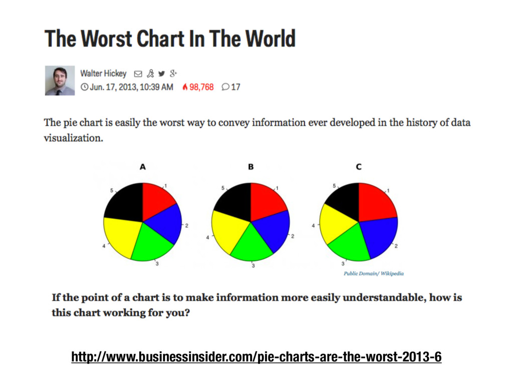
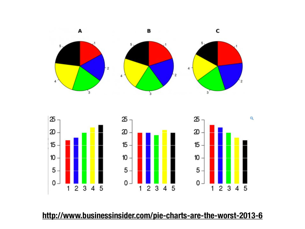
categorical attributes that have a relatively small number of values - Common in popular articles, but used less frequently in technical publications - The size of relative areas can be hard to judge - Histograms are preferred for technical work!
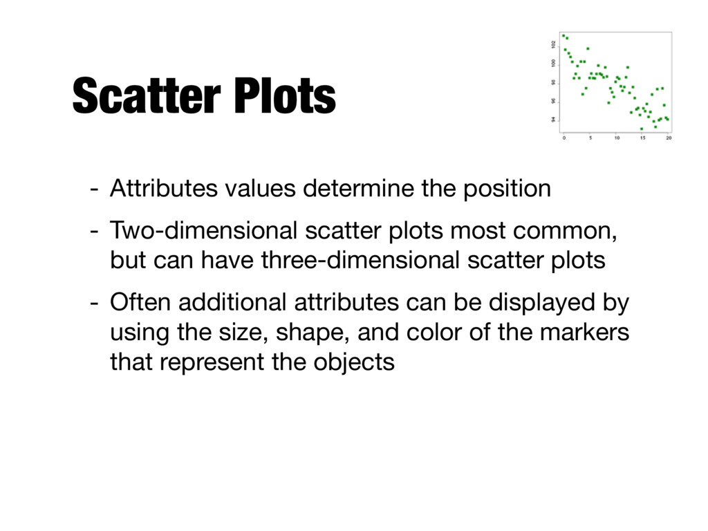
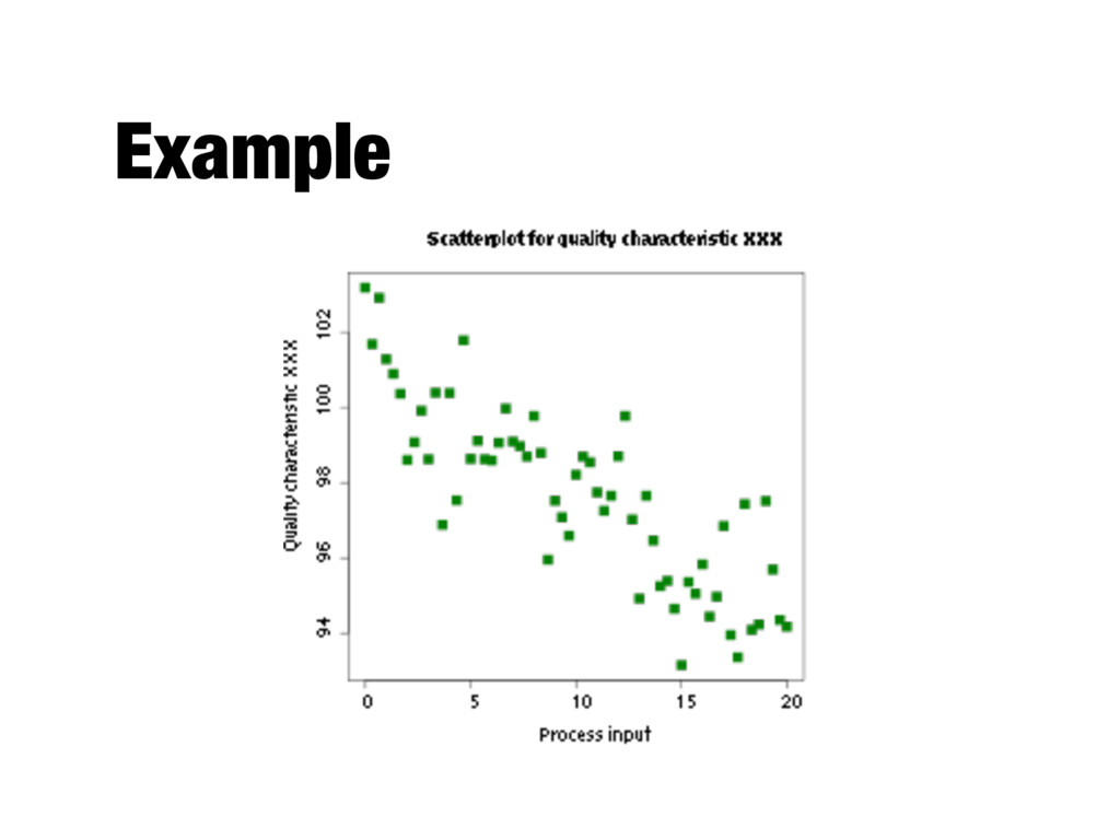
scatter plots most common, but can have three-dimensional scatter plots - Often additional attributes can be displayed by using the size, shape, and color of the markers that represent the objects
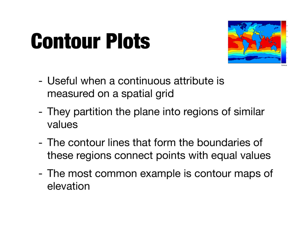
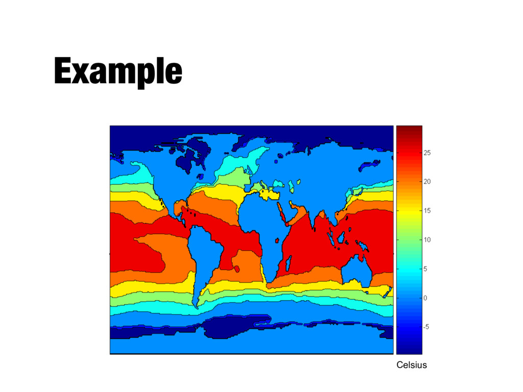
on a spatial grid - They partition the plane into regions of similar values - The contour lines that form the boundaries of these regions connect points with equal values - The most common example is contour maps of elevation Celsius
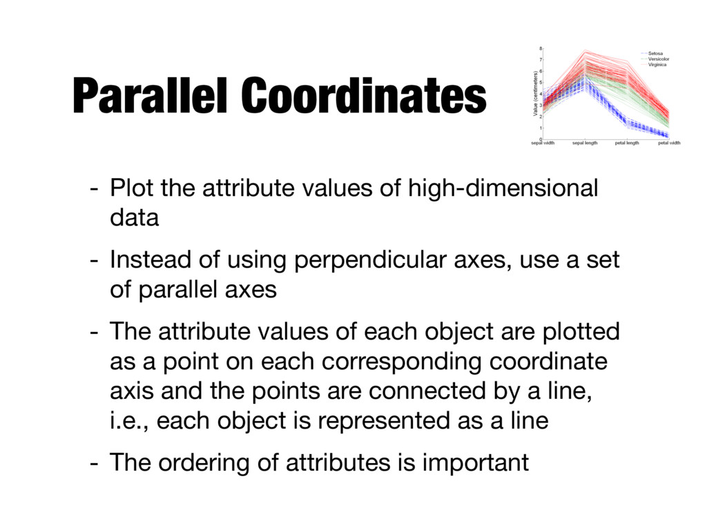
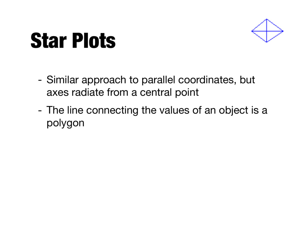
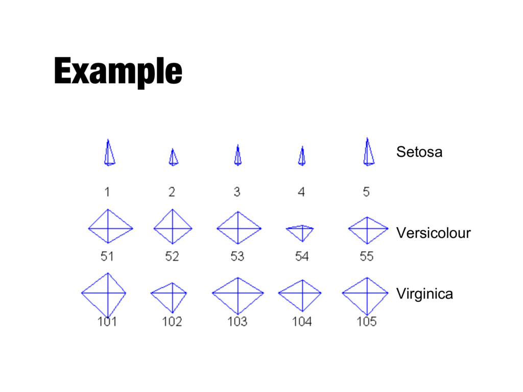
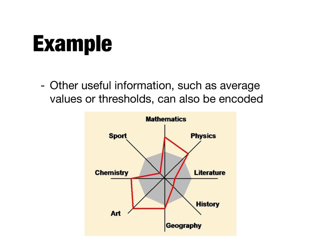
- Instead of using perpendicular axes, use a set of parallel axes - The attribute values of each object are plotted as a point on each corresponding coordinate axis and the points are connected by a line, i.e., each object is represented as a line - The ordering of attributes is important
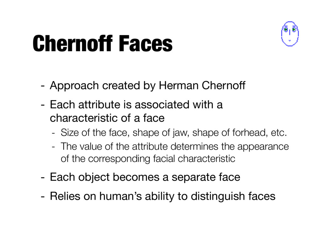
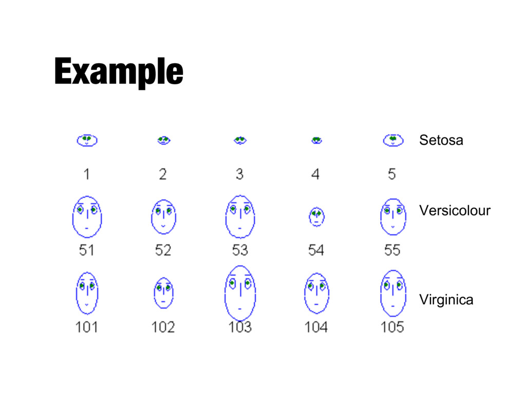
attribute is associated with a characteristic of a face - Size of the face, shape of jaw, shape of forhead, etc. - The value of the attribute determines the appearance of the corresponding facial characteristic - Each object becomes a separate face - Relies on human’s ability to distinguish faces
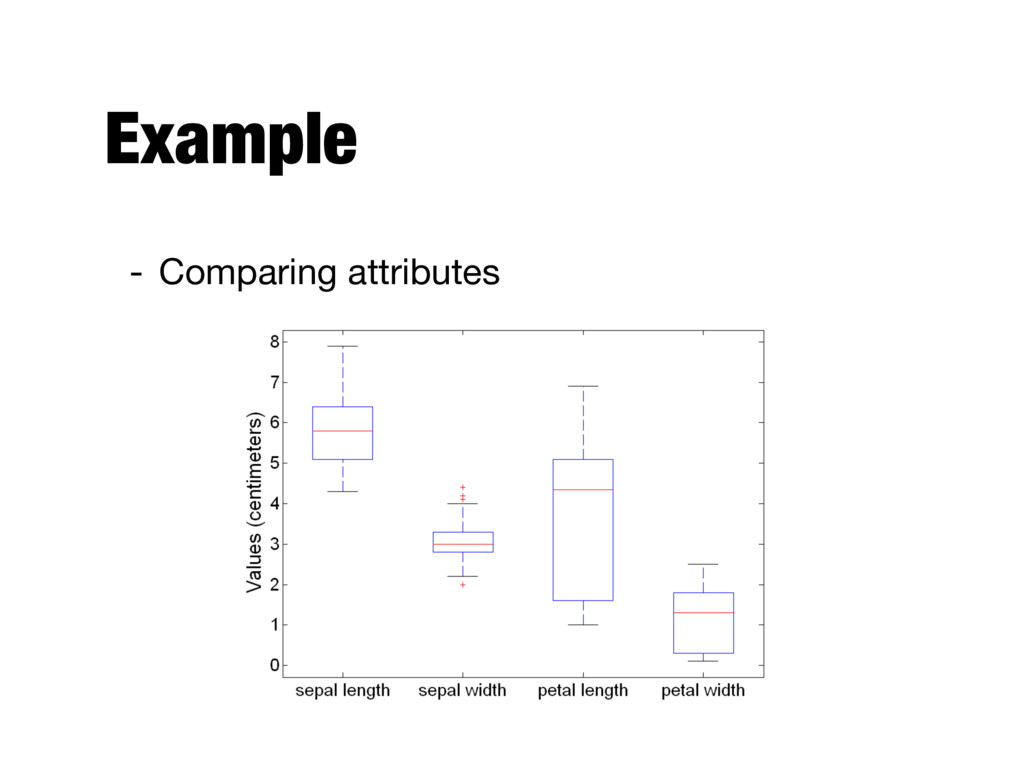
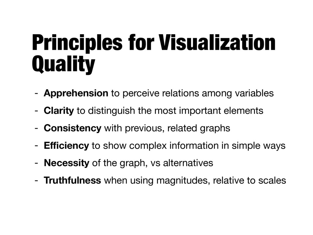
variables - Clarity to distinguish the most important elements - Consistency with previous, related graphs - Efficiency to show complex information in simple ways - Necessity of the graph, vs alternatives - Truthfulness when using magnitudes, relative to scales
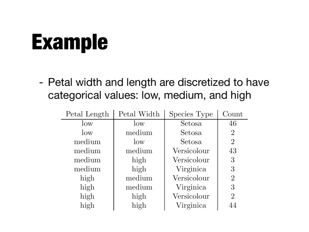
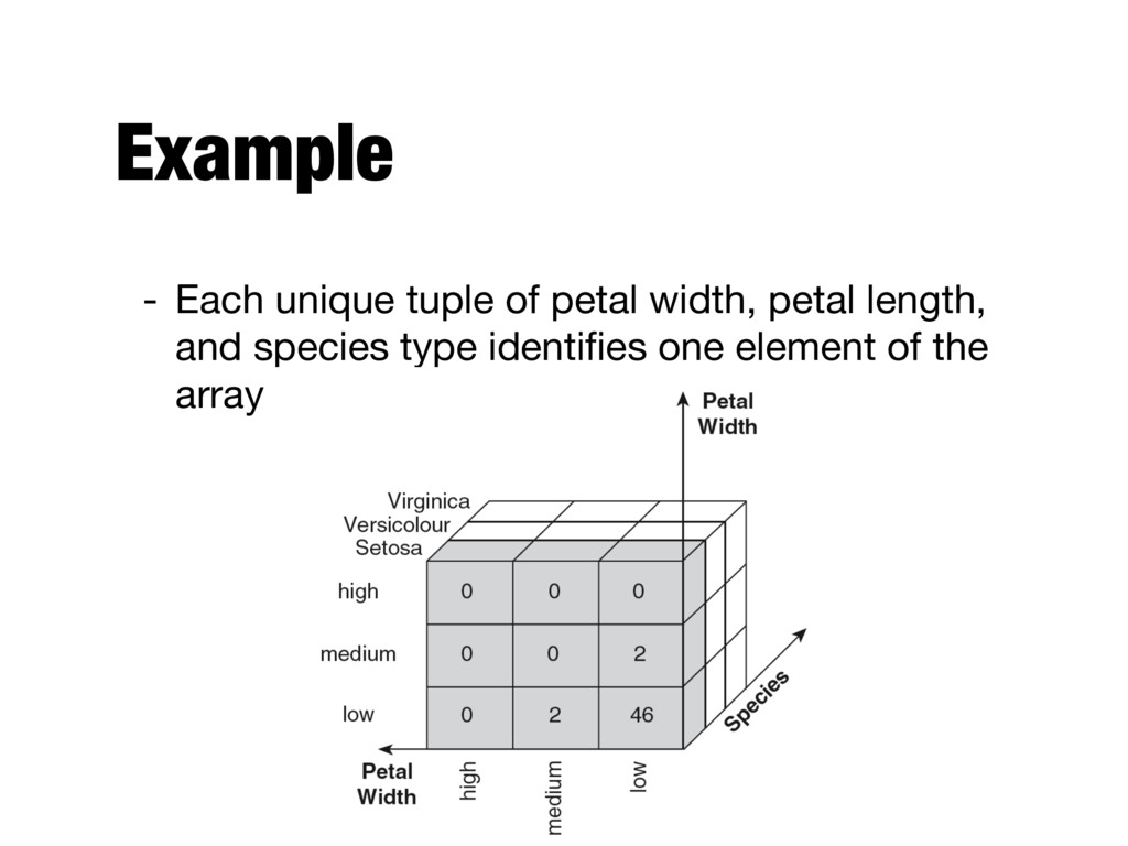
uses a multidimensional array representation - Such representations of data previously existed in statistics and other fields - There are a number of data analysis and data exploration operations that are easier with such a data representation
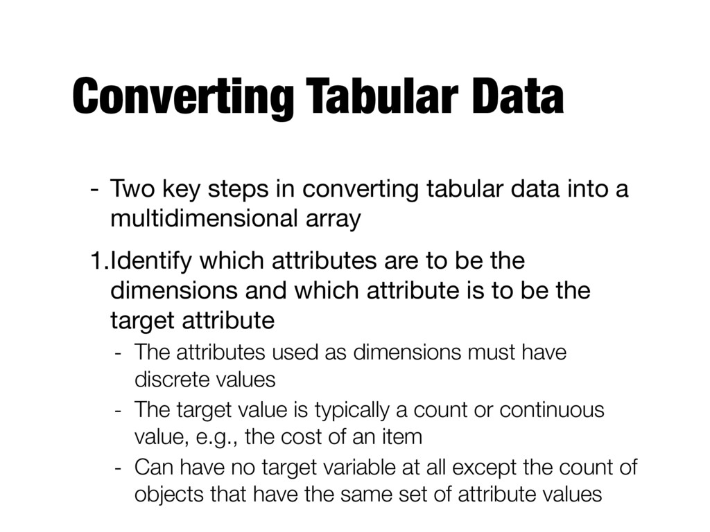
data into a multidimensional array 1.Identify which attributes are to be the dimensions and which attribute is to be the target attribute - The attributes used as dimensions must have discrete values - The target value is typically a count or continuous value, e.g., the cost of an item - Can have no target variable at all except the count of objects that have the same set of attribute values
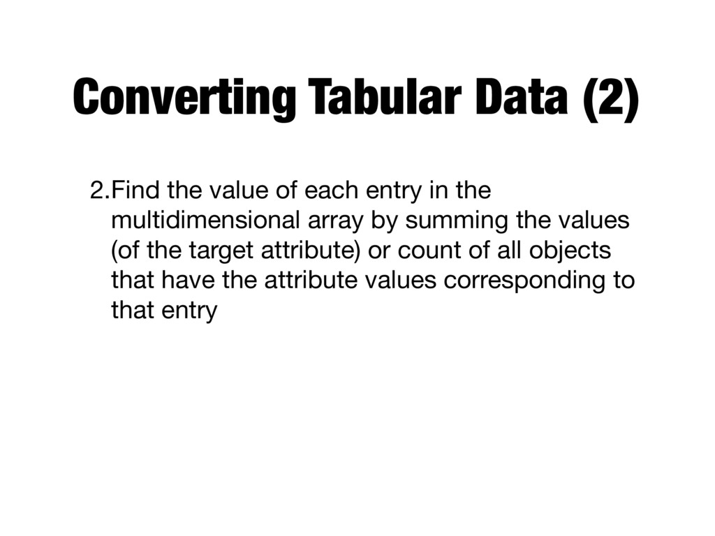
in the multidimensional array by summing the values (of the target attribute) or count of all objects that have the attribute values corresponding to that entry
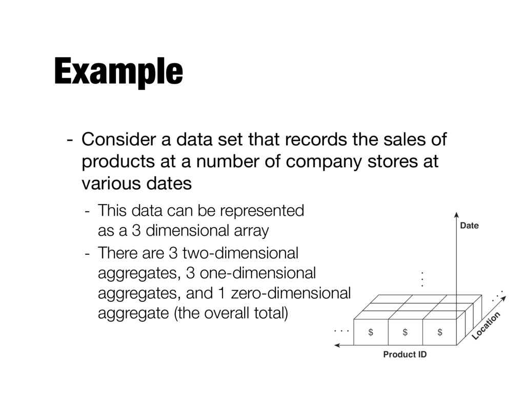
the formation of a data cube - A data cube is a multidimensional representation of data, together with all possible aggregates - Aggregates that result by selecting a proper subset of the dimensions and summing over all remaining dimensions
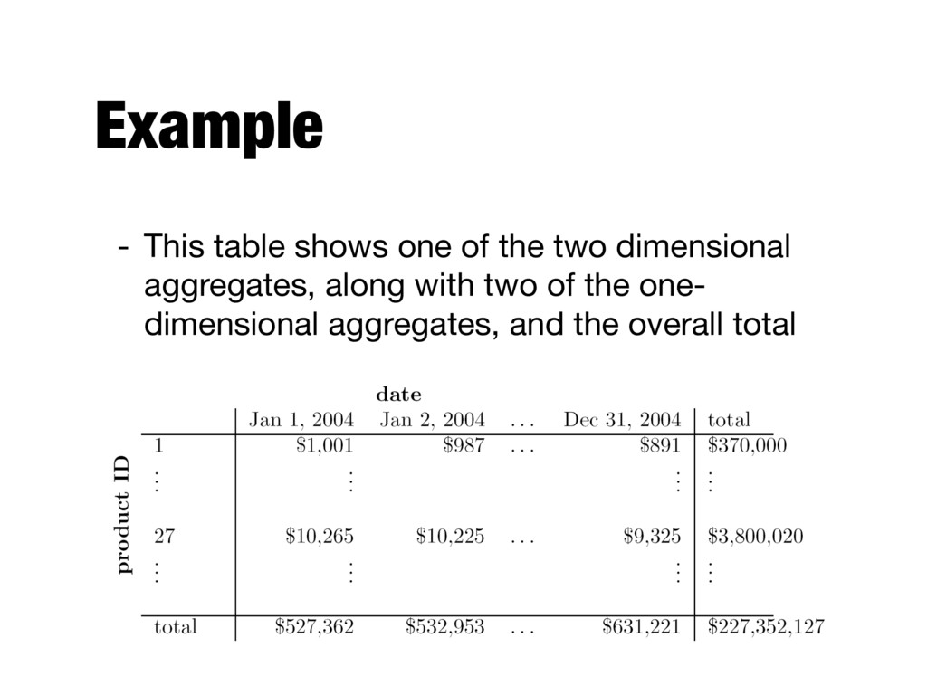
of products at a number of company stores at various dates - This data can be represented as a 3 dimensional array - There are 3 two-dimensional aggregates, 3 one-dimensional aggregates, and 1 zero-dimensional aggregate (the overall total)
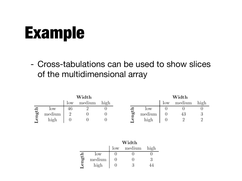
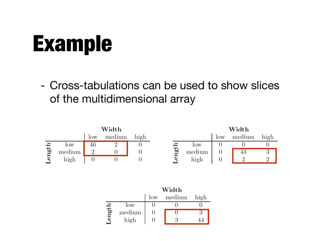
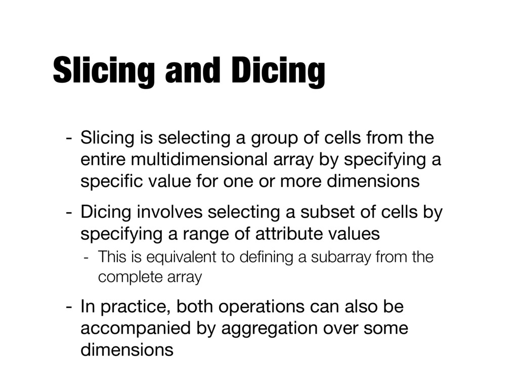
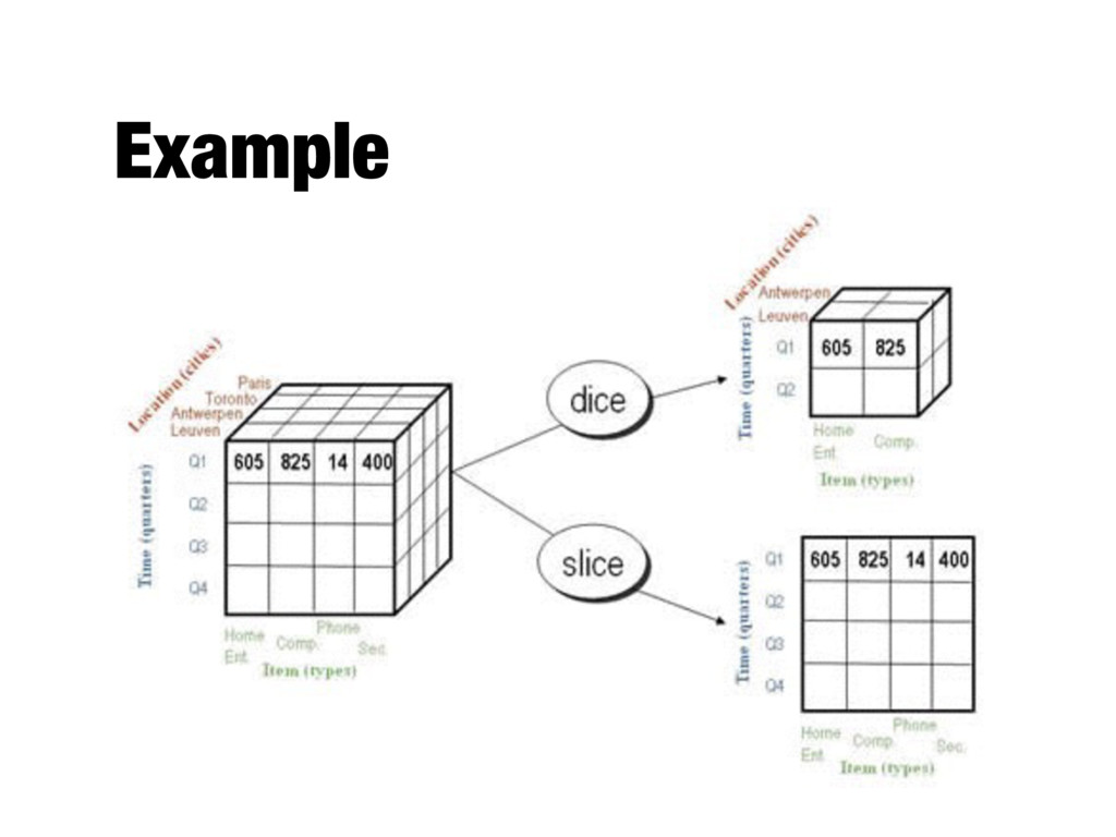
cells from the entire multidimensional array by specifying a specific value for one or more dimensions - Dicing involves selecting a subset of cells by specifying a range of attribute values - This is equivalent to defining a subarray from the complete array - In practice, both operations can also be accompanied by aggregation over some dimensions
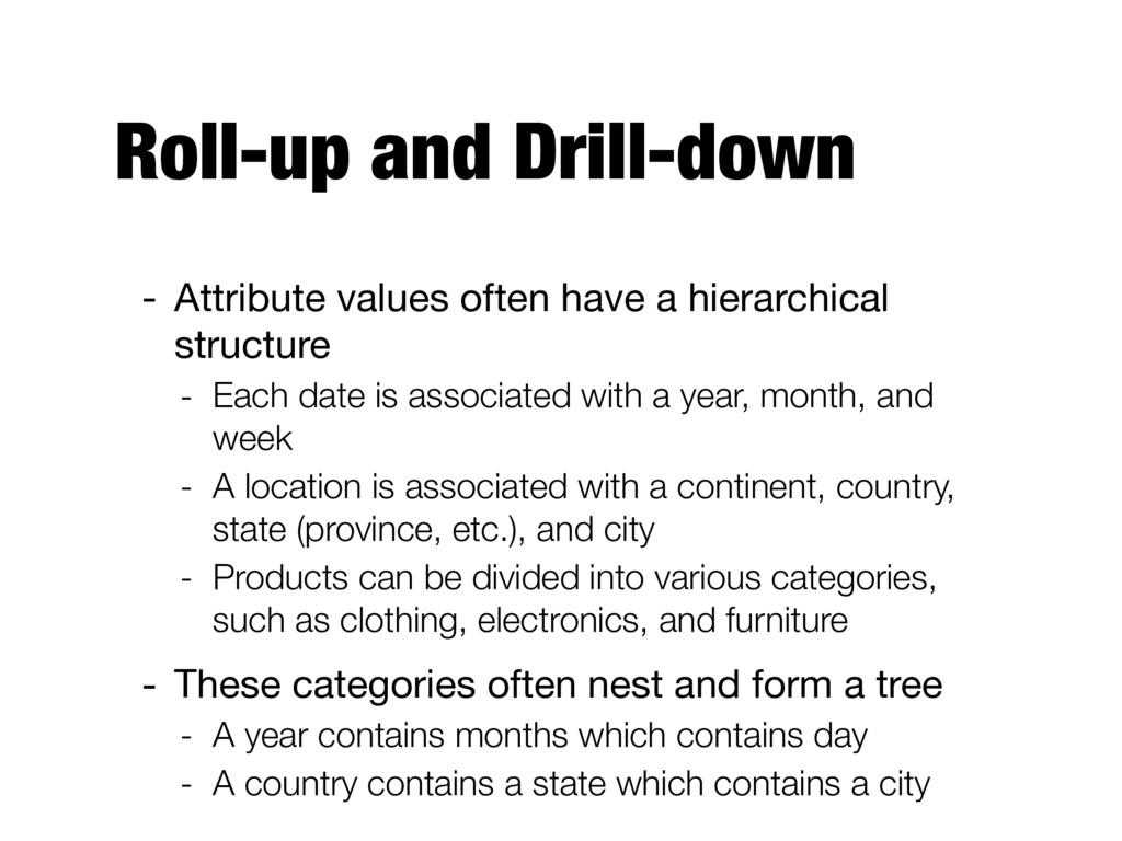
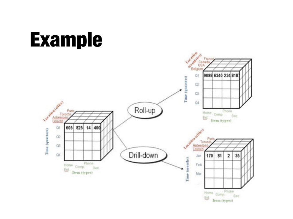
structure - Each date is associated with a year, month, and week - A location is associated with a continent, country, state (province, etc.), and city - Products can be divided into various categories, such as clothing, electronics, and furniture - These categories often nest and form a tree - A year contains months which contains day - A country contains a state which contains a city