Upgrade to Pro
— share decks privately, control downloads, hide ads and more …
Speaker Deck
Features
Speaker Deck
PRO
Sign in
Sign up for free
Search
Search
CSS Gird
Search
Kevin Dees
May 18, 2017
Programming
530
0
Share
Embed
Copy iframe code
Copy JS code
Copy link
Start on current slide
CSS Gird
Great web design starts with the grid
Kevin Dees
May 18, 2017
More Decks by Kevin Dees
See All by Kevin Dees
The Hidden Features Of CSS
kevindees
1
130
Create Your Own Theme Page-Builder in Minutes
kevindees
0
2.3k
Forms make the web
kevindees
1
330
Design for Developers
kevindees
1
180
TypeRocket 3.0: Unleash WordPress and be amazing (Wilmington NC)
kevindees
1
440
TypeRocket 3.0 - Unleash WordPress and Be Amazing
kevindees
0
980
Busting The Loop Lies
kevindees
2
200
Pragmatic WordPress Workflow
kevindees
2
320
Pragmatic WordPress WorkFlow: Theming
kevindees
0
690
Other Decks in Programming
See All in Programming
AIを活用したE2Eテスト実装効率化のあゆみ / ebisu-mobile-14-kotetu
kotetuco
0
170
『コードを書く以外の』エンジニアリング〜課金基盤移行プロジェクト推進のためのTips4選
yuriko1211
0
510
【やさしく解説 設計編・中級 #1】一つの車に、運転手は一人 ~ある倉庫システムの事例から~
panda728
PRO
0
180
AIキャラアプリkaiwaの低遅延音声通話基盤をどう作ったか - AWS Gravitonで支える低遅延・低コストAI Agent基盤
mogamit
0
170
AI駆動開発を妨げる技術的負債の解消アプローチ / ai-refactoring-approach
minodriven
17
9.1k
1年で人数1.5倍、PR数5.5倍増。 品質とアウトカムはどうなったか、 何が効いたか
ike002jp
0
140
霧の中の代数的エフェクト
funnyycat
1
410
琵琶湖の水は止められてもNet--HTTPのリトライは止められない / You might be able to stop the water flow of Lake Biwa but you can't stop Net::HTTP retries
luccafort
PRO
0
400
Terraform標準の組織で AWS CDKをどう使うか
mu7889yoon
0
290
ITヒヤリハットを整理してみた ~ライフサイクルと原因から考える再発防止策~
koukimiura
1
110
Generative UI & AI-Assistants for Your Angular Solutions
manfredsteyer
PRO
1
190
はてなアカウント基盤 State of the Union
cockscomb
1
1.3k
Featured
See All Featured
Imperfection Machines: The Place of Print at Facebook
scottboms
270
14k
Designing Powerful Visuals for Engaging Learning
tmiket
1
450
Building an army of robots
kneath
306
46k
Fireside Chat
paigeccino
42
4k
How STYLIGHT went responsive
nonsquared
100
6.2k
Designing Experiences People Love
moore
143
24k
The Organizational Zoo: Understanding Human Behavior Agility Through Metaphoric Constructive Conversations (based on the works of Arthur Shelley, Ph.D)
kimpetersen
PRO
0
390
Chasing Engaging Ingredients in Design
codingconduct
0
240
The Cost Of JavaScript in 2023
addyosmani
55
10k
How To Speak Unicorn (iThemes Webinar)
marktimemedia
1
510
Marketing to machines
jonoalderson
1
5.6k
Stewardship and Sustainability of Urban and Community Forests
pwiseman
0
350
Transcript
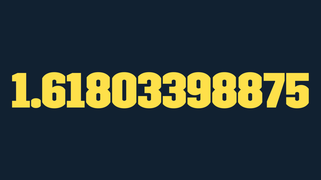
1.61803398875
None
None
None
None
None
Order and creativity
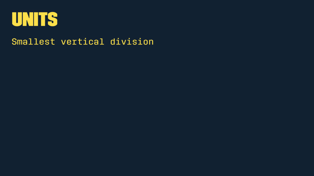
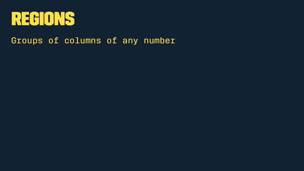
The Anatomy of the Grid
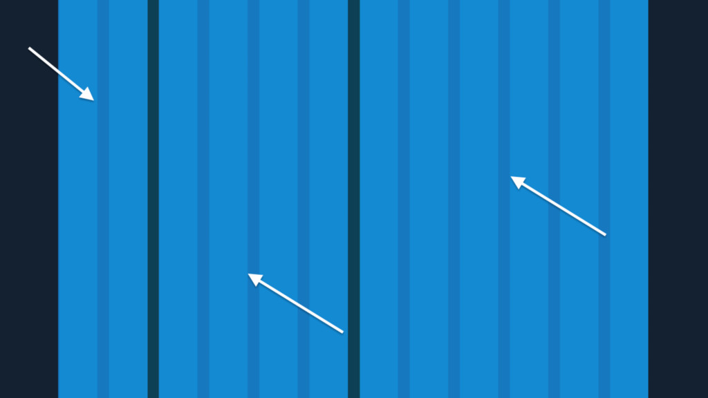
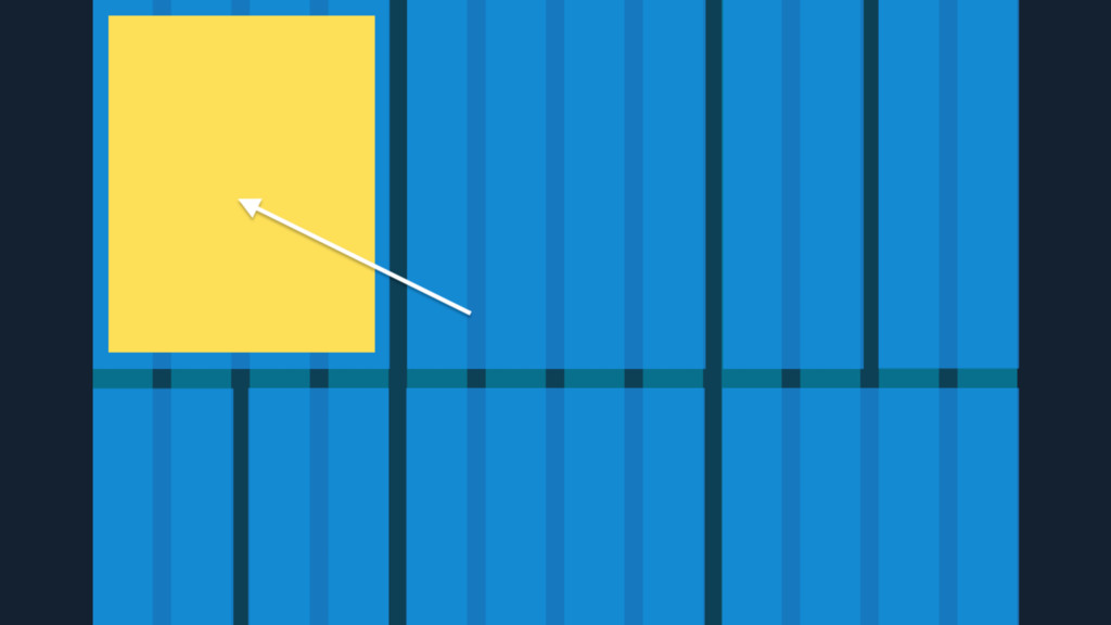
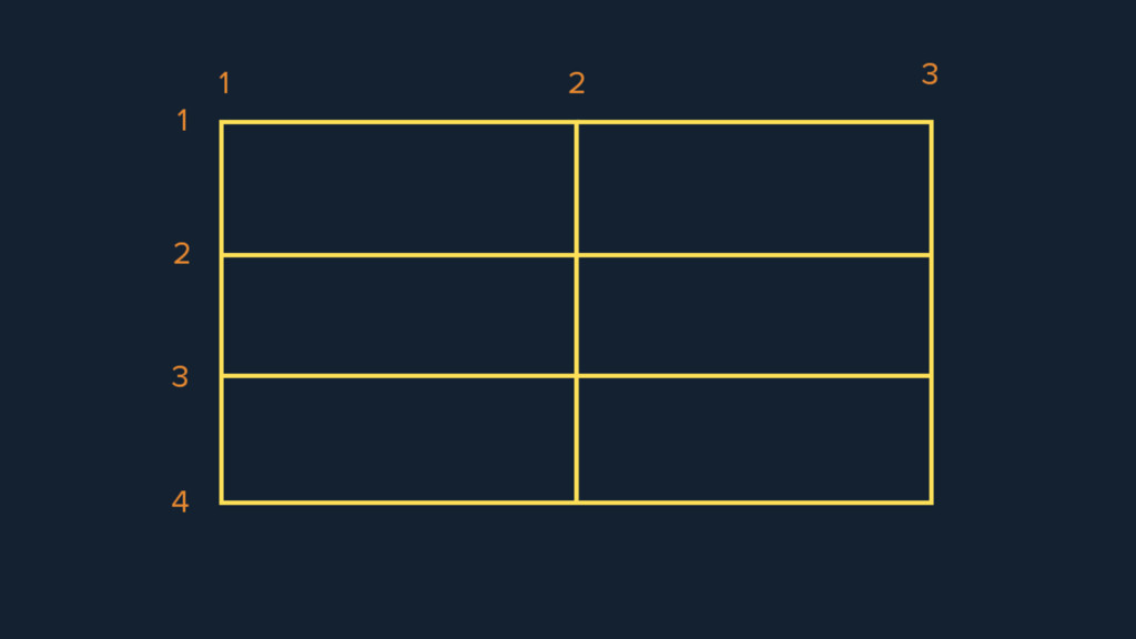
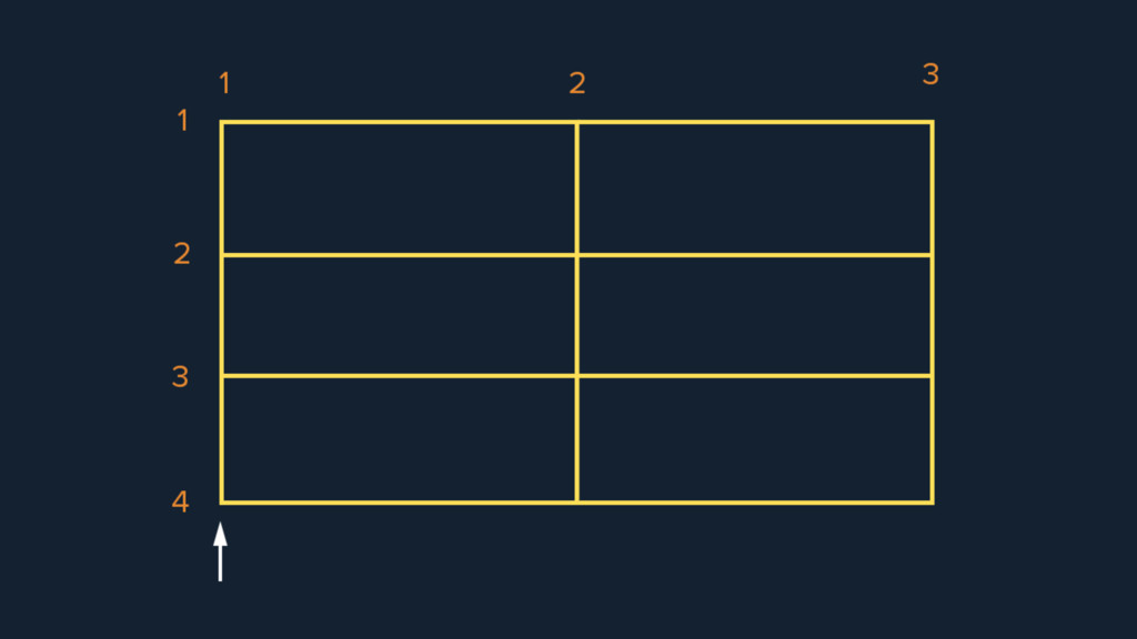
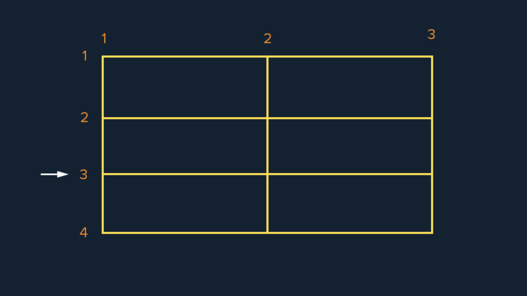
Units Smallest vertical division
None
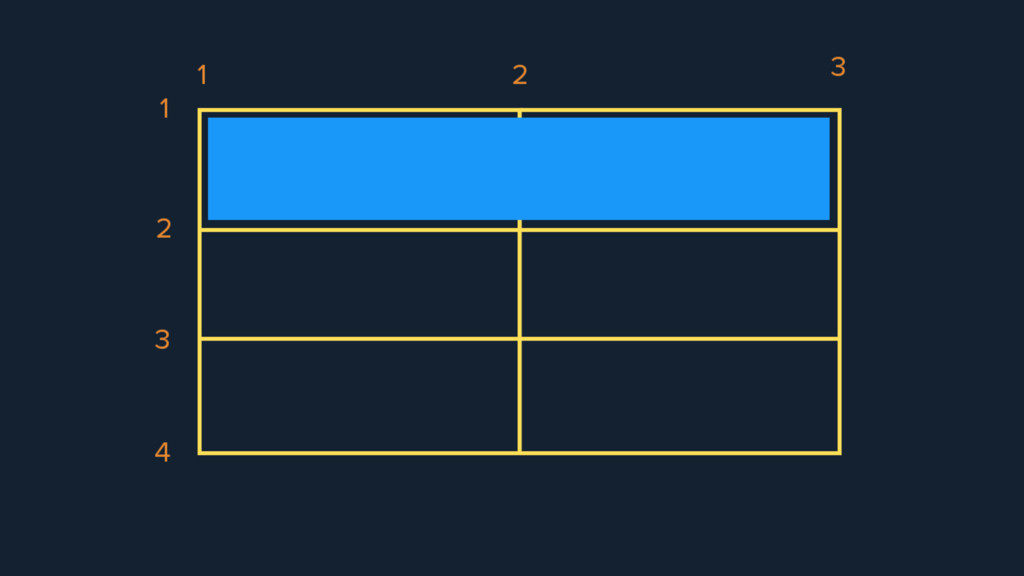
Columns Groups of units
None
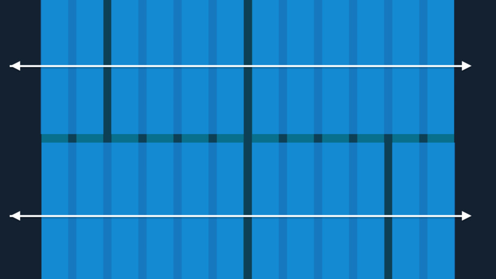
Regions Groups of columns of any number
None
Fields Horizontal divisions
None
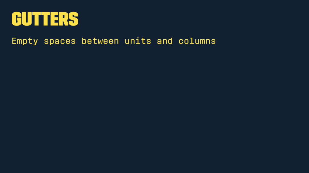
Gutters Empty spaces between units and columns
None
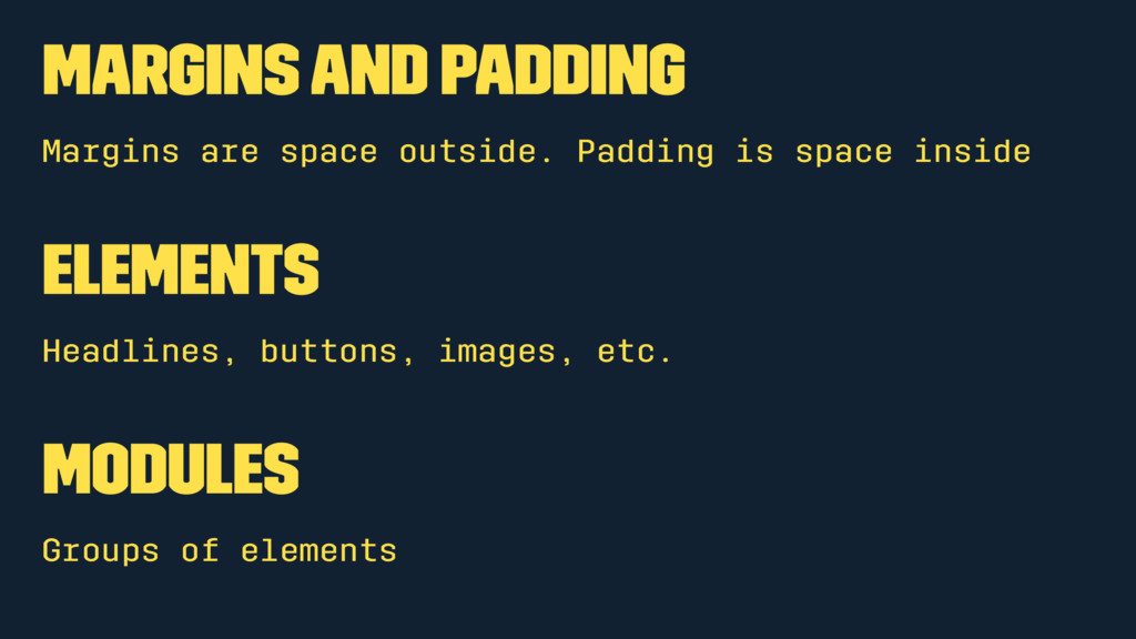
Margins and Padding Margins are space outside. Padding is space
inside Elements Headlines, buttons, images, etc. Modules Groups of elements
None
None
None
None
None
Grid Is Epic In Every Way
None
None
None
None
CSS Floats Have always been awesome
None
None
None
None
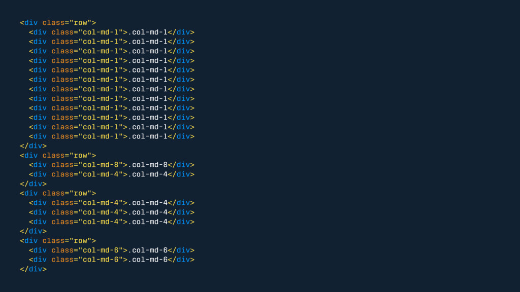
<div class="row"> <div class="col-md-1">.col-md-1</div> <div class="col-md-1">.col-md-1</div> <div class="col-md-1">.col-md-1</div> <div class="col-md-1">.col-md-1</div>
<div class="col-md-1">.col-md-1</div> <div class="col-md-1">.col-md-1</div> <div class="col-md-1">.col-md-1</div> <div class="col-md-1">.col-md-1</div> <div class="col-md-1">.col-md-1</div> <div class="col-md-1">.col-md-1</div> <div class="col-md-1">.col-md-1</div> <div class="col-md-1">.col-md-1</div> </div> <div class="row"> <div class="col-md-8">.col-md-8</div> <div class="col-md-4">.col-md-4</div> </div> <div class="row"> <div class="col-md-4">.col-md-4</div> <div class="col-md-4">.col-md-4</div> <div class="col-md-4">.col-md-4</div> </div> <div class="row"> <div class="col-md-6">.col-md-6</div> <div class="col-md-6">.col-md-6</div> </div>
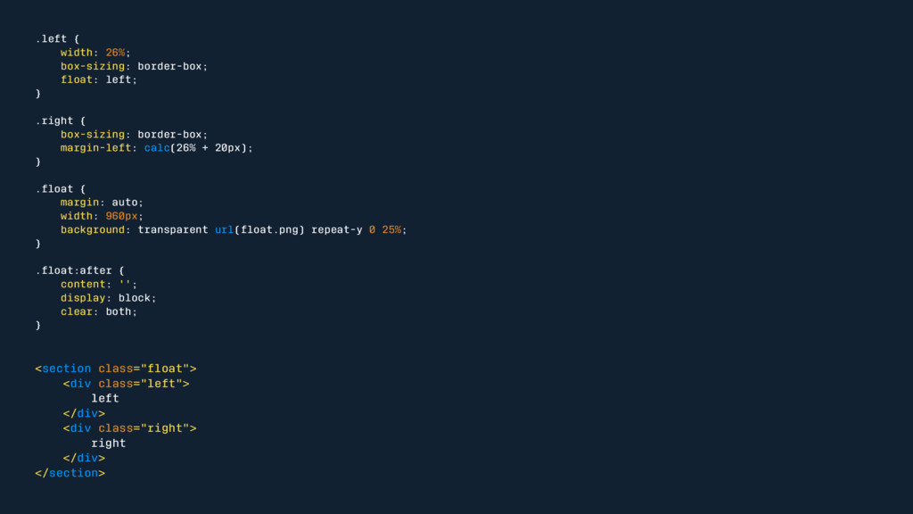
.left { width: 26%; box-sizing: border-box; float: left; } .right
{ box-sizing: border-box; margin-left: calc(26% + 20px); } .float { margin: auto; width: 960px; background: transparent url(float.png) repeat-y 0 25%; } .float:after { content: ''; display: block; clear: both; } <section class="float"> <div class="left"> left </div> <div class="right"> right </div> </section>
Floats are evil There must be a better way
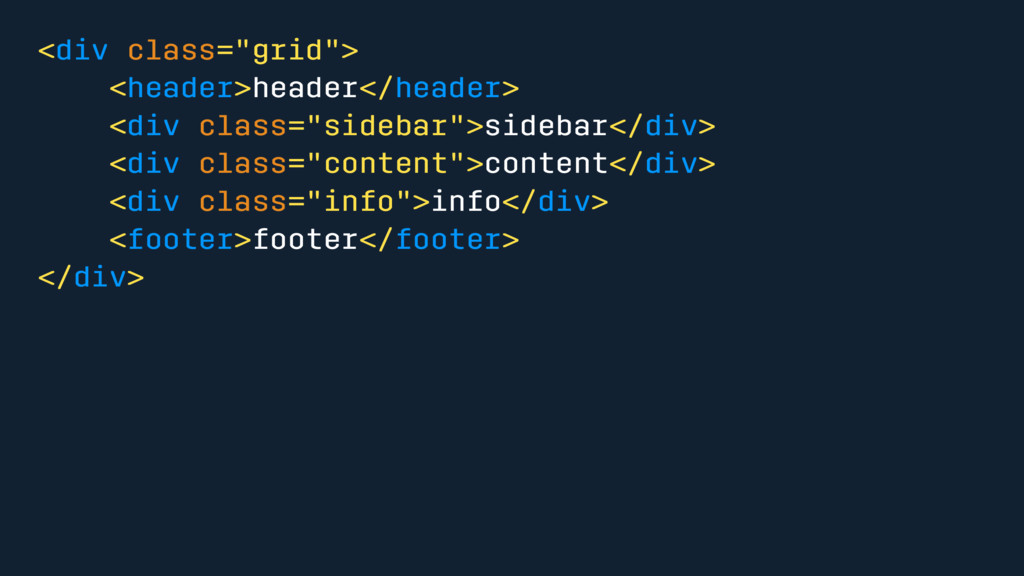
CSS Grid
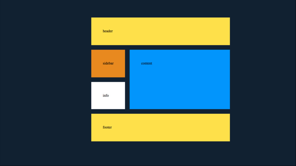
<div class="grid"> <header>header</header> <div class="sidebar">sidebar</div> <div class="content">content</div> <div class="info">info</div> <footer>footer</footer>
</div>
None
None
None
None
None
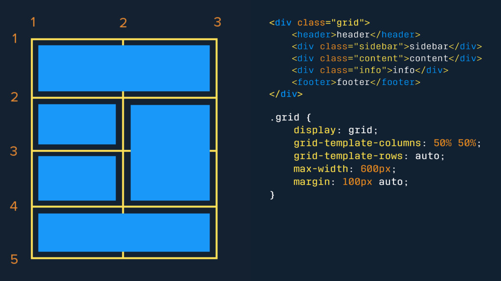
<div class="grid"> <header>header</header> <div class="sidebar">sidebar</div> <div class="content">content</div> <div class="info">info</div> <footer>footer</footer>
</div> .grid { display: grid; grid-template-columns: 50% 50%; grid-template-rows: auto; max-width: 600px; margin: 100px auto; }
None
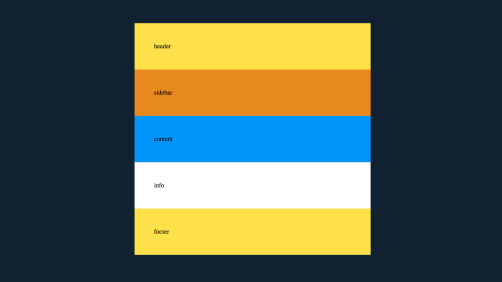
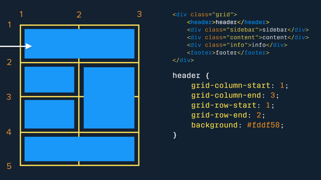
<div class="grid"> <header>header</header> <div class="sidebar">sidebar</div> <div class="content">content</div> <div class="info">info</div> <footer>footer</footer>
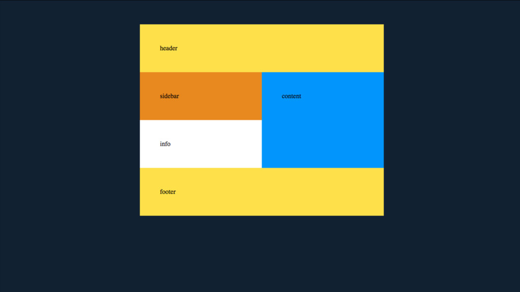
</div> header { grid-column-start: 1; grid-column-end: 3; grid-row-start: 1; grid-row-end: 2; background: #fddf58; }
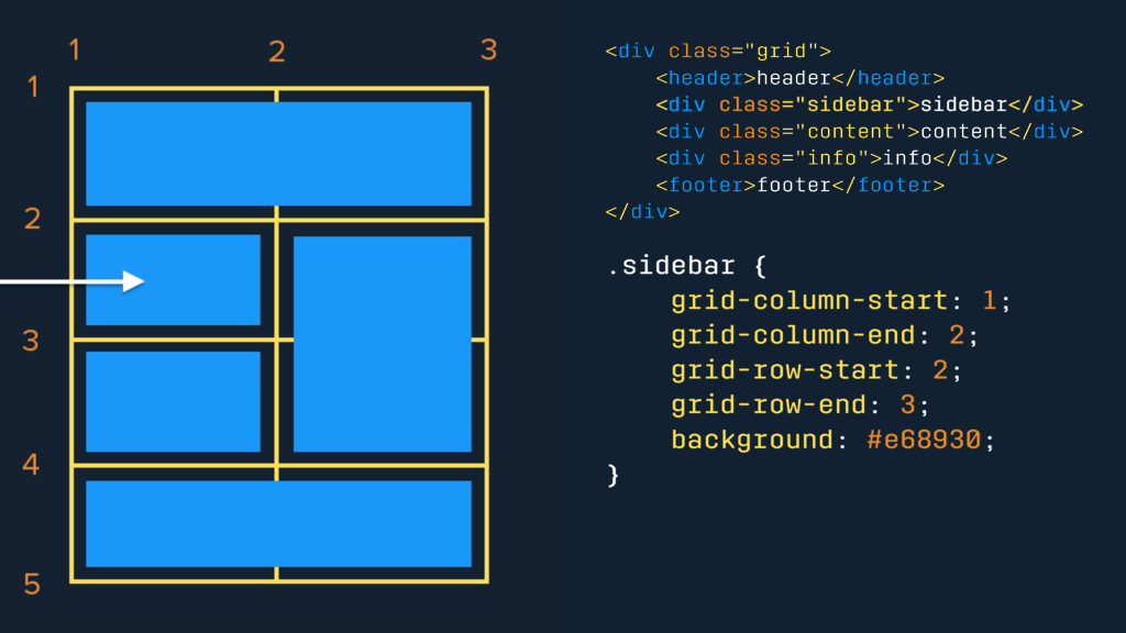
<div class="grid"> <header>header</header> <div class="sidebar">sidebar</div> <div class="content">content</div> <div class="info">info</div> <footer>footer</footer>
</div> .sidebar { grid-column-start: 1; grid-column-end: 2; grid-row-start: 2; grid-row-end: 3; background: #e68930; }
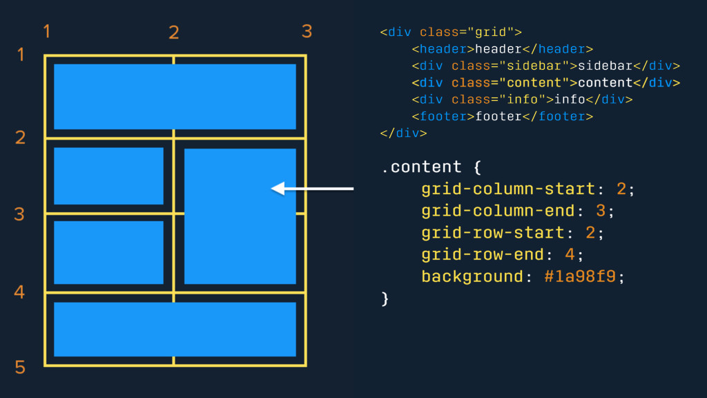
<div class="grid"> <header>header</header> <div class="sidebar">sidebar</div> <div class="content">content</div> <div class="info">info</div> <footer>footer</footer>
</div> .content { grid-column-start: 2; grid-column-end: 3; grid-row-start: 2; grid-row-end: 4; background: #1a98f9; }
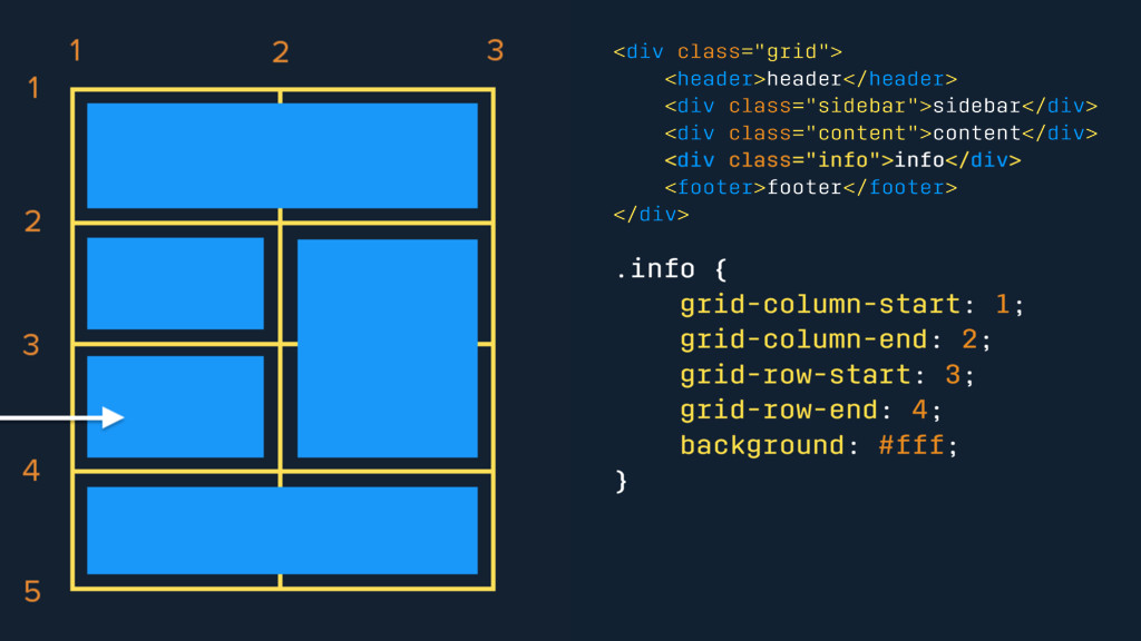
<div class="grid"> <header>header</header> <div class="sidebar">sidebar</div> <div class="content">content</div> <div class="info">info</div> <footer>footer</footer>
</div> .info { grid-column-start: 1; grid-column-end: 2; grid-row-start: 3; grid-row-end: 4; background: #fff; }
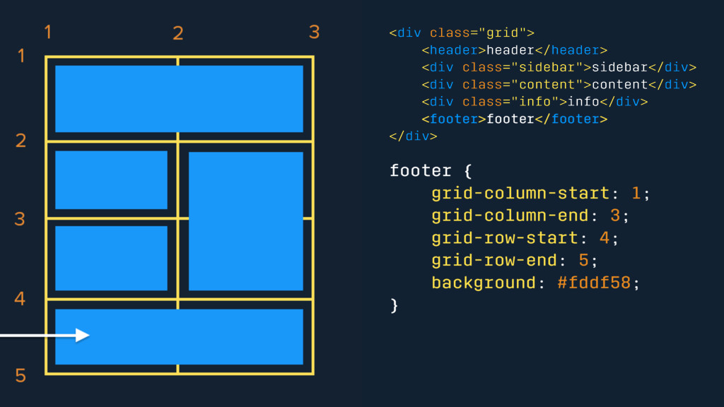
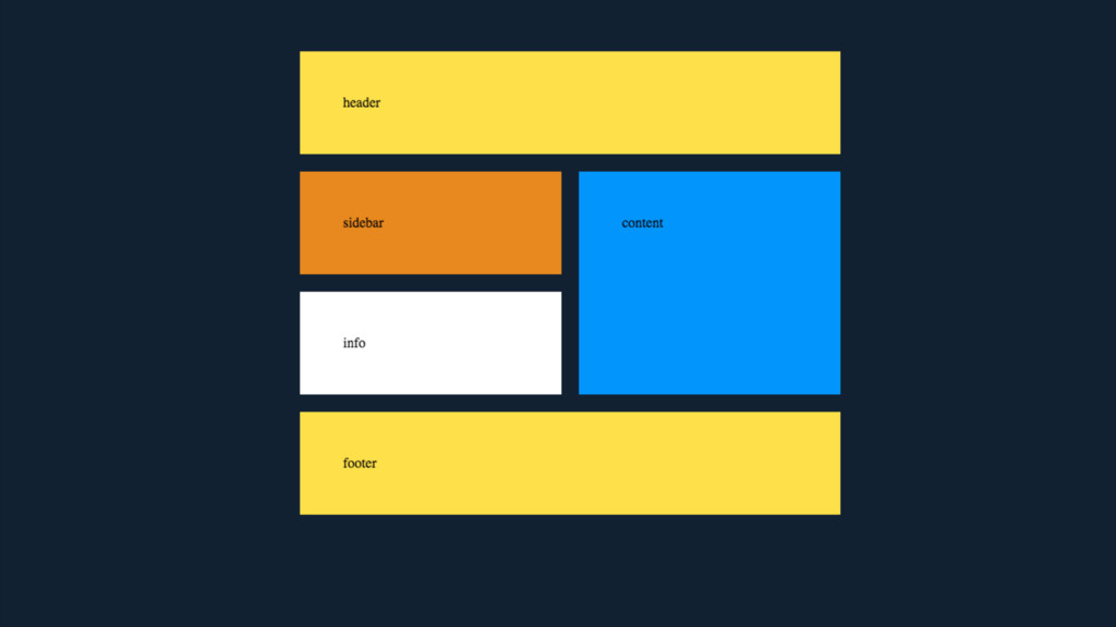
<div class="grid"> <header>header</header> <div class="sidebar">sidebar</div> <div class="content">content</div> <div class="info">info</div> <footer>footer</footer>
</div> footer { grid-column-start: 1; grid-column-end: 3; grid-row-start: 4; grid-row-end: 5; background: #fddf58; }
None
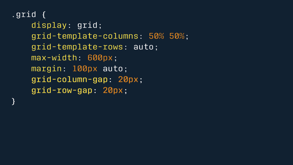
.grid { display: grid; grid-template-columns: 50% 50%; grid-template-rows: auto; max-width:
600px; margin: 100px auto; grid-column-gap: 20px; grid-row-gap: 20px; }
None
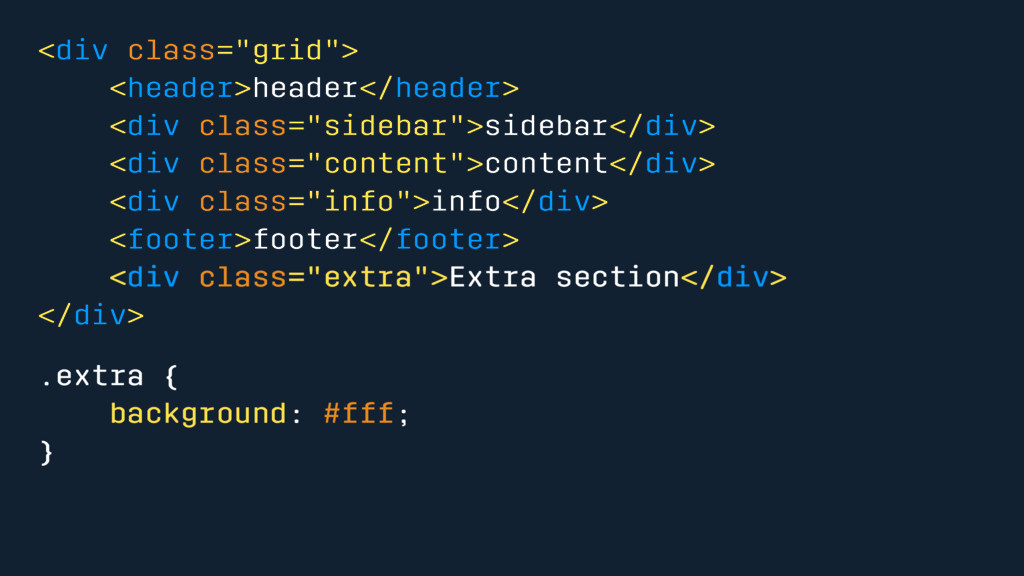
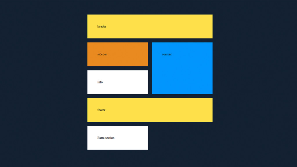
<div class="grid"> <header>header</header> <div class="sidebar">sidebar</div> <div class="content">content</div> <div class="info">info</div> <footer>footer</footer>
<div class="extra">Extra section</div> </div> .extra { background: #fff; }
None
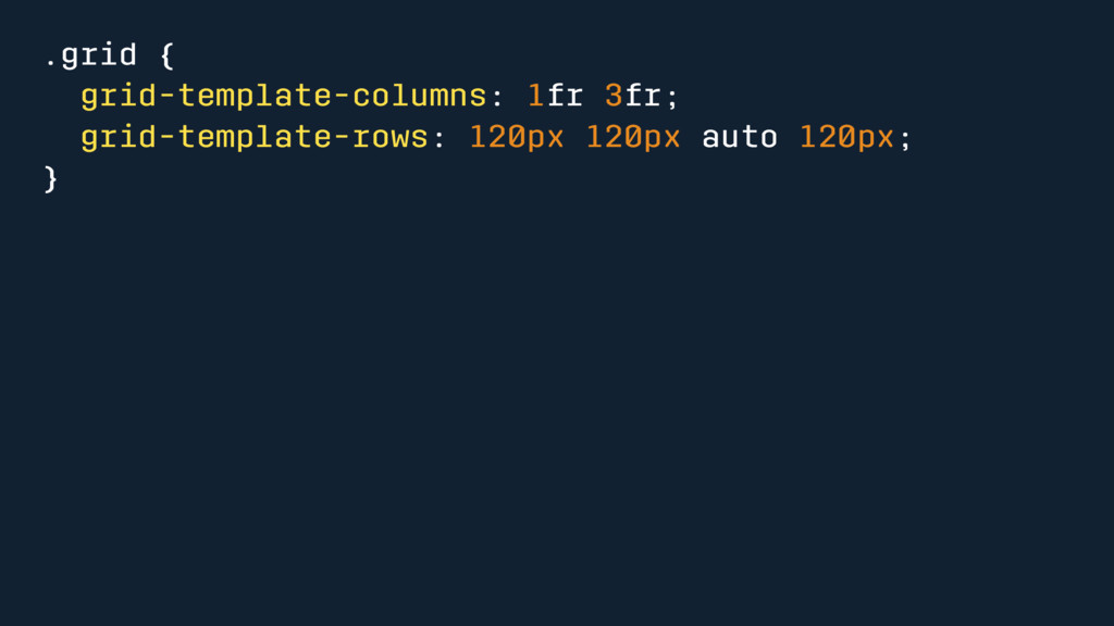
Implicit and Explicit Grid
.grid { grid-template-columns: 1fr 3fr; grid-template-rows: 120px 120px auto 120px;
}
None
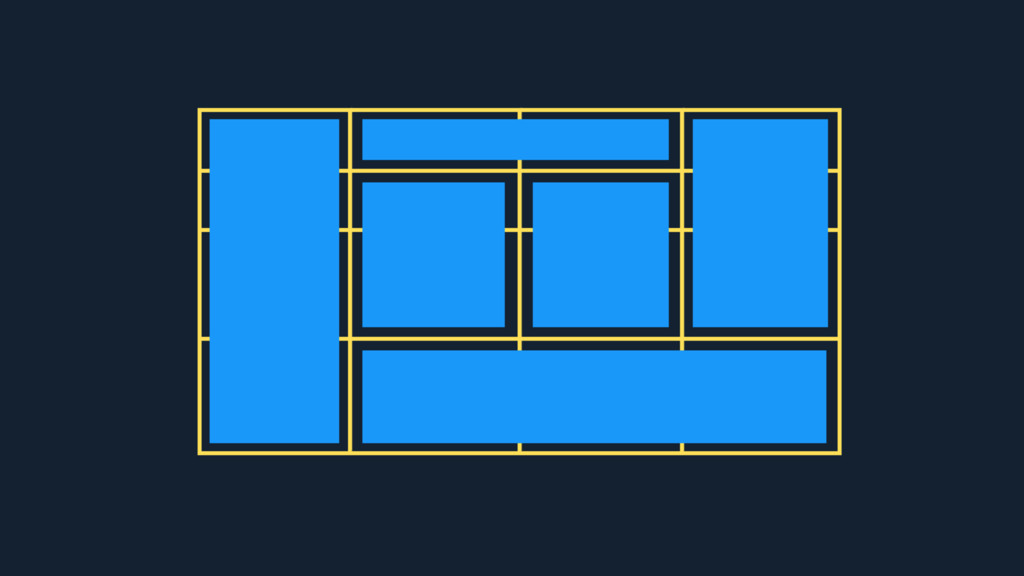
Complex Layouts
None
Do you need a framework?
Nope
Ascii Art \`\ /`/ \ V / /. .\ =\
T /= / ^ \ /\\ //\ __\ " " /__ (____/^\____)
None
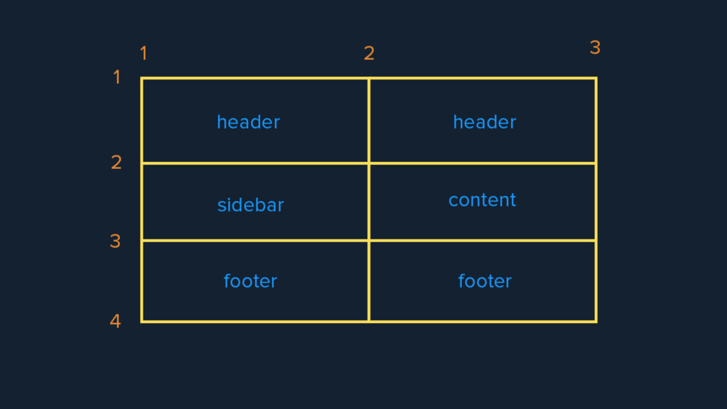
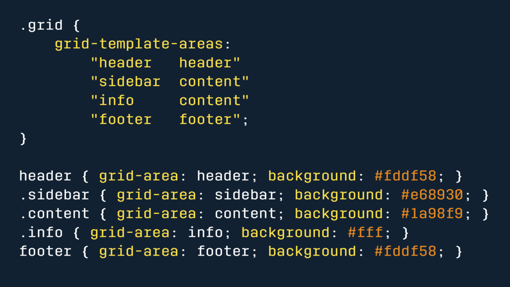
.grid { grid-template-areas: "header header" "sidebar content" "info content" "footer
footer"; } header { grid-area: header; background: #fddf58; } .sidebar { grid-area: sidebar; background: #e68930; } .content { grid-area: content; background: #1a98f9; } .info { grid-area: info; background: #fff; } footer { grid-area: footer; background: #fddf58; }
None
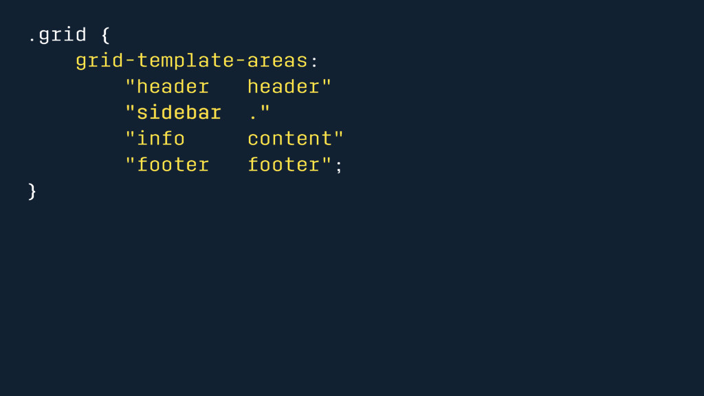
.grid { grid-template-areas: "header header" "sidebar ." "info content" "footer
footer"; }
None
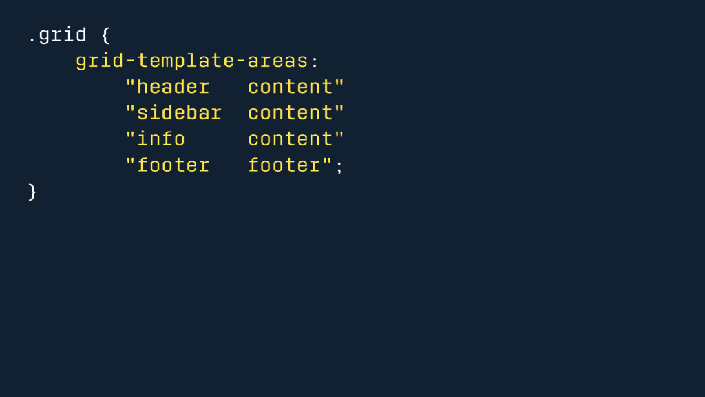
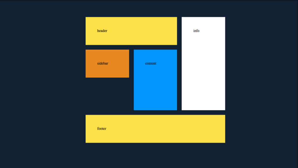
.grid { grid-template-areas: "header content" "sidebar content" "info content" "footer
footer"; }
None
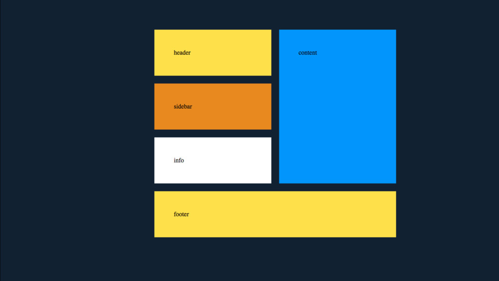
.grid { grid-template-areas: "header header info" "sidebar content info" ".
content info" "footer footer footer"; } .grid { grid-template-columns: 1fr 1fr 1fr; grid-template-rows: 120px 120px 120px 120px; }
None
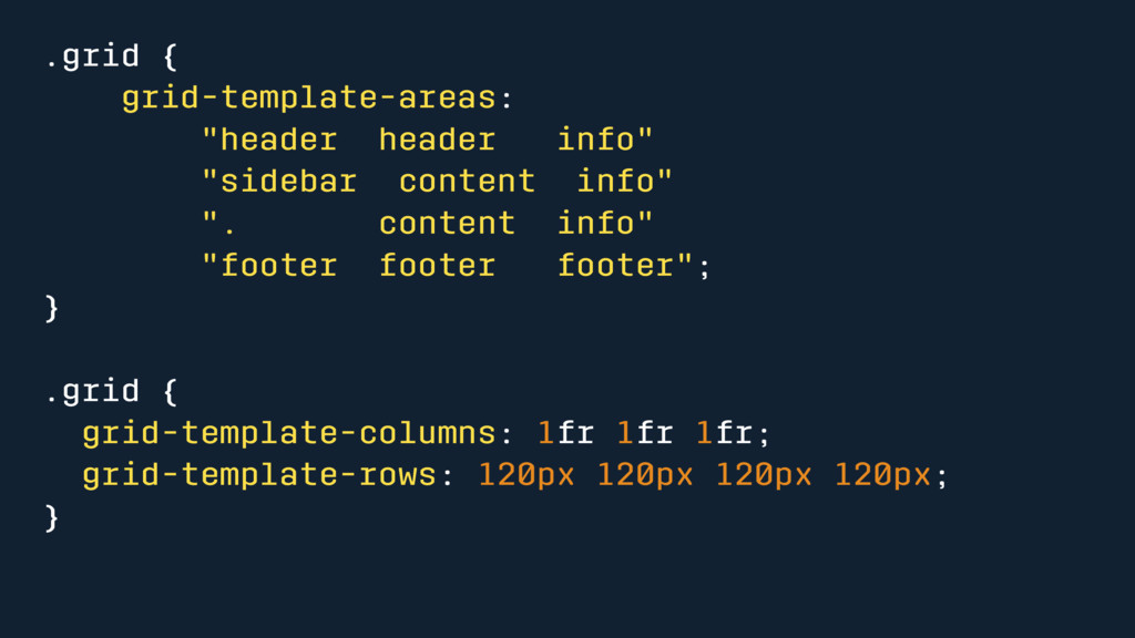
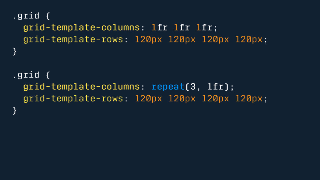
.grid { grid-template-columns: 1fr 1fr 1fr; grid-template-rows: 120px 120px 120px
120px; } .grid { grid-template-columns: repeat(3, 1fr); grid-template-rows: 120px 120px 120px 120px; }
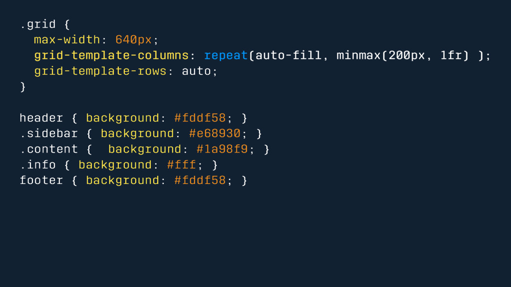
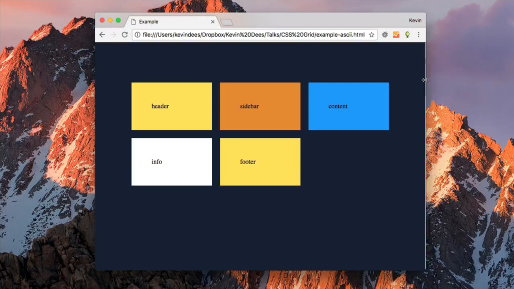
.grid { max-width: 640px; grid-template-columns: repeat(auto-fill, minmax(200px, 1fr) ); grid-template-rows:
auto; } header { background: #fddf58; } .sidebar { background: #e68930; } .content { background: #1a98f9; } .info { background: #fff; } footer { background: #fddf58; }
None
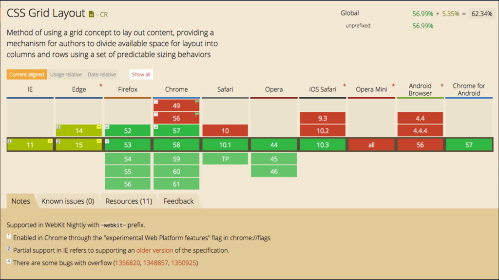
Browser Support
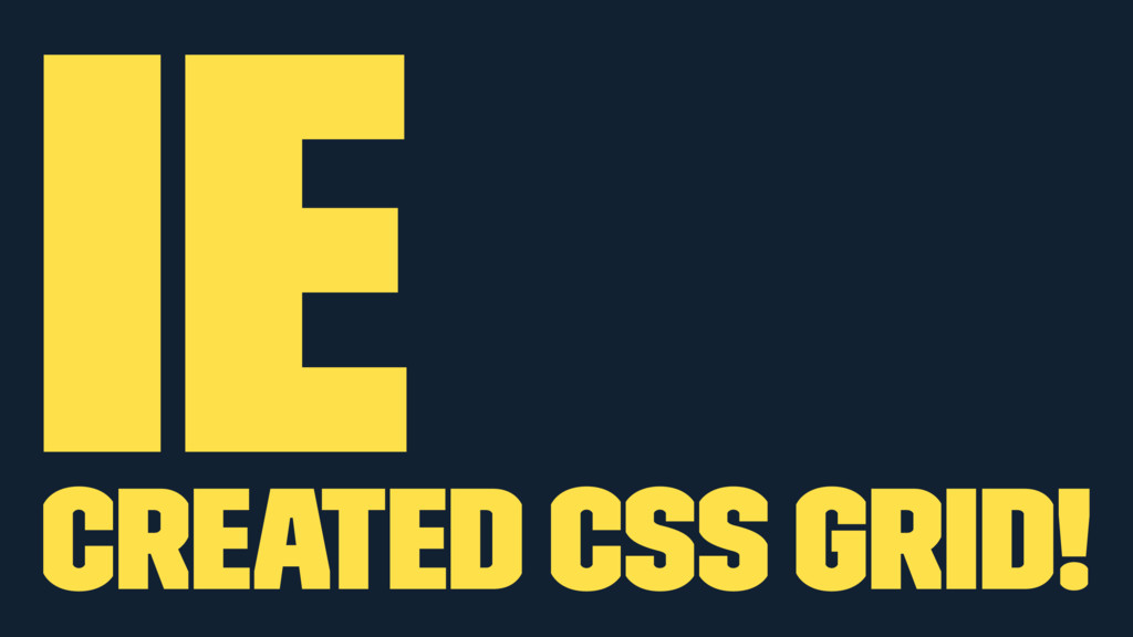
IE Created CSS Grid!
None
None
Are we back to browser sniffing?
None
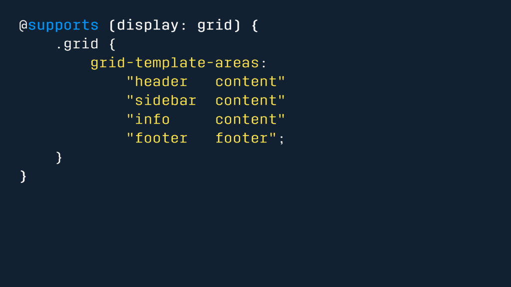
@supports (display: grid) { .grid { grid-template-areas: "header content" "sidebar
content" "info content" "footer footer"; } }
Fallbacks
Flexbox
Accessability
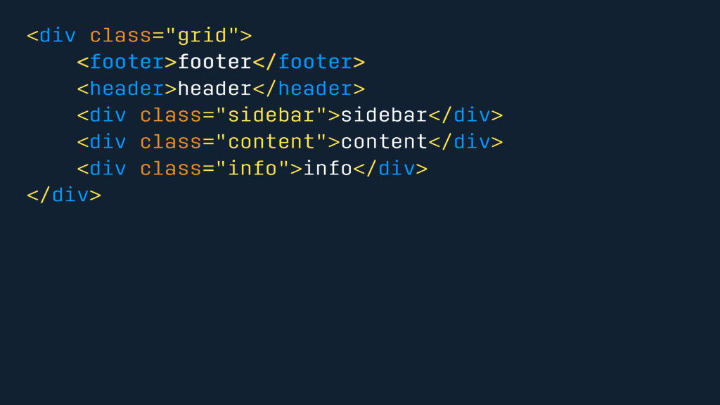
<div class="grid"> <footer>footer</footer> <header>header</header> <div class="sidebar">sidebar</div> <div class="content">content</div> <div class="info">info</div>
</div>
Rachel Andrews - Grid by Design
Rachel Andrews - Talk
“Great web design starts with the grid”
 kevindees
 kotetuco
.png) yuriko1211
yuriko1211
 panda728
 mogamit
 minodriven
 ike002jp
 funnyycat
 luccafort
 mu7889yoon
 koukimiura
 manfredsteyer
 cockscomb
 scottboms
 tmiket
 kneath
 paigeccino
 nonsquared
 moore
moore
 kimpetersen
 codingconduct
 addyosmani
 marktimemedia
 jonoalderson
 pwiseman