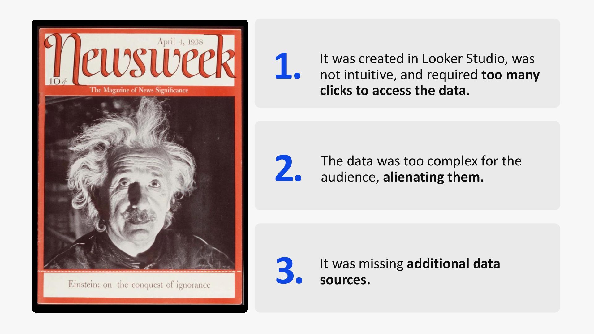
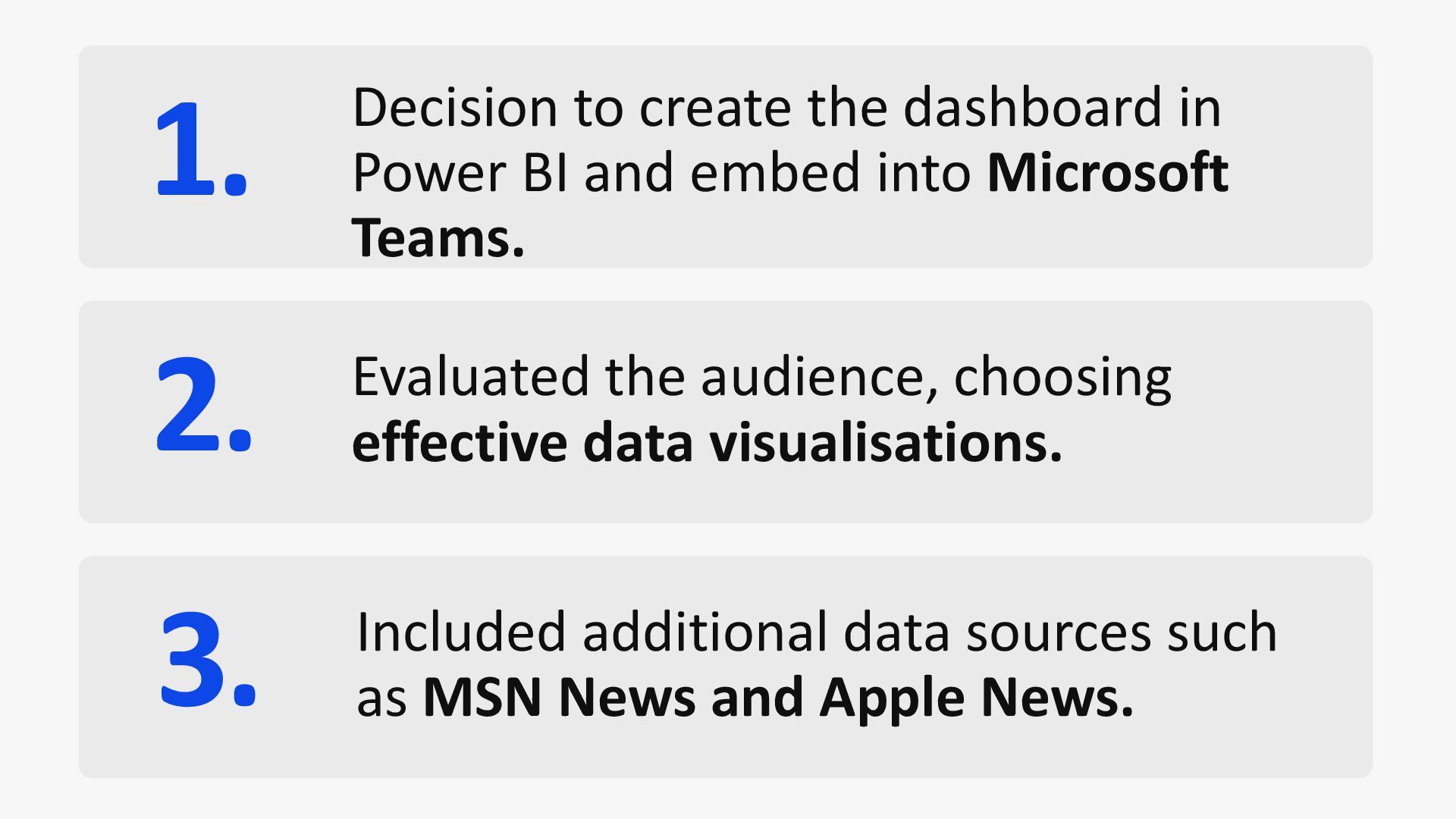
and required too many clicks to access the data. 2. The data was too complex for the audience, alienating them. 3. It was missing additional data sources.
embed into Microsoft Teams. 2. Evaluated the audience, choosing effective data visualisations. 3. Included additional data sources such as MSN News and Apple News.
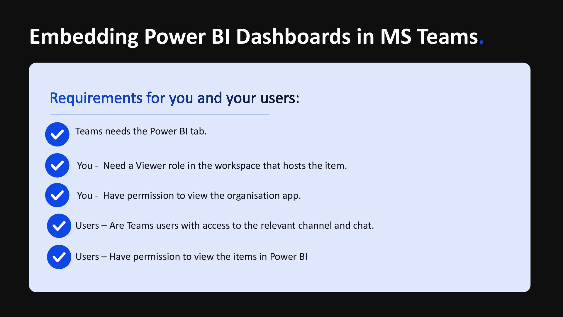
Power BI tab. You - Need a Viewer role in the workspace that hosts the item. You - Have permission to view the organisation app. Users – Are Teams users with access to the relevant channel and chat. Users – Have permission to view the items in Power BI
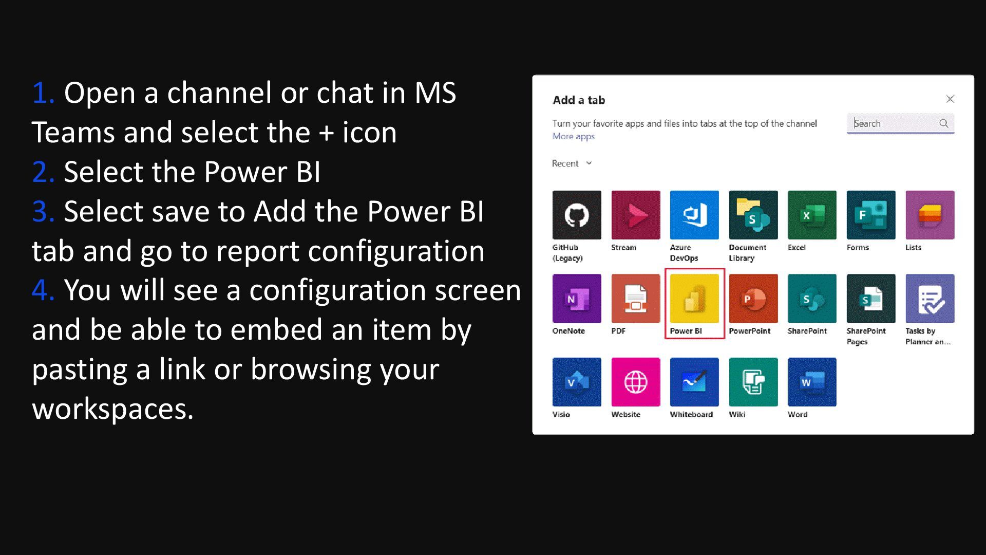
select the + icon 2. Select the Power BI 3. Select save to Add the Power BI tab and go to report configuration 4. You will see a configuration screen and be able to embed an item by pasting a link or browsing your workspaces.
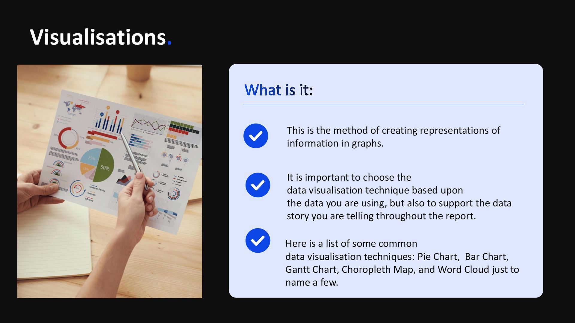
in graphs. It is important to choose the data visualisation technique based upon the data you are using, but also to support the data story you are telling throughout the report. Here is a list of some common data visualisation techniques: Pie Chart, Bar Chart, Gantt Chart, Choropleth Map, and Word Cloud just to name a few.
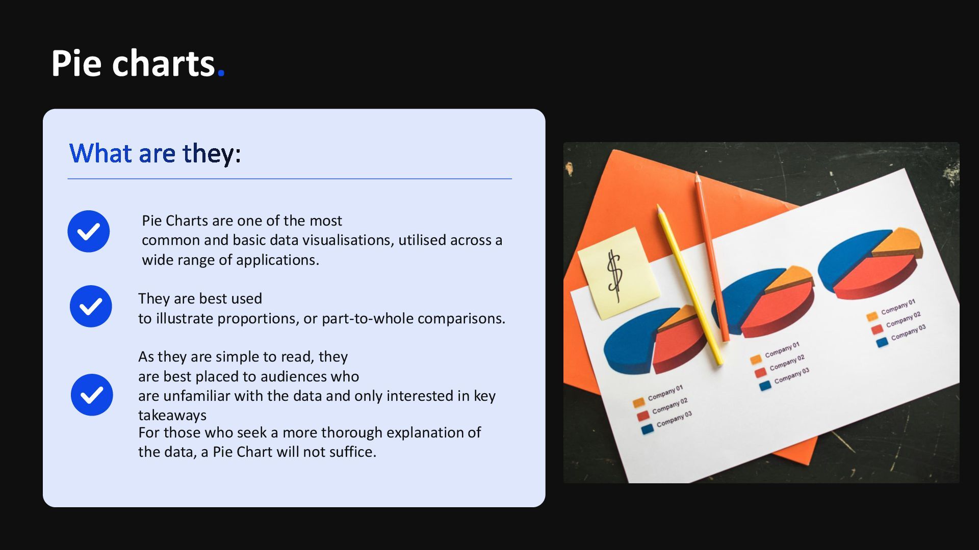
and basic data visualisations, utilised across a wide range of applications. They are best used to illustrate proportions, or part-to-whole comparisons. As they are simple to read, they are best placed to audiences who are unfamiliar with the data and only interested in key takeaways For those who seek a more thorough explanation of the data, a Pie Chart will not suffice.
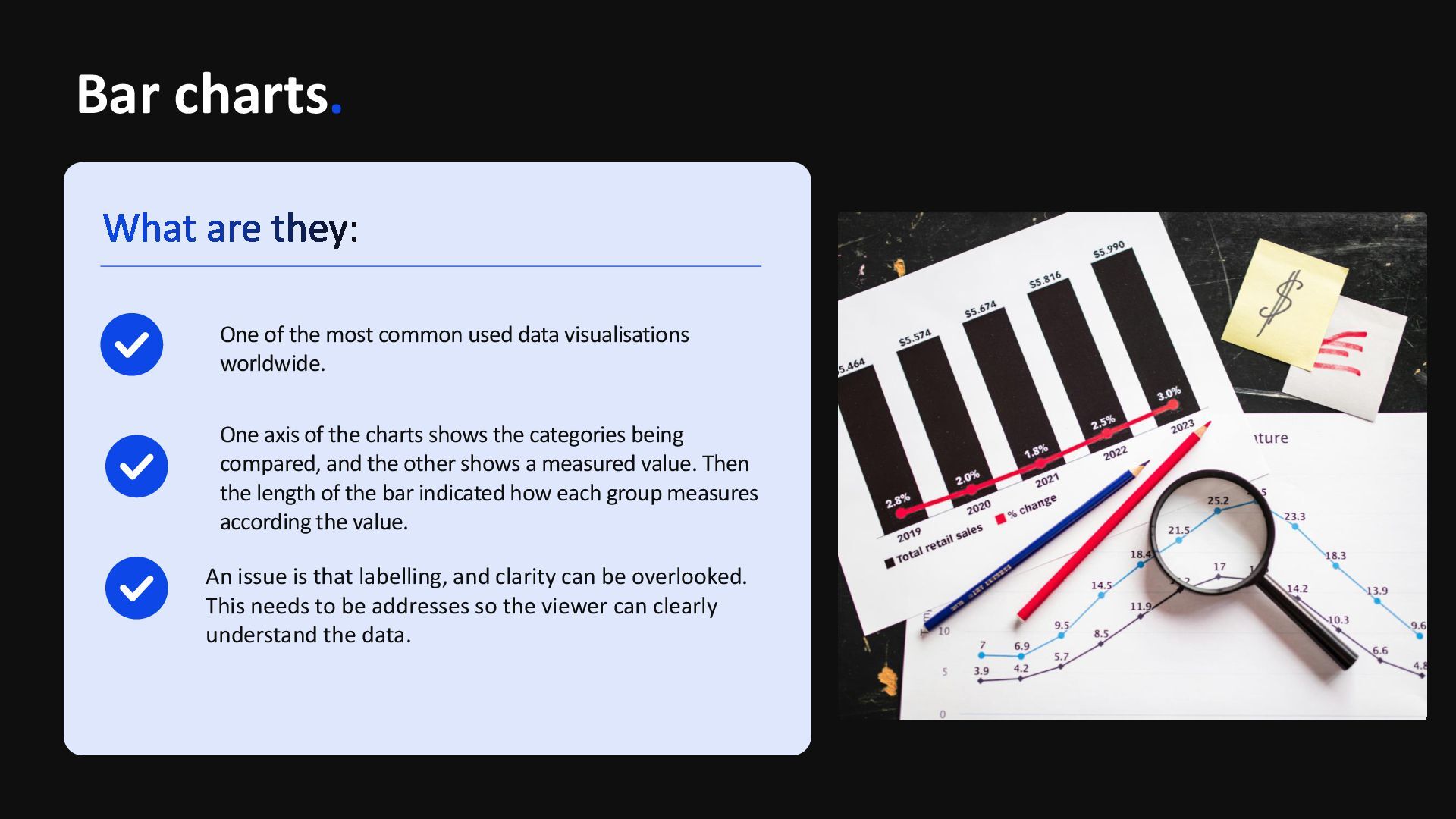
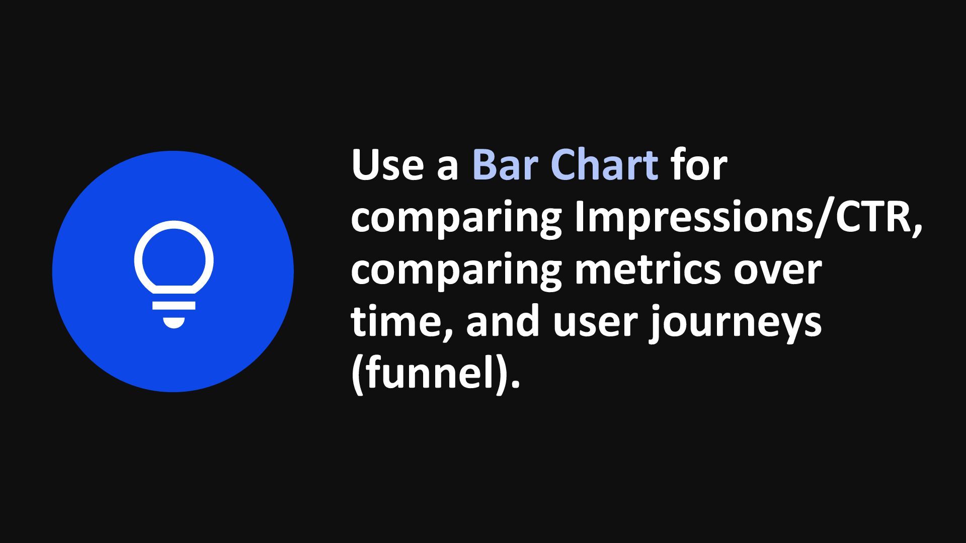
being compared, and the other shows a measured value. Then the length of the bar indicated how each group measures according the value. An issue is that labelling, and clarity can be overlooked. This needs to be addresses so the viewer can clearly understand the data. One of the most common used data visualisations worldwide.
on the vertical axis and time intervals on the horizontal axis. The horizontal bars in the body of the chart represent the duration of each activity. Gantt Charts are popular within project management, as they demonstrate project timelines or progression of tasks. Gantt charts are effective at showcasing timelines to enable viewers to understand every aspect of media activity deployed.
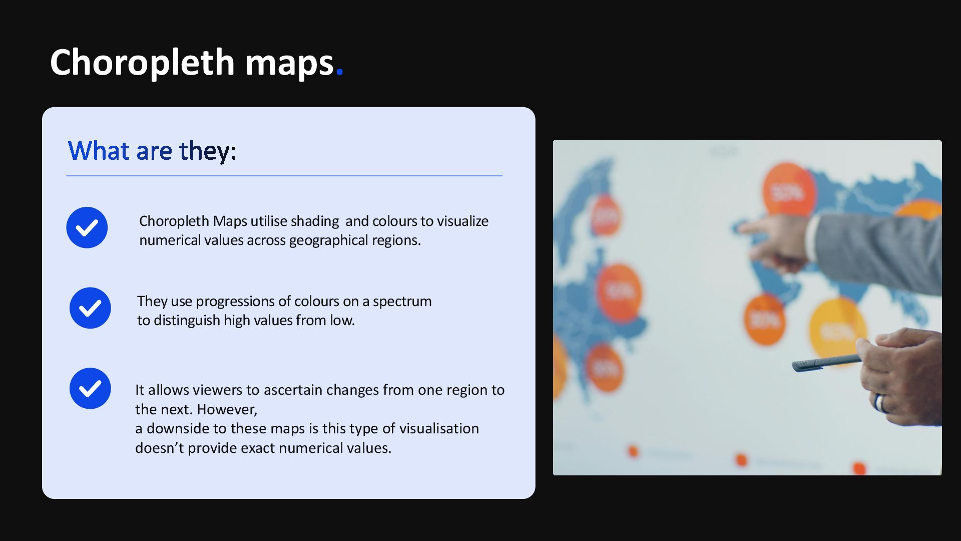
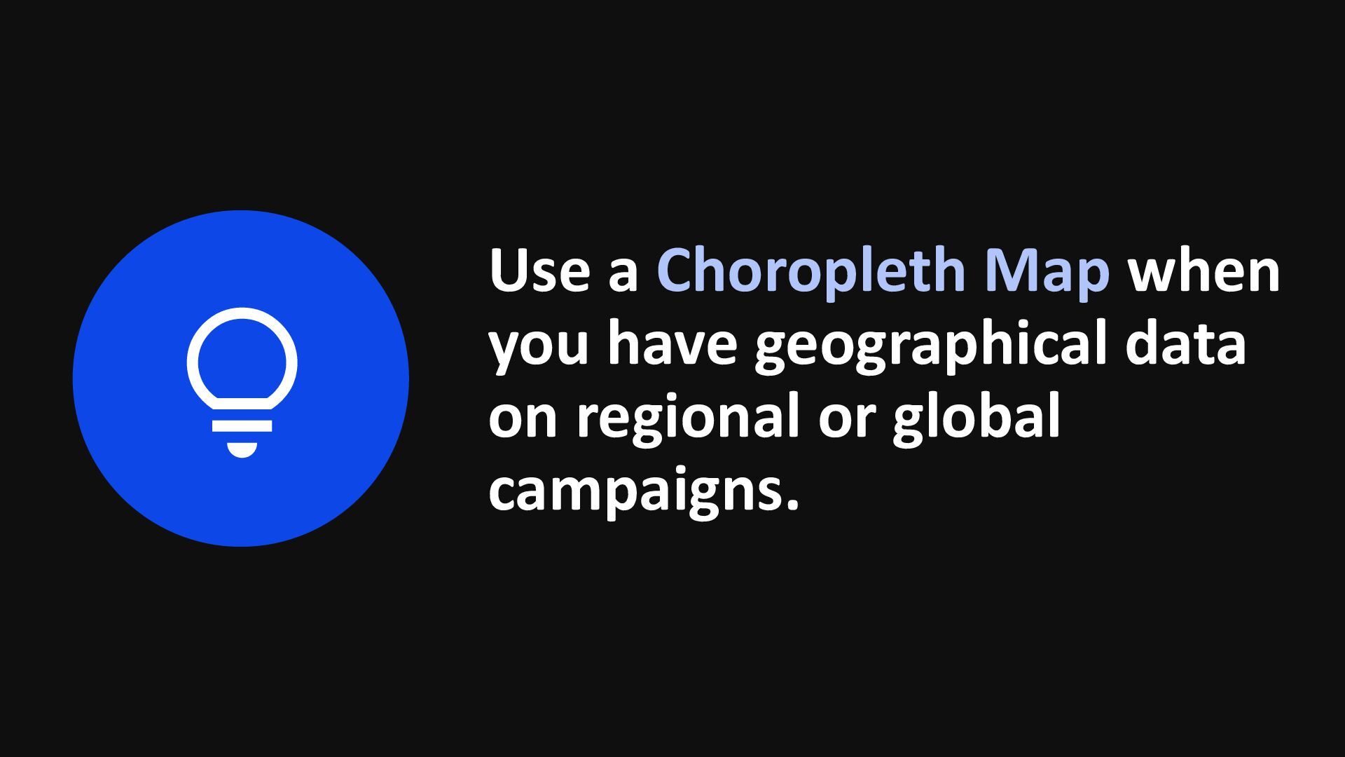
to distinguish high values from low. Choropleth Maps utilise shading and colours to visualize numerical values across geographical regions. It allows viewers to ascertain changes from one region to the next. However, a downside to these maps is this type of visualisation doesn’t provide exact numerical values.
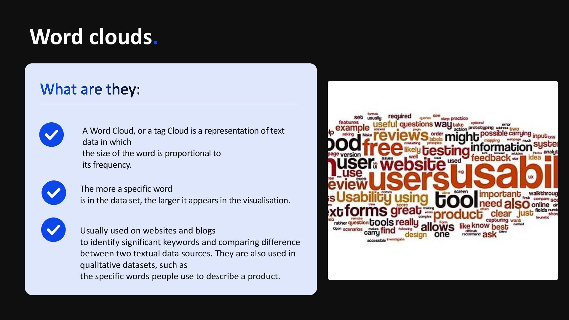
data set, the larger it appears in the visualisation. A Word Cloud, or a tag Cloud is a representation of text data in which the size of the word is proportional to its frequency. Usually used on websites and blogs to identify significant keywords and comparing difference between two textual data sources. They are also used in qualitative datasets, such as the specific words people use to describe a product.