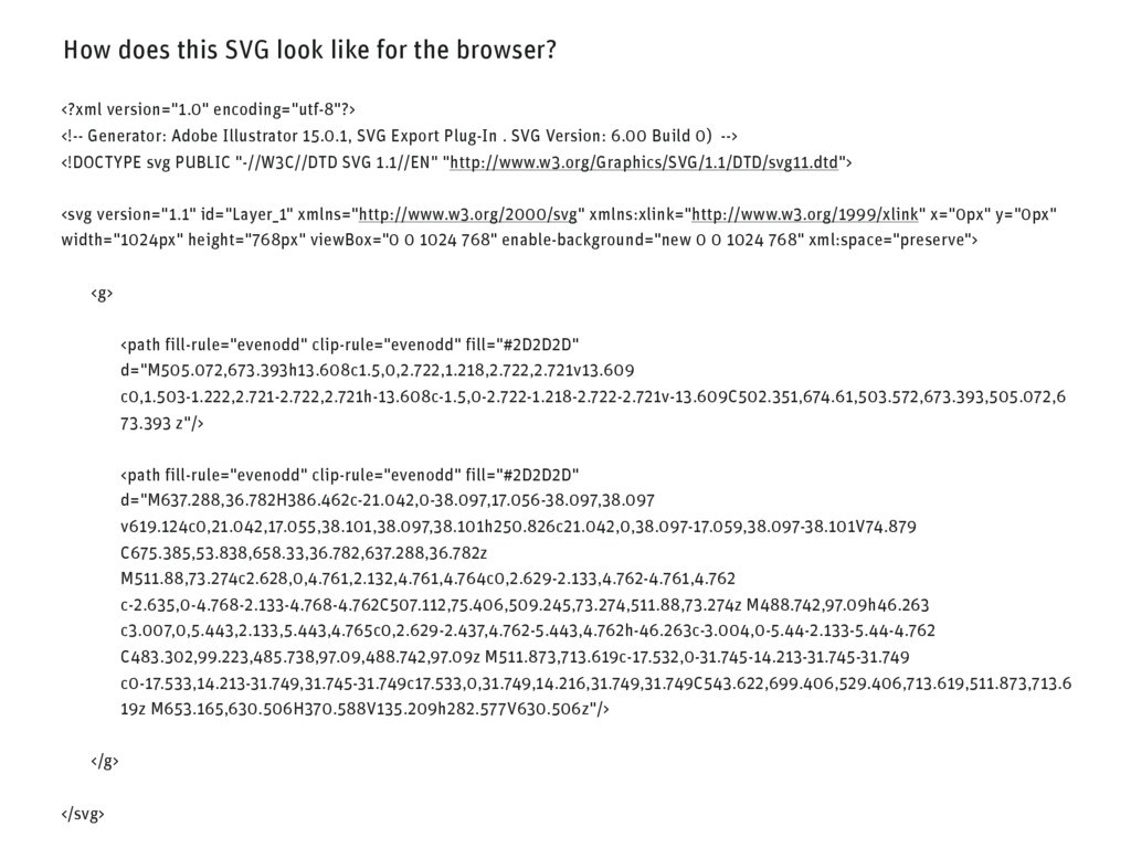
version="1.0" encoding="utf-8"?> <!-- Generator: Adobe Illustrator 15.0.1, SVG Export Plug-In . SVG Version: 6.00 Build 0) --> <!DOCTYPE svg PUBLIC "-//W3C//DTD SVG 1.1//EN" "http://www.w3.org/Graphics/SVG/1.1/DTD/svg11.dtd"> <svg version="1.1" id="Layer_1" xmlns="http://www.w3.org/2000/svg" xmlns:xlink="http://www.w3.org/1999/xlink" x="0px" y="0px" width="1024px" height="768px" viewBox="0 0 1024 768" enable-background="new 0 0 1024 768" xml:space="preserve"> <g> <path fill-rule="evenodd" clip-rule="evenodd" fill="#2D2D2D" d="M505.072,673.393h13.608c1.5,0,2.722,1.218,2.722,2.721v13.609 c0,1.503-1.222,2.721-2.722,2.721h-13.608c-1.5,0-2.722-1.218-2.722-2.721v-13.609C502.351,674.61,503.572,673.393,505.072,6 73.393 z"/> <path fill-rule="evenodd" clip-rule="evenodd" fill="#2D2D2D" d="M637.288,36.782H386.462c-21.042,0-38.097,17.056-38.097,38.097 v619.124c0,21.042,17.055,38.101,38.097,38.101h250.826c21.042,0,38.097-17.059,38.097-38.101V74.879 C675.385,53.838,658.33,36.782,637.288,36.782z M511.88,73.274c2.628,0,4.761,2.132,4.761,4.764c0,2.629-2.133,4.762-4.761,4.762 c-2.635,0-4.768-2.133-4.768-4.762C507.112,75.406,509.245,73.274,511.88,73.274z M488.742,97.09h46.263 c3.007,0,5.443,2.133,5.443,4.765c0,2.629-2.437,4.762-5.443,4.762h-46.263c-3.004,0-5.44-2.133-5.44-4.762 C483.302,99.223,485.738,97.09,488.742,97.09z M511.873,713.619c-17.532,0-31.745-14.213-31.745-31.749 c0-17.533,14.213-31.749,31.745-31.749c17.533,0,31.749,14.216,31.749,31.749C543.622,699.406,529.406,713.619,511.873,713.6 19z M653.165,630.506H370.588V135.209h282.577V630.506z"/> </g> </svg>
 kraenzmann
 ryu1013
 koyaman
 keita_yoshikawa
 takaikanako
 satosio
 usagimaru
 mhand01
 ajstarks
 bebe
bebe
 godlingkogami
 shoko_seven11
 securecat
 jonoalderson
 sferik
 emna__ayadi
 mlcsv
mlcsv
 ivargrimstad
 carmenintech
 skoyamalab
 palkan
 honzajavorek
 inesmontani
 marcoroth
 soudai
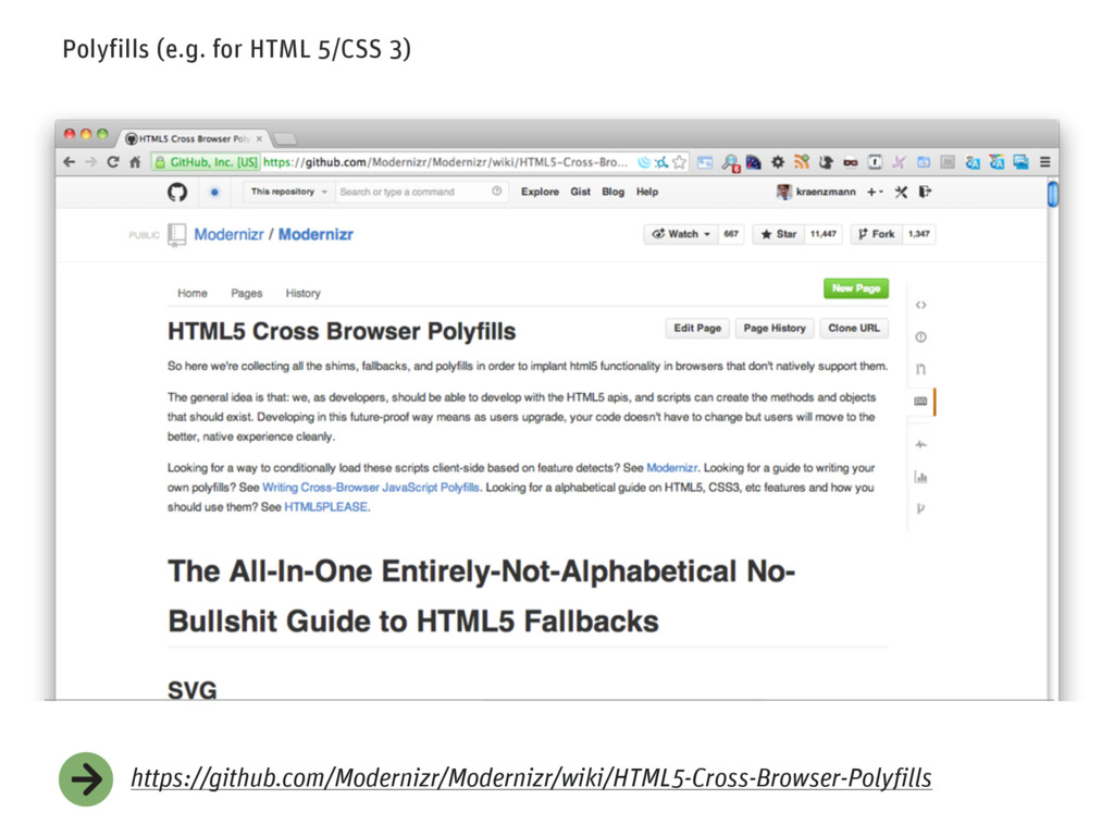