mostly to replace me because I mostly do the conference circuit... So we plunked him down at a desk and gave him a bunch of data. Well, then I quickly realized that even if you’re data minded, you still need guidance to make the leap to visuals... It’s a CREATIVE PROCESS. So, this session is about that. It’s spawned from discussions with Andrew, our data scientist. It’s our very informal, by the seat of your pants, process of jumping from data to visual data. 1
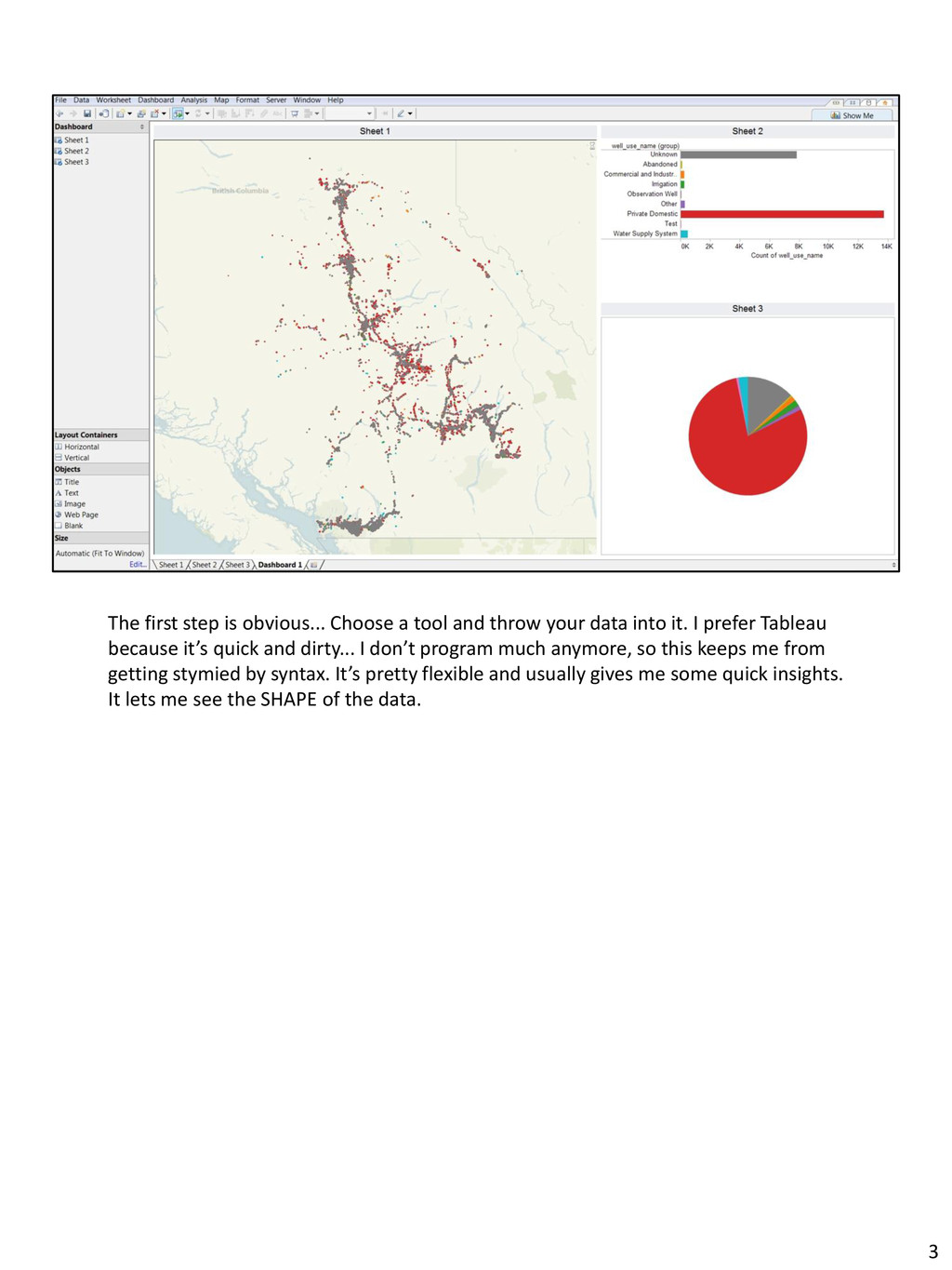
your data into it. I prefer Tableau because it’s quick and dirty... I don’t program much anymore, so this keeps me from getting stymied by syntax. It’s pretty flexible and usually gives me some quick insights. It lets me see the SHAPE of the data. 3
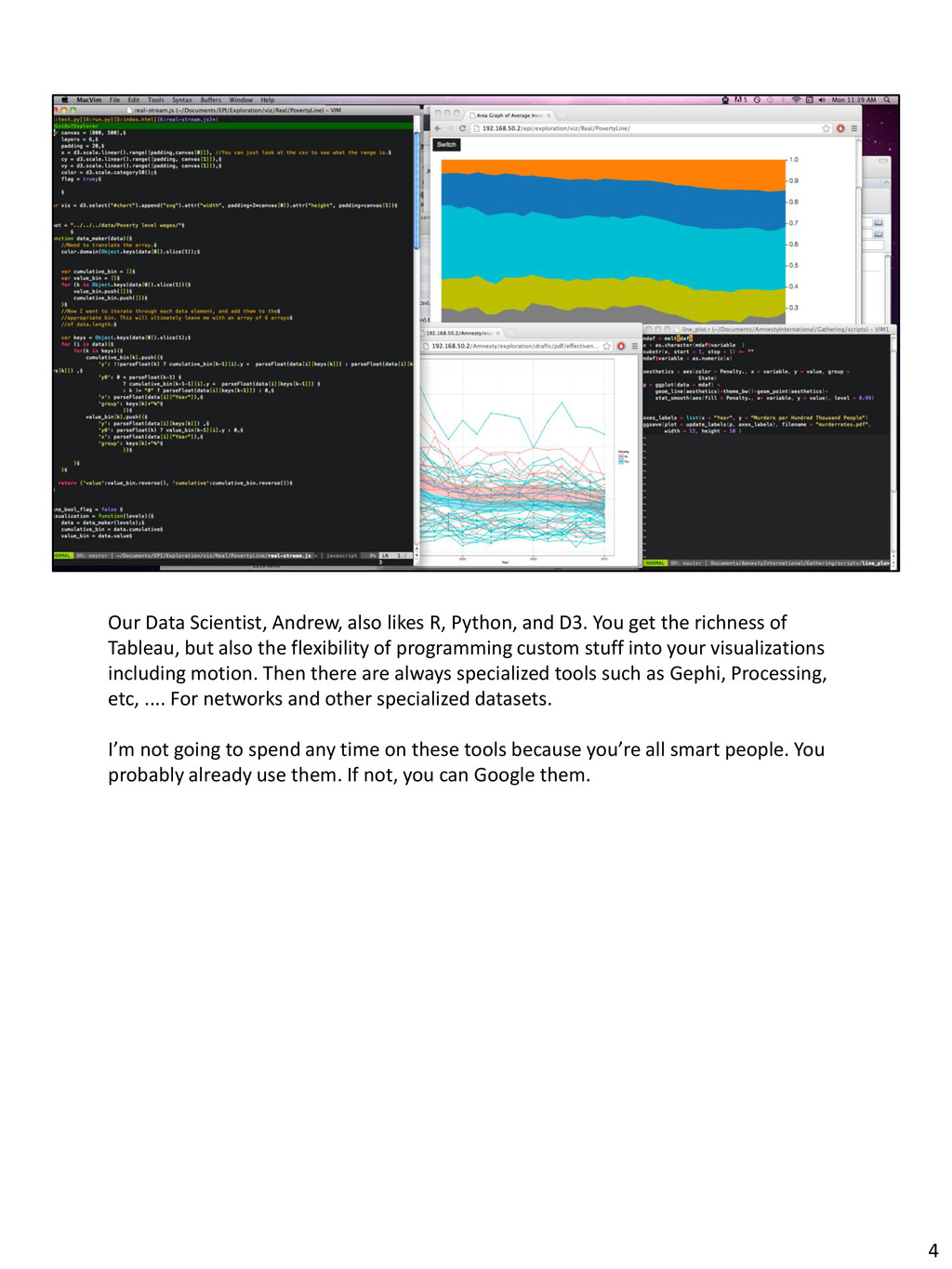
You get the richness of Tableau, but also the flexibility of programming custom stuff into your visualizations including motion. Then there are always specialized tools such as Gephi, Processing, etc, .... For networks and other specialized datasets. I’m not going to spend any time on these tools because you’re all smart people. You probably already use them. If not, you can Google them. 4
with your data for a day or so, you should take a step back. You’ve been heads down in the weeds of data for awhile, so you’ll need to get a new perspective on it. Now bear in mind, using one of those tools I just mentioned, you can leave the room right now and do pretty well by making charts and graphs. But in order to do cool viz stuff... You need to do all the rest of the stuff I’m going to talk about. This is where the magic and the hard work happens. It’s unthinking yourself out of those weeds of data. 5
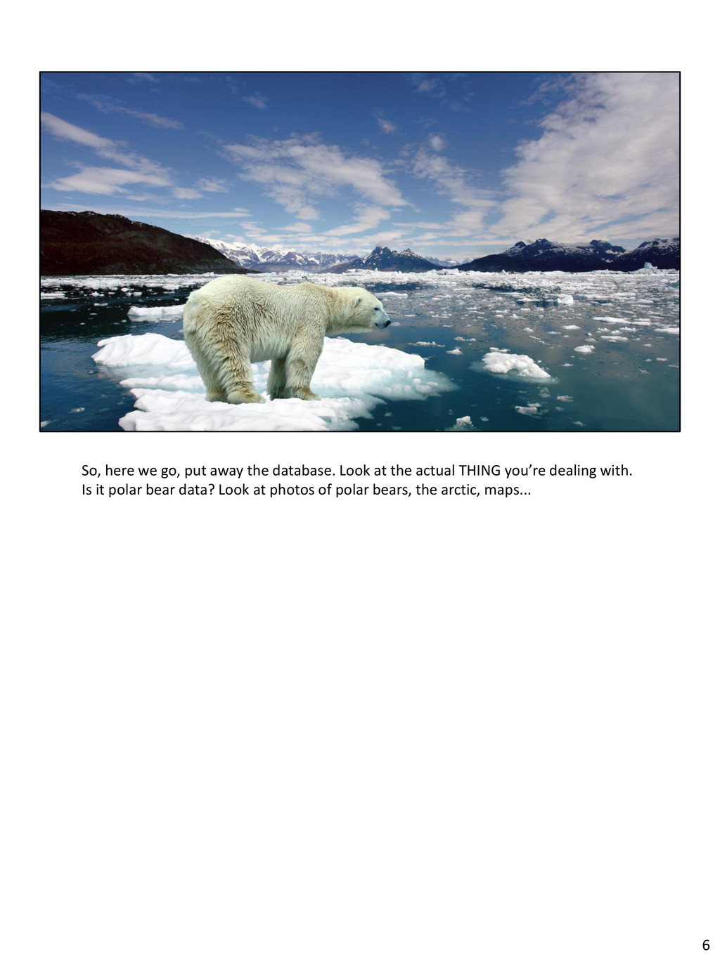
unexpected or even shocking things. When we started working on our polar bear project (that just launched) we noticed a datapoint called “harvest.” Harvest? That didn’t really sink in until you see a startling photo like this. “Harvest” means legally killing polar bears. This is both heartbreaking and beautiful. A traditional way of life crashing into a modern reality. And bear in mind that this traditional way of life didn’t endanger the bear population... It was the shrinking ice cap. 7
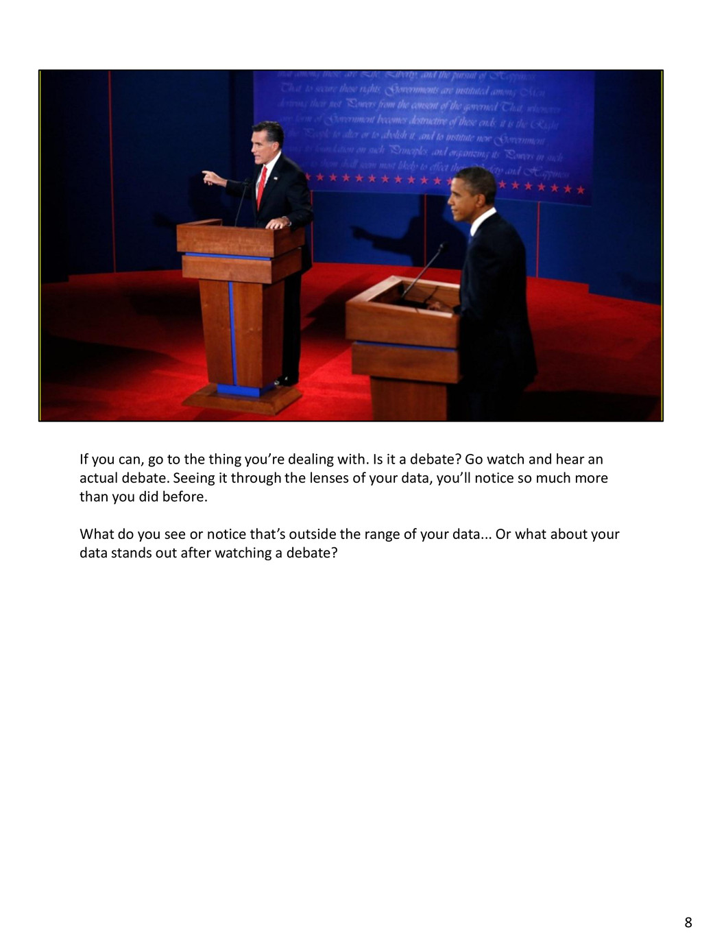
Is it a debate? Go watch and hear an actual debate. Seeing it through the lenses of your data, you’ll notice so much more than you did before. What do you see or notice that’s outside the range of your data... Or what about your data stands out after watching a debate? 8
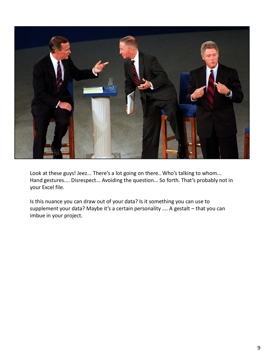
there.. Who’s talking to whom... Hand gestures.... Disrespect... Avoiding the question... So forth. That’s probably not in your Excel file. Is this nuance you can draw out of your data? Is it something you can use to supplement your data? Maybe it’s a certain personality .... A gestalt – that you can imbue in your project. 9
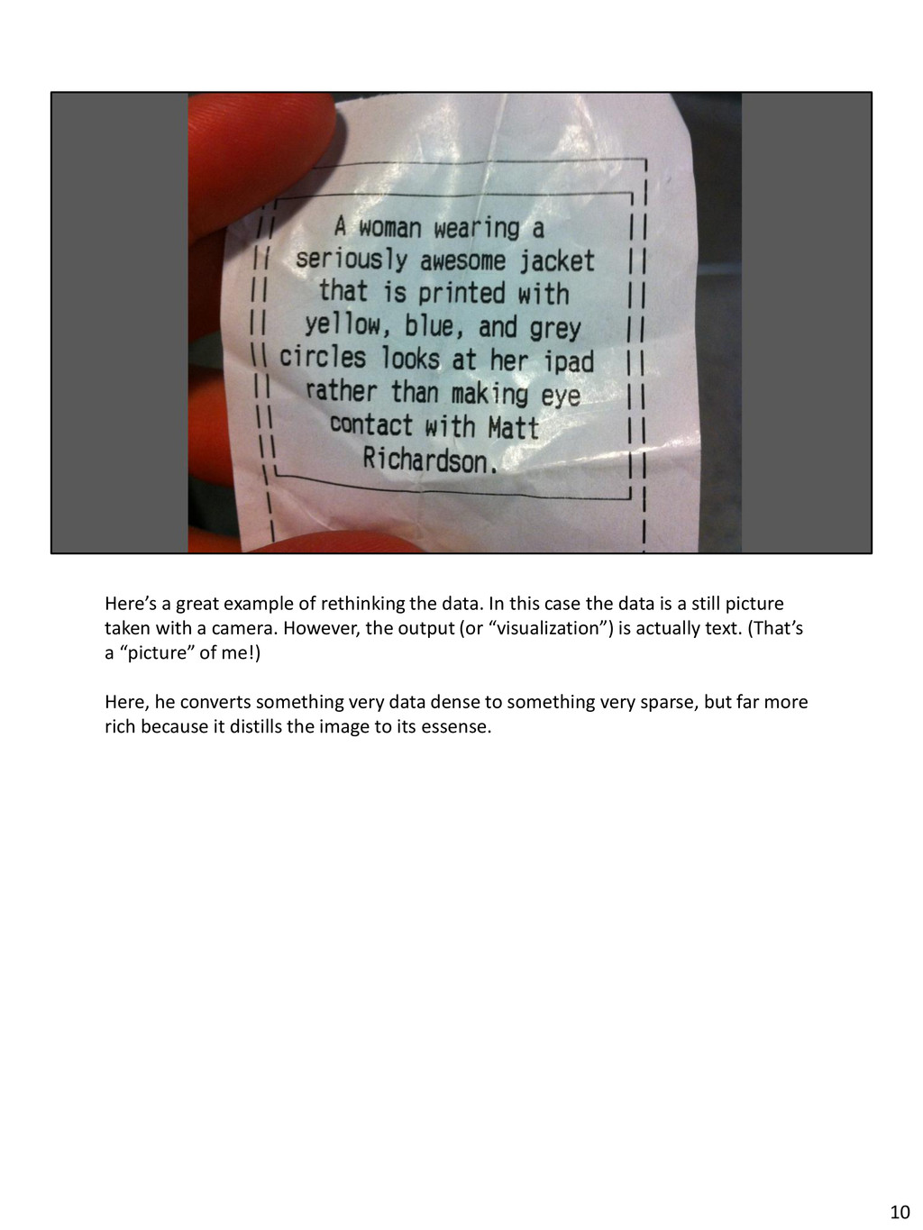
case the data is a still picture taken with a camera. However, the output (or “visualization”) is actually text. (That’s a “picture” of me!) Here, he converts something very data dense to something very sparse, but far more rich because it distills the image to its essense. 10
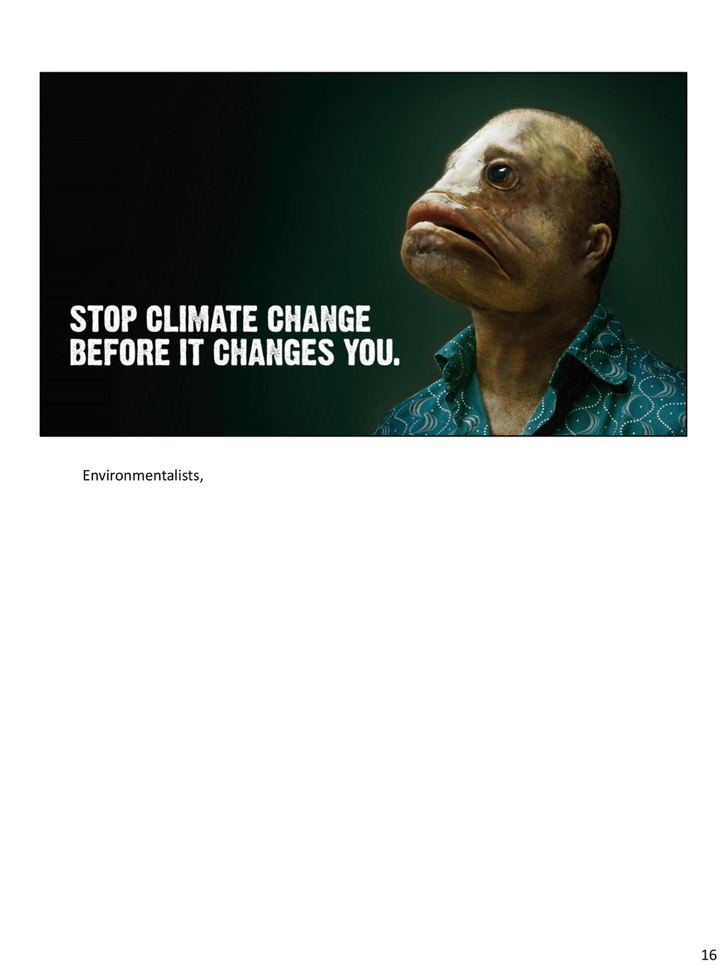
real world life. It’s salmon that are dying at sea before they can spawn, it’s kids being bullied, it’s people without enough money to feed their families. You need to confront the emotion of data. 11
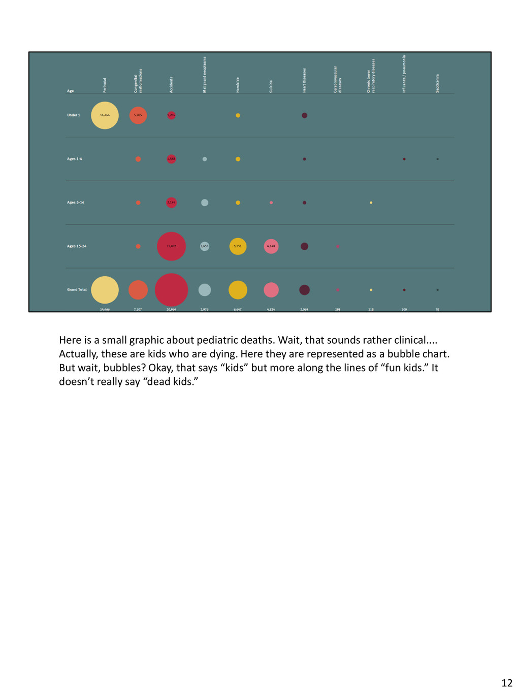
sounds rather clinical.... Actually, these are kids who are dying. Here they are represented as a bubble chart. But wait, bubbles? Okay, that says “kids” but more along the lines of “fun kids.” It doesn’t really say “dead kids.” 12
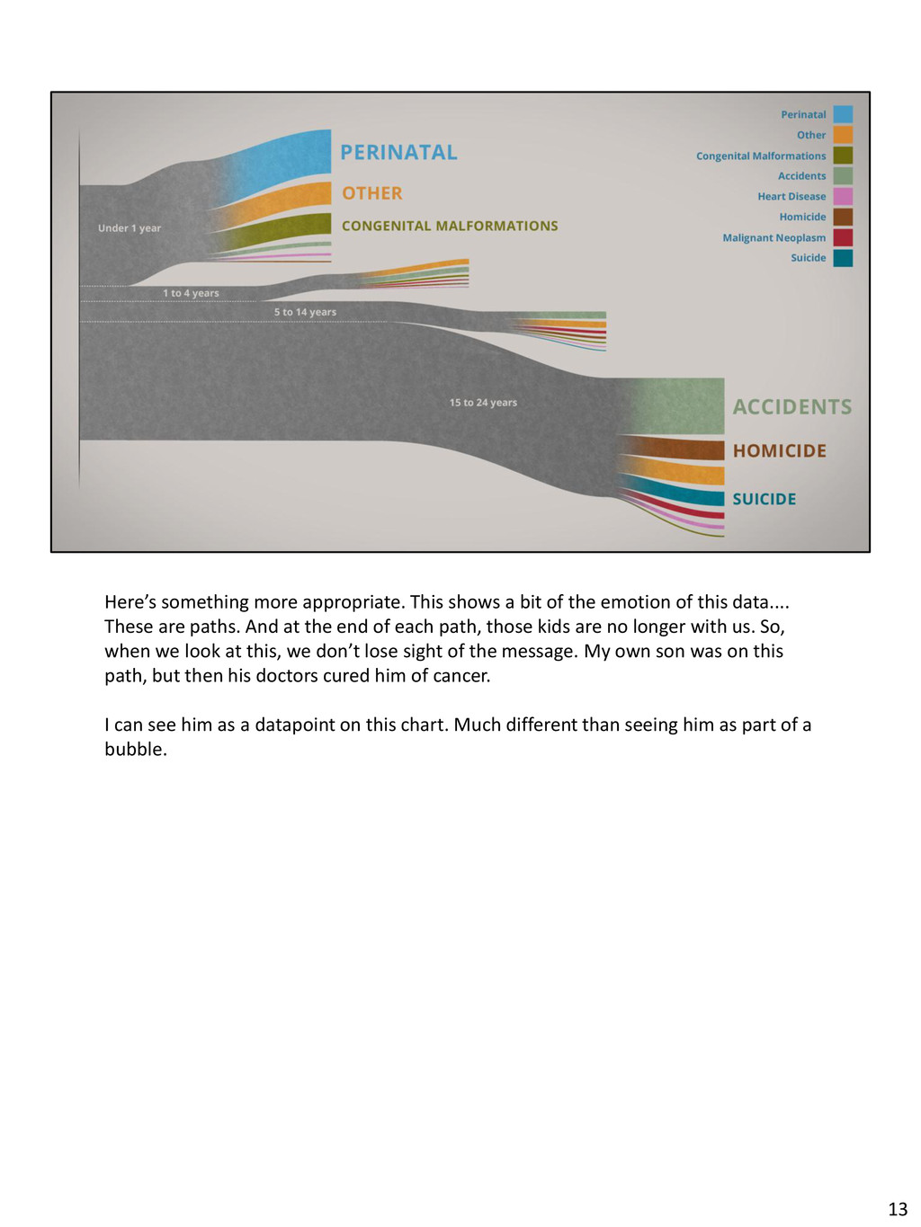
emotion of this data.... These are paths. And at the end of each path, those kids are no longer with us. So, when we look at this, we don’t lose sight of the message. My own son was on this path, but then his doctors cured him of cancer. I can see him as a datapoint on this chart. Much different than seeing him as part of a bubble. 13
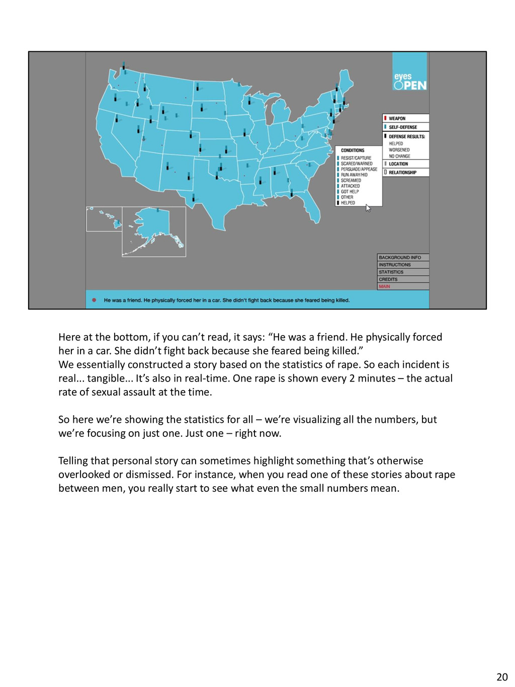
“He was a friend. He physically forced her in a car. She didn’t fight back because she feared being killed.” We essentially constructed a story based on the statistics of rape. So each incident is real... tangible... It’s also in real-time. One rape is shown every 2 minutes – the actual rate of sexual assault at the time. So here we’re showing the statistics for all – we’re visualizing all the numbers, but we’re focusing on just one. Just one – right now. Telling that personal story can sometimes highlight something that’s otherwise overlooked or dismissed. For instance, when you read one of these stories about rape between men, you really start to see what even the small numbers mean. 20
feel like.... Well, a little overwhelmed by all this amorphous emotion and all these qualitative things.... Everything starts to feel a bit mushy. That’s when I go back to the data. This is the dance you do with data.... It’s like sculpting... Just as with any other medium, you have to respond to the qualities of your data, to let it go in its own direction... Then have the ability to coax it back to elegance.... To cull its significance. 21
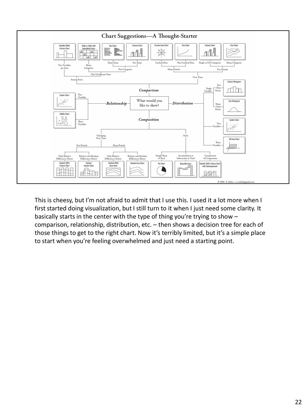
I use this. I used it a lot more when I first started doing visualization, but I still turn to it when I just need some clarity. It basically starts in the center with the type of thing you’re trying to show – comparison, relationship, distribution, etc. – then shows a decision tree for each of those things to get to the right chart. Now it’s terribly limited, but it’s a simple place to start when you’re feeling overwhelmed and just need a starting point. 22
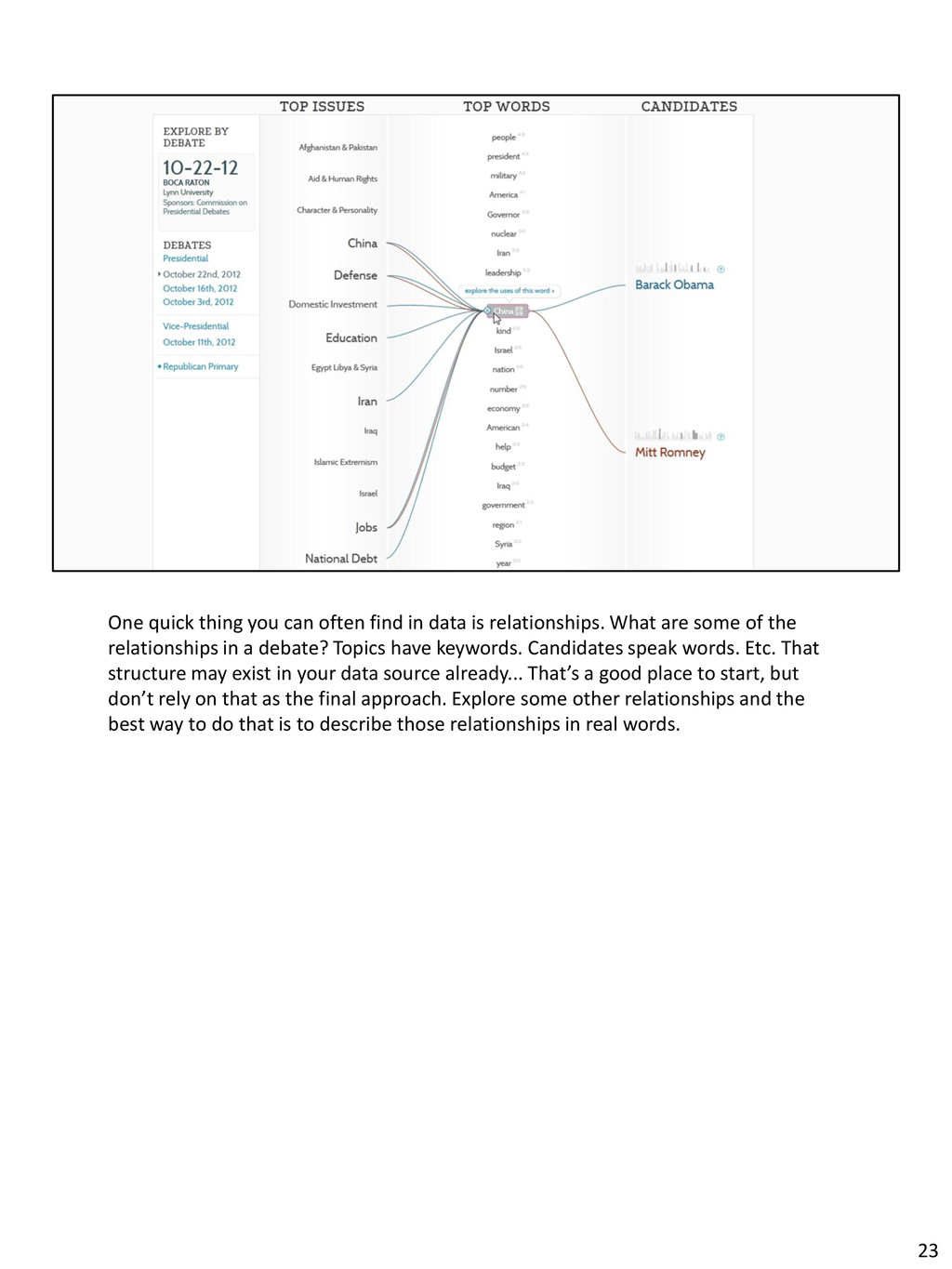
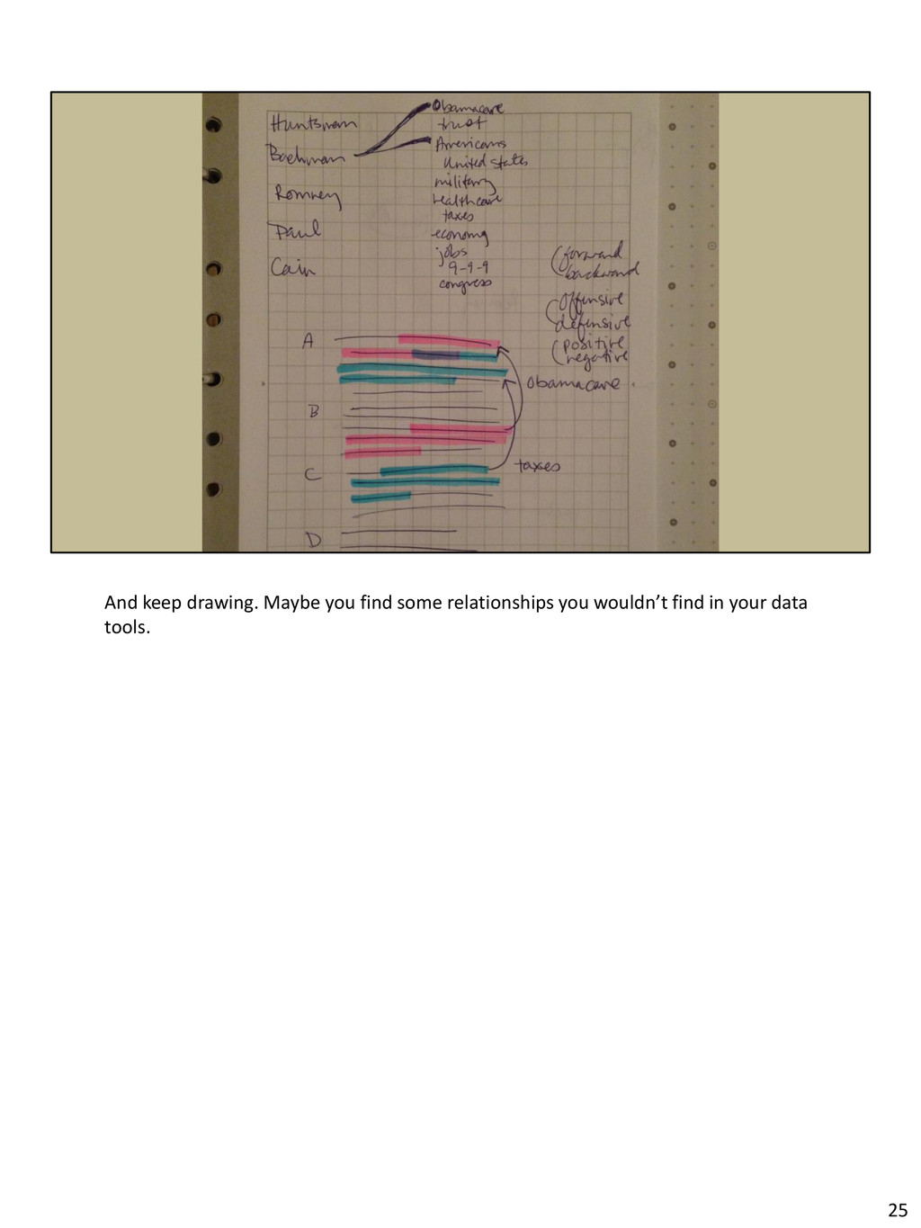
relationships. What are some of the relationships in a debate? Topics have keywords. Candidates speak words. Etc. That structure may exist in your data source already... That’s a good place to start, but don’t rely on that as the final approach. Explore some other relationships and the best way to do that is to describe those relationships in real words. 23
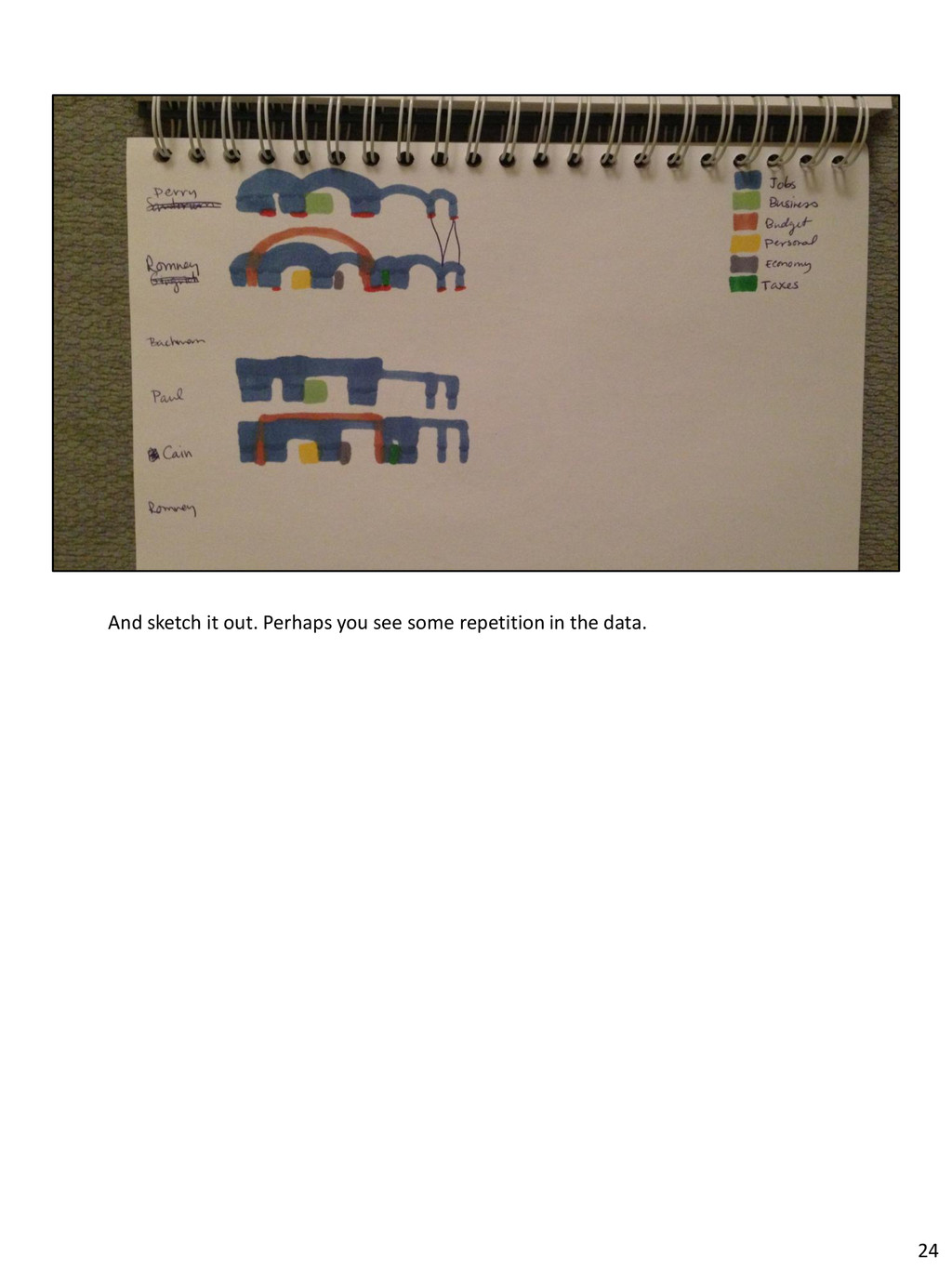
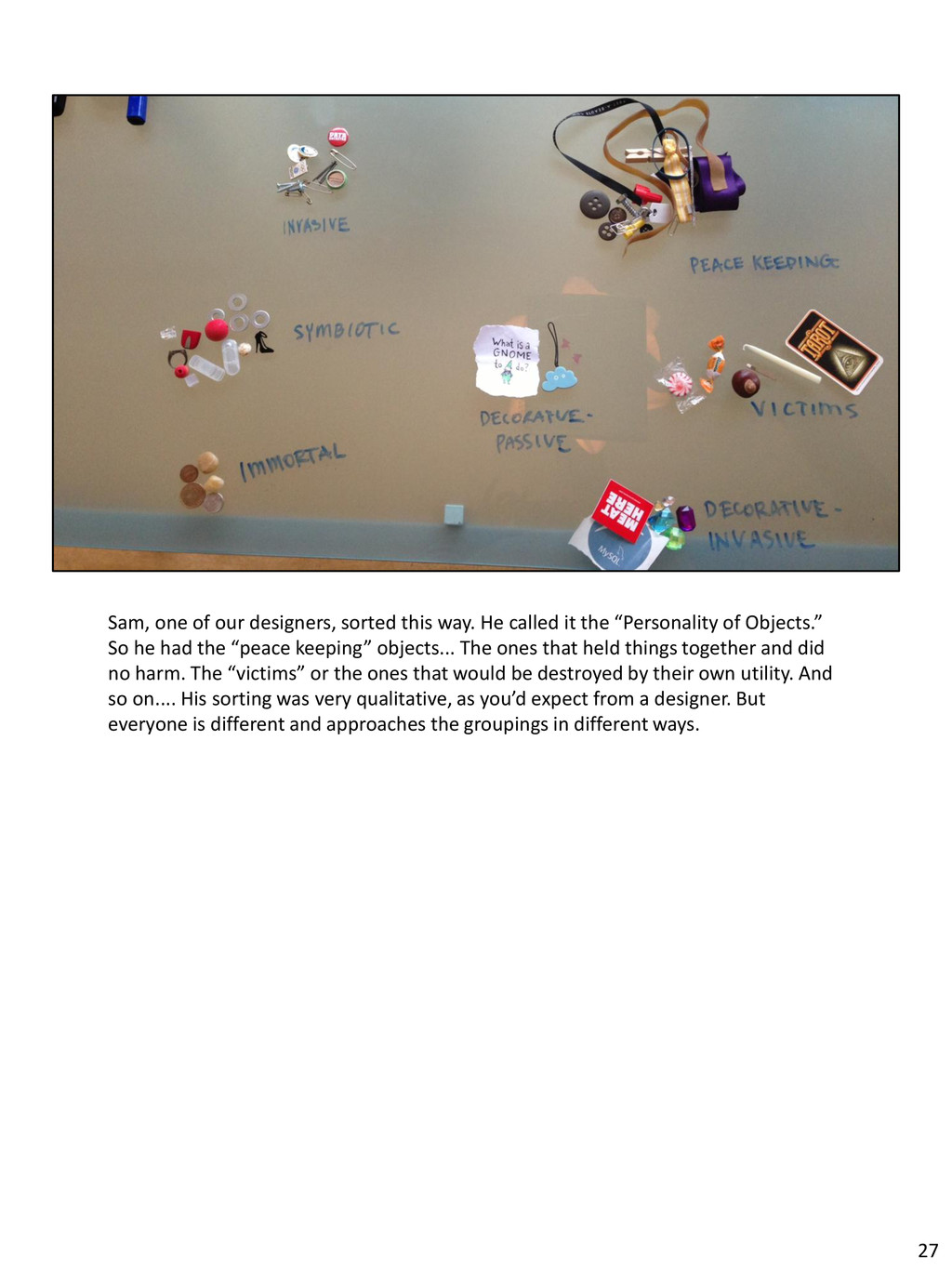
it the “Personality of Objects.” So he had the “peace keeping” objects... The ones that held things together and did no harm. The “victims” or the ones that would be destroyed by their own utility. And so on.... His sorting was very qualitative, as you’d expect from a designer. But everyone is different and approaches the groupings in different ways. 27
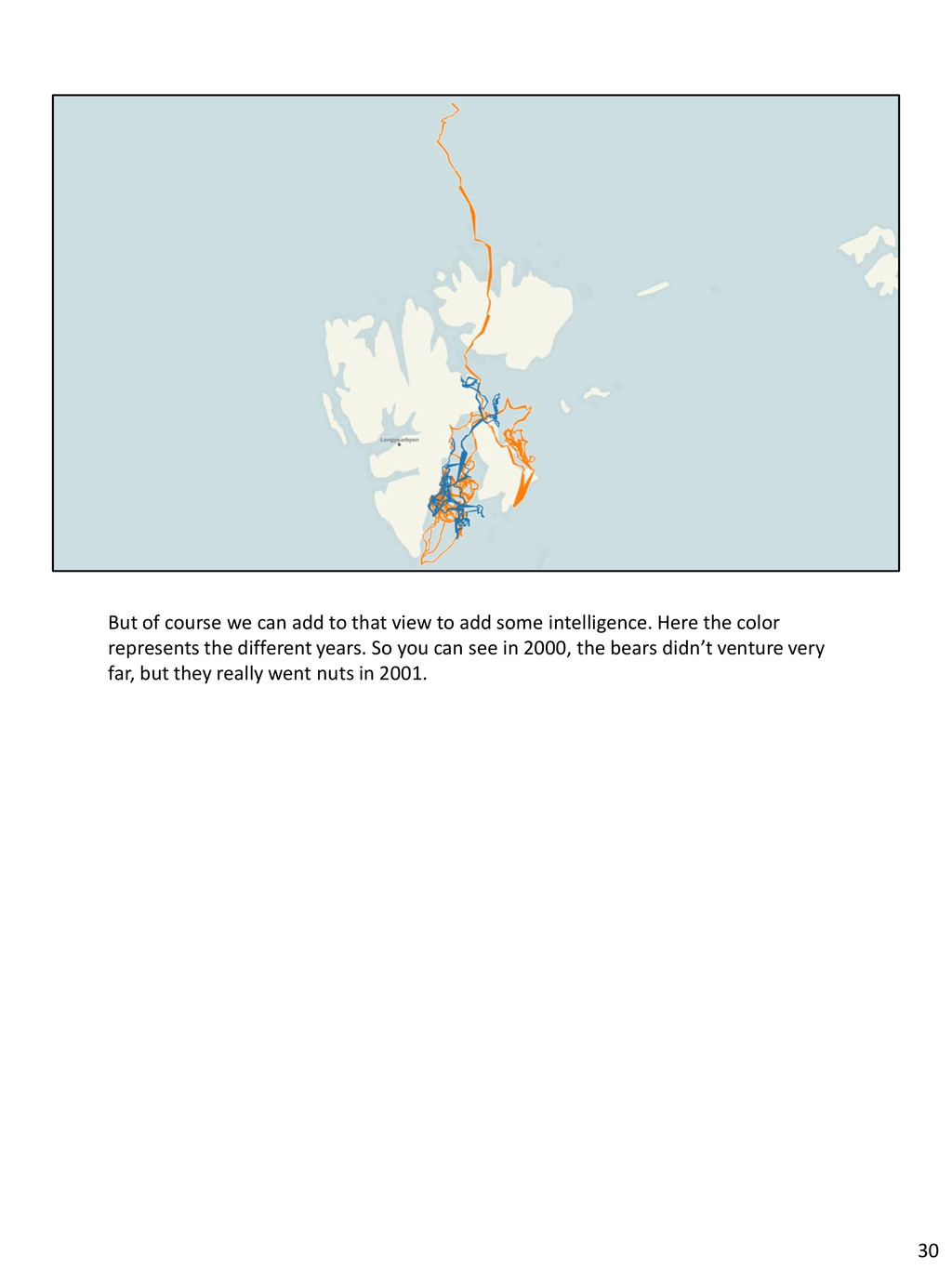
add some intelligence. Here the color represents the different years. So you can see in 2000, the bears didn’t venture very far, but they really went nuts in 2001. 30
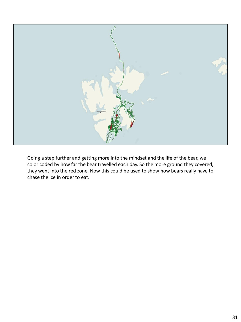
and the life of the bear, we color coded by how far the bear travelled each day. So the more ground they covered, they went into the red zone. Now this could be used to show how bears really have to chase the ice in order to eat. 31
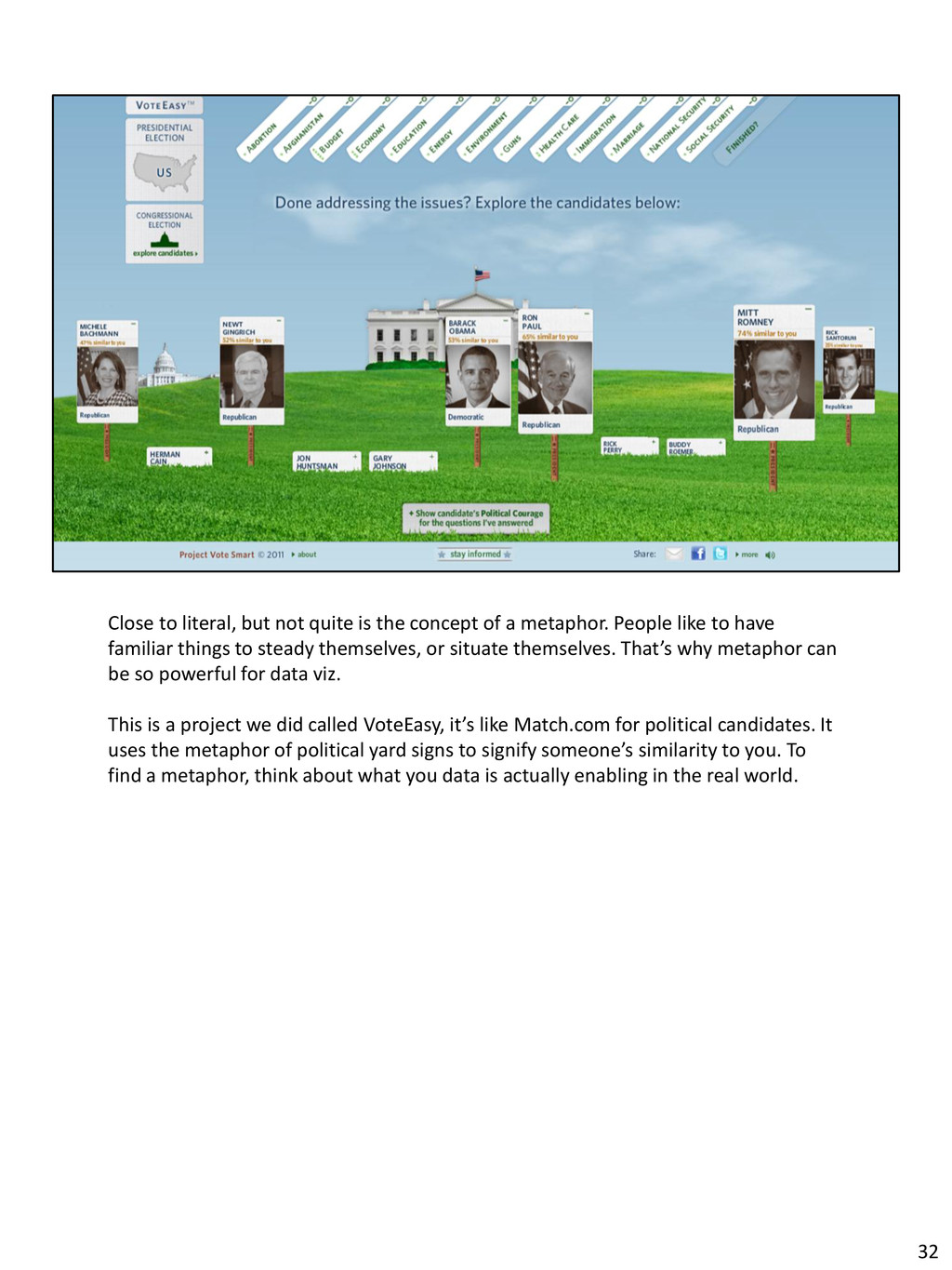
a metaphor. People like to have familiar things to steady themselves, or situate themselves. That’s why metaphor can be so powerful for data viz. This is a project we did called VoteEasy, it’s like Match.com for political candidates. It uses the metaphor of political yard signs to signify someone’s similarity to you. To find a metaphor, think about what you data is actually enabling in the real world. 32
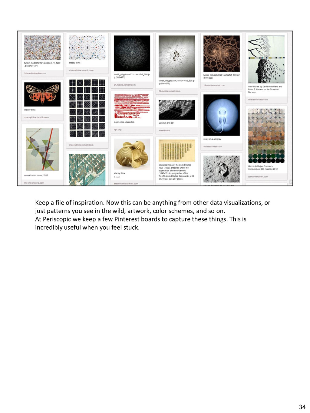
from other data visualizations, or just patterns you see in the wild, artwork, color schemes, and so on. At Periscopic we keep a few Pinterest boards to capture these things. This is incredibly useful when you feel stuck. 34