$30 off During Our Annual Pro Sale. View Details »

Android Design Support Library

Vasya
November 08, 2015

Android Design Support Library

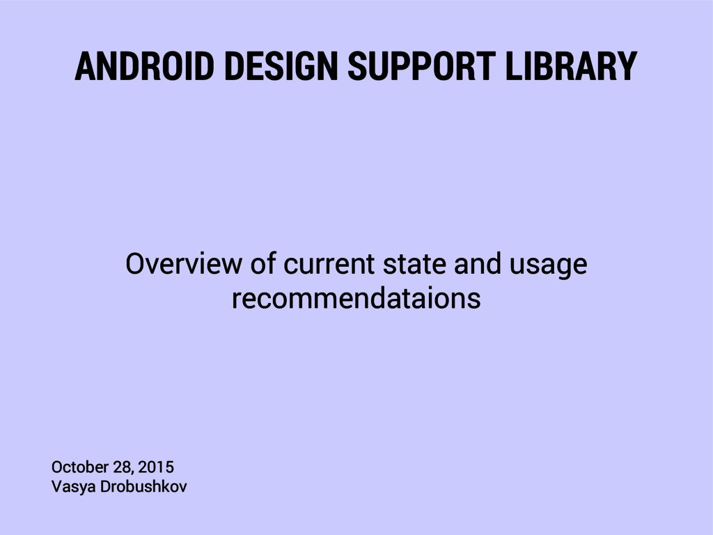
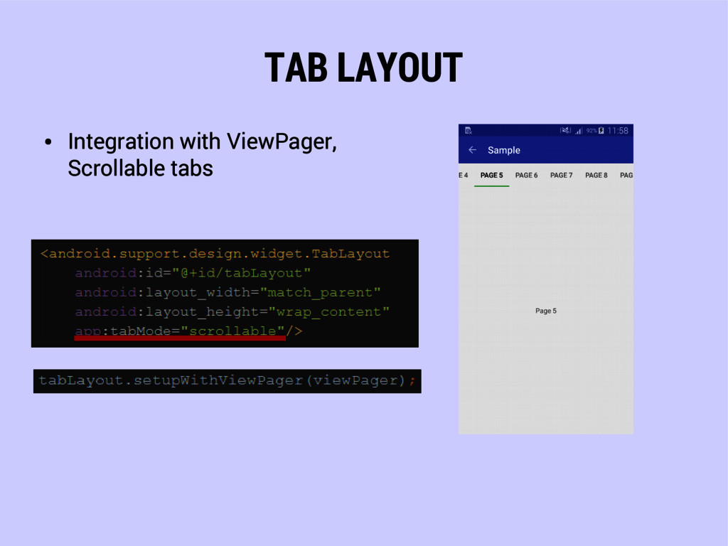
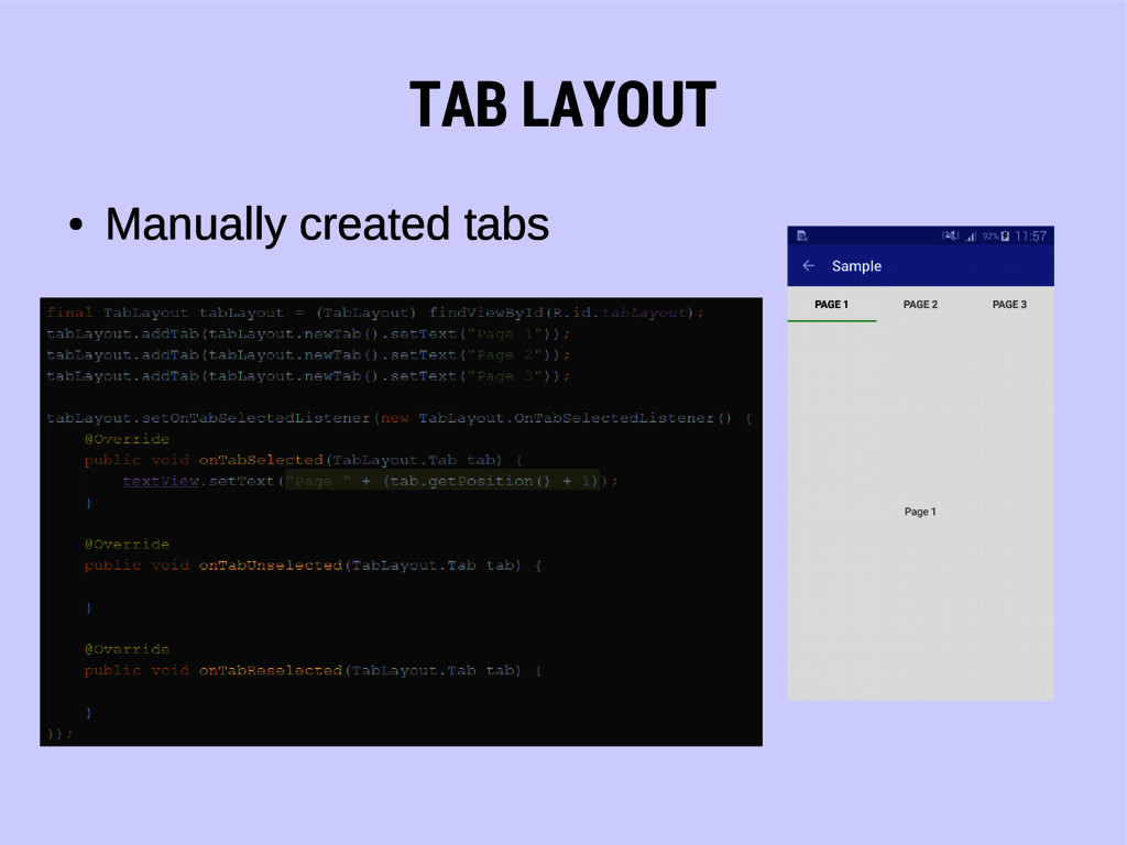
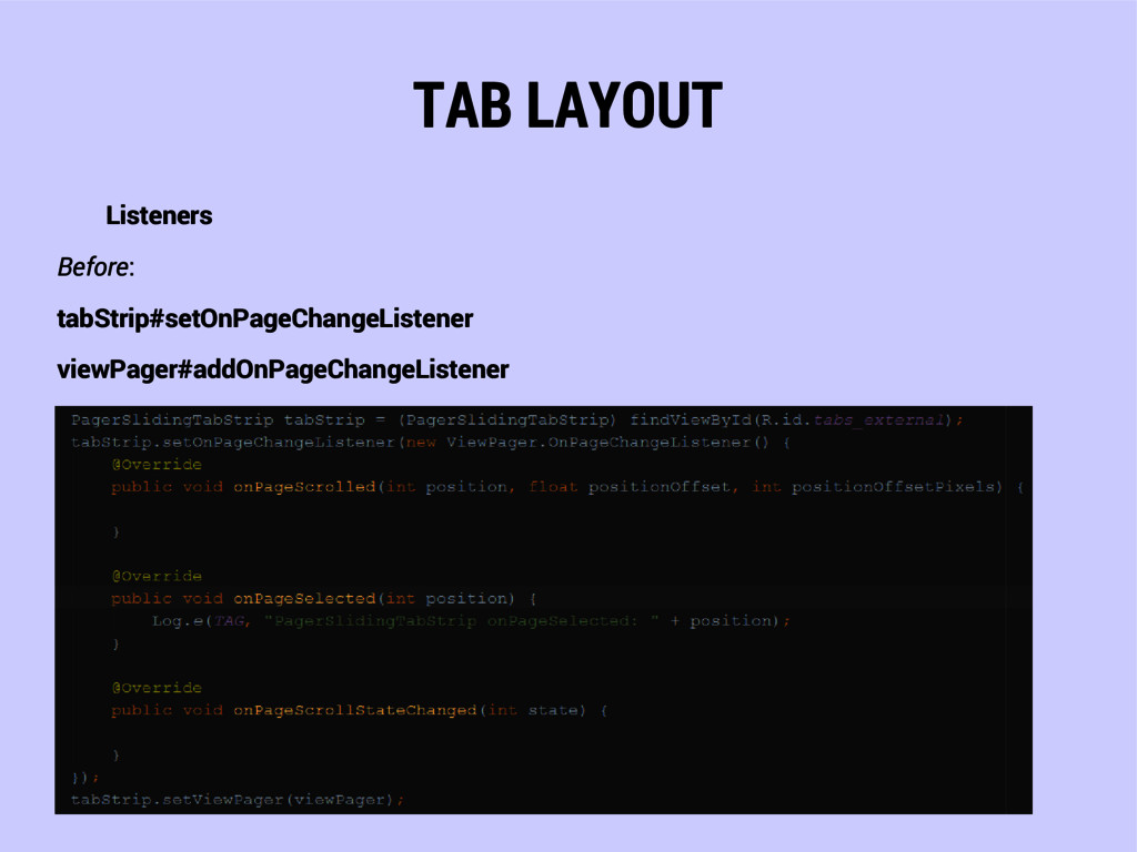
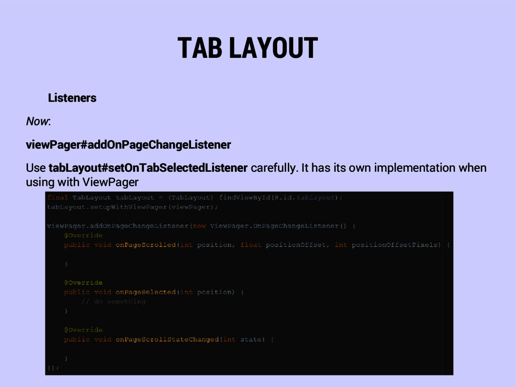
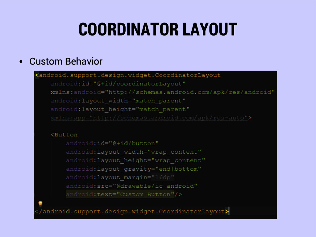
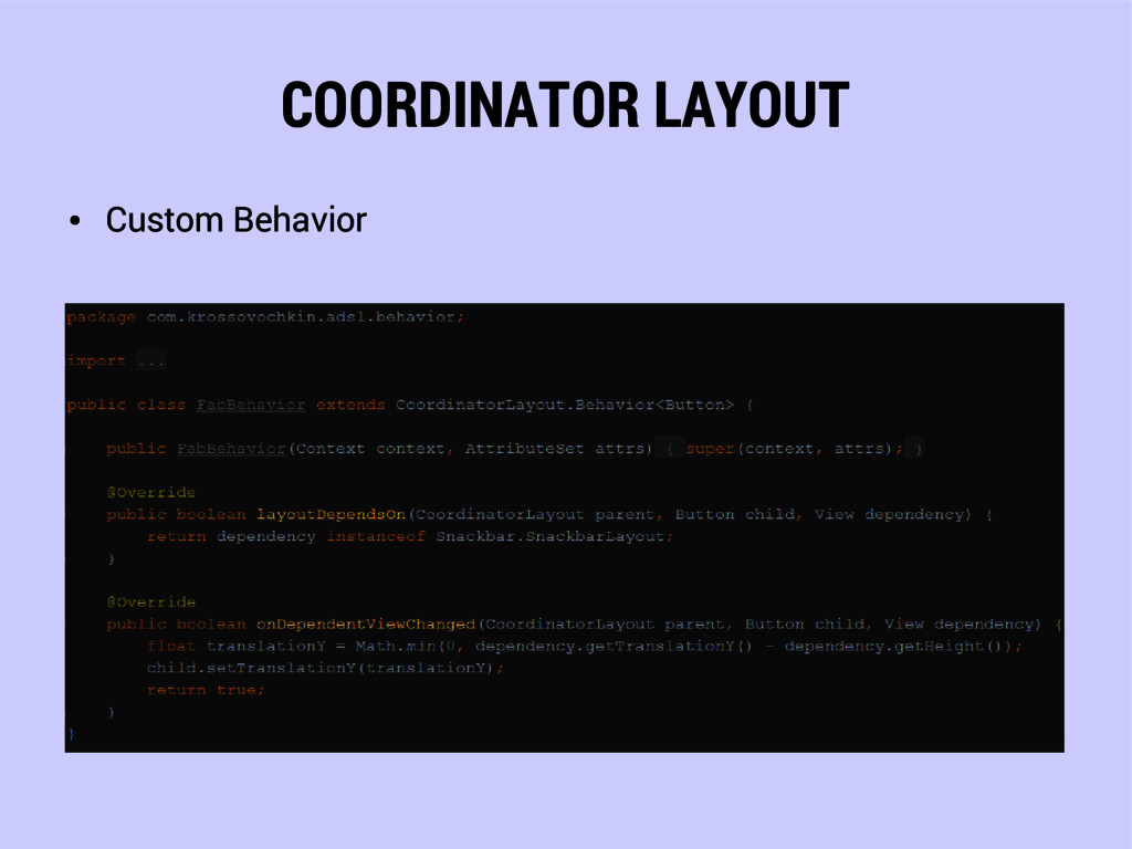
Android Design Support Library.
Overview of current state and usage recommendations.

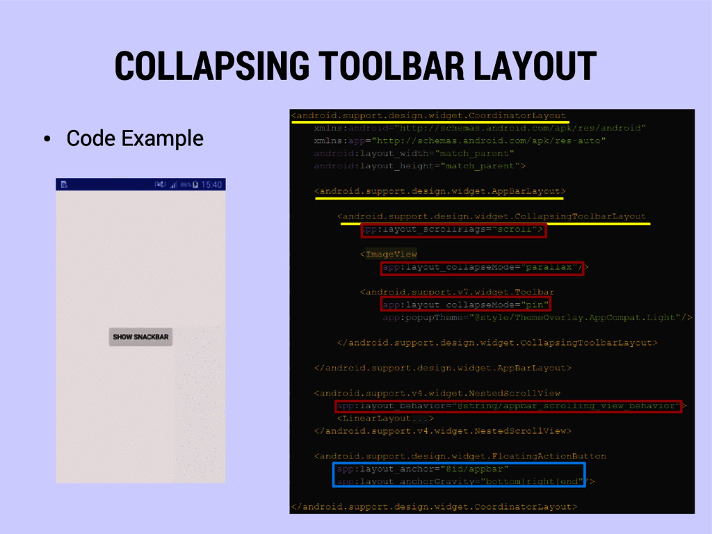
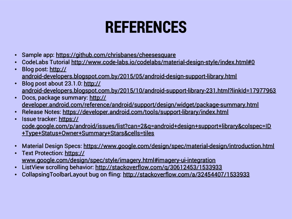
You can find project here: https://github.com/krossovochkin/AndroidDesignSupportLibrarySample

Vasya

November 08, 2015
Tweet

More Decks by Vasya

Other Decks in Programming

Transcript

  1. ANDROID DESIGN SUPPORT LIBRARY
    Overview of current state and usage
    recommendataions
    October 28, 2015
    Vasya Drobushkov

    View Slide

  2. HISTORY

    Google I/O 2014 – Material design
    concept was introduced

    AppCompat-v7 library (with
    AppCompat theme and Toolbar
    widget) was released (also
    recycler-view, card-view, pallete
    support libraries were released)

    Google I/O 2015 – Android Design
    Support library was released

    View Slide

  3. ANDROID DESIGN SUPPORT LIBRARY

    Components to easier build
    Material applications

    Compatible to API 7 (but
    actually 15 and even 16 is
    recommended)

    To be used with appcompat
    library

    View Slide

  4. INSTALLATION
    Add to your project build.gradle file

    View Slide

  5. NAVIGATION VIEW

    View Slide

  6. NAVIGATION VIEW
    Represents a standard navigation
    menu for application.
    Features:

    Selectable/clickable items

    Icons

    Paddings

    Fonts

    Header layout

    Subtitles
    Design Specs:
    http://goo.gl/5wFoPO

    View Slide

  7. NAVIGATION VIEW
    The menu contents can
    be populated by a menu
    resource file.
    R.menu.drawer_menu
    drawer_menu.xml
    To create Divider one
    should have two groups
    with different ids.

    View Slide

  8. NAVIGATION VIEW
    Add to activity/fragment layout file:

    View Slide

  9. NAVIGATION VIEW
    Add listeners:

    View Slide

  10. NAVIGATION VIEW
    How to customize
    Create action_layout.xml

    View Slide

  11. NAVIGATION VIEW
    Add layout to menu item as app:actionLayout

    View Slide

  12. NAVIGATION VIEW
    Set listeners, change texts etc.
    MenuItemCompat#getActionView

    View Slide

  13. TEXT INPUT LAYOUT

    View Slide

  14. TEXT INPUT LAYOUT
    Layout which wraps an EditText
    to show floating label when the
    hint is hidden due to user
    inputting text.
    TextInputLayout extends
    LinearLayout.
    Design Specs:
    http://goo.gl/Ltv8JQ

    View Slide

  15. TEXT INPUT LAYOUT

    Code Example

    View Slide

  16. TEXT INPUT LAYOUT
    Errors
    textInputLayout#setError
    (NOT editText#setError !!)

    View Slide

  17. TEXT INPUT LAYOUT
    Char Counters

    View Slide

  18. FLOATING ACTION BUTTON

    View Slide

  19. FLOATING ACTION BUTTON

    Floating action buttons are used for a promoted action.

    FAB extends ImageView.

    Default background color is colorAccent.

    Two sizes: (Default 56dp, Small 40dp)

    Button-like interface
    Design Specs:
    http://goo.gl/NFCJ35

    View Slide

  20. FLOATING ACTION BUTTON

    Code Example

    View Slide

  21. SNACKBAR

    View Slide

  22. SNACKBAR

    Use instead of Toast (has toast-
    like interface)

    View is used instead of Context

    Can have action (retry, undo etc.)

    Can be dismissed by swipe

    Show time: LENGTH_SHORT,
    LENGTH_LONG,
    LENGTH_INDEFINITE

    Might be difficult to use in
    nested fragments
    Design Specs:
    http://goo.gl/oQjwgO

    View Slide

  23. SNACKBAR

    Code Example

    View Slide

  24. TAB LAYOUT

    View Slide

  25. TAB LAYOUT
    Horizontal layout to display
    tabs.

    Binding to ViewPager

    Manually created tabs

    Scrollable/Fixed tabs
    Design Specs:
    http://goo.gl/dIHEf6

    View Slide

  26. TAB LAYOUT

    Integration with ViewPager,
    Fixed tabs

    View Slide

  27. TAB LAYOUT

    Integration with ViewPager,
    Scrollable tabs

    View Slide

  28. TAB LAYOUT

    Manually created tabs

    View Slide

  29. TAB LAYOUT
    Listeners
    Before:
    tabStrip#setOnPageChangeListener
    viewPager#addOnPageChangeListener

    View Slide

  30. TAB LAYOUT
    Listeners
    Now:
    viewPager#addOnPageChangeListener
    Use tabLayout#setOnTabSelectedListener carefully. It has its own implementation when
    using with ViewPager

    View Slide

  31. APP BAR LAYOUT

    View Slide

  32. APP BAR LAYOUT
    AppBarLayout extends LinearLayout
    Style for TabLayout is applied
    automatically

    View Slide

  33. COORDINATOR LAYOUT

    View Slide

  34. COORDINATOR LAYOUT

    CoordinatorLayout is super-powered FrameLayout ©

    Container for specific interaction with one or more child views
    (BEHAVIOR)

    Anchor Views to other Coordinator layout’s children

    View Slide

  35. COORDINATOR LAYOUT AND FAB

    No extra code required!

    View Slide

  36. COORDINATOR LAYOUT AND FAB

    Code Example

    View Slide

  37. COORDINATOR LAYOUT AND APP BAR
    CoordinatorLayout app:layout_behavior
    @string/appbar_scrolling_view_behavior
    Design Specs:
    http://goo.gl/AYvtRI

    View Slide

  38. COORDINATOR LAYOUT AND APP BAR

    View Slide

  39. COORDINATOR LAYOUT AND APP BAR
    AppBarLayout app:layout_scrollFlags
    scroll

    View Slide

  40. COORDINATOR LAYOUT AND APP BAR
    AppBarLayout app:layout_scrollFlags
    scroll|enterAlways

    View Slide

  41. COORDINATOR LAYOUT AND APP BAR
    AppBarLayout app:layout_scrollFlags
    scroll|enterAlways|snap

    View Slide

  42. COORDINATOR LAYOUT
    Scrolling behavior is available when using:

    Recycler View

    NestedScrollView (extends FrameLayout)

    ViewPager with RecyclerView or NestedScrollView

    View (API 21+) view#setNestedScrollingEnabled(Boolean)
    Otherwise you have to implement required callbacks by yourself!

    View Slide

  43. COORDINATOR LAYOUT

    Anchoring

    View Slide

  44. COORDINATOR LAYOUT

    Custom Behavior

    View Slide

  45. COORDINATOR LAYOUT

    Custom Behavior

    View Slide

  46. COORDINATOR LAYOUT

    Custom Behavior

    View Slide

  47. COORDINATOR LAYOUT

    Custom Behavior. Result

    View Slide

  48. COORDINATOR LAYOUT
    Scroll Aware FAB Behavior
    More difficult example by Ian Lake
    https://goo.gl/GJUnfM
    (show/hide FAB on list scroll)

    View Slide

  49. COLLAPSING TOOLBAR
    LAYOUT

    View Slide

  50. COLLAPSING TOOLBAR LAYOUT
    Collapsing Toolbar Layout is a wrapper for Toolbar.
    Features

    Collapsing title

    Content/Status bar scrim

    Parallax scrolling

    View Slide

  51. COLLAPSING TOOLBAR LAYOUT

    Code Example

    View Slide

  52. COLLAPSING TOOLBAR LAYOUT
    AppBarLayout app:layout_scrollFlags
    scroll

    View Slide

  53. COLLAPSING TOOLBAR LAYOUT
    AppBarLayout app:layout_scrollFlags
    scroll|exitUntilCollapsed

    View Slide

  54. COLLAPSING TOOLBAR LAYOUT
    AppBarLayout app:layout_scrollFlags
    scroll|enterAlways|enterAlwaysCollapsed

    View Slide

  55. COLLAPSING TOOLBAR LAYOUT
    AppBarLayout app:layout_scrollFlags ISSUE
    scroll|enterAlways|enterAlwaysCollapsed
    Look at the arrow

    View Slide

  56. COLLAPSING TOOLBAR LAYOUT

    Attributes Overview

    View Slide

  57. COLLAPSING TOOLBAR LAYOUT
    Limitation
    Has no subtitle, only title
    Feature
    Tricky title setting

    View Slide

  58. COLLAPSING TOOLBAR LAYOUT
    Collapsing Toolbar Layout

    extends FrameLayout

    contains Toolbar

    contains ImageView
    Overdraw?

    View Slide

  59. COLLAPSING TOOLBAR LAYOUT
    White text on white image
    Problem with font on white image in toolbar layout
    Look here when
    text goes through it

    View Slide

  60. COLLAPSING TOOLBAR LAYOUT

    Text protection (scrims)
    Design Specs:
    https://goo.gl/d3c71N
    Implementation:
    http://
    stackoverflow.com/a/318
    38291/1533933

    View Slide

  61. COLLAPSING TOOLBAR LAYOUT
    Think about overdraw.
    Use transparency carefully!

    View Slide

  62. COLLAPSING TOOLBAR LAYOUT
    Issues
    Scrolling to top from collapsed, doesn’t expand toolbar, overflow is shown
    Not responsive scrolling on fling (http://
    stackoverflow.com/a/32454407/1533933, https://goo.gl/oEYnKj)

    View Slide

  63. CONCLUSION

    View Slide

  64. CONCLUSION

    View Slide

  65. CONCLUSION
    What to do

    Use “AS IS”. Wait for update and fixes.

    Do not use. Wait for update and fixes.

    Use third party libraries https://android-arsenal.com/

    Fix bugs by yourself https://android.googlesource.com/platform/frameworks/support/
    https://android.googlesource.com/platform/frameworks/support/+/master/design/

    Create everything by yourself

    View Slide

  66. THANK YOU!

    View Slide

  67. REFERENCES
    • Sample app: https://github.com/chrisbanes/cheesesquare
    • CodeLabs Tutorial http://www.code-labs.io/codelabs/material-design-style/index.html#0
    • Blog post: http://
    android-developers.blogspot.com.by/2015/05/android-design-support-library.html
    • Blog post about 23.1.0: http://
    android-developers.blogspot.com.by/2015/10/android-support-library-231.html?linkId=17977963
    • Docs, package summary: http://
    developer.android.com/reference/android/support/design/widget/package-summary.html
    • Release Notes: https://developer.android.com/tools/support-library/index.html
    • Issue tracker: https://
    code.google.com/p/android/issues/list?can=2&q=android+design+support+library&colspec=ID
    +Type+Status+Owner+Summary+Stars&cells=tiles
    • Material Design Specs: https://www.google.com/design/spec/material-design/introduction.html
    • Text Protection: https://
    www.google.com/design/spec/style/imagery.html#imagery-ui-integration
    • ListView scrolling behavior: http://stackoverflow.com/q/30612453/1533933
    • CollapsingToolbarLayout bug on fling: http://stackoverflow.com/a/32454407/1533933

    View Slide