Upgrade to Pro — share decks privately, control downloads, hide ads and more …

Designing for Words: Elements of Typographic Style for the Web

Designing for Words: Elements of Typographic Style for the Web

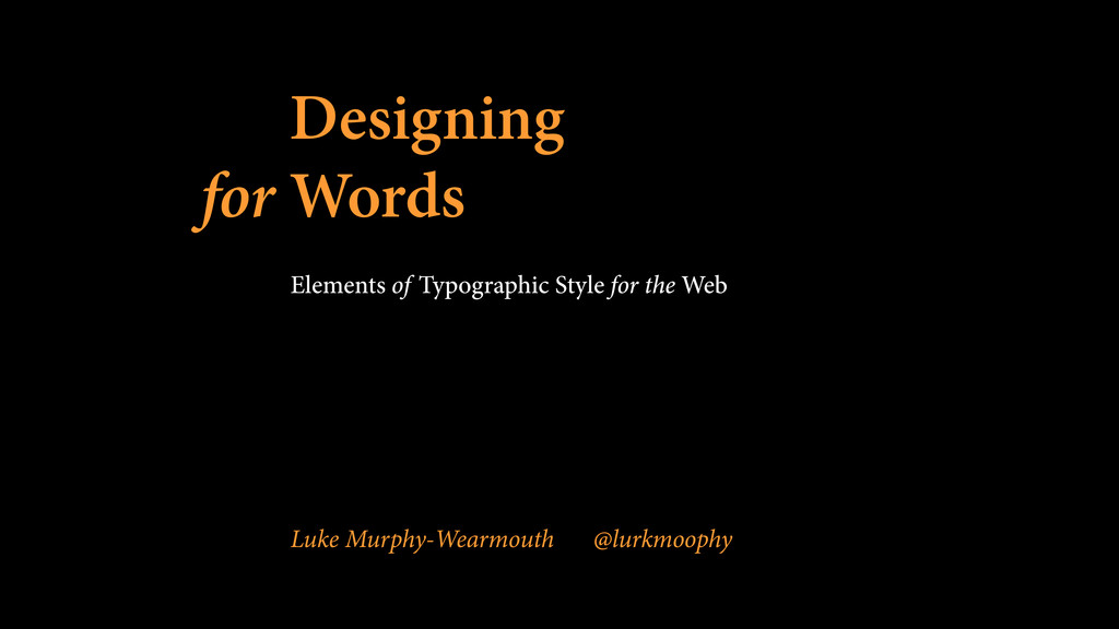
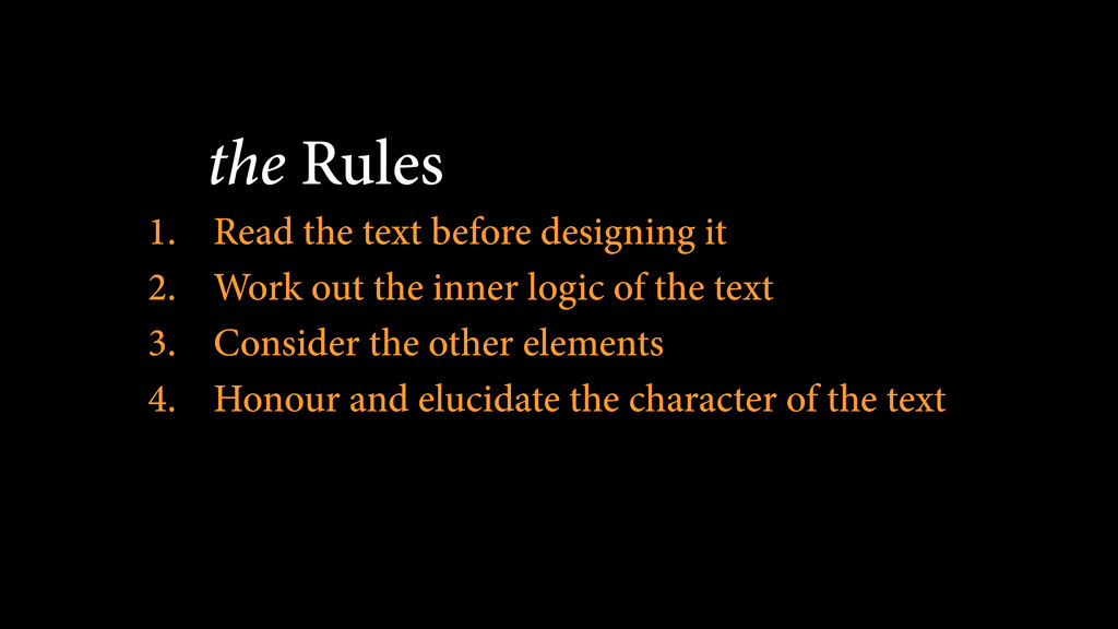
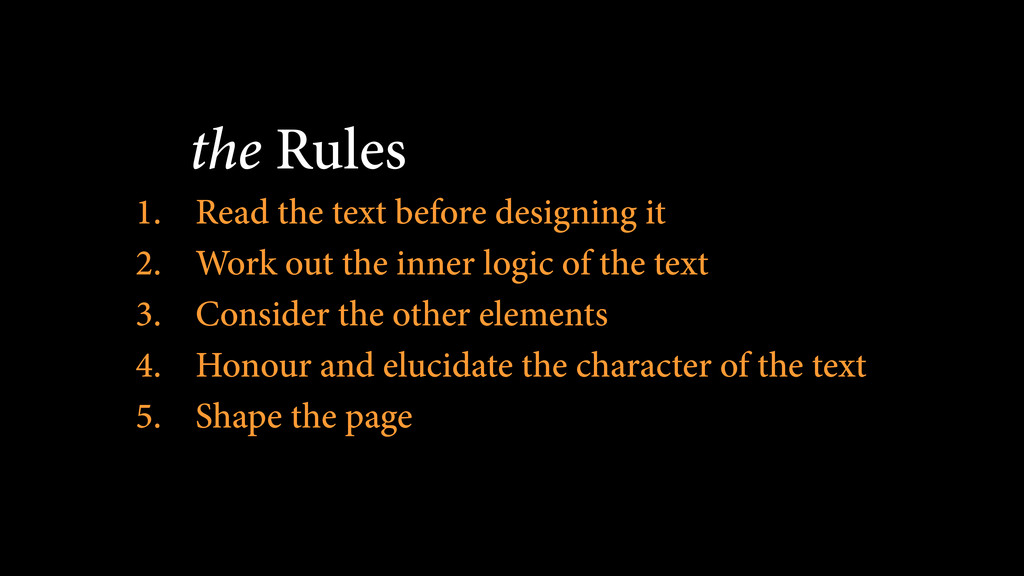
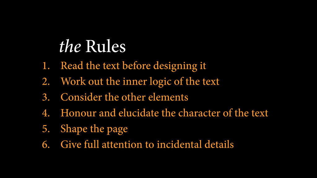
At the beginning of the web, all we had was words on a screen. 22 years later, the web we design for is a far more complicated place, but words still lie at the very heart of what we do.

In recent years, we’ve been given far more control over the way we style our content, allowing us to do things we haven’t been able to before via JavaScript, HTML and CSS. However, it’s not just from an aesthetic point of view that we need to be looking at this, but from a simple point of legibility as well.

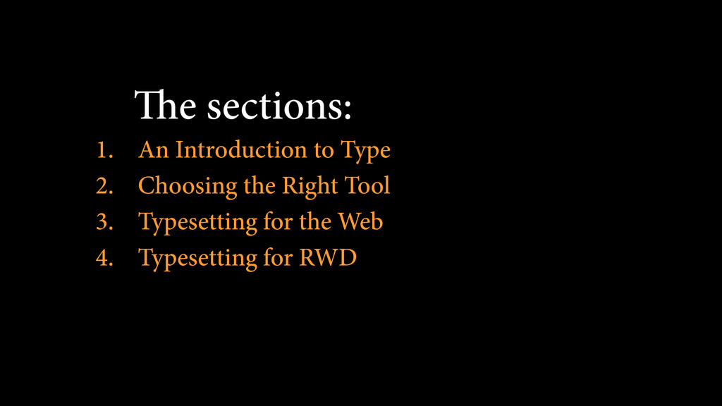
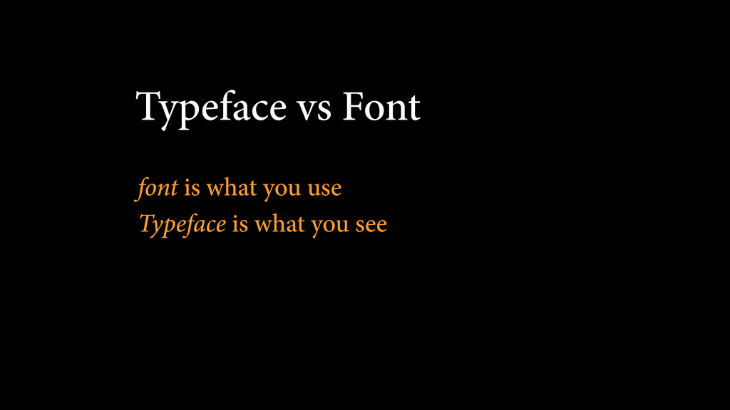
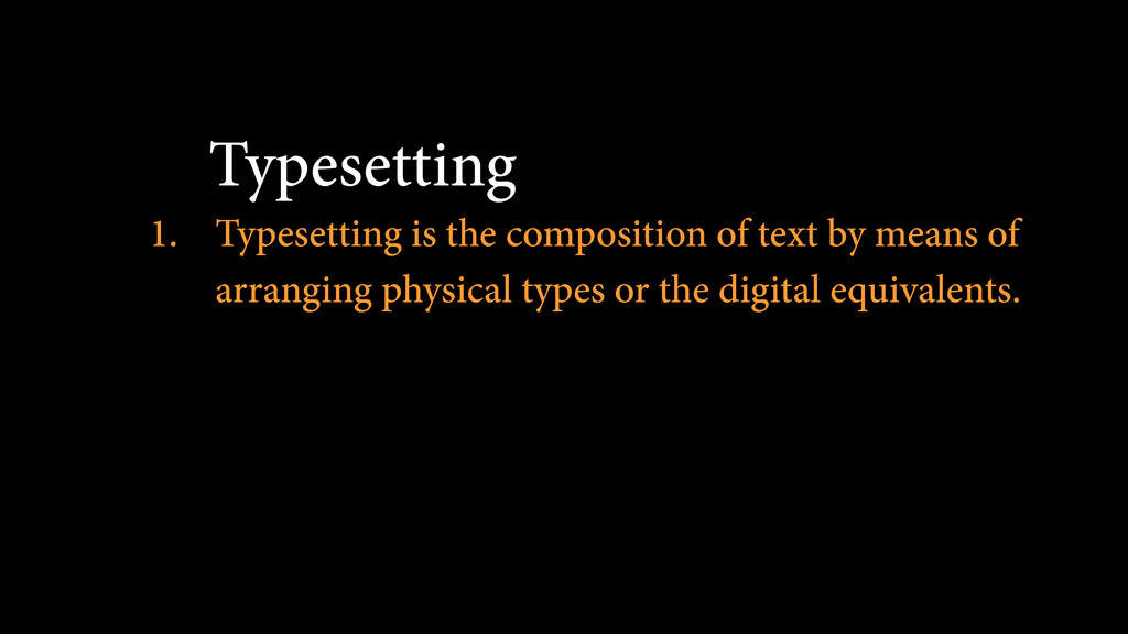
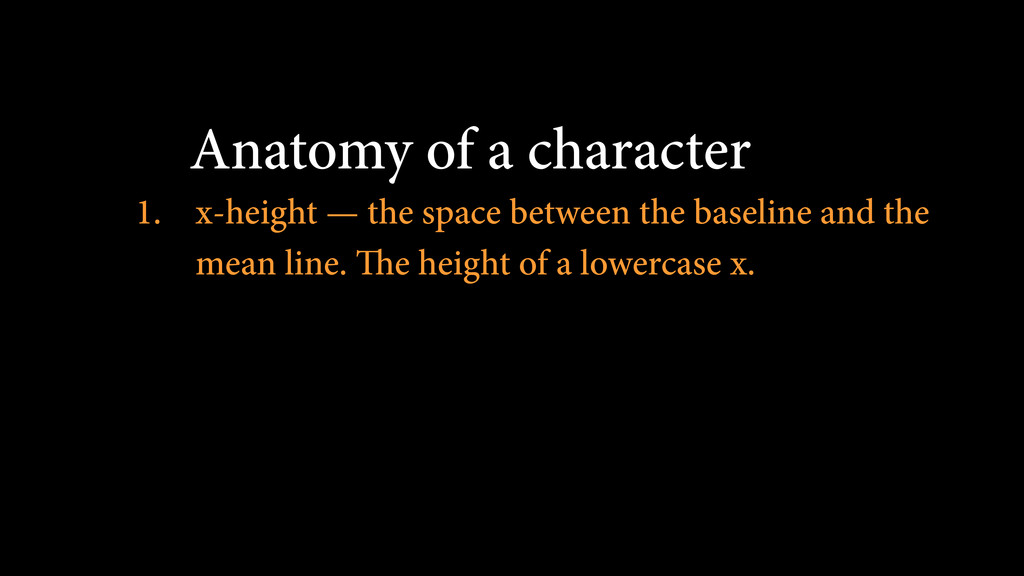
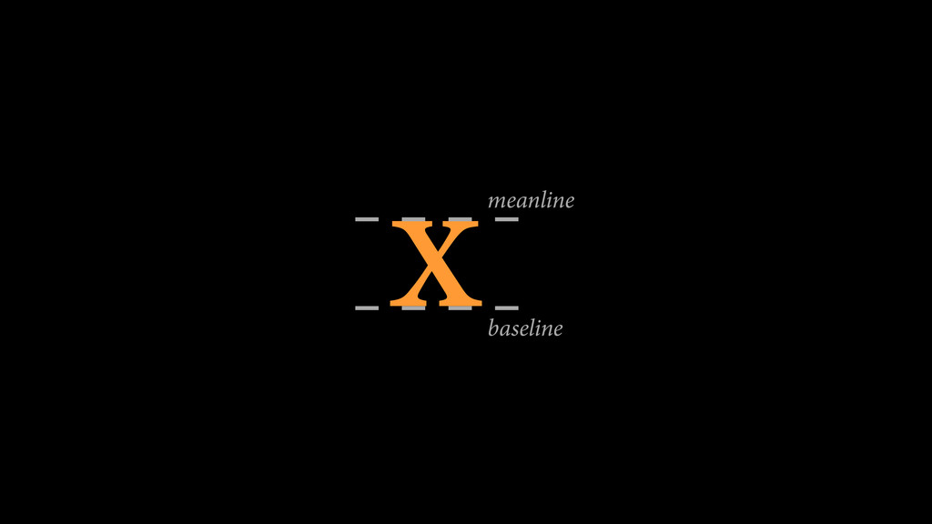
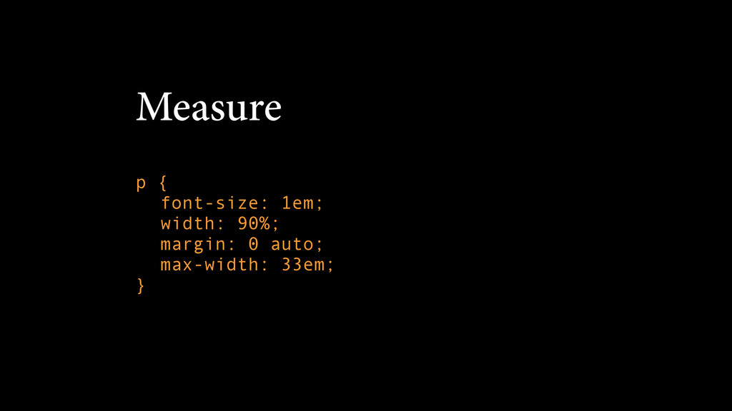
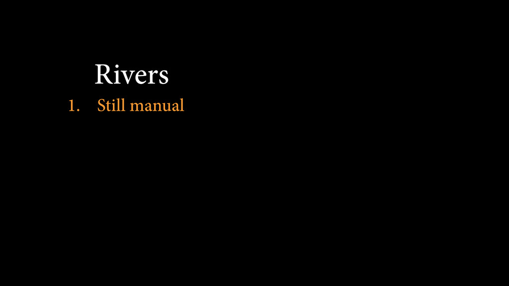
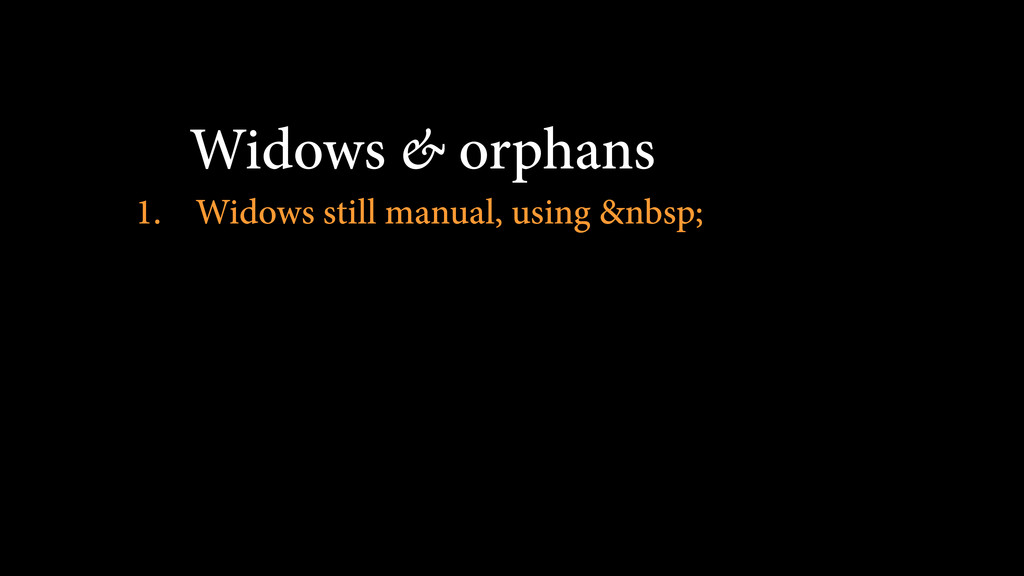
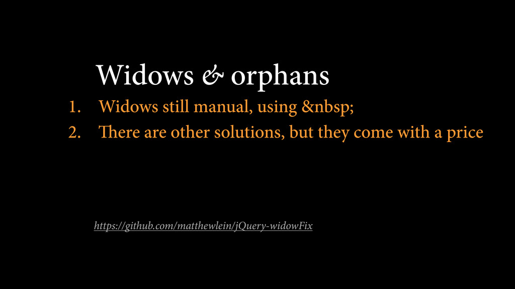
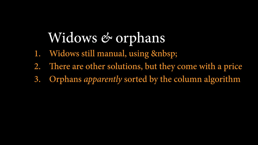
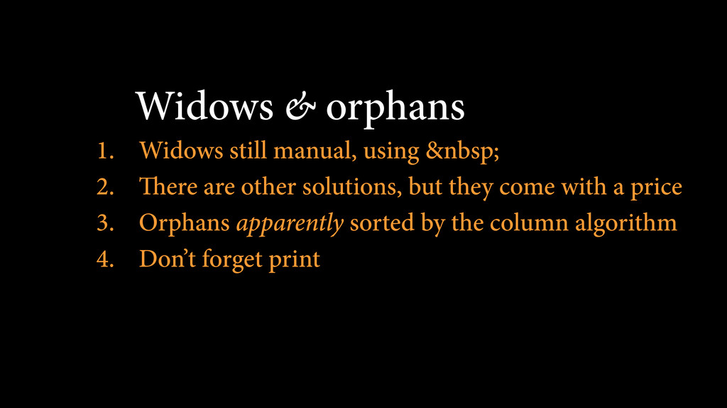
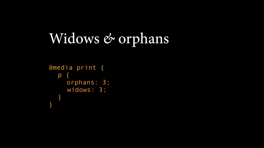
Looking at some of the fundamentals of typography and layout design, I plan to look at how we can make the words we display beautiful and user friendly, looking at how to choose the right font for the job and pitfalls of web fonts to look out for, to how we implement print-based rules of thumb using CSS and JS, to how to tackle some of the trickier problems such as orphans, widows, rivers, columns and how to tackle responsive from a content point of view.

Luke Murphy-Wearmouth

September 22, 2015
Tweet

More Decks by Luke Murphy-Wearmouth

Other Decks in Design

Transcript

  1. The sections: 1. An Introduction to Type 2. Choosing the

    Right Tool 3. Typesetting for the Web 4. Typesetting for RWD
  2. Typeface vs Font 1. Typeface — the overall design of

    a collection
 Helvetica is a typeface
  3. Typeface vs Font 1. Typeface — the overall design of

    a collection
 Helvetica is a typeface 2. Font — The physical embodiment of a collection of letters, numbers, symbols etc.
 Helvetica Bold is a font
  4. Typesetting 1. Typesetting is the composition of text by means

    of arranging physical types or the digital equivalents.
  5. Anatomy of a character 1. x-height — the space between

    the baseline and the mean line. The height of a lowercase x.
  6. Anatomy of a character 1. x-height — the space between

    the baseline and the mean line. The height of a lowercase x. 2. ascenders and descenders — the tops and bottoms of letters like b, d, j, q
  7. Anatomy of a character 1. x-height — the space between

    the baseline and the mean line. The height of a lowercase x. 2. ascenders and descenders — the tops and bottoms of letters like b, d, j, q 3. cap-height — height of a capital letter
  8. Anatomy of a character 4. counter — the open space

    within a letter, both partially closed (c) and closed (o)
  9. Anatomy of a character 4. counter — the open space

    within a letter, both partially closed (c) and closed (o) 5. serif — a little stroke found at the end of main vertical and horizontal strokes of some letterforms
  10. Kerning 1. adjusting the space between characters in a proportional

    font to achieve a visually pleasing result
  11. War

  12. War

  13. A type that stops you in the middle of a

    sentence and asks you to admire its smartness is a bad type “
  14. The morning had dawned clear and cold, with a crispness

    that hinted at the end of summer. They set forth at daybreak to see a man beheaded, twenty in all, and Bran rode among them, nervous with excitement. This was the first time he had been deemed old enough to go with his lord father and his brothers to see the king's justice done. It was the ninth year of summer, and the seventh of Bran's life. The man had been taken outside a small holdfast in the hills. Robb thought he was a wildling, his sword sworn to Mance Rayder, the King-beyond-the-Wall. It made Bran's skin prickle to think of it. He remembered the hearth tales Old Nan told them. The wildlings were cruel men, she said, slavers and slayers and thieves. They consorted with giants and ghouls, stole girl children in the dead of night, and drank blood from polished horns. And their women lay with the Others in the Long Night to sire terrible half-human children.
  15. the Rules 1. Read the text before designing it 2.

    Work out the inner logic of the text
  16. the Rules 1. Read the text before designing it 2.

    Work out the inner logic of the text 3. Consider the other elements
  17. the Rules 1. Read the text before designing it 2.

    Work out the inner logic of the text 3. Consider the other elements 4. Honour and elucidate the character of the text
  18. the Rules 1. Read the text before designing it 2.

    Work out the inner logic of the text 3. Consider the other elements 4. Honour and elucidate the character of the text 5. Shape the page
  19. the Rules 1. Read the text before designing it 2.

    Work out the inner logic of the text 3. Consider the other elements 4. Honour and elucidate the character of the text 5. Shape the page 6. Give full attention to incidental details
  20. Use ems not pt 1. EU law 2. It keeps

    everything relative and scalable
  21. Use ems not pt 1. EU law 2. It keeps

    everything relative and scalable 3. ems vs rems
  22. Choosing your scale 0.75 0.83 1 1.1667 1.333 1.5 1.75

    2 3 4 5 http://www.type-scale.com/
  23. Choosing your scale body { font-size: 16px; } p {

    font-size: 1em; } h1 { font-size: 3em; }
  24. Margins 1. Lock the text block 2. Frame the text

    block 3. Protect the text block
  25. Measure 1. Ideal line length is 45-75 characters 2. Dependent

    on the font, alignment etc. 3. Use ems not pxs/percentages
  26. Letterspacing 1. Don’t letterspace lowercase letters without a reason 2.

    Letterspace strings of capitals, small caps and 
 strings of digits
  27. letter-spacing: 1. You can use positive and negative values 2.

    It’s animatable 3. Not entirely cross-browser
  28. letter-spacing: $( document ).ready( function() {
 var rex = new

    RegExp( "([0-9]{3,})", “gm" );
 $( “*” ).each( function(){
 var $this = $( this );
 var content = $this.html();
 $this.html( content.replace( rex, “<span class=
 “string-of-digits”>$1</span>” ) );
 });
 });

  29. Leading 1. Music is the space between notes 2. It’s

    about vertical rhythm and feel 3. My rule of thumb: 140%
  30. Leading p { font-size: 1em; width: 90%; margin: 0 auto;

    max-width: 33em; line-height: 1.4em; }
  31. Kerning 1. Kern consistently or not at all 2. It’s

    more about font choice than technical solutions
  32. text-rendering: p { font-size: 1em; width: 90%; margin: 0 auto;

    max-width: 33em; line-height: 1.4em; /*probably not a good idea yet */ text-rendering: optimizeLegibility }
  33. Kerning 1. Kern consistently or not at all 2. It’s

    more about font choice than technical solutions 3. kerning.js (if you’re a control freak) #pixel-perfect { -letter-kern: 1px 1px 0 0 0 1px 0 2px 0 0 0 0 0; }
  34. Vertical space and rhythm 1. Tempo should not change arbitrarily

    in music 2. Even multiples of the basic leading
  35. Vertical space and rhythm p { font-size: 1em; width: 90%;

    margin: 0 auto; max-width: 33em; line-height: 1.4em; margin-bottom: 0.7em; }
  36. Vertical space and rhythm p { font-size: 1em; width: 90%;

    margin: 0 auto 0.7em auto; max-width: 33em; line-height: 1.4em; }
  37. Vertical space and rhythm 1. Tempo should not change arbitrarily

    in music 2. Even multiples of the basic leading 3. Don’t interrupt the rhythm of the page
  38. Vertical space and rhythm p { font-size: 1em; width: 90%;

    margin: 0 auto 0.7em auto; max-width: 33em; line-height: 1.4em; hanging-punctuation: first; }
  39. Types of dashes subtraction sign/hyphen - en dash – &ndash;

    em dash — &mdash; http://en.wikipedia.org/wiki/Dash
  40. Types of dashes 1. Pedantry at its finest 2. Use

    an en dashes with space either side in copy, 
 or a close set em dash
  41. Types of dashes 1. Pedantry at its finest 2. Use

    an en dashes with space either side in copy, 
 or a close set em dash 3. Use a close set en dash for ranges
  42. Quotation marks str = str.replace(/"(?=\w|$)/g, "&#8220;"); 
 str = str.replace(/(?<=\w|^)"/g,

    "&#8221;"); 
 str = str.replace(/(?<=[\w,.?!\)]|^)"/g, "&#8221;");
  43. Columns p { font-size: 1em; width: 90%; margin: 0 auto

    0.7em auto; max-width: 33em; line-height: 1.4em; column-count: 3; column-gap: 1.4em; -moz-column-count: 3; -moz-column-gap: 1.4em; -webkit-column-count: 3; -webkit-column-gap: 1.4em; }
  44. Widows & orphans 1. Widows still manual, using &nbsp; 2.

    There are other solutions, but they come with a price https://github.com/matthewlein/jQuery-widowFix
  45. Widows & orphans 1. Widows still manual, using &nbsp; 2.

    There are other solutions, but they come with a price 3. Orphans apparently sorted by the column algorithm
  46. Widows & orphans 1. Widows still manual, using &nbsp; 2.

    There are other solutions, but they come with a price 3. Orphans apparently sorted by the column algorithm 4. Don’t forget print
  47. colophon The body text was set in Minion Pro Medium,

    Medium Italic, Semibold and Semibold Italic Code was set in Andale Mono Regular.