Share
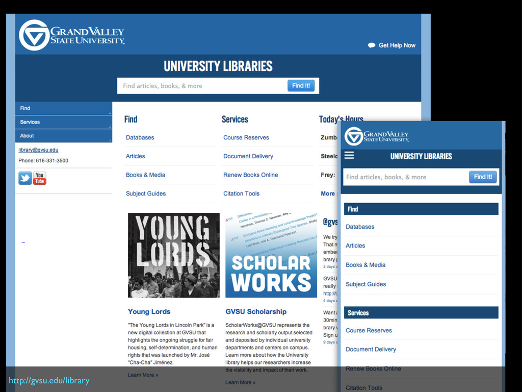
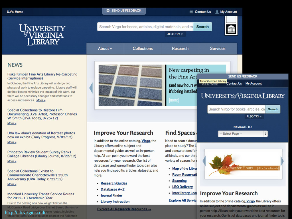
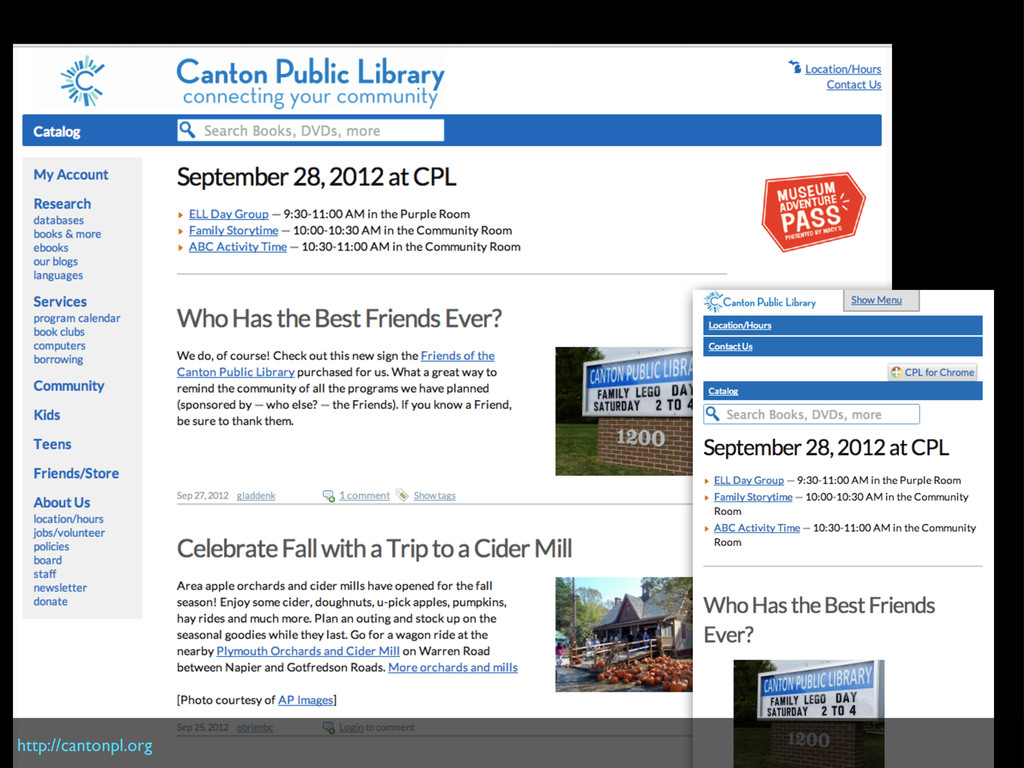
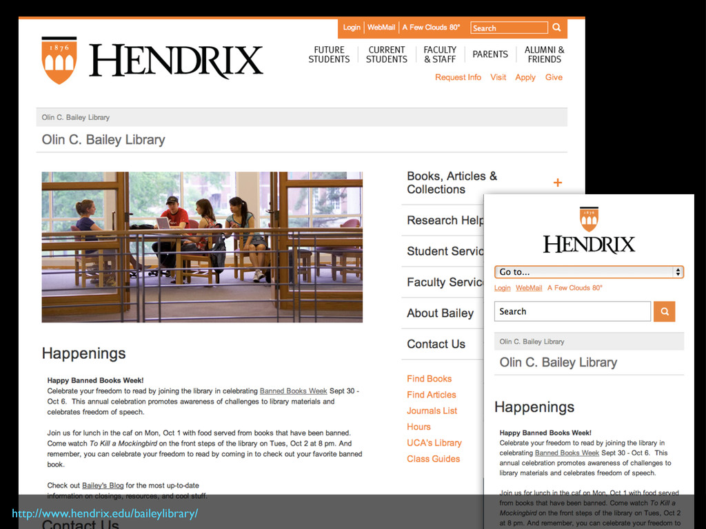
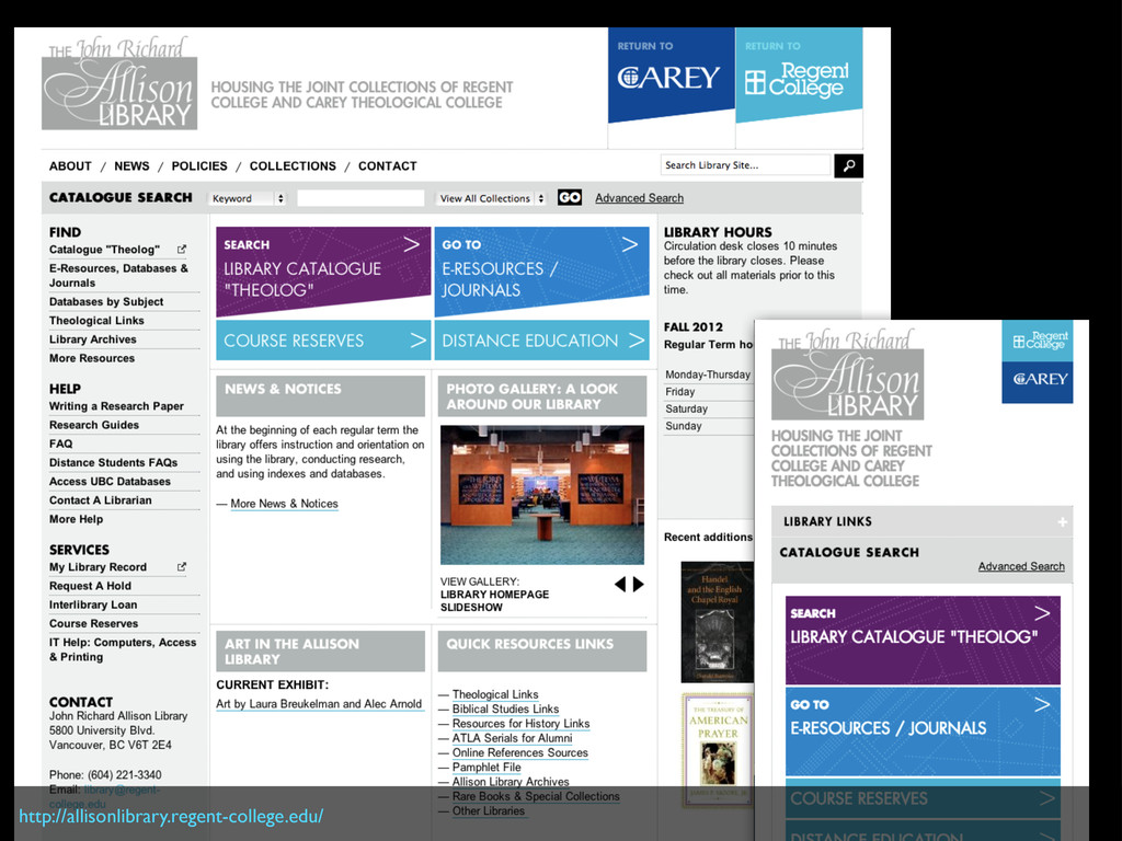
Slides for webinar on Responsive Design given to the Metropolitain New York Library Council on October 1, 2012.
 SiteGround - Reliable hosting with speed, security, and support you can count on.
 matthewreidsma
 dmmsre
 muziyoshiz
 yuksew
 sue445
 mhrtech
 yuukiyo
 satohy0323
 shift_evolve
 zozotech
 ry0_ka
 kzykmyzw
 coborinai
 inesmontani
 axbom
axbom
 morganepeng
 chriscoyier
 jeffersonlam
 sstephenson
 tammyeverts
 mayatellez
 bluesmoon
 brad_frost
 oripsolob
 reverentgeek
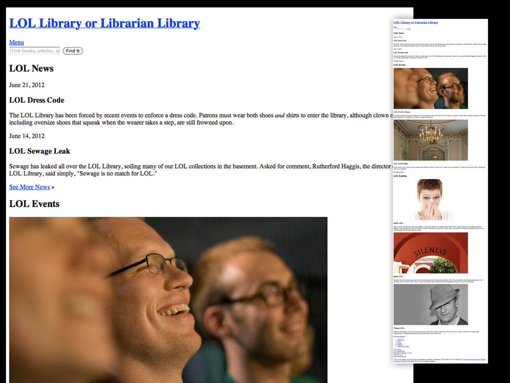
![INPUT TYPE=”TEXT” INPUT TYPE=”SUBMIT” input[type=”text”] { display: block; margin: 0](https://files.speakerdeck.com/presentations/5066734e244a9d000203e216/slide_61.jpg)
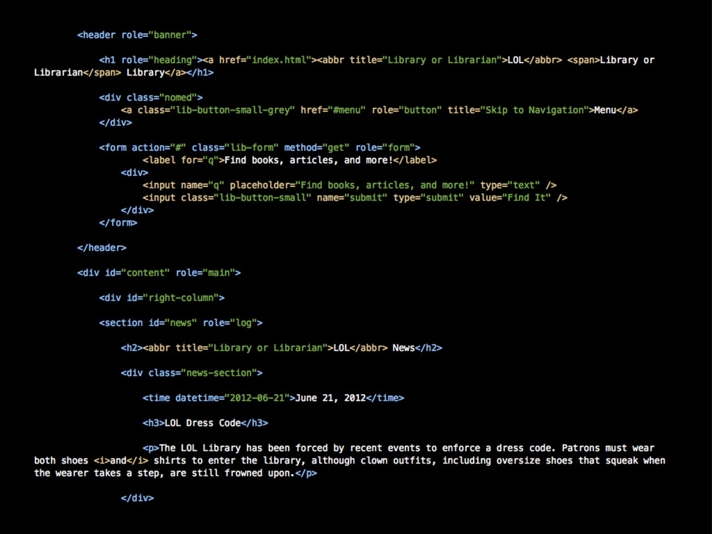
![body { display: table; caption-side: top; } nav[role="navigation"] { display:](https://files.speakerdeck.com/presentations/5066734e244a9d000203e216/slide_81.jpg)
![[email protected] :: @mreidsma matthewreidsma.com :: gvsu.edu/library/labs YOU THANK](https://files.speakerdeck.com/presentations/5066734e244a9d000203e216/slide_113.jpg)