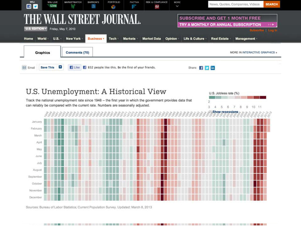
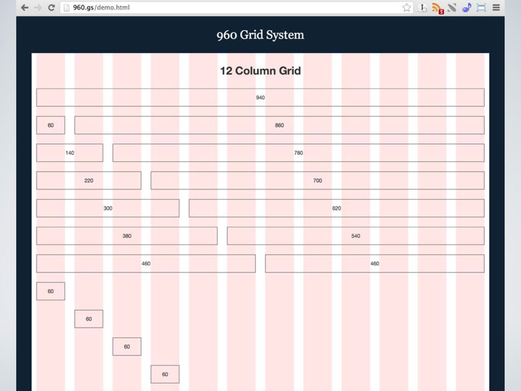
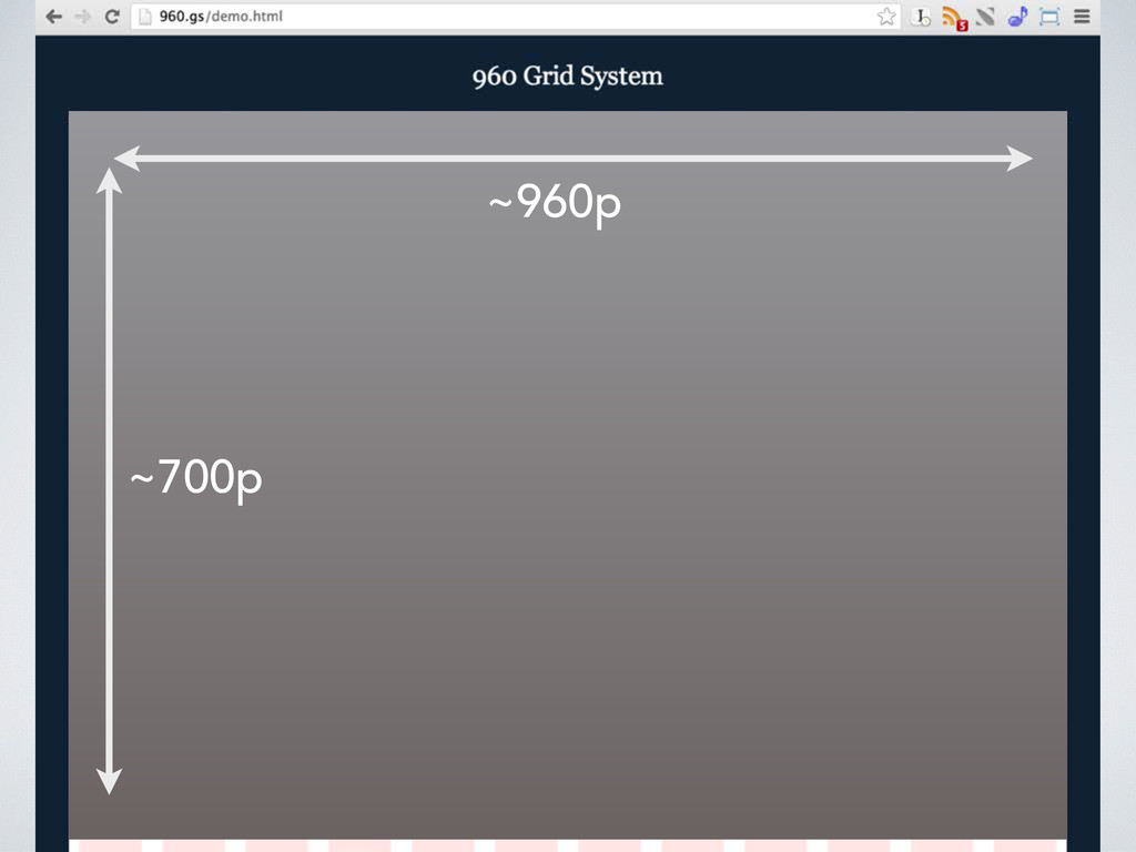
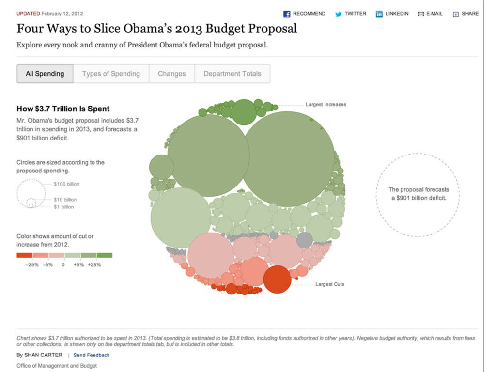
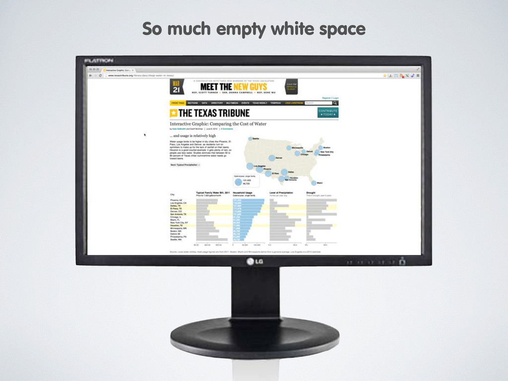
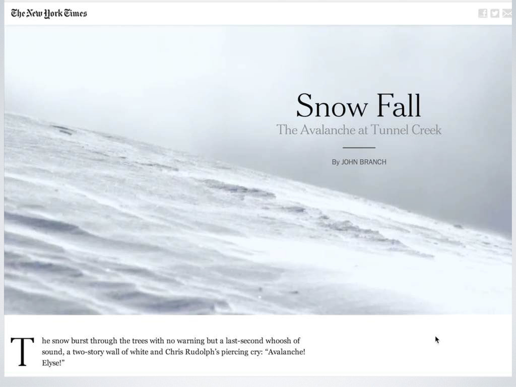
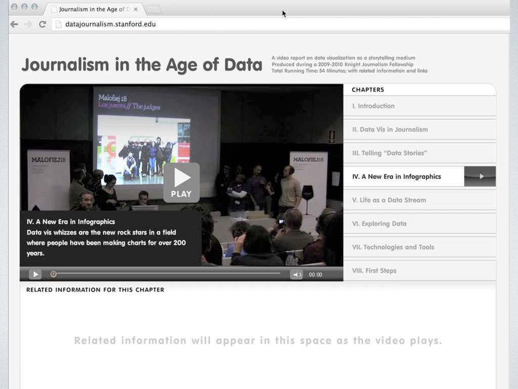
common denominator for PCs) • “960 Grid” invented to create mathematically elegant base for 12 or 16 column grids • 1024 px was the horizontal resolution of the iPad, the first modern tablet device • 700 px is about the amount of display space visible “above the scroll” The 960 Pixel “Page” The Architecture of Online Infographics ~960px ~700px • Predominant design pattern since ~2006 • Made good sense when Flash was predominant infographics tool, because of fixed-size canvas (very hard to extend content from original boundaries)
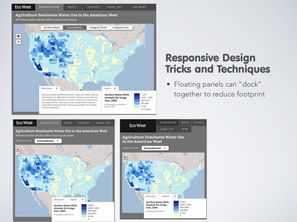
• They have little presence on the rest of a website, can’t be put on front • They cannot be embedded or otherwise “quoted” elsewhere, except with a static image • For organizations that use syndication as a business model or social media strategy, they are a big problem • For sites with a usable space of less than 960 (say 600 or 700 pixels), the maximum workspace is permanently limited to a very small size • Yes, you can use a lightbox, but... More Problems with Fixed Size Infographics
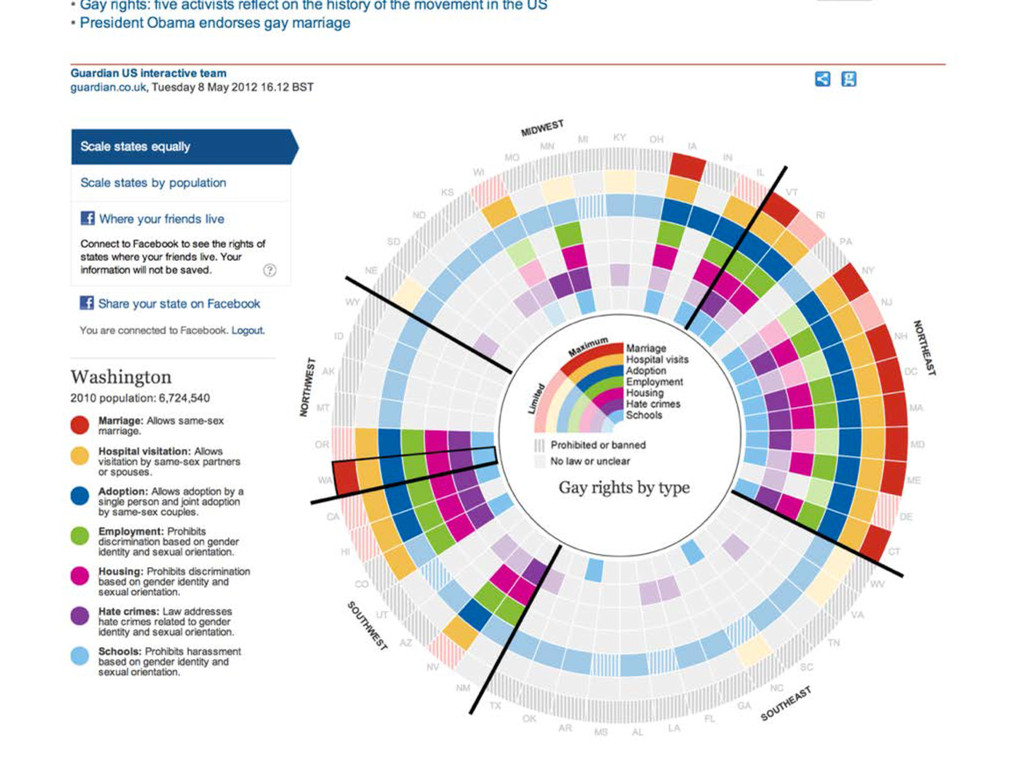
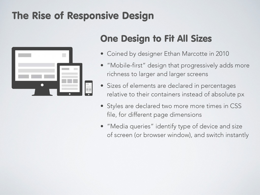
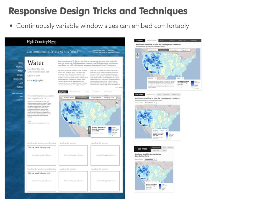
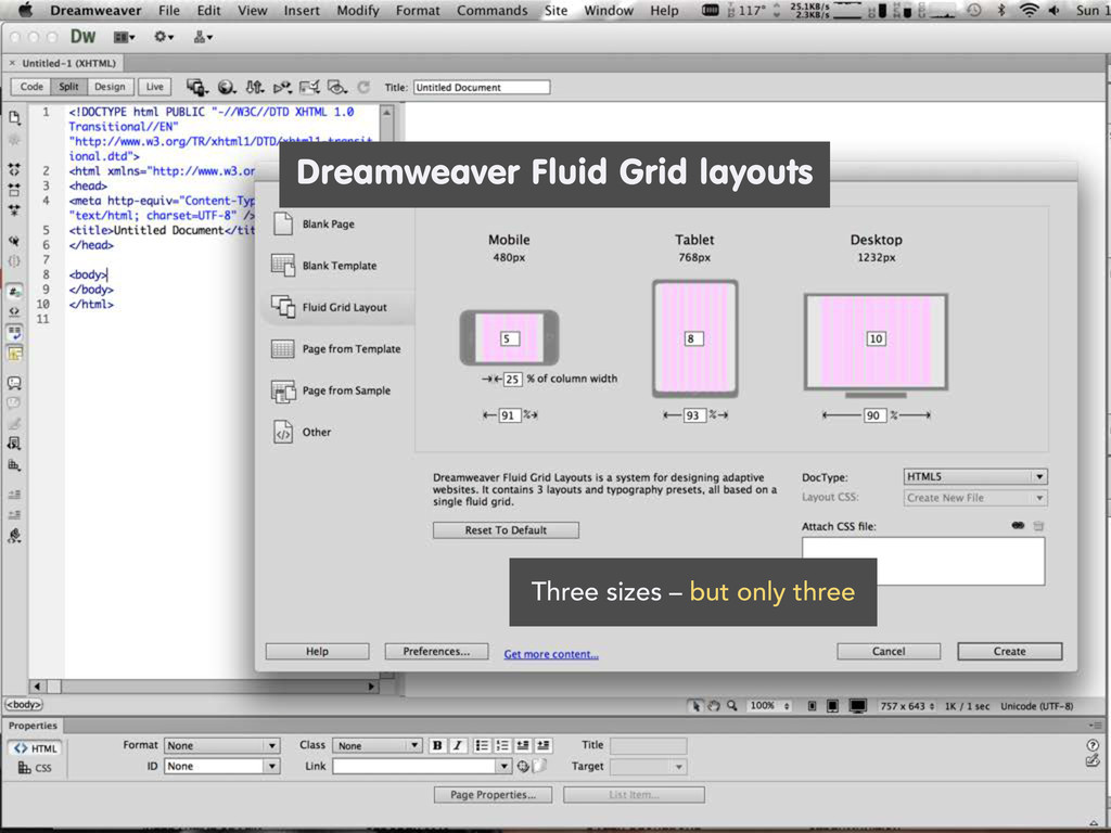
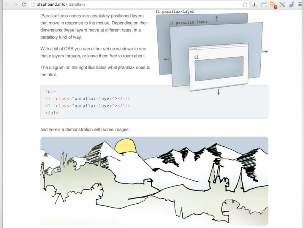
design that progressively adds more richness to larger and larger screens • Sizes of elements are declared in percentages relative to their containers instead of absolute px • Styles are declared two more more times in CSS file, for different page dimensions • “Media queries” identify type of device and size of screen (or browser window), and switch instantly One Design to Fit All Sizes The Rise of Responsive Design
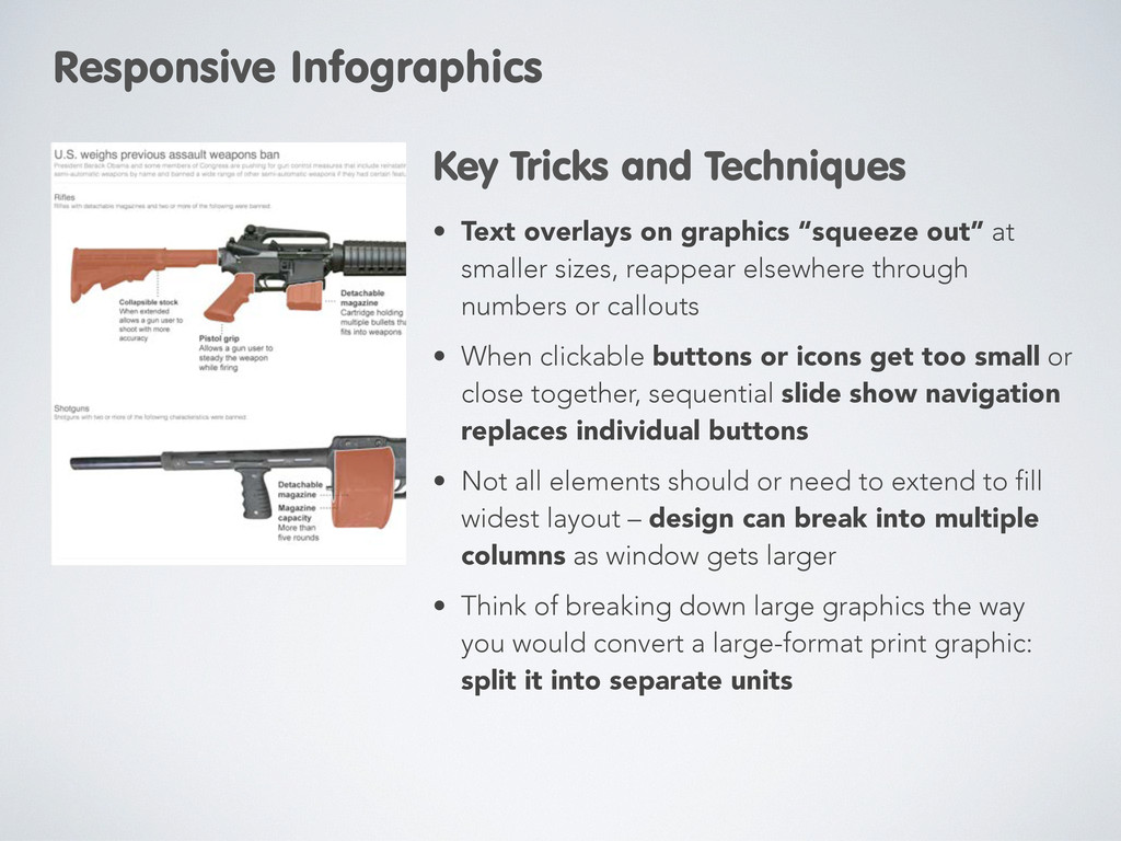
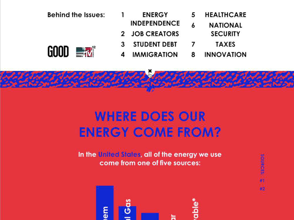
reappear elsewhere through numbers or callouts • When clickable buttons or icons get too small or close together, sequential slide show navigation replaces individual buttons • Not all elements should or need to extend to fill widest layout – design can break into multiple columns as window gets larger • Think of breaking down large graphics the way you would convert a large-format print graphic: split it into separate units Key Tricks and Techniques Responsive Infographics
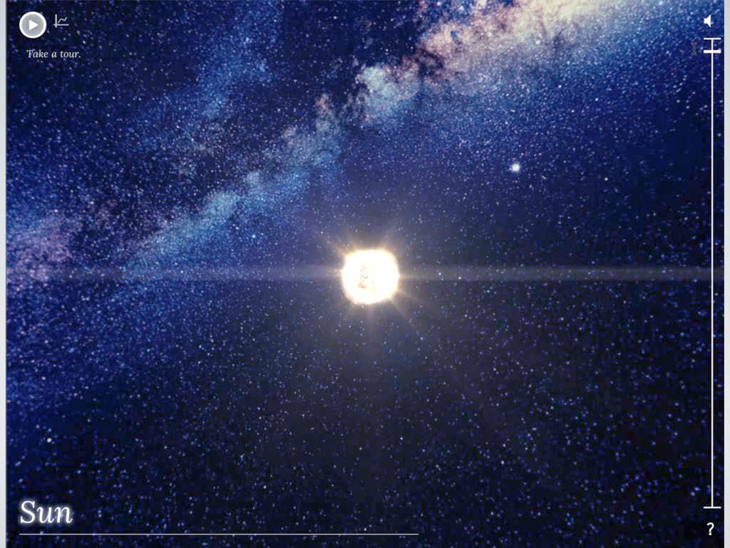
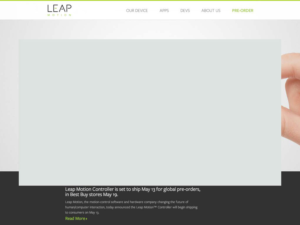
devices, whether it’s a mouse-wheel, swipe on a trackpad, magic mouse, tablet surface or smartphone screen • It has little or no visual interface that needs to be directly manipulated (in fact, Mac OS 10.7 virtually banished the scroll bar) • As we saw in the responsive design examples, directly clickable controls are very complicated to manage at varying resolutions... get rid of them? • Action of “scrolling” is co-opted to trigger other reactions than down movement - cuing a video, rotating, flipping through images, whatever! Infographics Where You Never Get Lost Scroll or Swipe-Based Interaction
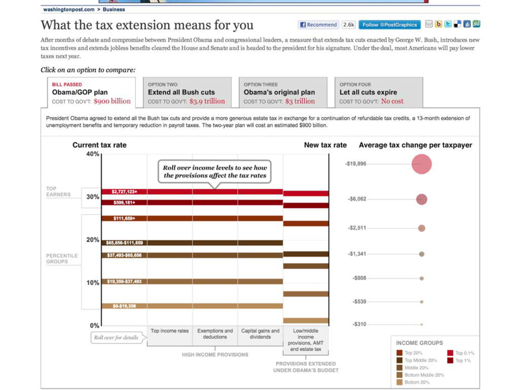
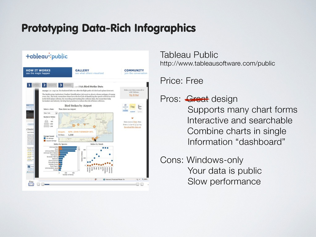
Great design Supports many chart forms Interactive and searchable Combine charts in single Information “dashboard” Cons: Windows-only Your data is public Slow performance Getting Started with Visualization Prototyping Data-Rich Infographics
 mcgeoff
 yusukeiyoda
 rezaline
 saki822
 mhand01
 r5ni4
r5ni4
 moco1013
 bebe
bebe
 pkshadeck
 sony
sony
.jpg) rwang05
rwang05
 terencebasart
 videlvequio
 sabderemane
 stuffmc
 cassininazir
 nonsquared
 aki_iinuma
 skoyamalab
 danielanewman
 frankvandijk
 ryanjones
 marktimemedia
 nikkihalliwell
![Thanks! [email protected] Twitter: @mcgeoff](https://files.speakerdeck.com/presentations/b4b3a9206dfa0130951122000a1e9733/slide_84.jpg)