Upgrade to Pro — share decks privately, control downloads, hide ads and more …

The conversation of UI: Unpacking voice and tone for interfaces

The conversation of UI: Unpacking voice and tone for interfaces

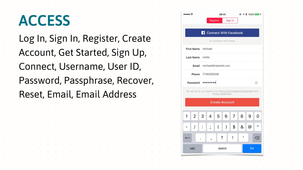
Interface components like buttons, menus, errors, and confirmation messages are built with words, and it’s remarkable how much a consistent voice and tone matter. Are you using an efficient, informative voice, or do you sound more like a quirky, lovable goofball? The appropriate voice builds trust, increases retention, humanizes interactions, and ultimately drives conversions and other business goals.

Drawing on their experience writing and designing for digital products, Andy and Michael will help you develop frameworks to explore and document how voice and tone affect the different aspects of your product, brand, website, or service.

This session will cover three primary things:
- Discovery: Learn about voice and tone variants so you can understand how to match them to your company or product. Find out how to facilitate meaningful feedback from your audience and stakeholders as you develop your voice.
- Design: Explore how tone should change based on what your users are going through, then apply your tone decisions practically by creating a prototype.
- Testing: See how to get data about how well your voice and tone decisions are working through testing and research.

Michael J. Metts

April 19, 2019
Tweet

More Decks by Michael J. Metts

Other Decks in Design

Transcript

  1. THE CONVERSATION OF UI Unpacking Voice and Tone for Interfaces

    Andy Welfle (@awelfle) UX Content Strategy Manager, Adobe Michael J. Metts (@mjmetts) Conversation Design Lead, Allstate
  2. THE CONVERSATION OF UI Unpacking Voice and Tone for Interfaces

    Andy Welfle (@awelfle) UX Content Strategy Manager, Adobe Michael J. Metts (@mjmetts) Conversation Design Lead, Allstate
  3. “We expect things to be digital, but also, in many

    cases, physical. We want things to feel auto-magic while retaining a human touch. We want to be safe, but not spied on. We use words at our whim.” Abby Covert How to Make Sense of Any Mess
  4. “I work on digital products and physical goods, so I’m

    deeply involved in the design process. But I also want to call out early that my process is the design process. I don’t write fiction or short stories; I use language to solve problems—whether that’s behind the scenes or in the product itself. I use words as material.” Nicole Fenton Co-author of Nicely Said Source: http://nicolefenton.com/words-as-material/
  5. APP STORE If you really want to know your company’s

    value proposition, try fitting it across the top of four screenshots in the app store.
  6. ONBOARDING Do it again, but make it unique from the

    app store one while encouraging account creation.
  7. ACCESS Log In, Sign In, Register, Create Account, Get Started,

    Sign Up, Connect, Username, User ID, Password, Passphrase, Recover, Reset, Email, Email Address
  8. ERRORS Whoops, Sorry, Oops…, We broke something, Just a moment,

    Please wait, There was a problem, Something’s Wrong, Invalid, Incorrect, Don’t Worry
  9. ADMIN AREAS Account, Profile, Settings, My Acount, Your Profile, Your

    Settings, Personal Details, Personal Information, Credit Cards, Payment Information, Payment Methods, Preferences
  10. TRANSACTIONS Cart, Shopping Basket, Items, Payment, Renewal, Subscription, Recurring, Repeating,

    Pro-Rated, Discount, Initial Payment, Checkout, Buy, Complete Purchase, Burger Me!
  11. MORE THINGS • SMS notifications • Push notifications • Email

    notifications • Confirmation emails • Account recovery emails • Email validation emails (emails about emails) • Re-engagement emails • Release notes (bug fixes and performance improvements) • Help content • Terms and conditions • Privacy policy • Contact forms • Contact form confirmation screens and emails
  12. It's not a question of whether your interface has a

    voice or changes its tone. It's a question of how intentional you are about it.
  13. “Customer Service Behavior included items that were related to the

    friendliness and politeness of the system, its speaking pace, and its use of familiar terms.” Melanie Polkosky, PhD Toward a Social-Cognitive Psychology of Speech Technology: Affective Responses to Speech-Based e-Service Source: https://www.researchgate.net/publication/33994535_Toward_a_social- cognitive_psychology_of_speech_technology_electronic_resource_affective_responses_to_speech-based_e-service In a study with 821 participants, customer service behavior was found to be one of the four most important usability factors out of 76 possibilities.
  14. Learning more about your users is always a good thing,

    no matter how small or limited the effort.
  15. TYPES OF RESEARCH: Looking at numbers - A/B tests, analytics

    research, surveys Talking to users - Interviews, conversations Understanding vocabulary - Forums, Google Trends Observing users - Usability testing, contextual inquiry
  16. What's the difference between feedback and critique? Feedback is a

    quick, one-way reaction often grounded in opinion. Critique is critical dialogue grounded in objectives that helps us understand design decisions. Mia Blume defines it this way:
  17. GUIDELINES FOR CRITIQUE • Let everyone participate. Every perspective is

    important. • Ask questions if you’re unsure why something is the way it is. • Speak from objectives. Avoid phrases like “I don’t like that”. • Dig into the details. Talk through the nuances of word choice, discuss alternate approaches and more. Critique the writing, not the writer.
  18. A QUICK PRIMER ON VOICE VS. TONE (using a few

    GIFs from The Little Mermaid)
  19. Voice is who you are. Tone is how we respond

    to different situations. — Michael Haggerty-Villa, Intuit
  20. WHAT IS ADOBE’S VOICE? Human Friendly, honest and respectful •

    Vary sentence style and structure for readability and empathy • Show empathy in situations where people feel uncertain, frustrated or confused Rational Clear and understandable • Avoid language that’s overly idiomatic, intentionally clever or trendy Reductive Concise and simple • Start with only essential information, and add in extra content if needed
  21. Above: Voice and Tone | MailChimp Content Style Guide: http://styleguide.mailchimp.com/voice-and-tone/

    Right: Shopify's voice and tone guide | Medium: https://medium.com/shopify-ux/shopify-s-voice-and-tone-guide-968539e06777 “ADJECTIVE BUT NOT ADJECTIVE”
  22. OTHER VOICE CHARACTERISTICS Facebook: Simple | Straightforward | Human Shopify:

    Trustworthy | Confident | Empowering Source: https://ux.shopify.com/shopify-s-voice-and-tone-guide-968539e06777 Airbnb: Straightforward | Inclusive | Thoughtful | Spirited Source: Marissa Philips, Advocating from the inside out: Motivating your team to evangelize their work, Confab 2017 Source: https://medium.com/facebook-design/getting-started-in-content-strategy-d7543ed22633 Slack: Clear | Concise | Human Source: https://api.slack.com/best-practices/voice-and-tone
  23. THIS BUT NOT THAT Michael’s Voice: Soft-spoken but not hesitant

    Funny but not goofy Humble but not deferential Confident but not braggadocios
  24. THE CONSTRAINTS No personas: If your voice is friendly, the

    bot shouldn't have to say "I'm friendly". Let the interface itself convey the nuances of voice and tone. Focus on providing user value: Unlike the real world, there are no technology constraints. Create any functionality you want—just make sure your users' needs are resolved.
  25. WHAT TO FOCUS ON Facilitation: Lead others through unfamiliar territory.

    Experimentation: The conversation of UI can go in a lot of different directions. Adaptation: Let’s talk through how these work, or even don’t work, for your situation.
  26. THE WRITER THE TEAM • Repsonsible for: Writing the words.

    • Motivation: Clarity. • Pain point: Left out of design conversations.
  27. THE DESIGNER THE TEAM • Repsonsible for: Visuals and interaction.

    • Motivation: Cohesive aesthetics. • Pain point: Heavy workload.
  28. THE ENGINEER THE TEAM • Responsible for: Delivering code. •

    Motivation: Smart architecture. • Pain point: Team doesn't understand the technology.
  29. THE PRODUCT MANAGER THE TEAM • Repsonsible for: Reducing call

    center volume. • Motivation: Appeasing leadership. • Pain point: Thinks the team plans too much.
  30. THE CONTENT STRATEGIST THE TEAM • Repsonsible for: Maintaining standards.

    • Motivation: Consistency. • Pain point: Spread across 10 scrum teams.
  31. THE WRITER THE TEAM • Responsible for: Writing the words.

    • Motivation: Clarity. • Pain point: Left out of design conversations. THE DESIGNER • Responsible for: Visuals and interaction. • Motivation: Cohesive aesthetics. • Pain point: Heavy workload. THE ENGINEER • Responsible for: Delivering code. • Motivation: Smart architecture. • Pain point: Team doesn't understand the technology. THE PRODUCT MANAGER • Responsible for: Reducing call center volume. • Motivation: Appeasing leadership. • Pain point: Thinks the team plans too much. THE CONTENT STRATEGIST • Responsible for: Maintaining standards. • Motivation: Consistency. • Pain point: Spread across 10 scrum teams.
  32. DRAW THREE IDEAS FOR HOW TO SPREAD THE IDEAS BEHIND

    YOUR PRODUCT'S VOICE ON STICKY NOTES. Bonus round
  33. Lots of tone No tone LEVEL 1 Headlines, marquees, subject

    lines, big stories, chapter headers Tone is engaging, human, emotional, creative, thought-provoking LEVEL 2 Subheads, pre-headers, How Adobe helps Tone is more directional or informational LEVEL 3 Main body copy, sub-sections, customer stories, case studies Tone is conversational, including technical details and story LEVEL 4 Main bullets, deeper content, tech specs, features, capabilities Tone is technical, straightforward, to the point LEVEL 5 CTAs Tone is direct, short and punchy How marketers often think about tone
  34. HOW UX WRITERS THINK ABOUT TONE Sibling Boss Cow orker

    Room m ate N eighbor Rather than a volume knob where you turn “tone” up and down, it’s a spectrum upon which you pick a tone to best respond to the user.
  35. HOW UX WRITERS THINK ABOUT TONE Rather than a volume

    knob where you turn “tone” up and down, it’s a spectrum upon which you pick a tone to best respond to the user. Inform ational M otivational U seful Supportive Reassuring Proactive Reactive
  36. You (the interface) YOU Goal: What do you want the

    user to do? Mood: What feeling do we want to display to the user? Attribute: What qualities does this interaction have? How would you say things? USER Emotion: What might they be feeling when they encounter this message? Receptiveness: How open to this message is the user likely to be? Your user Scenario SCENARIO UI Type: What is this UI element? Location: Where in their journey might this user be? Exit Point: What will the user be encountering next after this message?
  37. MOTIVATIONAL Your goal To show user new features, get them

    excited about using a product — perhaps for the first time You mood Positive and passionate User’s emotion: Curious, possibly overwhelmed User’s receptiveness: Medium to high Typical UI type: Onboarding, new user experiences Tone Attribute: Encouraging TONE PROFILE
  38. Your Goal: To tell you about something that might be

    useful for you in context. Your Mood: Polite, respectful User’s Emotion: Busy, distracted User’s Receptiveness: Low to medium Typical UI Type: Tooltips, modal dialogs Tone Attribute: Helpful USEFUL TONE PROFILE
  39. Your Goal: To fade into the background and present relevant

    information if needed Your Mood: Neutral User’s Emotion: Any User’s Receptiveness: High Typical UI Type: Microcopy, labels, button CTAs Tone Attribute: Straightforward INFORMATIONAL TONE PROFILE
  40. A/B TESTS! Light & Funny Caring & Serious With
 Headline

    We got you, boo
 So it looks like your password is not so fresh — how about you work on that? Your password is out of date We care about you and your account, so please take a moment to update your password. Without
 Headline So it looks like your password is not so fresh — how about you work on that? We care about you and your account, so please take a moment to update your password.
  41. Light & Funny Caring & Serious With
 Headline We got

    you, boo
 So it looks like your password is not so fresh — how about you work on that? -2.18% CTR Your password is out of date We care about you and your account, so please take a moment to update your password. +5.45% CTR Without
 Headline So it looks like your password is not so fresh — how about you work on that? +.47% CTR We care about you and your account, so please take a moment to update your password. +1.2% CTR A/B TESTS!
  42. IDEAS FOR SCENARIOS • A user just created their bank

    account • A payment was just accepted by its intended recipient • A credit card on the user's account is about to expire • There was suspicious activity on the user's account, so they need to reset their password before they can sign in • ABC is offering an account credit if the user invites friends to sign up for an account
  43. TESTING METHOD • Underline the things that are helpful •

    Circle the things that aren't helpful Ask your participant to: • Ask follow-up questions You should:
  44. GUIDELINES FOR CRITIQUE • Let everyone participate. Every perspective is

    important. • Ask questions if you’re unsure why something is the way it is. • Speak from objectives. Avoid phrases like “I don’t like that”. • Dig into the details. Talk through the nuances of word choice, discuss alternate approaches and more. Critique the writing, not the writer.
  45. WHAT NEEDS TO BE CONSISTENT? • Style. The basics like

    abbreviation and capitalization, as well as things unique to your org, like branded terms and product names. • Patterns. The components that are actually used to build the software. These can include writing, visual design, and code.
  46. WHAT NEEDS TO BE EFFICIENT? • Design decisions. There's no

    reason eight competent professionals need to spend an hour every other month debating the merits of "Buy" vs "Purchase". • Workflow. Working from a place of shared understanding helps teams estimate accurately and mitigates miscommunication.
  47. START WITH A STRATEGY A design system that's not driven

    by strategy just helps you do the wrong thing more efficiently and consistently.
  48. A design system that doesn't treat language as a core

    element isn't really about design.
  49. "A design system is a product. Documenting business processes for

    a product does not create a product. Documenting components for a design system does not create a design system. It's a tool for a specific set of users under specific circumstances." Amy Chick Strategist and Designer
  50. STRATEGY DESIGN SYSTEMS Shopify includes naming guidelines in the Polaris

    design system. • Used as a governance tool • Enables the teams to have naming conversations based on more than personal opinion Source: https://polaris.shopify.com/content/naming
  51. PATTERNS DESIGN SYSTEMS Instagram handles truncation consistently, and you can

    see why they handle it this way: • More consistent than "view both comments" • Better clarity than "view all comments"
  52. PATTERNS DESIGN SYSTEMS Rationale and guidelines give design system users

    the confidence to adopt patterns. • Designed specifically for intent recognition • Quickly summarize the intent so the user can decide whether to stay
  53. PATTERNS DESIGN SYSTEMS Including example wording when documenting a component

    helps teams understand its use. Audi's design system uses placeholder words, making it harder for its users to see how to use them. Source: https://www.audi.com/ci/en/guides/user-interface/components/buttons.html
  54. PATTERNS DESIGN SYSTEMS Including example wording when documenting a component

    helps teams understand its use. Atlassian's design system uses real words from the interfaces, making it easier for its users to understand the guidelines.