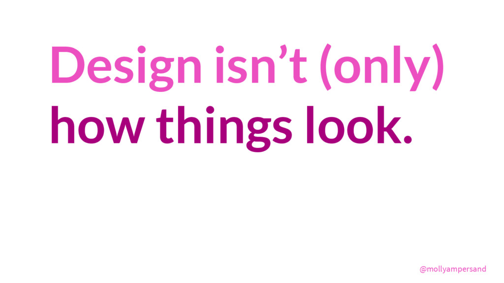
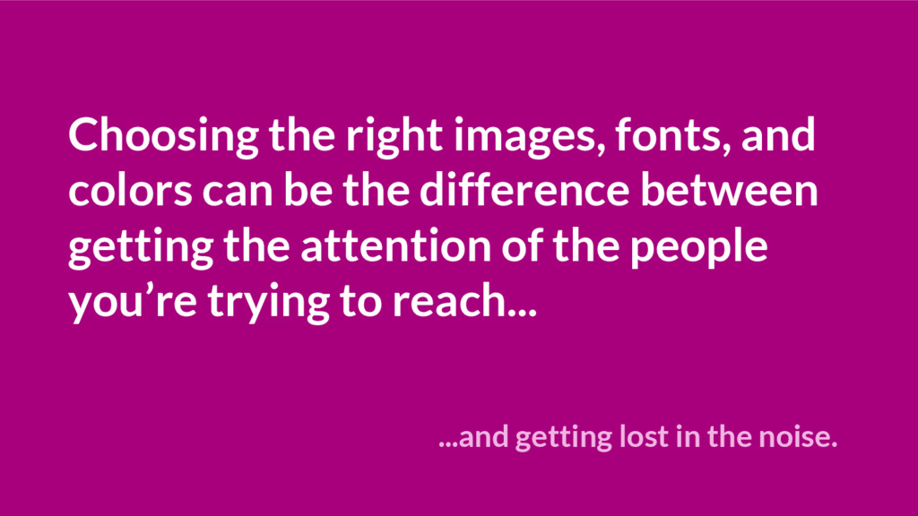
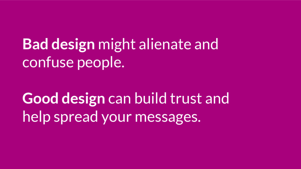
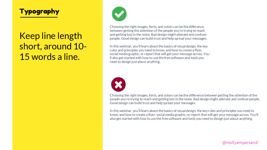
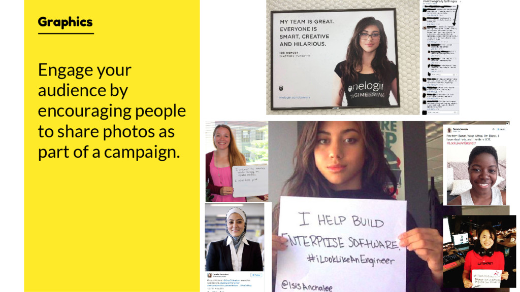
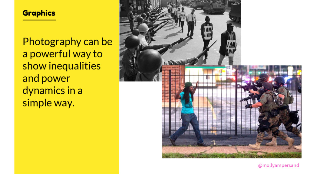
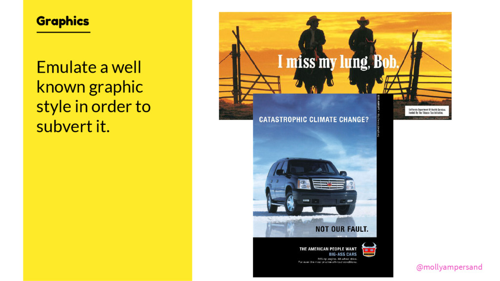
Choosing the right images, fonts, and colors can be the difference between getting the attention of the people you’re trying to reach and getting lost in the noise. Bad design might alienate and confuse people. Good design can build trust and help spread your messages.
You’ll learn about the basics of visual design, the key rules and principles you need to know, and how to create a flyer, social media graphic, or report that will get your message across. You’ll also get started with how to use the free software and tools you need to design just about anything.
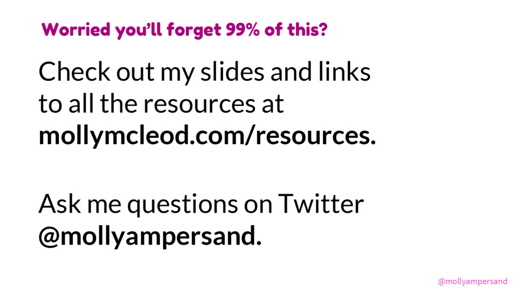
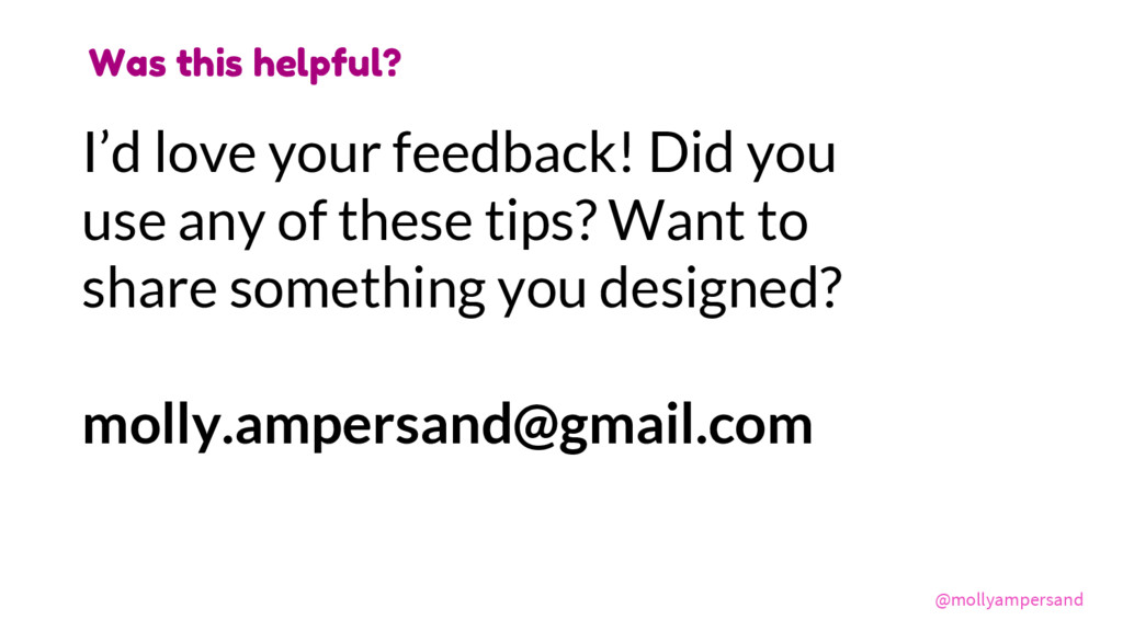
www.mollymcleod.com • [email protected]