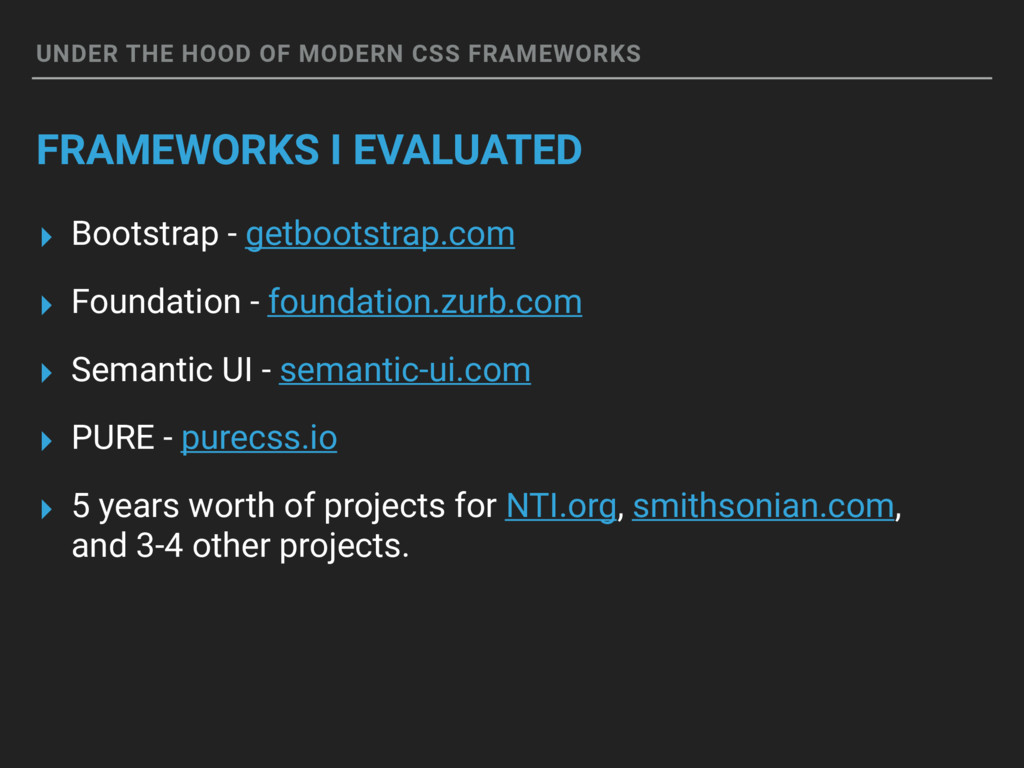
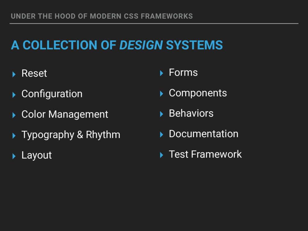
▸ Bootstrap - getbootstrap.com ▸ Foundation - foundation.zurb.com ▸ Semantic UI - semantic-ui.com ▸ PURE - purecss.io ▸ 5 years worth of projects for NTI.org, smithsonian.com, and 3-4 other projects.
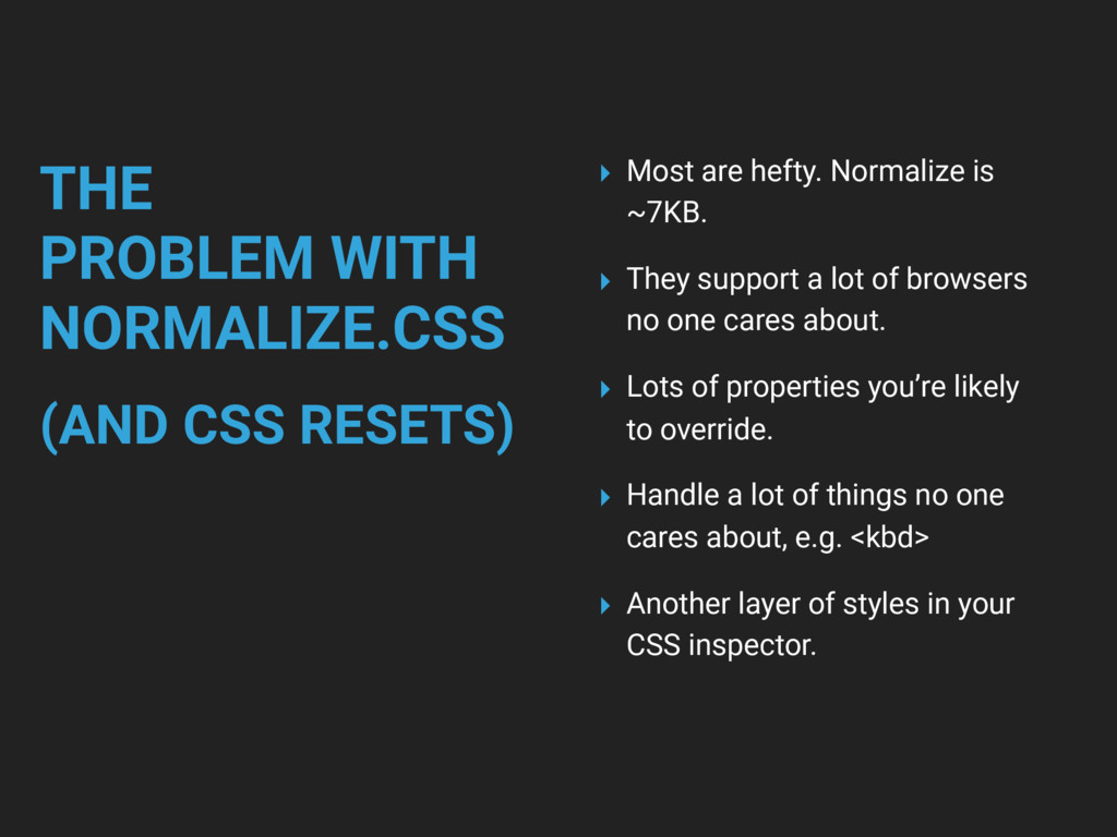
are hefty. Normalize is ~7KB. ▸ They support a lot of browsers no one cares about. ▸ Lots of properties you’re likely to override. ▸ Handle a lot of things no one cares about, e.g. <kbd> ▸ Another layer of styles in your CSS inspector.
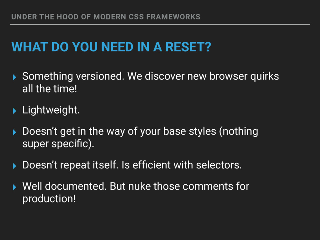
NEED IN A RESET? ▸ Something versioned. We discover new browser quirks all the time! ▸ Lightweight. ▸ Doesn’t get in the way of your base styles (nothing super specific). ▸ Doesn’t repeat itself. Is efficient with selectors. ▸ Well documented. But nuke those comments for production!
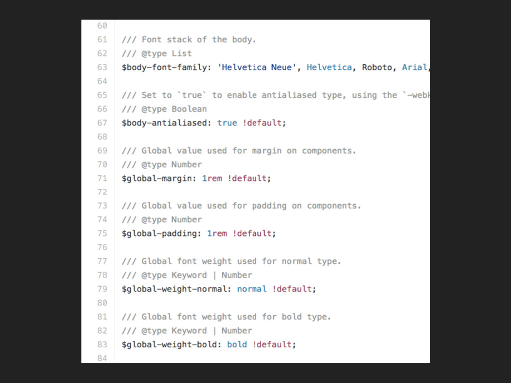
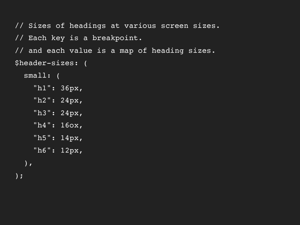
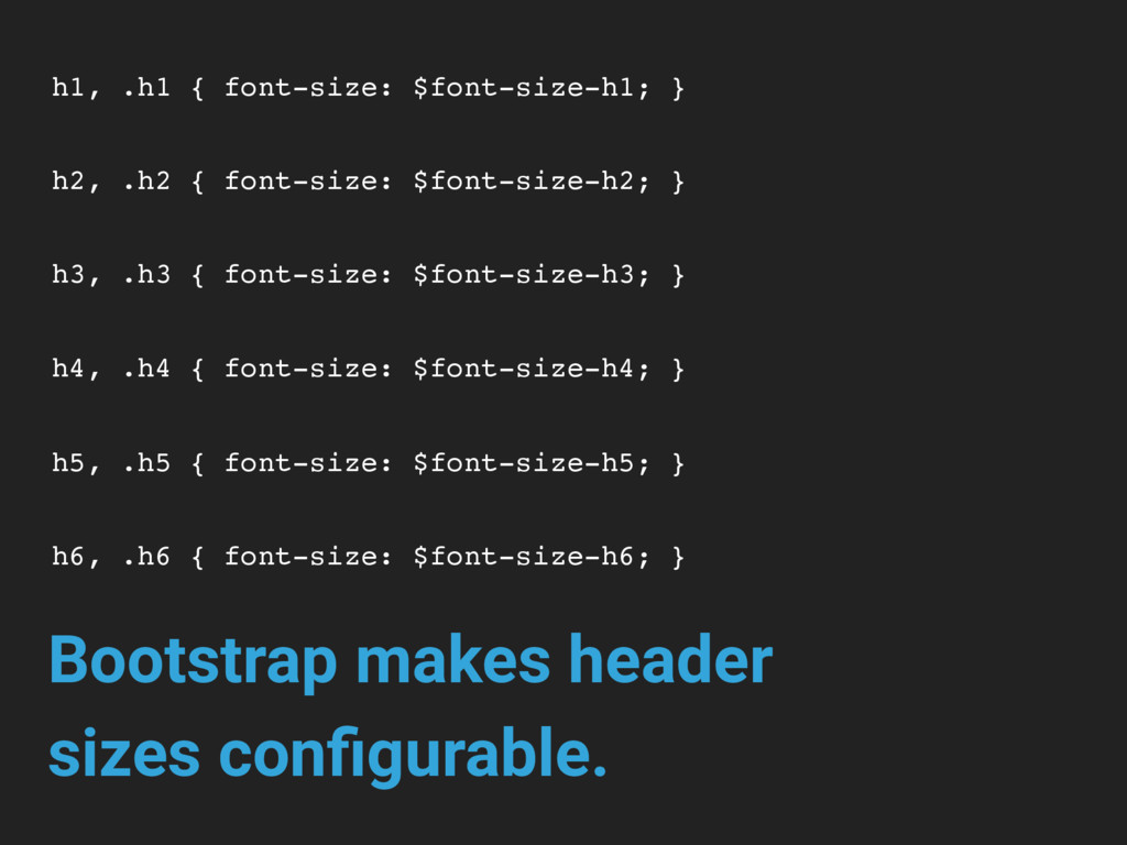
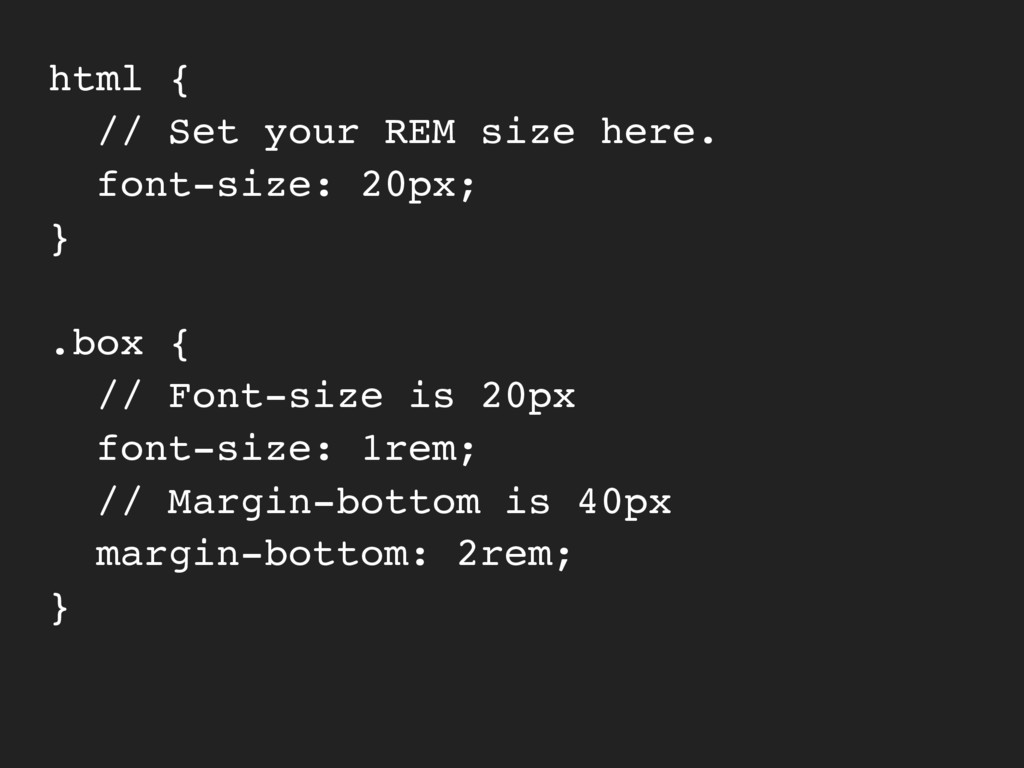
key is a breakpoint. // and each value is a map of heading sizes. $header-sizes: ( small: ( "h1": 36px, "h2": 24px, "h3": 24px, "h4": 16ox, "h5": 14px, "h6": 12px, ), );
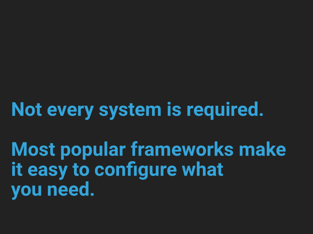
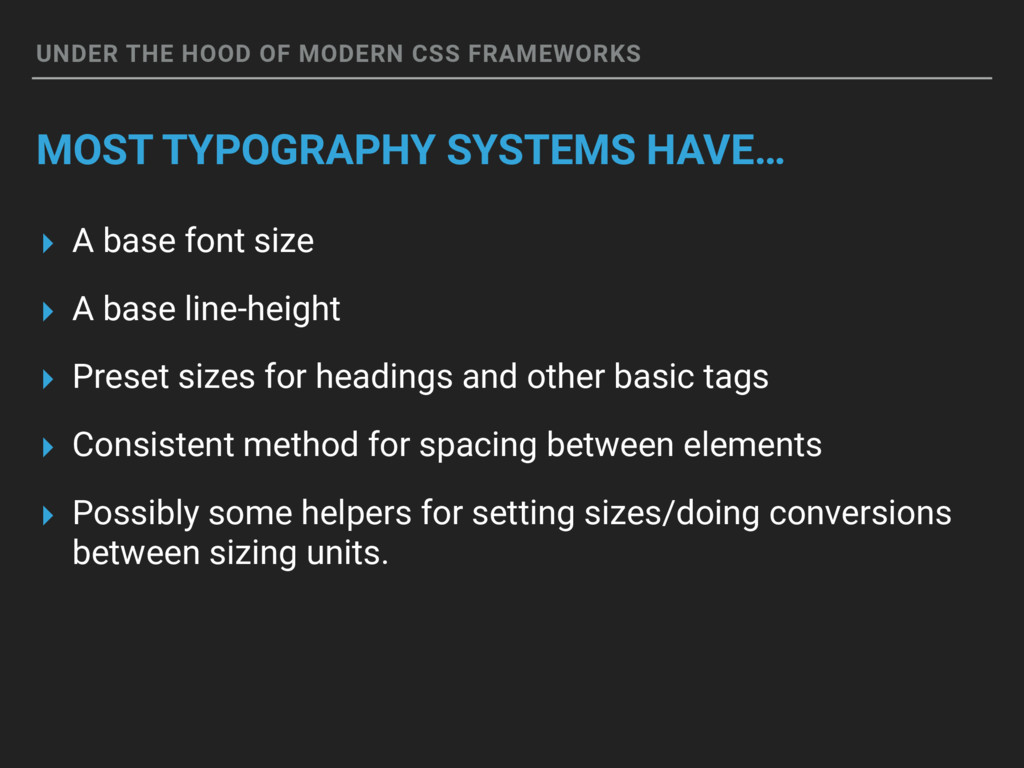
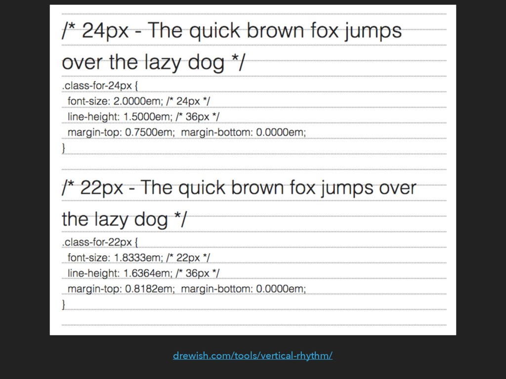
HAVE… ▸ A base font size ▸ A base line-height ▸ Preset sizes for headings and other basic tags ▸ Consistent method for spacing between elements ▸ Possibly some helpers for setting sizes/doing conversions between sizing units.
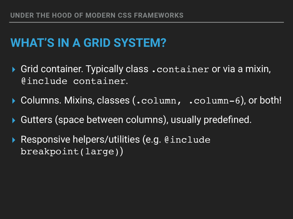
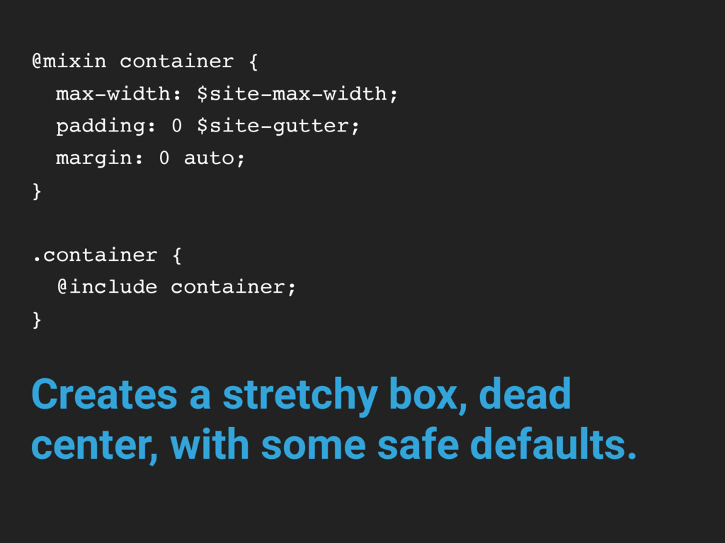
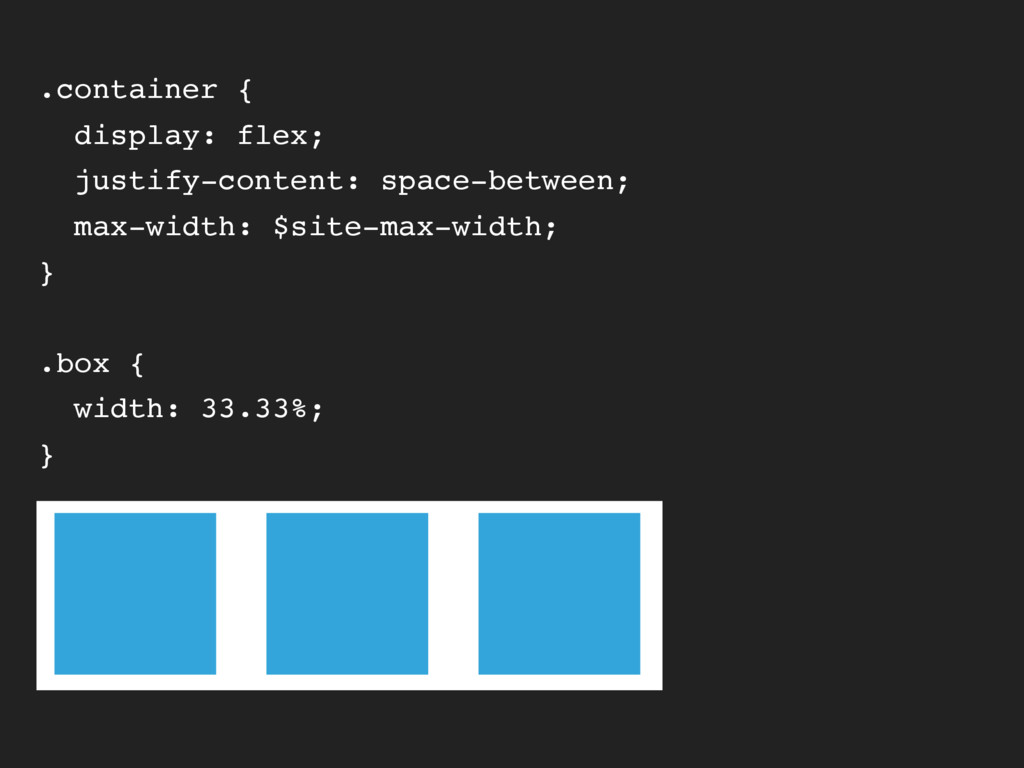
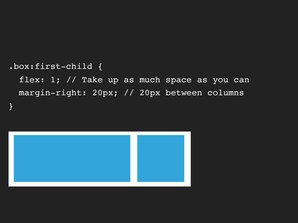
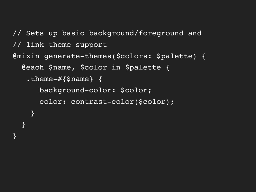
GRID SYSTEM? ▸ Grid container. Typically class .container or via a mixin, @include container. ▸ Columns. Mixins, classes (.column, .column-6), or both! ▸ Gutters (space between columns), usually predefined. ▸ Responsive helpers/utilities (e.g. @include breakpoint(large))
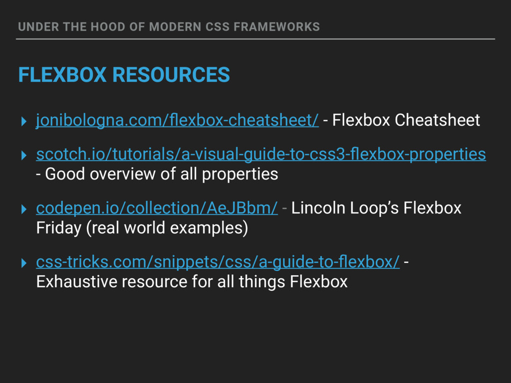
jonibologna.com/flexbox-cheatsheet/ - Flexbox Cheatsheet ▸ scotch.io/tutorials/a-visual-guide-to-css3-flexbox-properties - Good overview of all properties ▸ codepen.io/collection/AeJBbm/ - Lincoln Loop’s Flexbox Friday (real world examples) ▸ css-tricks.com/snippets/css/a-guide-to-flexbox/ - Exhaustive resource for all things Flexbox
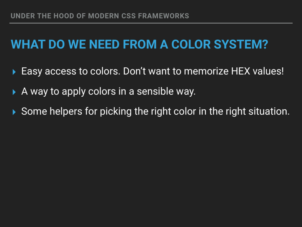
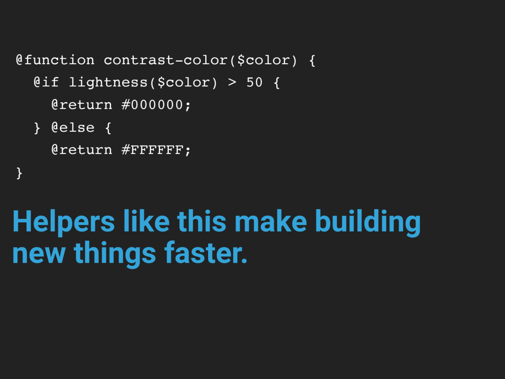
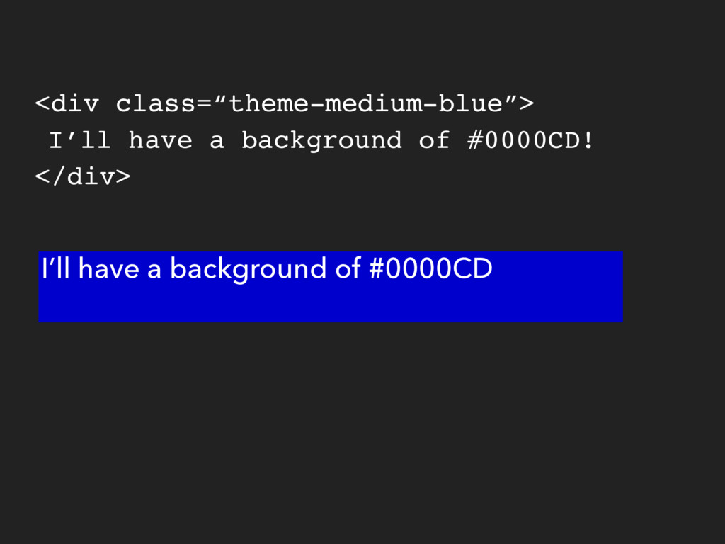
NEED FROM A COLOR SYSTEM? ▸ Easy access to colors. Don’t want to memorize HEX values! ▸ A way to apply colors in a sensible way. ▸ Some helpers for picking the right color in the right situation.
TO IMPRESS YOUR FRIENDS ▸ Avoid modifying colors via functions like darken() or lighten() functions. Make colors configurable. Exceptions: Something like zebra stripes. ▸ One color system. Using HEX? Use HEX everywhere. ▸ Use your color lingo when communicating with the team. If it’s proper name is orchid, use that name, not “bright rich purple”.
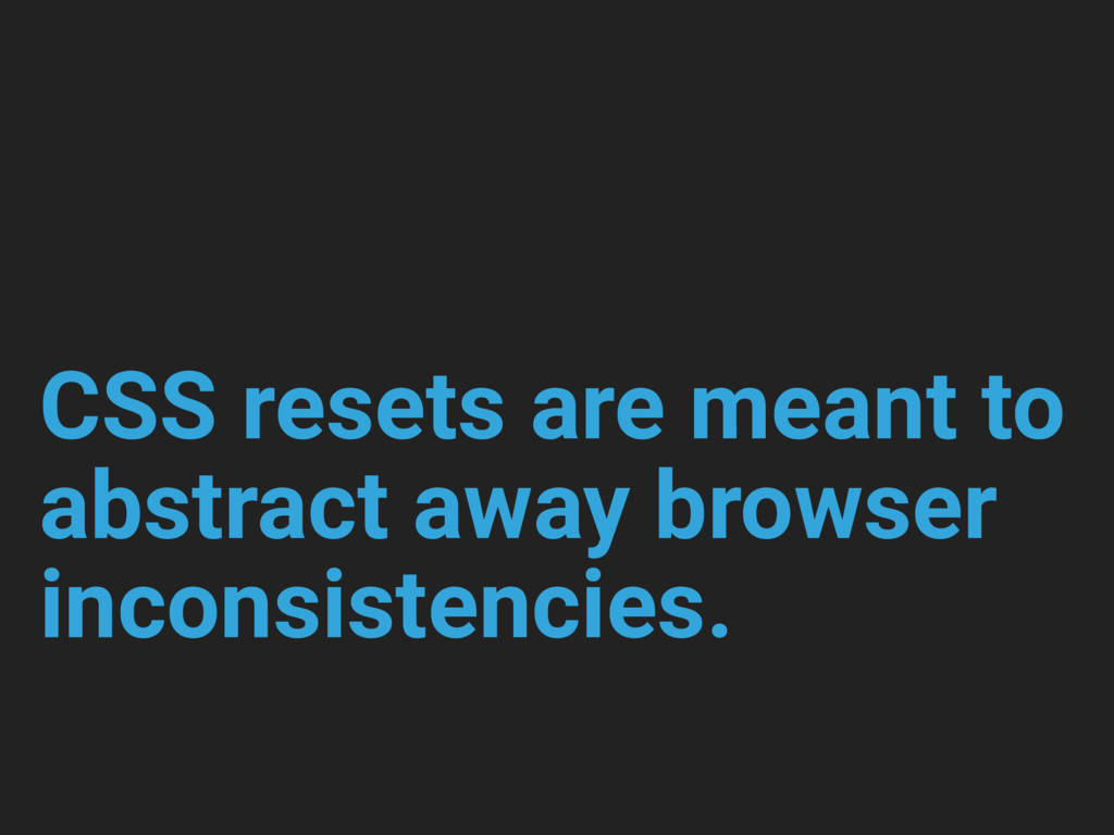
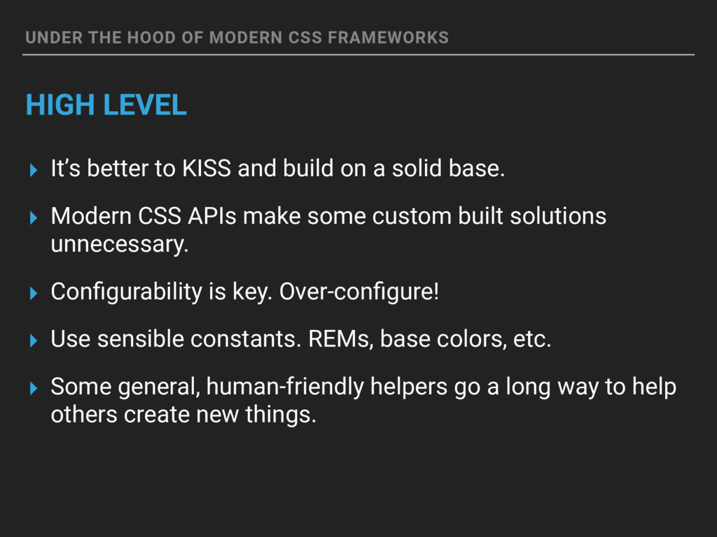
It’s better to KISS and build on a solid base. ▸ Modern CSS APIs make some custom built solutions unnecessary. ▸ Configurability is key. Over-configure! ▸ Use sensible constants. REMs, base colors, etc. ▸ Some general, human-friendly helpers go a long way to help others create new things.
 mtrythall
.png) takahirom
takahirom
 licux
licux
 naoya
naoya
 cottpan
 ryugen04
 sumedhbala
 16bitidol
 har1101
 wanko_it
 akihisaikeda
 manfredsteyer
 yukikurage
 schroneko
 uxyall
 rocio
rocio
 jct
jct
 minecr
 reverentgeek
 nmsamuel
 chikuwait
 marketingsoph
 kneath
 mojombo
 tamaranovitovic