$30 off During Our Annual Pro Sale. View Details »

UX Antipatterns: Hidden Traps in Sites and Apps

UX Antipatterns: Hidden Traps in Sites and Apps

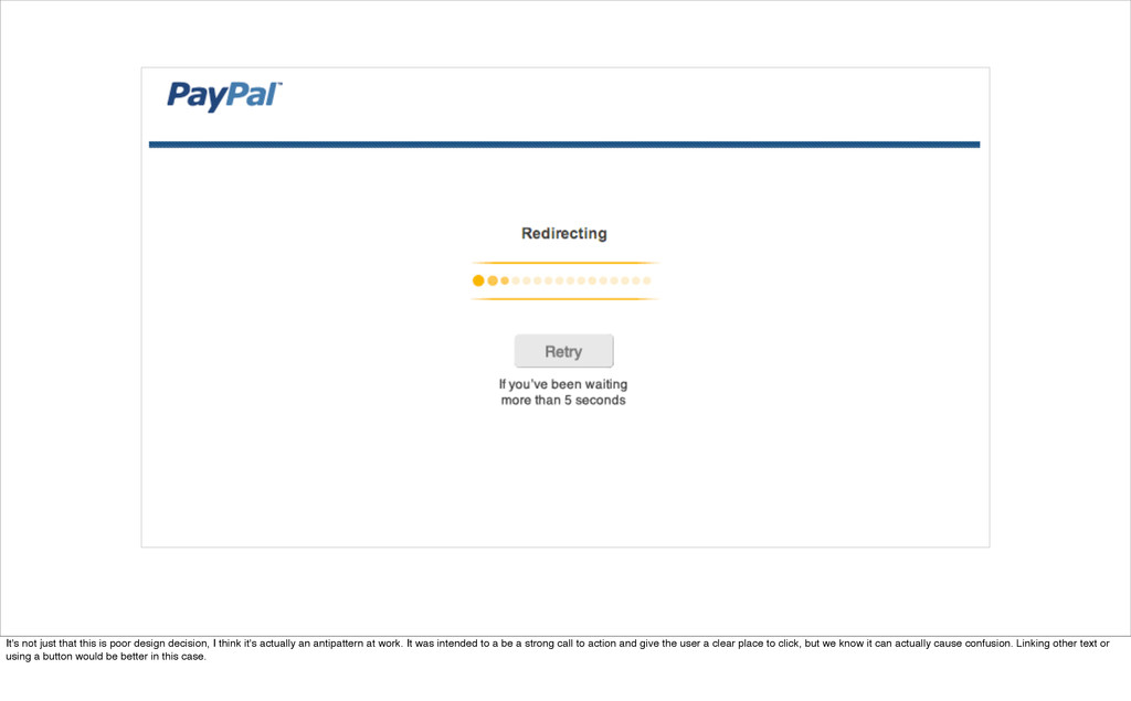
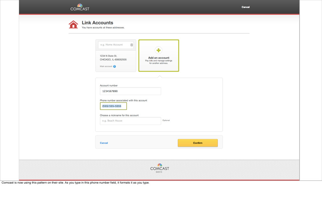
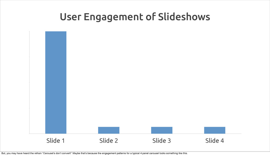
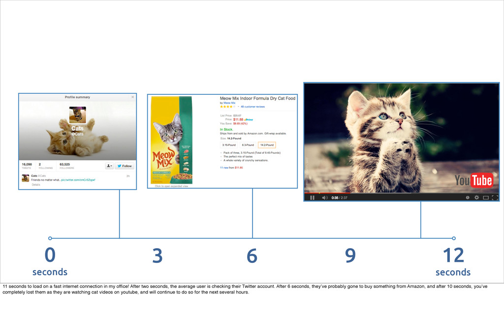
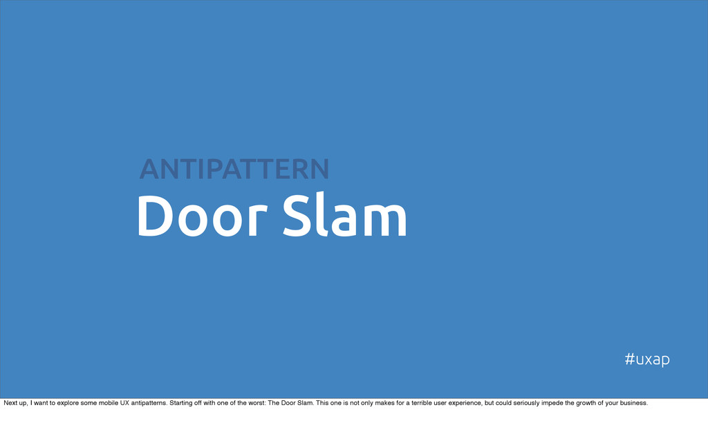
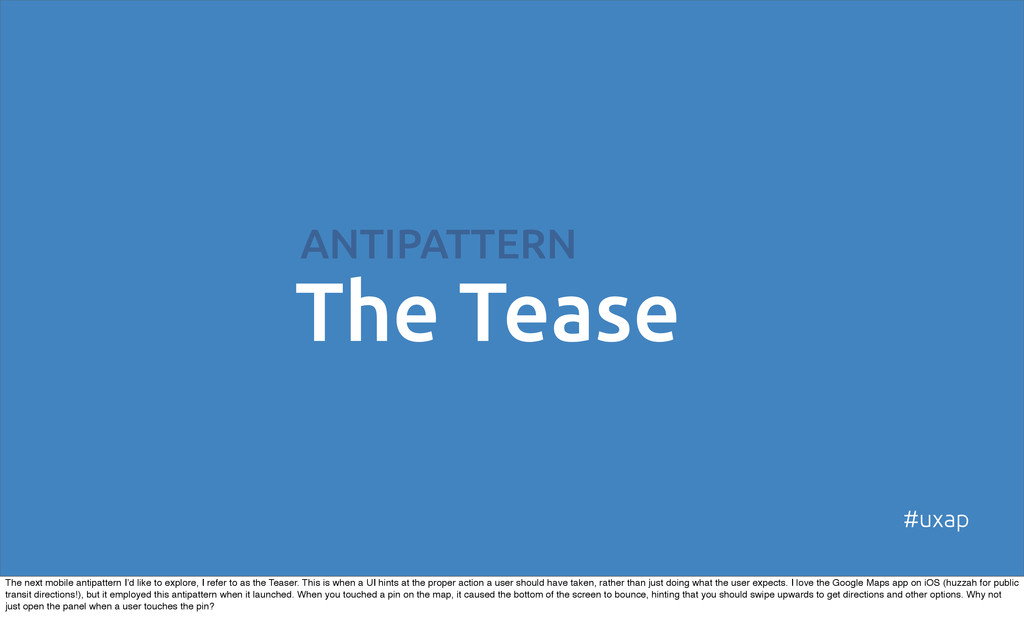
Let’s face it, as designers we’ve all been guilty of carelessly adopting popular usability and design conventions from time to time. Usually, we get the benefit of someone else’s thoughtfulness and research - no effort required. Unfortunately, popular solutions to user interface problems are sometimes actually counterproductive. In this session, Michael Boeke will be discussing user experience antipatterns - design conventions that appear to be good solutions at first, but actually end up hampering usability. We’ll look at a number of real life antipatterns collected from around the web, and explore some better approaches. Hopefully, we’ll all walk out with a few new items in our design toolkit, and an increased awareness (and wariness) of design conventions.

Michael Boeke

August 11, 2014
Tweet

More Decks by Michael Boeke

Other Decks in Design

Transcript

  1. UX Antipatterns
    Hidden traps in sites and apps
    #uxap
    @mvboeke
    I’m Michael Boeke. I’m a product manager and designer at Braintree. Before that, I worked as a designer, front end developer, and product manager at several other startups.

    View Slide

  2. A modern foundation for payments
    Some of the fastest growing companies in the world rely on
    us to process mobile and web payments.
    If you’re not familiar with Braintree, we are a payments platform that makes it easy for developers to accept payment in their apps and on their website. We’ve been around for a five years, but you may have heard more about us recently,
    as we were acquired by PayPal.

    View Slide

  3. Pay your friends instantly
    with the first fun and social
    payment platform. Make
    ultra secure transactions
    without any fees.
    Braintree also has fantastic app called Venmo, which ensures you’ll never owe your friends money again. It makes it super simple to pay friends for things like cab rides, bar tabs, and even rent or utilities.

    View Slide

  4. Patterns + Antipatterns
    What are patterns and anti-patterns? The world of programming has a notion of design patterns, common ways of architecting technical solutions. Developers can turn to these patterns as templates for solving similar types of problems
    over and over again.

    View Slide

  5. These exist in the interactive design world too. Anyone who has used a couple of date-picker widgets to book a flight, has experienced a user interface design pattern. It's an innovation that has found its way into every travel site, but also
    anywhere else on the web where people need to input a range of days.

    View Slide

  6. Ha! Ha!
    Copyright  Fox  Broadcast  Company
    I was talking about my UX antipatterns posts with a couple of developer friends at Braintree, and one commented that “it’s fun to point out when people are doing it wrong online”. I wouldn’t disagree, but just because some site is doing it
    wrong, doesn’t mean it’s an antipattern. Sometimes it’s just crappy design, or total lack of design.

    View Slide

  7. 2 Qualifications to
    be an Antipattern
    1. Appears beneficial at first, but
    creates unintended problems.
    +
    2. There is a better solution that is
    demonstrable and repeatable.
    #uxap
    To qualify as an antipattern, it has to be a repeated pattern that appears to be beneficial at first, but turns out to create more unintended problems. Additionally, a better answer to the problem has to exist and be documentable and
    repeatable.

    View Slide

  8. Many of us are aware that this is not the best solution. The link draws the user's eye and calls you to action, but the link itself doesn't offer any more information about where the user user will end up. Beyond that, it's just extraneous text on
    the page.

    View Slide

  9. It's not just that this is poor design decision, I think it's actually an antipattern at work. It was intended to a be a strong call to action and give the user a clear place to click, but we know it can actually cause confusion. Linking other text or
    using a button would be better in this case.

    View Slide

  10. Double Jump
    ANTIPATTERN
    #uxap
    Alright. Now that we’ve established exactly what we mean when we’re talking about UX antipatterns, let’s take a look at a few examples I’ve found in the wild. First up: The Double Jump.

    View Slide

  11. When collecting a US phone number on a web form, it has become convention to collect it with three separate fields. This is meant to help the user successfully input the number in the format the server will accept. Since the user may think
    of the phone number as one piece of data, rather than three distinct items, many sites employ a feature that jumps the cursor to the next field as soon as it is filled with the expected numbers of characters. This will totally screw up a user
    like me, who is used to powering through web forms by hammering the tab key as soon as I complete a field. Which leads to the unfortunate situation illustrated below. The good folks at Southwest Airlines have tried to help me by moving
    my cursor to the second field in the phone number, but I’ve already hit the tab key. So I’ve skipped the second field entirely and gone straight to the third. Doh. Hence, an antipattern.

    View Slide

  12. And when that happens, I feel like this. So if we don’t want our users to feel sad and left out in the cold rain, what can we do?

    View Slide

  13. Luckily, we are living in a grand age of Javascript wizardry. We can now format phone numbers on the fly. We can just let the user enter the number into the field naturally, including or not including special characters as they wish, and
    format the number for them as they type. The end result might look something like this. This particular antipattern shows up in more situations than just phone number fields. Social Security Numbers and other places where sites collect
    numbers that include dashes or other formatting are prone to fall into the same trap. A single field is more natural for a user, and utilizing Javascript to format the field as the user types will ensure that it is formatted as expected for both the
    user and the server.

    View Slide

  14. That way, we have happy robots AND happy humans.

    View Slide

  15. 1234 N State St,
    Comcast is now using this pattern on their site. As you type in this phone number field, it formats it as you type.

    View Slide

  16. ANTIPATTERN
    Blind Carousel
    #uxap
    This is an antipattern I recently learned about from PJ McCormick (@mynameispj), who leads the UX team at Amazon Creative Services.

    View Slide

  17. If you aren’t familiar with the term, carousels are those sliding or rotating images you see on a lot of home pages, like the Kindle and Running shoes areas on the home page that Amazon assembles for me.

    View Slide

  18. Carousels are appealing because they are very efficient - they enable you to pack a lot of images and content into a layout. That makes a lot of people happy, especially when you have multiple stakeholders who are trying to get a piece of
    prime home page real estate, or if you’re a designer with competing priorities. To put it another way, Brad Frost says “carousels are used as appeasers to keep everyone from beating the shit out of each other” in meetings.

    View Slide

  19. Slide 1 Slide 2 Slide 3 Slide 4
    User Engagement of Slideshows
    But, you may have heard the refrain “Carousel’s don’t convert!” Maybe that’s because the engagement patterns for a typical 4 panel carousel looks something like this.

    View Slide

  20. So, PJ’s team at Amazon took a look at their carousels in the context of that engagement data from the last slide. They realized the problem is that most carousels are mystery meat navigation - you don’t know what is hidden so you never
    go there. Even if the carousel rotates automatically, a user may not stick around to see what shows up next. And that’s why I consider it to be an antipattern.

    View Slide

  21. So, they came up with a really nice solution: previews for the hidden carousel items. Their implementation is essentially a tabbed navigation for the hero images in the carousel. Each tab works as a preview, and when you roll over a tab, the
    big hero image rotates. This pattern preserves all the reasons people like to use carousels, but it makes them a lot more effective. It works really well, and you can now see it all over Amazon’s site. I can only presume that no one is beating
    the crap out of each other in meetings in Seattle.

    View Slide

  22. ANTIPATTERN
    Sharing Warts
    #uxap
    I call this one sharing warts, which is kind of an icky name, but that’s fitting because this is kind of an icky antipattern.

    View Slide

  23. I’m referring to the sharing buttons that you see on a lot of sites, particular blogs and content sites. Often times, this a string of different sharing buttons provided by each of the different social networks, which I believe is what Business
    Insider is using on their site. The idea is to make it easy for users to share content with their networks, which is good and makes a lot of sense for a content-driven site. The problem is that this type of layout distracts from the content. It
    displays buttons for social networks that the viewer might not even be a part of, and the share counts can actually make the content seem less valuable. Only 20 shares? That’s nothing for a BI article. But the biggest problem is the effect on
    page load speed.

    View Slide

  24. Let’s take a look at how this page loaded.

    View Slide

  25. 0
    seconds
    12
    seconds
    6
    3 9
    11 seconds to load on a fast internet connection in my office! After two seconds, the average user is checking their Twitter account. After 6 seconds, they’ve probably gone to buy something from Amazon, and after 10 seconds, you’ve
    completely lost them as they are watching cat videos on youtube, and will continue to do so for the next several hours.

    View Slide

  26. So what’s a better pattern? Prismatic is a newsreader site and app, so sharing is central to their product. They’ve come utilize a much better pattern.

    View Slide

  27. They have one button for sharing, which launches into a separate sharing dialog. It doesn’t distract from the content of the page, but it’s still readily accessible. You might also consider using a third party script, like Add This. They have
    done a lot of good thinking and research about how to optimize sharing.

    View Slide

  28. It doesn’t slow down the initial page load, so a user doesn’t have to wait for anything to load, unless they’ve already elected to share. Users are much more content to wait a moment for an action they initiated, than for something they didn’t
    ask for. As a bonus, this pattern enables you to share to multiple networks at once. This pattern is also touch screen friendly, for mobile devices. In fact, it’s similar to how iOS does image sharing.

    View Slide

  29. ANTIPATTERN
    Robotic Repeat
    #uxap
    This is an antipattern I’ve come across many times while working on financial software. It often occurs when a website is trying to present one form that will map to multiple systems, or will be used to replicate a physical form (e.g. a credit
    application). Few things are more frustrating to a user than having to fill out the same data multiple times. It adds no value, increases the likelihood of error, and causes people to tear their hair out.

    View Slide

  30. For example, let’s take a look at the Active.com signup for the Shamrock Shuffle (a great springtime running race in Chicago). It starts with just a few questions about my age. Thankfully, it calculates my age for me, based on my birthdate,
    but it won’t infer that I’m older than 16.

    View Slide

  31. As I get to the next section, they’re asking for my birthdate again. They ask my age again too...except this time they don’t calculate it for me.

    View Slide

  32. Finally, when I get to step three, they as me one more time if I’m 16 years or older, even though I’ve answered this very question already, and have given them both my age and my birthdate...twice. Yep, I’m still over 16! This redundancy is
    particularly galling to those of us who make software. We know it’s possible for the software to map one answer to multiple fields on the backend. When you have to collect a lot of data from a user, it’s easy to get focused on where the data
    is eventually going to live (e.g. in a paper form or on another system) but if we want people to complete your forms, we need to focus on the user instead.

    View Slide

  33. ANTIPATTERN
    Mixed Business
    #uxap
    This next example is actually the one that got me thinking about antipatterns in the first place.

    View Slide

  34. For an example, take a look at the Jukebox 2 open source music player. Are more of these accounts enabled, or disabled? It looks like most are disabled but, surprise, the reverse is true. The problem is that the button for disabling an
    account appears to be displaying it’s state. This is totally confusing to the user, because it is actually displaying the state the account will be in if the user clicks the button. The consequences of this antipattern can be pretty drastic. In
    instance where this antipattern was deployed to control access permissions on a site with sensitive personal information, a user freaked out and locked everyone out of the site.

    View Slide

  35. So what’s the better way to handle this? Much of the time, the action is a binary flag, so an ON/OFF switch is a natural metaphor. It can convey the current state explicitly without the need to even display the action, since it’s displayed by
    the nature of the switch.

    View Slide

  36. That’s better, but we could help the viewer to better understand which users are enabled at a glance. In order to avoid confusion, we can add some styling on the row to signify a disabled user with gray text and a desaturated avatar photo.
    That’s a big improvement in usability without a lot of development work. The next time you find yourself adding and “Actions” column to a table, think carefully about this antipattern.

    View Slide

  37. ANTIPATTERN
    Door Slam
    #uxap
    Next up, I want to explore some mobile UX antipatterns. Starting off with one of the worst: The Door Slam. This one is not only makes for a terrible user experience, but could seriously impede the growth of your business.

    View Slide

  38. #uxap
    I think we’ve all had this experience where we’ve been scrolling through our Twitter feed, or our inbox, and we see link that looks interesting and try to follow it...

    View Slide

  39. #uxap
    ...only to be greeted with one of these. Maybe this is done to juice the metrics by driving up the number of app downloads. Maybe the designers genuinely believe their audience will have a better experience if they download the app.
    However, this puts a major barrier in front of a user right at the time they are about to engage with your site. a lot of users are going to give up and move on without clicking through this page and certainly without downloading the app. You
    may as well just slam the door on them. A better approach is to bring the user to the content they want ASAP. Once they’ve had a chance to engage with your site, you can present them with the opportunity to download your app. This puts
    the onus on you to maintain a great mobile experience on your site - you can’t just rely on your app to provide a mobile experience. It’s more work, but it’s the price of entry for just about any product these days. Image credit: Flickr
    atelier_tee

    View Slide

  40. A better method is to get your user to the content they want ASAP, and then offer the option to download the app. Once they’ve engaged with your site and your content, they are in a much better position to decide if they want to invest the
    time to download your app. These Smart App Banners in Safari are a nice, standardized, way to present your app to your site visitors on iOS. Sites like Glassdoor and and YouTube use these to good effect. However, weirdly, Glassdoor
    uses the Smart App Banner, after putting their visitors through a Door Slam.

    View Slide

  41. ANTIPATTERN
    The Tease
    #uxap
    The next mobile antipattern I’d like to explore, I refer to as the Teaser. This is when a UI hints at the proper action a user should have taken, rather than just doing what the user expects. I love the Google Maps app on iOS (huzzah for public
    transit directions!), but it employed this antipattern when it launched. When you touched a pin on the map, it caused the bottom of the screen to bounce, hinting that you should swipe upwards to get directions and other options. Why not
    just open the panel when a user touches the pin?

    View Slide

  42. #UXantipatterns
    I think Google was hoping to train users to swipe first, and borrowed the bouncing-bar trick from Apple. The iOS team got kudos for using this approach on the camera button of the unlock screen. However, it’s a really different use case,
    because you don’t want to make the camera too easy to trigger on the unlock screen, or you’d end up with a lot of pocket shots on the photo roll. It makes sense for iOS to require the more intensive swipe gesture, to make sure that the
    action is deliberate.
    However, in the case of Google maps, the user is clearly interacting with the UI in an intentional manner. If enough users make the “mistake” of touching the pin that it warrants a hint, then Google maps should just accept the input request
    and give the user what they’re asking for. Clearly, the Google Maps app team agreed, and changed the behavior in a subsequent release. Iterative development FTW.

    View Slide

  43. Another example of The Tease on the web. Here, Layervault was displaying hints about how to use their UI. They’ve since updated and removed this.

    View Slide

  44. ANTIPATTERN
    Thumb Stretcher
    #uxap
    This next one might be more than a UX antipattern, it might actually be a safety hazard.

    View Slide

  45. #uxap
    It’s become a convention in mobile apps and websites to have a navigation hidden in a tray you can access by touching on a what we call “the hamburger” at Braintree, or Mr. Liney as Luke W calls it. This popular because it’s an efficient
    use of screen space and only shows the user a navigation list when they actually need. Often times, as with the Planet Money app, the hamburger goes in the upper left corner. It’s standard practice to put important controls in the upper left
    portion of the screen for desktop apps and websites. It’s pride-of-place in those layouts because most western readers eyes start scanning a page top to bottom, left to right. However, this creates some problems when the context switches
    to a mobile screen.

    View Slide

  46. Credit:  Luke Wrobleski, @lukew
    Source: Josh Clark, Tapworthy
    Per Luke Wroblewski (@lukew) the typical posture for holding a phone is one handed. 80-90% of the population is right handed, so these are the zones that are easy and hard to reach on a mobile phone. As we can see, Mr Liney falls into
    the “hard” zone, when he’s placed in the upper left corner.

    View Slide

  47. The better way to do it? Place the hamburger stack in the upper right corner. It still has pride-of-place at the top of the screen, where the eye will easily find it. However, it will also be in a place where the majority of users will be able to
    easily touch it.

    View Slide

  48. #thanksObama
    (we can blame him, right?)
    How do antipatterns survive and propagate in the wild? If we learned one thing from the healthcare.gov debacle, it’s that we can blame the current administration for everything that’s wrong with the internet. I’ve met people from the UX
    team at PayPal, and they were smart and had a huge amount of resources to spend on UX and they still have antipatterns on their site. As satisfying as it would be to blame somebody (anybody) else it’s actually our fault.

    View Slide

  49. No, it is our fault
    (damn.)
    We’re the people who design and build software, web sites, and mobile apps. When we’re pressed for time and resources, we reach for the first familiar pattern that seems to solve the problem.

    View Slide

  50. We make
    perfect
    websites
    products
    apps
    We make
    We make
    wonderful
    amazing
    It’s OK. Don't be a afraid of patterns. There are good patterns, and they are an excellent way to learn and can be a shortcut to a better user experience. Design patterns enable us to benefit from each others thinking and stand on the
    shoulders of giants. Pattern libraries can be helpful, and established conventions can help to orient users more quickly. We just need to use our brains and test whether patterns make sense in given situation, particularly if the medium has
    shifted, as it has with mobile. Also, since the mobile medium is so new, we shouldn’t blindly follow big players like Google or Apple - they’re still figuring this stuff out too. The good news is that we all have a lot of opportunity to improve UX
    for the world, in general. We make the internet, so we can make it better.

    View Slide

  51. mvboeke
    MichaelBoeke.com
    B
    BraintreePayments.com
    @
    If you liked this talk, you can find out more on my website at michaelboeke.com, follow me @mvboeke, and check out what we do at Braintree - braintreepayments.com.

    View Slide