$30 off During Our Annual Pro Sale. View Details »

Designing for Trust (with notes)

Michael Boeke
November 10, 2016

Designing for Trust (with notes)

(Full slides, without notes, are available at https://speakerdeck.com/mvboeke/designing-for-trust/)

The technology industry is on a quest to build frictionless, seemingly magical, experiences for our users. In the effort to design the simplest experiences possible, we exploit troves of personal data, to make important choices for our users. Unfortunately, simplicity is often at odds with transparency. If we don’t tread carefully, we can obscure critical context from users, and our magical experiences can start to feel creepy. So how do we build trust directly into the UX of our products?

In this session, we will review some of the factors that engender trust, like reputation, transparency and consent. We’ll also explore some real world examples of products that do a great job of establishing trust, and some others that...miss the mark. We should walk out with a better understanding of the issues surrounding privacy and trust, as well as some practical tools for making our own apps and software products more trustworthy.
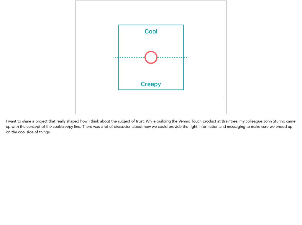
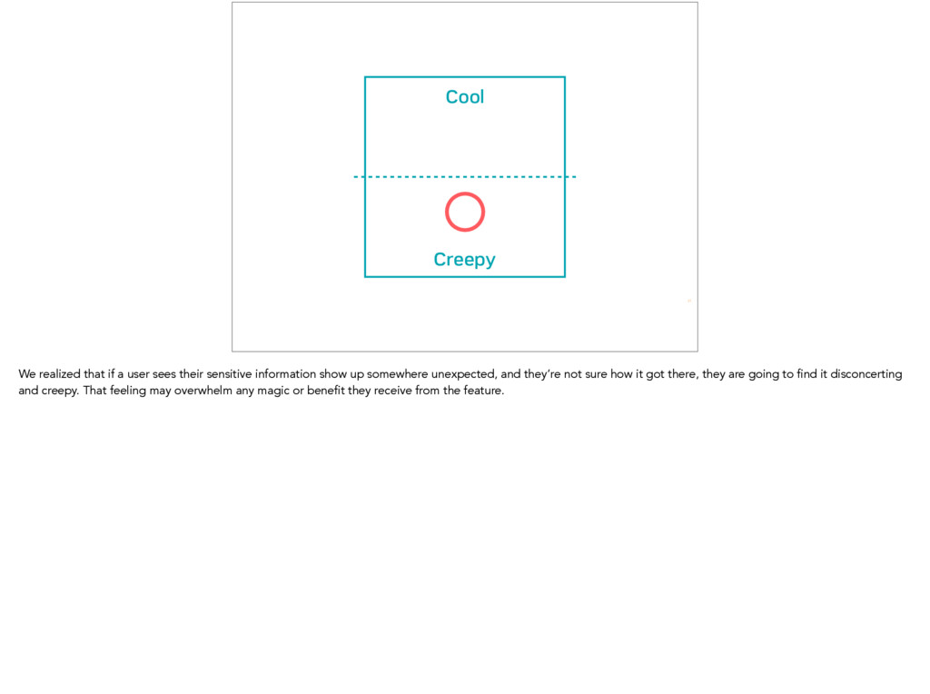
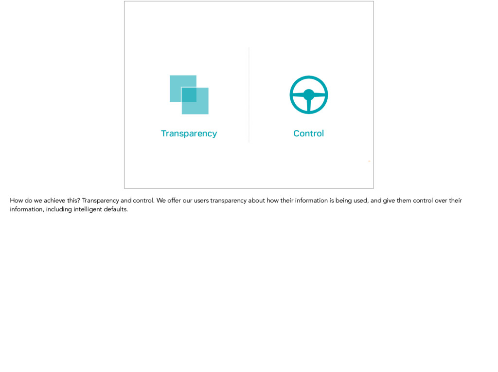
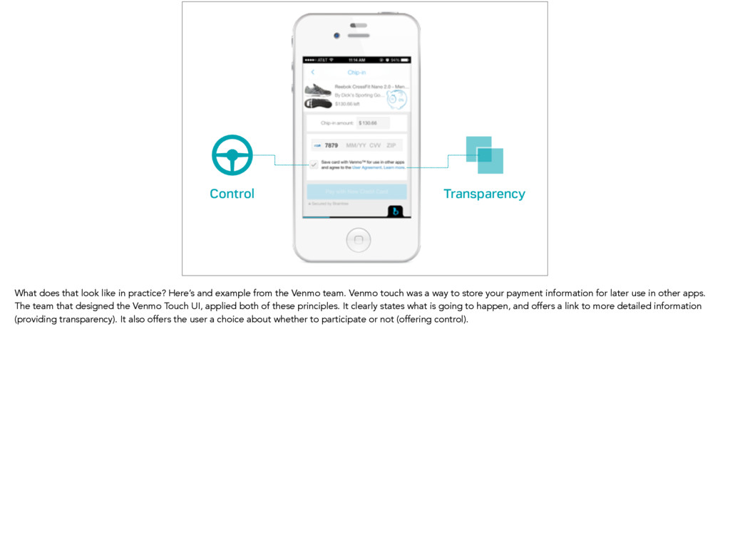
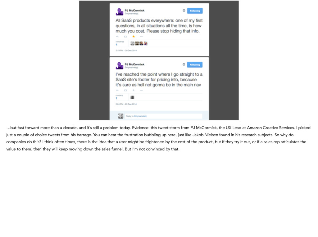
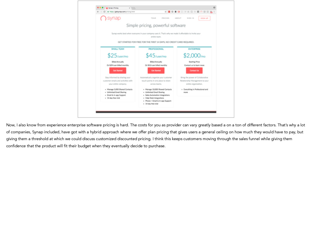
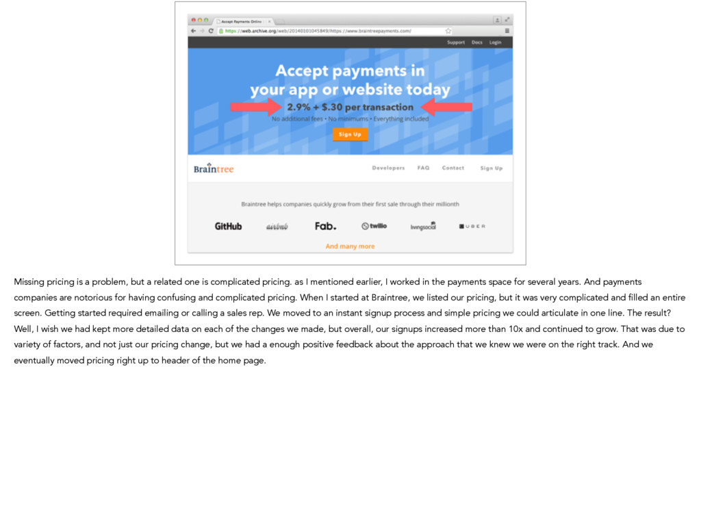
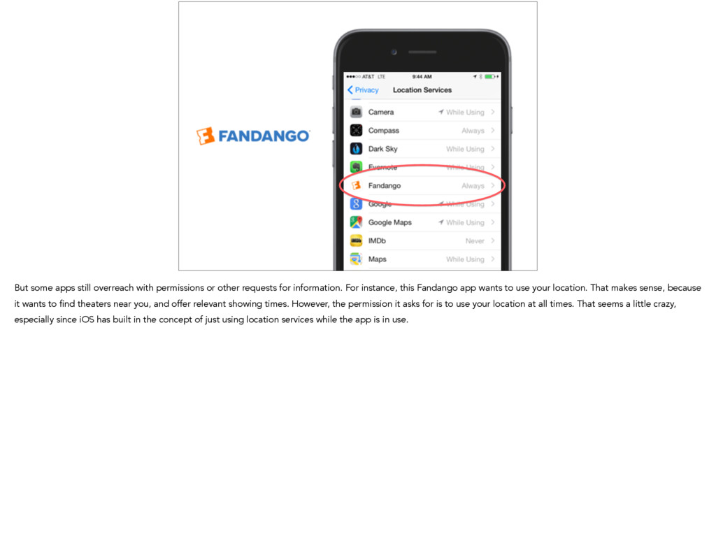
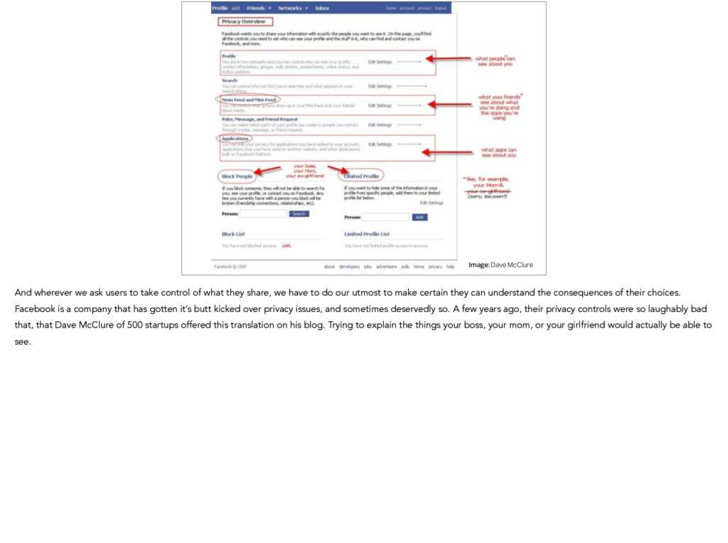
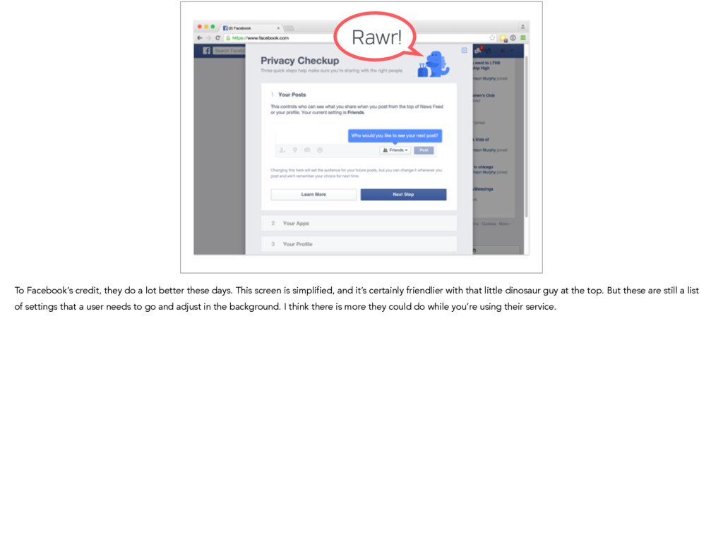
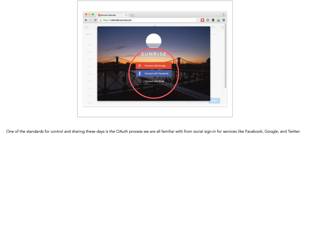
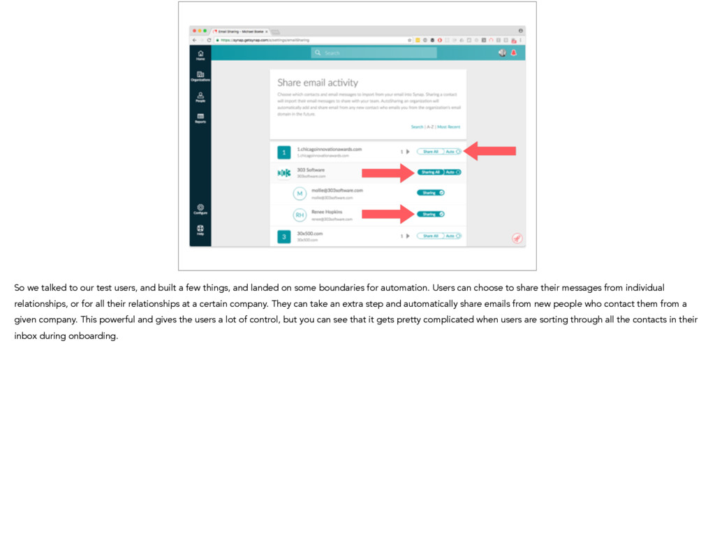
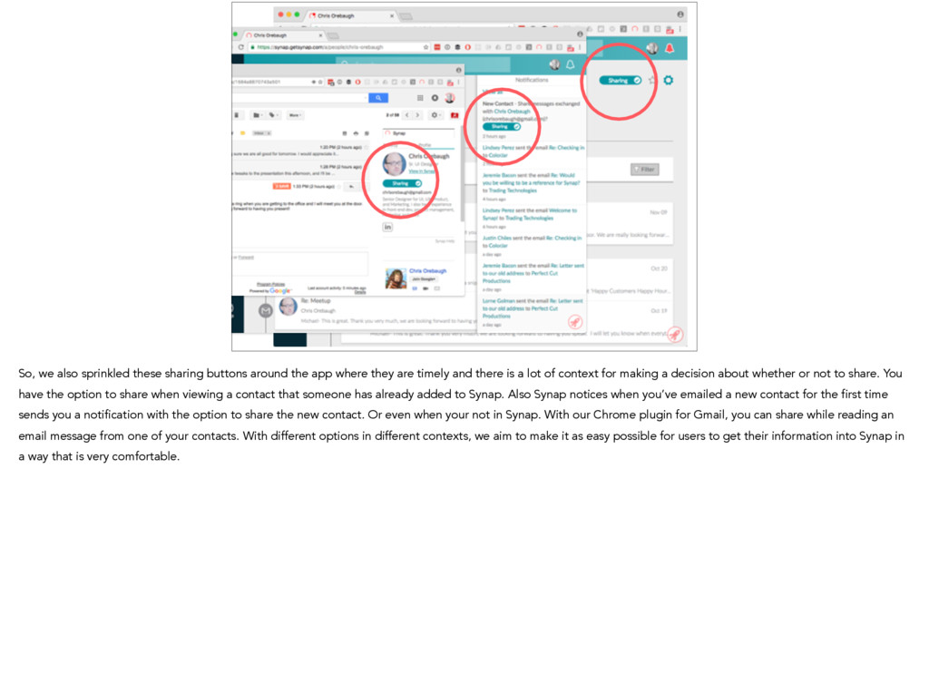
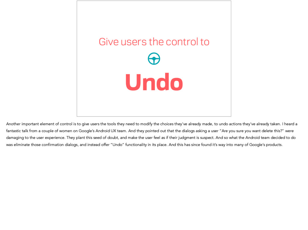
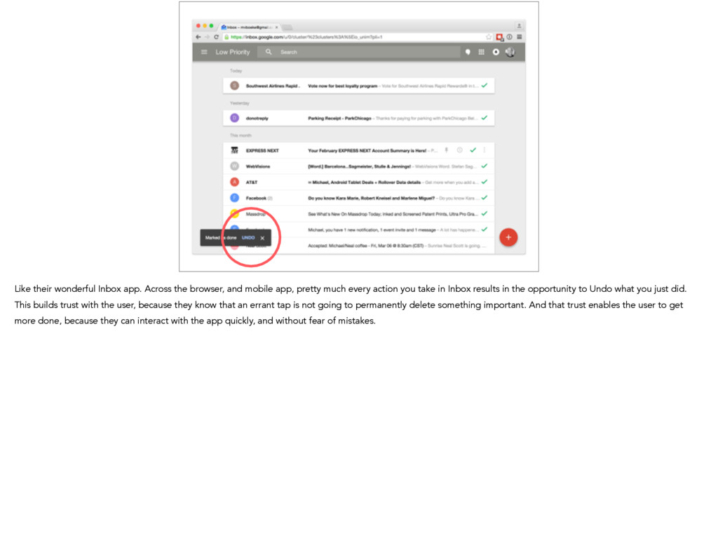
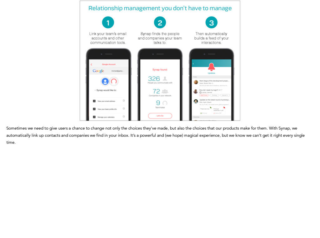
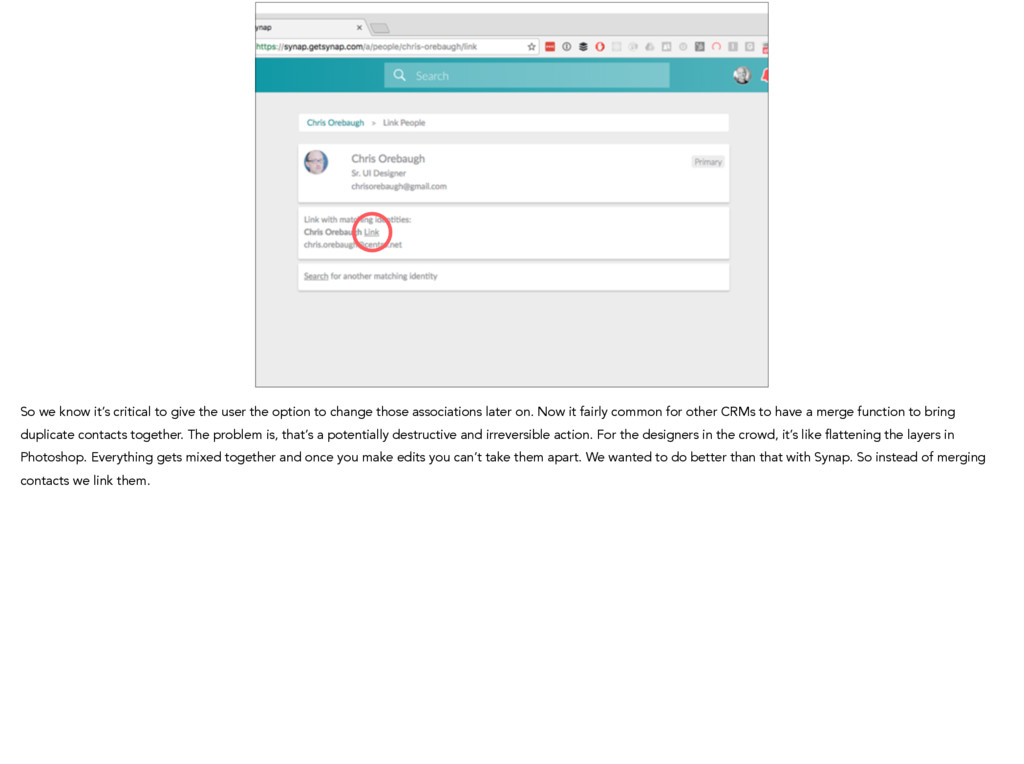
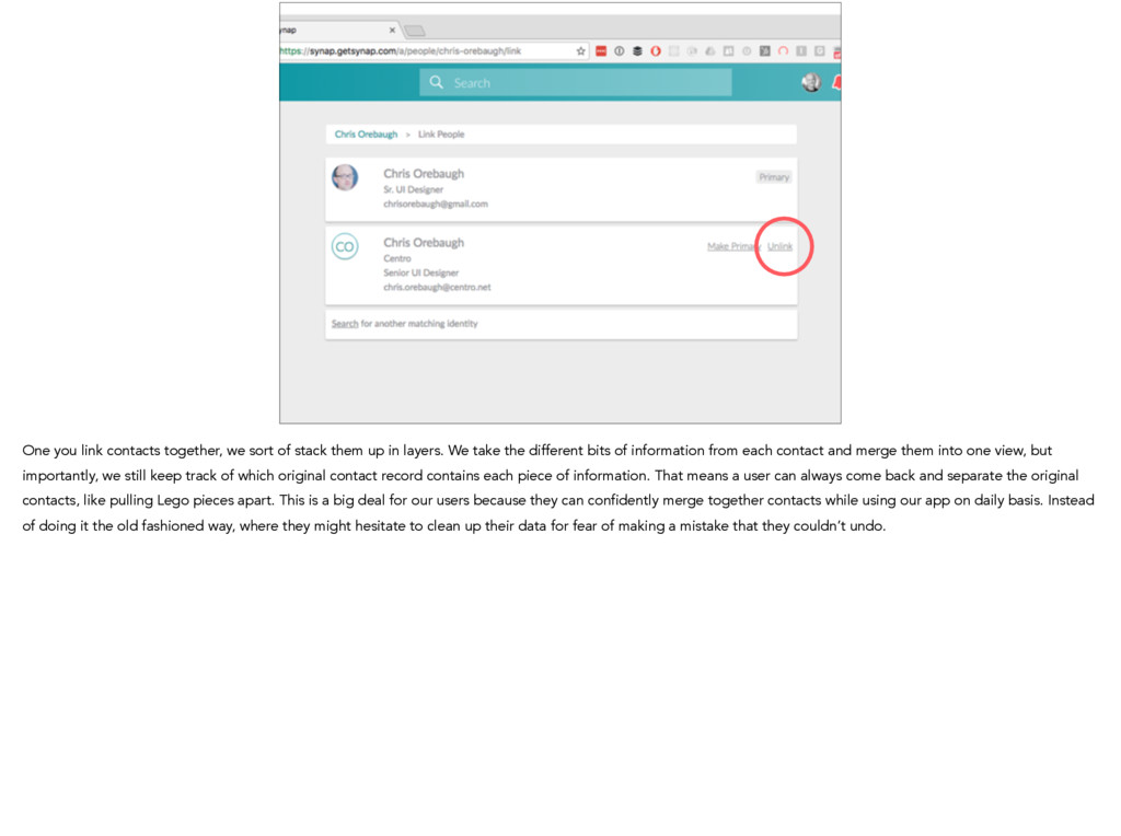
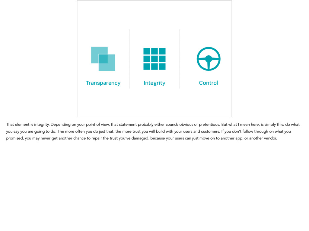
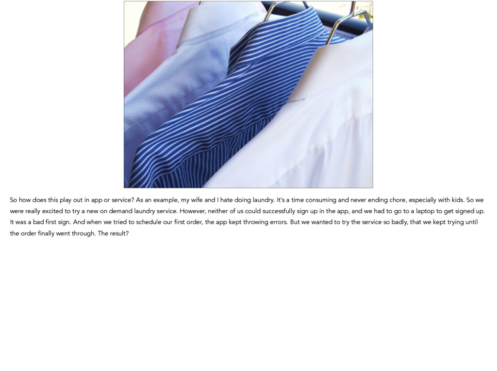
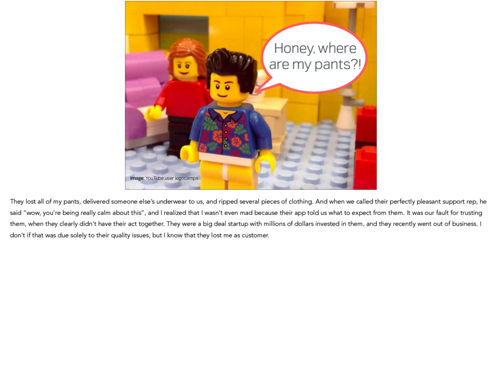
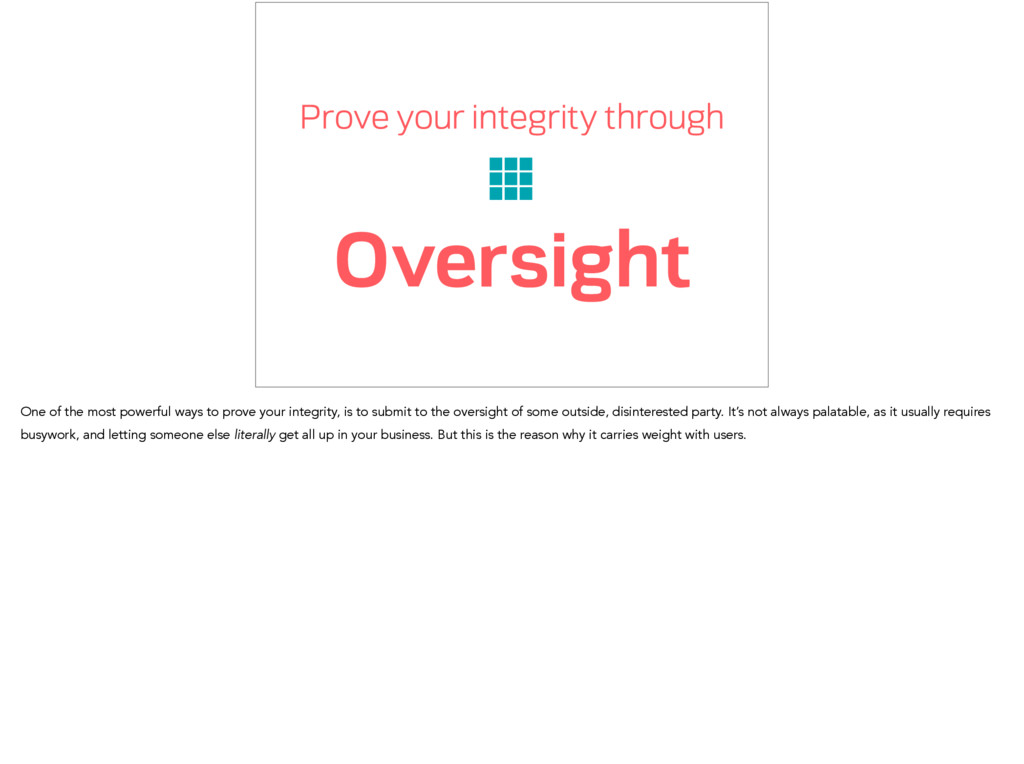
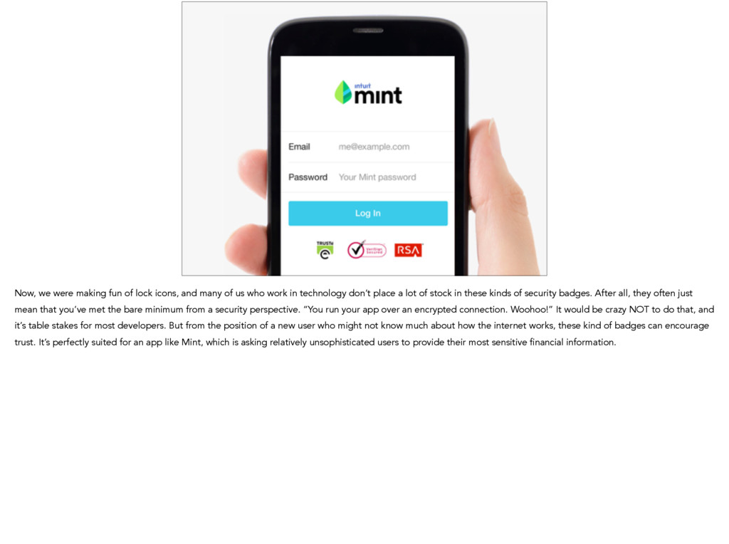
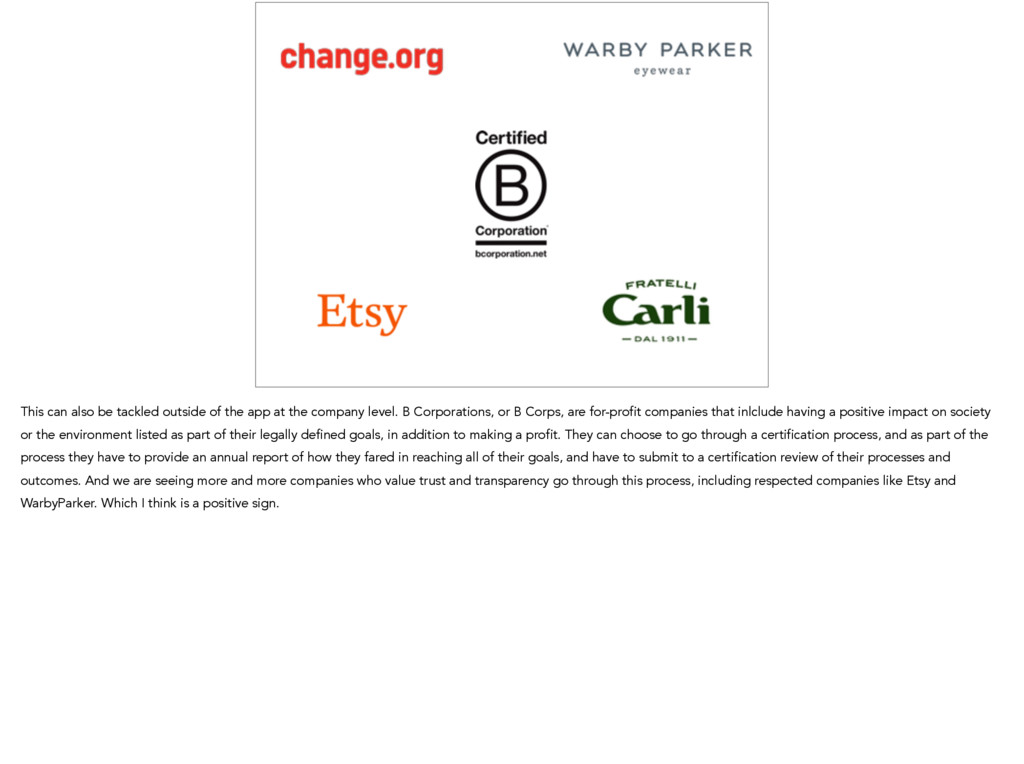
Michael Boeke

November 10, 2016
Tweet

More Decks by Michael Boeke

Other Decks in Design

Transcript

  1. Designing
    for Trust
    Michael Boeke
    UXD CHICAGO 2016
    Hi I’m Michael Boeke. I’m a product designer and the co-founder of Synap, a software startup in Chicago. I’m here to share a few things I’ve learned about designing for
    trust.

    View Slide

  2. What elements of
    design and UX help you to
    trust a website or app?
    When I was first putting this talk together, I asked the twitterverse “What elements of design help you to trust a website?” Lots of people replied with the same
    answer…

    View Slide

  3. …locks. A lot of sites seem to agree with this, and if you Google for lock icons, you’ll find hundreds of thousands of options. I’m not going to talk about putting lock
    icons on your website today. Instead I want to take step back and look at trust from a broader perspective of user experience. So let’s start with what is trust? Why does
    it matter?

    View Slide

  4. Image: Michael Boeke
    When we are babies, we have no choice but to trust our parents completely, because we are reliant on them for everything. As we grow, we begin to have choices about
    who to trust, and we learn how to decide who is trustworthy. And this is a critical, because it is the entire basis of how we interact with new people. It’s the basis of
    transactions we make in the marketplace. And when you have it, wonderful things can happen. At the macro level, societies that have a high level of social trust tend to
    have better commerce and economic prosperity. At a micro level, teams with a high degree of trust tend to get things done more effectively.

    View Slide

  5. Sources: Gallup, Pew Research Center
    20%
    40%
    60%
    80%
    '73 '75 77 79 81 83 85 87 89 91 93 95 97 99 01 03 05 07 09 11
    Media
    Religion
    Government
    We live in an interesting era. In America, trust in institutions and individuals, as measured by data wonks, has been falling for a long time. We see that public trust in
    institutions like government, media, and religion are all way down over the past 40 years.

    View Slide

  6. Source: NORC General Social Survey
    33%
    42%
    Adults who trust
    most people
    2012
    1972
    And we see that trust in individuals is down, too. The number of adults who reported they trust most people has dropped to only about a third of the country. And yet,
    all around us, people are engaging in all sorts of new exchanges based on trust.

    View Slide

  7. Image: Ebay
    Because while trust has been declining over the last several years, we haven’t retreated back into our caves and shut out the world. To the contrary, we’ve been
    increasingly willing to buy and sell things from strangers online. Witness the rise of Ebay and Craigslist (which Craig Newmark has called a social experiment in trust).

    View Slide

  8. Image: Uber
    But people aren’t just buying and selling things through classified ads. We’re also getting rides from strangers we find online.

    View Slide

  9. Image: AirBnB
    And we’re opening up our homes to strangers who find our places online.

    View Slide

  10. Image: Simple
    We’re sending our life savings to institutions where we’ve never met any the employees face-to-face.

    View Slide

  11. Image: Tinder
    Finding (ahem) dates with strangers we find online.

    View Slide

  12. Maybe even finding mates among strangers we meet online. This is a Craigslist personal ad posted by my goofy little brother. [read ad] What kind of guts were required
    for him to put this out there and trust that someone might respond. What kind of woman would trust the person who posted this crazy ad? Nobody, right? Actually one
    person responded. They hit it off, and 18 months later they’re married and I have a new sister in law. All because of online trust (and Sausagefest).

    View Slide

  13. I’ve been thinking about trust in design for a long time, due the types of products I’ve worked on. I’ve basically spent my career working on bringing sensitive
    information onto the internet, working in healthcare, investments, and online payments. I’ve worked at several Chicago technology startups going way back to the
    primordial ooze of the dotcom era. I was the designer of an early social network for hospitalized patients and their families, called Carpages, which is still in use at many
    childrens' hospitals. Then I was the first designer at another startup, that made some of the first SaaS software for hedge funds and other investors. After that, I moved
    on to Braintree, where I was a product manager for the platform that accepts payments for companies like Uber, AirBnB and Basecamp, and which was eventually
    acquired by PayPal.

    View Slide

  14. synap
    I’ve been thinking about trust a lot lately, because I’ve been working on something new (and no, it’s not a dating app).

    View Slide

  15. At Synap, we are building a platform to help account managers and customer success reps to guide and grow their customer relationships. Our platform helps them
    collaborate better, with each other and with the other teams at their company.

    View Slide

  16. Synap connects to the tools you already use, and
    automatically organizes your customer communication.
    Synap automatically organizes your customer communication at every stage in the relationship, by connecting to the communication tools that your teams already use.
    Our software connects to your email, help desk, and CRM platforms, and automatically builds a Facebook-style feed of all the interactions your company has had with a
    customer.

    View Slide

  17. >
    Sales + Solutions
    Accounts + Support
    Product + Engineering
    With Synap, we are inviting our users to interact with a higher level of trust with each other, in order to accomplish incredible things through collaboration. For example,
    we enable users to see the emails that everyone sends to customers. This is fantastic for Customer Success, account managers, who collaborate on projects for clients.
    Because without Synap, that information often ends up trapped in one person’s inbox.

    View Slide

  18. And since Synap organizes users’ messages and information for them. They have to trust our app to make good choices that make their lives easier. We also need them
    to trust us to connect to their systems without screwing up any of their data, all while maintaining the privacy and confidentiality of their communications. It’s a tall order,
    that’s why I’m thinking about trust again lately.

    View Slide

  19. Go to
    GetSynap.com!
    But don’t worry, the rest of this talk won’t be an infomercial for Synap. I’m going to draw on some examples of what we’ve built along with examples from lots of other
    places. Buuuuut…if you want to go to getsynap.com, you can sign up for a free trial and someone cool from my team will be happy to show you around.

    View Slide

  20. Cool
    20
    Creepy
    I want to share a project that really shaped how I think about the subject of trust. While building the Venmo Touch product at Braintree, my colleague John Sturino came
    up with the concept of the cool/creepy line. There was a lot of discussion about how we could provide the right information and messaging to make sure we ended up
    on the cool side of things.

    View Slide

  21. Cool
    21
    Creepy
    We realized that if a user sees their sensitive information show up somewhere unexpected, and they’re not sure how it got there, they are going to find it disconcerting
    and creepy. That feeling may overwhelm any magic or benefit they receive from the feature.

    View Slide

  22. Cool
    22
    Creepy
    If a user sees that their sensitive information is being used to make their life easier, they understand how the information got there, and they trust the company or app,
    then they are likely to think it’s cool.

    View Slide

  23. 23
    Transparency Control
    How do we achieve this? Transparency and control. We offer our users transparency about how their information is being used, and give them control over their
    information, including intelligent defaults.

    View Slide

  24. Control Transparency
    What does that look like in practice? Here’s and example from the Venmo team. Venmo touch was a way to store your payment information for later use in other apps.
    The team that designed the Venmo Touch UI, applied both of these principles. It clearly states what is going to happen, and offers a link to more detailed information
    (providing transparency). It also offers the user a choice about whether to participate or not (offering control).

    View Slide

  25. Be transparent about
    People
    We are going to talk a lot about transparency today. It’s the foundation for everything else in trust. The more information you have about the person or company you’re
    considering trusting, the more confident you can be you are making a good decision. Starting off with some good questions like: Who are the people behind this app?
    Can I talk to them?

    View Slide

  26. One of the things a smaller organization can do is show the actual people who build the product and support the customers right on their website. One of my favorite
    examples of showing this is Kickstarter’s team page. Not only do you see the people behind the product, but you get a strong sense of the flavor of the people, and
    how that finds it’s way into the product experience.

    View Slide

  27. It’s one thing to show the people behind a product, it’s another thing to actually be able to talk to them. People often inherently distrust larger organizations because
    there isn’t an actual person to talk to. Make it easy to contact those people. Zappos is renowned for their support, and you can see they stick their contact information
    in the most conspicuous place possible - right in the top left corner. Rackspace is another company that built it’s reputation based on what they call “fanatical” support,
    and they also include phone and chat links right at the top of their home page.

    View Slide

  28. At Synap, we tried to employ a bit of both of these approaches. Our team page lists everyone on our team, but it also includes multiple ways to contact us directly. So
    for me, you can get in touch with me via email, Twitter or LinkedIn.

    View Slide

  29. So how do we incorporate this into the experience of our products, and not just the website? I think Uber has thought about how being transparent about the people
    involved should really be part of the app experience. It’s important because you’re hopping in a car with a stranger, and safety is a real concern.

    View Slide

  30. When a driver accepts your request, you get both their license plate number and a picture of the driver. It helps you make sure you’re hopping in the correct car,
    building confidence in the Uber service, and trust that your ride is going to be a good experience.

    View Slide

  31. Be transparent about
    Customers
    I know this might sound a little weird. You probably wouldn’t want to post your customer list online, and your customers wouldn’t like that either. Depending on the type
    product you offer, that could be deep breach of trust. However, there are some ways to do this with an approach of “Social Proof”.

    View Slide

  32. Social Proof is the phenomenon of being persuaded by the actions of others. It’s especially powerful when those others are someone the customer respects and trusts.
    One way to achieve this is through testimonials or endorsements. It can be as simple as listing a handful of logos from your best-known customers, as Basecamp does
    here. Of course, you’d better get permission from your customers first, and give them control of whether they are included. However, lot’s of people and companies are
    willing to do this for trusted vendors, and they may even appreciate the extra marketing exposure.

    View Slide

  33. Testimonials are another great way of being transparent about your customers, but there are a few things to keep in mind. A lot of viewers will just discount reviews and
    testimonials that are just attributed to customers they don’t know. So there are a few techniques to help keep them feeling authentic. The first is to use celebrities, if you
    can. Customers know these are real people, and they’re probably trusted as authorities on the subject. We can see that in this example from Shopify. People know Tina
    Roth Eisenberg from her SwissMiss blog, and Daymond John from“Shark Tank”.

    View Slide

  34. Image: Signal v. Noise
    So, you may not have the ability to nab celebrity endorsements on your site. Another approach is to use customer photos. They give users a sense that the testimonial is
    from a real live human. Highrise found this out when they modified their landing page to use customer photos, and their conversion rate went up more than 100%. That
    was powerful boost in trust (and sales too).

    View Slide

  35. Another way to approach this is through referrals. There’s been lot’s of hoopla about so-called “growth hacking” techniques, which usually offer monetary incentives for
    referrals. The prototypical “Give $10 get $10!” promotion, or in this case from Dropbox, get free storage space by inviting friends. But the often unspoken benefit of
    referrals is that they are super targeted social proof marketing. The referrer is explicitly endorsing the product, but their endorsement is perfectly targeted to the group
    of people who would trust that person’s opinion the most - their friends and family.

    View Slide

  36. Be transparent about
    Motives
    Business models matter. As designers and developers, we sometimes don’t want to get our hands dirty with business-y stuff. However, business models affect the
    motives of the organization and manifest themselves in our products and designs. Users need to understand how the app is making money. Lest the old adage ring true
    “If you’re not paying for the product, you are the product”

    View Slide

  37. Image: GoldenShores Technologies
    The extreme example of this is the Flashlight app stealing customer data. Famously, one of the top free flashlight apps on Android was capturing user’s location data
    and device IDs and selling that data to advertisers, without informing users. Bad examples like this one make users wary and distrustful of other free services.

    View Slide

  38. For example: Sunrise was an awesome calendar app, but I got nervous using it after a while. It had been more than a year, and I didn’t see them charging money for
    anything. I know a little bit about startups, and I was thinking they must be burning through their funding, or maybe they have a revenue stream that isn’t obvious. As
    user trusting them with my data, I wanted to know about their business. I tweeted to them about it, and they quickly tweeted back letting me know that they were
    planning to charge for services in the future. Of course, I was right about them burning through funding, and instead of charging for their app they were acquired by
    Microsoft’s Outlook team, which shut down the app. I still miss it.

    View Slide

  39. 1
    2
    Sometimes motives can get muddled. I’m not sure that even the people at Ticketmaster know what their motives are on this page. After purchasing tickets for an event,
    they hit you with two separate lightboxes, when the whole point of a lightbox is to focus the user on one thing. One is to post on Facebook, and the other is take a
    survey. And if I dismiss those lightboxes, there is a barrage of other calls to action on the page behind this to buy more things and post to social networks. If
    Ticketmaster really cared about this survey, they should give it the spotlight it deserves, but because the user is getting pushed in different directions here, it calls into
    question the motive behind any of these things. There are a lot of pop-ups here, if I click one, am I going to go to a scammy site that takes over my browser? Do they
    really care what I think, or are they just going to try to sell me something more? I’d be willing to bet it hurts their conversion rate on the survey and limits the feedback
    they receive.

    View Slide

  40. All of that aside, those of you with keen eyes may have noticed that I was purchasing tickets to Monster Jam. People who don’t know me well are often surprised to find
    out that I would be into monster trucks.

    View Slide

  41. If you don’t think this is AWESOME, than you and I have very different definitions of that word.

    View Slide

  42. Be transparent about
    Pricing
    Next, I want to talk about pricing. Of course, if you want people to trust you, you can’t bait and switch them with hidden fees and other shadiness. I’m going to assume
    that you already know that. If you engage in those kinds of dark patterns, then this entire presentation is probably wasted on you. But I do want to talk about something
    much more common, and slightly less shady.

    View Slide

  43. Jakob Nielsen, The Nielsen Norman Group
    We have hours of video of users asking
    “Where's the price?”
    while tearing their hair out.
    The venerable Jakob Nielsen, wrote a a piece ages ago, entitled “The Top 10 Mistakes you can make on your website”. One of the things he called-out was sites that
    don’t list their pricing. As he rightly points out, price is one of the most critical pieces of information a user has for categorizing and making decisions about your
    product. If you withhold such a crucial piece of information, your site visitor are bound to be distrustful.

    View Slide

  44. As is perfectly illustrated in this cartoon Nielsen included in the post. Where the tactic is compared to shady used car salesman. The crazy thing is that Nielsen was
    writing about this in 2003…

    View Slide

  45. …but fast forward more than a decade, and it’s still a problem today. Evidence: this tweet storm from PJ McCormick, the UX Lead at Amazon Creative Services. I picked
    just a couple of choice tweets from his barrage. You can hear the frustration bubbling up here, just like Jakob Nielsen found in his research subjects. So why do
    companies do this? I think often times, there is the idea that a user might be frightened by the cost of the product, but if they try it out, or if a sales rep articulates the
    value to them, then they will keep moving down the sales funnel. But I’m not convinced by that.

    View Slide

  46. Now, I also know from experience enterprise software pricing is hard. The costs for you as provider can vary greatly based a on a ton of different factors. That’s why a lot
    of companies, Synap included, have got with a hybrid approach where we offer plan pricing that gives users a general ceiling on how much they would have to pay, but
    giving them a threshold at which we could discuss customized discounted pricing. I think this keeps customers moving through the sales funnel while giving them
    confidence that the product will fit their budget when they eventually decide to purchase.

    View Slide

  47. Missing pricing is a problem, but a related one is complicated pricing. as I mentioned earlier, I worked in the payments space for several years. And payments
    companies are notorious for having confusing and complicated pricing. When I started at Braintree, we listed our pricing, but it was very complicated and filled an entire
    screen. Getting started required emailing or calling a sales rep. We moved to an instant signup process and simple pricing we could articulate in one line. The result?
    Well, I wish we had kept more detailed data on each of the changes we made, but overall, our signups increased more than 10x and continued to grow. That was due to
    variety of factors, and not just our pricing change, but we had a enough positive feedback about the approach that we knew we were on the right track. And we
    eventually moved pricing right up to header of the home page.

    View Slide

  48. Give users control of
    Sharing
    Now we are going to shift gears and talk about control. Obtaining consent from users to do something with their private information. Giving them the control over what
    information they want to share and what information they want to keep private. Recently iOS has done a lot to improve control and transparency. It shows bars at the
    top of the screen, alerting the user when features like the microphone and GPS are in use in the background, and giving users the chance to turn those things off.

    View Slide

  49. But some apps still overreach with permissions or other requests for information. For instance, this Fandango app wants to use your location. That makes sense, because
    it wants to find theaters near you, and offer relevant showing times. However, the permission it asks for is to use your location at all times. That seems a little crazy,
    especially since iOS has built in the concept of just using location services while the app is in use.

    View Slide

  50. Image: Dave McClure
    And wherever we ask users to take control of what they share, we have to do our utmost to make certain they can understand the consequences of their choices.
    Facebook is a company that has gotten it’s butt kicked over privacy issues, and sometimes deservedly so. A few years ago, their privacy controls were so laughably bad
    that, that Dave McClure of 500 startups offered this translation on his blog. Trying to explain the things your boss, your mom, or your girlfriend would actually be able to
    see.

    View Slide

  51. Rawr!
    To Facebook’s credit, they do a lot better these days. This screen is simplified, and it’s certainly friendlier with that little dinosaur guy at the top. But these are still a list
    of settings that a user needs to go and adjust in the background. I think there is more they could do while you’re using their service.

    View Slide

  52. One of the standards for control and sharing these days is the OAuth process we are all familiar with from social sign-in for services like Facebook, Google, and Twitter.

    View Slide

  53. Control Transparency
    Taking Google’s flow as an example (which we use to connect to Gmail in Synap) we see how they clearly show the permissions, and explicitly ask for consent. This is a
    good step in the right direction, but only if users already know what they’re getting into. Synap users can invite their teammates to join them, and start sharing emails
    and contacts with their team. Now, we could start them off right at this screen, but without any context, most users would hesitate or run away screaming. So, we prime
    users for this screen in the invitation process, to make it likelier they will join Synap successfully.

    View Slide

  54. For starters, they first get an invitation email that tells them who invited them to Synap and then explains what it it is.

    View Slide

  55. When they click the link, we reinforce the value of what we are offering and tell them just what they are going to get from the experience. Only then do we ask them for
    permission to access their Google account.

    View Slide

  56. View your email address
    View your basic account info
    When you prime your users to with the reasons why you want to access their information, you’re not only doing the right thing, but you’re also likely to increase the
    number of users who make it through the process. In our case, almost everyone who receives an invitation accepts it and creates their Synap account in a timely manner.
    But there are still a few users who need to be chased down by the person who invited them. So while we’re doing a good job with this process, we know there is room
    to improve.

    View Slide

  57. In Synap the story doesn’t end there, because we are inviting our users to share their emails with the rest of their company. So we really had to think though our sharing
    controls. We started out with an all-or-nothing sharing mechanism that we used for early testing with internal email. It basically sucked all the email out of your inbox,
    organized it, and made it available to others on your team. It was fine for us because we were a new company and we knew this was how our email was going to work
    from day one. As you can imagine, that didn’t really fly past our alpha stage. We had to give our users control over which emails they shared, but without asking them to
    make decision about every. single. message. Other CRMs have gone that route, and since users are only human, a lot of important messages get missed that way, and
    you end up with an incomplete picture.

    View Slide

  58. So we talked to our test users, and built a few things, and landed on some boundaries for automation. Users can choose to share their messages from individual
    relationships, or for all their relationships at a certain company. They can take an extra step and automatically share emails from new people who contact them from a
    given company. This powerful and gives the users a lot of control, but you can see that it gets pretty complicated when users are sorting through all the contacts in their
    inbox during onboarding.

    View Slide

  59. So, we also sprinkled these sharing buttons around the app where they are timely and there is a lot of context for making a decision about whether or not to share. You
    have the option to share when viewing a contact that someone has already added to Synap. Also Synap notices when you’ve emailed a new contact for the first time
    sends you a notification with the option to share the new contact. Or even when your not in Synap. With our Chrome plugin for Gmail, you can share while reading an
    email message from one of your contacts. With different options in different contexts, we aim to make it as easy possible for users to get their information into Synap in
    a way that is very comfortable.

    View Slide

  60. Give users the control to
    Undo
    Another important element of control is to give users the tools they need to modify the choices they’ve already made, to undo actions they’ve already taken. I heard a
    fantastic talk from a couple of women on Google’s Android UX team. And they pointed out that the dialogs asking a user “Are you sure you want delete this?” were
    damaging to the user experience. They plant this seed of doubt, and make the user feel as if their judgment is suspect. And so what the Android team decided to do
    was eliminate those confirmation dialogs, and instead offer “Undo” functionality in its place. And this has since found it’s way into many of Google’s products.

    View Slide

  61. Like their wonderful Inbox app. Across the browser, and mobile app, pretty much every action you take in Inbox results in the opportunity to Undo what you just did.
    This builds trust with the user, because they know that an errant tap is not going to permanently delete something important. And that trust enables the user to get
    more done, because they can interact with the app quickly, and without fear of mistakes.

    View Slide

  62. Relationship management you don’t have to manage
    Link your team’s email
    accounts and other
    communication tools.
    Synap finds the people
    and companies your team
    talks to.
    Then automatically
    builds a feed of your
    interactions.
    1 2 3
    Sometimes we need to give users a chance to change not only the choices they’ve made, but also the choices that our products make for them. With Synap, we
    automatically link up contacts and companies we find in your inbox. It’s a powerful and (we hope) magical experience, but we know we can’t get it right every single
    time.

    View Slide

  63. So we know it’s critical to give the user the option to change those associations later on. Now it fairly common for other CRMs to have a merge function to bring
    duplicate contacts together. The problem is, that’s a potentially destructive and irreversible action. For the designers in the crowd, it’s like flattening the layers in
    Photoshop. Everything gets mixed together and once you make edits you can’t take them apart. We wanted to do better than that with Synap. So instead of merging
    contacts we link them.

    View Slide

  64. One you link contacts together, we sort of stack them up in layers. We take the different bits of information from each contact and merge them into one view, but
    importantly, we still keep track of which original contact record contains each piece of information. That means a user can always come back and separate the original
    contacts, like pulling Lego pieces apart. This is a big deal for our users because they can confidently merge together contacts while using our app on daily basis. Instead
    of doing it the old fashioned way, where they might hesitate to clean up their data for fear of making a mistake that they couldn’t undo.

    View Slide

  65. Transparency Control
    From the beginning, I’ve been talking a lot about transparency and control. And those concepts are crucial to trust. However, I don’t think they are enough. There is a
    third element that has to exist - that holds everything else together.

    View Slide

  66. Transparency Control
    Integrity
    That element is integrity. Depending on your point of view, that statement probably either sounds obvious or pretentious. But what I mean here, is simply this: do what
    you say you are going to do. The more often you do just that, the more trust you will build with your users and customers. If you don’t follow through on what you
    promised, you may never get another chance to repair the trust you’ve damaged, because your users can just move on to another app, or another vendor.

    View Slide

  67. Prove your integrity through
    Consistency
    How to we demonstrate our integrity? One of the ways to do it is through consistency.

    View Slide

  68. Image: Uber
    Uber got themselves in trouble a while back, when it got out that certain executives at the company were accessing something named “God Mode” to see where
    individual named passengers were in real time. Now, Uber says they have policies in place that limit use of “God Mode” except by the few people who need it to
    operate the service, or to support customers. And I have no doubt that’s true, the problem is they got caught applying the policy inconsistently. You can’t make a
    promise and then just keep it most of the time. You have to remain consistent.

    View Slide

  69. “God
    Mode”
    Also, on a side note here, if you're building a product that raises serious potential privacy concerns, do not name your admin screen “God Mode”. It’s creepy as hell,
    and it will come back to bite you. If you take nothing else from this talk, remember this.

    View Slide

  70. Prove your integrity through
    Quality
    Quality is really just another word integrity. Except with quality, you’re answering the customer’s question of _can_ you do what you say you will do? If you have poor
    quality, it’s a sign that you may not be able to do what you say, even if you want to. If an app shows carelessness with bugs and typos, can users trust it with their money
    and personal data?

    View Slide

  71. Customers implicitly rate us on our quality, whether we like it or not. EBay makes a big deal about seller ratings. Presumably, buying from a seller with great ratings
    should give customers a lot of reassurance, but studies have found that website quality is just as important to whether or not customers trust a seller on eBay.

    View Slide

  72. Journal: Electronic Commerce Research
    “Sellers with poor website quality are not perceived as
    trustworthy even if they have a high eBay reputation score”
    The effect is so profound that all sellers with high-quality websites are perceived to be equally trustworthy regardless of their eBay rating; and sellers with poor-quality
    sites are perceived as untrustworthy even if they have a great rating. http://link.springer.com/article/10.1007/s10660-010-9044-2

    View Slide

  73. So how does this play out in app or service? As an example, my wife and I hate doing laundry. It’s a time consuming and never ending chore, especially with kids. So we
    were really excited to try a new on demand laundry service. However, neither of us could successfully sign up in the app, and we had to go to a laptop to get signed up.
    It was a bad first sign. And when we tried to schedule our first order, the app kept throwing errors. But we wanted to try the service so badly, that we kept trying until
    the order finally went through. The result?

    View Slide

  74. Image: YouTube user legocamps
    Honey, where
    are my pants?!
    They lost all of my pants, delivered someone else’s underwear to us, and ripped several pieces of clothing. And when we called their perfectly pleasant support rep, he
    said “wow, you’re being really calm about this”, and I realized that I wasn’t even mad because their app told us what to expect from them. It was our fault for trusting
    them, when they clearly didn’t have their act together. They were a big deal startup with millions of dollars invested in them, and they recently went out of business. I
    don’t if that was due solely to their quality issues, but I know that they lost me as customer.

    View Slide

  75. Prove your integrity through
    Oversight
    One of the most powerful ways to prove your integrity, is to submit to the oversight of some outside, disinterested party. It’s not always palatable, as it usually requires
    busywork, and letting someone else literally get all up in your business. But this is the reason why it carries weight with users.

    View Slide

  76. Now, we were making fun of lock icons, and many of us who work in technology don’t place a lot of stock in these kinds of security badges. After all, they often just
    mean that you’ve met the bare minimum from a security perspective. “You run your app over an encrypted connection. Woohoo!” It would be crazy NOT to do that, and
    it’s table stakes for most developers. But from the position of a new user who might not know much about how the internet works, these kind of badges can encourage
    trust. It’s perfectly suited for an app like Mint, which is asking relatively unsophisticated users to provide their most sensitive financial information.

    View Slide

  77. This can also be tackled outside of the app at the company level. B Corporations, or B Corps, are for-profit companies that inlclude having a positive impact on society
    or the environment listed as part of their legally defined goals, in addition to making a profit. They can choose to go through a certification process, and as part of the
    process they have to provide an annual report of how they fared in reaching all of their goals, and have to submit to a certification review of their processes and
    outcomes. And we are seeing more and more companies who value trust and transparency go through this process, including respected companies like Etsy and
    WarbyParker. Which I think is a positive sign.

    View Slide

  78. You are directly responsible for
    what you put into the world.
    Mike Monteiro, Mule Design
    So we covered a lot of ground, so let’s go back to why we should go to the effort to do any of the things I’ve suggested today. Mike Monteiro gives a fantastic talk titled
    “How Designers Destroyed the World”. It’s a tremendous call for ethics in design, and a reminder that as we are exploiting all of this contextual information and
    personal data we can glean from our users, we have a responsibility to handle it carefully. And yes, we want our products to be successful and make money and all of
    that jazz. But in the end it boils down to what Monteiro says: as designers, as the makers of stuff, WE are responsible for the things we build, and how those things
    affect the people that use them. It’s not only good for business, but it’s good for the soul.

    View Slide

  79. Transparency Control
    Integrity
    So what are a few key takeaways from this talk:
    -Give your users a view into what you are doing, and why.
    -Enable your users to control how their data is used in your app.
    -Do what you say you are going to do.
    If you design these aspects into your website, your app, and your business, I think your users will reward you with their trust and willingness to share.

    View Slide

  80. Thank You.
    @mvboeke GetSynap.com
    Please avoid being creepy.
    Thank you for coming out to join me today, and for letting me share a little of what I’ve learned with you. I’m happy to take a few questions from the crowd, if there are
    any. You can also find me on Twitter or at GetSynap.com if you want to learn more. I will also stick around if people want chat. Thanks!

    View Slide