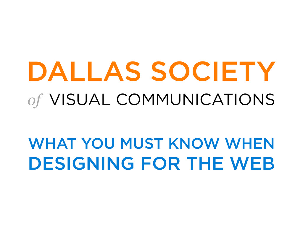
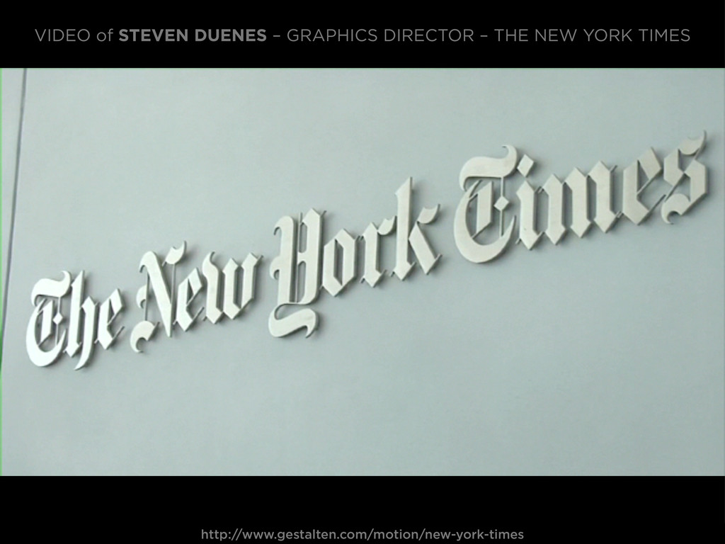
Talk I gave with Andy Rutledge, at the Dallas Society of Visual Communications — to an audience of (mostly) print designers, wanting to learn more about the principles of web design.
think are good to keep in mind when making the transition from designing for print, to designing for the web. Note: We’re not print guys. So bear with us if we can’t recite what exactly CMYK stands for! :)
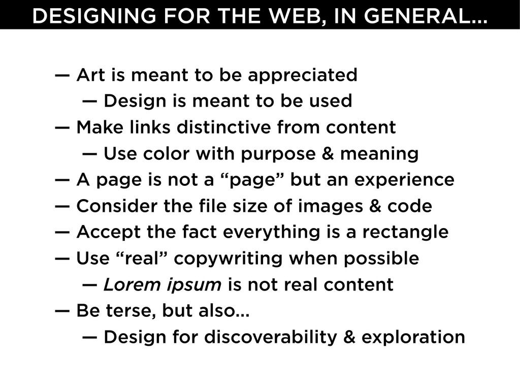
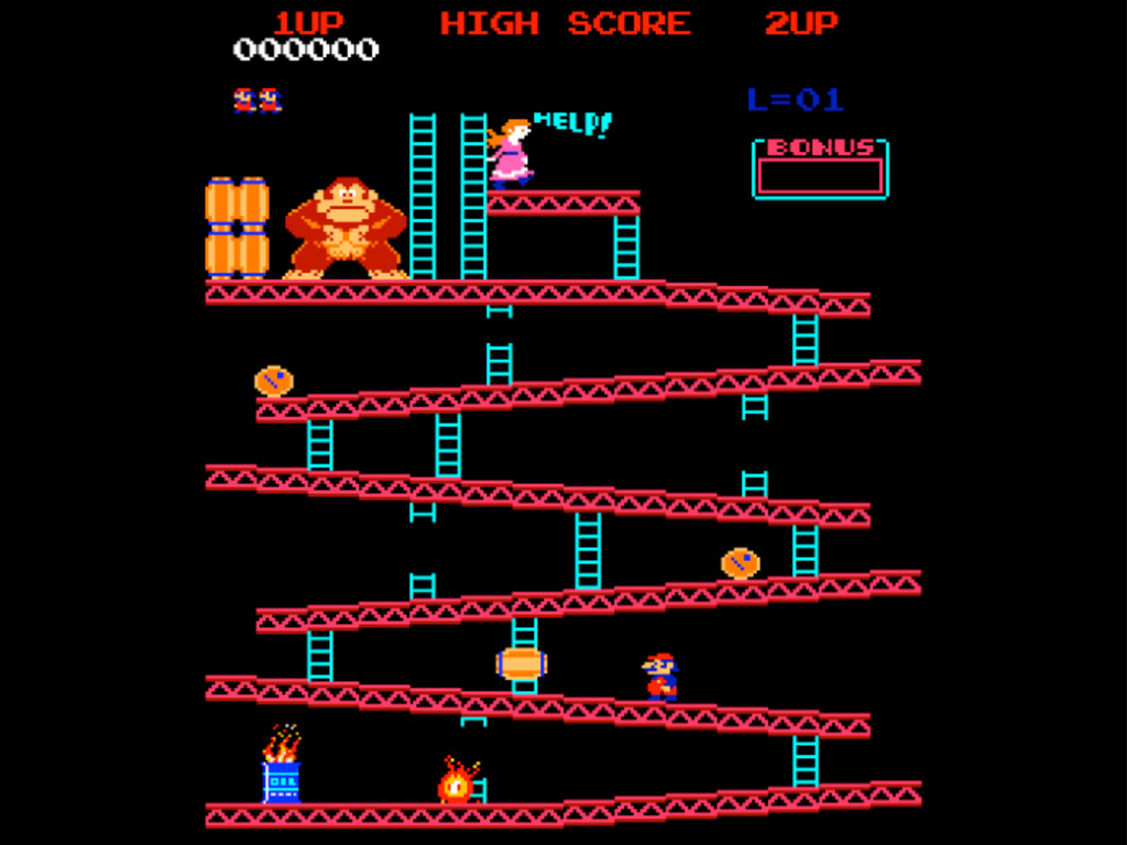
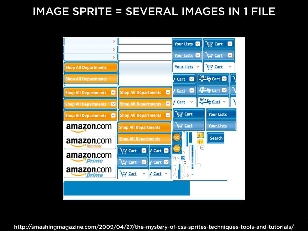
to be appreciated — Design is meant to be used — Make links distinctive from content — Use color with purpose & meaning — A page is not a “page” but an experience — Consider the file size of images & code — Accept the fact everything is a rectangle — Use “real” copywriting when possible — Lorem ipsum is not real content — Be terse, but also... — Design for discoverability & exploration
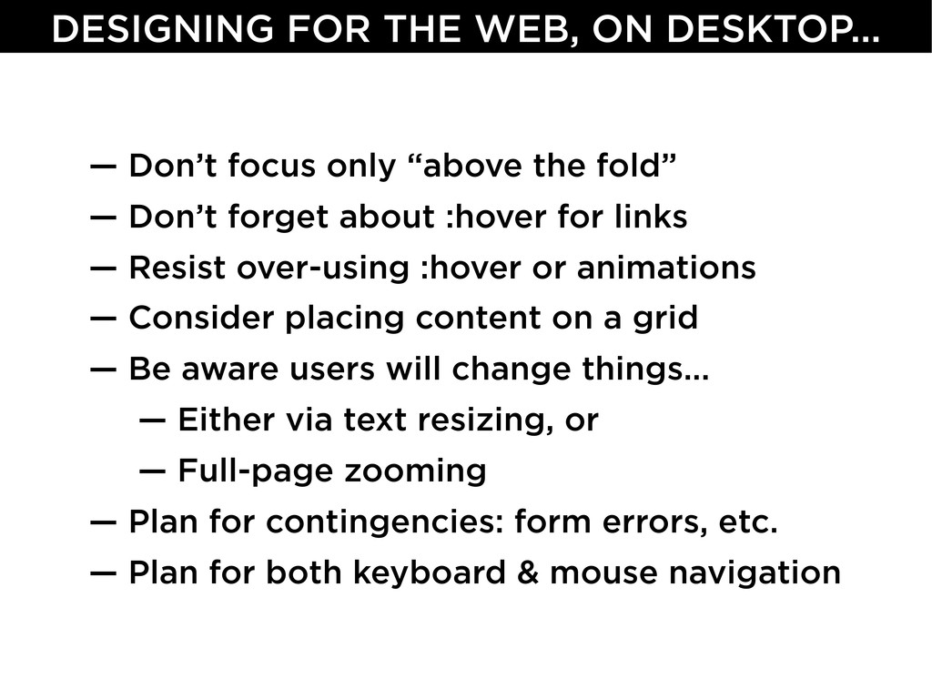
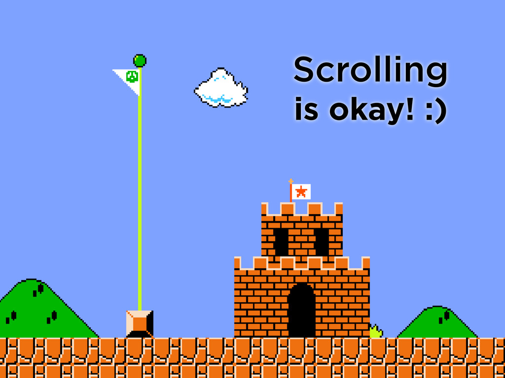
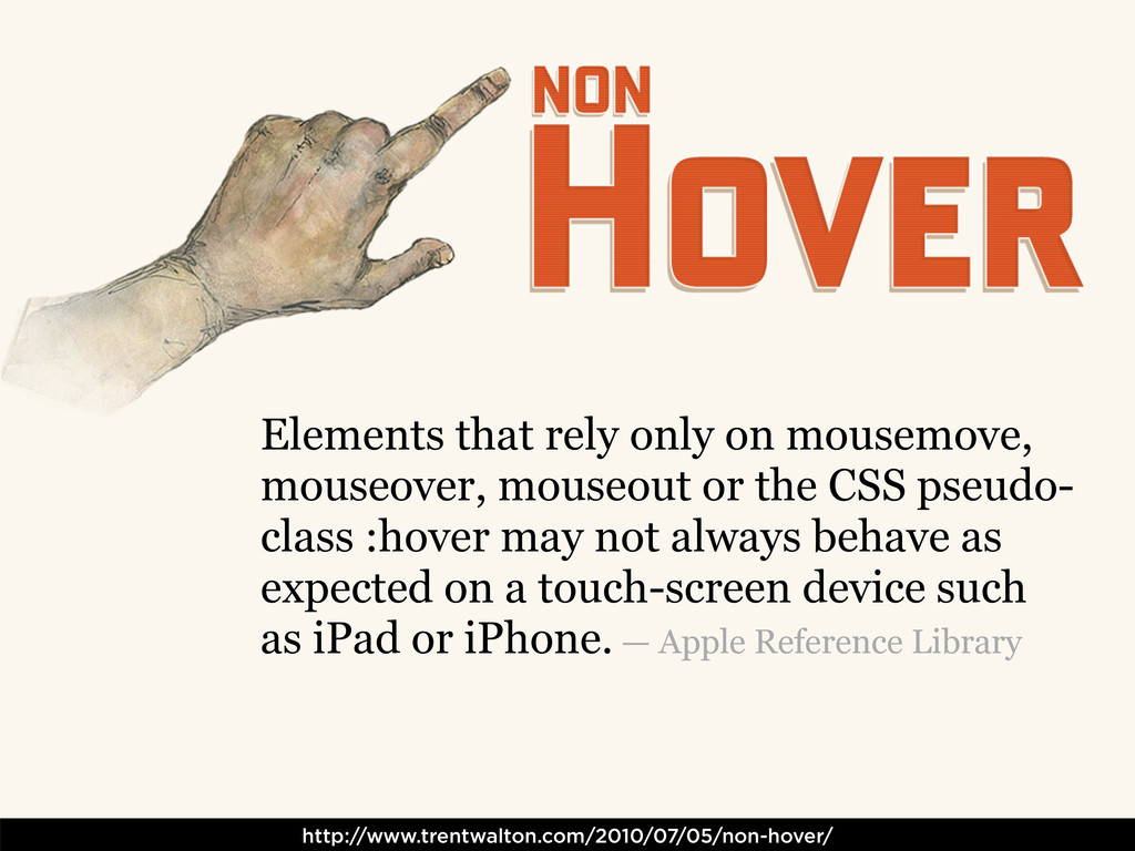
about :hover for links — Resist over-using :hover or animations — Consider placing content on a grid — Be aware users will change things... — Either via text resizing, or — Full-page zooming — Plan for contingencies: form errors, etc. — Plan for both keyboard & mouse navigation DESIGNING FOR THE WEB, ON DESKTOP...
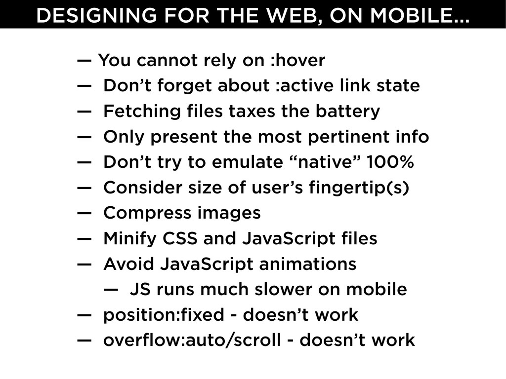
:active link state — Fetching files taxes the battery — Only present the most pertinent info — Don’t try to emulate “native” 100% — Consider size of user’s fingertip(s) — Compress images — Minify CSS and JavaScript files — Avoid JavaScript animations — JS runs much slower on mobile — position:fixed - doesn’t work — overflow:auto/scroll - doesn’t work DESIGNING FOR THE WEB, ON MOBILE...
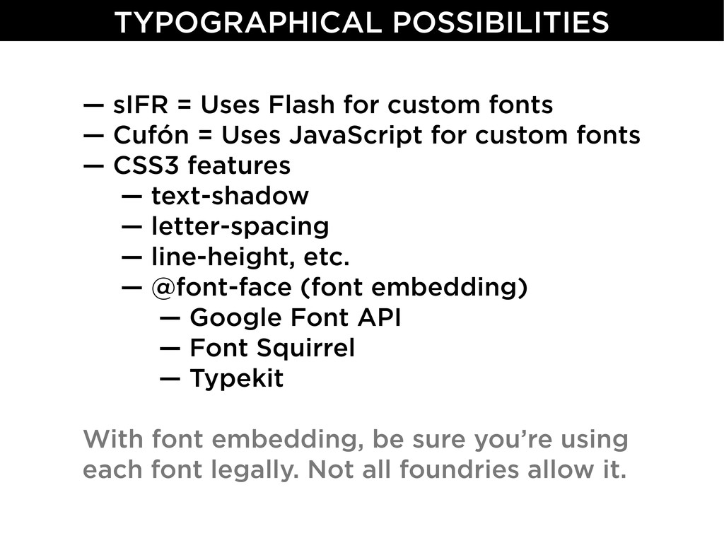
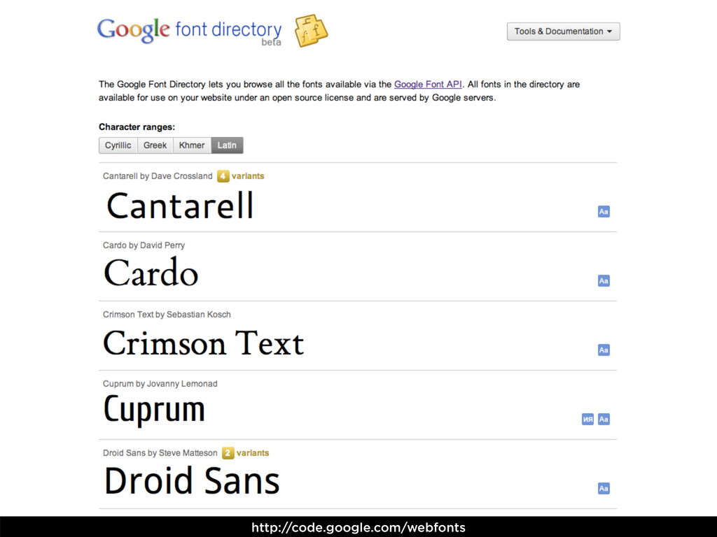
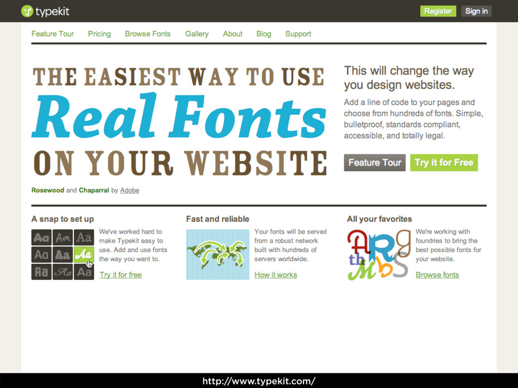
= Uses JavaScript for custom fonts — CSS3 features — text-shadow — letter-spacing — line-height, etc. — @font-face (font embedding) — Google Font API — Font Squirrel — Typekit With font embedding, be sure you’re using each font legally. Not all foundries allow it. TYPOGRAPHICAL POSSIBILITIES
Smith TWITTER: http://twitter.com/nathansmith CONTACT: http://sonspring.com/contact GET THESE SLIDES... http://slideshare.net/nathansmith/dsvc-design-talk
 nathansmith
 takanorip
 kamechi7222222
 kenichiota0711
 atsushihomma
 nttcom
 kossykinto
 hypebeans
 ds35mm
 saki822
 mottox2
 stmn
stmn
 samanthasiow
 aleyda
 sferik
 tammyeverts
 lara
lara
 nonsquared
 rakko
rakko
 dougneiner
 csswizardry
 seathinner
 destraynor
 hannesfritz