Upgrade to Pro — share decks privately, control downloads, hide ads and more …

Using Responsive Images Responsibly: Performance & Accessibility [Full Stack]

newtron
November 22, 2014

Using Responsive Images Responsibly: Performance & Accessibility [Full Stack]

Full Stack Toronto 2014,
November 22, 2014
https://github.com/nwtn/pres-respimg-perf-fsto

newtron

November 22, 2014
Tweet

More Decks by newtron

Other Decks in Programming

Transcript

  1. David Newton, St. Michael’s Hospital 1 1 Using Responsive Images

    Responsibly: Performance & Accessibility: Full Stack Toronto 2014 Twitter: @newtron Github: @nwtn Email: [email protected] Slides: https://github.com/nwtn/pres-respimg-perf-fsto
  2. “ 4 ‘Disability’ means… any degree of physical disability, infirmity,

    malformation or disfigurement that is caused by bodily injury, birth defect or illness… —Accessibility for Ontarians with Disabilities Act
  3. “ 6 Following these guidelines will make content accessible to

    a wider range of people with disabilities, including blindness and low vision, deafness and hearing loss, learning disabilities, cognitive limitations, limited movement, speech disabilities, photosensitivity and combinations of these. Following these guidelines will also often make your Web content more usable to users in general. —Web Content Accessibility Guidelines 2.0 (emphasis mine)
  4. “ 8 The goal of Web design is not merely

    to dazzle, but to deliver information to the widest audience possible. …Compromise should not come at the expense of the user, but rather in terms of the native capabilities of the user’s choice of device.… Leave no one behind. —Steven Champeon, Inclusive Web Design for the Future (emphasis mine)
  5. “ 11 Rather than creating disconnected designs, each tailored to

    a particular device or browser, we should instead treat them as facets of the same experience. —Ethan Marcotte, Responsive Web Design (emphasis mine)
  6. 12 Responsive web design Deliver a great experience to all

    users, regardless of their viewing context.
  7. “ 14 Many of us are fortunate to live in

    high bandwidth regions, but there are still large portions of the world that do not. By keeping your client side code small and lightweight, you can literally open your product up to new markets. —Chris Zacharias, Page Weight Matters (emphasis mine)
  8. 18 Accessibility Progressive enhancement Responsive web design Web performance Universal

    web design Accessibility Progressive enhancement Responsive web design Web performance
  9. 18 Accessibility Progressive enhancement Responsive web design Web performance Universal

    web design Accessibility Progressive enhancement Responsive web design Web performance
  10. “ 19 Universal design is the design of products and

    environments to be usable by all people, to the greatest extent possible, without the need for adaptation or specialized design. —Ronald L. Mace
  11. 22 63% of Americans used a phone to access the

    internet 34% of Americans used a mobile device as their primary way to access the web
  12. “ 23 More human beings today have access to a

    cellphone than…a clean toilet. –Anand Giridharadas, New York Times April 10 2010
  13. “ 23 More human beings today have access to a

    cellphone than…a clean toilet. –Anand Giridharadas, New York Times April 10 2010
  14. 27

  15. 28

  16. 30

  17. 31

  18. 32 —HTTP Archive, November 1 2014 Stylesheets 57 KB HTML

    60 KB Flash 76 KB Other 152 KB Scripts 305 KB Images 1,206 KB Total 1,925 KB
  19. 33

  20. 34

  21. 35 2x resolution = 4x as many pixels 3x resolution

    = 9x as many pixels 4x resolution = 16x as many pixels
  22. 36 more pixels = more energy more pixels = more

    money more pixels = more time
  23. 42

  24. 43

  25. 44

  26. 46

  27. 50 Firefox (Gecko) Chrome/Opera (Blink) Safari (WebKit) Internet Explorer (Trident)

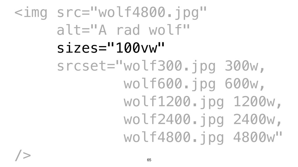
    srcset (x) N/A Chrome 34 Opera 21 Works now! Safari 8 Works now! N/A? srcset (x & w) + sizes Behind a flag: FF 32 On by default: FF 36? Chrome 38 Opera 25 Works now! Safari 8.1? 12? picture Behind a flag: FF 33 On by default: FF 36? Chrome 38 Opera 25 Works now! Safari 8.1? 12?
  28. 59 <img src="wolf600.jpg" alt="A rad wolf" srcset="wolf300.jpg 0.5x, wolf600.jpg 1x,

    wolf1200.jpg 2x, wolf2400.jpg 3x, wolf4800.jpg 4x" />
  29. 60 <img src="wolf600.jpg" alt="A rad wolf" srcset="wolf300.jpg 0.5x, wolf600.jpg 1x,

    wolf1200.jpg 2x, wolf2400.jpg 3x, wolf4800.jpg 4x" />
  30. 63 <img src="wolf4800.jpg" alt="A rad wolf" sizes="100vw" srcset="wolf300.jpg 300w, wolf600.jpg

    600w, wolf1200.jpg 1200w, wolf2400.jpg 2400w, wolf4800.jpg 4800w" />
  31. 64 <img src="wolf4800.jpg" alt="A rad wolf" sizes="100vw" srcset="wolf300.jpg 300w, wolf600.jpg

    600w, wolf1200.jpg 1200w, wolf2400.jpg 2400w, wolf4800.jpg 4800w" />
  32. 65 <img src="wolf4800.jpg" alt="A rad wolf" sizes="100vw" srcset="wolf300.jpg 300w, wolf600.jpg

    600w, wolf1200.jpg 1200w, wolf2400.jpg 2400w, wolf4800.jpg 4800w" />
  33. 66 <img src="wolf4800.jpg" alt="A rad wolf" sizes="100vw" srcset="wolf300.jpg 300w, wolf600.jpg

    600w, wolf1200.jpg 1200w, wolf2400.jpg 2400w, wolf4800.jpg 4800w" />
  34. 67 <img src="wolf4800.jpg" alt="A rad wolf" sizes="100vw" srcset="wolf300.jpg 300w, wolf600.jpg

    600w, wolf1200.jpg 1200w, wolf2400.jpg 2400w, wolf4800.jpg 4800w" />
  35. 68 <img src="wolf4800.jpg" alt="A rad wolf" sizes="100vw" srcset="wolf300.jpg 300w, wolf600.jpg

    600w, wolf1200.jpg 1200w, wolf2400.jpg 2400w, wolf4800.jpg 4800w" />
  36. 69 <img src="wolf4800.jpg" alt="A rad wolf" sizes="600px" srcset="wolf300.jpg 300w, wolf600.jpg

    600w, wolf1200.jpg 1200w, wolf2400.jpg 2400w, wolf4800.jpg 4800w" />
  37. 70 <img src="wolf4800.jpg" alt="A rad wolf" sizes="calc(100vw - 10em)" srcset="wolf300.jpg

    300w, wolf600.jpg 600w, wolf1200.jpg 1200w, wolf2400.jpg 2400w, wolf4800.jpg 4800w" />
  38. 71 <img src="wolf4800.jpg" alt="A rad wolf" sizes=“100%" srcset="wolf300.jpg 300w, wolf600.jpg

    600w, wolf1200.jpg 1200w, wolf2400.jpg 2400w, wolf4800.jpg 4800w" />
  39. 72 <img src="wolf4800.jpg" alt="A rad wolf" sizes="100vw" srcset="wolf300.jpg 300w, wolf600.jpg

    600w, wolf1200.jpg 1200w, wolf2400.jpg 2400w, wolf4800.jpg 4800w" />
  40. 73

  41. 74 <img src="wolf4800.jpg" alt="A rad wolf" sizes="(min-width: 1000px) 33vw, (min-width:

    600px) 50vw, 100vw" srcset="wolf300.jpg 300w, wolf600.jpg 600w, wolf1200.jpg 1200w, wolf2400.jpg 2400w, wolf4800.jpg 4800w" />
  42. 75 <img src="wolf4800.jpg" alt="A rad wolf" sizes="(min-width: 1000px) 33vw, (min-width:

    600px) 50vw, 100vw" srcset="wolf300.jpg 300w, wolf600.jpg 600w, wolf1200.jpg 1200w, wolf2400.jpg 2400w, wolf4800.jpg 4800w" />
  43. 86

  44. 87

  45. 89 <picture> <source media="(min-width: 1000px)" srcset="wolf-crop-bg.jpg" /> <source media="(min-width: 600px)"

    srcset="wolf-crop-sm.jpg" /> <img src="wolf.jpg" alt="A rad wolf" /> </picture>
  46. 90 <picture> <source media="(min-width: 1000px)" srcset="wolf-crop-bg.jpg" /> <source media="(min-width: 600px)"

    srcset="wolf-crop-sm.jpg" /> <img src="wolf.jpg" alt="A rad wolf" /> </picture>
  47. 91 <picture> <source media="(min-width: 1000px)" srcset="wolf-crop-bg.jpg" /> <source media="(min-width: 600px)"

    srcset="wolf-crop-sm.jpg" /> <img src="wolf.jpg" alt="A rad wolf" /> </picture>
  48. 92 <picture> <source media="(min-width: 1000px)" srcset="wolf-crop-bg.jpg" /> <source media="(min-width: 600px)"

    srcset="wolf-crop-sm.jpg" /> <img src="wolf.jpg" alt="A rad wolf" /> </picture>
  49. 93 <picture> <source media="(min-width: 1000px)" srcset="wolf-crop-bg.jpg" /> <source media="(min-width: 600px)"

    srcset="wolf-crop-sm.jpg" /> <img src="wolf.jpg" alt="A rad wolf" /> </picture>
  50. 95 <picture> <source type="image/webp" media="(min-width: 1000px)" sizes="33vw" srcset="wolf-crop-big-300.jpg 300w, wolf-crop-big-600.jpg

    600w, wolf-crop-big-1200.jpg 1200w, wolf-crop-big-2400.jpg 2400w, wolf-crop-big-4800.jpg 4800w" /> <source type="image/webp" media="(min-width: 600px)" sizes="50vw" srcset="wolf-crop-small-300.jpg 300w, wolf-crop-small-600.jpg 600w, wolf-crop-small-1200.jpg 1200w, wolf-crop-small-2400.jpg 2400w, wolf-crop-small-4800.jpg 4800w" /> <source type="image/webp" sizes="100vw" srcset="wolf-crop-med-300.jpg 300w, wolf-crop-med-600.jpg 600w, wolf-crop-med-1200.jpg 1200w, wolf-crop-med-2400.jpg 2400w, wolf-crop-med-4800.jpg 4800w" /> <source media="(min-width: 1000px)" sizes="33vw" srcset="wolf-crop-big-300.jpg 300w, wolf-crop-big-600.jpg 600w, wolf-crop-big-1200.jpg 1200w, wolf-crop-big-2400.jpg 2400w, wolf-crop-big-4800.jpg 4800w" /> <source media="(min-width: 600px)" sizes="50vw" srcset="wolf-crop-small-300.jpg 300w, wolf-crop-small-600.jpg 600w, wolf-crop-small-1200.jpg 1200w, wolf-crop-small-2400.jpg 2400w, wolf-crop-small-4800.jpg 4800w" /> <source sizes="100vw" srcset="wolf-crop-med-300.jpg 300w, wolf-crop-med-600.jpg 600w, wolf-crop-med-1200.jpg 1200w, wolf-crop-med-2400.jpg 2400w, wolf-crop-med-4800.jpg 4800w" /> <img src="wolf-crop-med-600.jpg" alt="A rad wolf" /> </picture>
  51. 96 <img src="wolf600.jpg" alt="A rad wolf" sizes="(min-width: 1000px) 33vw, (min-width:

    600px) 50vw, 100vw" srcset="wolf300.jpg 300w, wolf600.jpg 600w, wolf1200.jpg 1200w, wolf2400.jpg 2400w, wolf4800.jpg 4800w" />
  52. 104

  53. 105

  54. 109 ExpiresActive on ExpiresDefault "access plus 1 month" ExpiresByType image/gif

    "access plus 1 year" ExpiresByType image/jpeg "access plus 1 year" ExpiresByType image/png "access plus 1 year" ExpiresByType image/svg+xml "access plus 1 year" Note: Apache is confusing and I’m not guaranteeing this will work.
  55. 110 1. Responsive images 2. Image optimization 3. Deferred image

    loading 4. CDNs & Caching 5. Appropriate contrast and colour
  56. 113

  57. 116 1. Responsive images 2. Image optimization 3. Deferred image

    loading 4. CDNs & Caching 5. Appropriate contrast and colour 6. Text-based alternatives
  58. 118 http://www.w3.org/TR/html-alt-techniques/ HTML5: Techniques for providing useful text alternatives http://www.w3.org/WAI/GL/wiki/Using_aria-describedby_to_provide_descriptions_of_images

    Using aria-describedby to provide descriptions of images http://w3c.github.io/test-results/html-longdesc/cr-report.html longdesc Implementation Report http://www.paciellogroup.com/blog/2013/12/using-aria-enhance-svg-accessibility/ Using ARIA to enhance SVG accessibility http://www.w3.org/WAI/GL/wiki/Using_aria-labelledby_to_provide_a_text_alternative_for_non- text_content Using aria-labelledby to provide a text alternative for non-text content
  59. 119 1. Responsive images 2. Image optimization 3. Deferred image

    loading 4. CDNs & Caching 5. Appropriate contrast and colour 6. Text-based alternatives 7. Fewer images!
  60. 121

  61. 122

  62. 123 Unoptimized Optimized + Responsive Optimized + Responsive + Lazyload

    CSS 1 KB 1 KB 1 KB HTML 2 KB 3 KB 3 KB Scripts 29 KB 33 KB 33 KB Images 661 KB 253 KB 87 KB Total 693 KB 290 KB (~58% savings) 119 KB (~83% savings)
  63. 124 Browser Unoptimized Optimized + Responsive + Lazyload Firefox (Desktop)

    2.2 s 2.0 s Safari (iOS) 2.1 s 1.7 s Average 2.2 s 1.9 s (~14% savings)
  64. 125

  65. David Newton, St. Michael’s Hospital 127 Using Responsive Images Responsibly:

    Performance & Accessibility: Full Stack Toronto 2014 Twitter: @newtron Github: @nwtn Email: [email protected] Slides: https://github.com/nwtn/pres-respimg-perf-fsto