Project team: Chris Lloyd, Gemma Catney and Paul Williamson, University of Liverpool, UK Email: [email protected] / [email protected] @nickbearmanuk #RMF18 ESRC Research Methods Festival, Bath, 4th July 2018
UK Censuses of 1971, 1981, 1991, 2001 and 2011 • Creation of population surfaces for Britain for all comparable variables (1km cells nationally and 100m cells for urban areas; in Northern Ireland grid square counts for 1971-2011 are already available) • Provision of population surfaces, code in R programming language to manipulate data and an online atlas of population change
1991, 2001 and 2011 • Create intensity 1km grid using postcodes • Overlay enumeration districts or output areas with 1km postcode intensity grid • Use areal weighting to estimate populations of each overlapping area with postcode intensities as weights • Aggregate counts within grid cells • Smooth grid cells to make neighbouring cells similar
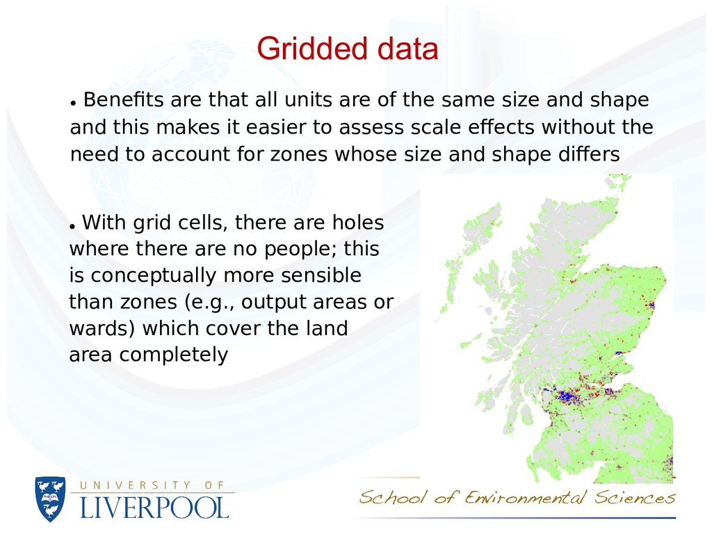
the same size and shape and this makes it easier to assess scale efects without the need to account for zones whose size and shape difers • With grid cells, there are holes where there are no people; this is conceptually more sensible than zones (e.g., output areas or wards) which cover the land area completely
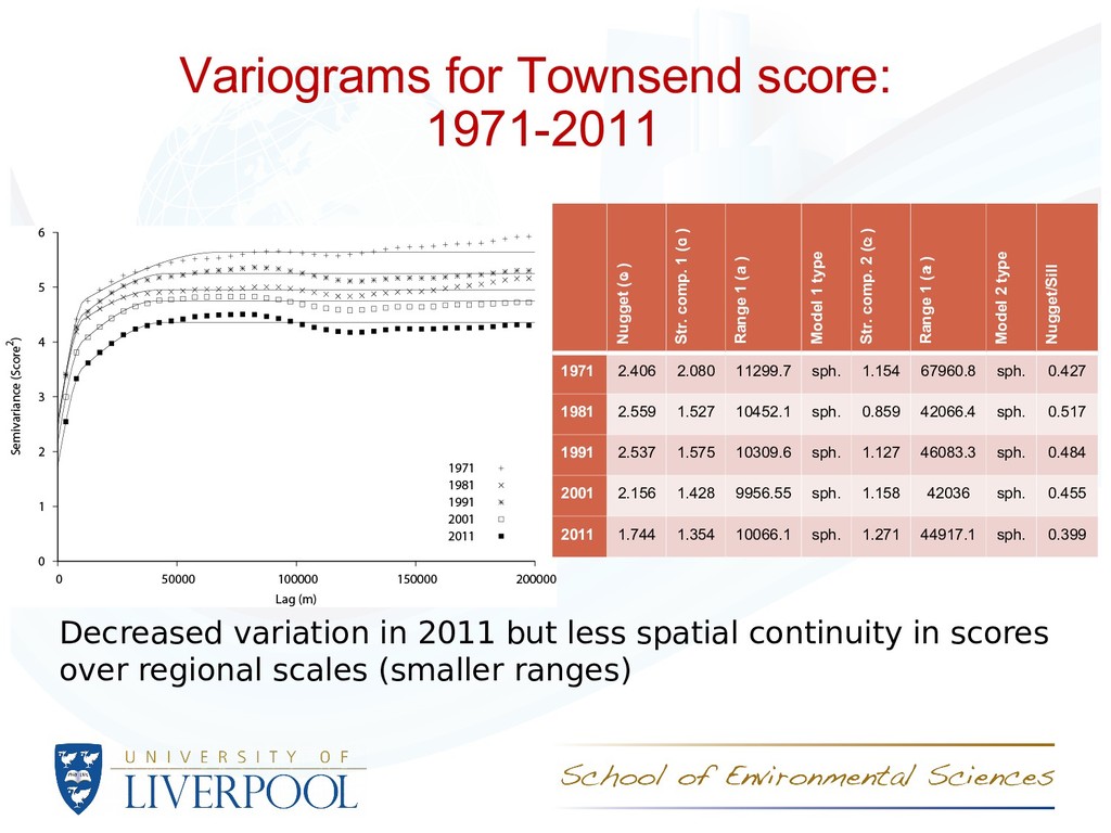
2011 for - Total persons - Unemployed persons (% of employed and unemployed) - Non owner occupied households (%) - Households without access to a car or van (%) - Households with more than one person per room (%) • From the latter four, z scores were derived (percentage- mean / standard deviation) and these were summed to derive a deprivation score (following Townsend)
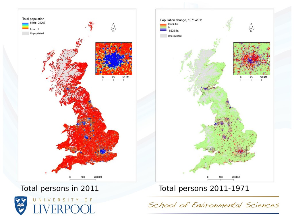
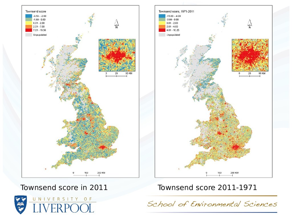
- Total persons, Unemployed persons (%), Townsend score • Analysis of population spatial distribution using index of dissimilarity and Moran’s I autocorrelation coefcient • Correlations between counts/percentages/scores for 1971 and 2011
unevenness in owner occupation reduced 1981 to 2011 – partly a function of ‘right to buy’ scheme, resulting in mixed tenures in areas formally dominated by social housing Index of dissimilarity, D (1 = uneven, 0 = % identical) Unemployed Non owner occupied No car van access Overcrowded 1971 0.22 0.40 0.29 0.32 1981 0.26 0.41 0.30 0.36 1991 0.25 0.36 0.31 0.33 2001 0.25 0.33 0.31 0.38 2011 0.22 0.32 0.32 0.40 Cells with > 0.5 persons/HH for all 4 variables for specific year
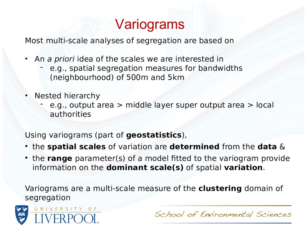
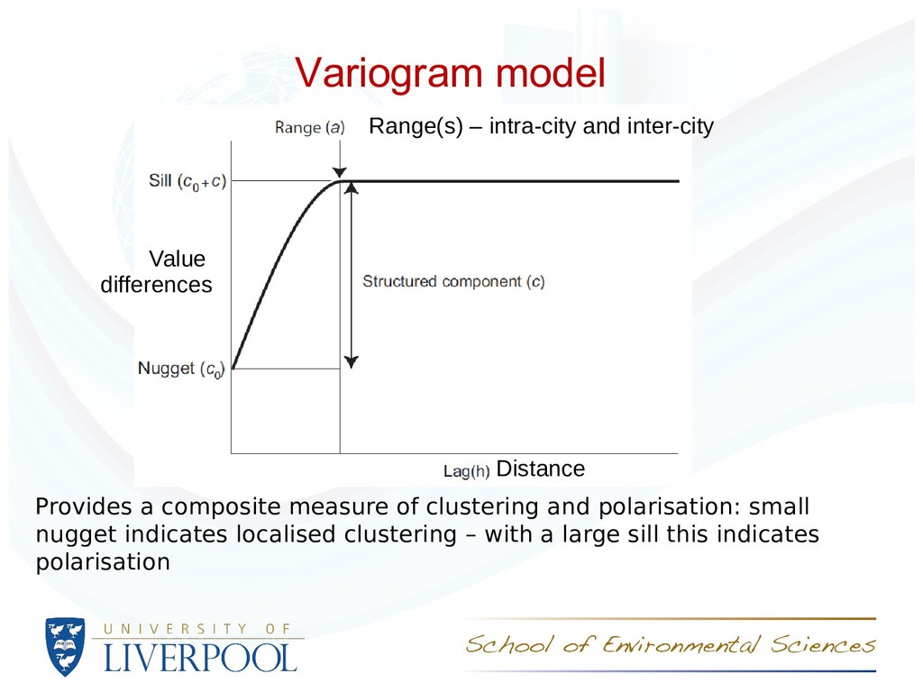
An a priori idea of the scales we are interested in - e.g., spatial segregation measures for bandwidths (neighbourhood) of 500m and 5km • Nested hierarchy - e.g., output area > middle layer super output area > local authorities Using variograms (part of geostatistics), • the spatial scales of variation are determined from the data & • the range parameter(s) of a model ftted to the variogram provide information on the dominant scale(s) of spatial variation. Variograms are a multi-scale measure of the clustering domain of segregation
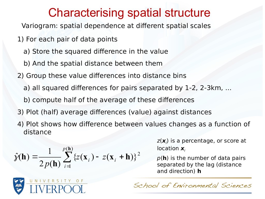
score at location x i p(h) is the number of data pairs separated by the lag (distance and direction) h Variogram: spatial dependence at diferent spatial scales 1) For each pair of data points a) Store the squared diference in the value b) And the spatial distance between them 2) Group these value diferences into distance bins a) all squared diferences for pairs separated by 1-2, 2-3km, ... b) compute half of the average of these diferences 3) Plot (half) average diferences (value) against distances 4) Plot shows how diference between values changes as a function of distance 2 ) ( 1 )} ( ) ( { ) ( 2 1 ) ( ˆ h x x h h h i i p i z z p
indicates localised clustering – with a large sill this indicates polarisation Variogram model Value differences Distance Range(s) – intra-city and inter-city
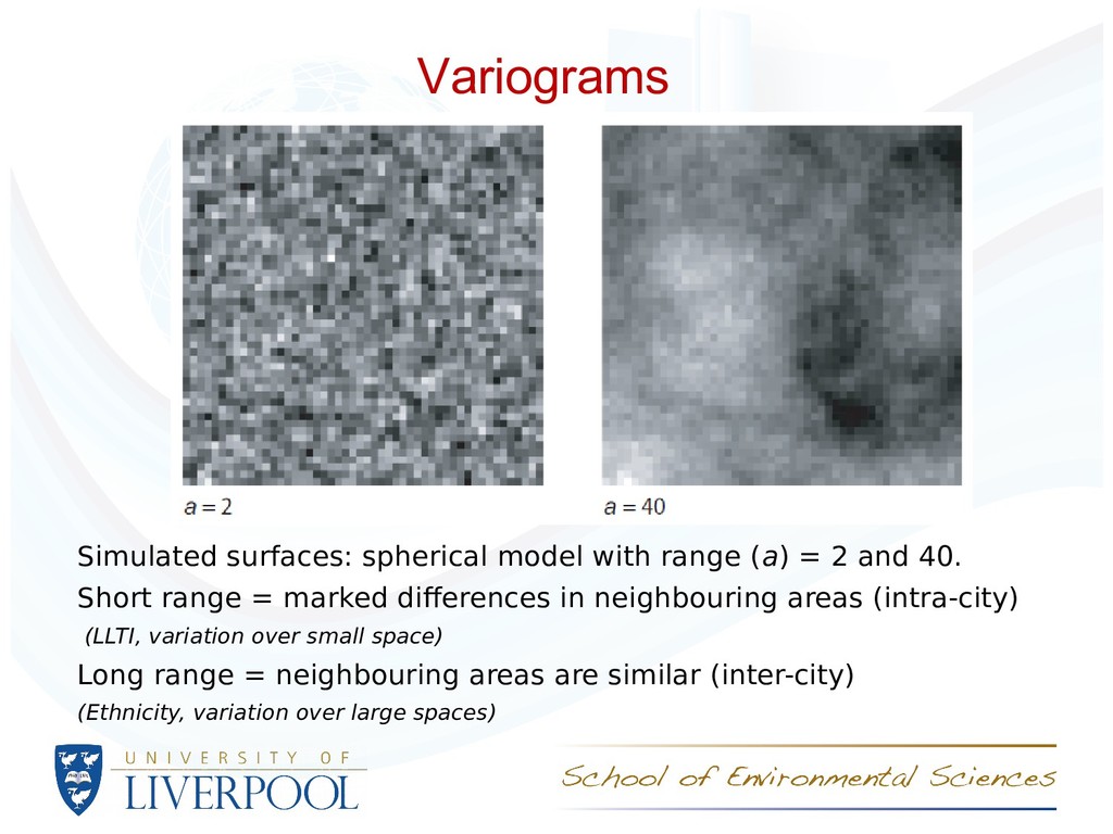
40. Short range = marked diferences in neighbouring areas (intra-city) (LLTI, variation over small space) Long range = neighbouring areas are similar (inter-city) (Ethnicity, variation over large spaces) Variograms
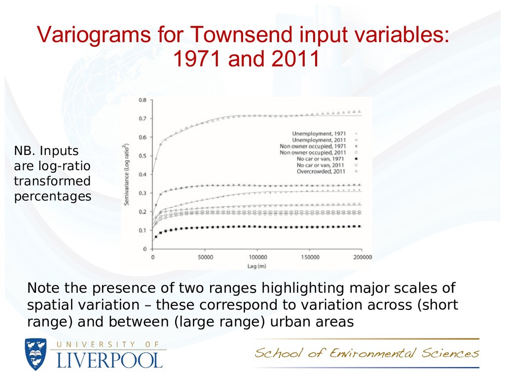
presence of two ranges highlighting major scales of spatial variation – these correspond to variation across (short range) and between (large range) urban areas NB. Inputs are log-ratio transformed percentages
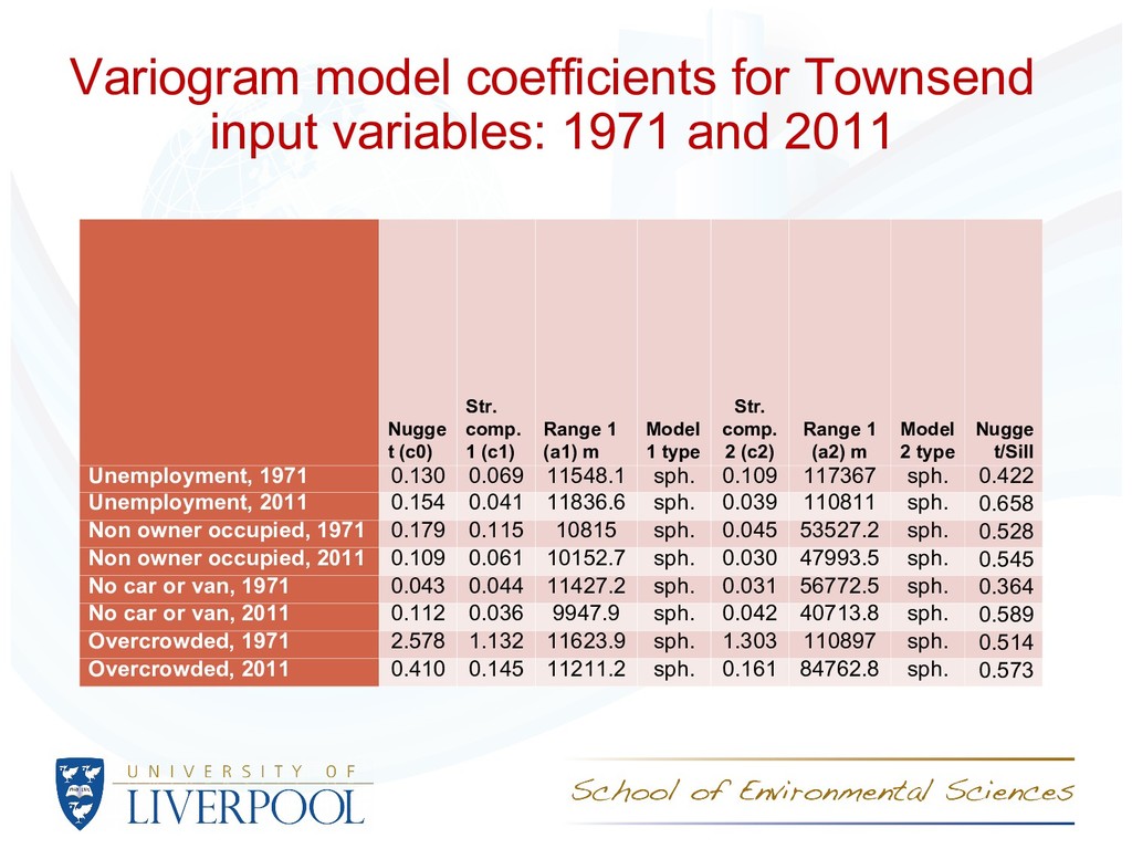
Unemployment: spatial distribution is similar, but the magnitude of variation was greater in 1971 than in 2011 – the places with large and small rates are similar, but the differences between places have reduced. Tenure: again, spatial distribution is similar (slightly less spatially continuous), but the magnitude of variation was greater in 1971 than in 2011 – the places with large and small rates are similar, but the differences between places have reduced. Car or van access: increased short range spatial variation – this suggests that there is more variation over rerlatively short distances – there are more pronounced distinctions between places with small and large rates in the same regions. Overcrowding: marked decrease in variation (note differences between Scotland and England and Wales in 1971 make comparisons difficult). Reduction in the spatial scale of variation – overcrowding is ‘spreading out’ of urban areas (especially London).
- analyses of population change in the UK and, specifcally, the ways in which the population has become more or less geographically unequal • The variogram ofers a powerful means of characterising the spatial distribution of population variables • The spatial structure of socioeconomic variables is consistent across time, but the magnitude of variation has reduced for most variables – locations with large percentages of, for example, unemployment, are broadly the same but the diferences between locations have reduced
No ES/L014769/1). The Ofce for National Statistics are thanked for provision of the data. Ofce for National Statistics, 2011 Census: Digitised Boundary Data (England and Wales) [computer fle]. ESRC/JISC Census Programme, Census Geography Data Unit (UKBORDERS), EDINA (University of Edinburgh)/Census Dissemination Unit. Census output is Crown copyright and is reproduced with the permission of the Controller of HMSO and the Queen's Printer for Scotland.
Bearman Project team: Chris Lloyd, Gemma Catney and Paul Williamson, University of Liverpool, UK ESRC Research Methods Festival, Bath, 4th July 2018 Email: [email protected] / [email protected] Lloyd, C. D., Catney, G., Williamson, P. and Bearman, N. (2017) Exploring the utility of grids for analysing long term population change. Computers, Environment and Urban Systems, 66, 1–12. doi:10.1016/j.compenvurbsys.2017.07.003, Open Access @nickbearmanuk #RMF18
score at location x i p(h) is the number of data pairs separated by the lag (distance and direction) h Variogram: spatial dependence at diferent spatial scales 1. Take each data value in turn and compute its squared diference from each of the other values in the data set and store the distances between them 2. Group these diferences into distance bins – e.g., all squared diferences for pairs separated by 1 to 2 km and compute half of the average of these diferences 3. Plot these (half) average diferences against distances 4. The plot shows how diference between values changes as a function of distance 2 ) ( 1 )} ( ) ( { ) ( 2 1 ) ( ˆ h x x h h h i i p i z z p
a composite measure of clustering and polarisation: small nugget indicates localised clustering – with a large sill this indicates polarisation Variogram model Value differences Distance Range(s) – intra-city and inter-city