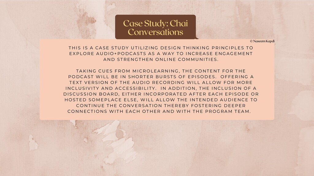
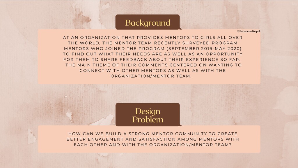
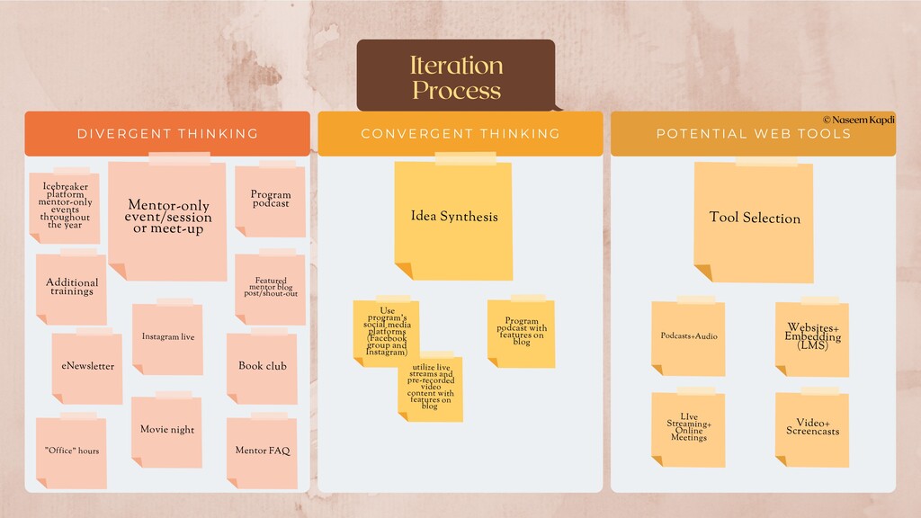
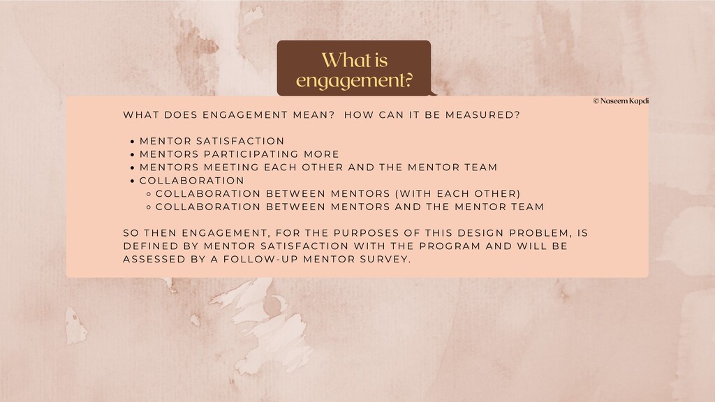
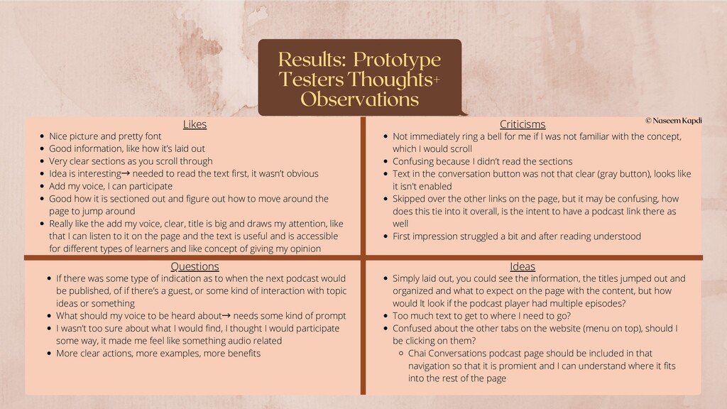
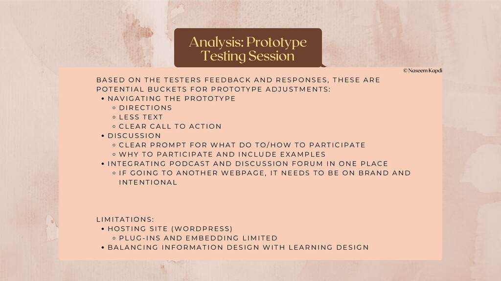
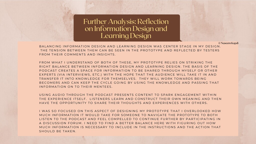
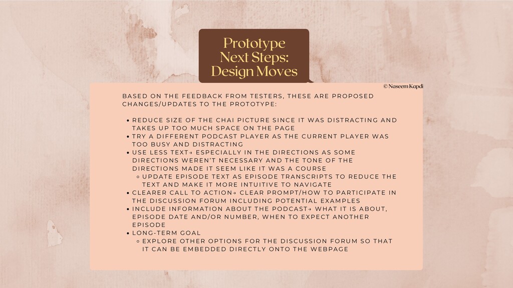
Questions Ideas Nice picture and pretty font Good information, like how it’s laid out Very clear sections as you scroll through Idea is interesting → needed to read the text first, it wasn’t obvious Add my voice, I can participate Good how it is sectioned out and figure out how to move around the page to jump around Really like the add my voice, clear, title is big and draws my attention, like that I can listen to it on the page and the text is useful and is accessible for different types of learners and like concept of giving my opinion Not immediately ring a bell for me if I was not familiar with the concept, which I would scroll Confusing because I didn’t read the sections Text in the conversation button was not that clear (gray button), looks like it isn't enabled Skipped over the other links on the page, but it may be confusing, how does this tie into it overall, is the intent to have a podcast link there as well First impression struggled a bit and after reading understood Simply laid out, you could see the information, the titles jumped out and organized and what to expect on the page with the content, but how would lt look if the podcast player had multiple episodes? Too much text to get to where I need to go? Confused about the other tabs on the website (menu on top), should I be clicking on them? Chai Conversations podcast page should be included in that navigation so that it is promient and I can understand where it fits into the rest of the page If there was some type of indication as to when the next podcast would be published, of if there’s a guest, or some kind of interaction with topic ideas or something What should my voice to be heard about → needs some kind of prompt I wasn’t too sure about what I would find, I thought I would participate some way, it made me feel like something audio related More clear actions, more examples, more benefits


 cygames
 a2k
 miyayou
 rezaline
 nikkei_engineer_recruiting
 yuri9911
 fumink7
 kotasaito_cnt
 findyinc
 ottatto
 toy1618
 philnash
 soudai
 leimatthew05
 aleyda
 wjessup
 afnizarnur
 bryan
 axbom
 joshbly
 sachag
 rabernat
 productmarketing